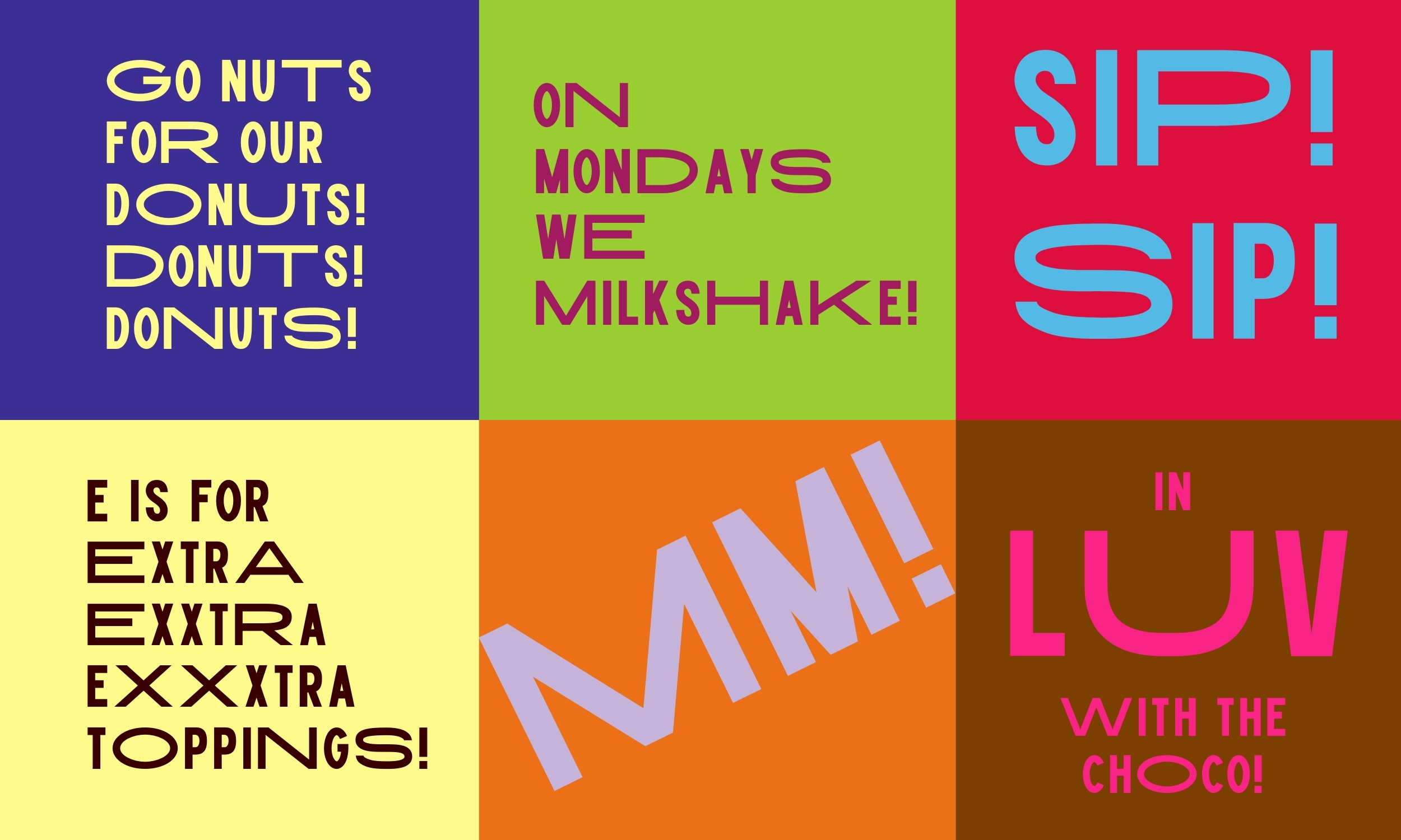
Milky Mountain’s brand was drowned out in Ghana’s ever-growing snack beverages and baked sweets category. It was time for a complete makeover of the brand and its visual identity, and Don’t Be A Stranger was tapped to deliver a rebrand that would reintroduce the brand to its audience, distinguish its image from the category and revive the Milky Mountain personality, to reflect the brand’s mission to bring a positively emotional experience in every sip and bite.
A look into the category behavior revealed weaknesses across several brands (client included), such as a common color palette, similar cursive font styles and a typical brand language that simply explains the taste of snacks, to the neglect of a rich expression of the feelings of excitement, and the “high” associated with enjoying one’s favorite sweet snack.
Don’t Be A Stranger therefore decided to tap into a familiar feeling associated with sweets – a sugar rush – as the big idea that would drive design. The strategy was to express the bubbliness, the unpredictable jumpiness and excitement that comes from a sugar rush, through typography, color and a new logo, and to allow positive emotion and joyful expression to come through in every element of Milky Mountain’s visual identity and language.
In this new design system, the language makes the logo. Representing Milky Mountain’s initials, while doubling as the sound one makes to express sheer pleasure and enjoyment, the new logo says all that needs to be said about the brand’s sweet treats, and achieves true stand out and relevance in a sea of sameness. The logo also fits neatly into words that express taste and sweetness.
The typography puts on a performance by visualizing the experience of a sugar rush, with its contracting and expanding letterforms; unpredictable and energetic in their act across the visual identity. It supports content to be written and presented in endless forms, allowing Milky Mountain to look and feel fresh anytime it engages its audience with messaging.
Inspiration for a color palette came from the multi-colored sprinkles used to decorate pastries, and add flair and texture to them. The new, broader and more exciting range of colors set the brand free from category blandness, and complement the energy and fun-ready personality of the new logo.

CREDIT
- Agency/Creative: Don't Be A Stranger
- Article Title: Don’t Be A Stranger’s Redesign of Milky Mountain Captures the Feeling of a Sugar Rush
- Organisation/Entity: Agency
- Project Type: Identity
- Project Status: Published
- Agency/Creative Country: Ghana
- Agency/Creative City: Dawhenya
- Market Region: Africa
- Project Deliverables: Brand Identity, Brand Tone of Voice, Logo Design, Typography
- Industry: Food/Beverage
- Keywords: Branding, Visual identity, brand design, logo design, food and snacks identity system, brand naming
-
Credits:
Design Director: Jean Quarcoopome
Writer: Jean Quarcoopome
Creative Director: Jean Quarcoopome


