


Yaz Oku directly translates as Write Read. Starting with its naming, the communication strategy we have developed for Yaz Oku was fast-paced, clear and fostering close-connection. For our target group of 25-35-year-old adults who have an affinity for reading and writing, the visual communication was built upon the main focus of Yaz Oku ; the typography.
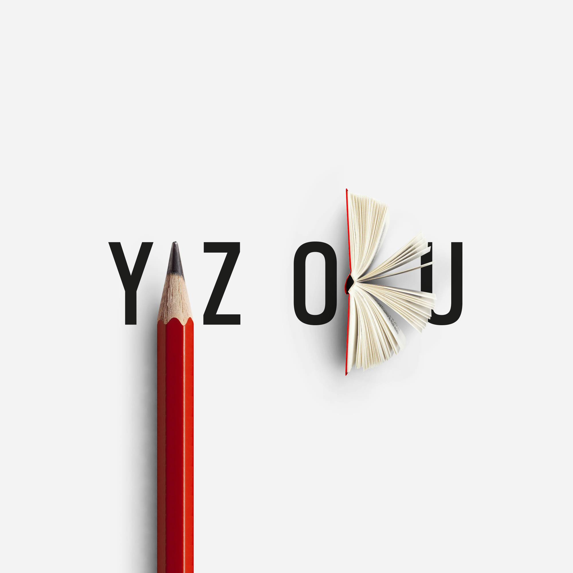
For the logotype work, we have developed symbols from associating the meaning of the words with the letters’ geometric forms. The letter A, located in the middle of the word Yaz (meaning “Write”), was symbolized by a pencil, while the letter K, in the middle of the word OKU (meaning “Read”) was symbolised by a book.
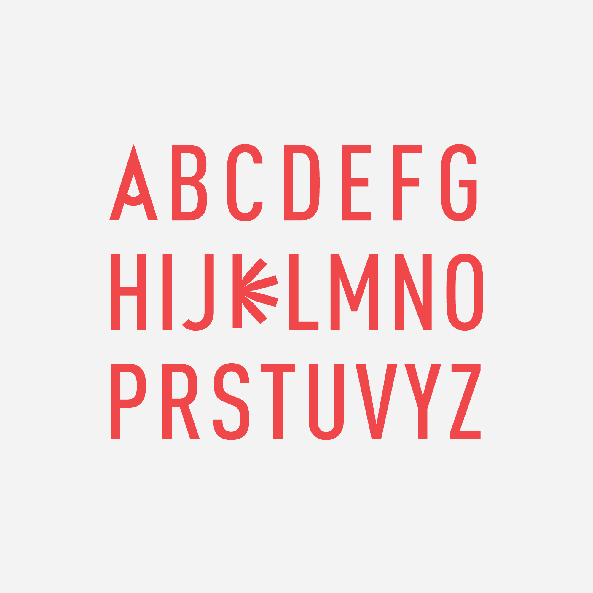
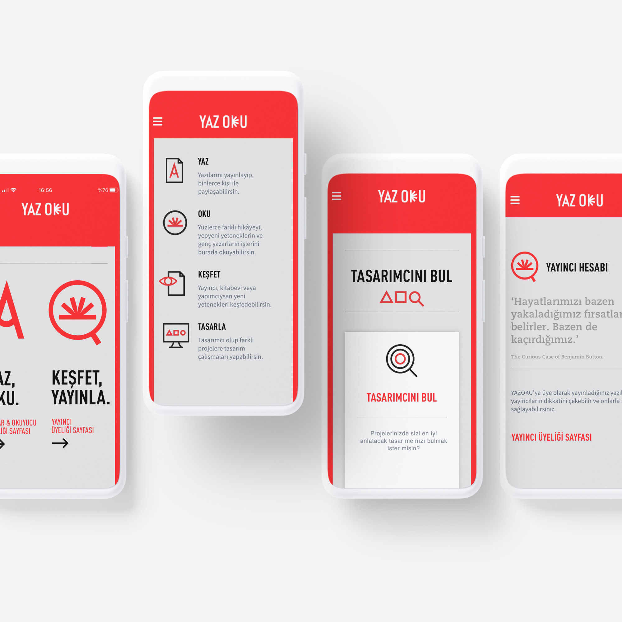
Then, we have designed a font family that included the A and K that was designed for the logotype. Being the key visuals, these symbols contributed to the uniqueness of the typography. To clearly communicate the sub-headings on digital platforms, we have developed animated icons that were a continuation of the visual structure.
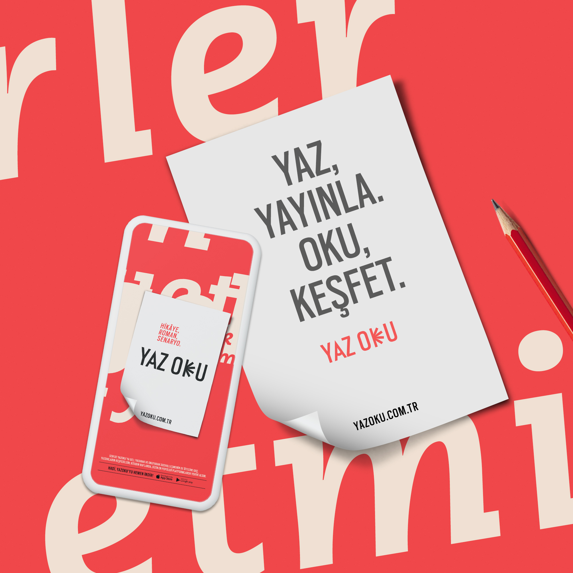
The succint and action-oriented expression of the name was continued on (transferred to) written materials. Sincere, succint, and clear statements encouraging taking action were chosen in communication.
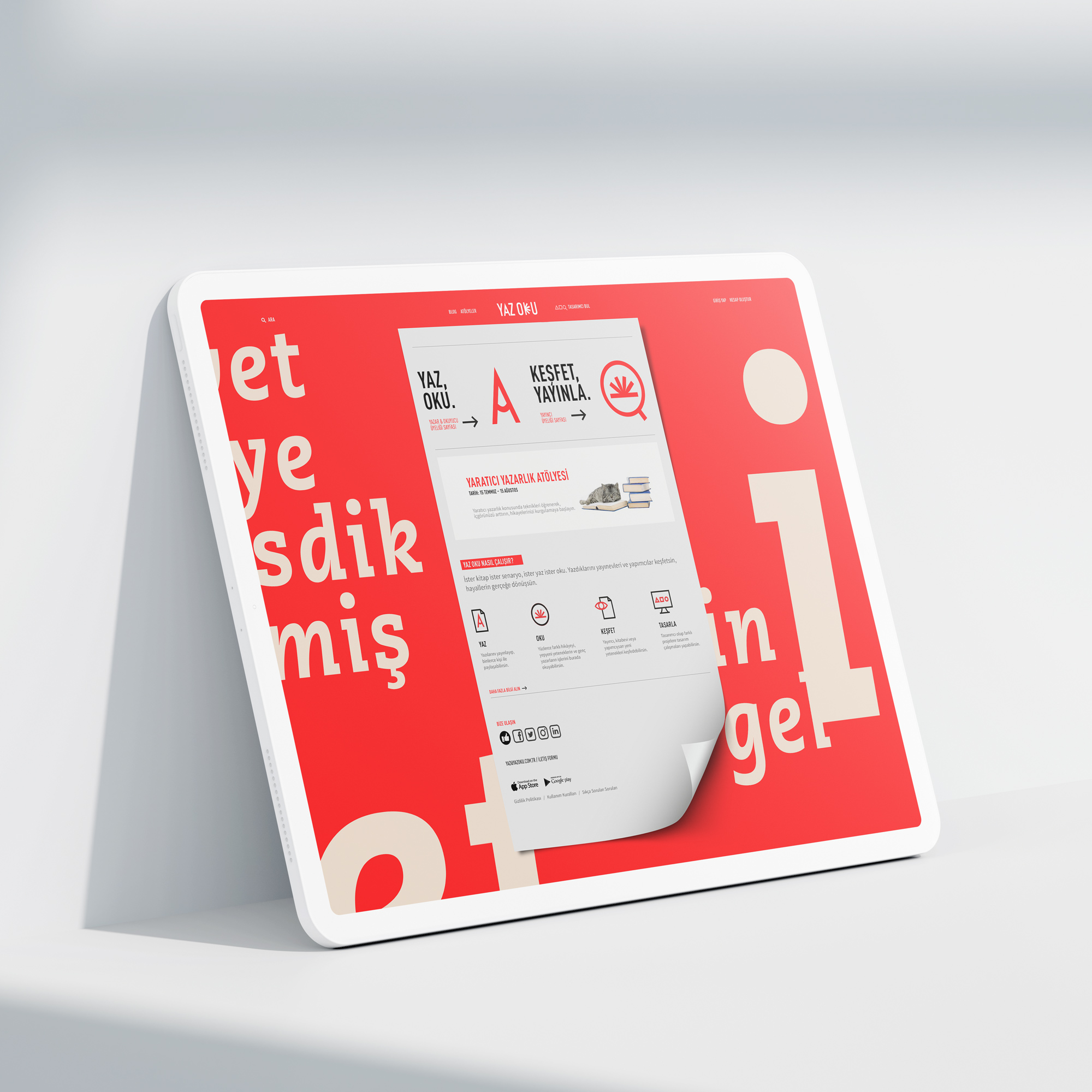
After we have established the branding design, we have designed the website and mobile application in accordance with the visual codes utilized in branding.
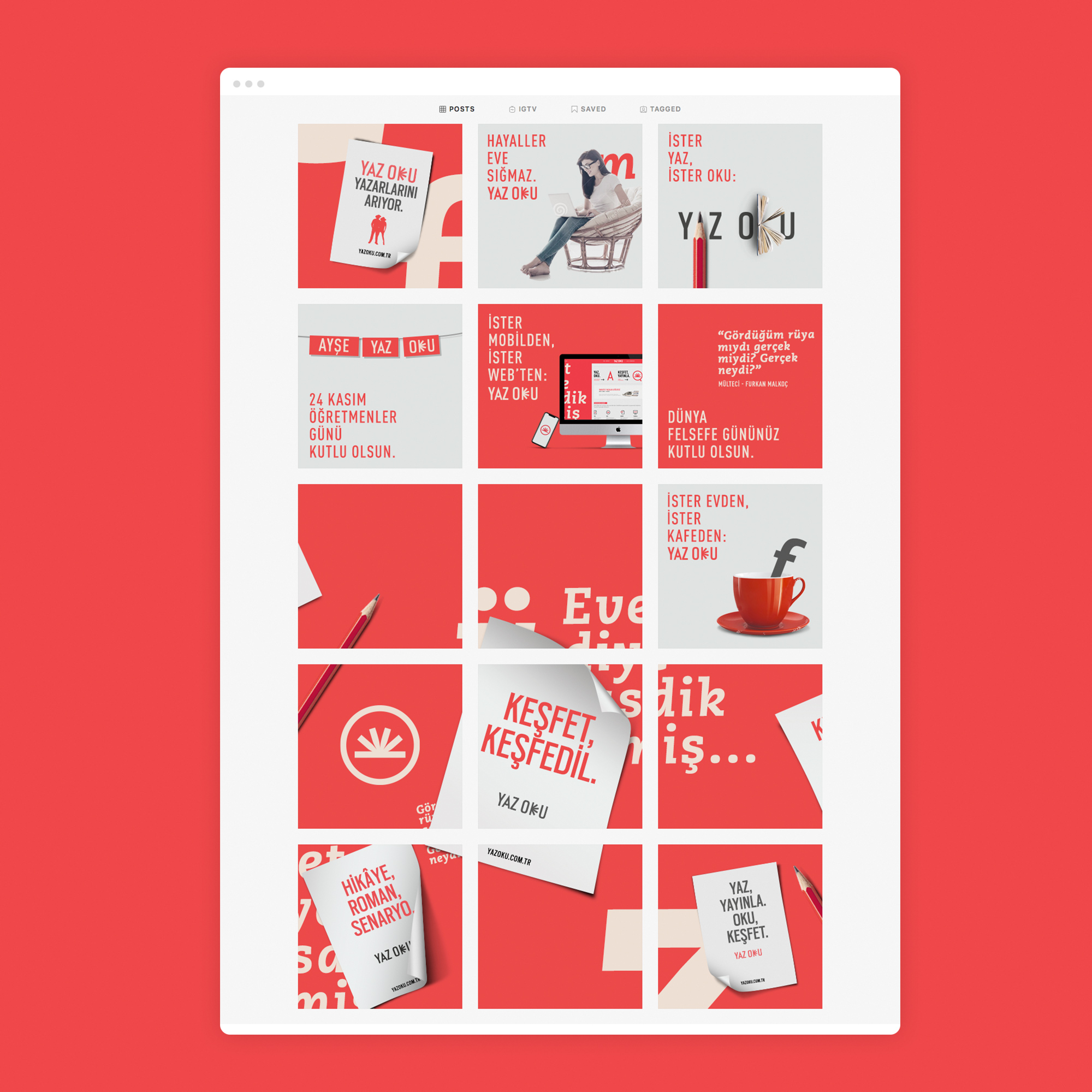
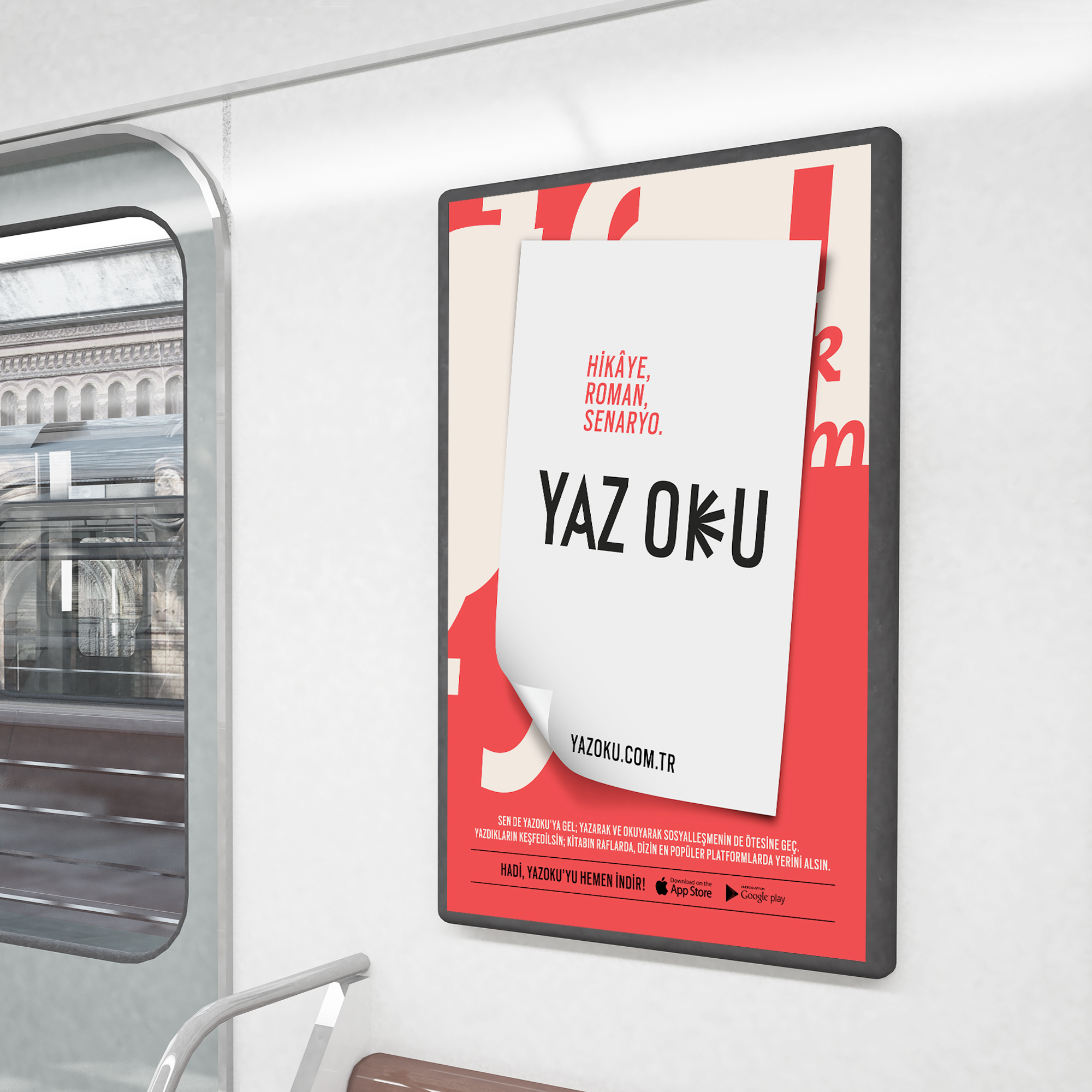
The process of preparing the creative for the brand’s local launch was most exciting and fulfilling. The promotion campaign was conducted mostly through digital platforms and social media as well as outdoor posters. Through the promotion campaign, we have focused on and utilized typography that allowed us to visually represent the reading and writing processes.
We have created the templates for the visual structure that would be used on social media. From the graphics to the tone of voice, each content was designed to support the brand identity. Video animations were used to bring movement to social media presence and digital promotions. Engaging in a project that allowed us to create the brand and touch every aspect of its visual presence was most fulfilling.
CREDIT
- Agency/Creative: Paper Brand Identity
- Article Title: Yaz Oku Digital Platform Branding Designed by Paper Brand Identity
- Organisation/Entity: Agency, Published Commercial Design
- Project Type: Identity
- Project Status: Published
- Agency/Creative Country: Turkey
- Market Region: Europe
- Project Deliverables: Brand Advertising, Brand Design, Brand Identity, Brand Strategy, Branding, Tone of Voice
- Industry: Entertainment
- Keywords: Brand Identity, Application Design, Web Design


