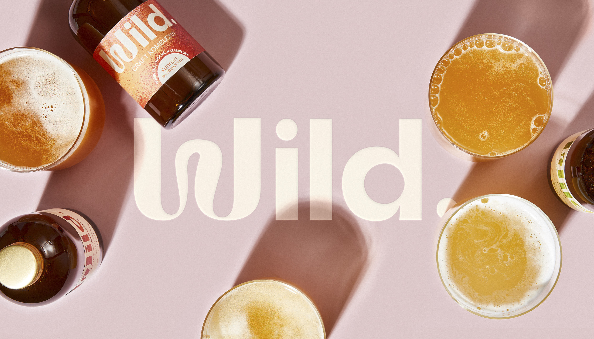
Wild. is a fermentation brand that set out to change the landscape of commercialised kombucha with a craft product that is 100% natural, taste-forward, with no additional flavourings or artificial carbonation and delivered fresh to the consumer’s door on a subscription-based model.
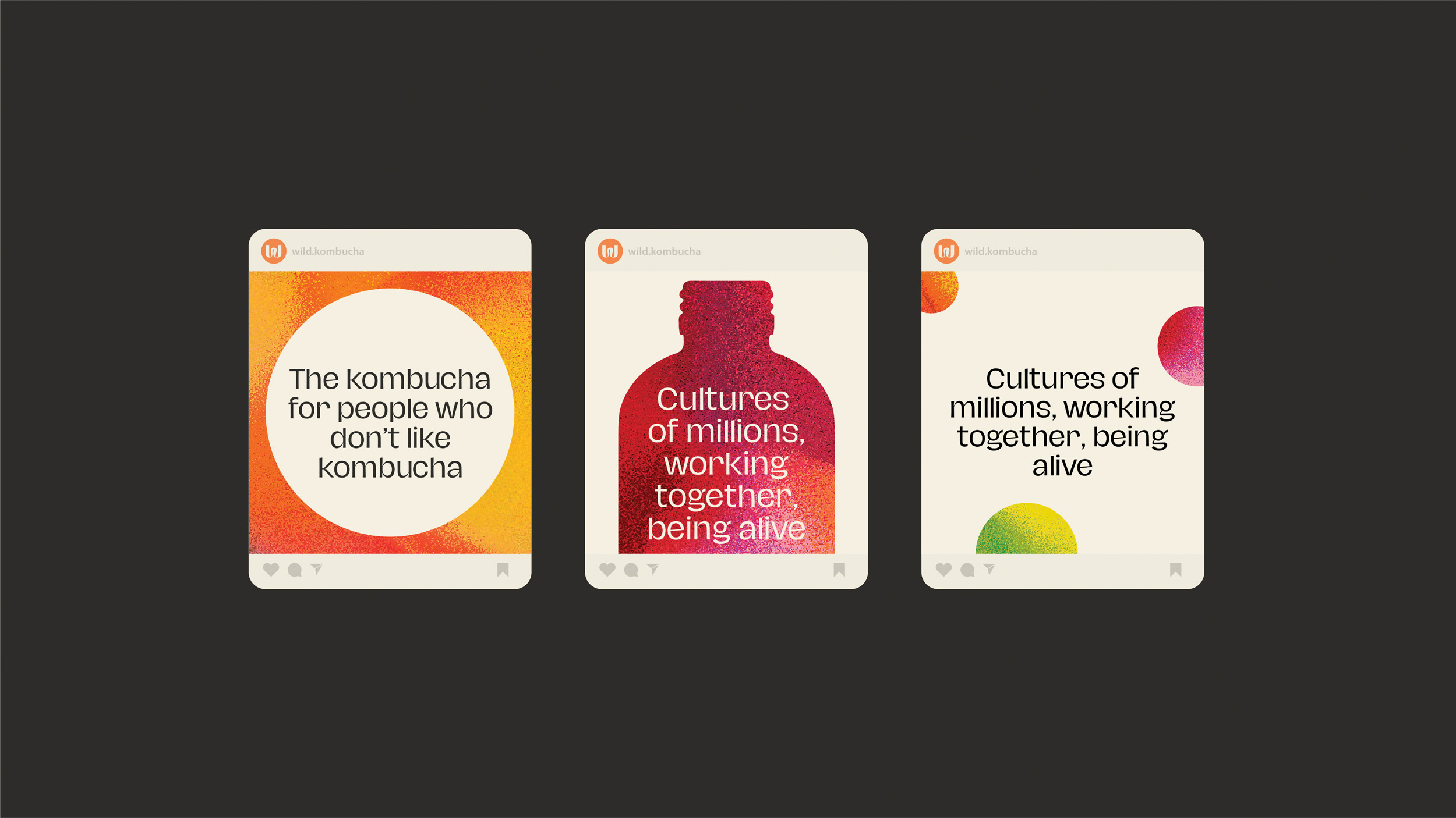
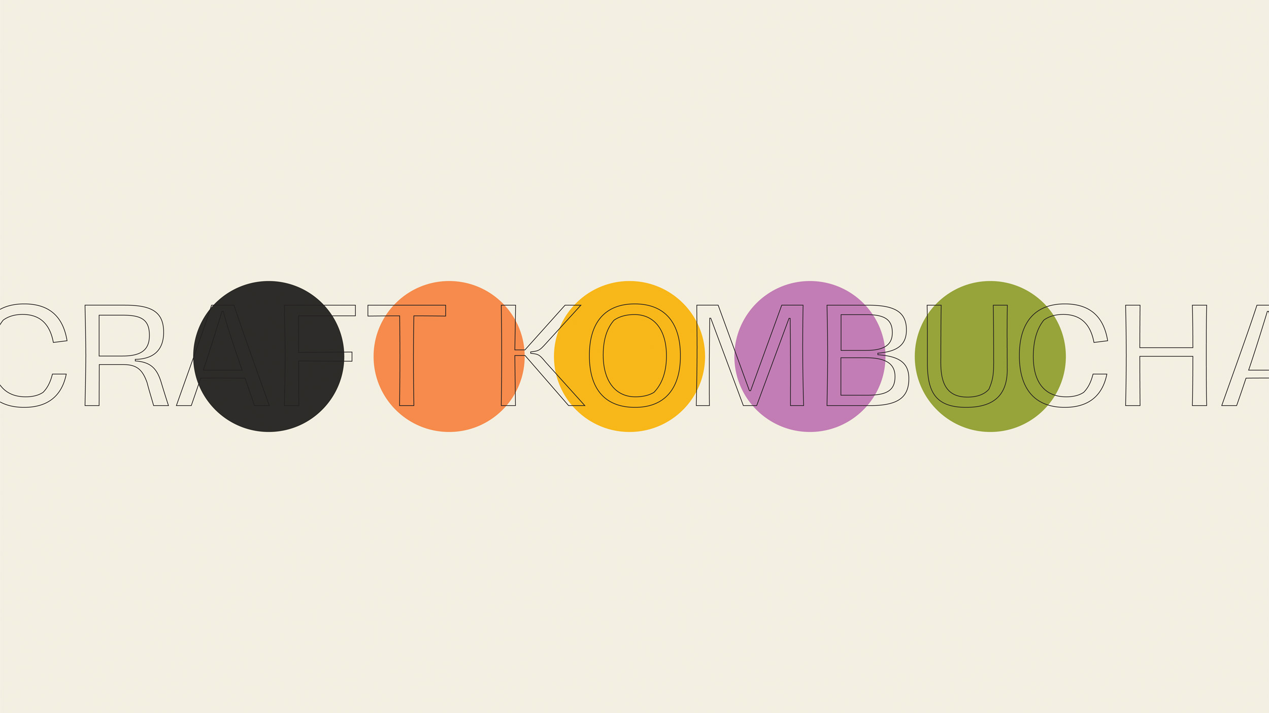
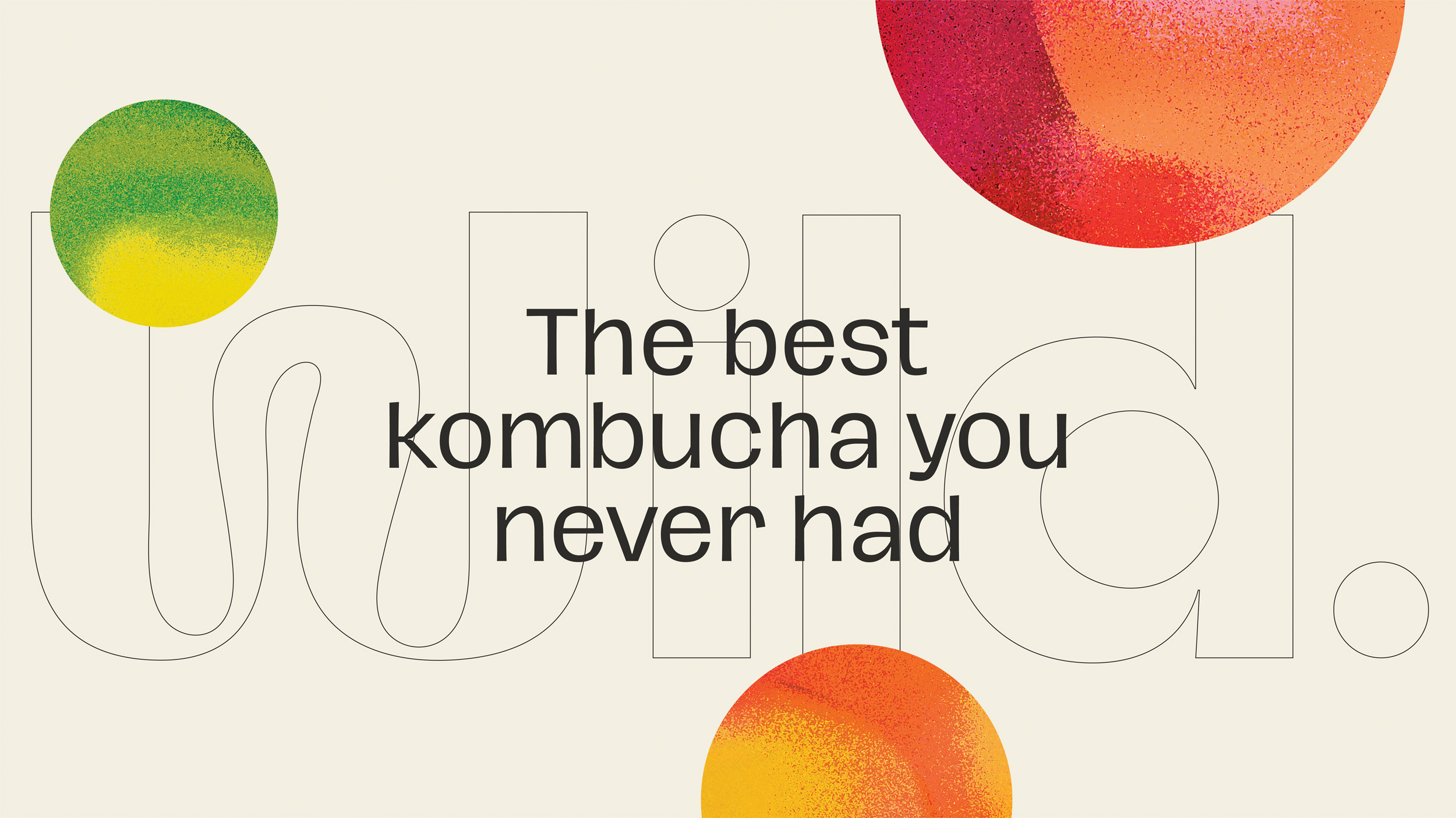
Our challenge was to create an identity that is both accessible for new shoppers – as Kombucha is still relatively niche – and yet also felt authentic to a small yet passionate group of heavy users. The phrase ‘Fermentation is a culture of billions, working toghether, being alive’ became the starting point of the visual identity concept. With this idea in mind, we developed a series of dynamic textured gradients that reference the cultures of bacteria responsible for the miracle of fermentation. These textures became the backbone of the brand identity, to which we added a strong wordmark logo with hints of organic dynamism, a minimalistic packaging design system, beautiful sustainable outercase design and clean layout systems based on contrasts, layering and bubbles!
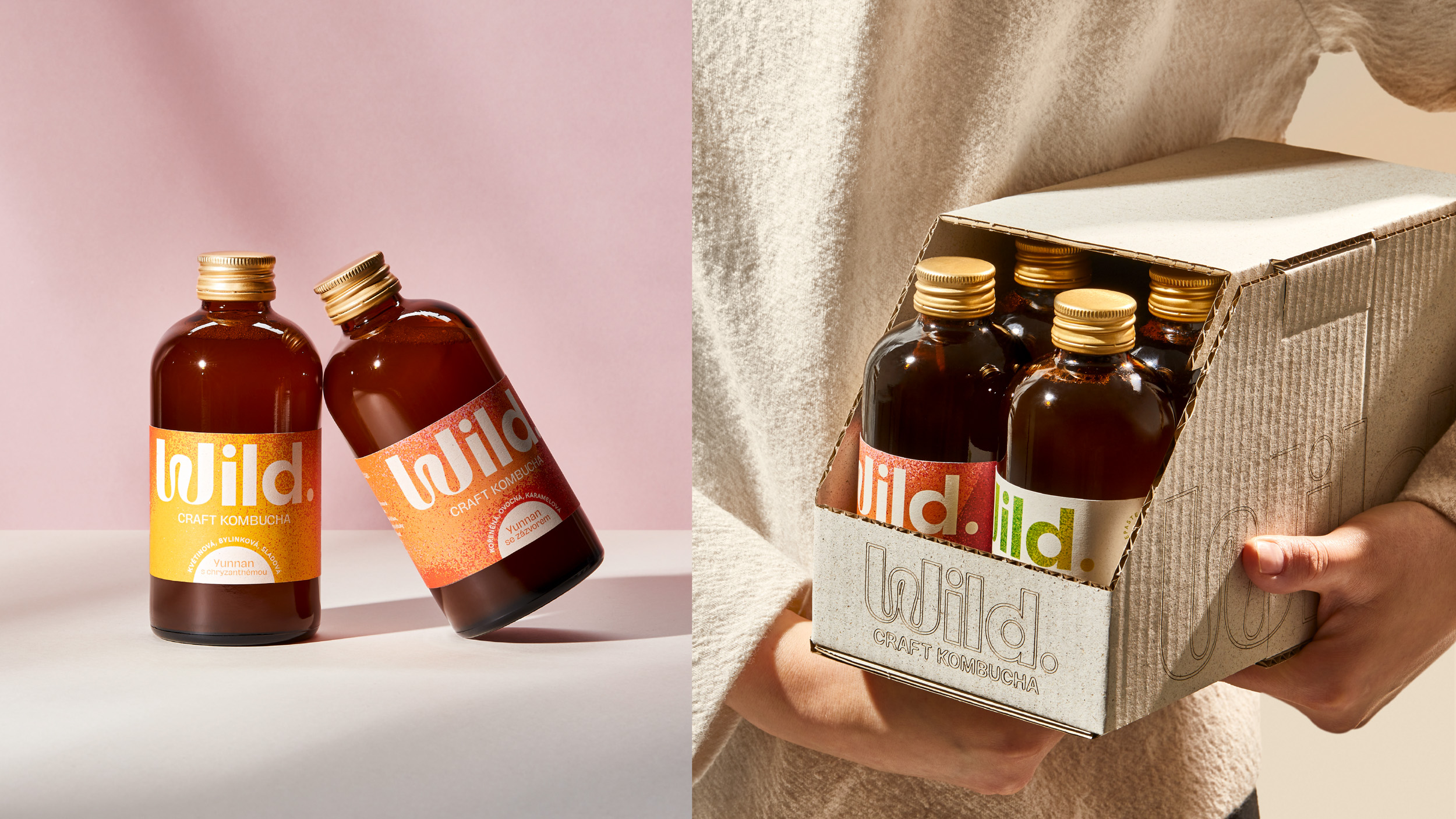
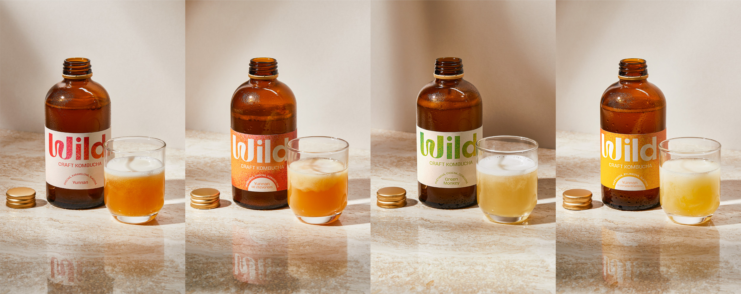
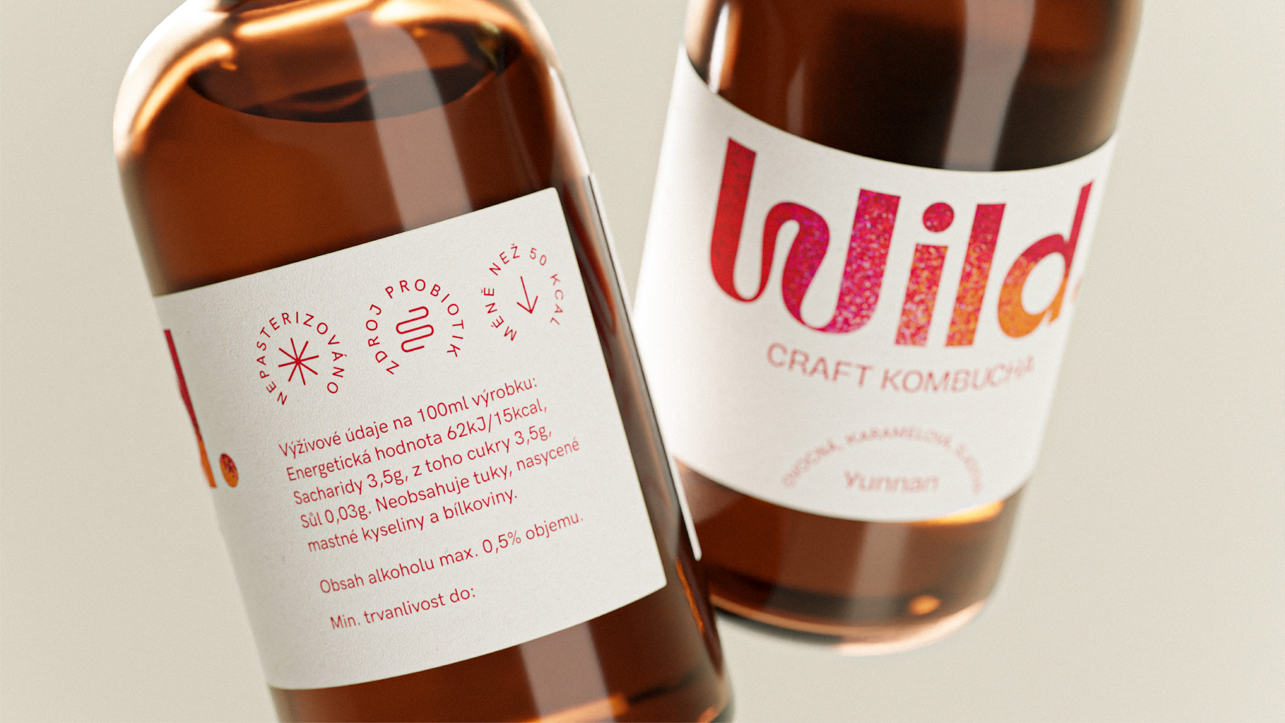
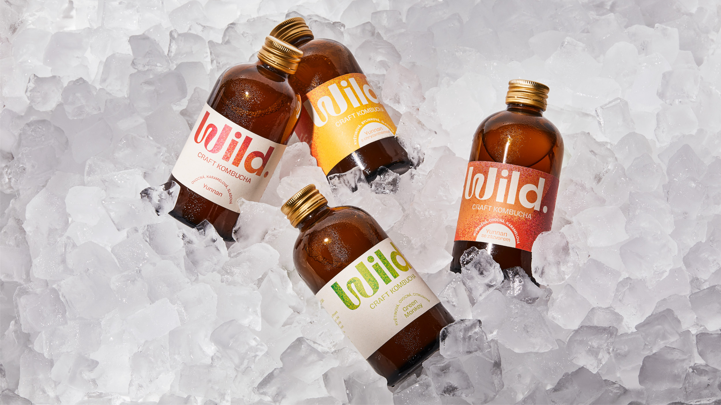
The typographical logo takes center stage on the label design, while the textured gradient plays the main role in variant differentiation. The portfolio system is simple but effective, the flavoured kombucha has a clear logo on colourful background, while the pure tea kombucha has a colourful logo on clear background. The colours in each textured gradient reflect the flavour of each type of kombucha and the tasting notes of each product are mentioned on the front labels.
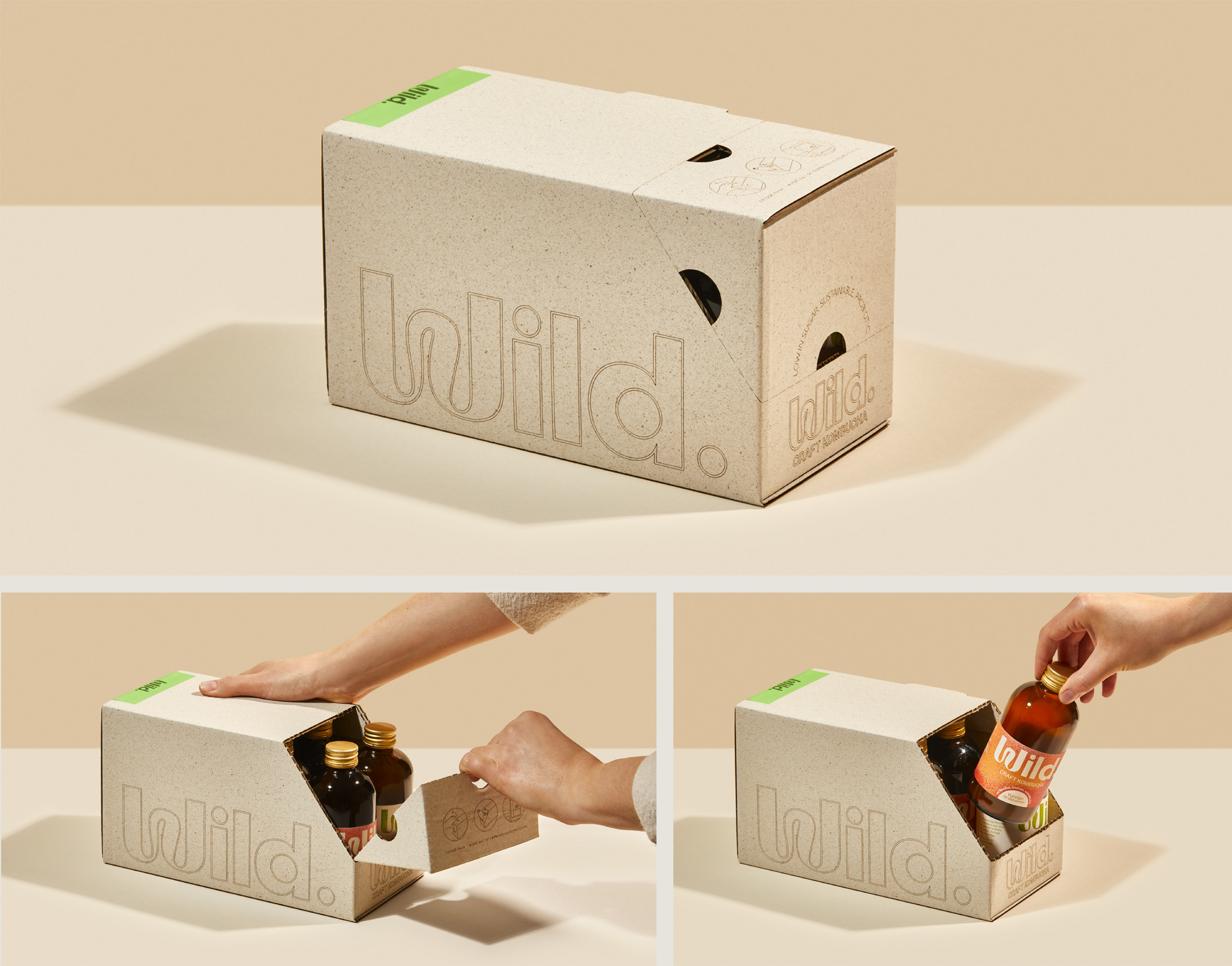
One of the core values of the Wild. brand is sustainability and that reflects in the sources of the base teas, as well as in the manufacturing process. The client knew they want sustainable packaging so they sourced recycled materials for both the labels and the delivery boxes. Based on that, we designed the packaging and looked for the perfect balance between branding and pure, natural material. For example, in contrast to the colorful labels, there is no printing on the box, the branding is made entirely with laser cutting on the surface of the cardboard.
CREDIT
- Agency/Creative: Marlon studio
- Article Title: Wild Kombucha Brand and Packaging Design by Marlon Studio
- Organisation/Entity: Agency
- Project Type: Packaging
- Project Status: Published
- Agency/Creative Country: Czech Republic
- Agency/Creative City: Prague
- Market Region: Europe
- Project Deliverables: Art Direction, Brand Design, Brand Mark, Identity System, Packaging Design, User Experience, Web Design
- Format: Bottle
- Substrate: Pulp Paper
- Industry: Food/Beverage
- Keywords: kombucha, fermented, wild, texture, gradient, sustainable
-
Credits:
Photography: Marek Bartos
Copywriting: Salwa Benaissa


