


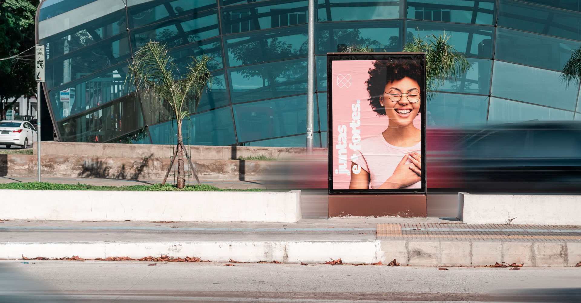
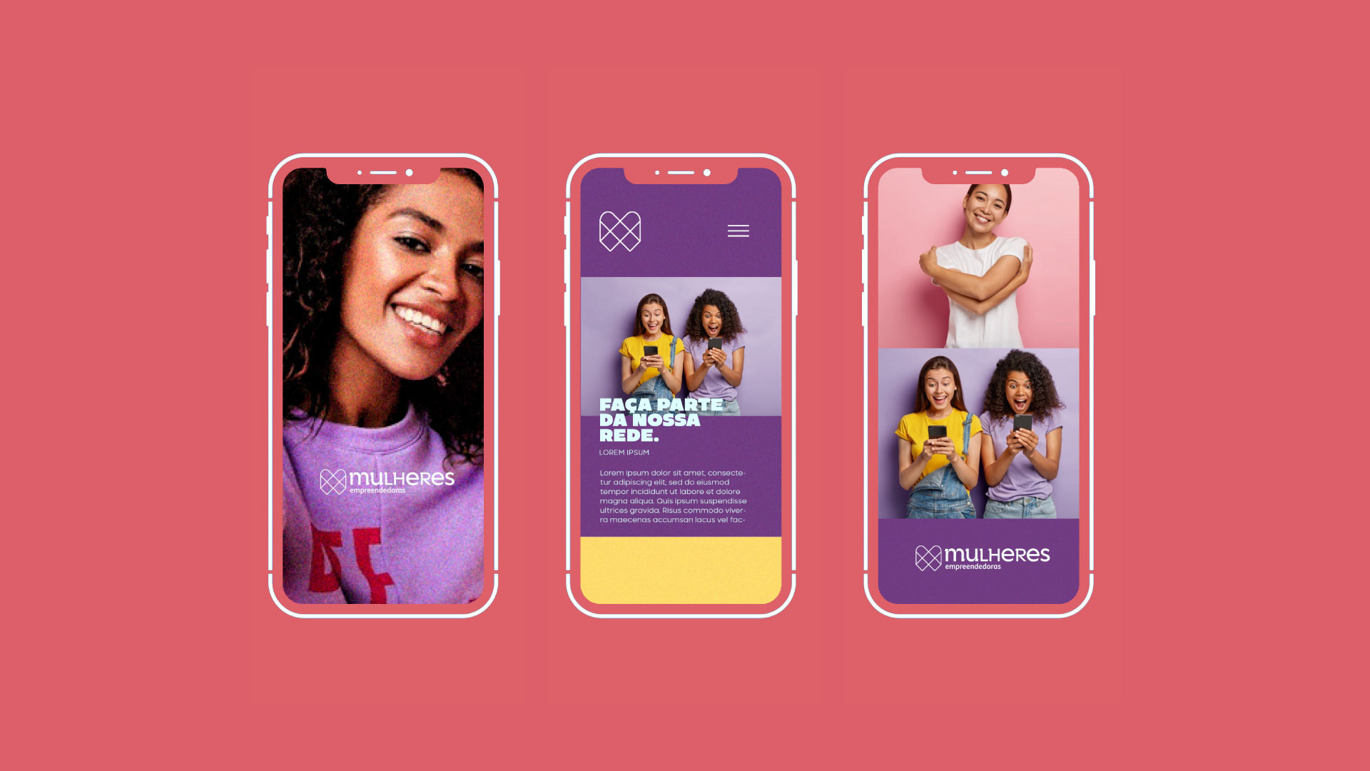
Women Entrepreneurs is a non-profit organisation that welcomes, connects, and empowers women in São Paulo, Brazil. A community that shares knowledge, the projects encourage women to advertise their companies. And that’s connecting potential contractors with service providers.
How to create a brand that connects women and maintains the tone of voice of the brand: simple, welcoming, and modern? One of the main challenges of the project was to develop a project that did not connect with the old brand, the goal was to make a complete renovation. That is why we define the positioning of the brand, trace its personality, emotional benefits, and manifest the brand. The pillars of the brand were: connection, training, and professionalism.
The platform’s audience is women entrepreneurs who seek to publicise their companies to other women and families in the region through the brand’s talent bank and social networks. The creation brief described the need for a modern brand that speaks to the public and that transits between materials in a coordinated and easy to apply way to digital and print. The brief also signaled the need to develop the graphic part of the website and the entire application for materials for lectures, courses, and meetings.
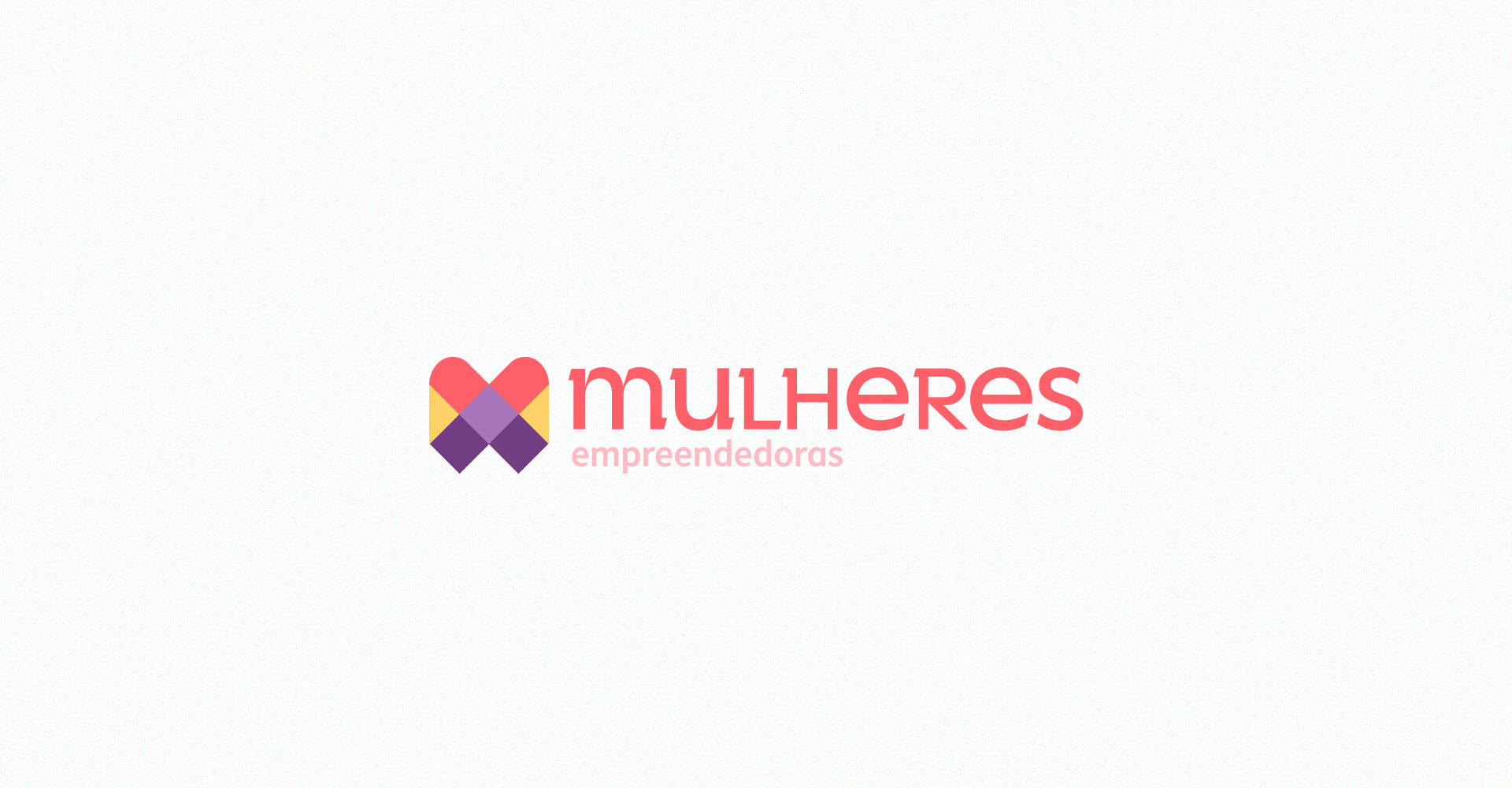
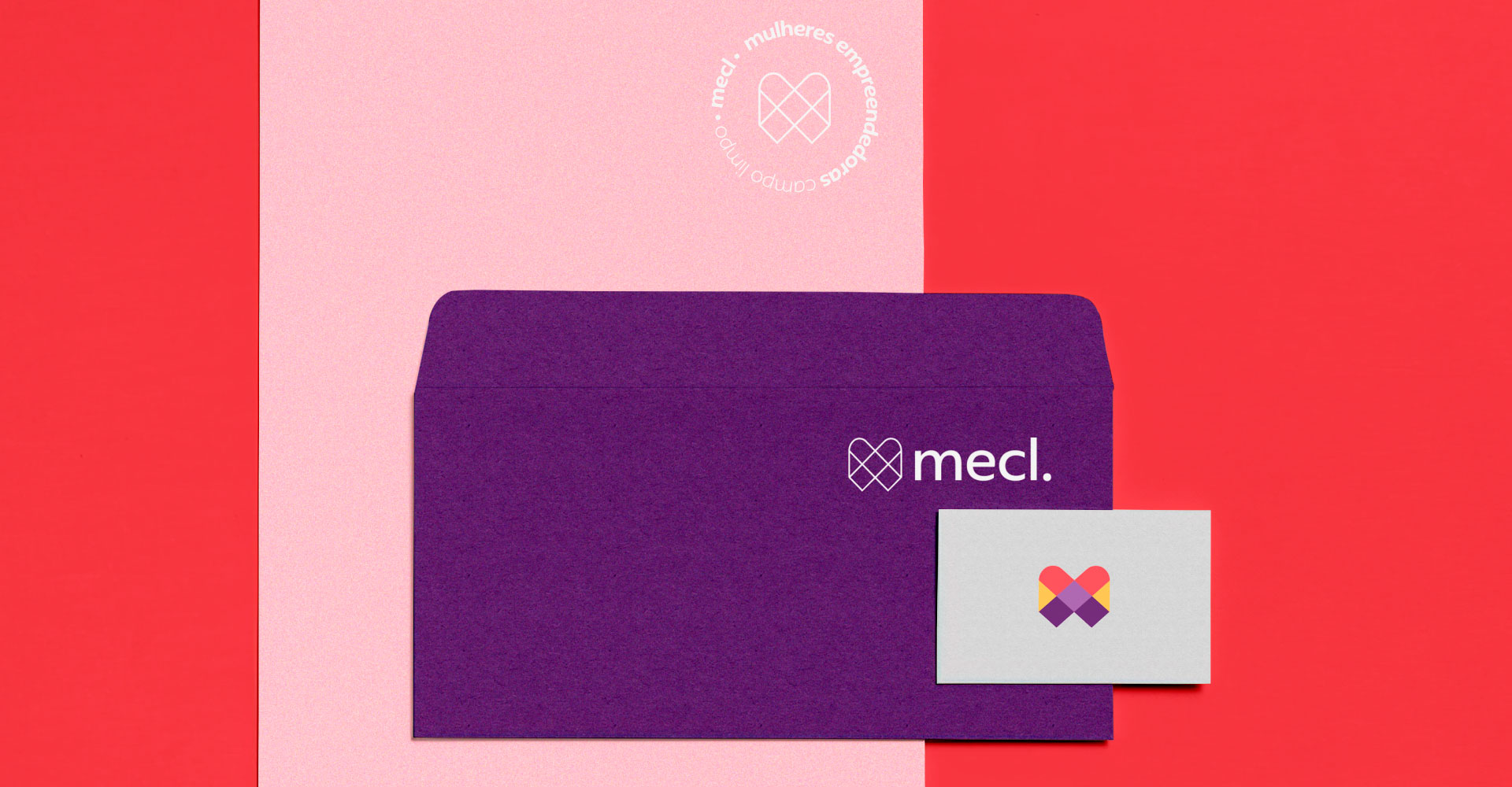
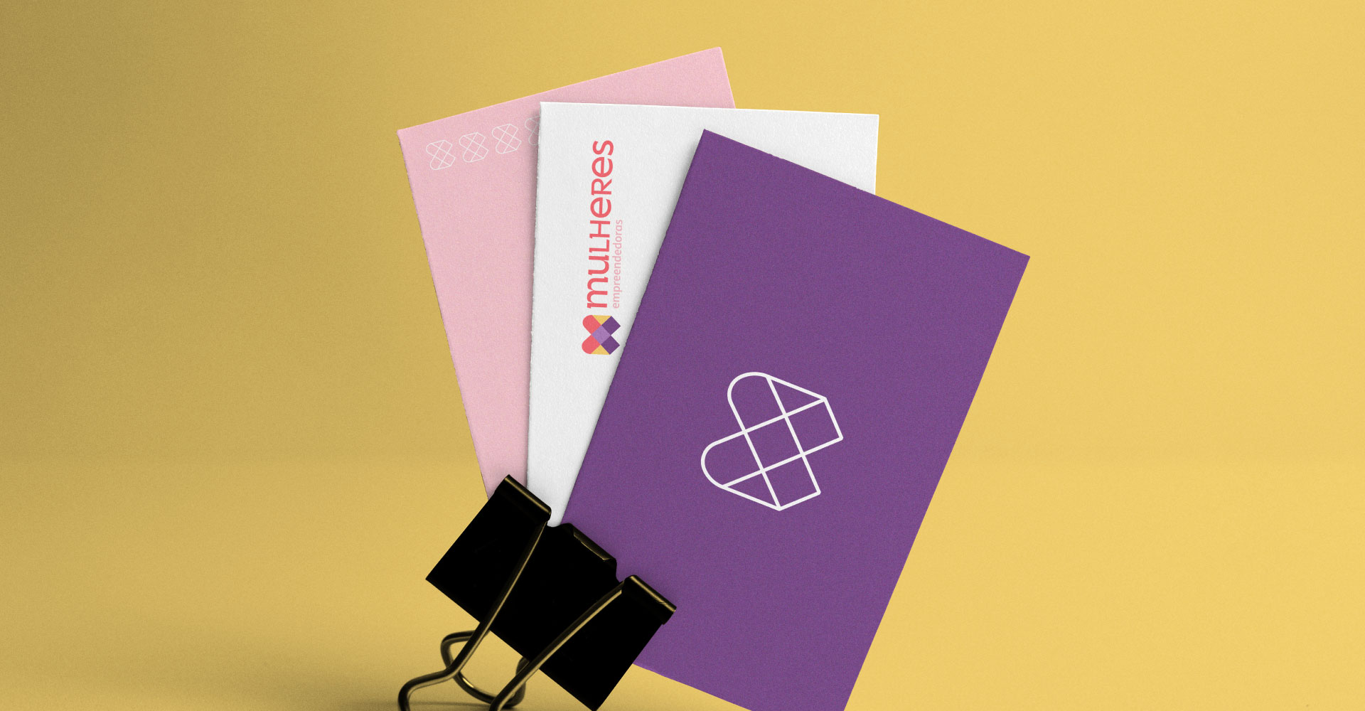
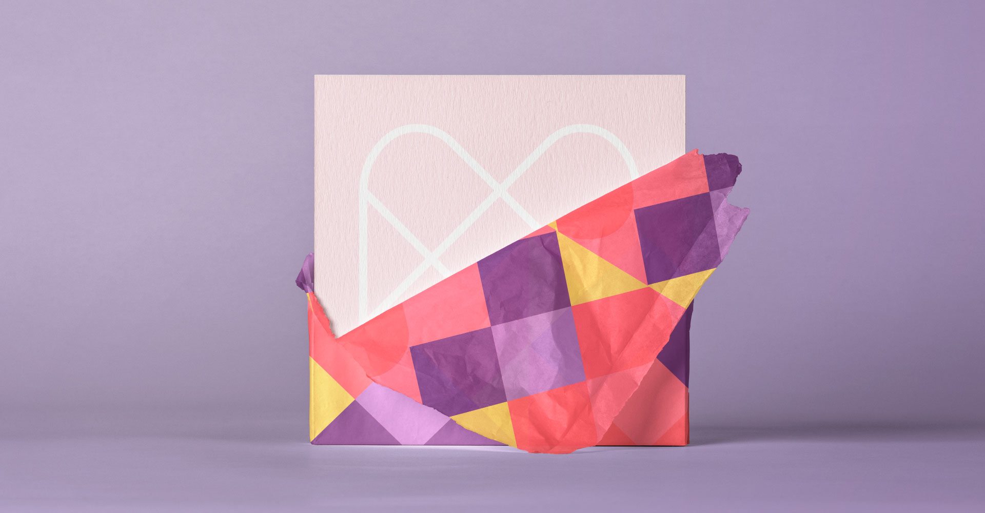
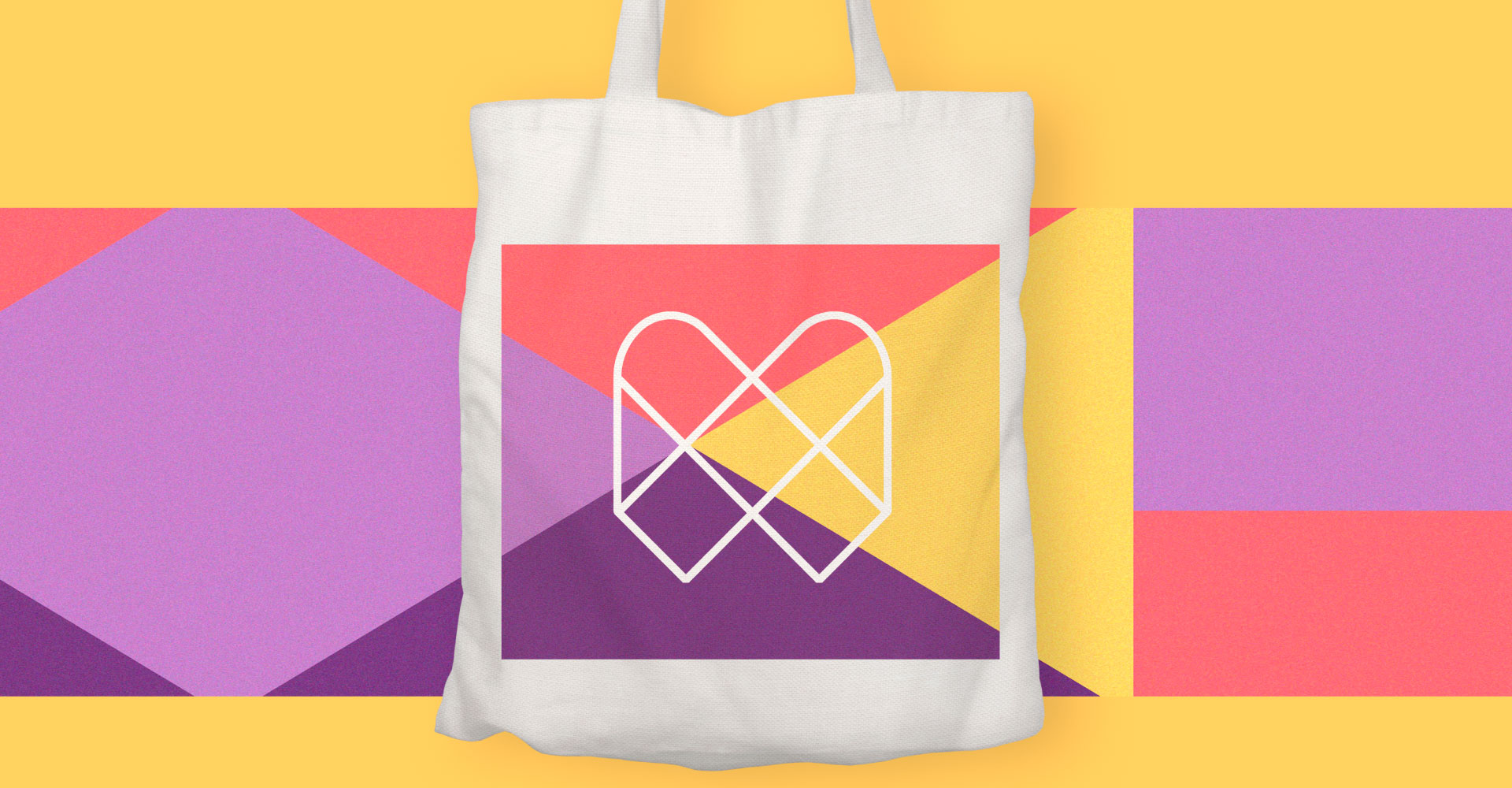
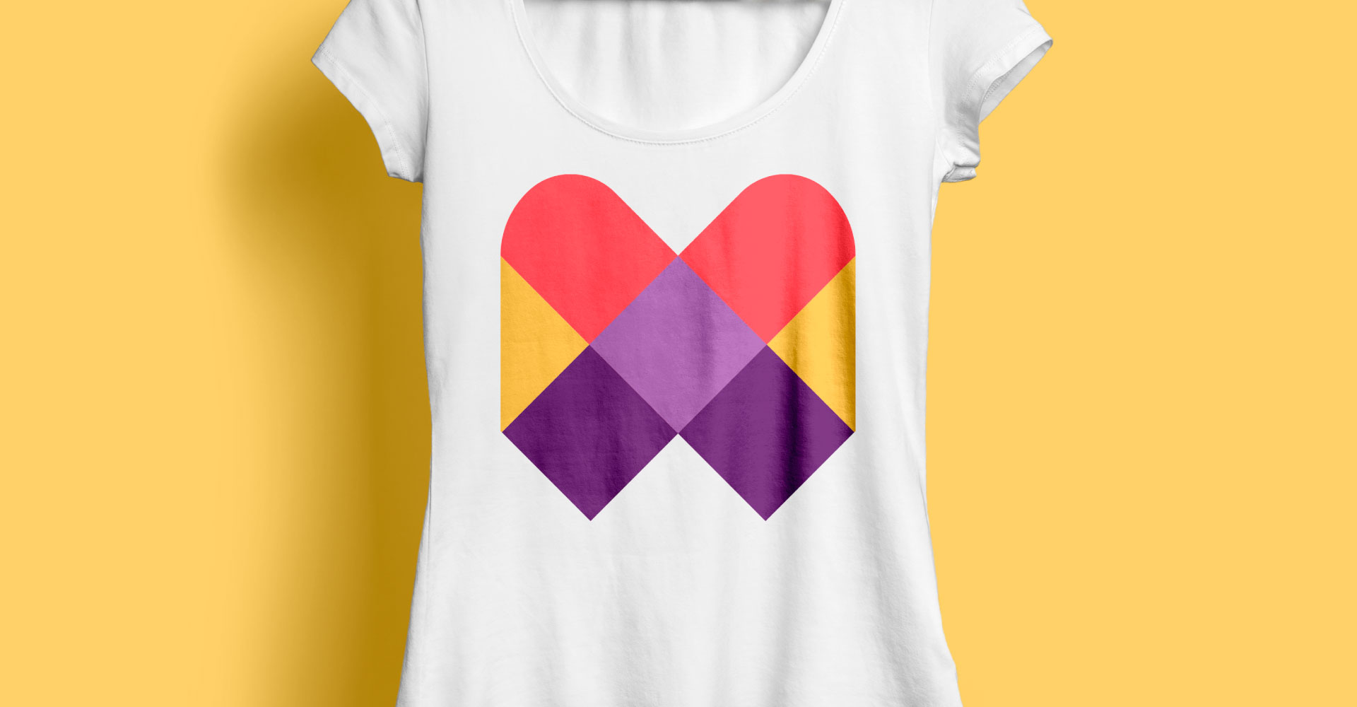
The symbol was constructed with the stylized letter “M”, a heart, connection, and network concept, creating a modern and friendly shape. Deriving the logo symbol was a choice to synthesise the brand, facilitate applications and make it timeless. In Redonda – original typography – it was necessary to make some adjustments to better suit the attributes of the brand, bringing a smooth and friendly air, while some letters have undergone modifications that allow better legibility. The chosen colour palette provides light and warmth, easily connecting with the brand’s audience and bringing many possibilities. With this, we were able to make the brand tangible, creating patterns and dynamic elements that strengthened the contact points.


CREDIT
- Agency/Creative: Marina Hauers da Oie!Design
- Article Title: Visual Identity for a Non-Profit by Marina Hauers Designer
- Organisation/Entity: Freelance, Published Commercial Design
- Project Type: Identity
- Agency/Creative Country: Brazil
- Market Region: South America
- Project Deliverables: Brand Architecture, Brand Creation, Brand Design, Brand Experience, Brand Identity, Brand Redesign, Brand Strategy, Brand World, Branding, Graphic Design, Identity System, Rebranding, Research, Structural Design, Tone of Voice
- Industry: Non-Profit
- Keywords: brand, logo, brand, identity, rebranding, visual identity


