


Casa del Valle is a multidisciplinary space born from a lovely couple’s unique vision where Mexican pottery and Japanese floristry (Ikebana) meet to make a single moment last forever, located in the Dominican Republic.
This Brand was born in 2020 by Hikari and Alejandro, a married couple who dreamed of conceiving a space that could instinctively converge their practice’s passion and soul. Casa del Valle’s philosophy of enjoying harmony and what we have now has grown stronger through these uncertain times, resulting in uniting people with new artistic expressions.
They take joy in challenging the conventional business model by creating one-of-kind arrangements inspired by Ikebana’s traditional Japanese art, complete with handcrafted Mexican pottery pieces, evoking in this way a homely atmosphere and a meaningful experience from the beginning to end.
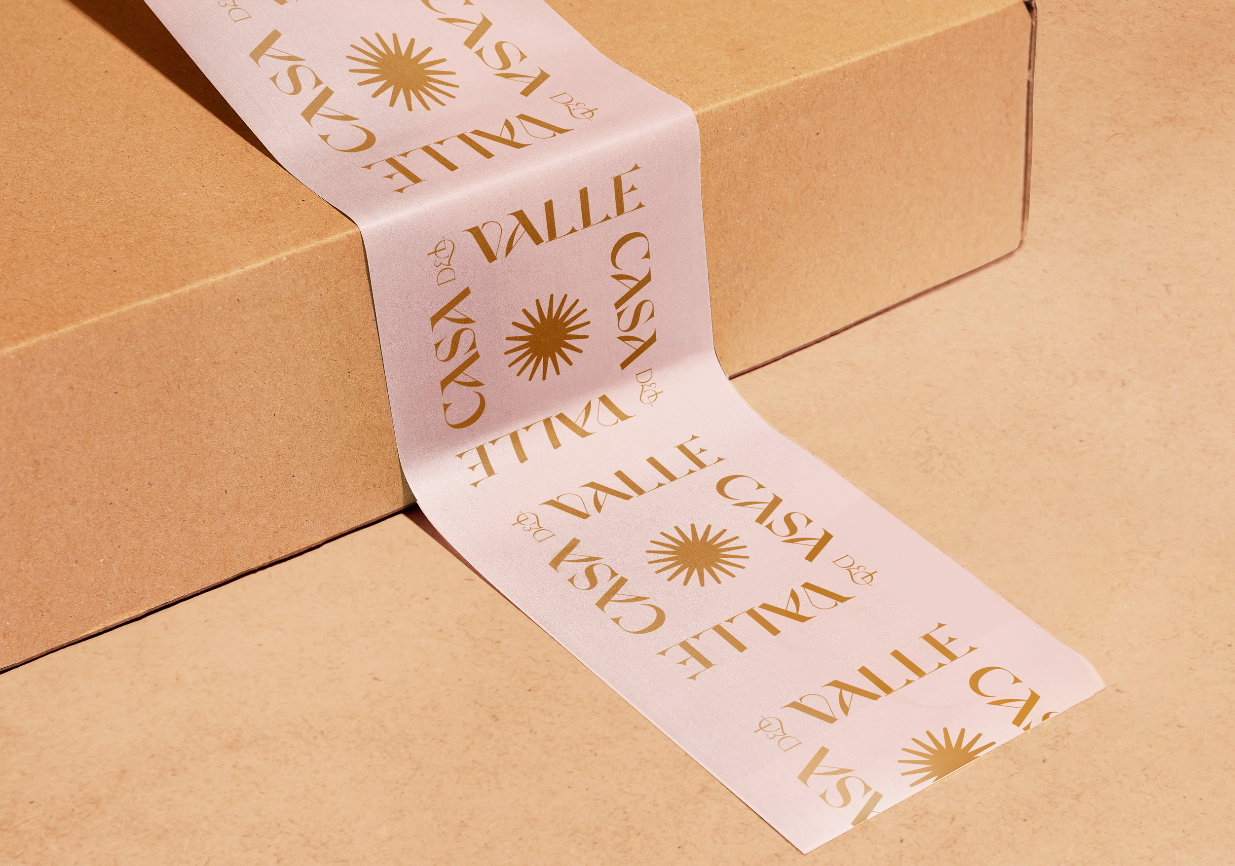
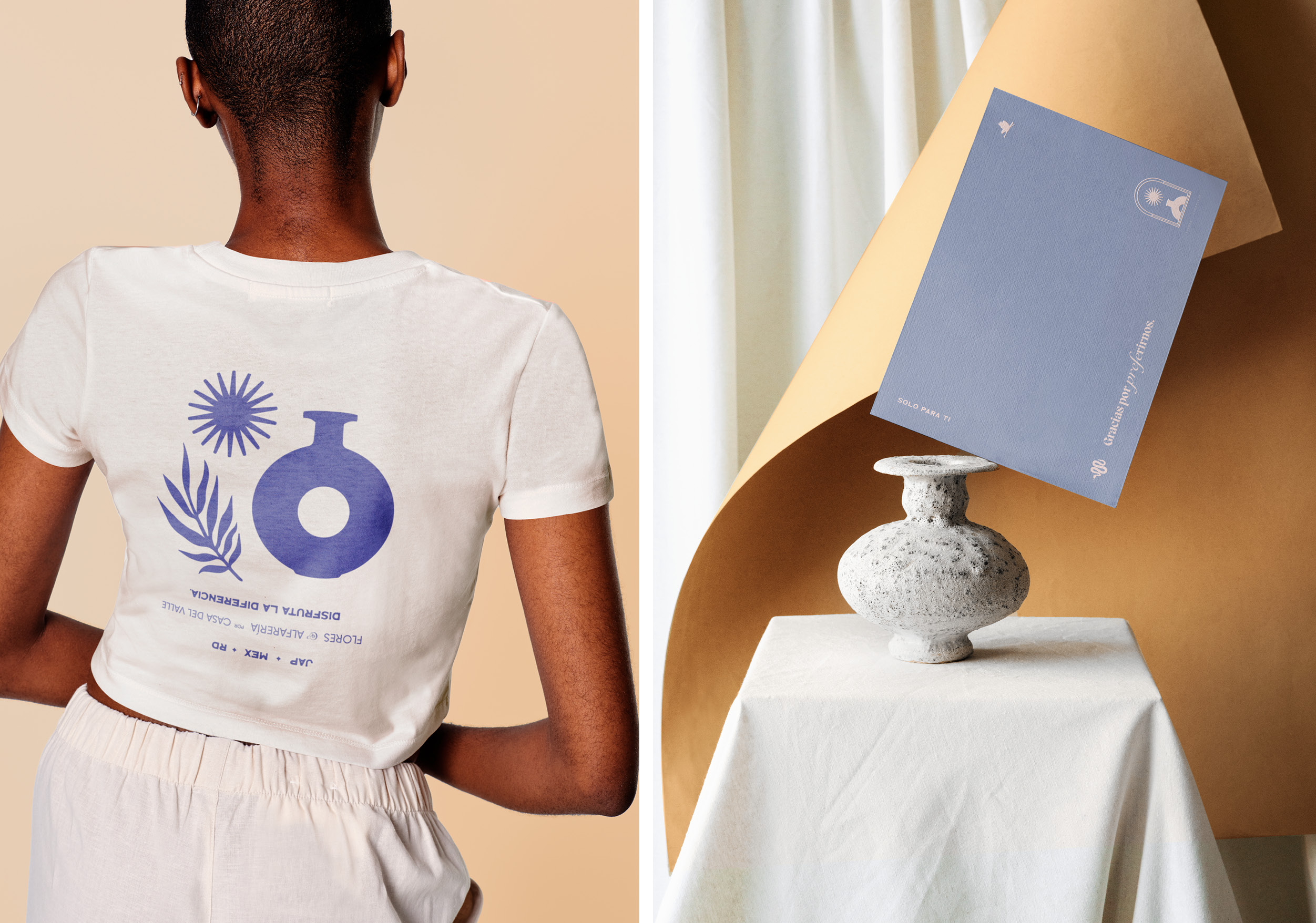
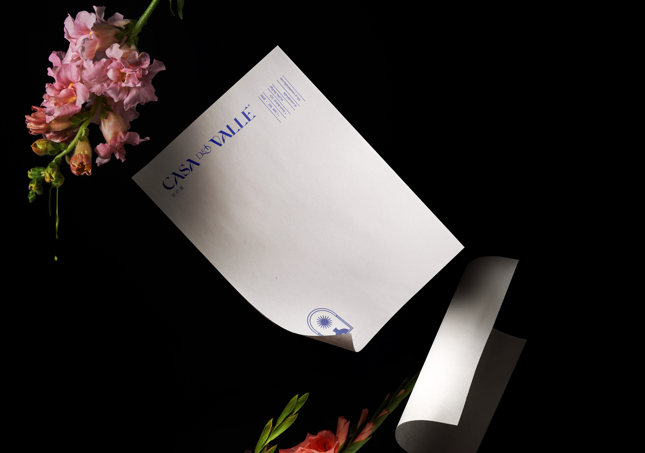
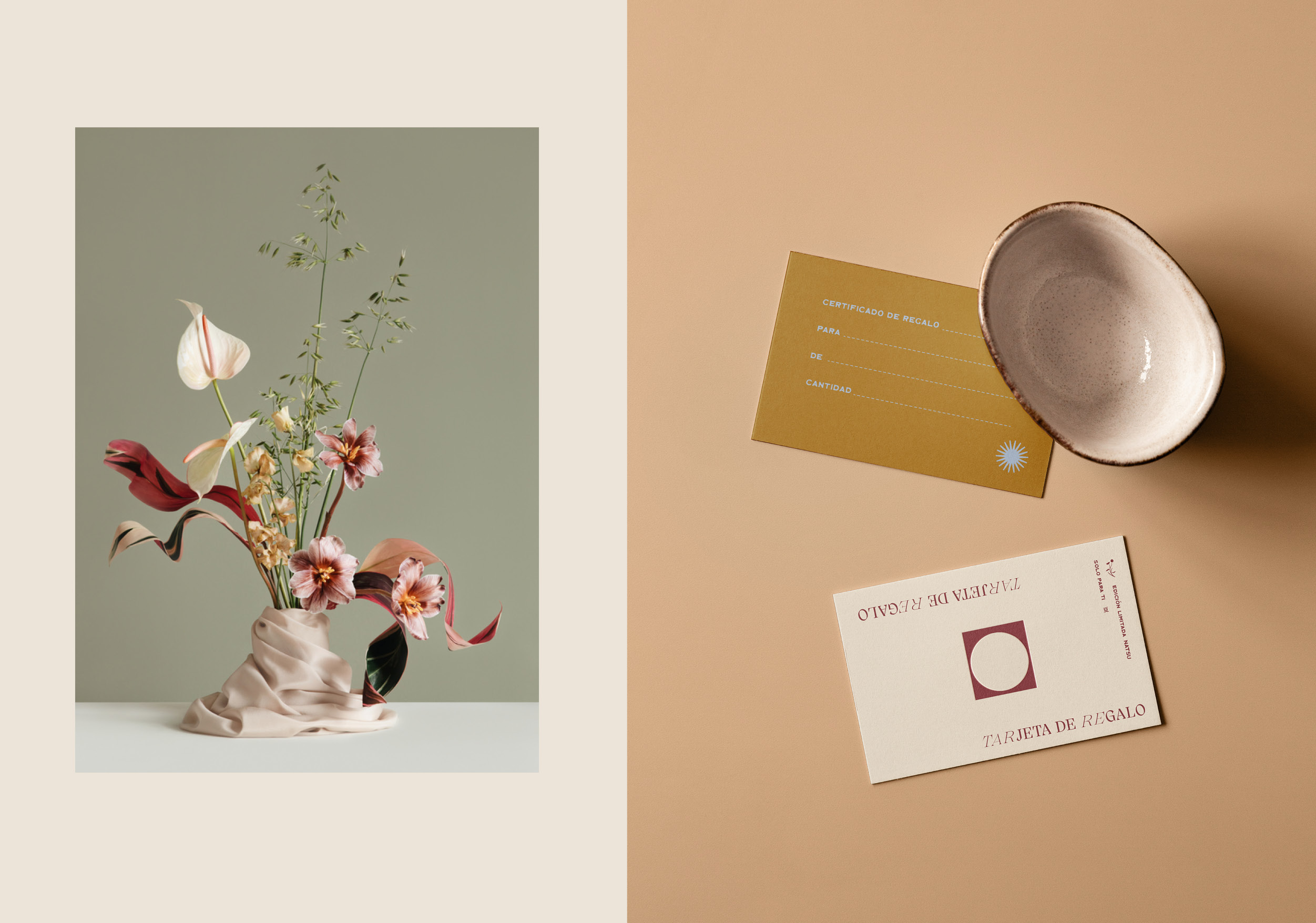
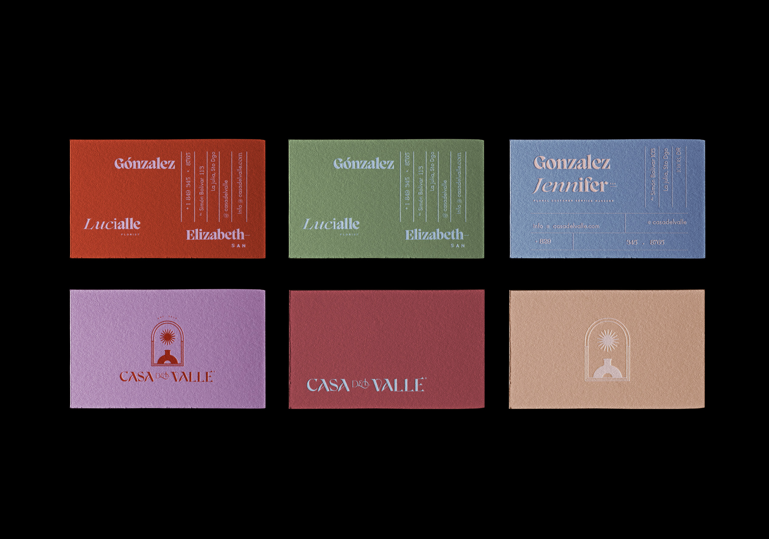
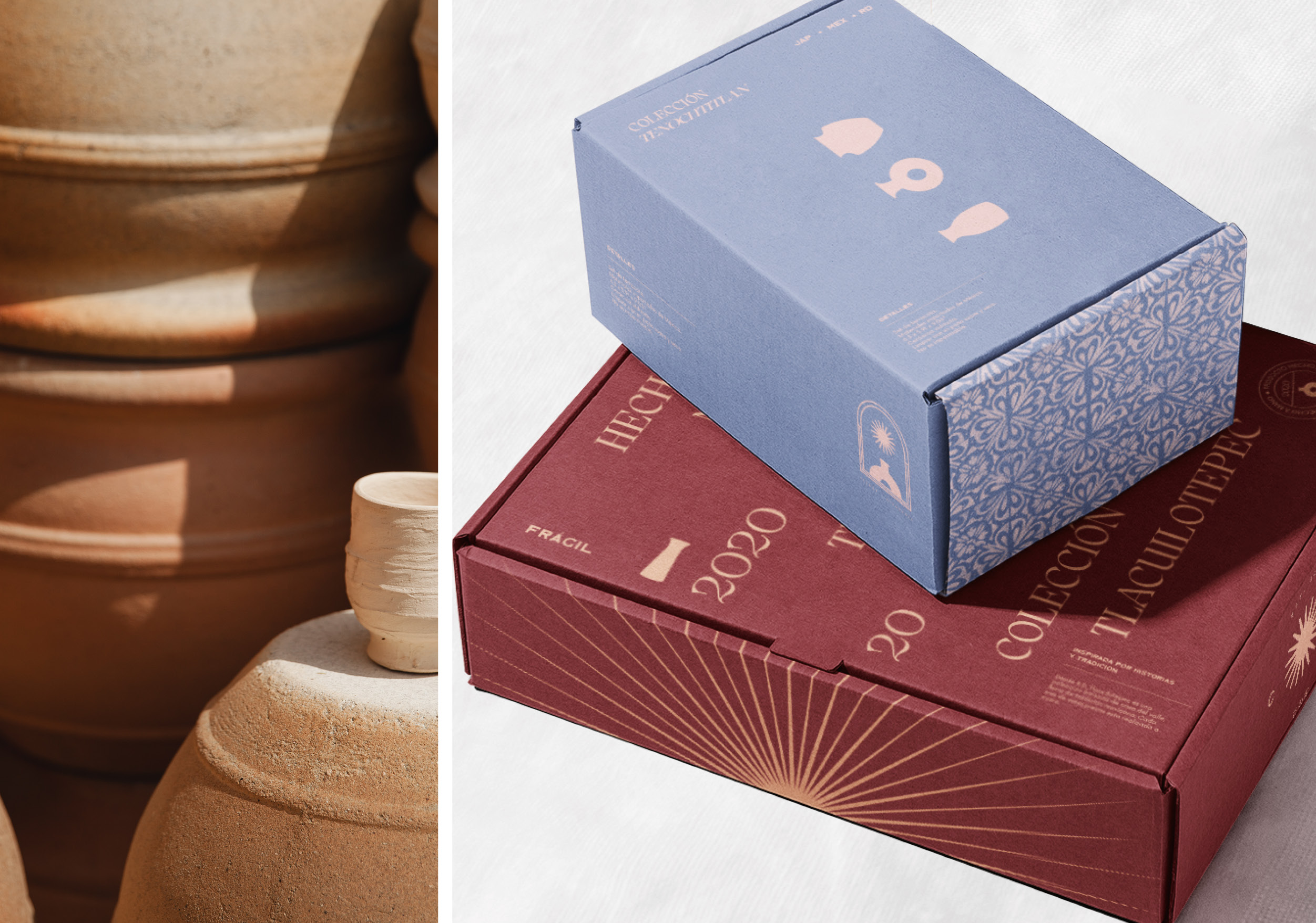
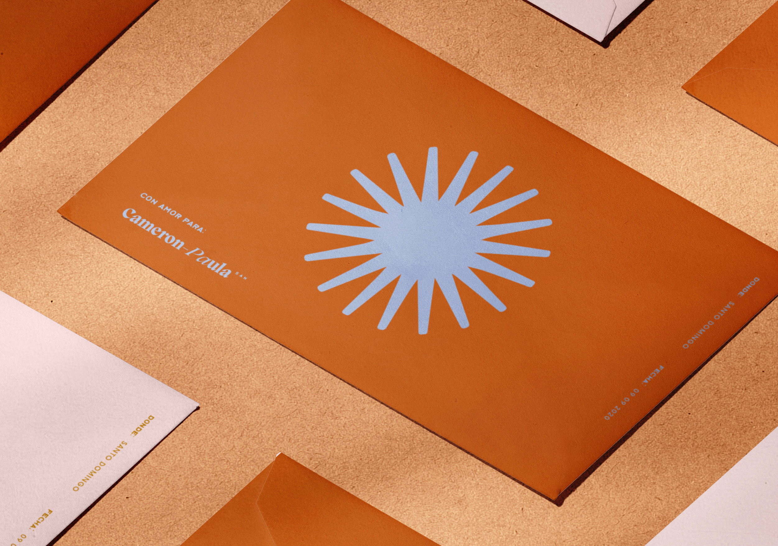
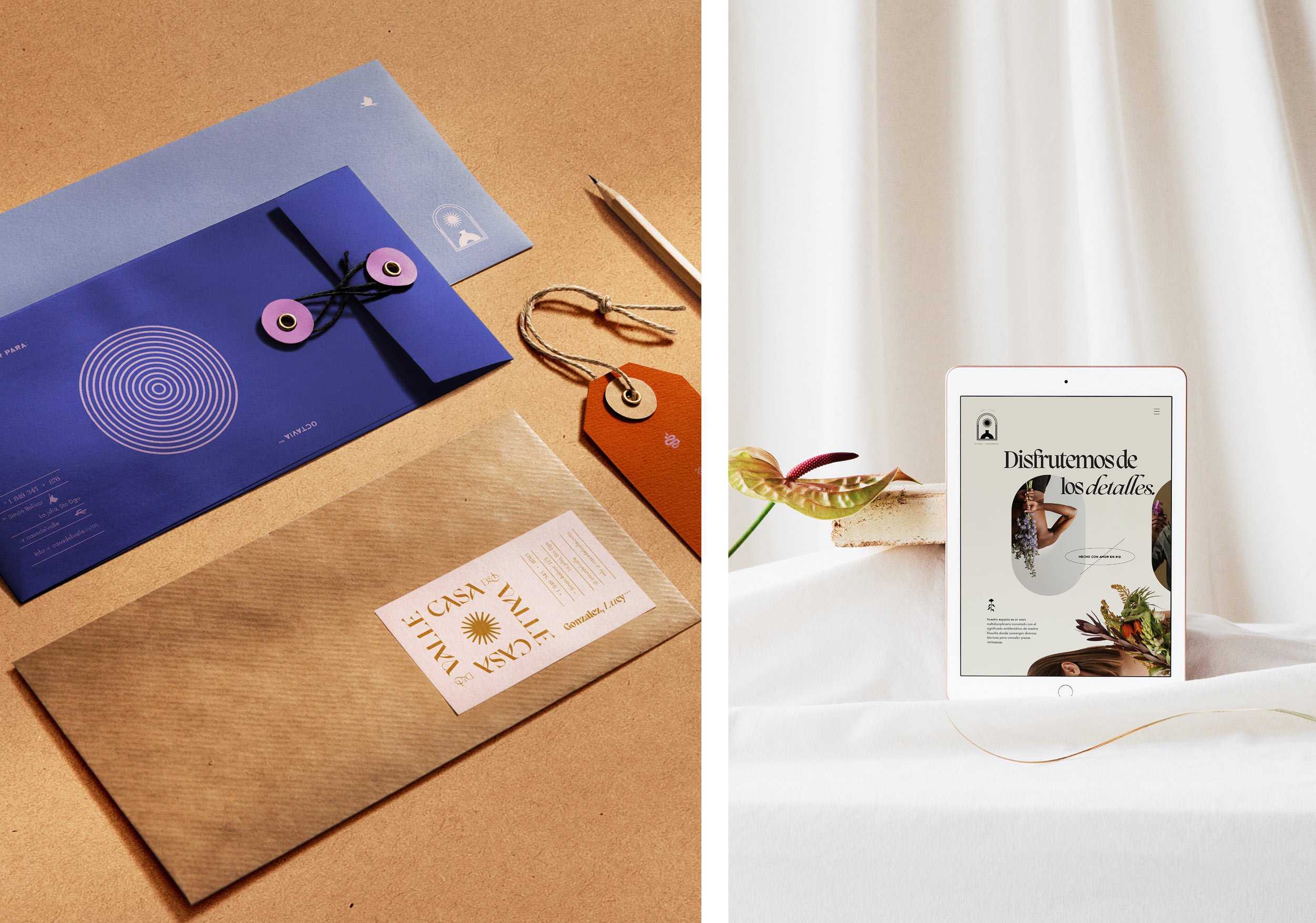
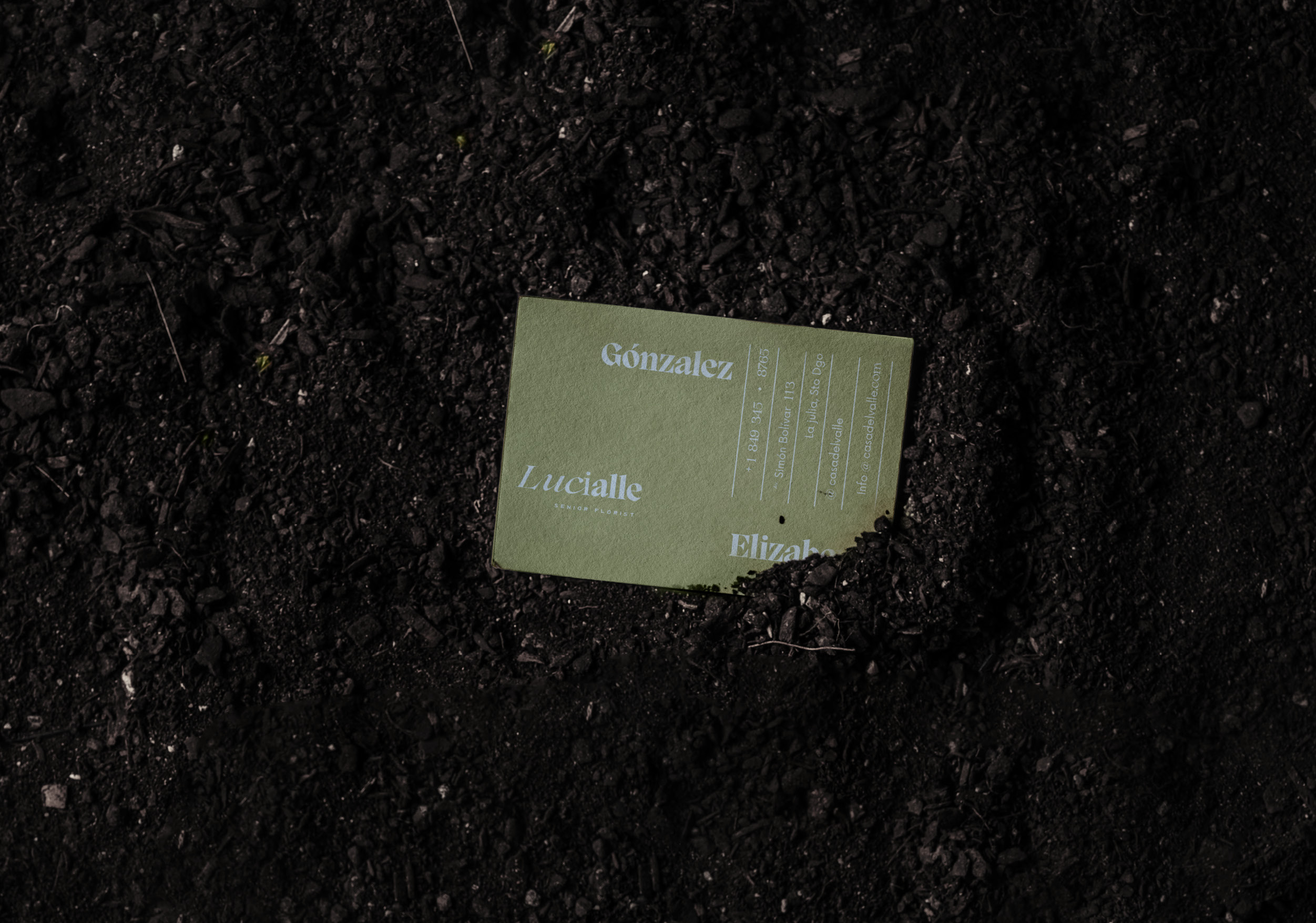
Casa del Valle’s graphic identity honours the cultural duality of its creators. The sun was selected as the main symbolic element due to its influence as a direct source of origin for both disciplines, its rich symbolism, and its strong anthropological roots. For the color palette, colloquial tones based on the vivacity of Mexican architecture were carefully selected. As for the logotype, the FH Cordelia font was chosen and customized to allude to the Japanese’s characteristic calligraphy strokes; this is reinforced with the rest of the versatile and sophisticated typeface family. Finally, this visual language blends harmoniously with Kamisaka Sekka’s classic illustrations, meaningful patterns, and modern icons to emphasize form, style, and feel.
Their cultural essence was fused in each piece dedicated to any arrangement and pottery given, thus communicating their feelings while creating a timeless artisan-style, rich in details. The combination of key details, such as the seasons of the year, and Japanese form of writing, or the use of Aztec names on products gave the identity a traditional yet practical character that demonstrated their love for their clients.
CREDIT
- Agency/Creative: Tiare Payano
- Article Title: Visual Brand Identity of Casa del Valle by Tiare Payano
- Organisation/Entity: Freelance, Non Published Concept Design
- Project Type: Packaging
- Agency/Creative Country: Dominican Republic
- Market Region: North America
- Project Deliverables: Brand Advertising, Brand Creation, Brand Guidelines, Brand Identity, Brand Naming, Brand Strategy, Branding, Graphic Design, Packaging Design, Research, Structural Design, Tone of Voice
- Industry: Manufacturing
- Keywords: Branding, pottery, Mexico, Japan, Ikebana, Casa del Valle, Asia, Vase, Florist, Flower, Ceramic, Naming, design, Brand Identity, Identity System, Branding, Brand Creation, Graphic Design


