


ADDWORK – Lority Branding
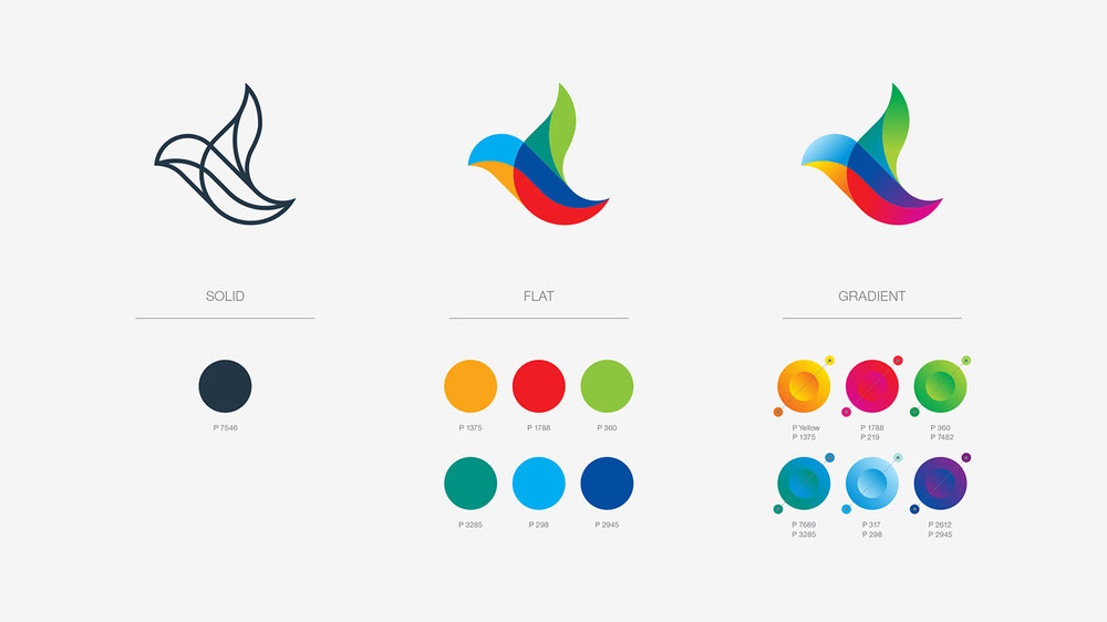
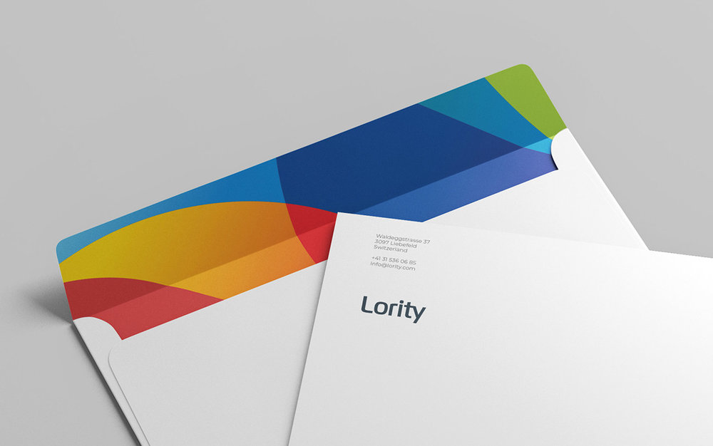
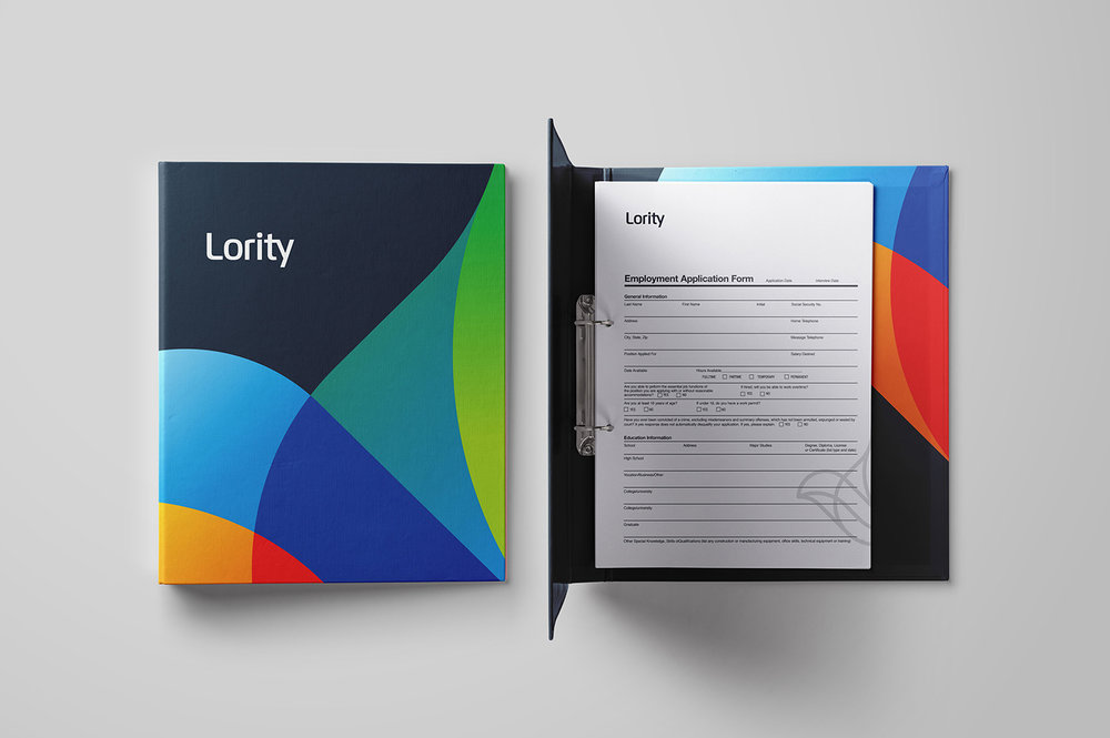
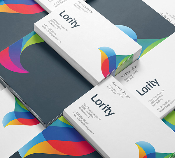
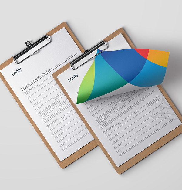
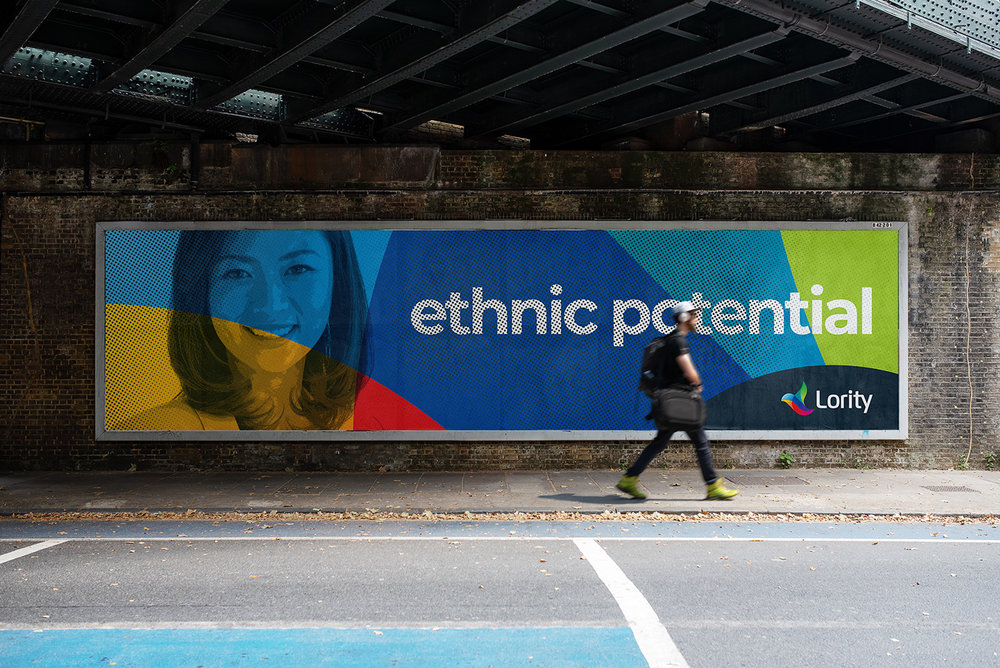
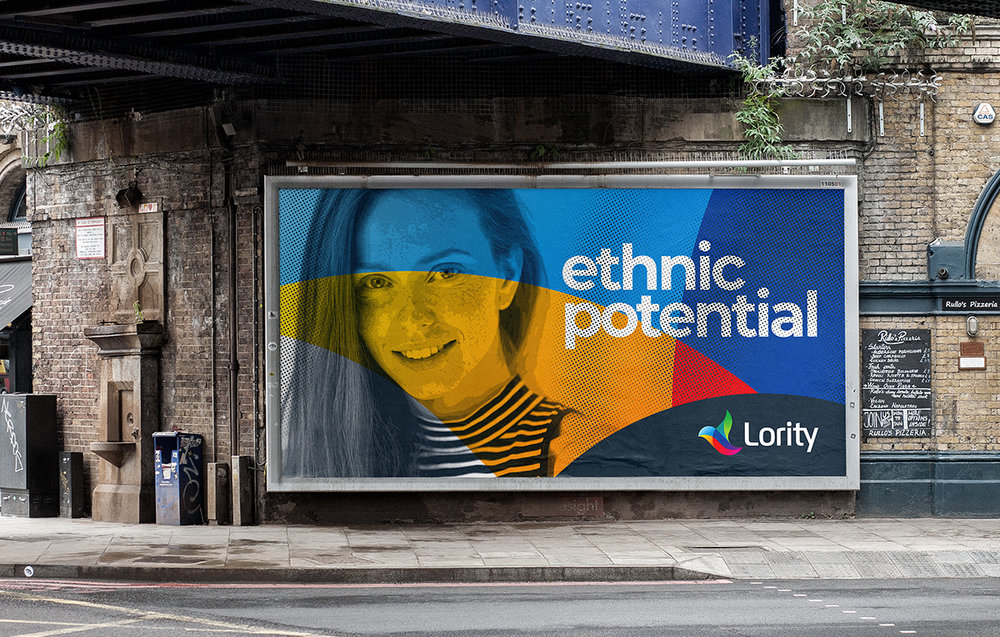
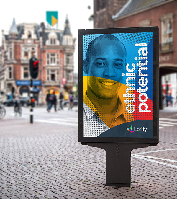
LOYALTY + SOLIDARITY = LORITYBirds are known as the symbols of loyalty and solidarity, two main principles of Lority. According to the researches; only 3% of all mammalian species are monogamous; while this rate is %90 for bird species. They are always in a certain manner whether they float in the sky or they perch on branches. This is formed by allowing the weakest ones to be fed and move easily like the others.Therefore we prefered a bird in the logo as the best symbol describing the founding purpose and function of Lority. We used colours to represent different cultures, and we emphasized integration and living all together in a harmony by colour transitions.


CREDIT
- Agency/Creative: ADDWORK
- Article Title: The Brand Identity for Lority AG, Switzerland
- Project Type: Packaging
- Agency/Creative Country: Turkey
- Market Region: Europe
- Industry: Human Resources
FEEDBACK
Relevance: Solution/idea in relation to brand, product or service
Implementation: Attention, detailing and finishing of final solution
Presentation: Text, visualisation and quality of the presentation


