


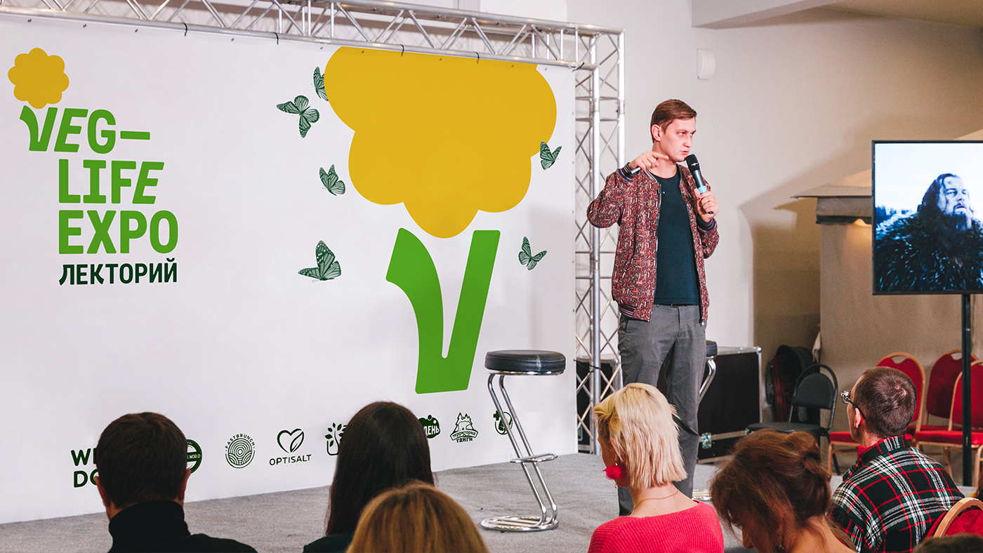
Veg-Life Expo is a vegetarian and healthy living exhibition is held in Moscow twice a year. You can see and taste the most actual products in their category: food is made from plant ingredients; there are also organic cosmetics, and products for the home and clothes. Every year, more than a hundred companies from Russia exhibit there. It also hosts lectures by healthy lifestyle experts, doctors and nutritionists, has a yoga zone and a vegetarian food court.
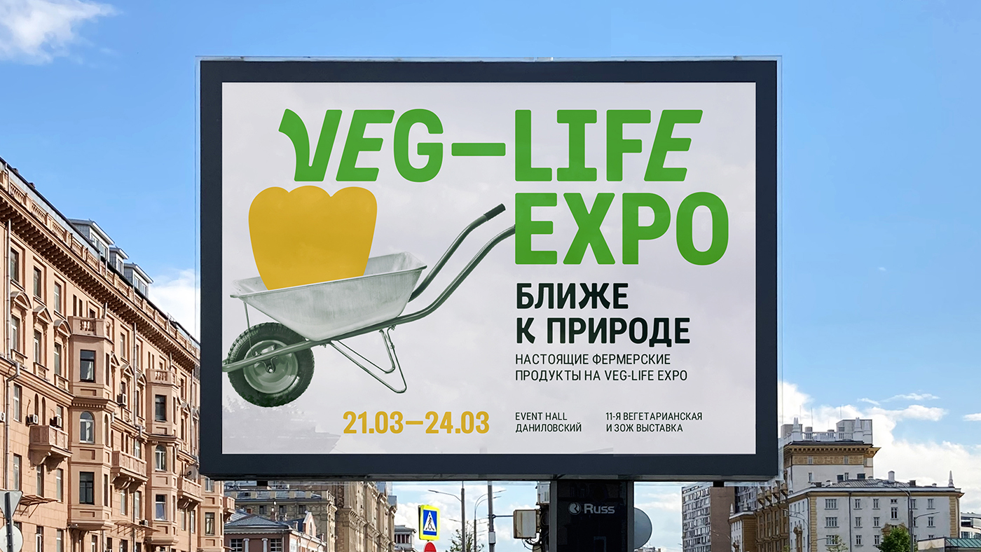
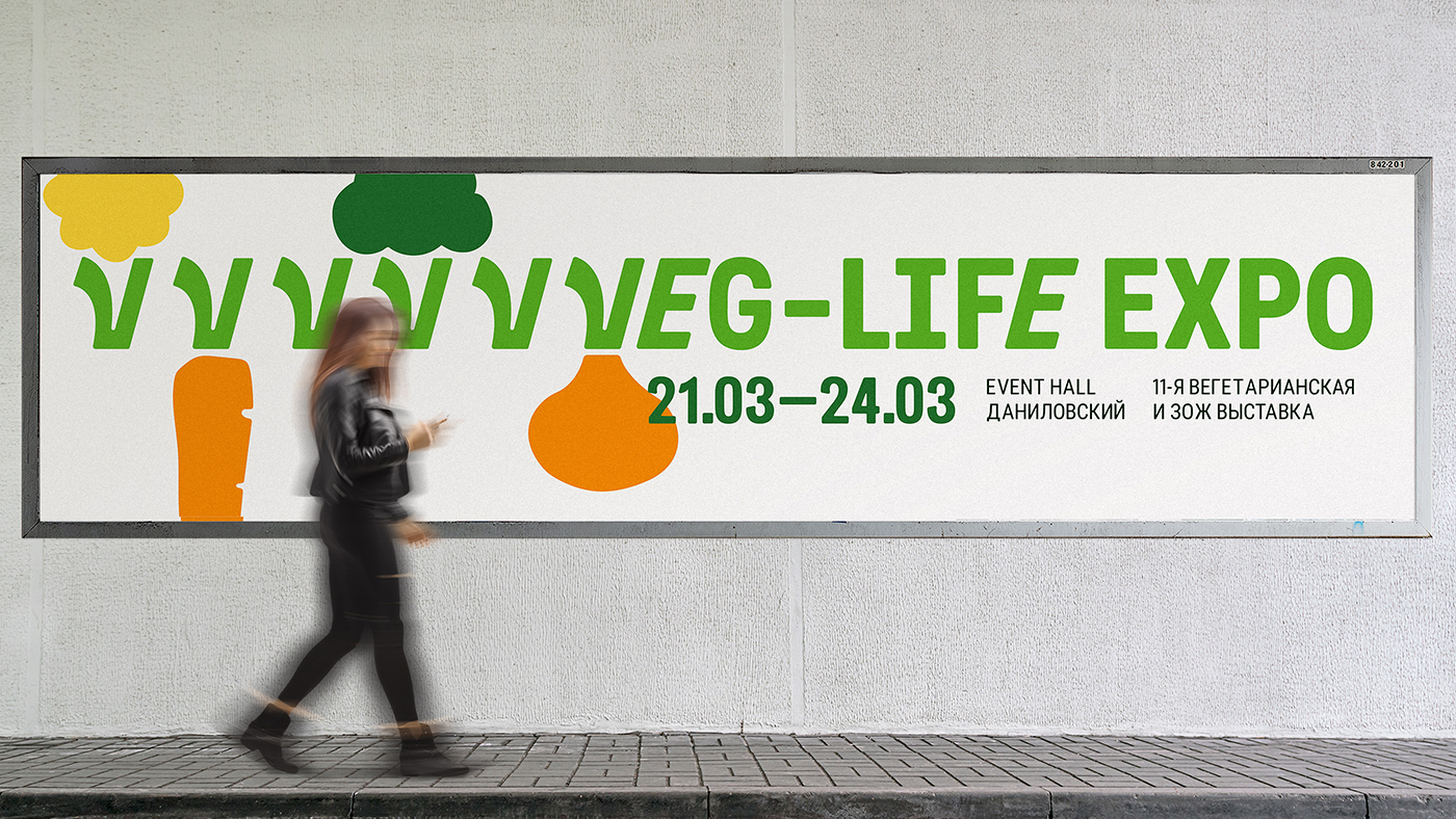
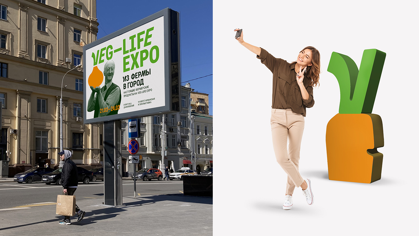
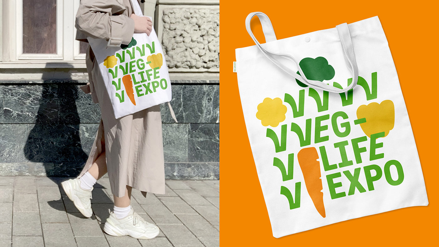
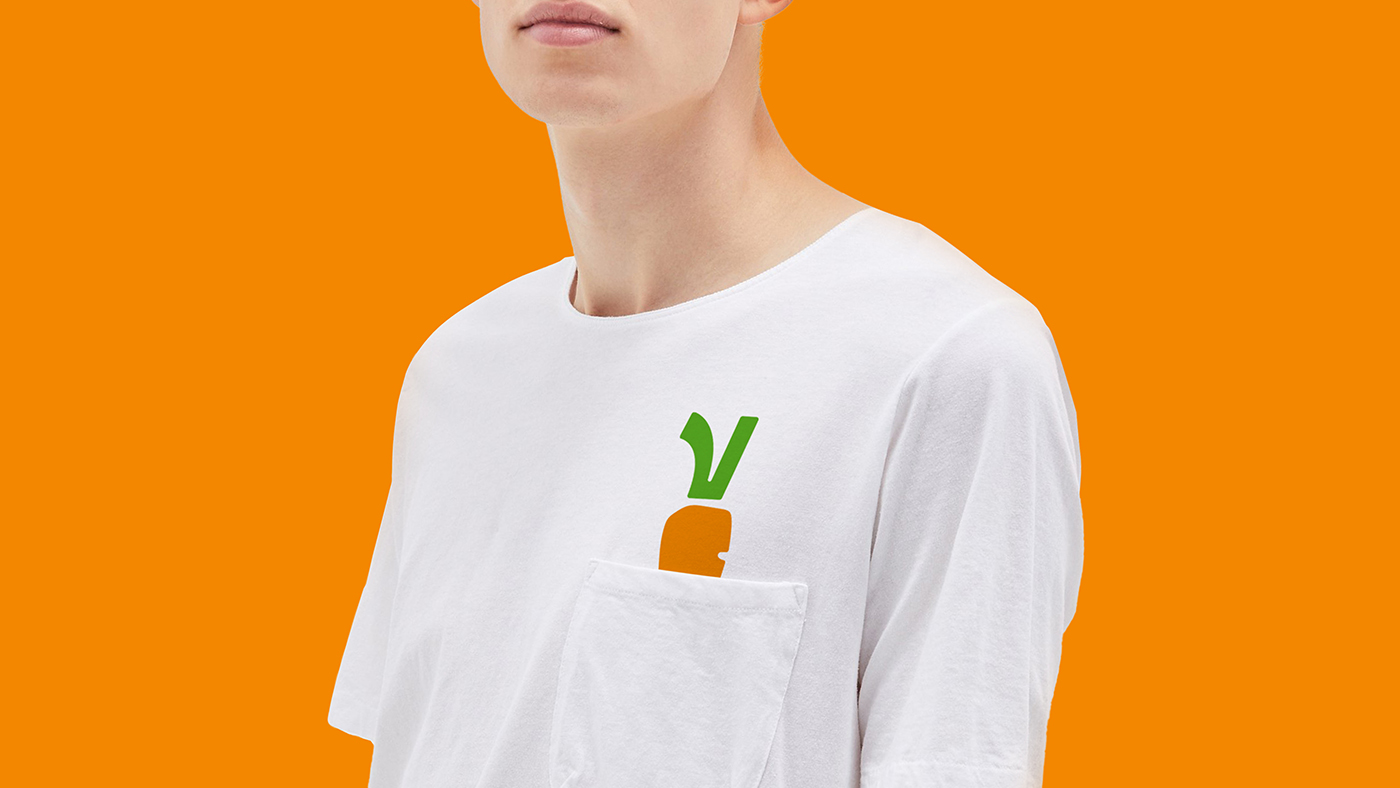
The design had to differentiate Veg-Life Expo from a number of other major exhibitions not related to vegetarianism, to tell futher visitors about its focus, as well as showing the mission of Veg-Life – to set the main direction in its niche and help brands to grow and develop. Therefore, the main image of the icon was the letter “V” – a small sprout gives rise to flowers, fruits and vegetables, thus referring to the mission of the exhibition. It was also important to make an identity that did not propagate any values or ideas, did not put itself in opposition to the world around, but rather emphasized that vegetarianism has become a matter of routine, organic modernity.
On the basis of Roboto Condensed Bold, the Vegeto font was developed especially for the exhibition, which contains direct and slanted writing and many alternative signs. It was used for the headlines on all the media, and it also served as the basis for the logo.
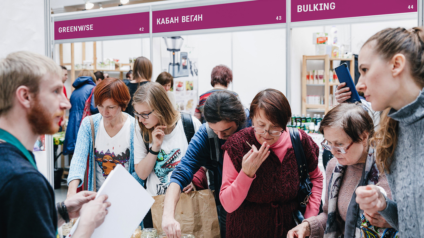
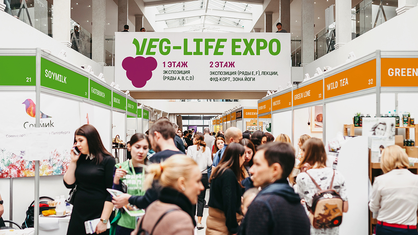
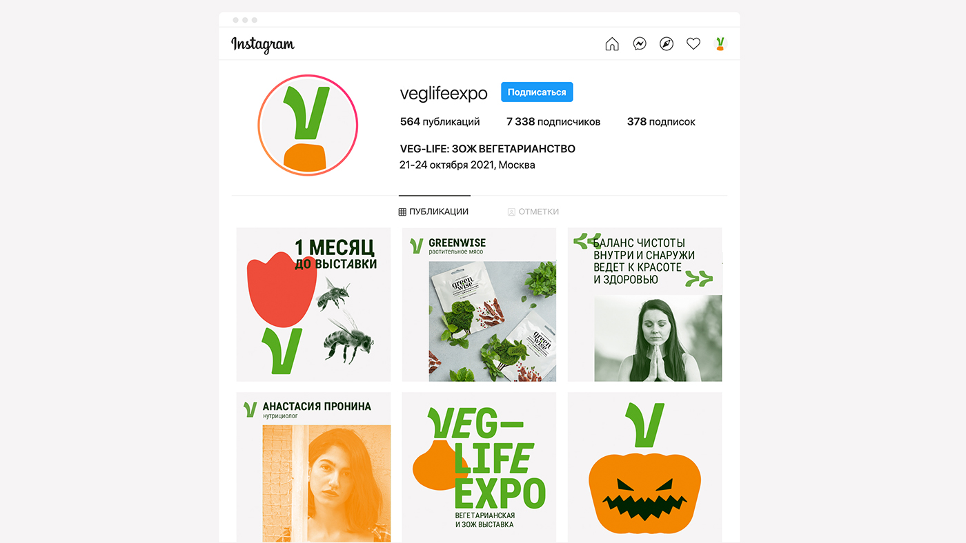
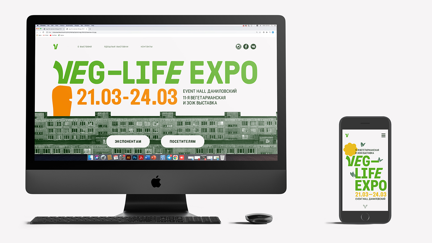
The rows of stands at the exhibition looked like mazes, and white signs with the names of brands did not help to navigate in space. To simplify navigation at Veg-Life Expo, each row of booths was assigned a different color. The layout of Instagram was also redesigned. Extraneous information was removed from publications, and posts were divided into headings. The site on one page had information both for ordinary visitors, who come to try and buy something new, and for business, which comes to conclude contracts. Therefore, the site has also undergone changes. Its main functional update – on the first page there are two buttons, which divide the traffic into two groups.
CREDIT
- Agency/Creative: Nikita Gavrilov
- Article Title: Student Nikita Gavrilov Creates Conceptual Branding for Veg-Life Expo
- Organisation/Entity: Student
- Project Type: Identity
- Project Status: Non Published
- Agency/Creative Country: Russia
- Agency/Creative City: Moscow
- Market Region: Europe
- Project Deliverables: 2D Design, Advertising, Brand Creation, Brand Redesign, Design, Type Design, Typography
- Industry: Mass Media
- Keywords: WBDS Student Design Awards 2021/22
-
Credits:
Designer: Nikita Gavrilov


