


Suckerpunch – Torimodosu Sake
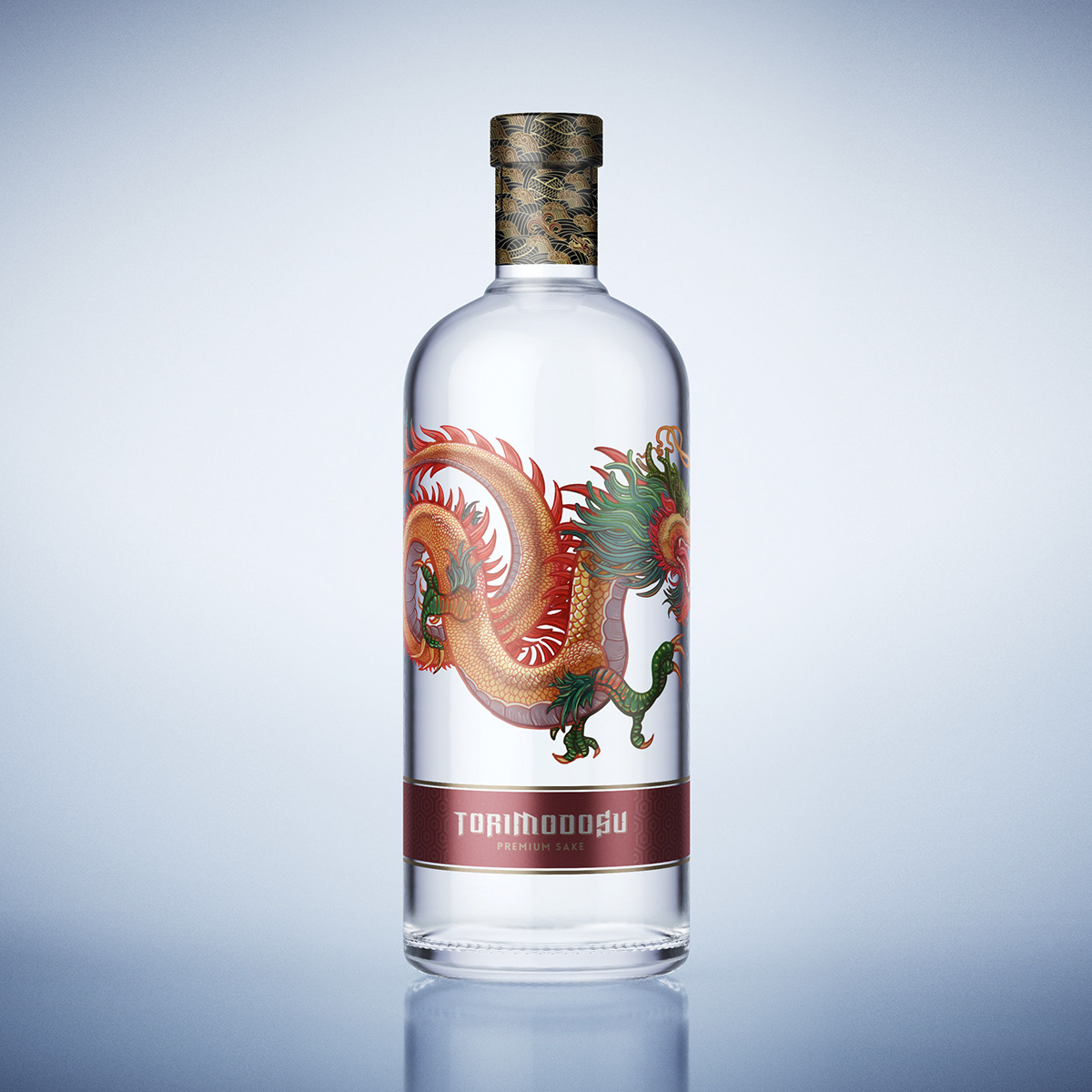
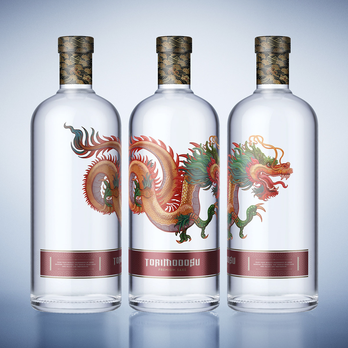
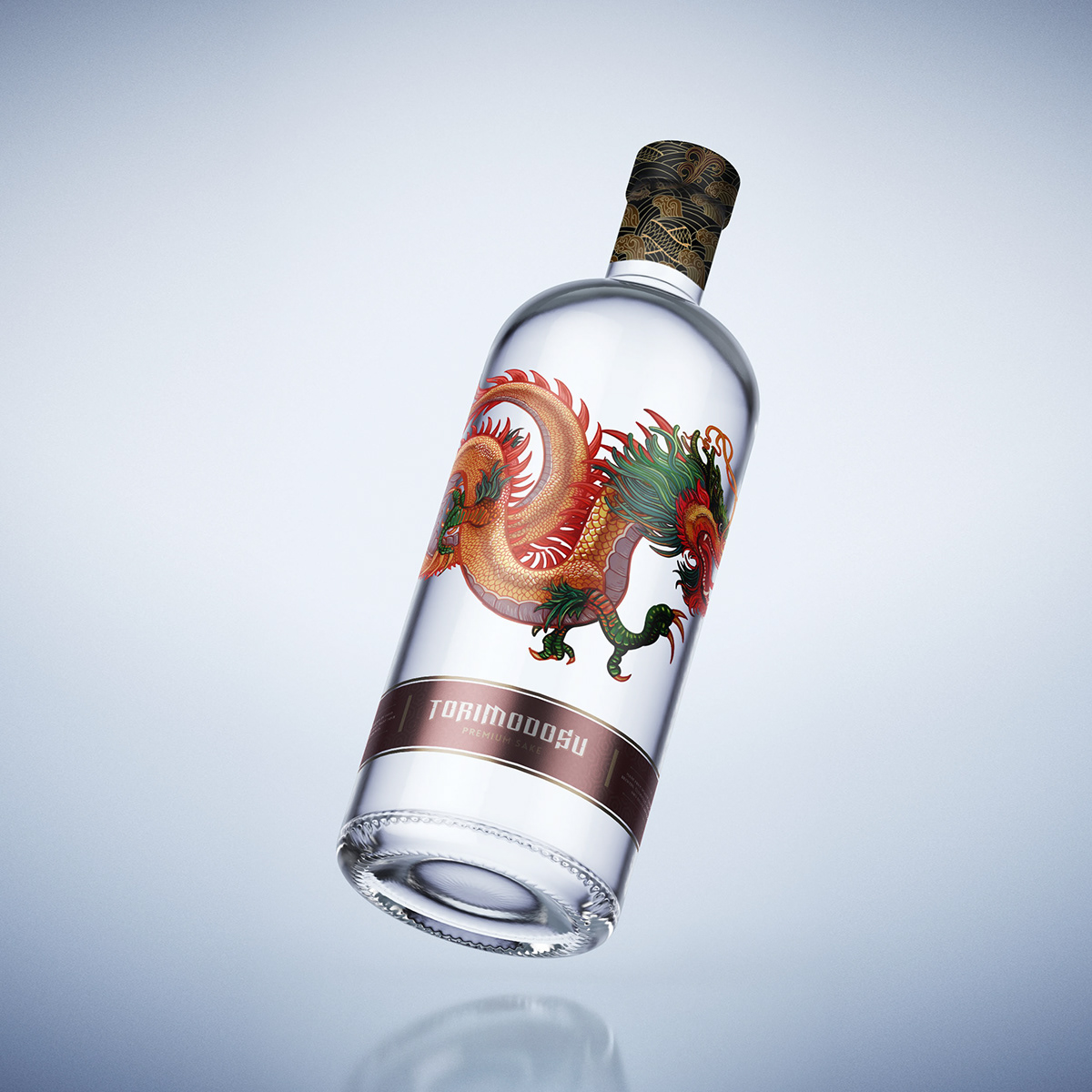
Torimodosu – When life knocks you down, dust yourself off and get back up again. A concept project to introduce Sake into the mainstream Western drinking culture. Red symbolizes energy, power, passion, and determination which are all symbolic of the Japanese culture. It was important to bring as much of this Japanese culture into the design as possible from the small ornate spot UV patterns in the metallic red strip to the iconic illustrated dragon representing success, power, and prosperity to the traditional dragon pattern on the neck. The design layout also needed to reflect the clean simplicity of Japanese design.
CREDIT
- Agency/Creative: Suckerpunch
- Article Title: Sake Bottle Design for the Western Market
- Organisation/Entity: Freelance, Non Published Concept Design
- Project Type: Packaging
- Agency/Creative Country: South Africa
- Market Region: Multiple Regions
- Format: Bottle
- Substrate: Glass
FEEDBACK
Relevance: Solution/idea in relation to brand, product or service
Implementation: Attention, detailing and finishing of final solution
Presentation: Text, visualisation and quality of the presentation


