


Safari Sundays has designed the identity for a new fat-forward, diet disruptor.
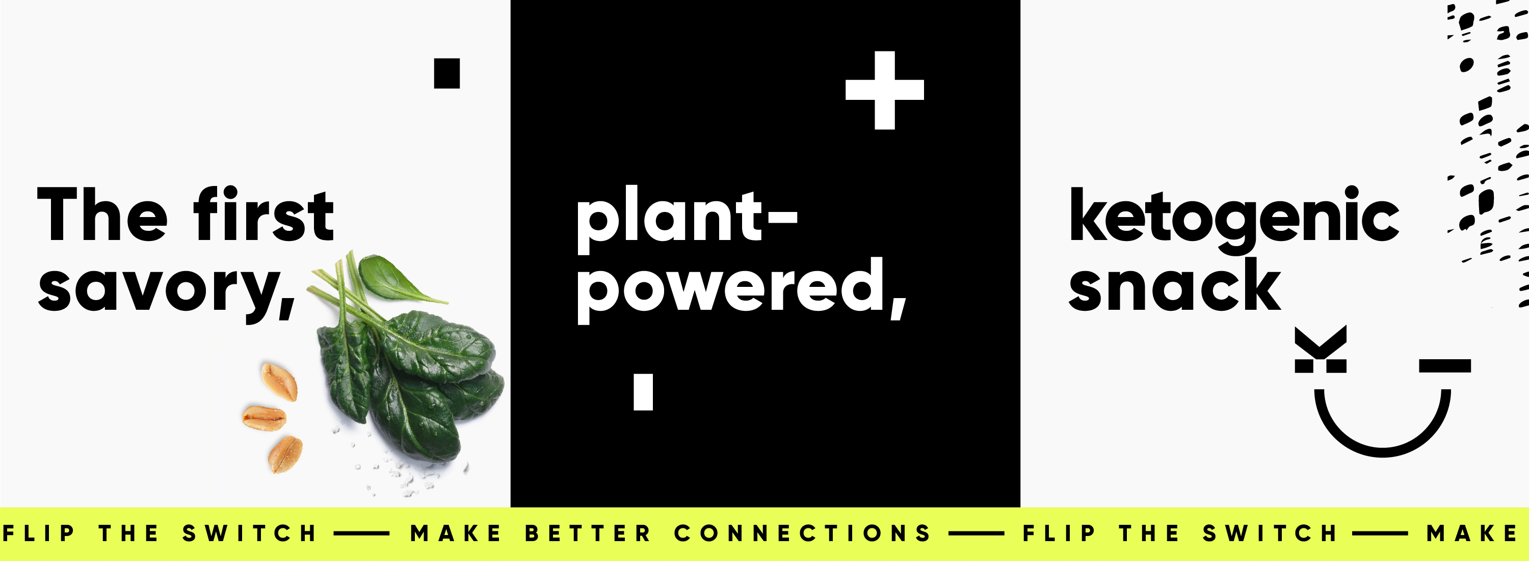
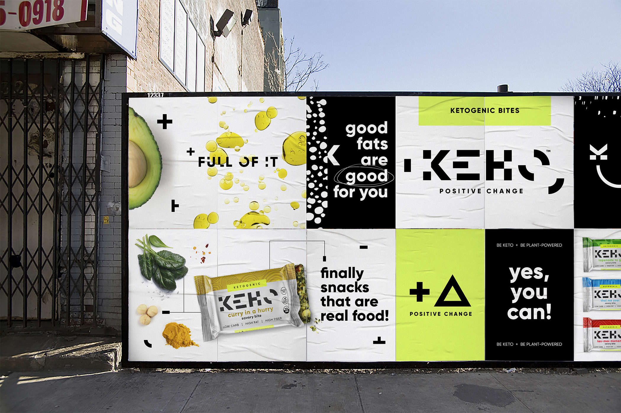
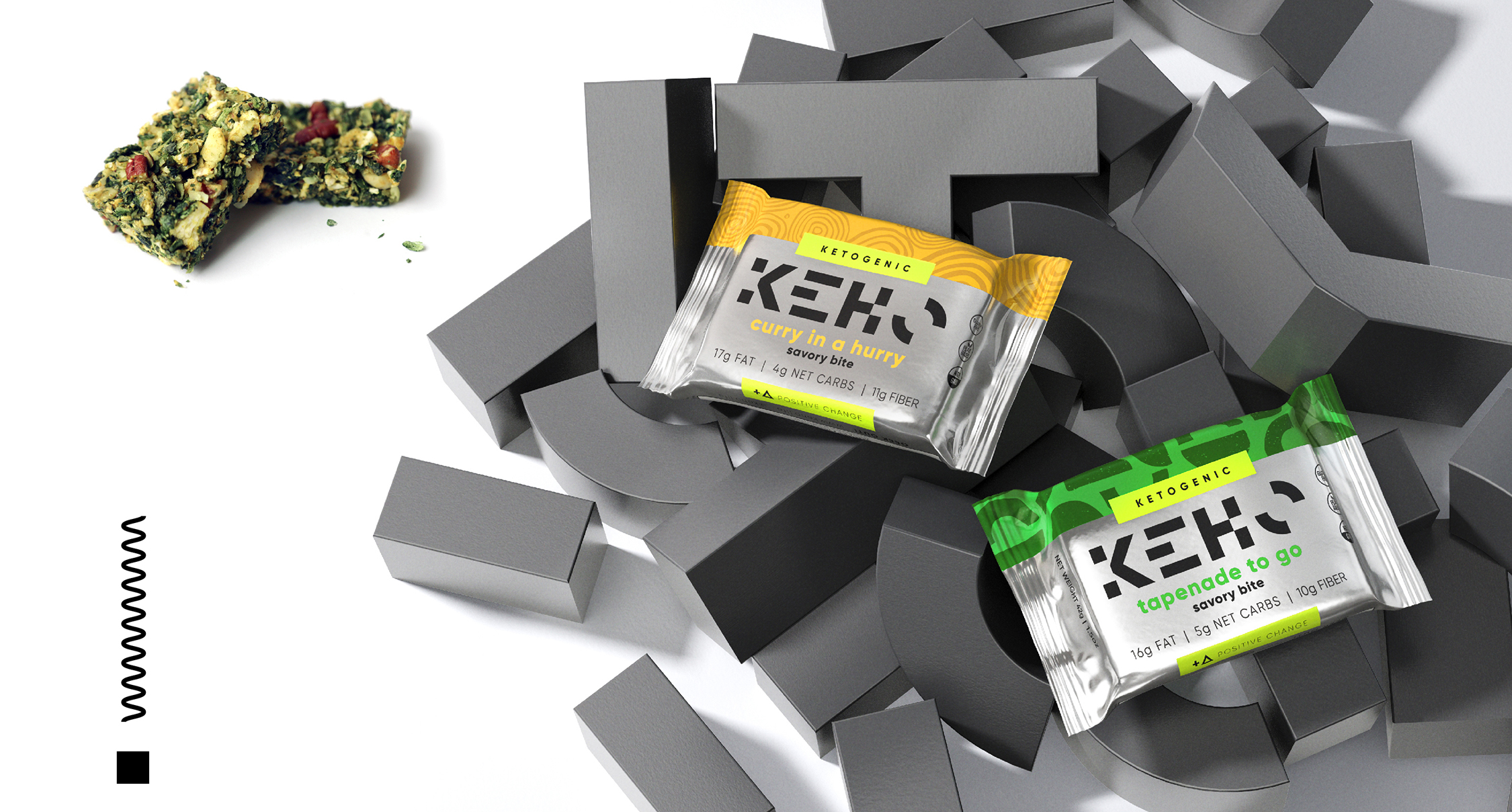
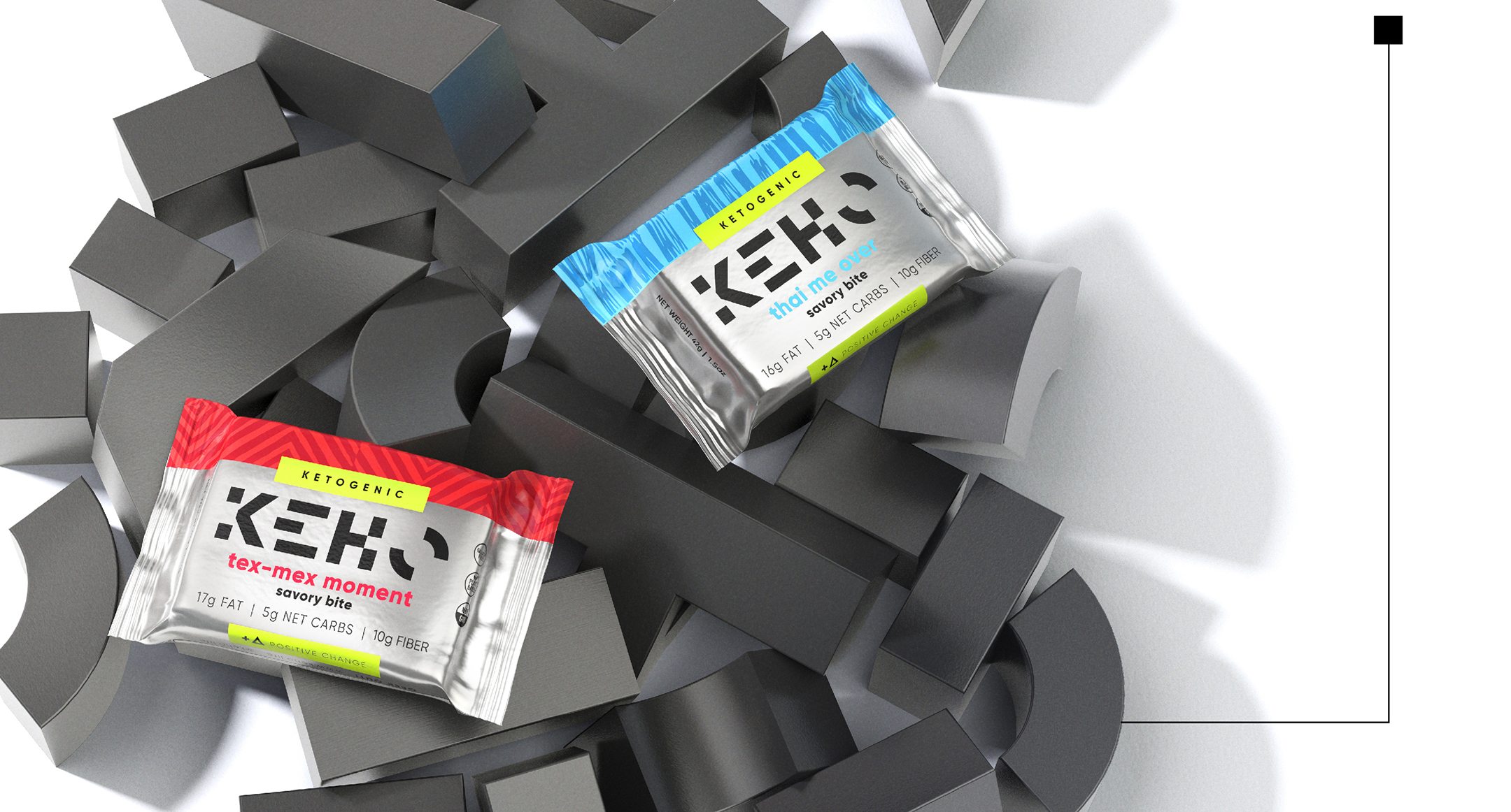
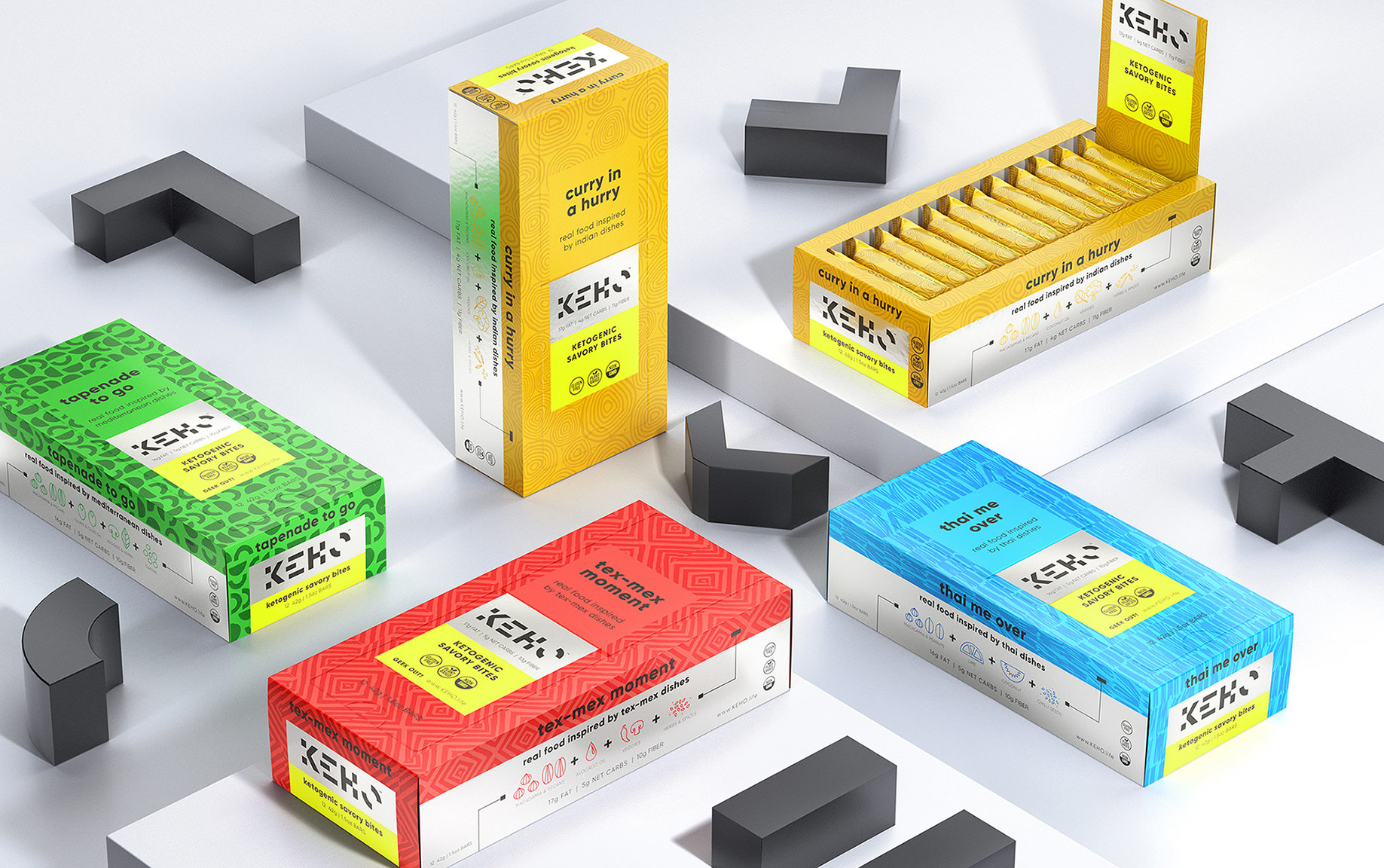
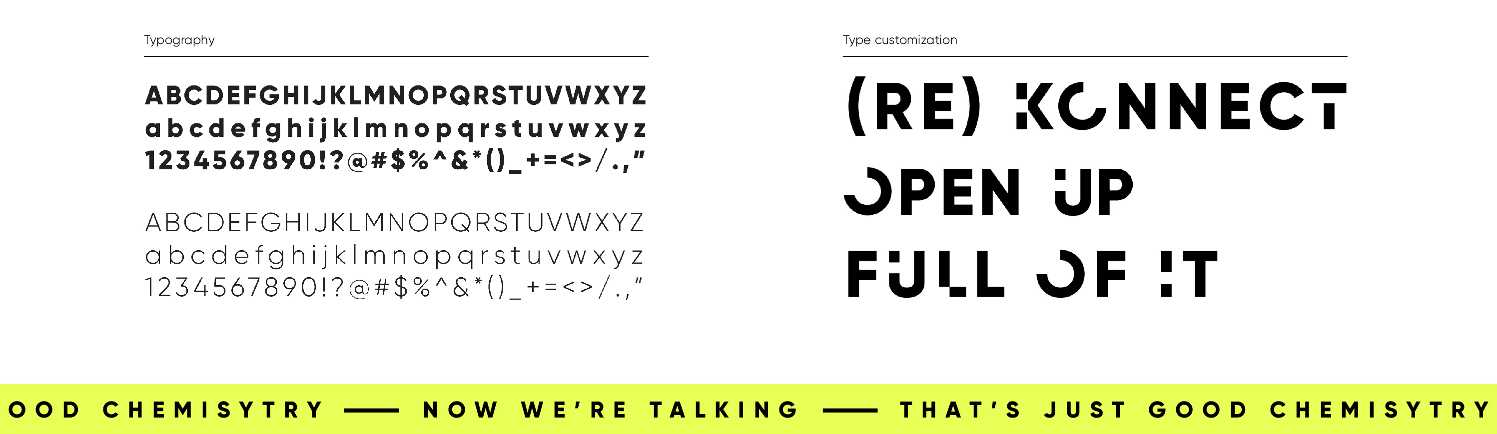
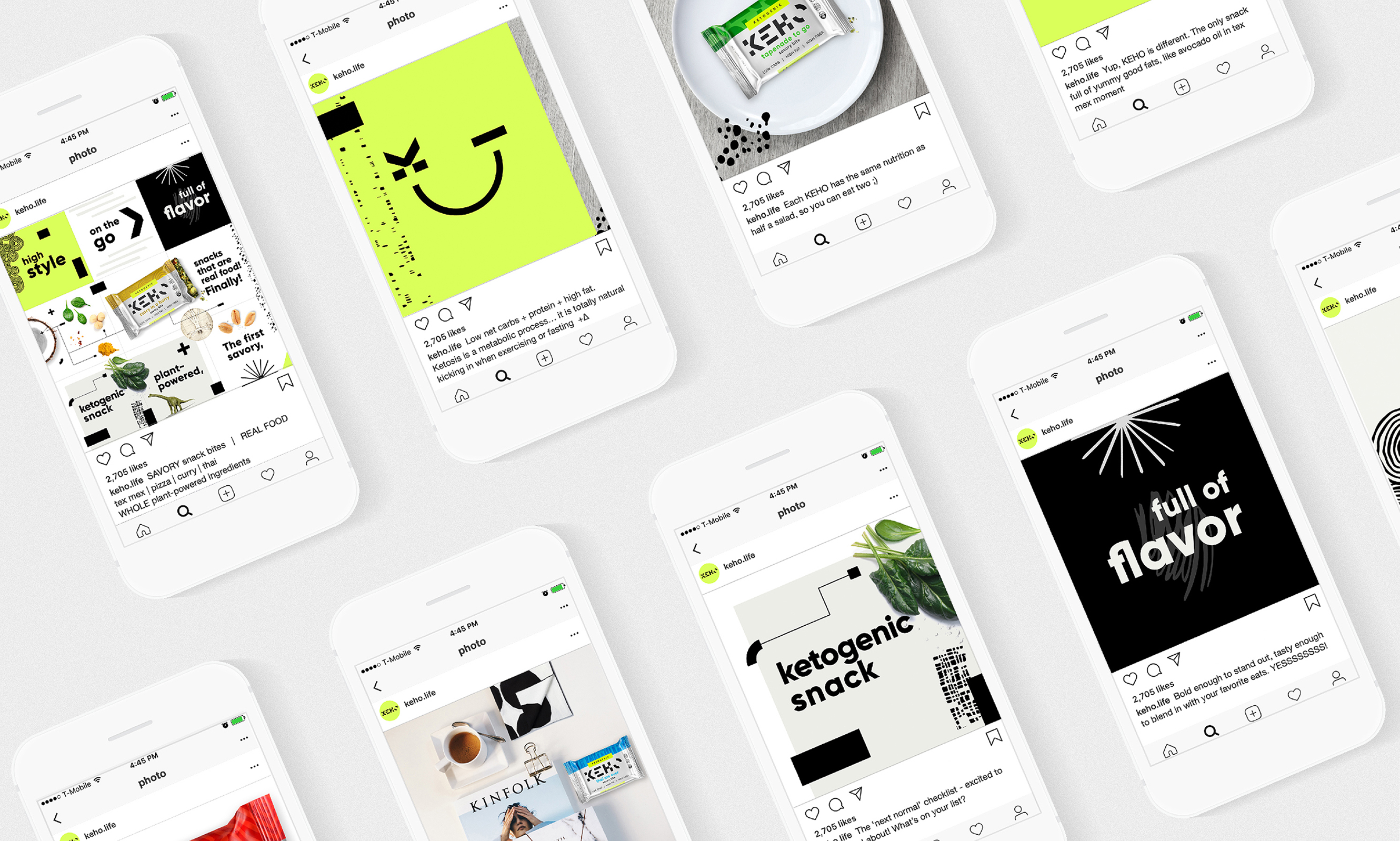
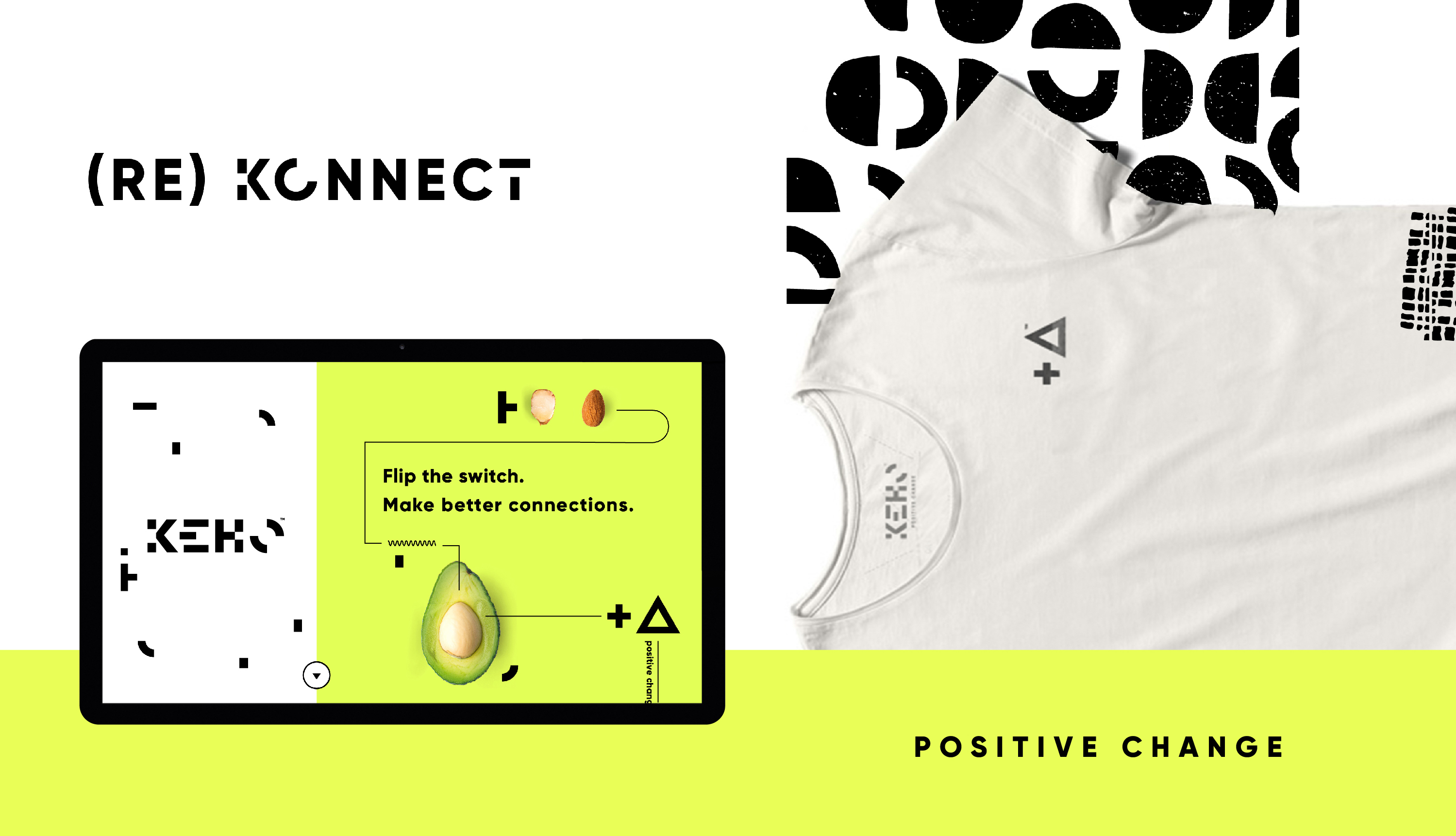
KEHO , is the market’s first 100% plant-powered, ketogenic, savory snack bite. The design team went wanted to exemplify the science behind the brand by playing with the language of chemistry. By using just two symbols: the +, a sign of positivity and the ∆, the chemical sign for change, they created a bold new tagline: + ∆, POSITIVE CHANGE. The use of bold neon colors and metallic substrates as vibrant brand colors further emphasizes both the impactful taste and science behind these snacks. With names like: “Curry in a hurry” or “Tex-Mex Moment”, each snack bar in the set of four conjures a different global flavor in which the team named with a hyper playful tone of voice.

CREDIT
- Agency/Creative: Safari Sundays
- Article Title: Safari Sundays Flips The Nutrition Tradition With Keho
- Organisation/Entity: Agency, Published Commercial Design
- Project Type: Packaging
- Agency/Creative Country: United States
- Market Region: North America
- Project Deliverables: Brand Architecture, Brand Design, Brand Identity, Brand Naming, Brand Strategy, Brand World, Branding, Graphic Design, Illustration, Packaging Design, Product Naming, Research, Tone of Voice
- Format: Box, Wrap
- Substrate: Metal, Pulp Board


