


The product: This is a premium strong beer, rich and malty with a strong earthy aroma. It was identified and crafted to suit the Indian palate, keeping in mind their taste for strong beers. The product was slated to be a young, lively and fun brand of beer which has the power to tantalize the senses and compel repeat sales.
Audience: The beer is aimed at the young Indian who doesn’t want to drink what his dad does. This audience doesn’t care for aged traditions and the heritage of comfortable old brands. The young Indian wants to break away from the pack where it comes to his choice of refreshment. They are looking for a brand with a unique identity that can be their own.
Task: Umbrella Design was tasked with creating a brand name, identity and packaging for the brand. This involved studying the existing market, analysing marketing equivalents and finding parallel strategies that this brand the go-to drink for an audience under 35.
Strategy: The task was to break away from traditional beer branding and promotion, and stand out from the rest of the players in the category. We decided to rethink the category entirely. What if this was a completely new category that was targeted at the youth. A brand name that belonged to a company, its owner or a place of origin would be exactly like every other beer in the market. We started with a naming exercise based on the product and its promise to the target audience.
The design and packaging tasks came alongside. The design philosophy we adopted was to remove all the stock elements of beer packaging, make it bolder, louder and more vibrant than any other drink on the shelf. This would have to be a bottle or a can to be seen with. It was made for nightclubs and raves, and not for a quiet night out with friends.
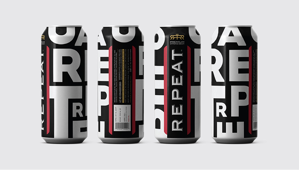
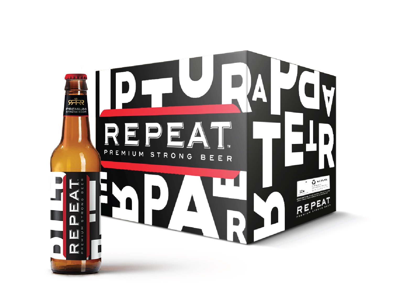
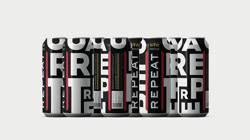
Brand and Packaging Design: The brand name chosen was Repeat, which comes from the very Indian custom of asking for a ‘repeat’ when a refill is due. The brand message derived from this name. The design followed the name into its extreme conclusion, creating infinite loops of the brand name around the product.
Hence the bold approach to the packaging. A patterned jumble of letters derived from the name, repeated randomly to create a bold pattern that distinctively stands out in the retail environment.
The packaging and branding elements together lend themselves to a variety of marketing options. Given its unconventional bold image statement, the brand sits comfortably in the mind-space with colas and energy drinks that have the same fast-paced, bold, effusive personalities. The packaging is distinct and reads out loud in the retail environment. Supported with events and on-site activities, Repeat Beer is now seen as a point in the road where beer branding turned a corner.
CREDIT
- Agency/Creative: Umbrella Design
- Article Title: Repeat Beer Brand and Packaging Design by Umbrella Design
- Organisation/Entity: Agency, Published Commercial Design
- Project Type: Packaging
- Agency/Creative Country: India
- Market Region: Asia
- Project Deliverables: Brand Architecture, Brand Creation, Brand Experience, Brand Naming, Brand Strategy, Brand World, Packaging Design, Product Architecture, Product Naming, Research, Tone of Voice
- Format: Bottle, Box, Can, Tin
- Substrate: Glass Bottle, Metal, Pulp Paper


