


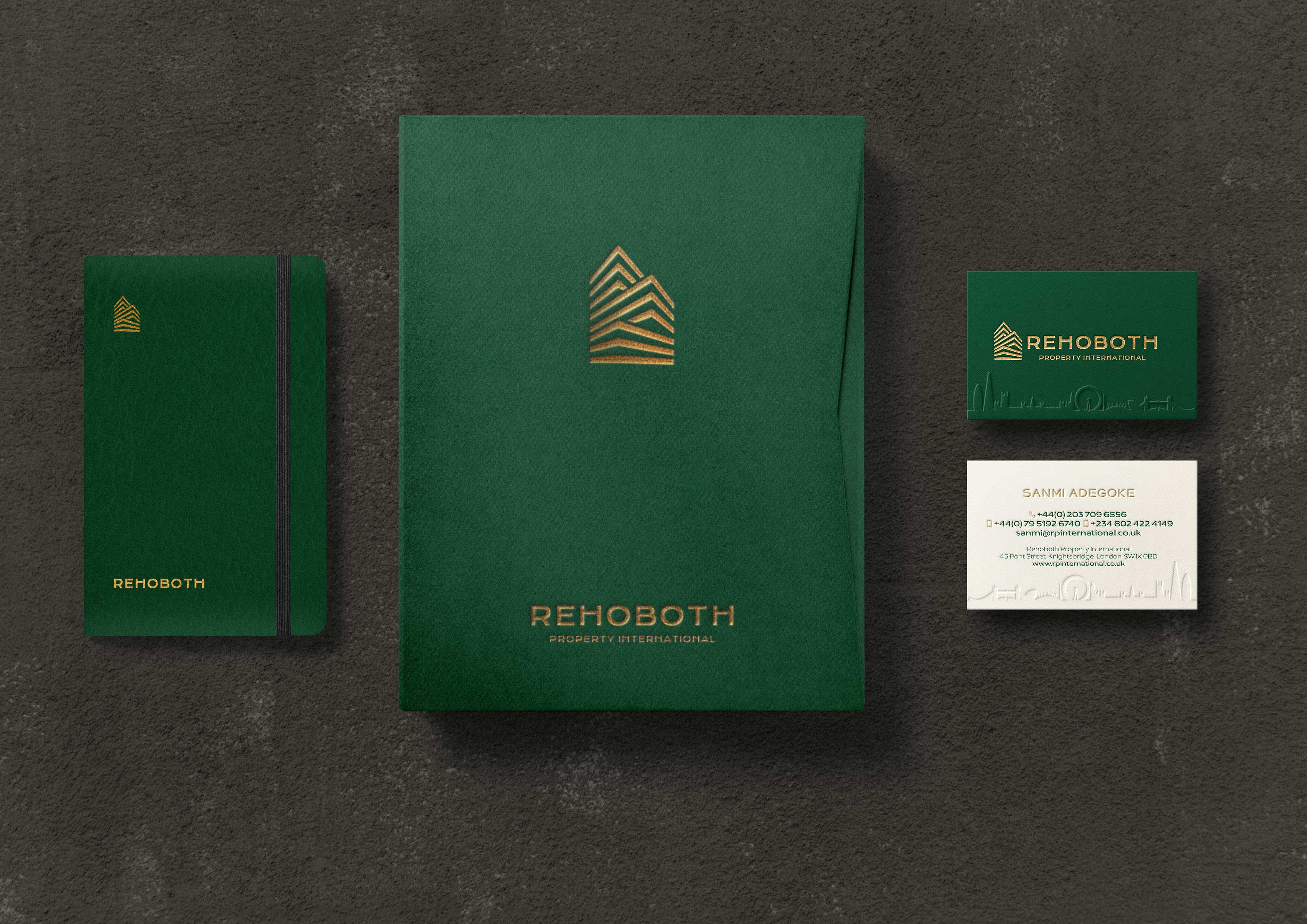
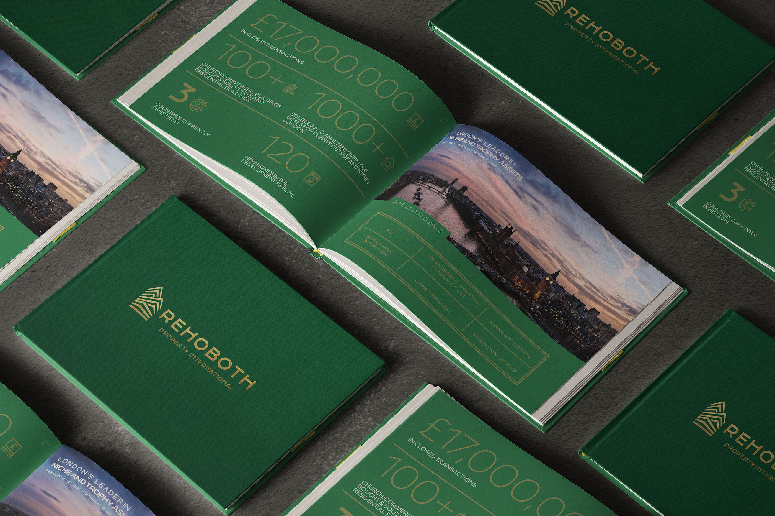
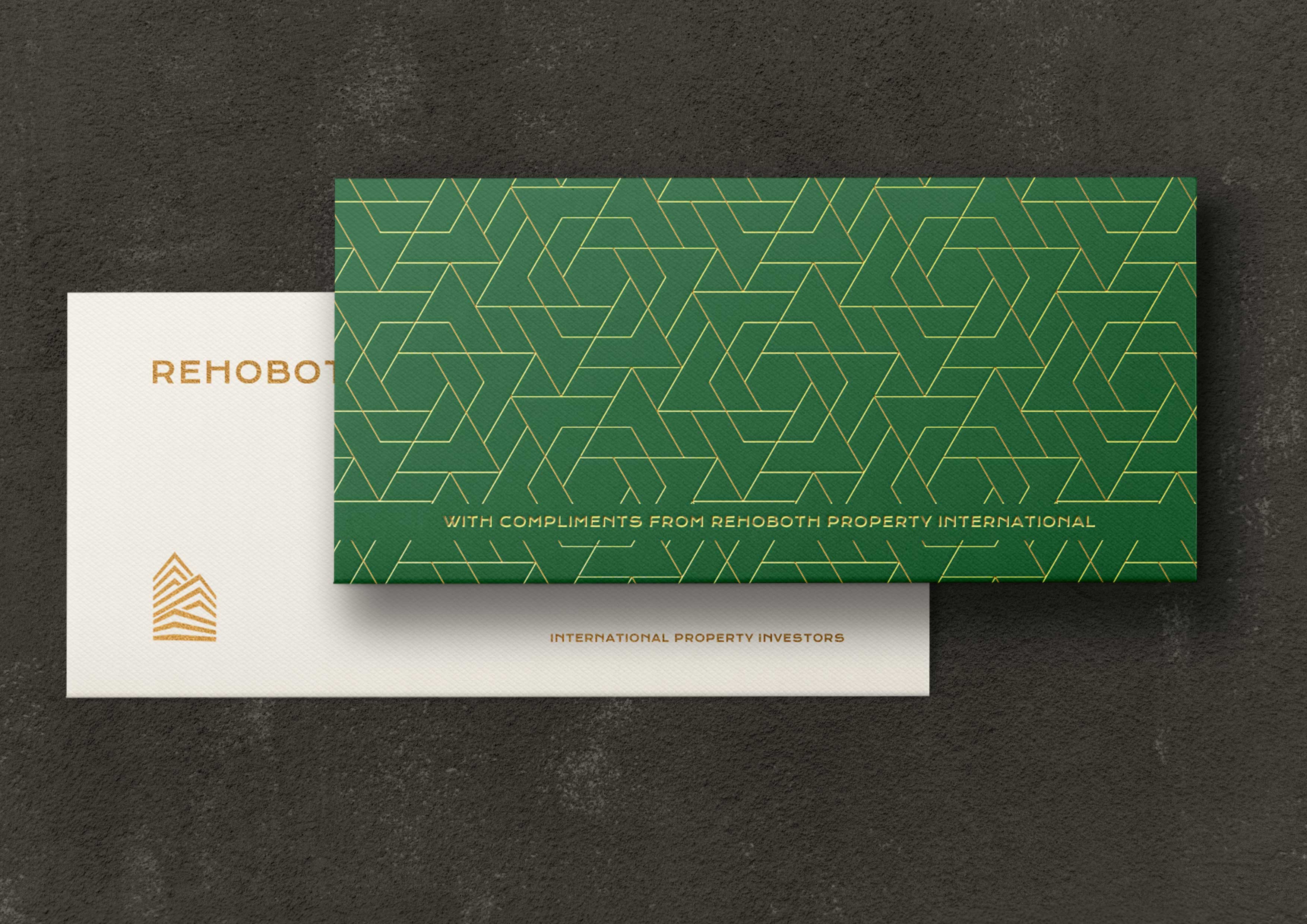
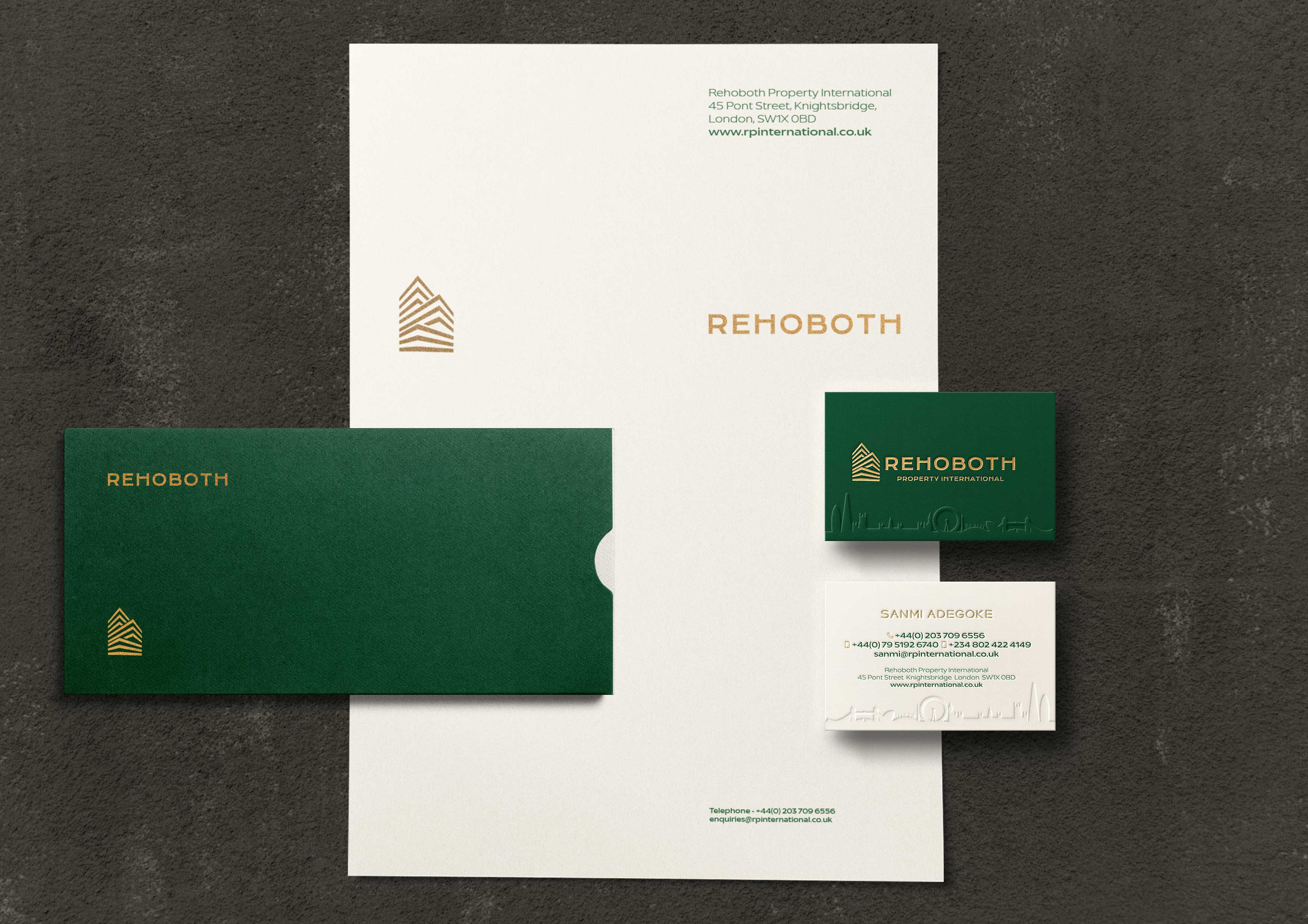
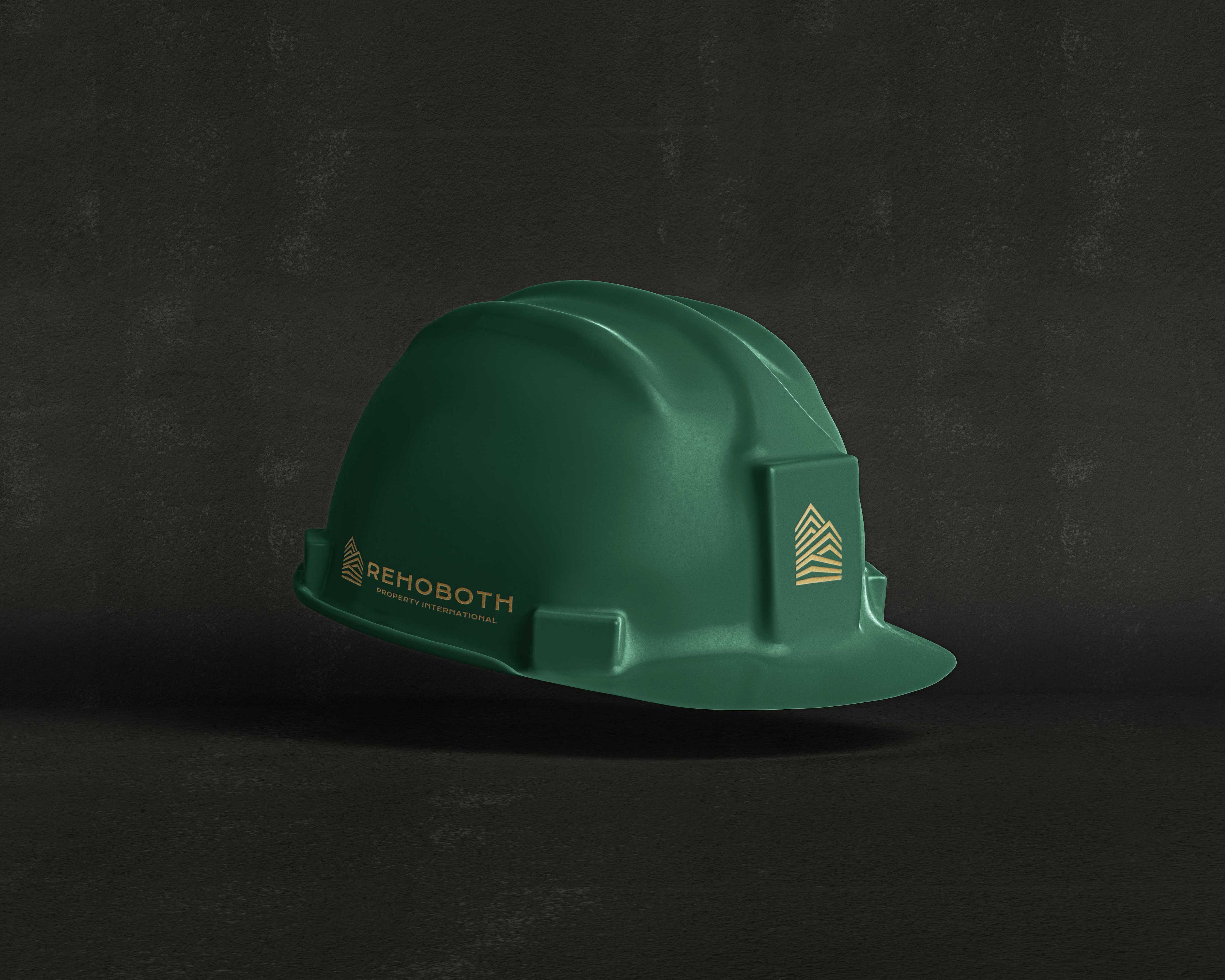
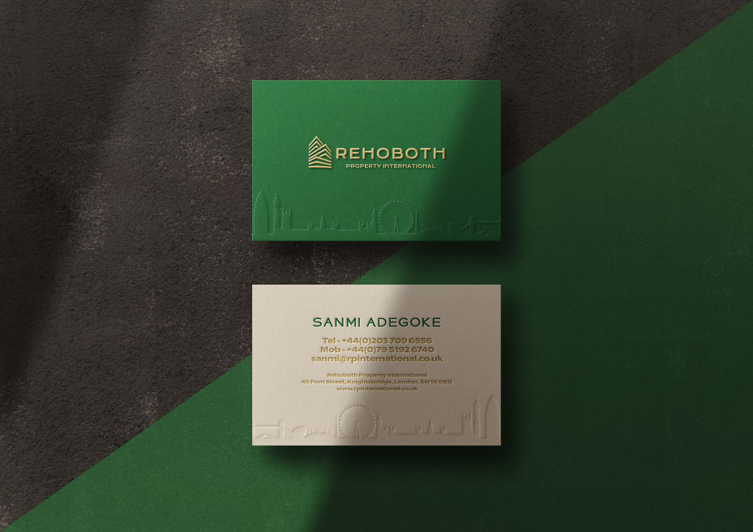
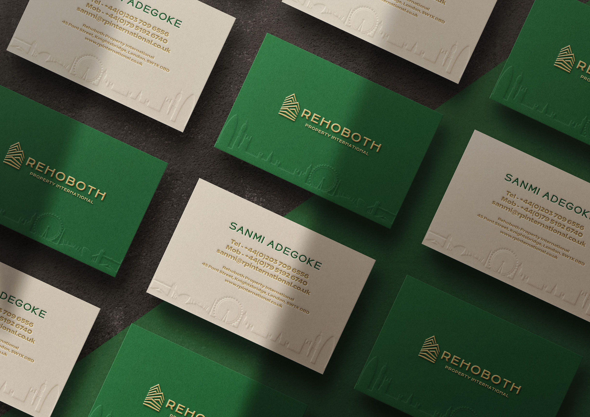
Rehoboth Property International is London’s premier property investment and acquisition firm consistently delivering high class service for the most prestigious owners and developers.
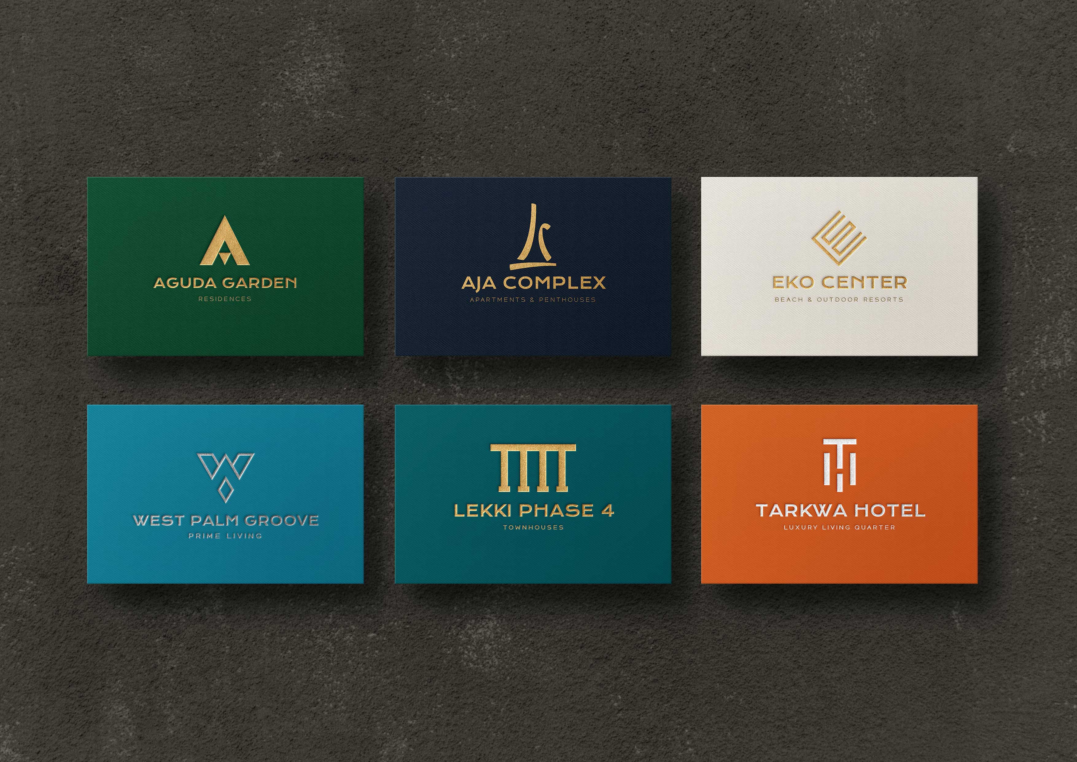
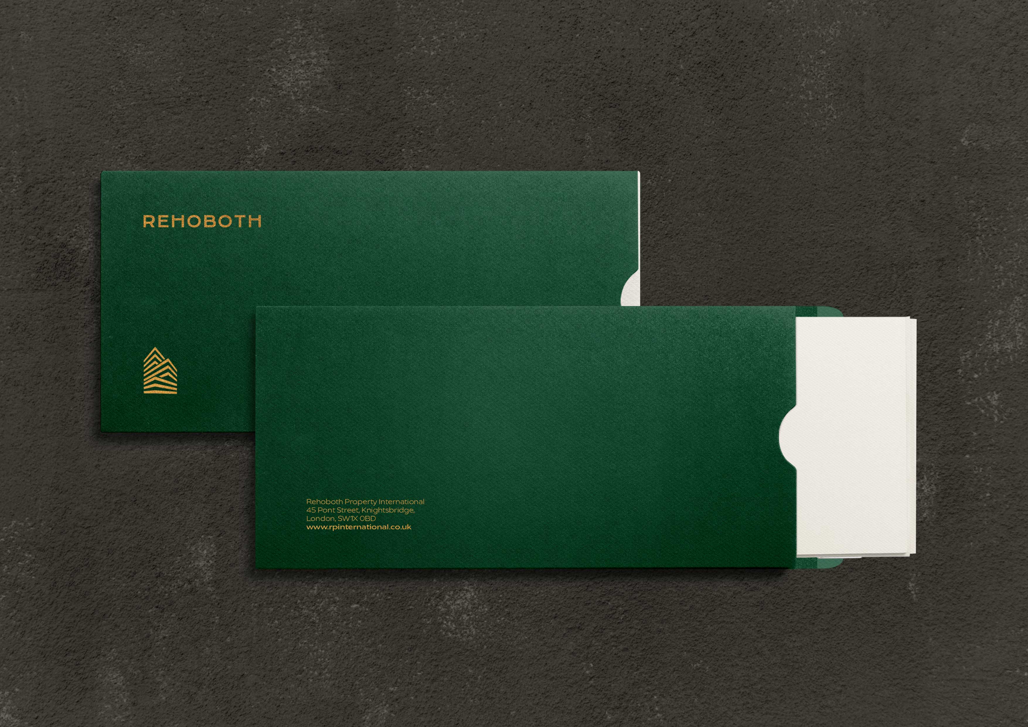
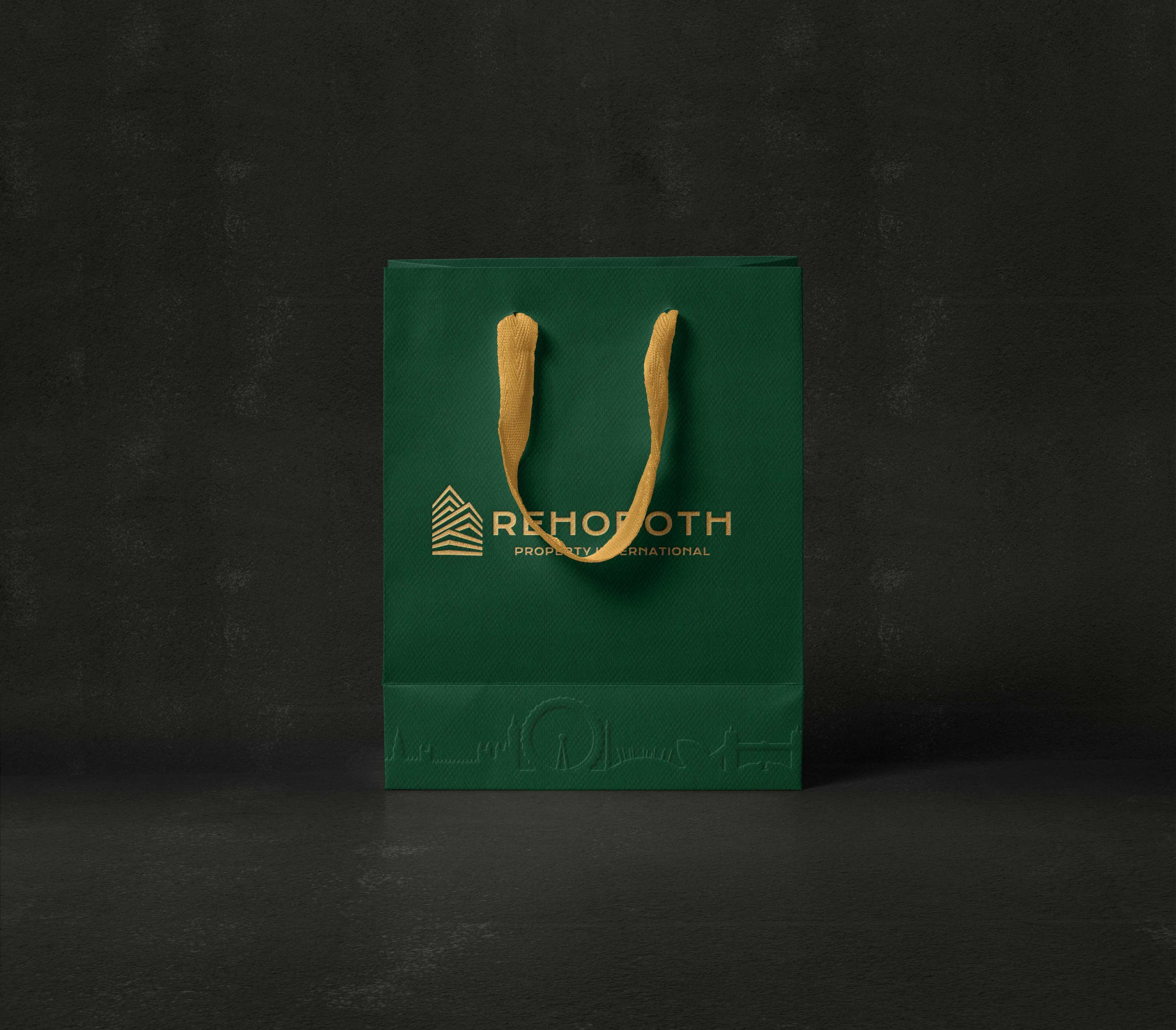
The opportunity to define the new brand for the company presented only one clear route to follow and that was ‘Minimalism’. The entire aesthetic is immaculate, simple and minimalistic. The cohesiveness of the entire set from the corporate identity to the packaging boxes, folders, merchandise and souvenirs oozes elegance and opulence.


CREDIT
- Agency/Creative: AdeOla Media
- Article Title: Rehoboth Property International
- Organisation/Entity: Agency, Published Commercial Design
- Project Type: Identity
- Agency/Creative Country: United Kingdom
- Market Region: Europe
- Project Deliverables: Brand Design, Brand Identity, Brand Redesign, Brand Refinement, Brand Rejuvenation, Brand Strategy, Branding, Graphic Design, Rebranding, Tone of Voice
- Industry: Real Estate
- Keywords: Property, Real Estate, Property Development, Luxury Property Agents, Branding
FEEDBACK
Relevance: Solution/idea in relation to brand, product or service
Implementation: Attention, detailing and finishing of final solution
Presentation: Text, visualisation and quality of the presentation


