


Grupo HOB was born in 2009 with the main aim of providing companies and privates with consulting, tax advice and advocacy services, from a closer point of view. They wanted to be part of the companies and be near them on their way, as if they were part of the company itself.
Because of their tenth anniversary, they notice that the image they were providing had became obsolete so they decided to update the tone of the brand, to focus it on that young audience who represents the generational change of companies.
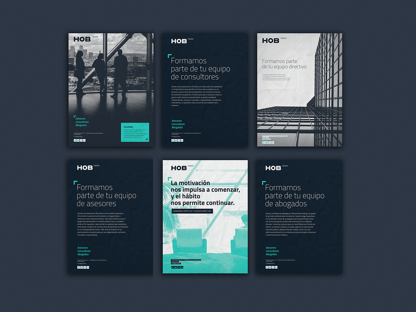
We had to show ourselves as a close brand but, this time, much more modern, in which the Group’s character of the brand was strengthened, without neglecting their three areas. To do this, we created a logo with a very powerful “grotesc” typeface and widened the horizontal arms of the H and B to give it even more stability and strength.
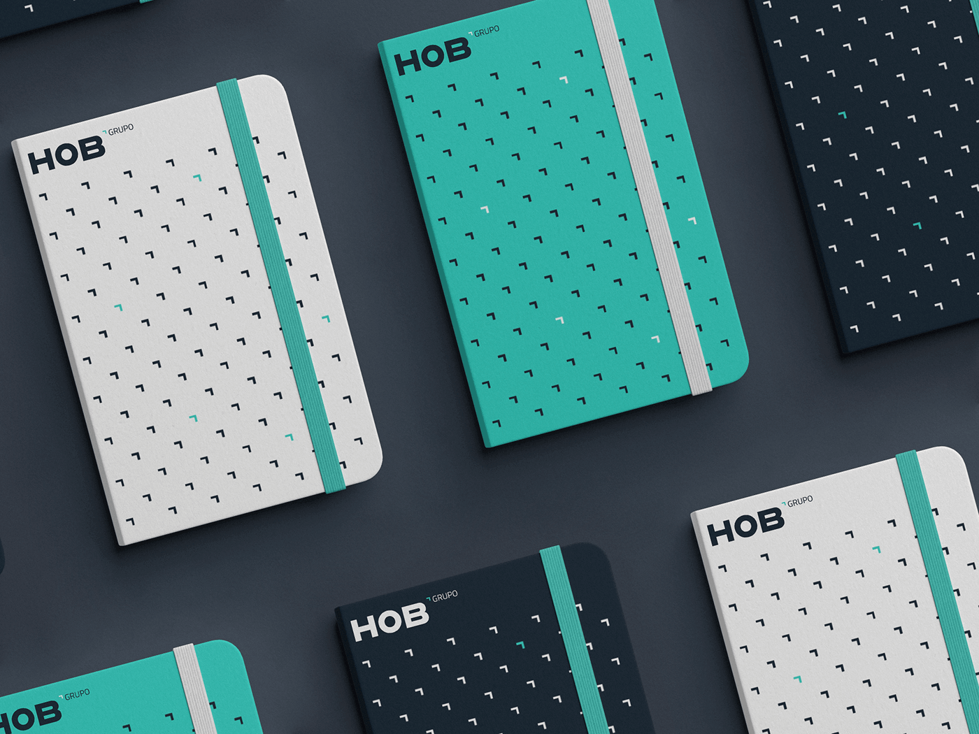
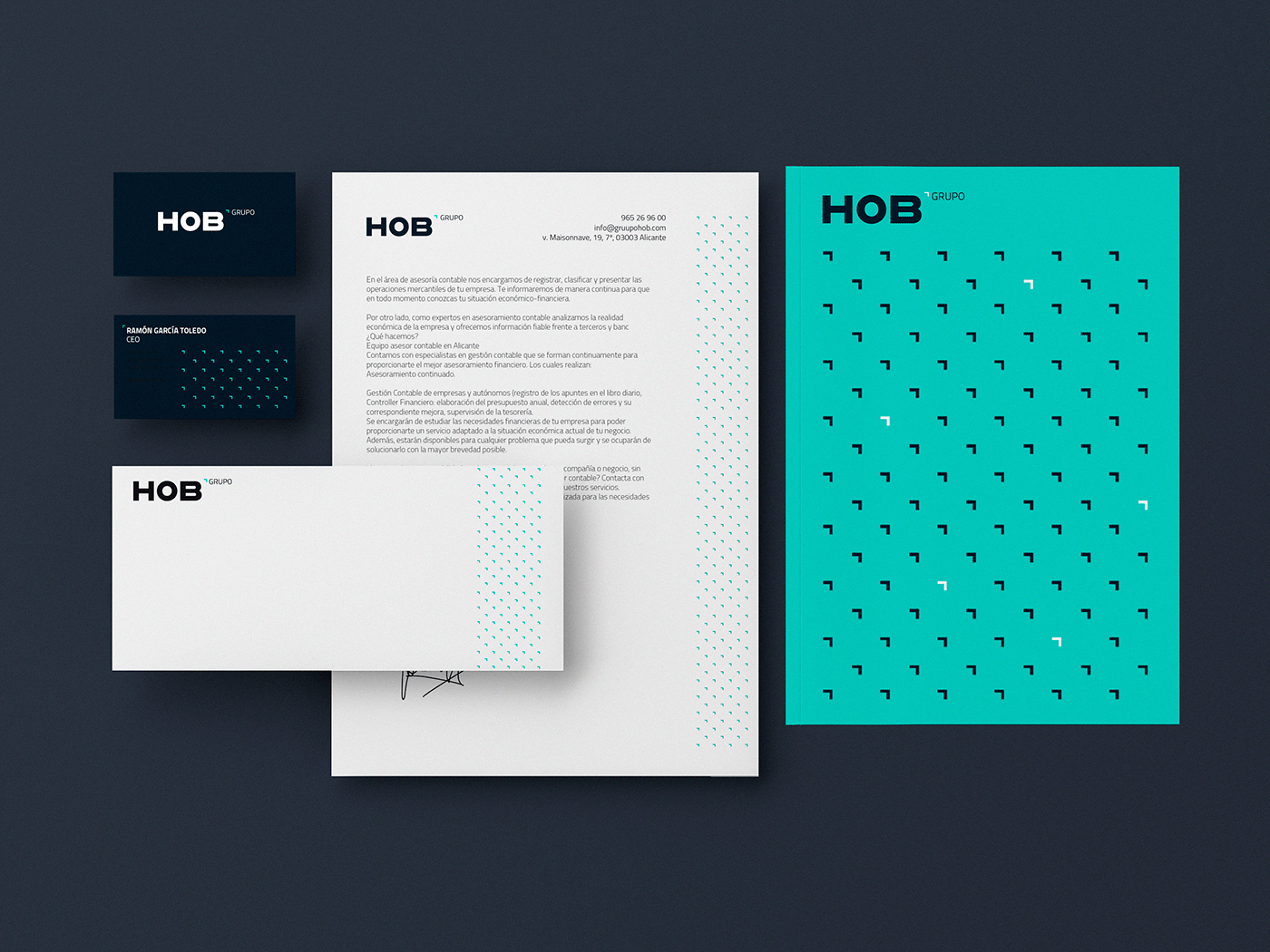
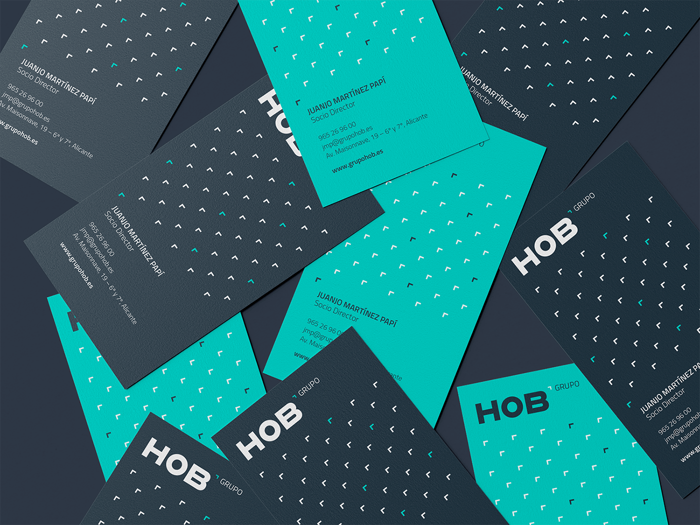
We needed to focus the logo so that it could be transformed depending on the sub-area it was going to represent (advisors, lawyers or consultants). This is why we reduced to a minimum the resource of the bracket, which groups us HOB and allows us to play on words depending on the needs. We use a blue seawater in this resource, in order to bring modernity to the brand and allow the secondary word not to be isolated.
We used the bracket as a graphic resource to provide the brand with movement, using it as a screen and main color during the branding.
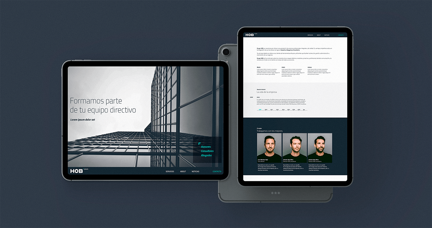
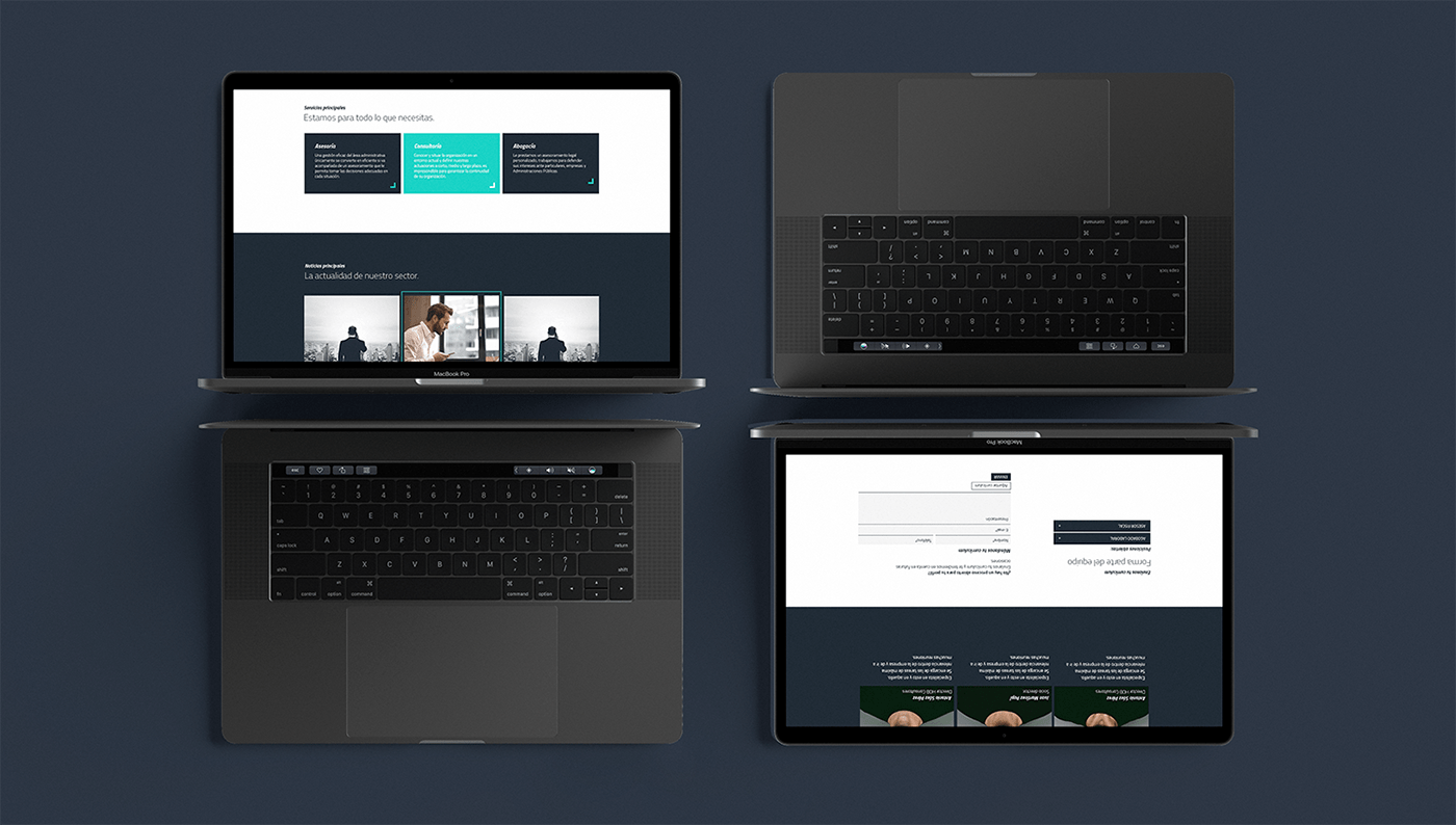
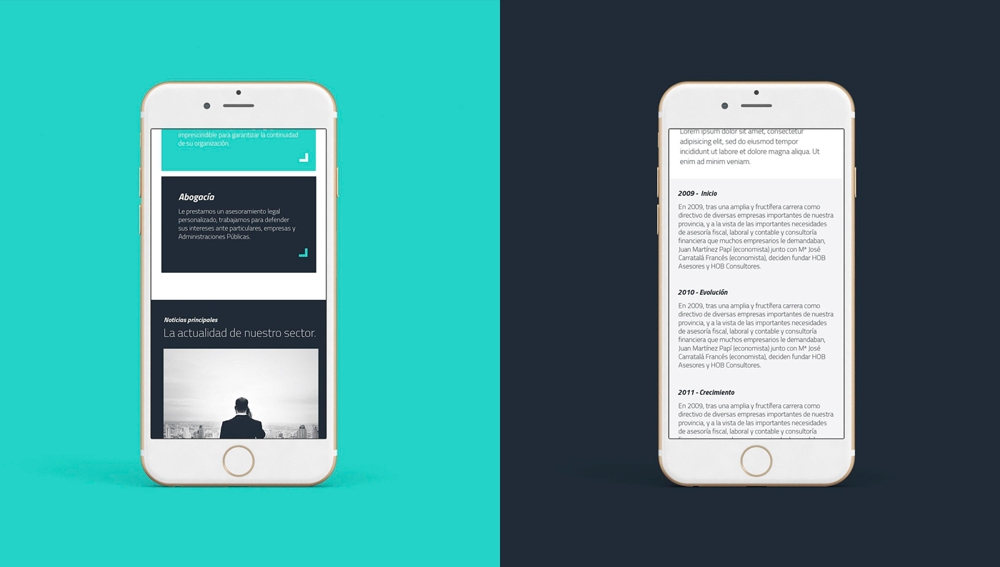
In addition to branding, we created a professional and direct website, but it must also have proximity to the client, through their “copys” and their corporatism. It was a website with many sections, so it had to be intuitive and easy to use.
The end result was a dynamic brand that adapts much better to its main customers without losing the seriousness necessary for the sector. With all those changes, we manage a brand who is able to talk to the new generations and show that they are a company capable of being at the forefront of the sector. A new brand which helps them to be remembered, and to communicate efficiently both internally and externally.


CREDIT
- Agency/Creative: Hola. Creativos
- Article Title: Rebranding of Grupo HOB Created by Hola. Creativos
- Organisation/Entity: Agency, Published Commercial Design
- Project Type: Identity
- Agency/Creative Country: Spain
- Market Region: Europe
- Project Deliverables: Brand Architecture, Brand Identity, Graphic Design, Identity System, Rebranding, Research
- Industry: Financial
- Keywords: logodesigner / creativelogo / identitydesign / brandidentity / branding / identity / visualstyle / rebranding


