


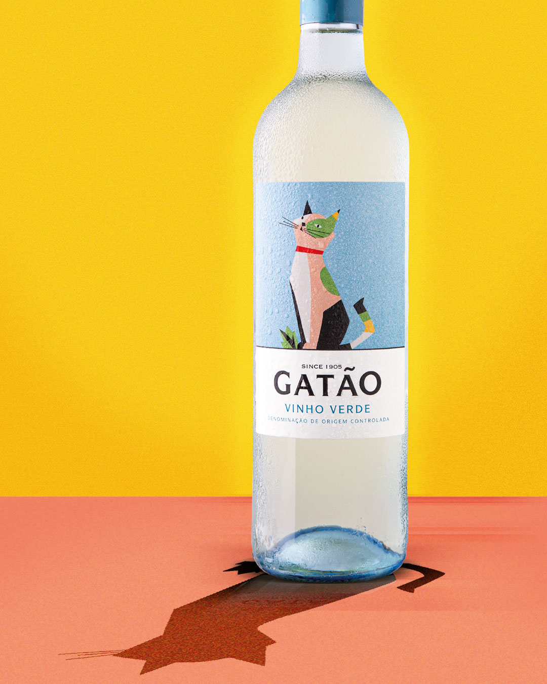
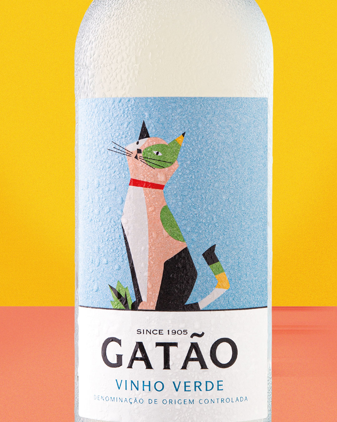
The challenge presented to us was to create a new image, youthful and urban, to reach a younger target audience and attract new markets. We were happy to embrace this challenge because we consider it an honor to work with one of the most emblematic brands in the Vinho Verde Region and one of the most representative brands of Portuguese wine in international markets in approximately 50 countries
On rebranding we preserved the graphic heritage of this century-old brand, created in 1905, keeping the iconic cat of the logo in the same position, but we gave it a new graphic design, with more geometric lines, with more cheerful and textured colors, to give it a vintage look that refers to its legacy.
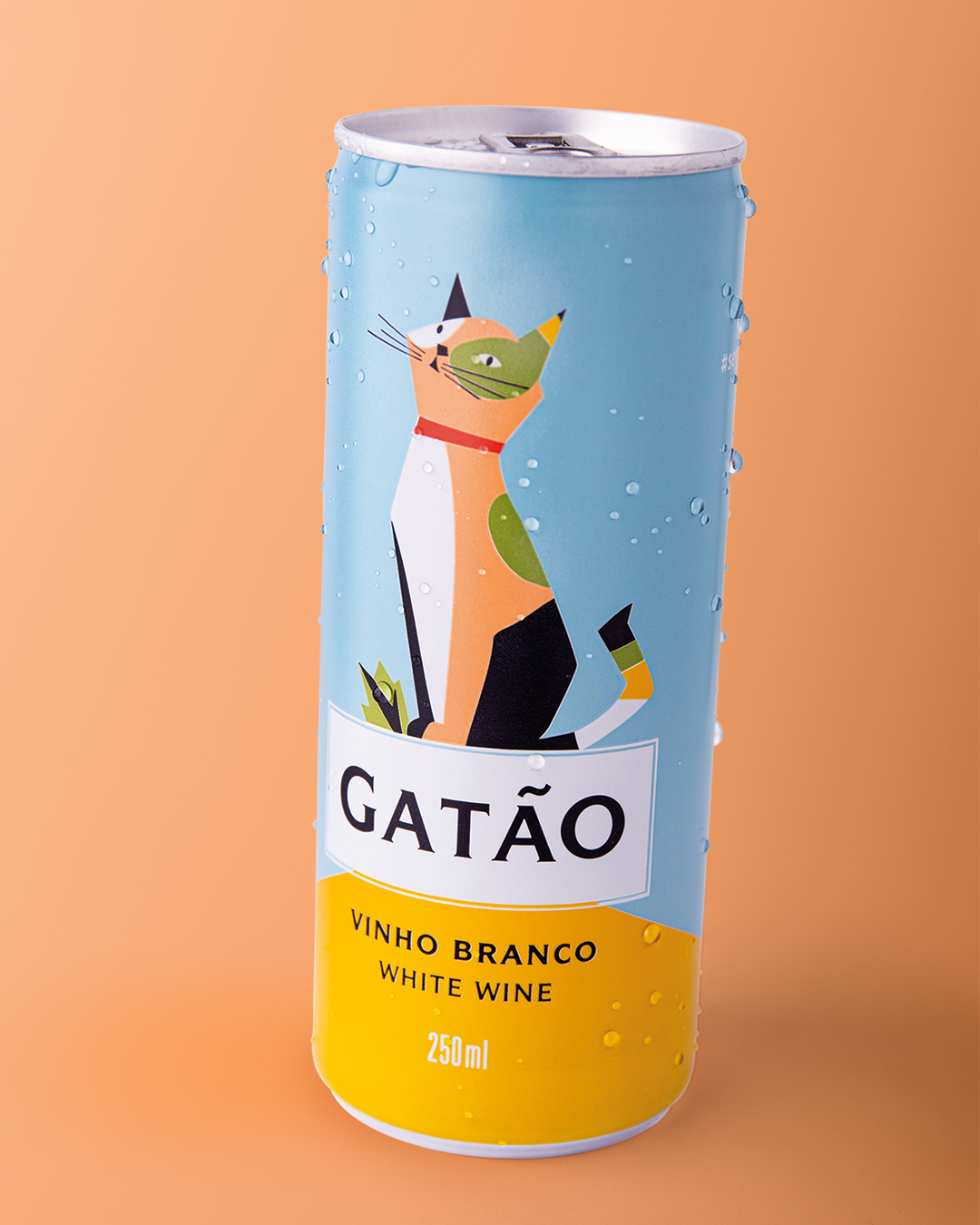
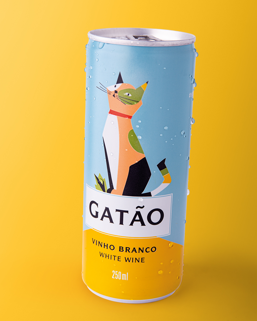
Following market trends, where there is an increase in demand for canned wines, with the Millennial generation being the largest base of consumers of canned wines, but Gen Xers are embracing the category as well, the Borges company adds the canned format to its portfolio of Gatão wines.
Gatão wine can is the synthesis that young wine consumers are looking for nowadays: environment, functionality, and outdoor consumption, also following the trend of demand for drinks with low alcohol content.
Continuing the Gatão brand image rebranding project carried out by us in 2019, it’s with satisfaction and joy that we developed the image for this new format.
Being one of the first Portuguese wine brands to take on this concept, it presents an attractive and urban image that remains faithful to the charisma and concept of the brand.
CREDIT
- Agency/Creative: RitaRivotti Premium Packaging Design
- Article Title: Rebranding of Gatão Wines By RitaRivotti
- Organisation/Entity: Agency
- Project Type: Packaging
- Project Status: Published
- Agency/Creative Country: Portugal
- Agency/Creative City: RitaRivotti® Premium Packaging Design
- Market Region: Europe, Global
- Project Deliverables: Brand Design, Brand Identity, Packaging Design
- Format: Bottle, Can
- Substrate: Glass, Metal, Pulp Paper
- Industry: Food/Beverage
- Keywords: RitaRivotti® Premium Packaging Design, Rita Rivotti, Gatão Wine, Wine, Packaging, Packaging Design, Graphic Design, Branding, Portugal
-
Credits:
Creative direction: Rita Rivotti / Pedro Roque
Designer: Sara Garcia


