


You can’t buy happiness, but you can buy ice cream and that is pretty much the same thing.
The Nice Company is a classic artisan company that has been producing fresh dairy ice cream, frozen yogurt, and fruit sorbets for over 20 years. They are dedicated to the process of original recipes, but excited and alert to inventive and contemporary developments in food.
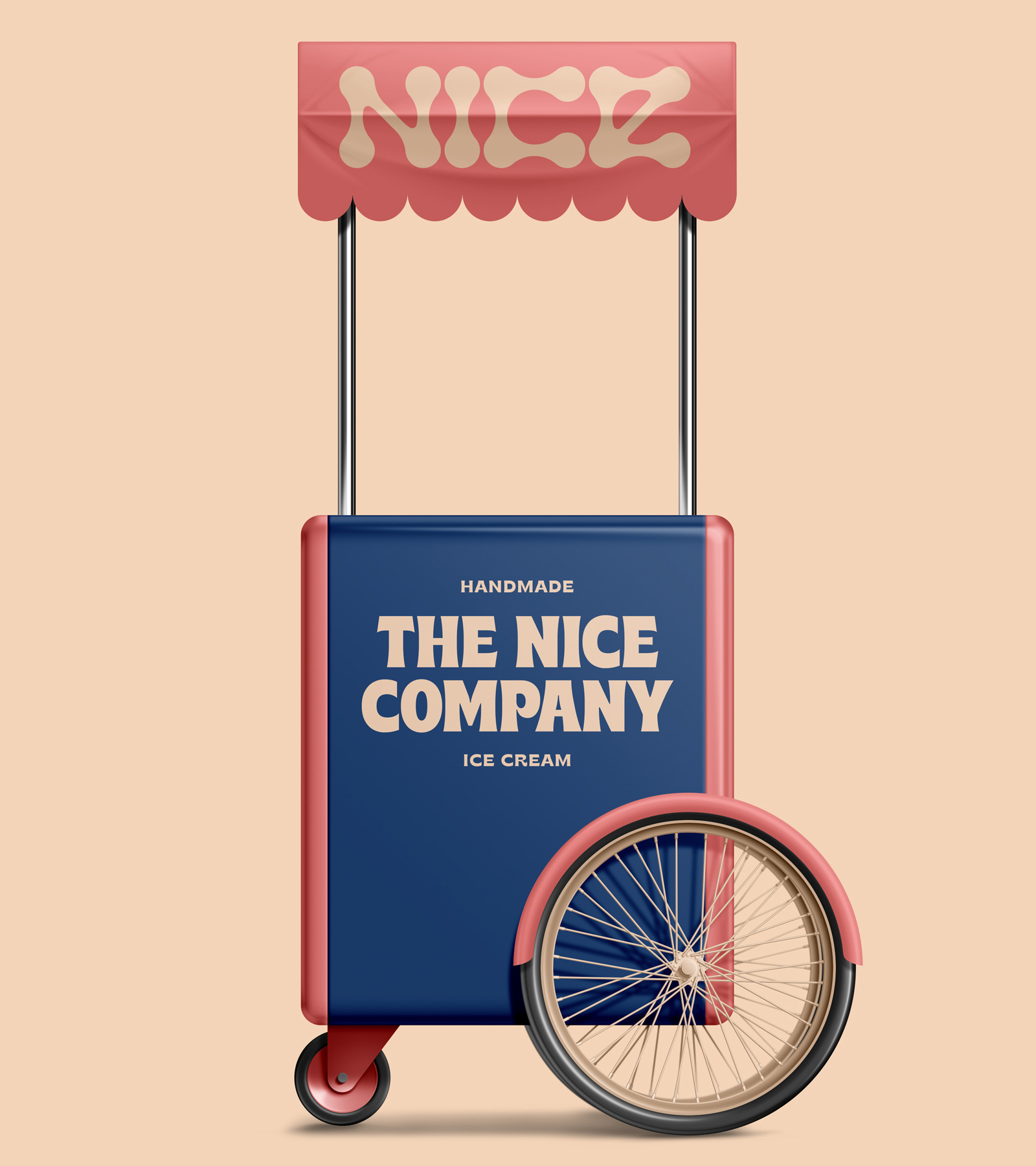
The brief form our client Nic was as simple as, ‘make it fun’, which for us was fantastic but also daunting as the creative directions where endless. We decided to stick to our approach as a studio and make the branding bold with a strong use of colour.
When thinking about, make it fun, we automatically thought about the excitement of the ice cream truck coming down the street as a kid and basically losing our minds until we had the tasty treat I our mouths, on our faces and pretty much everywhere else.
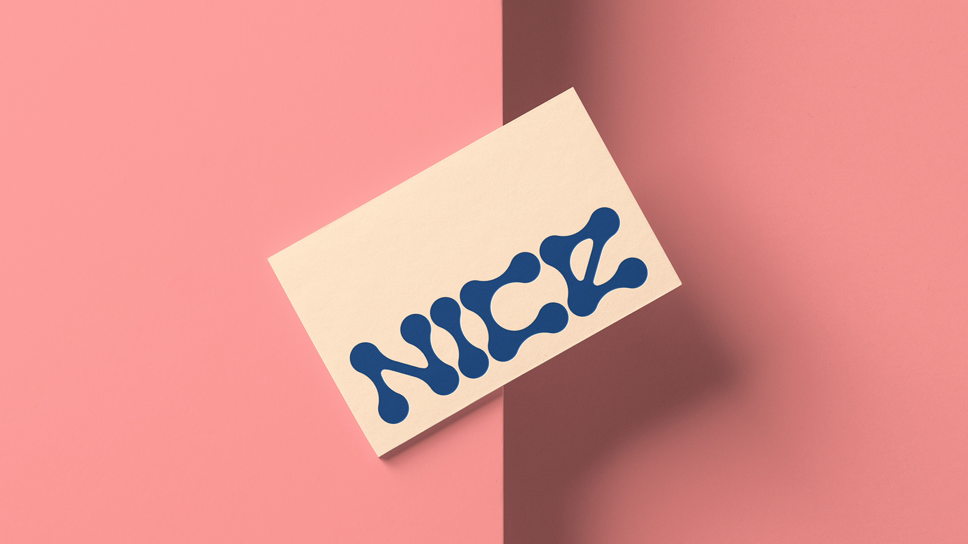
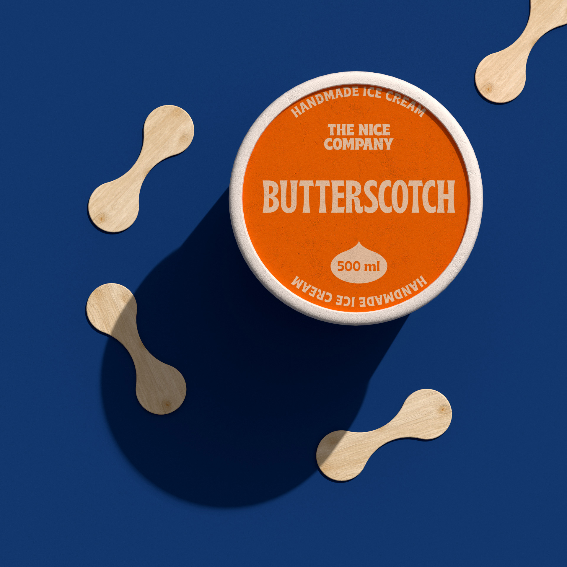
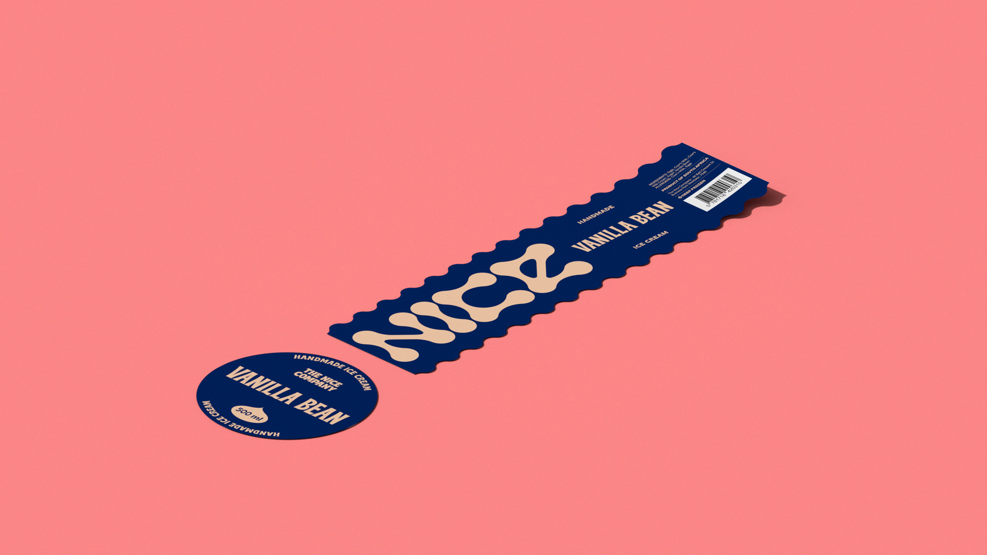
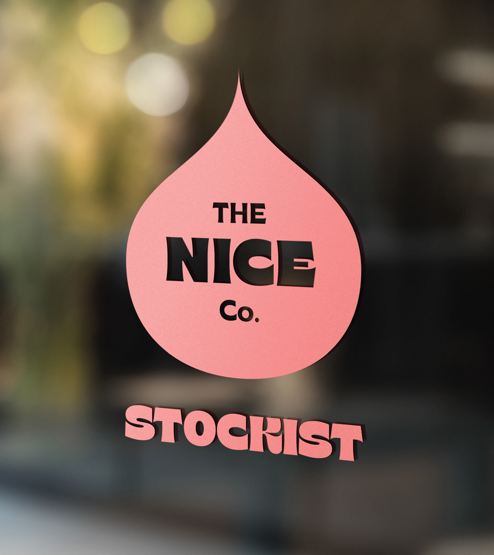
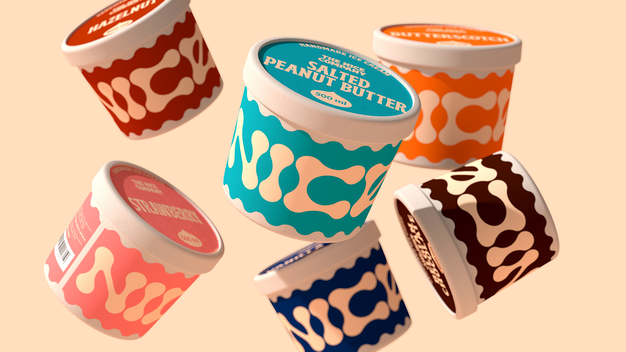
That got us thinking about the old school tubs with the stick included in the pack and found the shape to be the perfect foundation to build our logo type and bring in a classic ice cream reference.
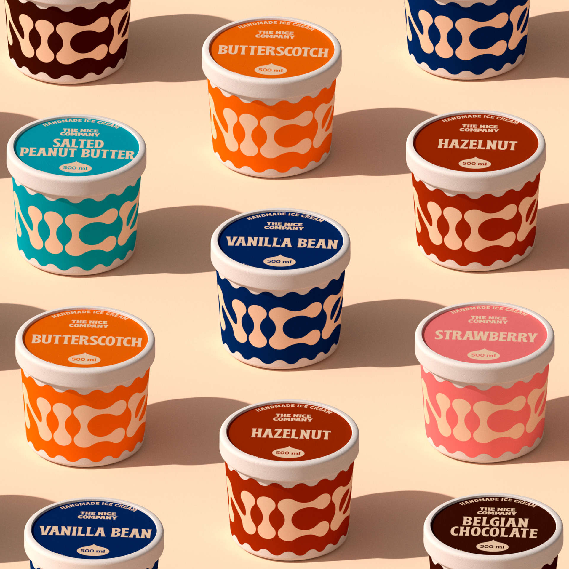
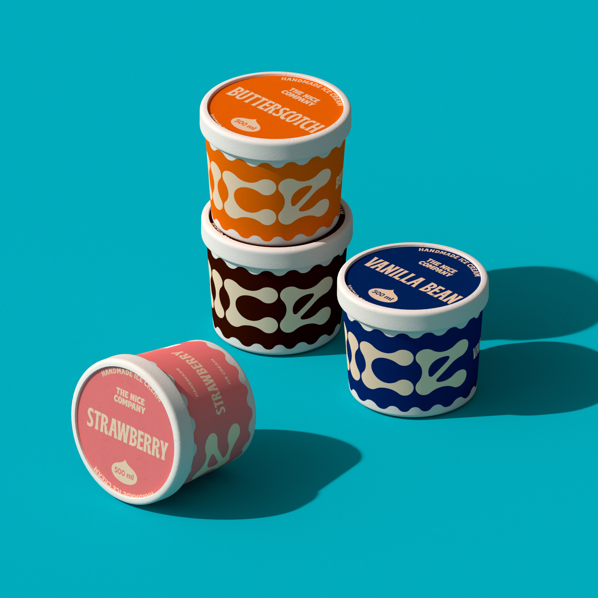
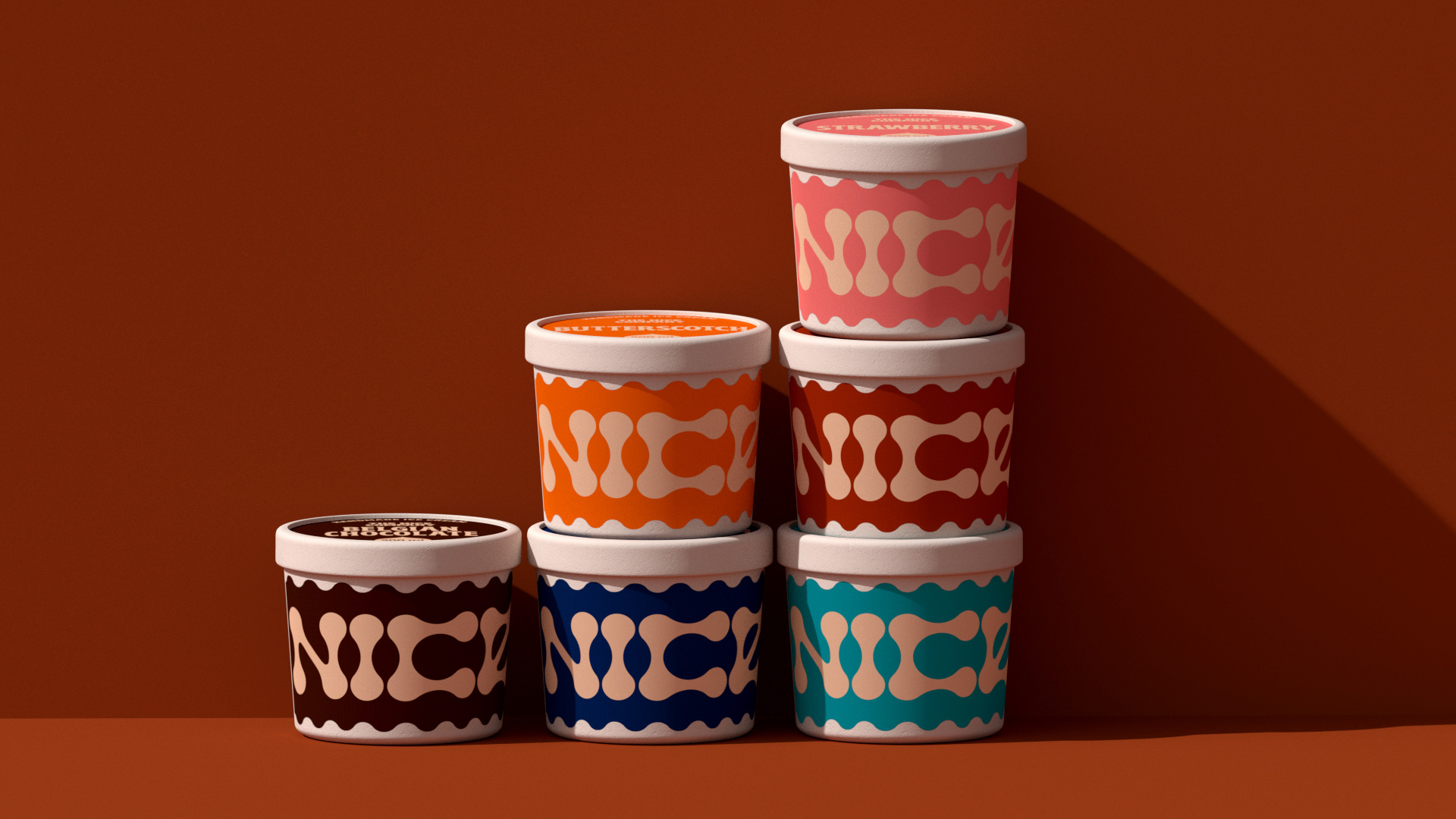
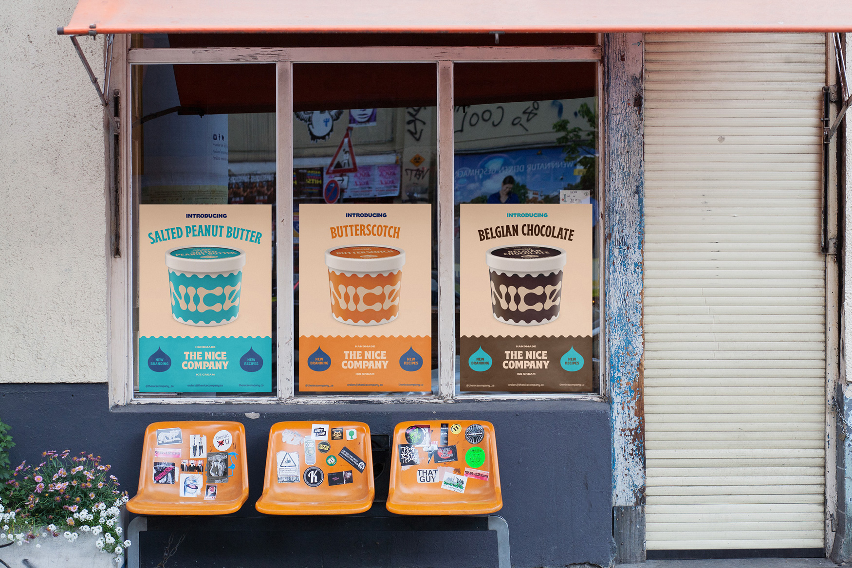
One obstacle was the fact we needed to produce labels as we could not print directly onto the pack. The main hurdle was to cover as much of the pack as possible with the label to bring in the strong colour and brand presence but at the same time we thought we could use the label as a design asset. After developing the logo we decided to use the same wooden spoon shape to use as a die cut for the labels which helped transform the standard tub and push the aesthetic we were after.
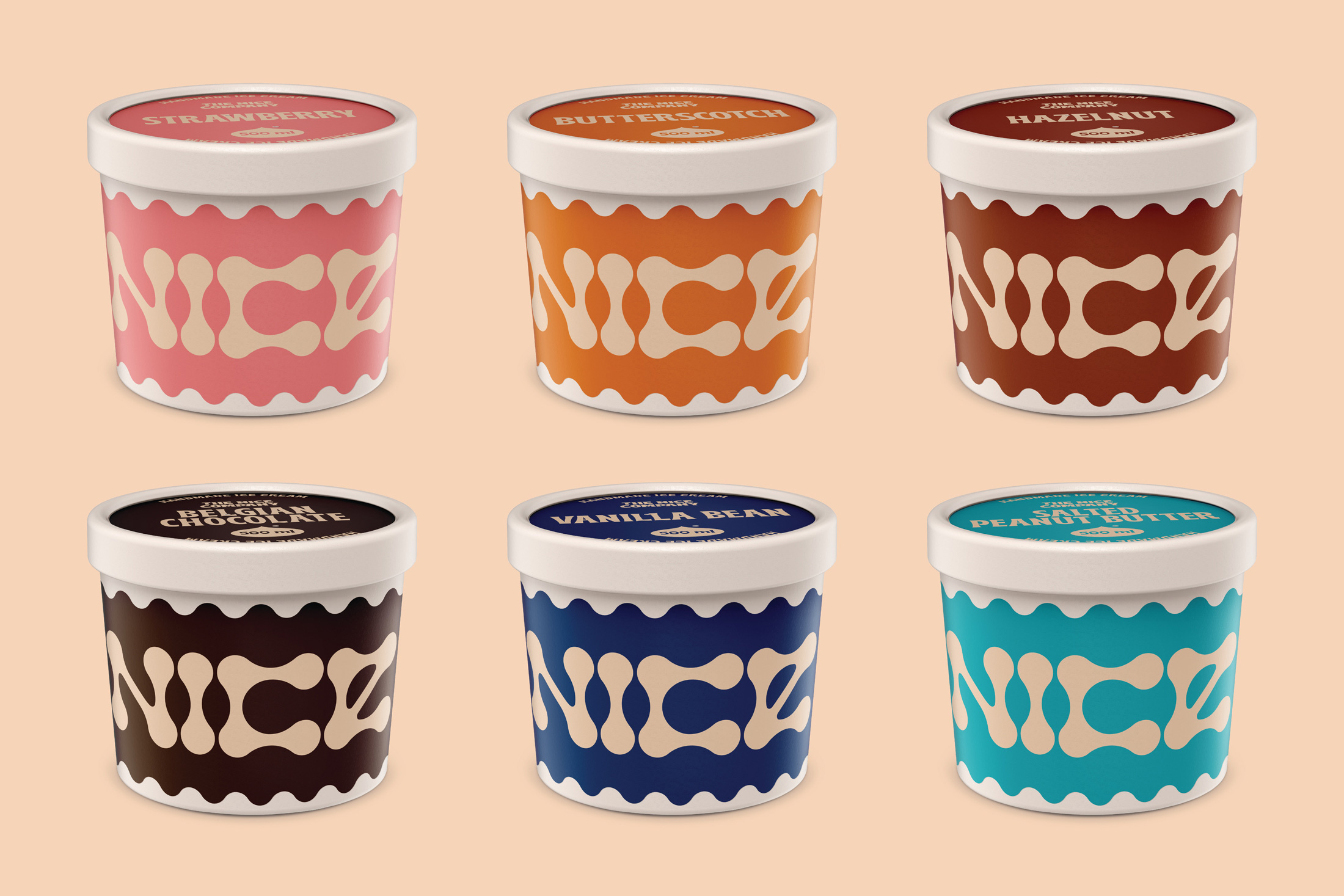
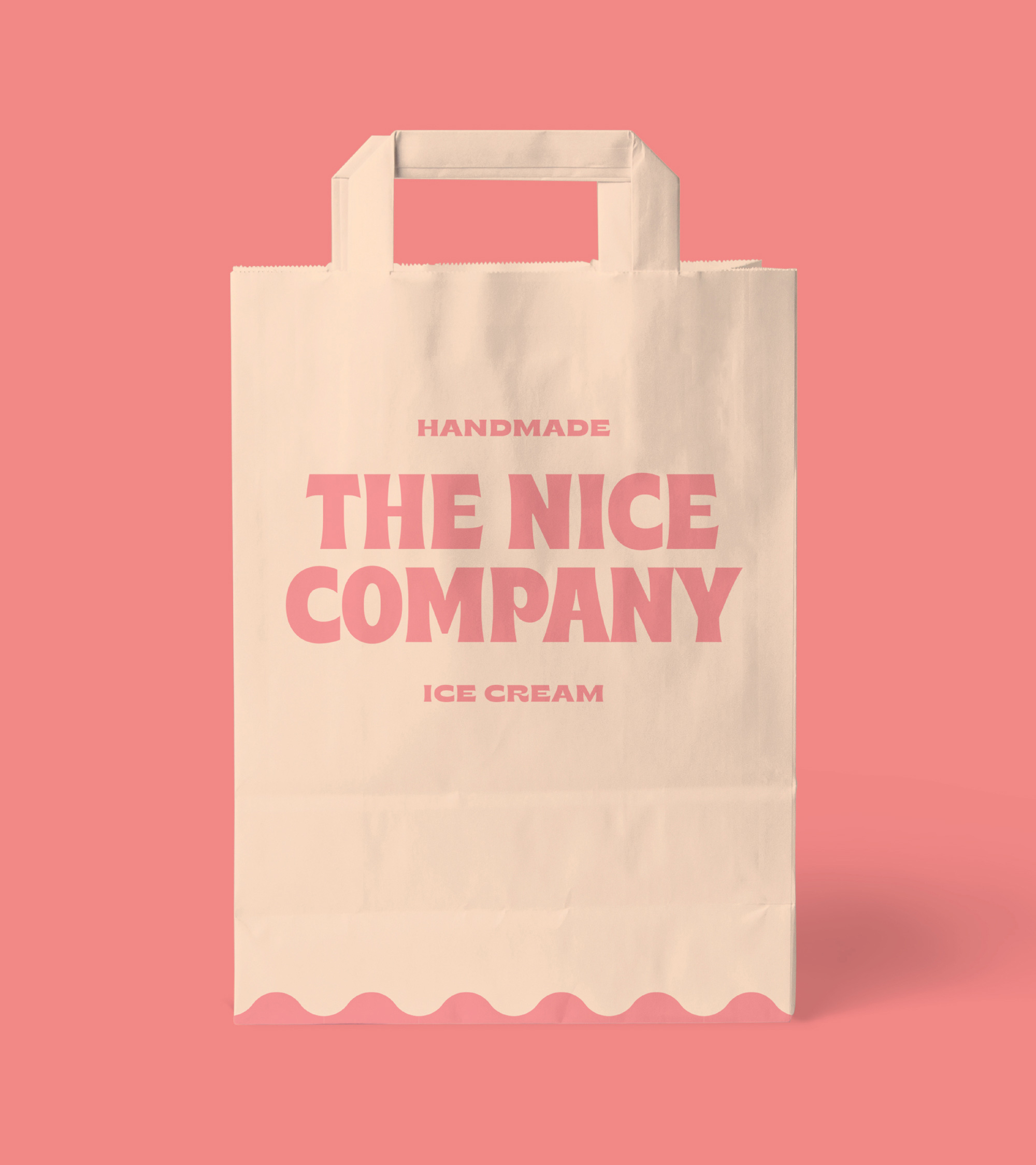
We knew that typography was going to be our hardest working asset as we needed to create a master label that could adapt to different flavours and multiply pack sizes. We chose a typeface that had a substantial family from narrow to wide as well as being playful and super legible. Then with regards to colour we wanted to be bright and bold but at the same time it needed to look appetising. We decided to use the cream colour as a base of all the lead information as milk/cream is the base of any ice cream flavour and that allowed us use full bleed on the labels for the flavour colours.
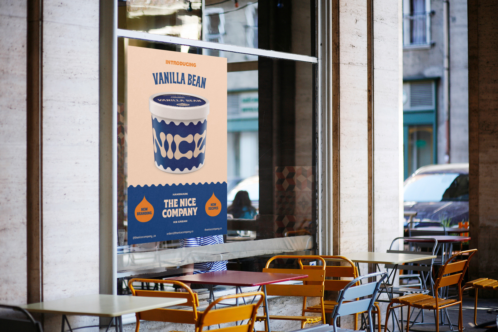
The Nice Company approached us to redesign the brand with a focus on the packaging. The brief was pretty simple,”, make it fun”. We remembered the fun day in our young of buying tubs of ice cream and eating them with the wooden spoon provided which got us thinking. We decided to design the brand wordmark using the shape of the old school wooden spoon and use it as the main element along with vibrant colors and reinforcing the type with a curved shape die-cut label.
Using a postmodern color scheme, predominantly with shades of bright blues, teals, and warm pink tones, was also a nostalgic tribute. The new branding is both fun and quirky, while maintaining a sense of the classic aspect of homemade ice cream the Nice Company stands for.
CREDIT
- Agency/Creative: Parners in Crime
- Article Title: Parners in Crime Ice Cream Brand and Packaging Design for The Nice Company
- Organisation/Entity: Agency, Published Commercial Design
- Project Type: Packaging
- Agency/Creative Country: South Africa
- Market Region: Africa
- Project Deliverables: Brand Architecture, Brand Identity, Branding, Packaging Design, Tone of Voice
- Format: Cup
- Substrate: Pulp Board


