


DiSimona is a brand that began in 2015, with the idea of creating a versatile product that facilitates the day-to-day life of its consumers.
This is how its founder created the master formula of artisan pasta to prepare from home. In the DiSimona product family, there are varied products of pasta and artisan sauces. All its products promise to be a quick and above all delicious lunch or dinner, which makes the brand a leader in the gastronomic market for homemade pasta.
Its packaging breaks the schemes of the traditional aesthetics of pasta on the market and captivates the target audience with a new and innovative way of seeing pasta.
Every detail generate a sense of harmony between each of its colors and shapes, obtaining as a result a friendly packaging that invites you to try the product.
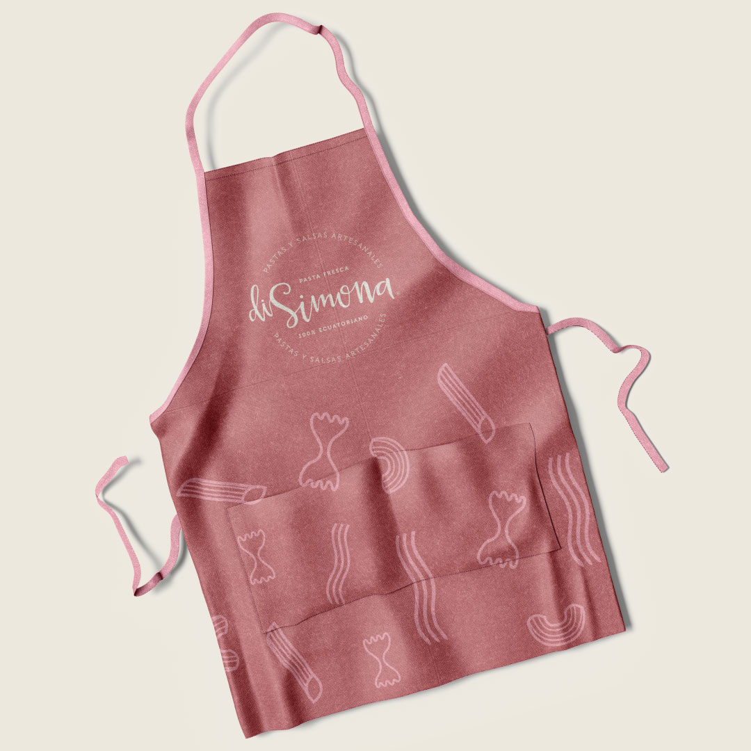
The illustrations that accompany DiSimona’s visual identity complement the fresh and friendly style of the proposed concept. For the illustrations we work on the best-selling products of the brand that provide a visual support.
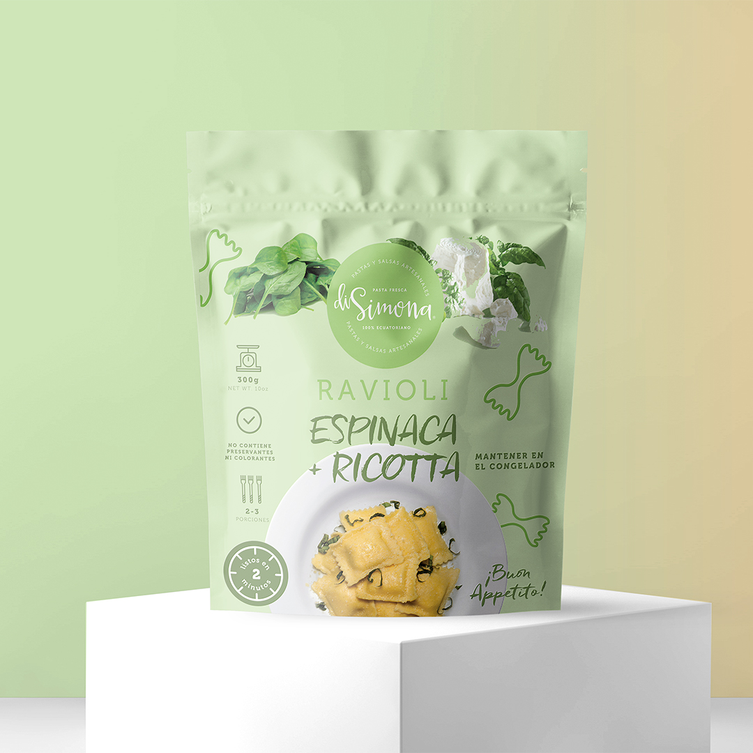
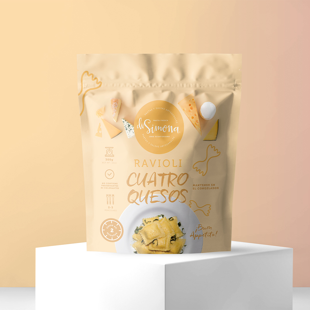
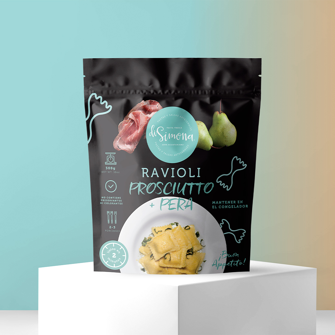
Ravioli packages contain differential colors that make the product stand out from other brands in the world of frozen pasta. All the elements used seek to reflect how easy it is to prepare the ravioli, with icons that facilitate the language of the brand and the preparation processes. Before trying it, and just seeing it already feels easy, it is striking for potential customers.
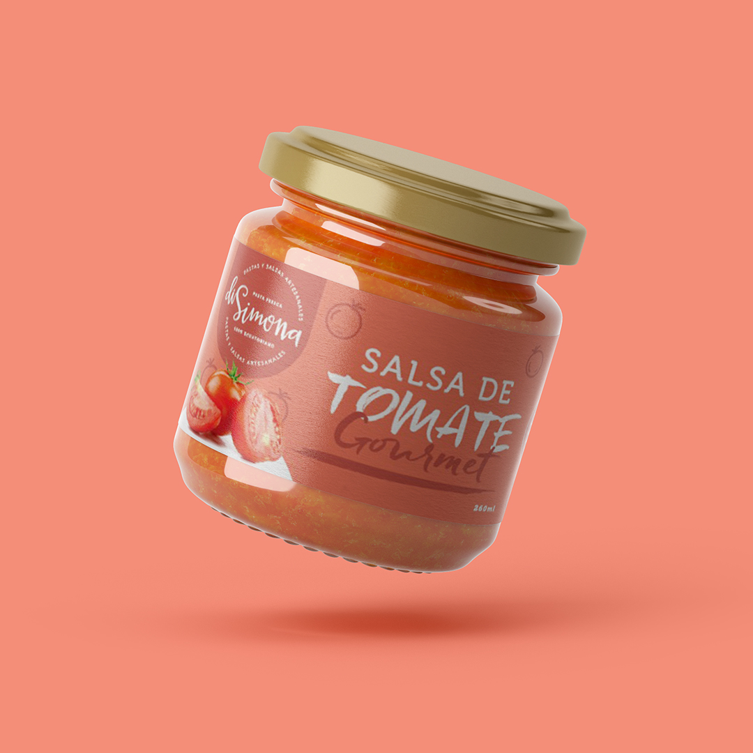
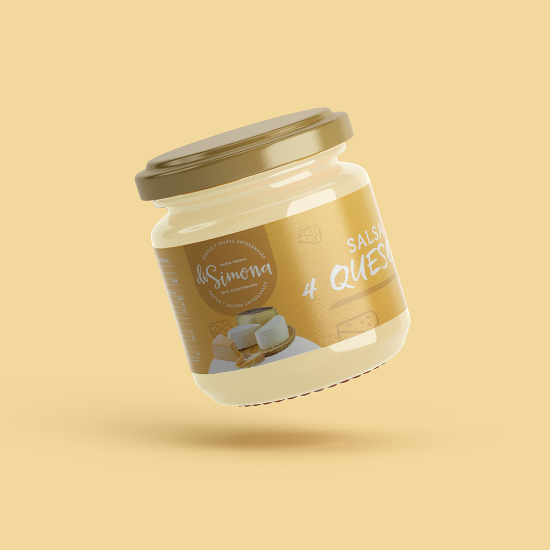
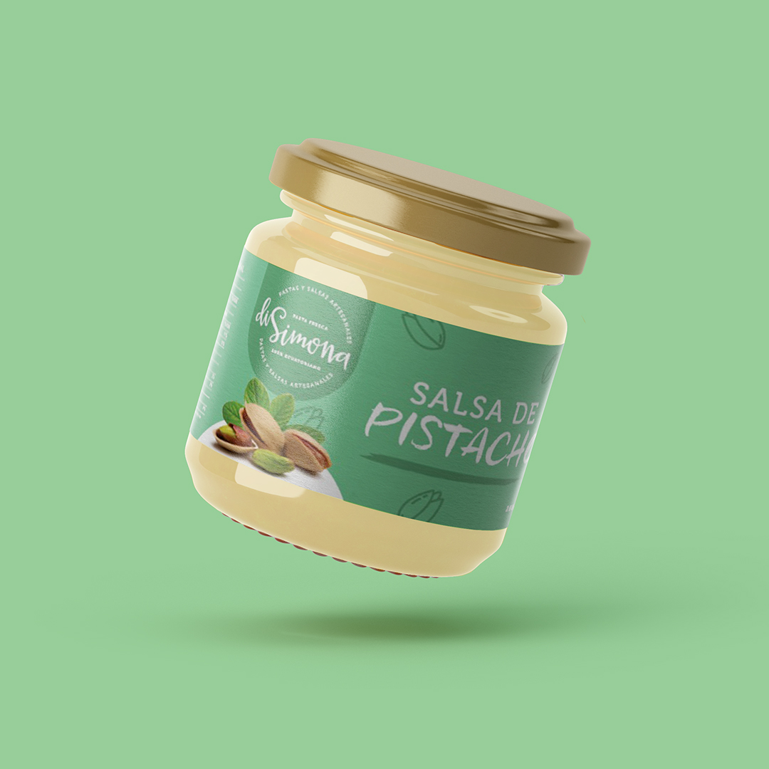
For the sauces that accompany the pasta the objective is to generate that link between artisanal and friendly, creating a unique universe for the brand. The bright colors of the labels represent the joy of accompanying your recipes with the unique flavor of pistachio, tomato and 4 cheeses. The sauces were placed in glass containers, this allows a better maintenance of the product. Each container has its label, differentiated by a color that indicates the differentiation of the flavor.
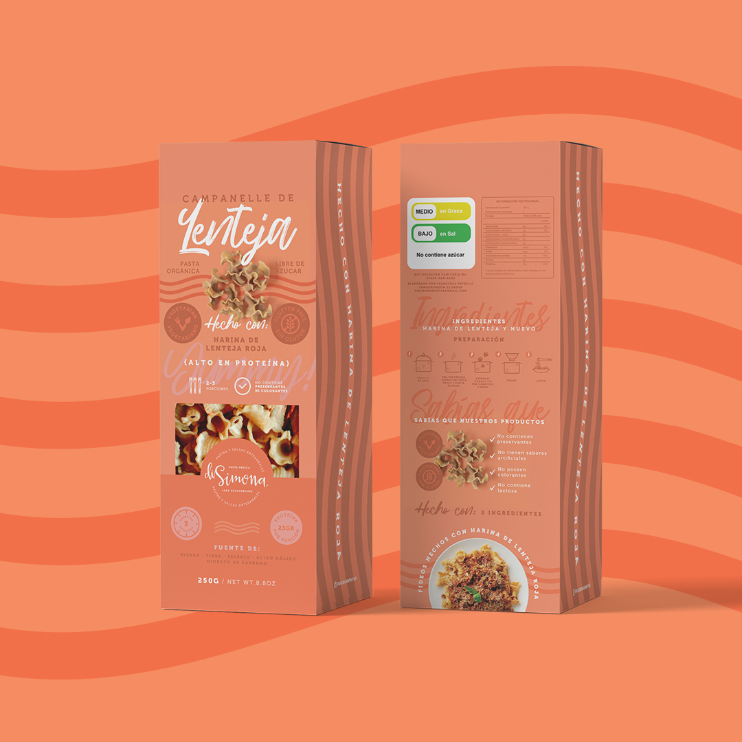
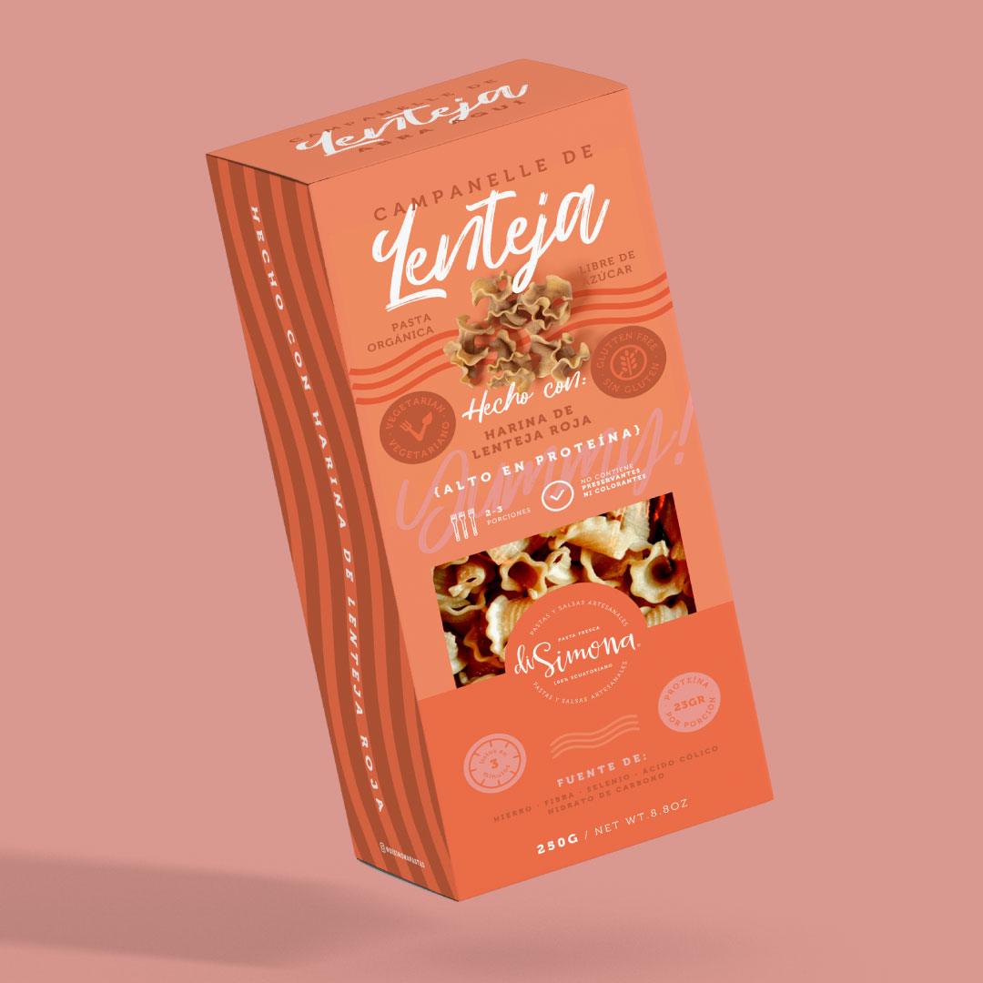
The packaging of the Campanelle pasta has abstract shapes / waves that are inspired by the finishes of campanelle. The color of the packaging refers to the semi-reddish color of the products made with lentils. The material used is a cardboard box since the product does not need refrigeration.
CREDIT
- Agency/Creative: Uva Studio
- Article Title: Packaging for DiSimona Artisan Pasta Family of Products Designed Uva Studio
- Organisation/Entity: Agency
- Project Type: Packaging
- Project Status: Published
- Agency/Creative Country: Ecuador
- Agency/Creative City: Uva Studio
- Market Region: South America
- Project Deliverables: Brand Design, Brand Identity, Branding, Logo Design, Packaging Design
- Format: Box, Jar, Pouch
- Substrate: Glass Jar, Plastic, Pulp Carton
- Industry: Food/Beverage
- Keywords: Pasta Ravioli Sauce
-
Credits:
Creative Director: Uva Studio


