


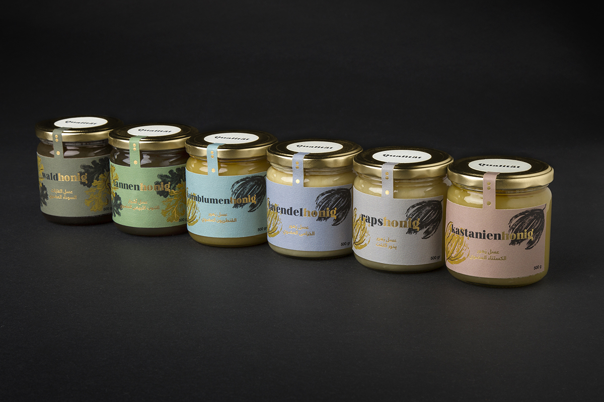
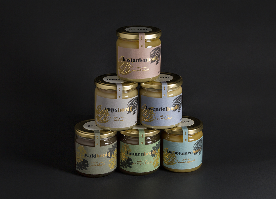
Qualität is a brand that belongs to the Dots and Drops group, based in Al Jubail (Saudi Arabia). This brand offers a careful selection of the best organic honeys from different German beekeepers, which are packaged and marketed under the Qüalitat brand in different cities in Saudi Arabia.
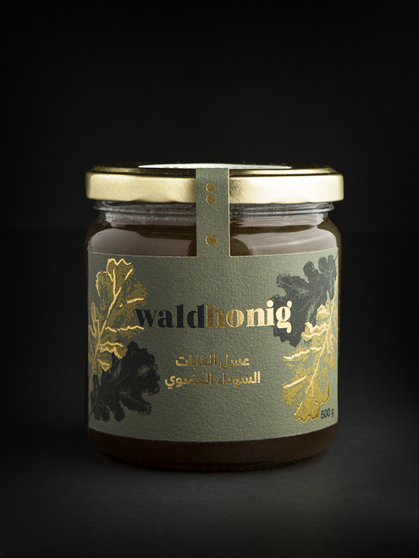
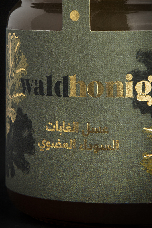
Designing the Qüalitat brand and packaging involves mixing visual cultures as different as European and Arabic. The dots present in the letters of its typeface, with their golden stamping, become the last drops of a jet of honey that step on the illustrations of an oak leaf or a flower petal, making a nod to the origin of the honey (flower or forest).
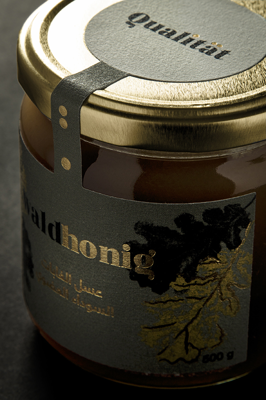
Regarding the adaptation of the brand to the packaging, we only worked on its labeling, that is, we did not have the opportunity to work on the glass jar. Therefore most of the visual communication of the packaging corresponds to the label.
Black and gold will act as the main colors of the brand. On the occasions that the gold can not be used or overshadows the design, a brown will replace it, being one of the tones that is perceived within the golds as the most elegant. At the same time, each new labeling will have a different color variant, in which the brand must be faithful to a range of desaturated colors that evoke calm and that are found in nature. These colors should have alow luminosity, so that they highlight the gleams of gold and balance with black ink so they do not have as much prominence as gold. The illustrations in the form of leaves or flowers will be differentiating elements of the type of honey in question, being generic for those of forest or those of flowers.
To emphasise the German origin of the product, the typography to be highlighted will be that of the German word while the Arabic will take a backseat in a simple and modern line typography that contrasts with the main one without taking away its protagonism. Also, in the names of the honeys we will highlight, whenever we can, with gold the “honig” playing with the black / gold contrast. The choice of the papers is also part of the communication of the brand. We will try to use papers with natural finishes, fleeing from plastics, transmitting the concepts of elegance and organic.
CREDIT
- Agency/Creative: Dmentes Estudio Creativo
- Article Title: Packaging Design for Honey Qualität Created by Dmentes Estudio Creativo
- Organisation/Entity: Agency, Published Commercial Design
- Project Type: Packaging
- Agency/Creative Country: Spain
- Market Region: Middle East
- Project Deliverables: Brand Creation, Brand Identity, Brand Redesign, Brand Refinement, Brand World, Branding, Graphic Design, Illustration, Packaging Design, Rebranding, Research
- Format: Jar
- Substrate: Glass Jar


