


The key problem with generic drugs is that they have no unique features and it is very difficult for a consumer to distinguish between products, while pharmacists find it hard to locate a particular drug at a warehouse, as products by different manufacturers have identical names. Meanwhile, the manufacturer often finds a large variety of drugs confusing and does not know how to package new products.
Our mission was to create a convenient packaging design system that would facilitate the following: Organise the entire portfolio of drugs that belong to different pharmacological classes; demonstrate a modern, patient-focused and best experience oriented approach to generics; use packaging to optimise the process of launching new drugs; differentiate a particular manufacturer among thousands of other medicines; gain practitioners’ loyalty; ensure navigation for pharmacists to enable easy drugs management.
Budget: The packaging must be budget-friendly since the premium on generics is low. The company produces 750 million pills and 87 million capsules annually, so the design system must be adaptive for thousands of SKUs. Brand relevance: The brand must communicate reliability and innovation. Target audience (consumer demographic / individuals / organisations). Its target audience is all people who look for optimally priced drugs, doctors who recommend, and pharmacists who sell.
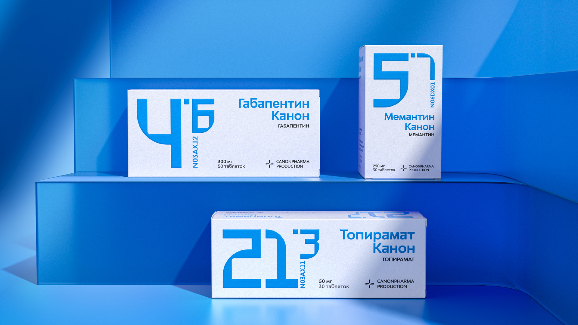
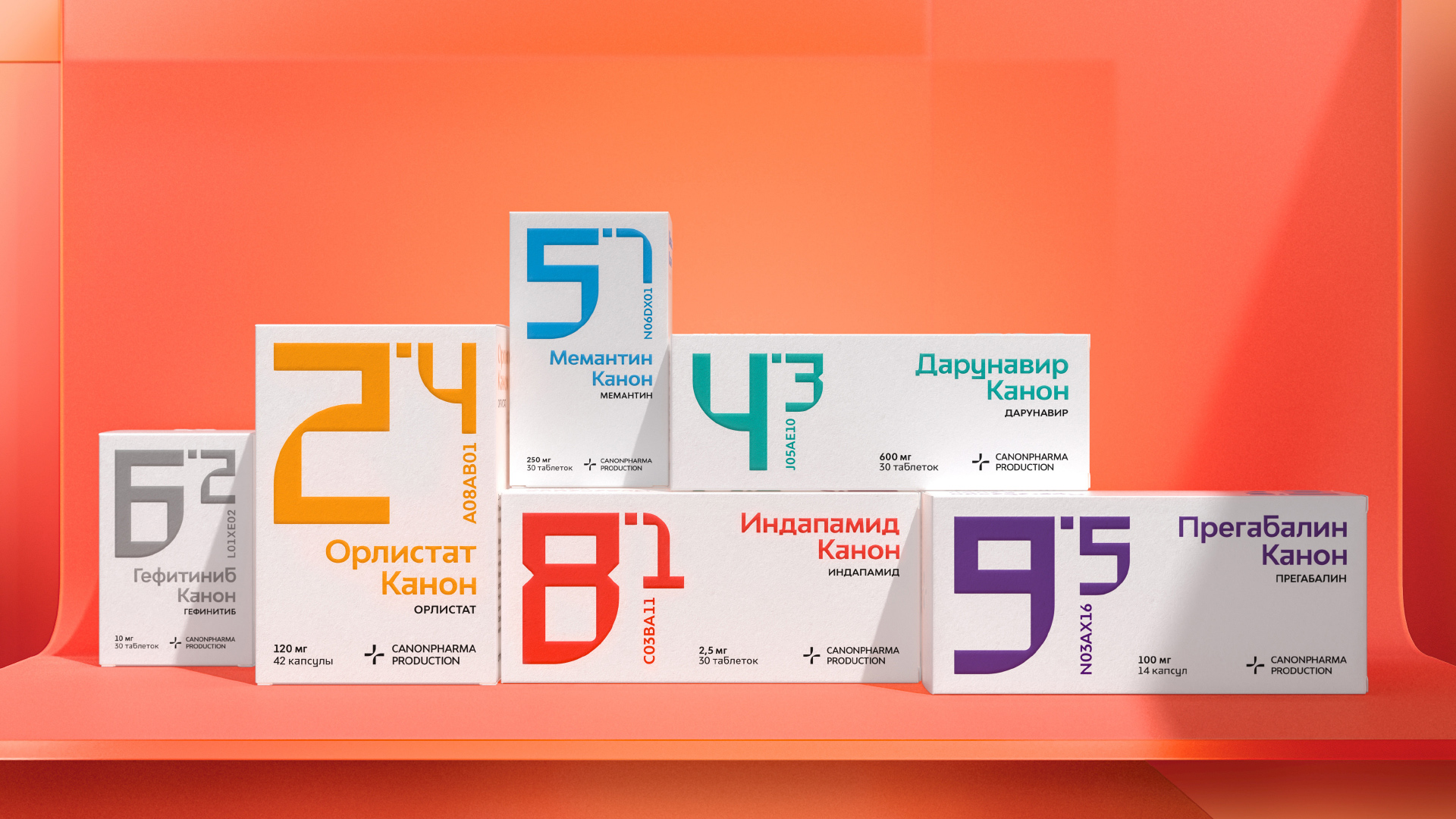
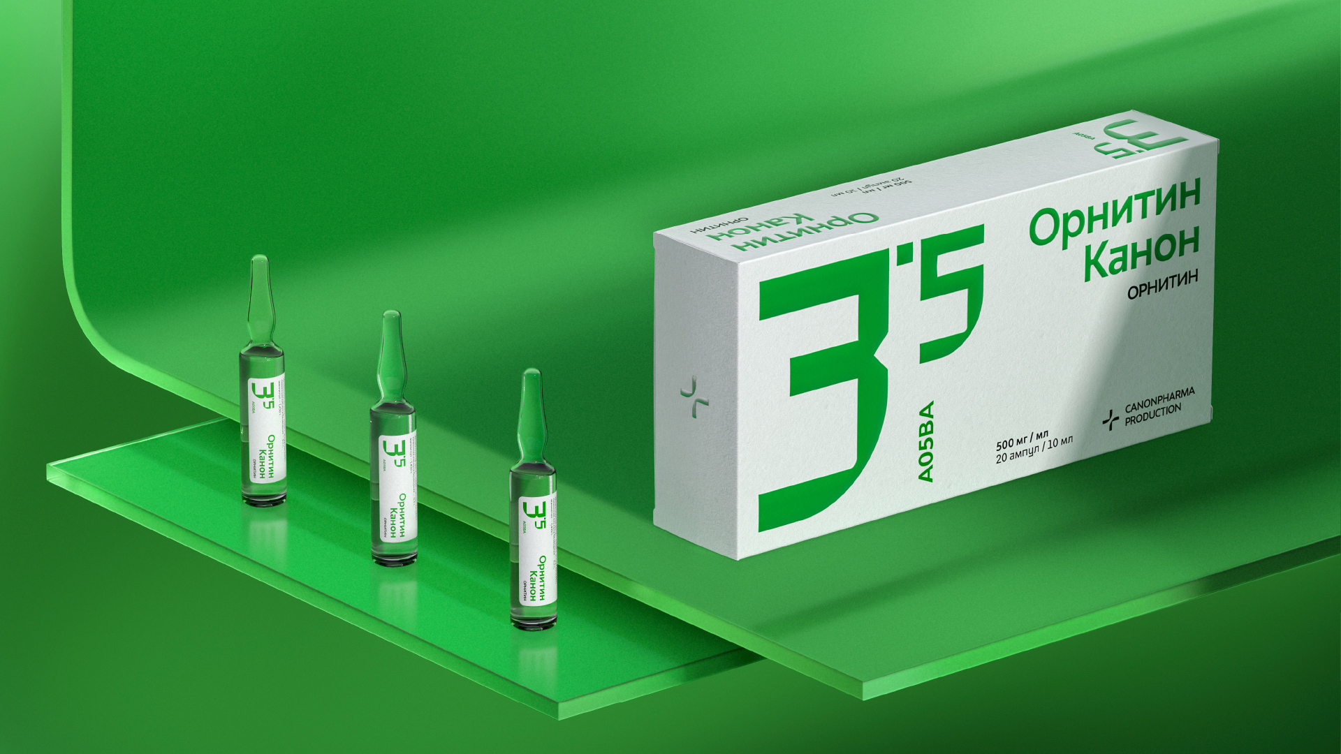
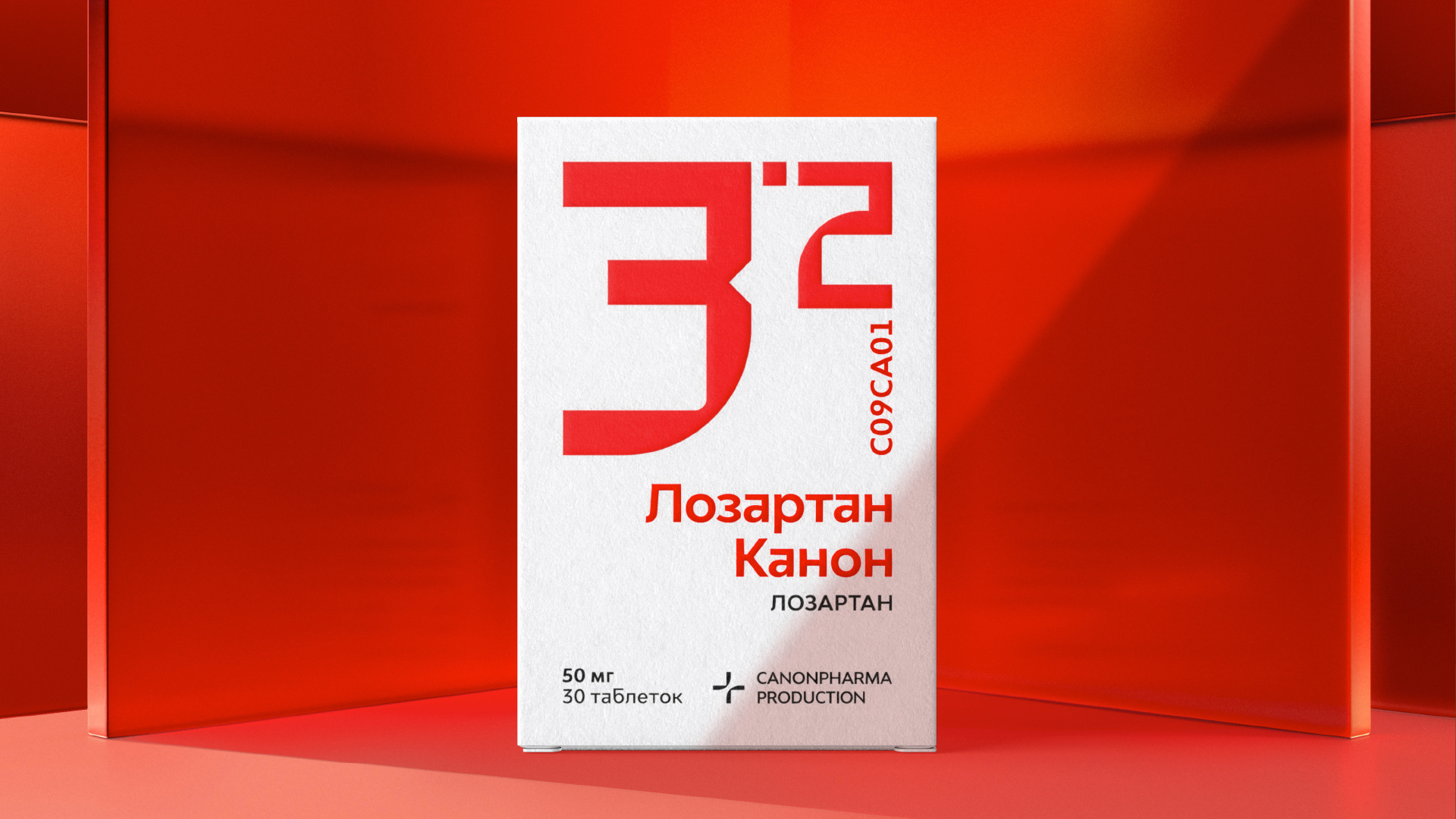
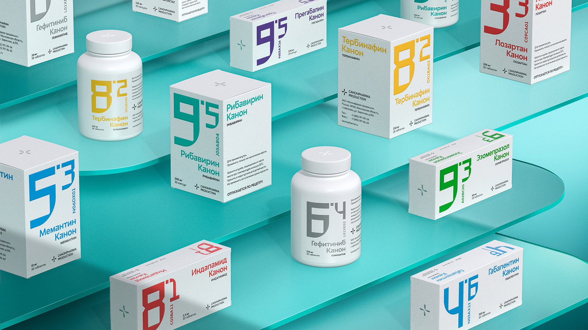
Creative Idea: We have developed a groundbreaking system that enables easy navigation among a multitude of drugs and dosages, based on colour-coding and numbering. We assigned a unique color to each pharmacological class and organized lists of all drugs within each class. The first digit stands for the drug number within the pharmacological class, while the second digit after the dot indicates the dosage. This way the patient can simply name the group and number to the pharmacist.
We paid great attention to the look of the digits so that these are clearly legible while bearing unique brand identification traits. Built on the contrast of hard and soft shapes, they reflect the idea of advanced technologies united with customer care.
Numbers and logo continue the legacy through rounded corners, while company typeface for drug names and the rest of the information translate the innovative feel of the packaging. Contrast and open colours facilitate easy recognition of various pharmacological classes. The boxes are made of pressboard and utilize only one additional colour on top of black, which significantly reduces packaging costs.
Results: Number-based system enabled the company to secure its own original method for organisation and branding of drugs; design solves a problem for patients who often struggle to remember drug names; pharmacists can easily find the necessary drugs; practitioners appreciate simple and convenient system and tend to recommend these drugs more often to their patients; design ensures savings on implementation and design costs for new drugs; the packaging helped unlock values of the company and emphasise its key mission – making modern drugs affordable for people. The design in this project has acquired its true meaning — it is discreet, and it does not distract from the essence while solving people’s problems.
CREDIT
- Agency/Creative: Repina branding
- Article Title: Packaging Design for All the Canonpharma’s Generic Drugs by Repina Branding
- Organisation/Entity: Agency, Published Commercial Design
- Project Type: Identity
- Agency/Creative Country: Russia
- Market Region: Multiple Regions
- Project Deliverables: Brand Strategy, Graphic Design, Packaging Design
- Industry: Health Care
- Keywords: Pharmacology, Medicine packaging


