


Being mighty is a New Zealand mindset, eating Be Mighty fuels that mindset.
New Zealand based Hubbards has a long history in creating new and exciting breakfast experiences. The well-known local brand has an extremely loyal following having been started by Dick Hubbard in his garage in the 1980’s – mixing the countries first mueslis with the help of a second-hand cement mixer. It always has, and always will be, a brand that invents, creates, pushes boundaries and disrupts. The new consumer trend of eating foods packed with good and sustainable energy provided Hubbards with an opportunity to enter a new breakfast category with a delicious range of granolas. Loaded with fibre and Low GI – Be Mighty meets consumers demands for foods that will power them through their day.
Having been involved with Hubbards since 2012, Onfire has been working with the Hubbards team revitalising the brand for the past year for the next stage of its journey. Evolving the iconic brand logo, creating a new flexible visual language and copywriting tone-of-voice, which can be applied across all of its product portfolio.
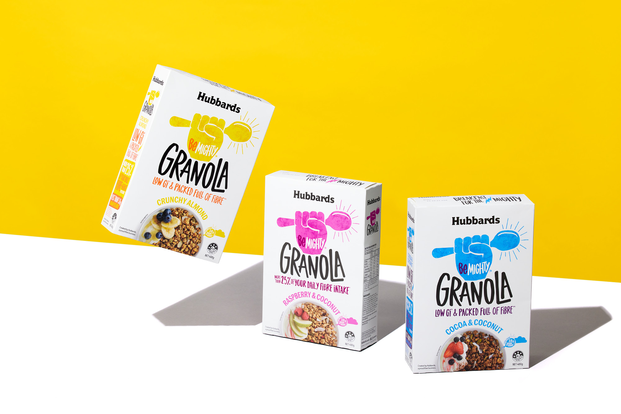
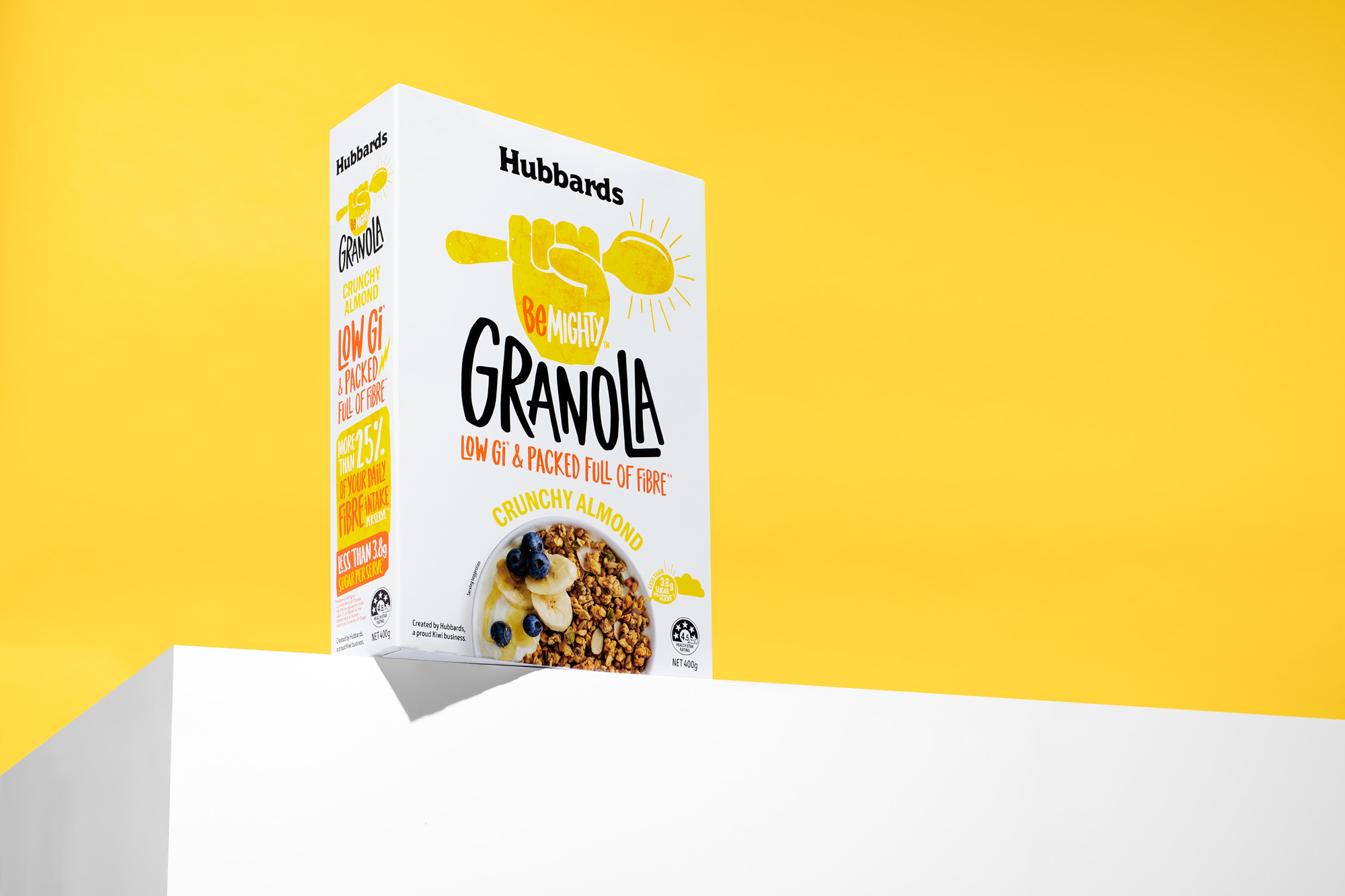
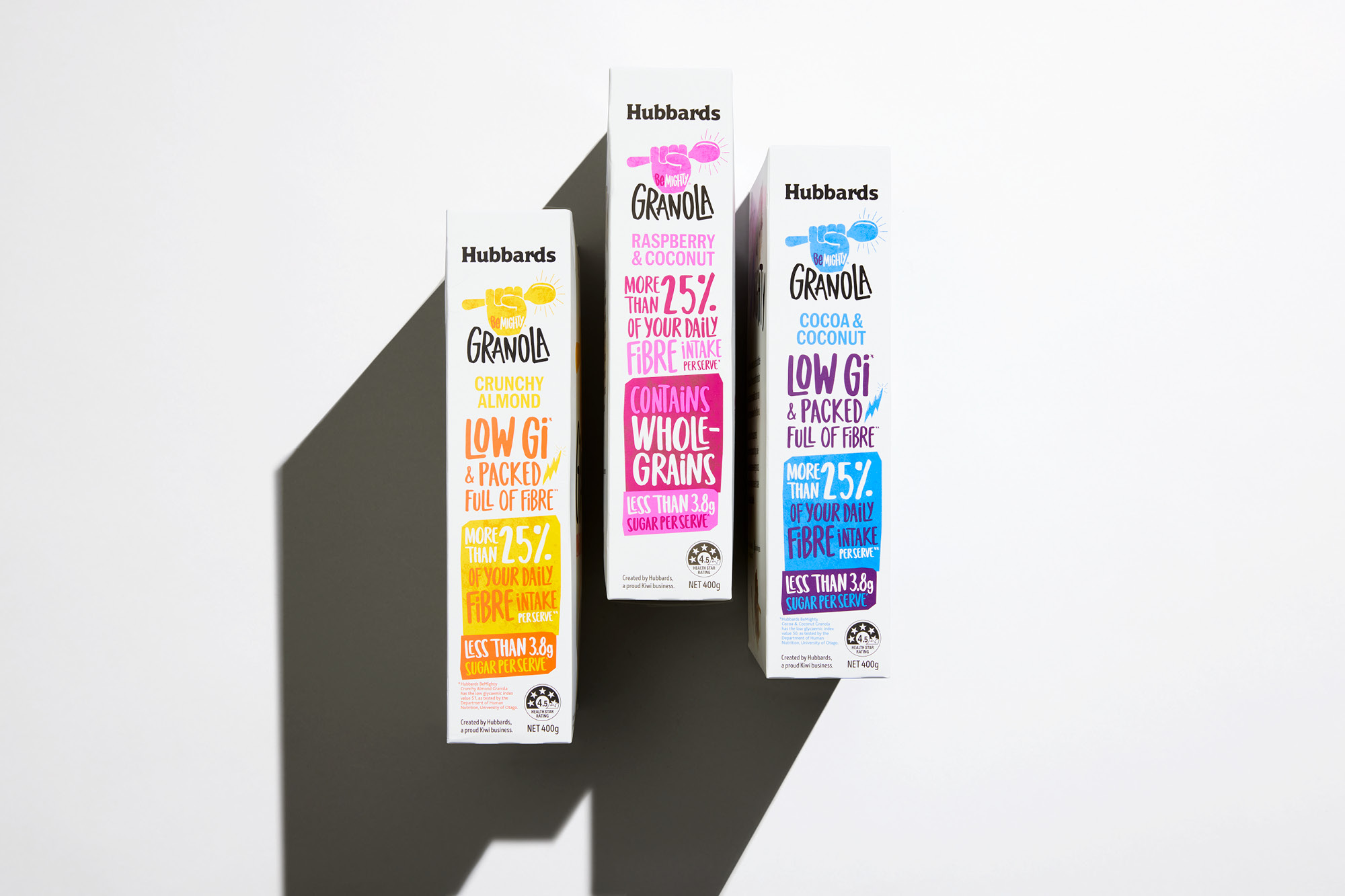
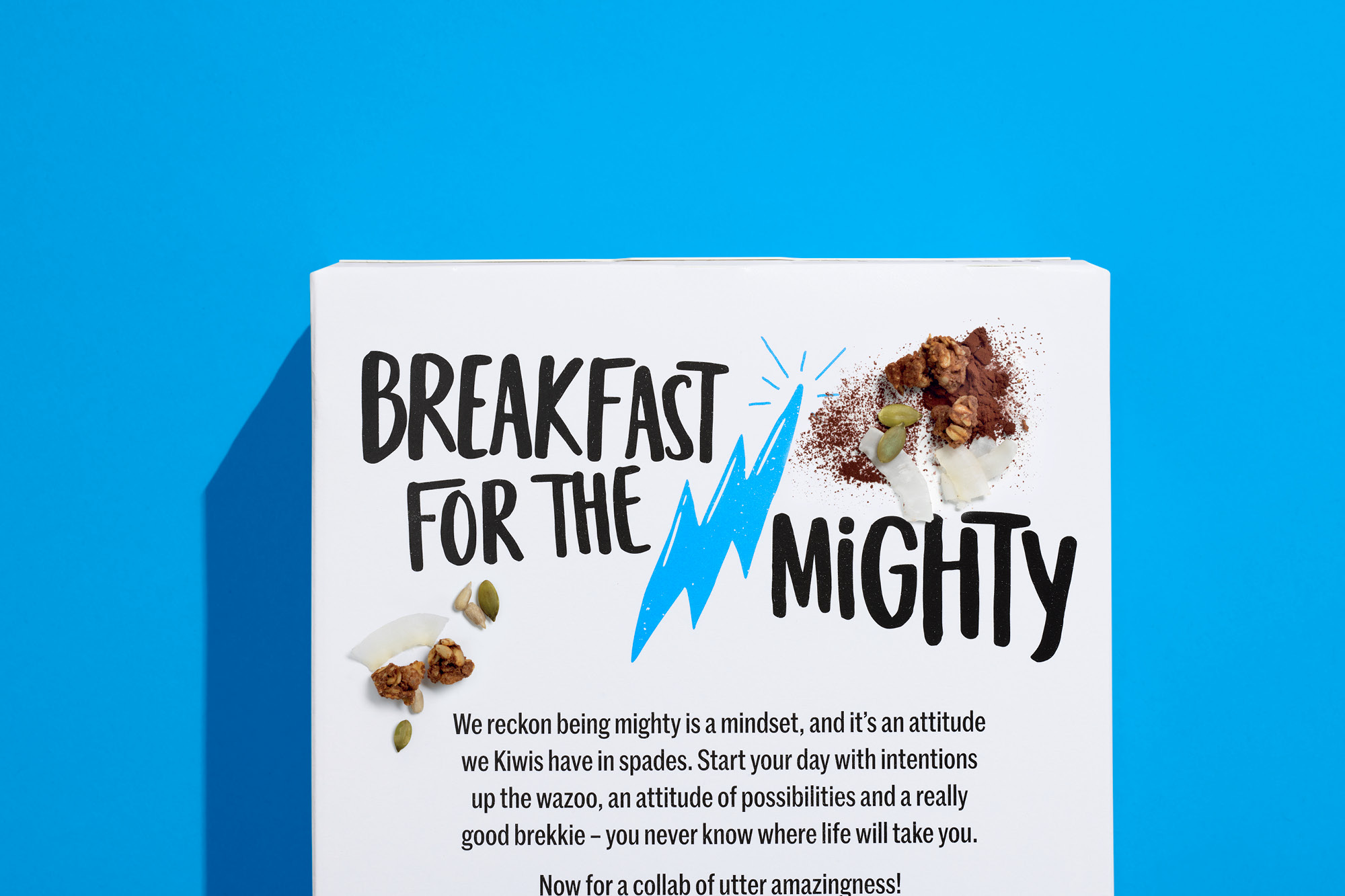
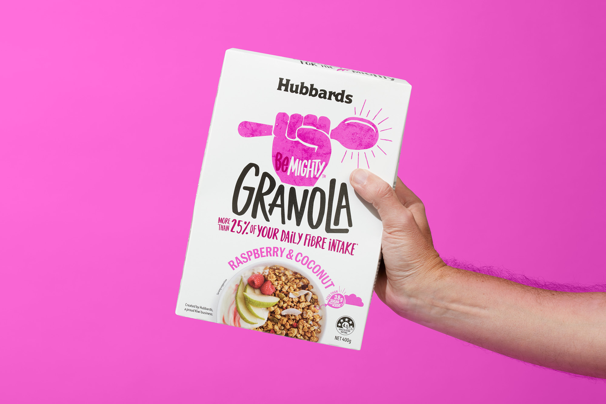
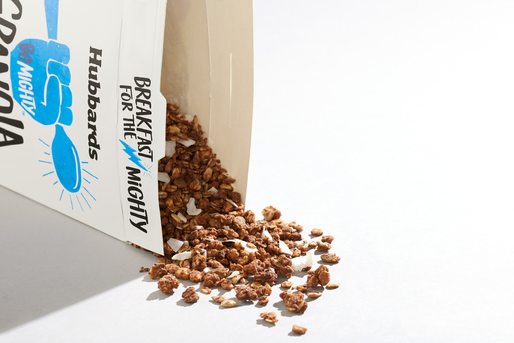
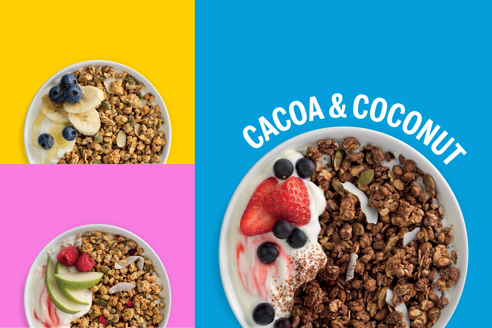
For Be Mighty, this new brand language was cranked up to the max to capture the energetic nature of this new range. A clean white pack emphasises the good energy contained within each variant. The dominant graphic is an unapologetically big, bold and brash pumped fist (of course holding a breakfast spoon) to underline the ‘hell yeah!’ product premise. Bright poppy colours disrupt on shelf and contrast starkly against incumbents more subdued colour palettes. The Onfire team created a range of hand-rendered expressive pieces that add to the energetic tone. Simultaneously, the back-of-pack copywriting is inspired by the positive thinking that created the range while being irreverent and fun. All these elements combine to create a vibrant proposition on-shelf, which is no retail wallflower.
BeMighty is defiantly optimistic. It shows that there is a way of putting great natural sustaining energy in, without all the nasties of the usual choices. With Hubbards Be Mighty you can start your day with intentions up the wazoo!
CREDIT
- Agency/Creative: Onfire Design
- Article Title: Onfire Design Helps Hubbards Be Mighty. A Breakfast for the Mighty!
- Organisation/Entity: Agency, Published Commercial Design
- Project Type: Packaging
- Project Status: Published
- Agency/Creative Country: New Zealand
- Market Region: Oceania
- Project Deliverables: Brand Architecture, Brand Creation, Brand Naming, Brand World, Branding, Graphic Design, Illustration, Packaging Design, Tone of Voice
- Format: Box
- Substrate: Pulp Carton
- Keywords: WBDS Agency Design Awards 2021/22


