


Wayward skincare is a logo design and branding project created by graphic designer Sean Quinn. It’s a self-initiated concept to explore designing within the growing market for men’s care products which is an industry previously unexplored in my work. The brand was designed for those who identify as men who are looking for a simple, reliable skincare routine from a brand whose values align with social and environmental justice. Wayward is committed to sustainably sourced and ethically grown ingredients and packaging with less impact. They believe in diversity, equity, and inclusion because that is how nature stays resilient. If you are looking to nourish your skin and the planet, Wayward skincare can help you do both.
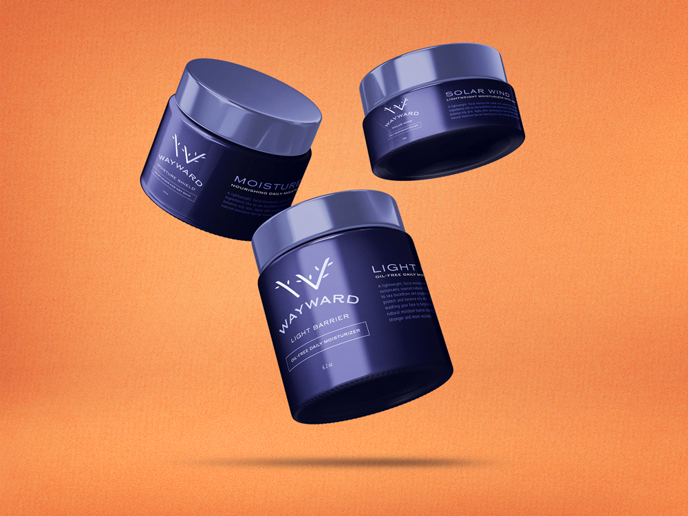
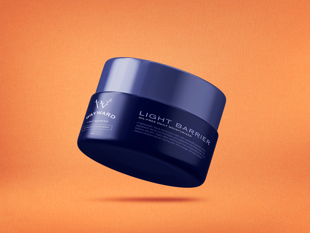
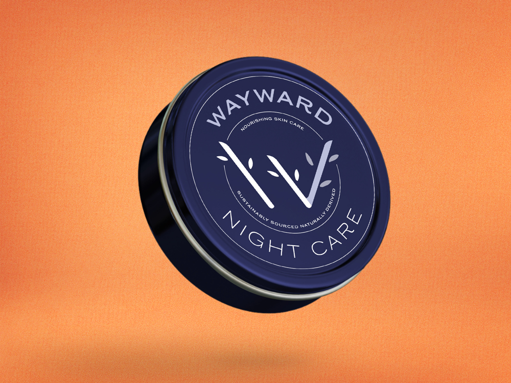
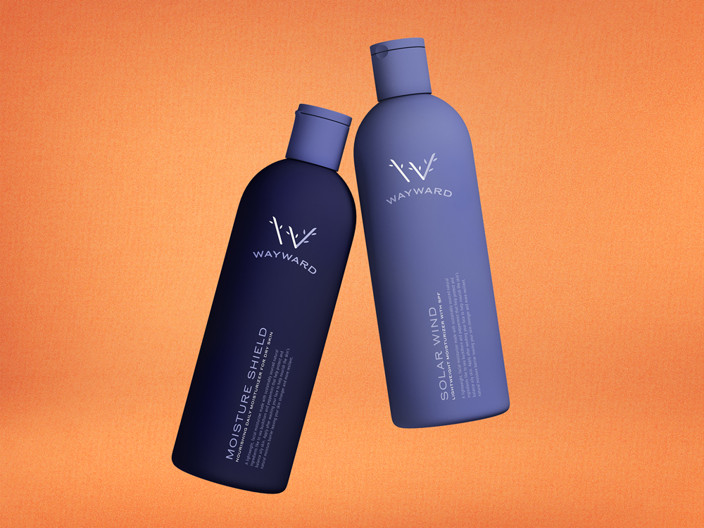
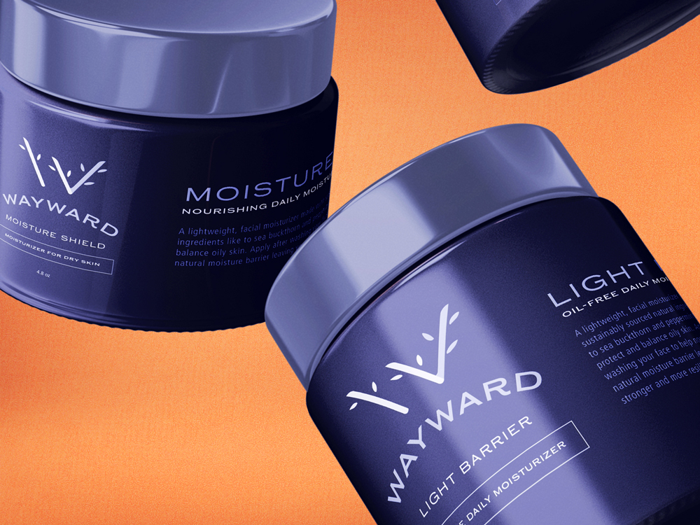
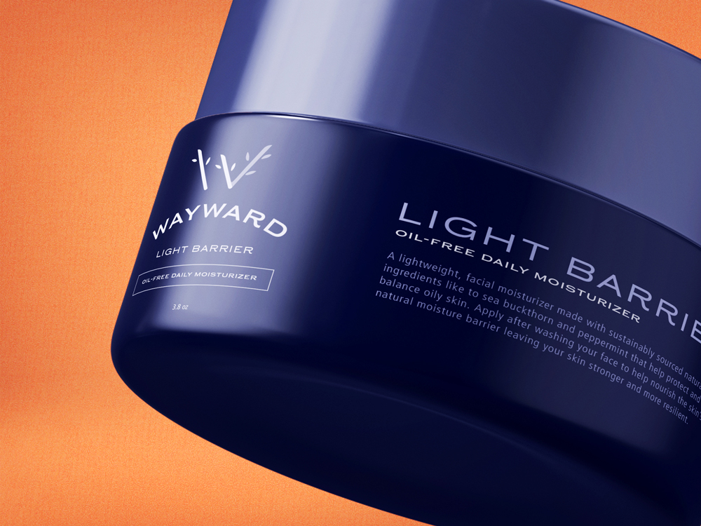
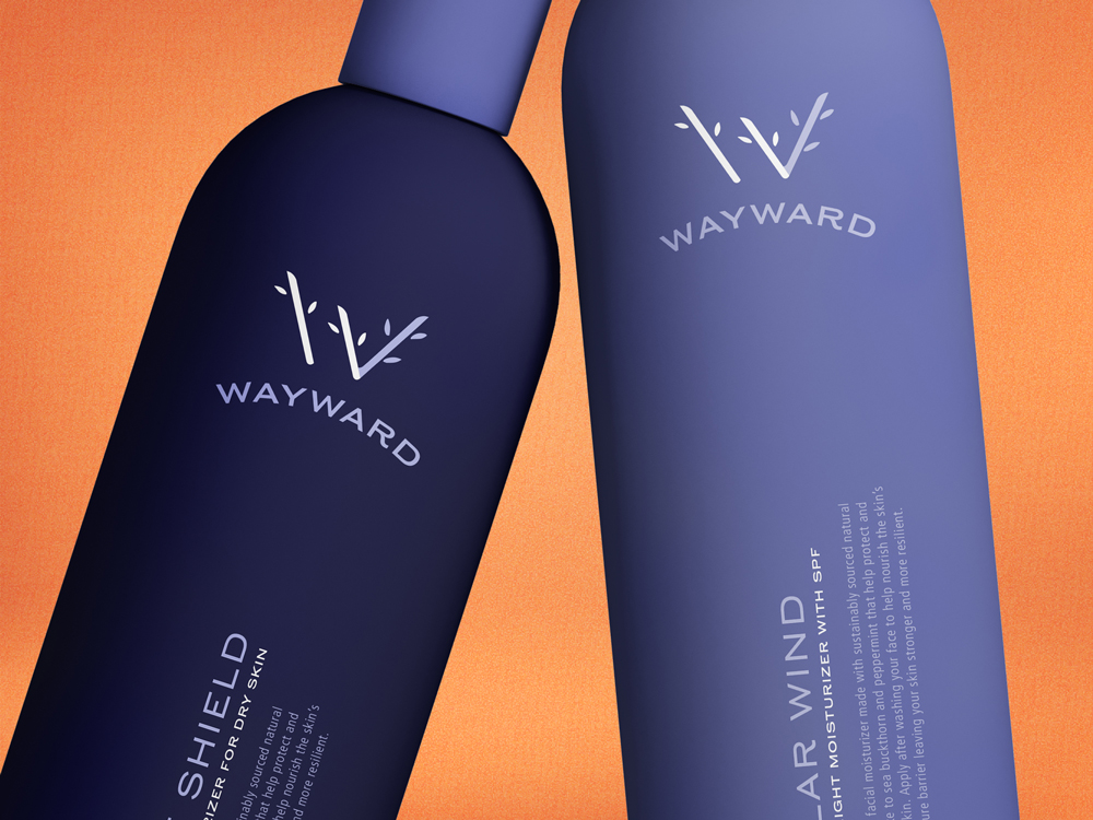
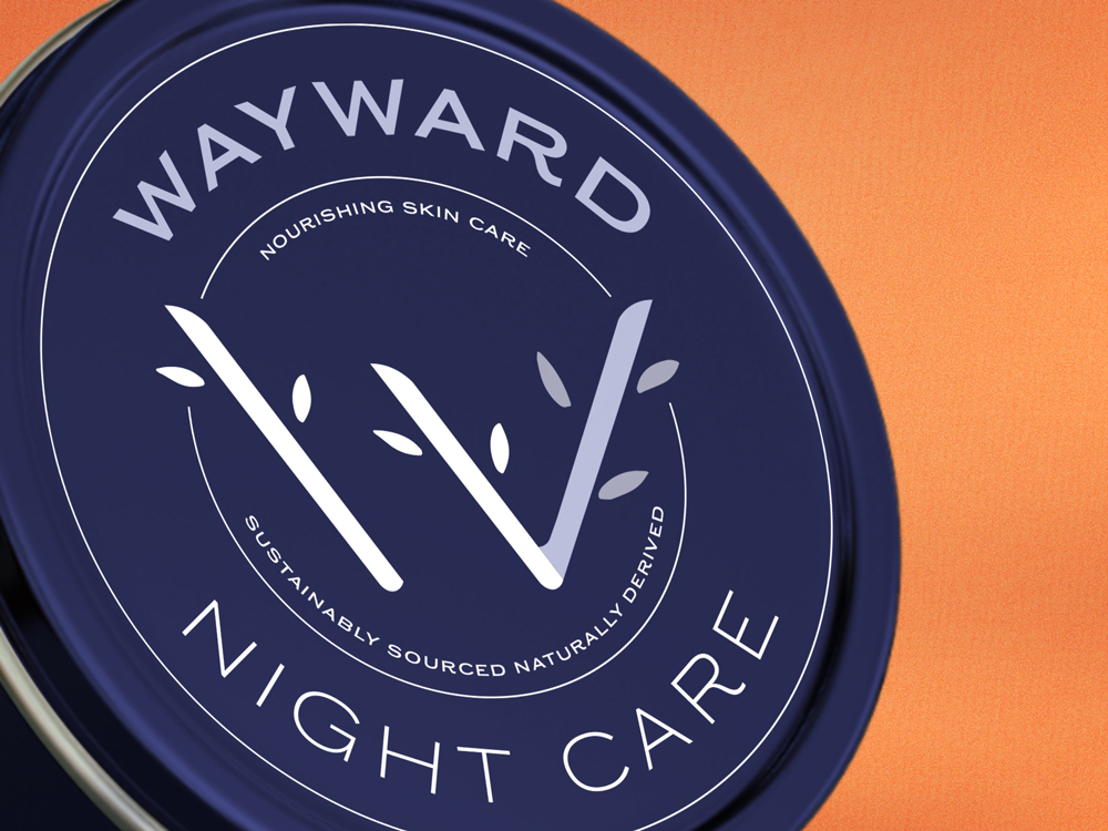
The logo for Wayward is a stylized “W” constructed from three diagonal lines. It was inspired by foliage, forest trails, and tree branches. The name itself comes from the third line in the logo which breaks the repetition and implied rhythm of the previous two resulting in a “wayward” branch. The branch motif is pushed further by the addition of small leaves that help soften the sharp lines while also giving the mark a touch of environmental context. Grounding the brand are the colors and personality of the packaging. They were designed to feel like they belonged in the crowded men’s care category while not relying on the black palettes that are most common. The rich indigo color used in the majority of the packaging helped to differentiate from the competition while still conveying an effective, premium product. The typography is clean and straightforward utilizing gentle arcs or curves to give movement to their forms on the various tins and jars.
The most challenging portion of the project was the logo design itself. Striking the right balance between a legible “w” that could convey the “wayward” idea with the repeated diagonal lines took many iterations. Some came across as a roman numeral four (IV) some lost the wayward concept altogether. Overall, I’m very happy with the result and would love to work on more projects outside my comfort zone like this!
CREDIT
- Agency/Creative: Sean Quinn
- Article Title: Logo and Packaging Design for Sustainable Skincare Concept by Sean Quinn
- Organisation/Entity: Freelance, Non Published Concept Design
- Project Type: Packaging
- Agency/Creative Country: United States
- Market Region: Global
- Project Deliverables: Brand Creation, Brand Identity, Brand Naming, Branding, Graphic Design, Identity System, Packaging Design
- Format: Bottle, Jar, Tin
- Substrate: Plastic


