


The client required Branding and Packaging with name studies for the hand-poured candles. From brand mission to mood board, the client was very specific with their preference of colors, mood, and styling. The brand logo needed to be cohesive with the products elements, and colour and typography had to work seamlessly with the collaterals and applications.
The brand had a very strong connection with supporting local resources and Philippine-made products. To provide all-natural, sustainable, and environmentally-friendly products and well as promote aromatherapy and holistic health through purposefully hand-crafted products.
Initial logo concept took inspiration from the Philippine flag’s iconic sun and three stars, Lokal highlights the brand’s mission to support the Philippine farming and coconut industry by sourcing all ingredients locally; from scents derived from indigenous flowers to candle wax made with local coconut oil. Everything is proudly Philippine-made.
The second concept, Liknang Kamay featured a hand presenting flame and light to communicate the brand’s mission to produce purposefully hand-crafted candles that promote aromatherapy, holistic health, clean living, and self care.
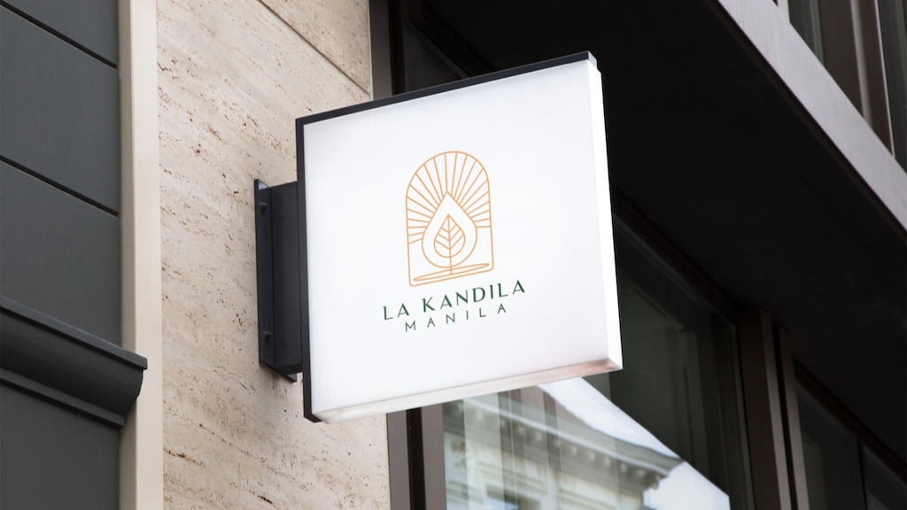
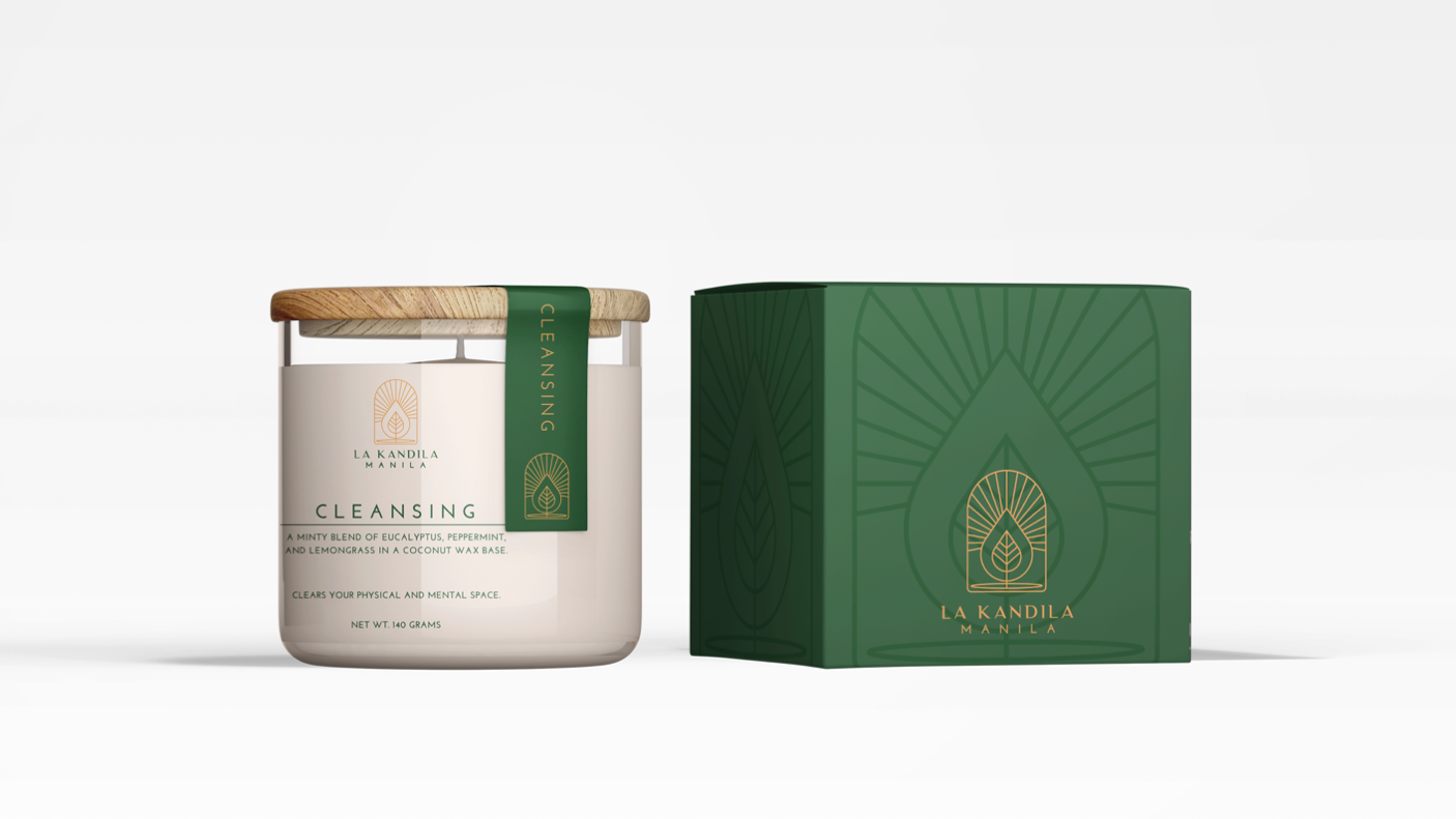
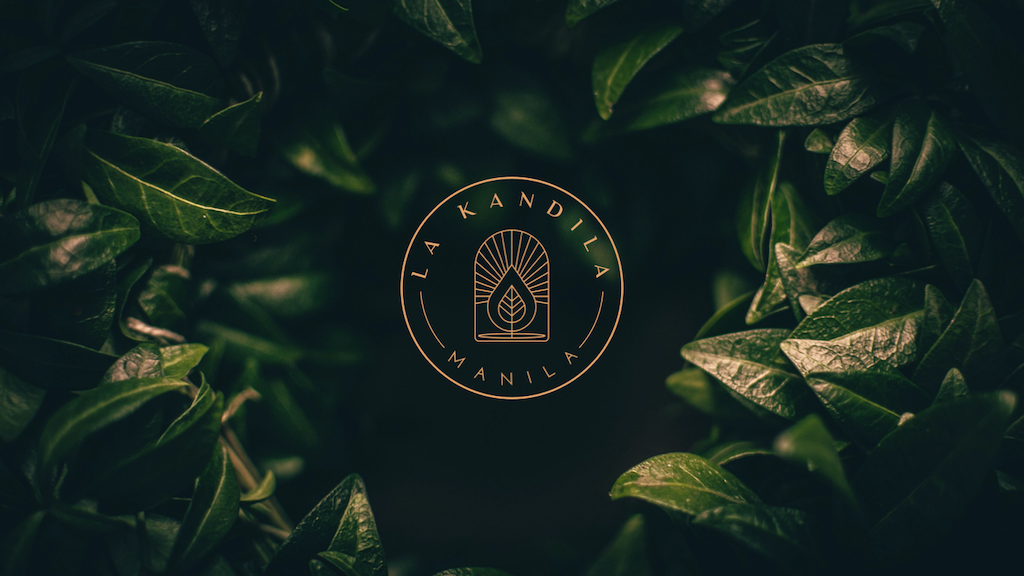
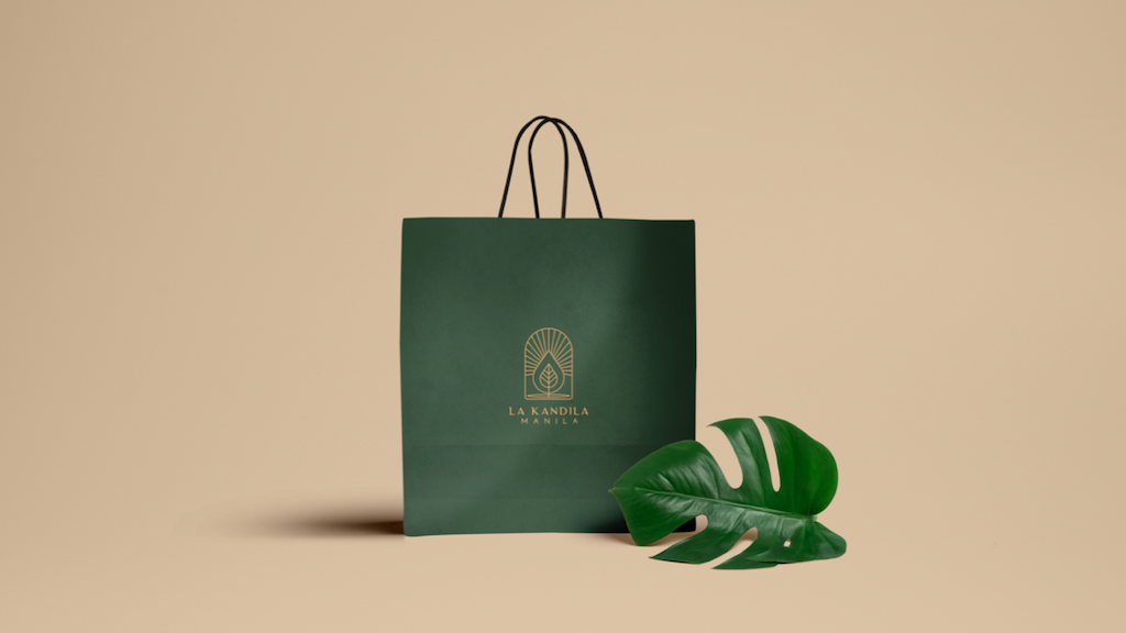
The chosen logo Kalikasan highlight the brand’s mission to protect nature by providing environmentally-friendly products, creating candles sourced from all-natural, vegan, and cruelty-free ingredients, and finally, presenting them in earth-friendly, plastic-free packaging. The main logo is a stacked layout of the logomark with the brand name always below. This should always be used for main packaging and collaterals.A variation of the logo was made into a seal to be used for secondary collaterals, such as social media, back labels or envelopes, as well as an icon for stand alone collaterals such as stickers, tags, and digital applications. Pantone colorway chosen were Formal Garden and Golden Nugget. Typography chosen were Luxia and Josephin Sans. Six labels total were designed for initial product launch. Front label: 6x6cm, clear sticker. Lid strip label: 1.5x8cm, green sticker. Bottom label: 5.5cm diameter, white sticker.

CREDIT
- Agency/Creative: Maricae Legazpi
- Article Title: Logo and Packaging Design for Local Hand-Poured Candles
- Organisation/Entity: Freelance, Published Commercial Design
- Project Type: Packaging
- Agency/Creative Country: Philippines
- Market Region: Asia
- Project Deliverables: Brand Creation, Brand Guidelines, Brand Identity, Brand Naming, Branding, Graphic Design, Illustration, Packaging Design, Research, Retail Brand Design
- Format: Box, Jar
- Substrate: Glass Jar, Pulp Carton


