


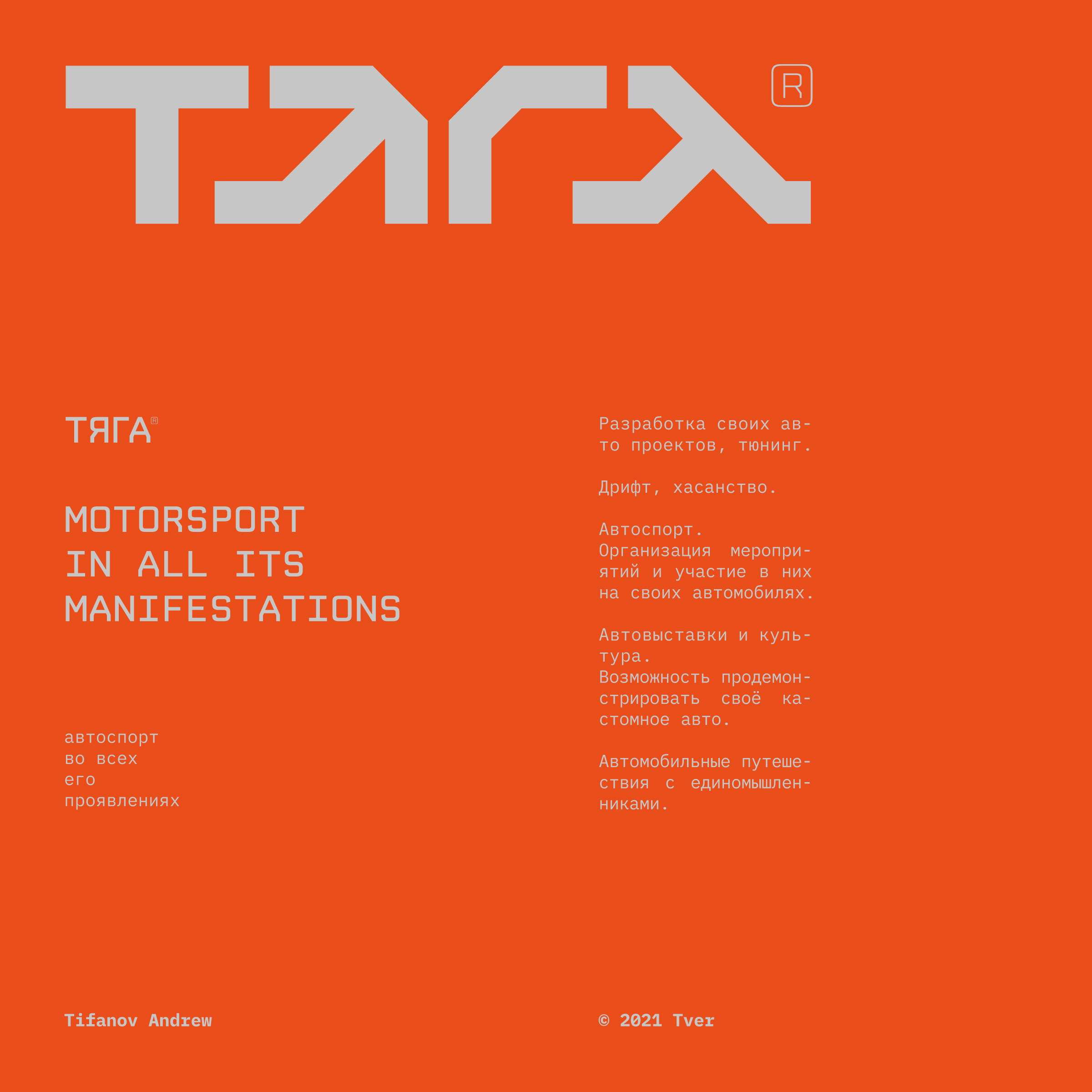
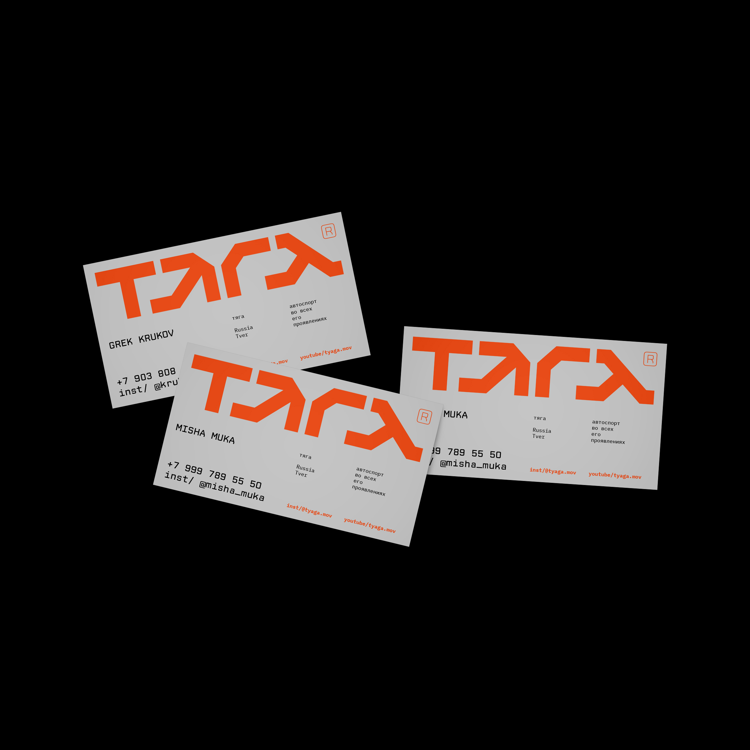
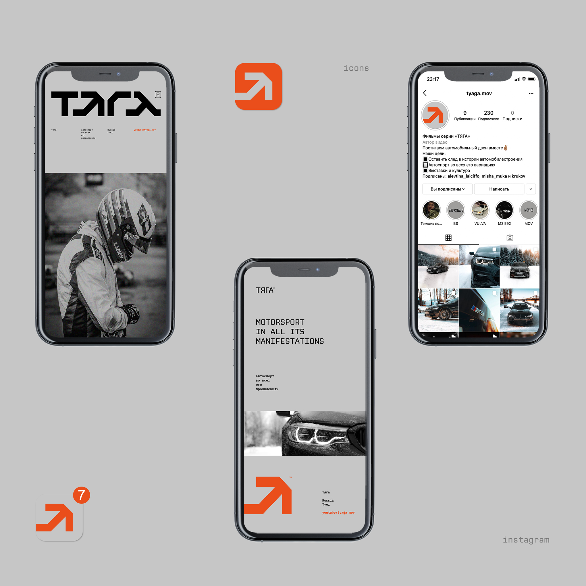
The PULL (ТЯГА) is a brand that was created from scratch. It’s a community of motorists. The name was also coined as part of this work. The name conveys power, engine operation, movement. The subsequent task was to develop a logo and a corporate identity system, which is to prove yourself and stand out from other brands in this industry.
The guys are developing their own auto projects and tuning. They drift cool and videotape it. Organize sports events where participants perform on their cars. Auto shows with the ability to showcase your car. They also have plans to create their own video blog on the topic of road travel.
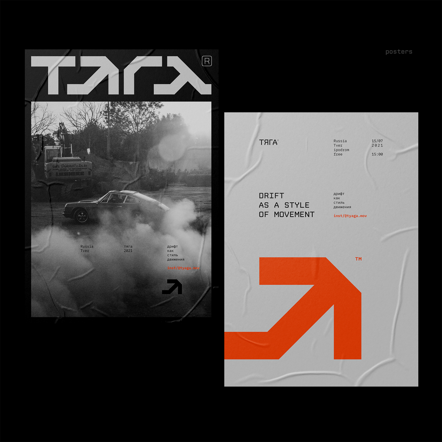
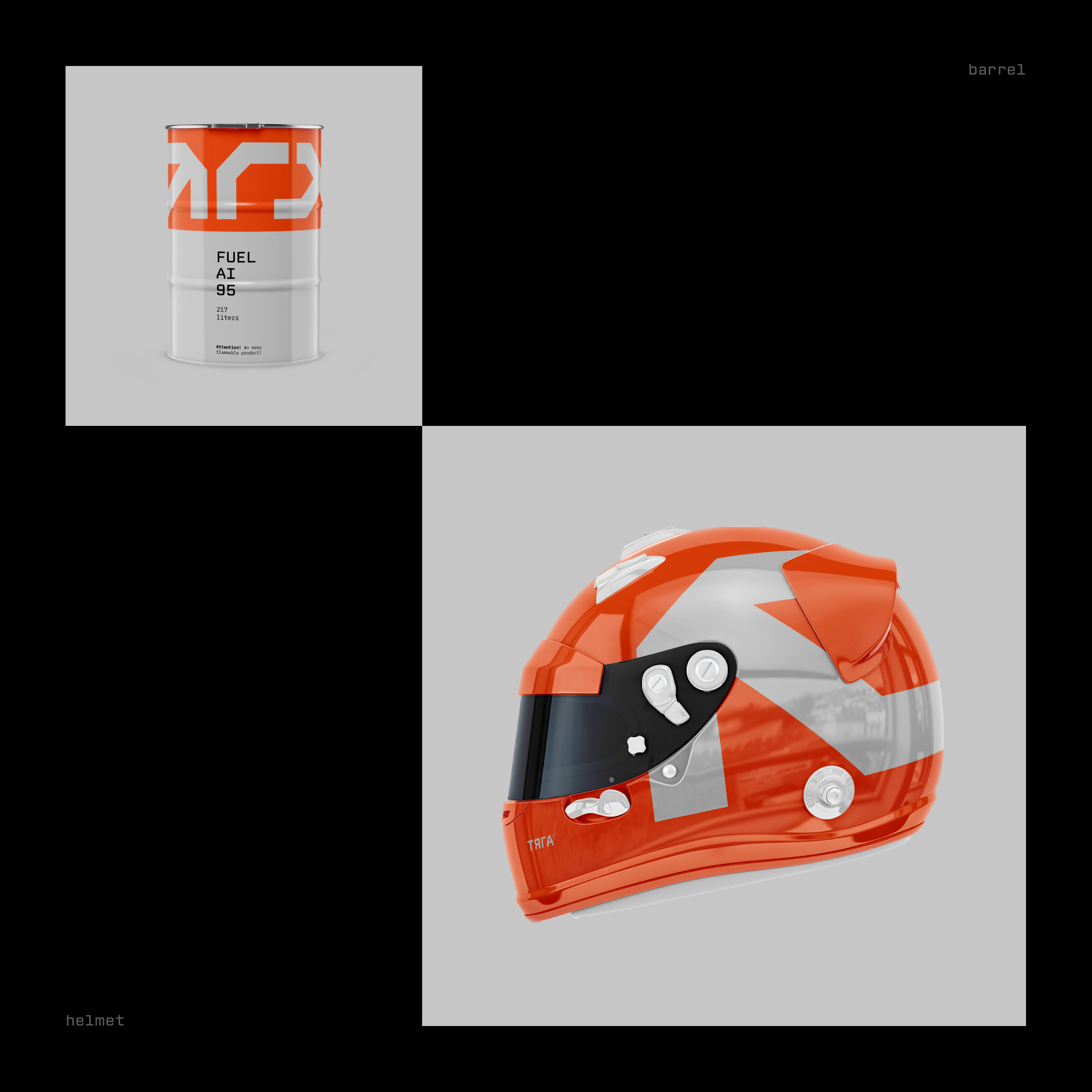
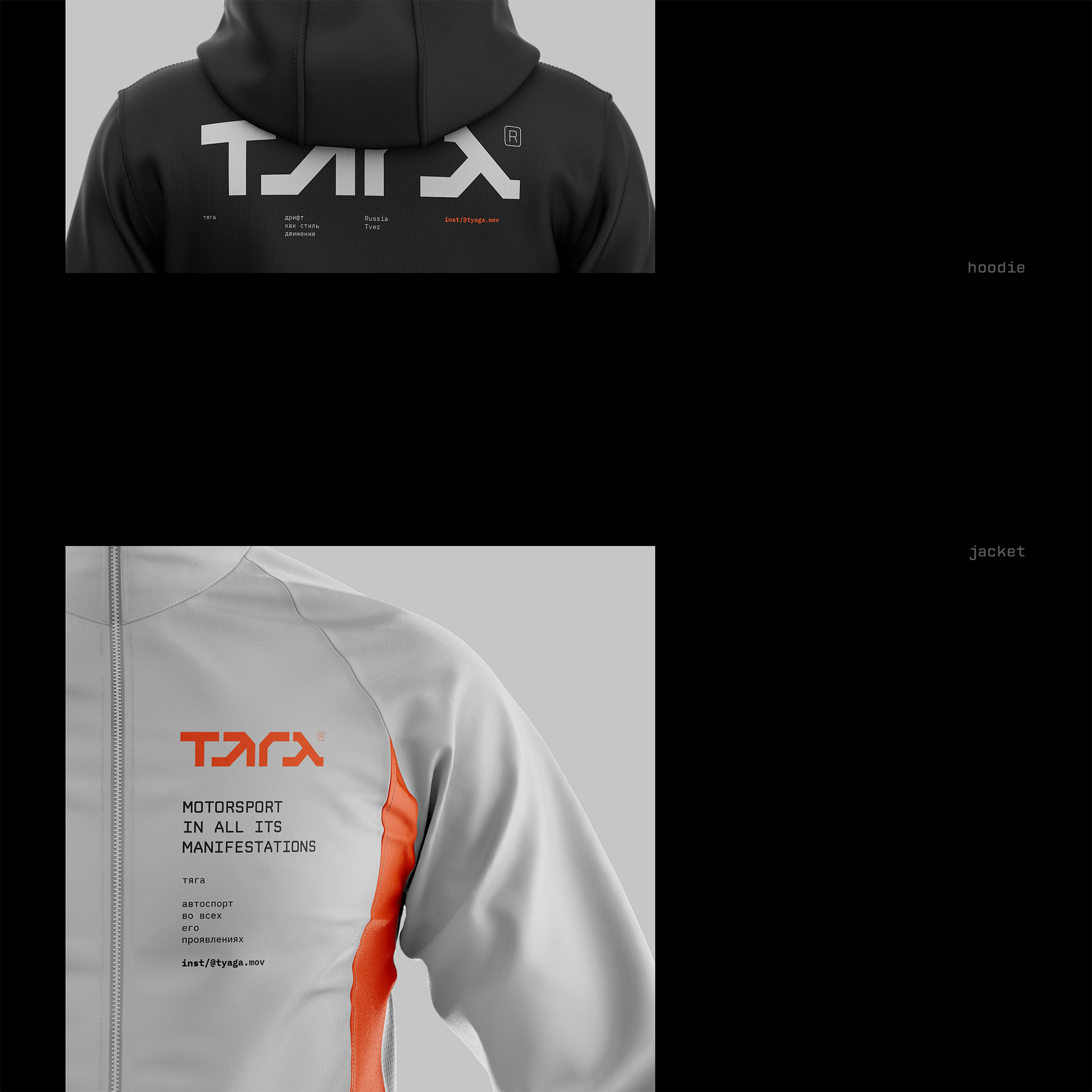
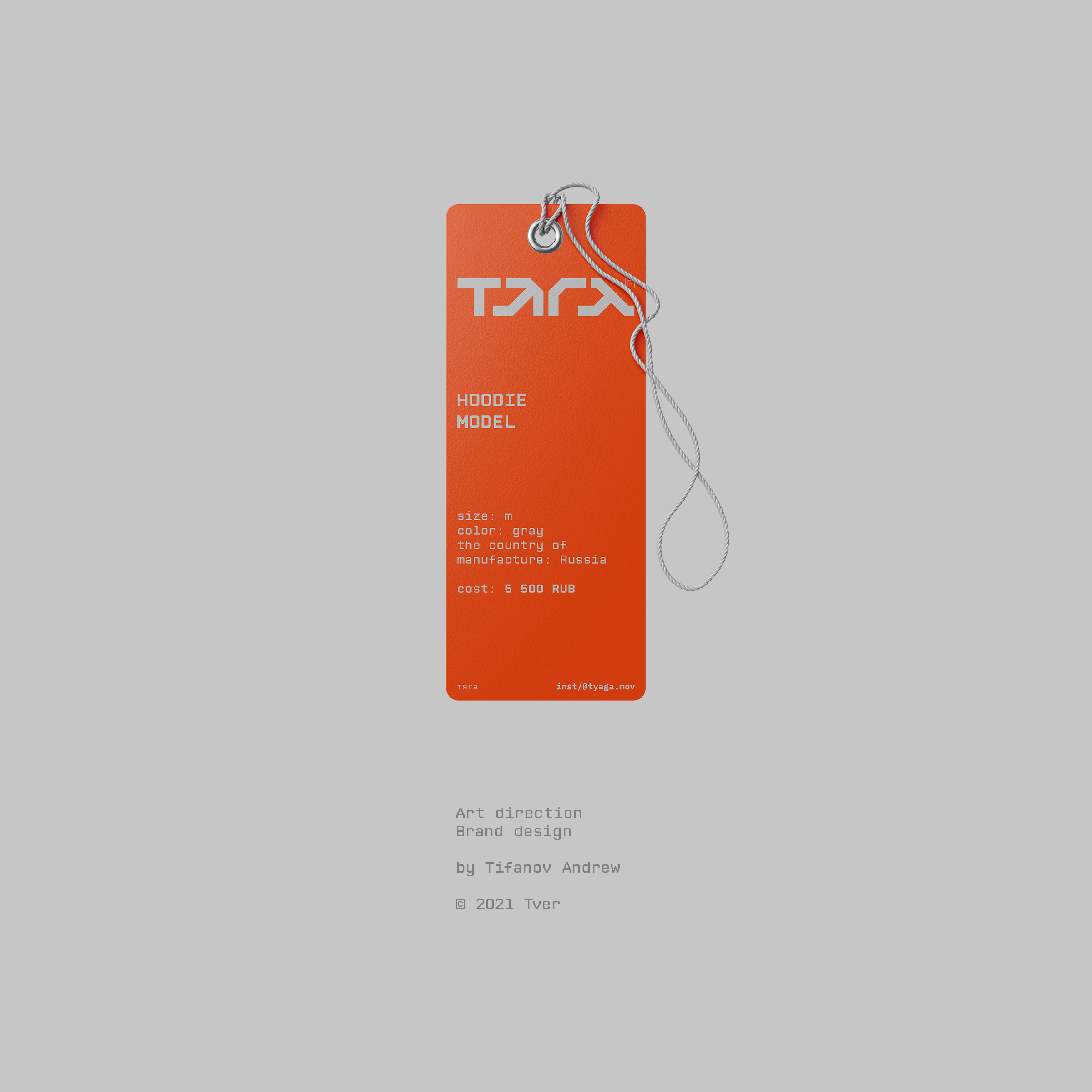
Mechanics and engineering, speed and drive. That’s what unites them. That’s exactly what I reflected in the style. Chopped shapes, mono font, and a little futurism. The color palette is contrasting: black, gray, orange, symbolizing the roadway, tires, metal and speed, riding on the verge and at maximum.
The logo is a lettering on Cyrillic, which says the name of the project (ТЯГА). The letter “Я” in the logo is made in the form of an arrow, which symbolizes the vector of movement of the car during the controlled skid and the position of the front wheels of the car at this point.
In the process, I was inspired by cyberpunk visuals, engineering and mechanics. That’s where the chopped shapes came from, the chopped typography is based on mono font.
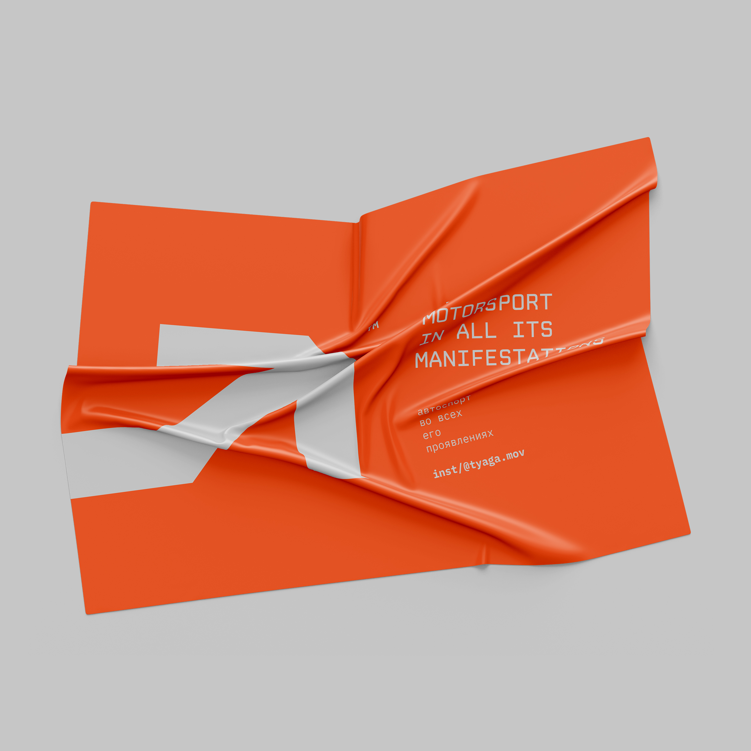
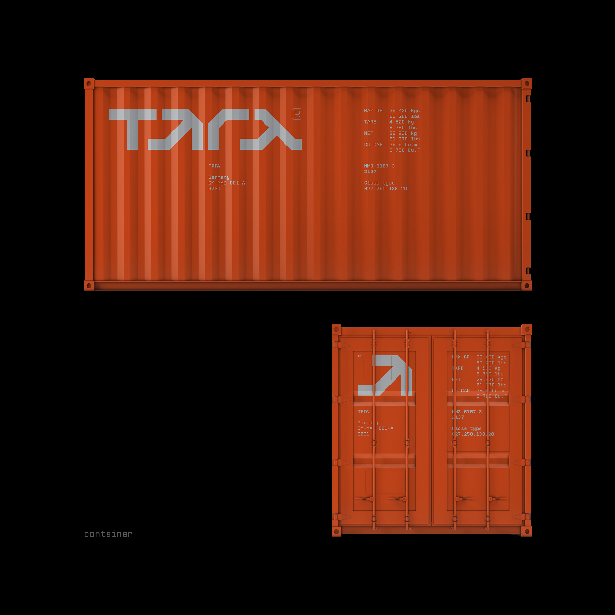
Next, in this style, I developed the necessary media. Posters that complement the image of communication and metaphor development, branded clothing, helmet, containers for car transportation, banners for social networks.

CREDIT
- Agency/Creative: Tifanov Andrew
- Article Title: Logo and Corporate Identity for PULL/ТЯГА Automotive Community
- Organisation/Entity: Freelance
- Project Type: Identity
- Project Status: Published
- Agency/Creative Country: Russia
- Agency/Creative City: Tver
- Market Region: Europe
- Project Deliverables: 2D Design, Art Direction, Brand Design, Brand Identity, Brand Naming, Branding, Design, Graphic Design, Identity System
- Industry: Transport
- Keywords: Branding car corporate Cyrillic engineer logo minimal Motorsport Russia typography
-
Credits:
Art Director: Tifanov Andrew
Designer: Tifanov Andrew


