


Lillymu is the latest restaurant offering from Ibby Moubadder and the ESCA hospitality group. Located in the new dining precinct of Parramatta, Lillymu serves dishes inspired by China and South East Asia that take a fresh, yet delightful modern perspective.
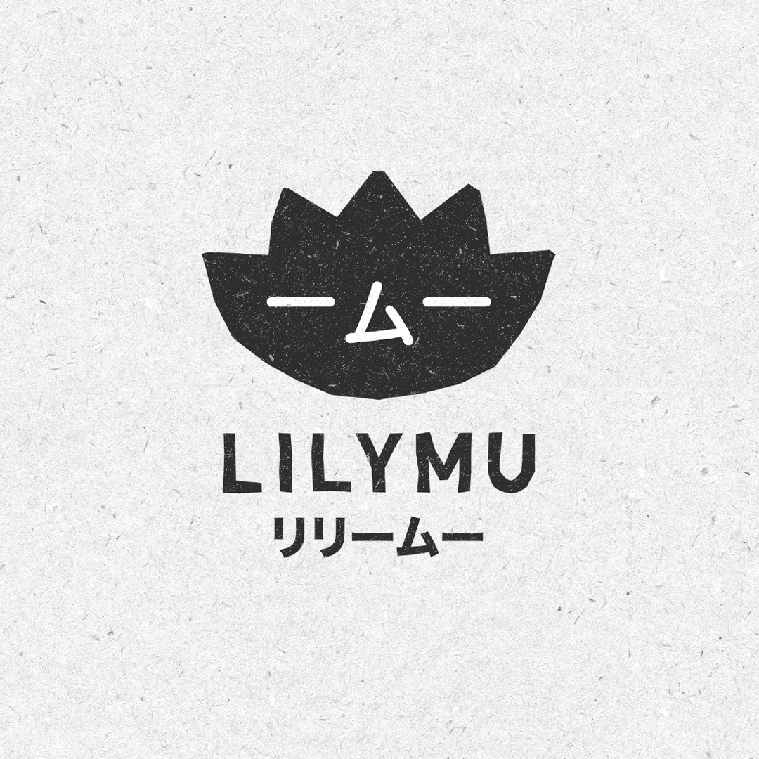
Lillymu’s name was inspired by the action adventure anime characters out of Japan and was chosen as a metaphor for the adventurous flavours and mash-up of cultures that occurs when experiencing the food.
The identity takes its core influence from the iconic shape of a lily but also the idea of crafting a character with personality and whimsy. A little design ‘gift’ was the shape of the Mu characters in Japanese text that make up the eyes and nose.
The lily and the type were originally set digitally and then manually cut from paper and re-scanned to create a unique, distinctive handmade shape.
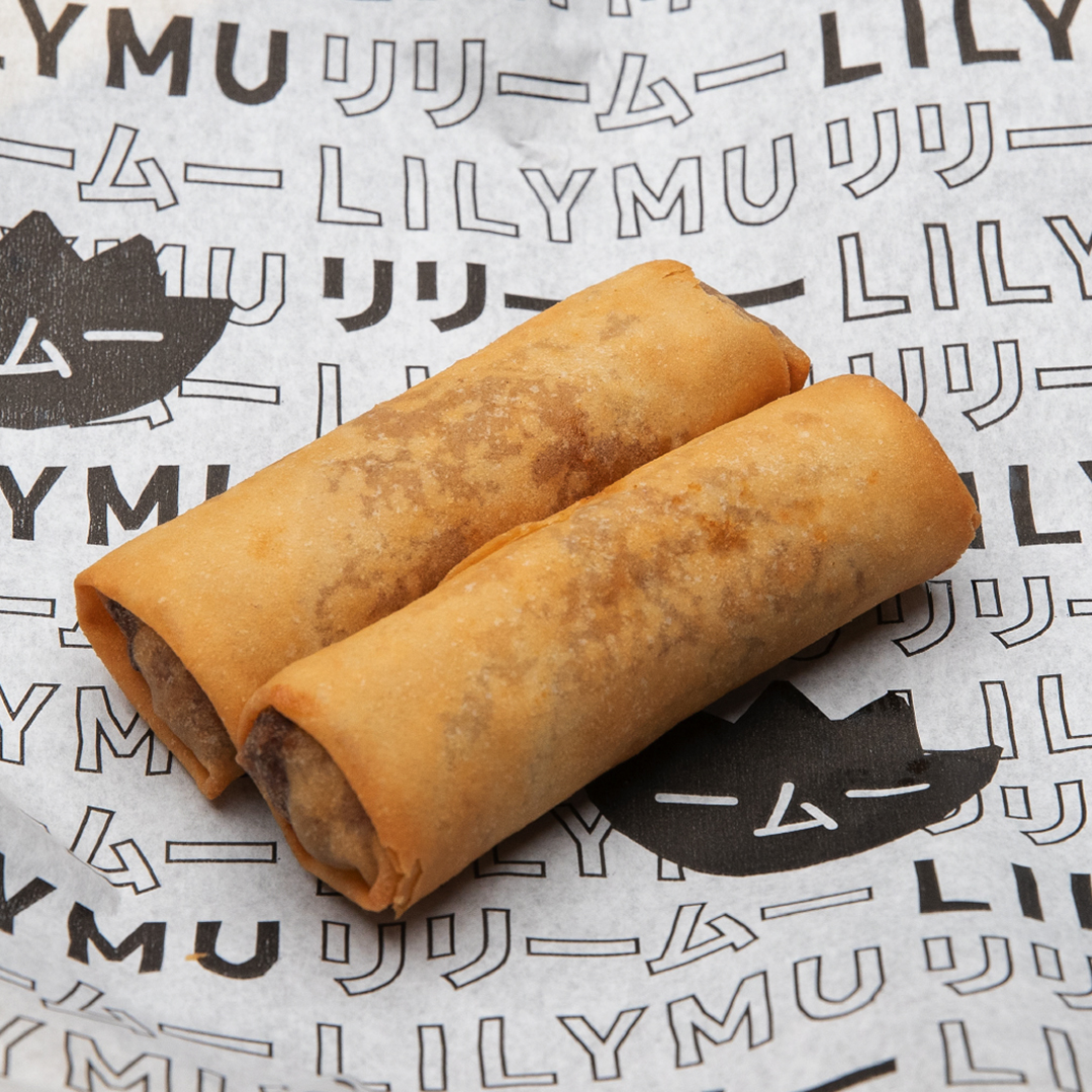
We created a number of visual assets that are used throughout the restaurant. The wrapping paper needed to be simple and showcase the brand for the ever-present Instagrammer.
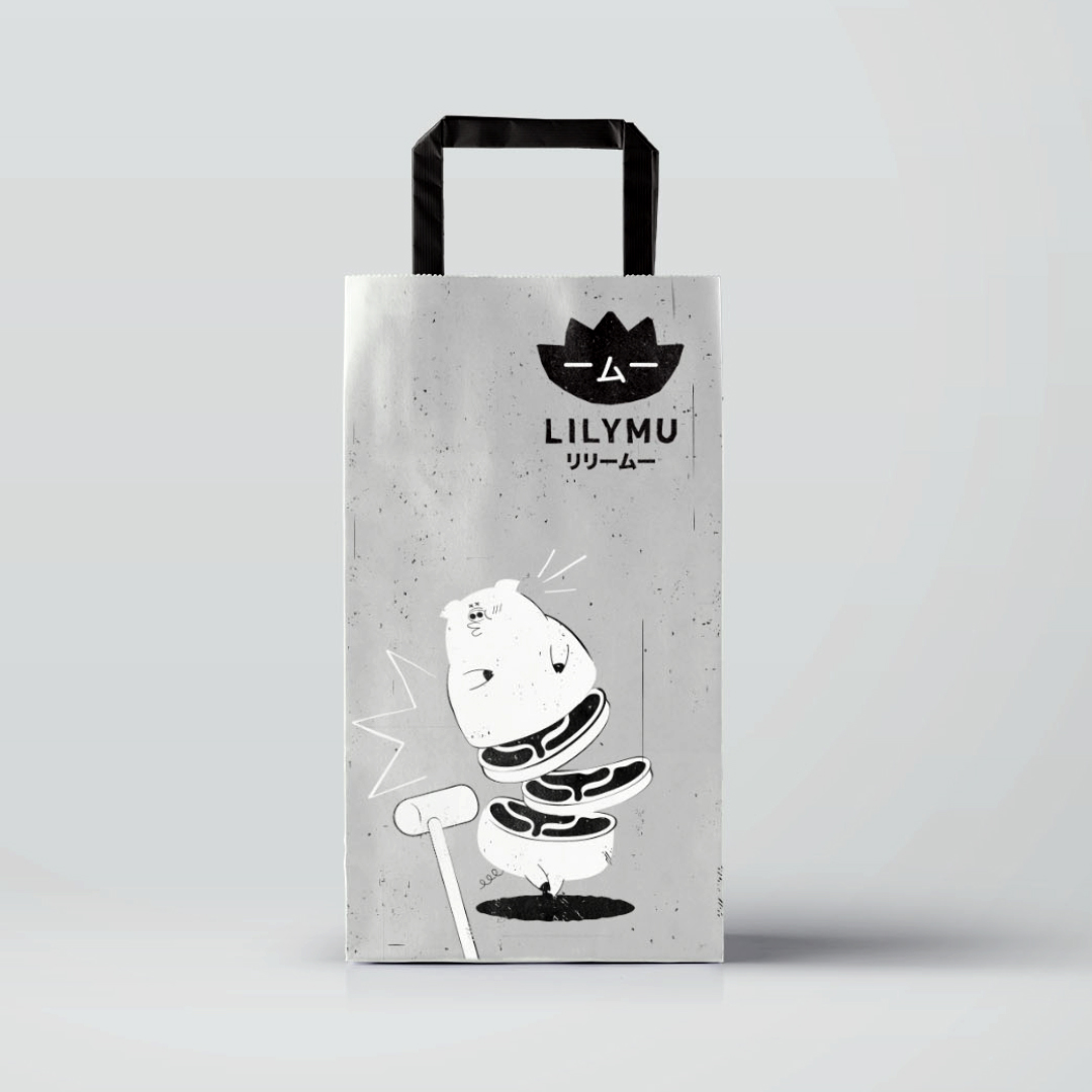
The takeaway bag concept was designed to be quirky and just a bit obscure. It shows a pig being hit by a hammer and forming perfect slices ready to eat – makes complete sense, really. We deliberately wanted to avoid the expected anime style and references.
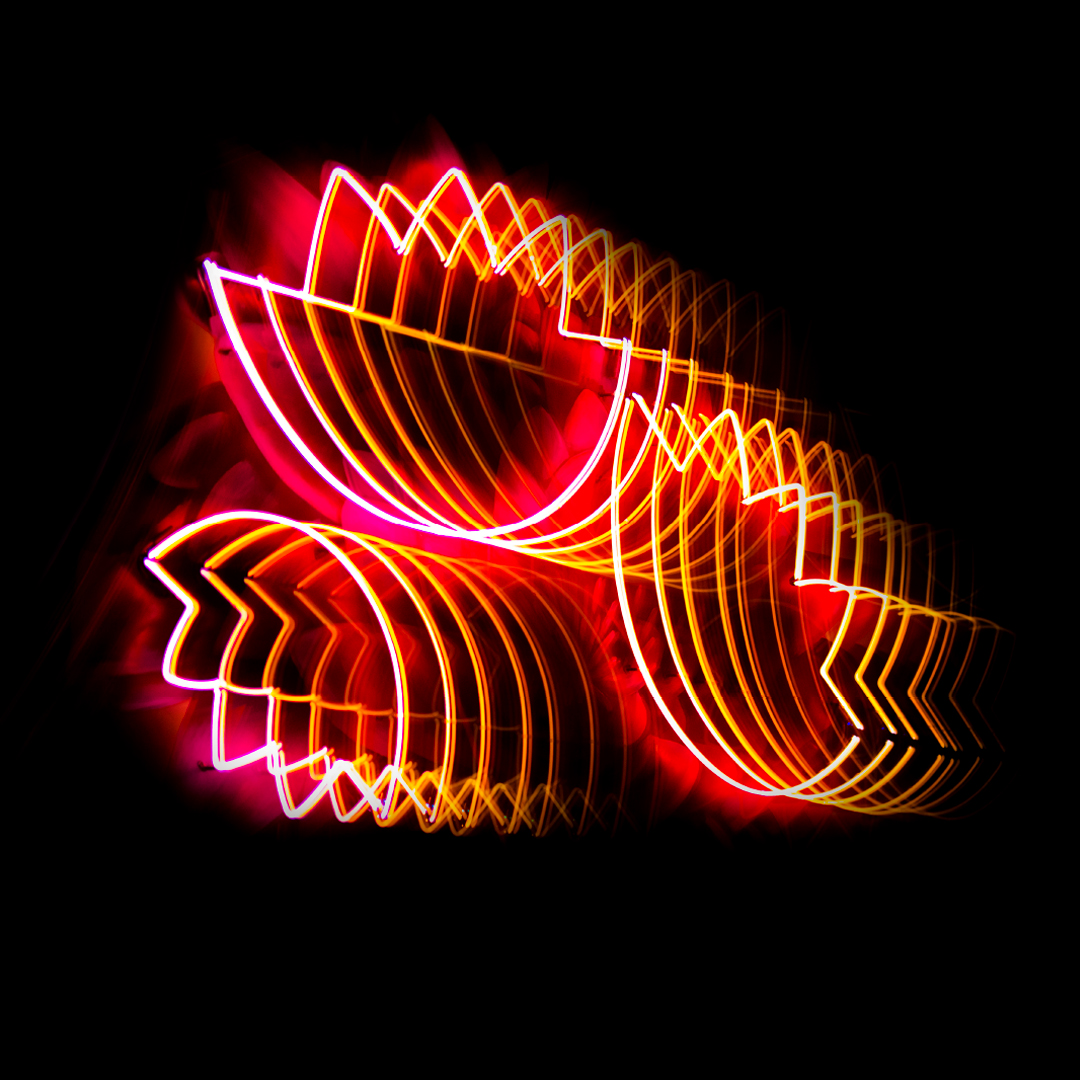
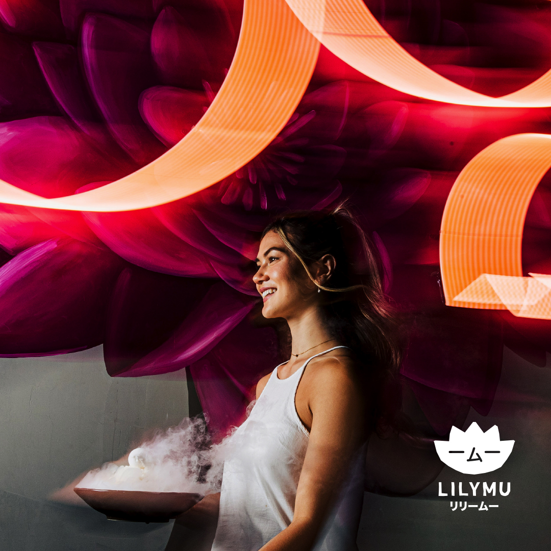
The simple shape is used as neon to bring the feeling of street, cool, and vibe to the interior.
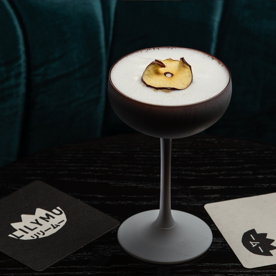
Some of the food and cocktail presentations are exquisite so we didn’t want the identity to take over but rather sit comfortably alongside.
Theatre and experience are two core parts of Lillymu and the combination of hand-painted murals and neon brings elements of old and new together seamlessly.
The uniqueness of the brand comes through the face incorporating both the lily and the ‘MU’ literally but in a completely fresh way. The form of the Japanese characters and the Lily create a sense of peace and wellbeing and also reflect the feeling of heavenly taste that comes through the dishes and cocktails… all with a dash of cheek and attitude.
CREDIT
- Agency/Creative: The Creative Method
- Article Title: Lillymu Restaurant Branding by The Creative Method
- Organisation/Entity: Agency
- Project Type: Identity
- Project Status: Published
- Agency/Creative Country: Australia
- Agency/Creative City: Sydney
- Market Region: Oceania
- Project Deliverables: Art Direction, Brand Creation, Brand Design, Brand Experience, Brand Identity, Brand Naming, Brand Strategy, Brand Tone of Voice, Branding, CGI, Copywriting, Creative Direction, Design, Digital Painting, Graphic Design, Illustration, Lettering, Logo Design, Web Design
- Industry: Hospitality
- Keywords: Idea, mash up, Asian, Fusion, craft, smile in mind, discoverable, handmade, rustic, rough, personality, character, smile, quality, unique, detail, craft, modified, black, white, texture
-
Credits:
Creative Director: Tony Ibbotson


