


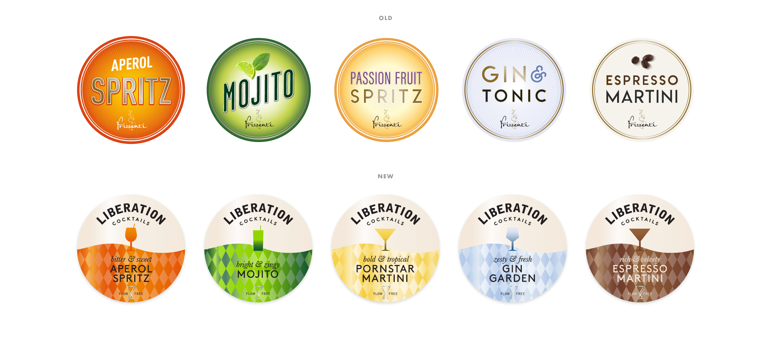
Popp Studio has worked with Frizzenti to create a new brand for their cocktail range, Liberation Cocktails, with a fresh brand strategy, visual and verbal identity, packaging designs and brand world. Frizzenti, which derived its name from the Italian for “sparkling”, are the UK leaders in still and sparkling wines, supplied on-tap to bars, restaurants and events.
It expanded initially into Prosecco-based cocktails, like Aperol Spritz, before developing a full range of recipes, including the classic Mojito, the recent hit Espresso Martini and their own bespoke creations, like Gin Garden. The brand’s design was variant-led and carried the Frizzenti name as an endorser.
Liberation Cocktails Co-Founder Daniel Spinath says:
“We recognised that the name Frizzenti didn’t fit with our expanding range of cocktail recipes, and we wanted to make our cocktails available in more formats, launching cans and bottles for off-trade purchase. We saw an opportunity to create a stand-alone brand distinct from the original Prosecco product, that better expressed the unique quality of our recipes, so we came up with the name Liberation and briefed Popp Studio to create the new brand from there.”
Frizzenti’s strategy was also very B2B focused, with its messaging aimed at bartenders and managers.
Popp helped the brand focus more on a consumer audience by creating a strategy centred on the idea of the “perfect moment”.
Popp Studio Managing Director and Co-Founder Andrew Slade says:
“Thanks to the pre-batching process, the exceptional quality of the ingredients, and the broad range of formats available to consumers, Liberation really is able to serve up a perfect cocktail moment, whenever and wherever the moment strikes.”
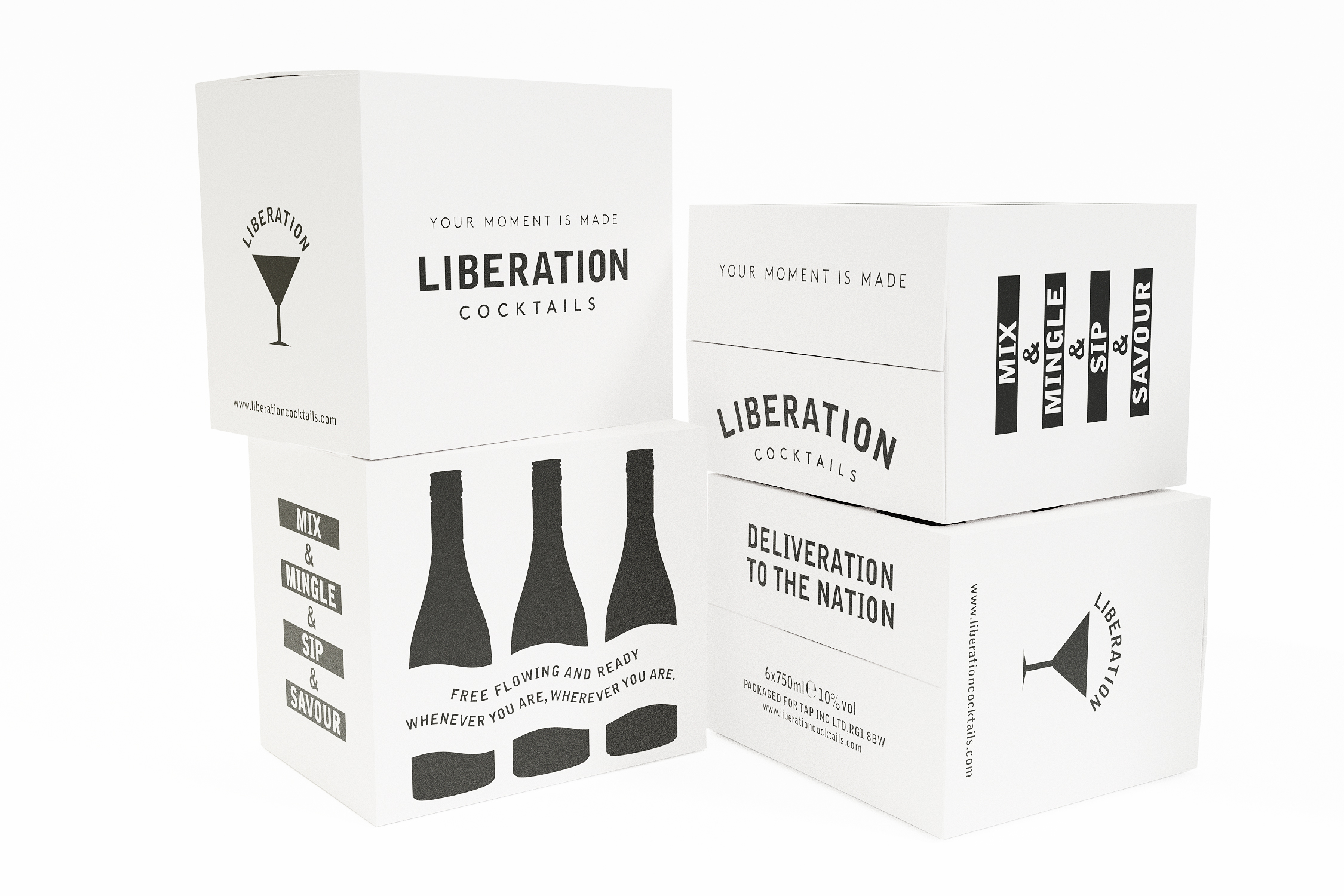
This led us to the strapline, “Your moment is made”, which takes consumers to that perfect cocktail moment, while emphasising how easy it is to enjoy it with Liberation’s pre-batched offering on-tap, in-can, or in-bottle.”
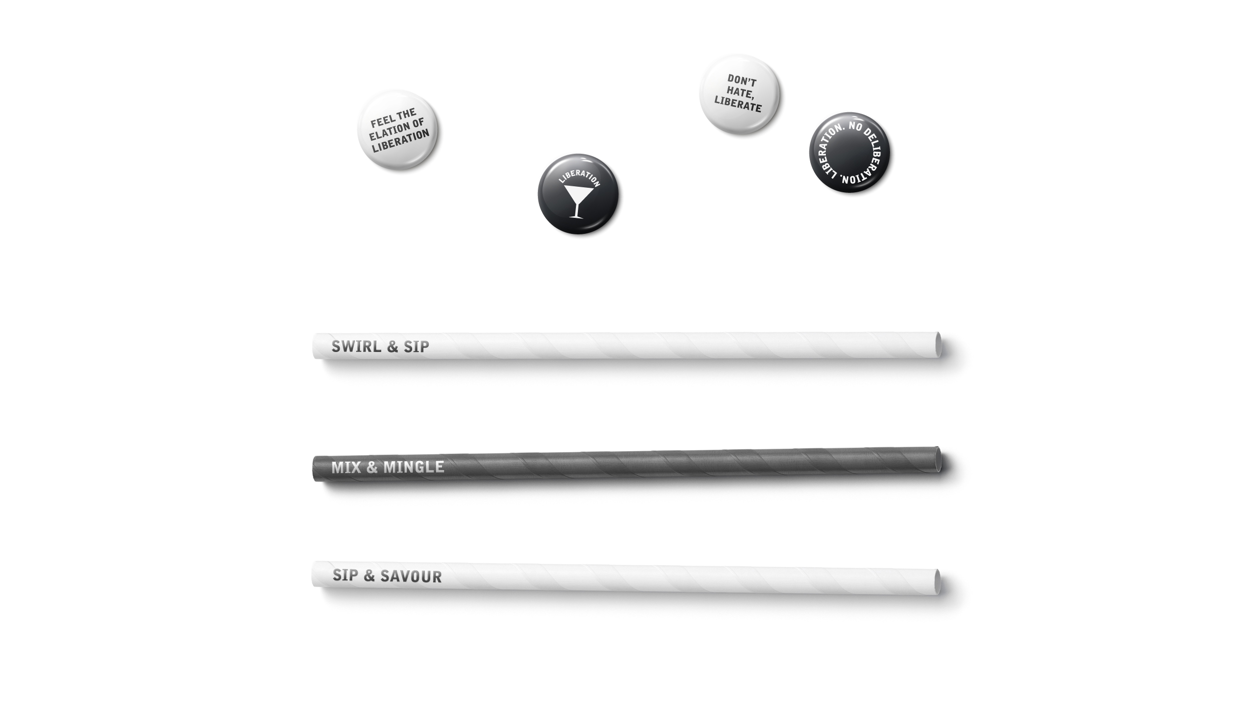
Liberation’s brand story bubbles with playful language that appears on various touchpoints, reinforcing its distinctive personality and points of difference. “Free flowing”, “mix and mingle” and “shape taste and twist tradition” capture both the spirit of the product itself as well as the sense of excitement and anticipation when cocktails are on the menu.
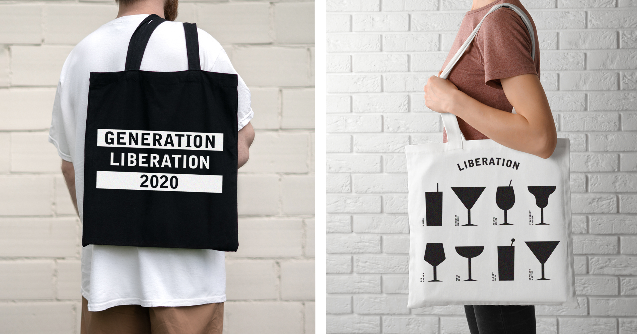
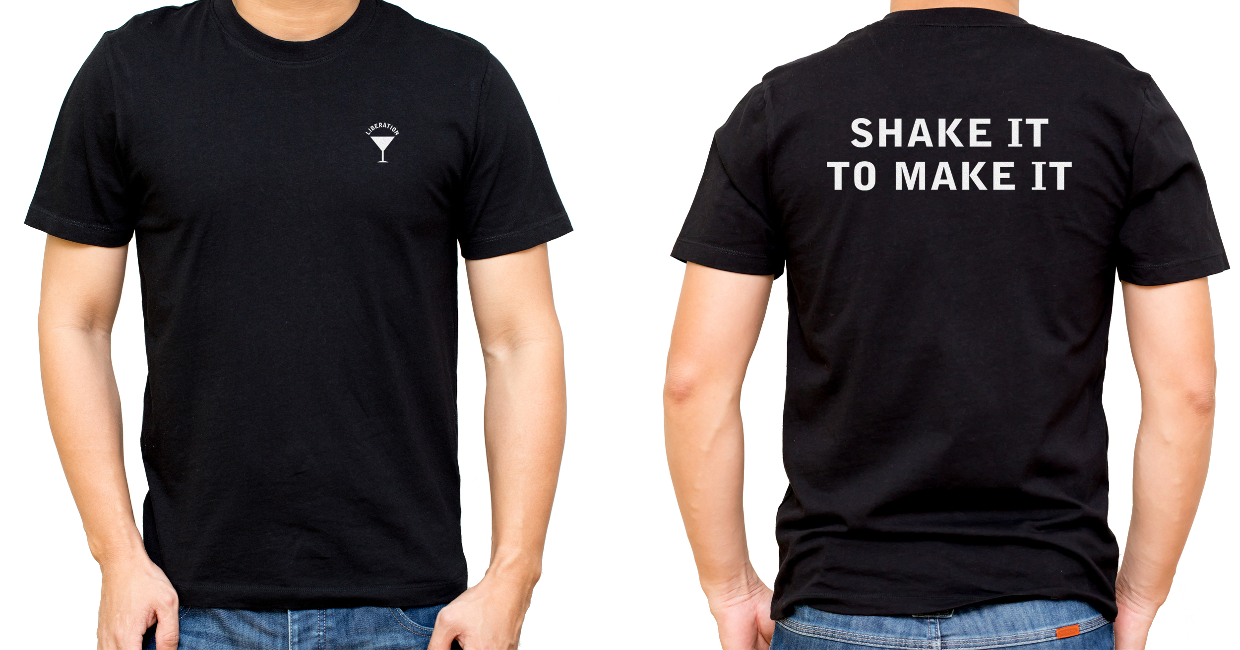
The confident, captivating tone of voice also lives freely in the brand world. With the brand’s launch at the easing of Lockdown, apparel and merchandise declares “Generation Liberation 2020” as well as “Shake it to make it”, which also appears on bottles and cans.
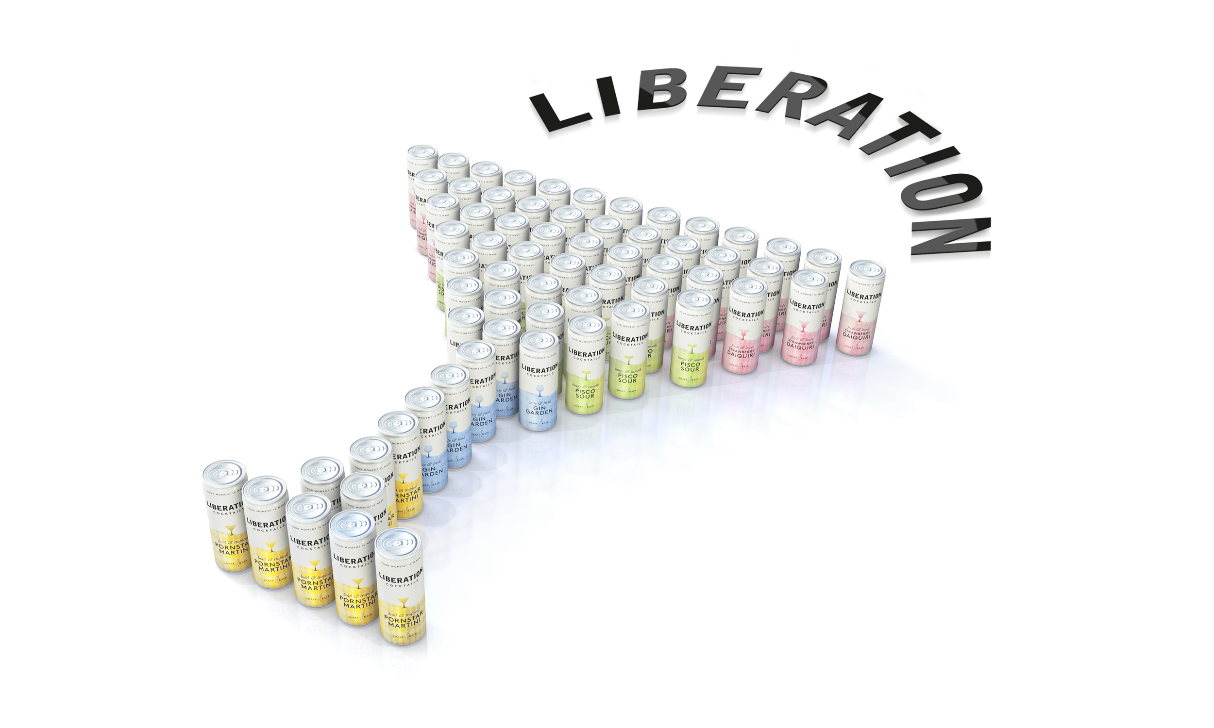
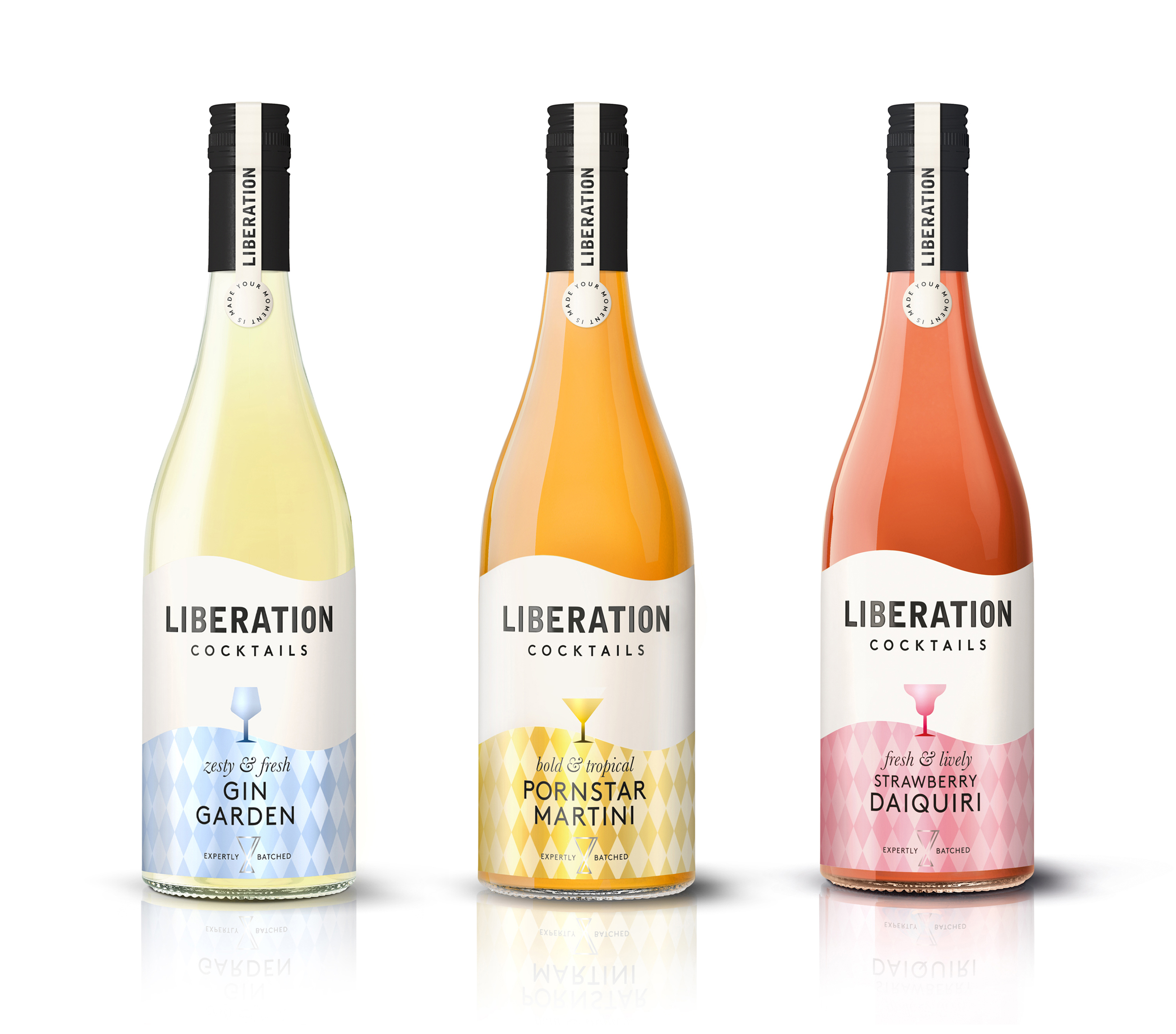
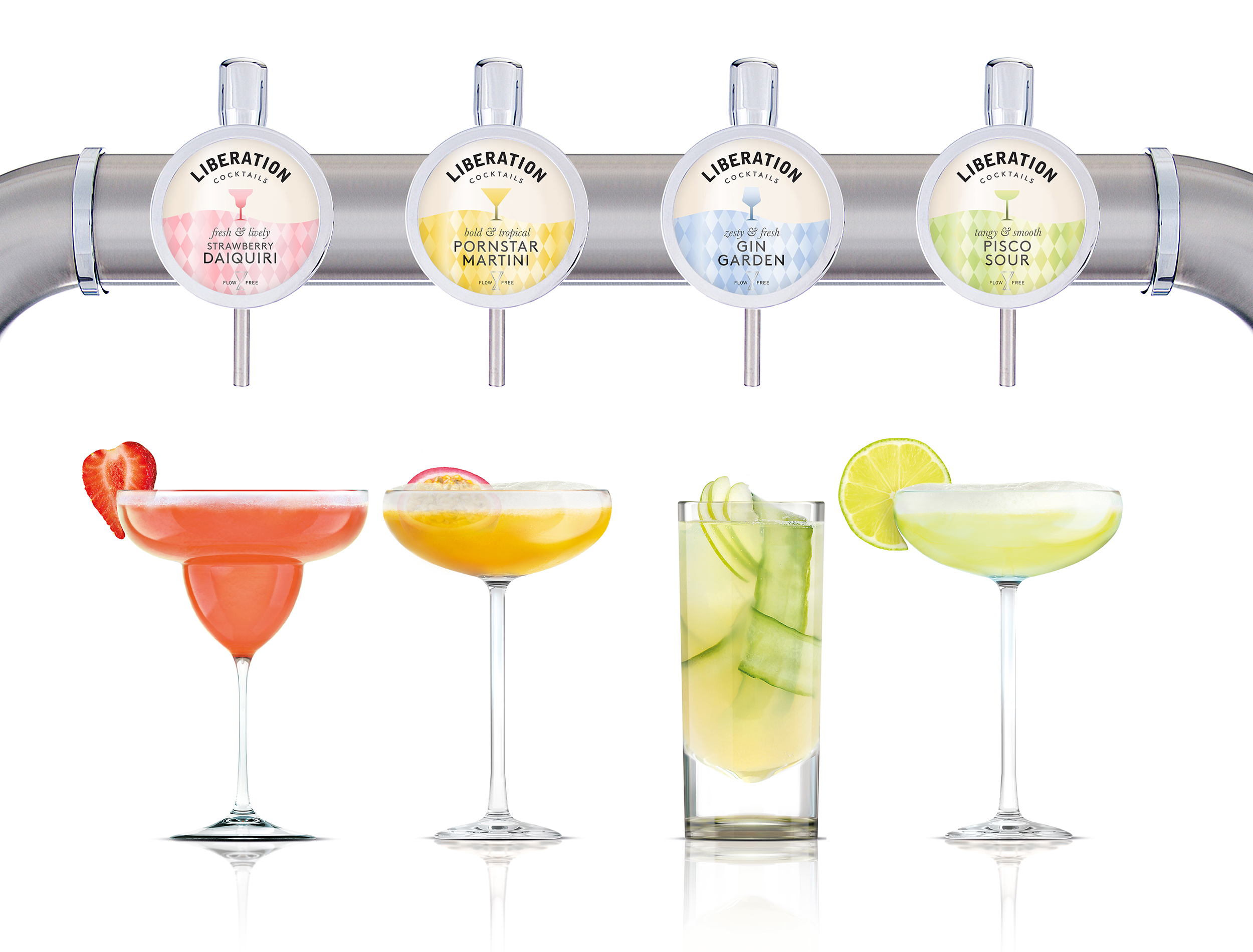
The visual identity features key distinctive assets designed to make the brand instantly recognisable and stand out amidst the loud crowd of competitors all adopting variant-first design strategies.
As a word-mark Liberation is effortlessly bold and simple. It adapts to each touchpoint, standing straight on bottles and cans whilst curving around tap signs to amplify its presence.
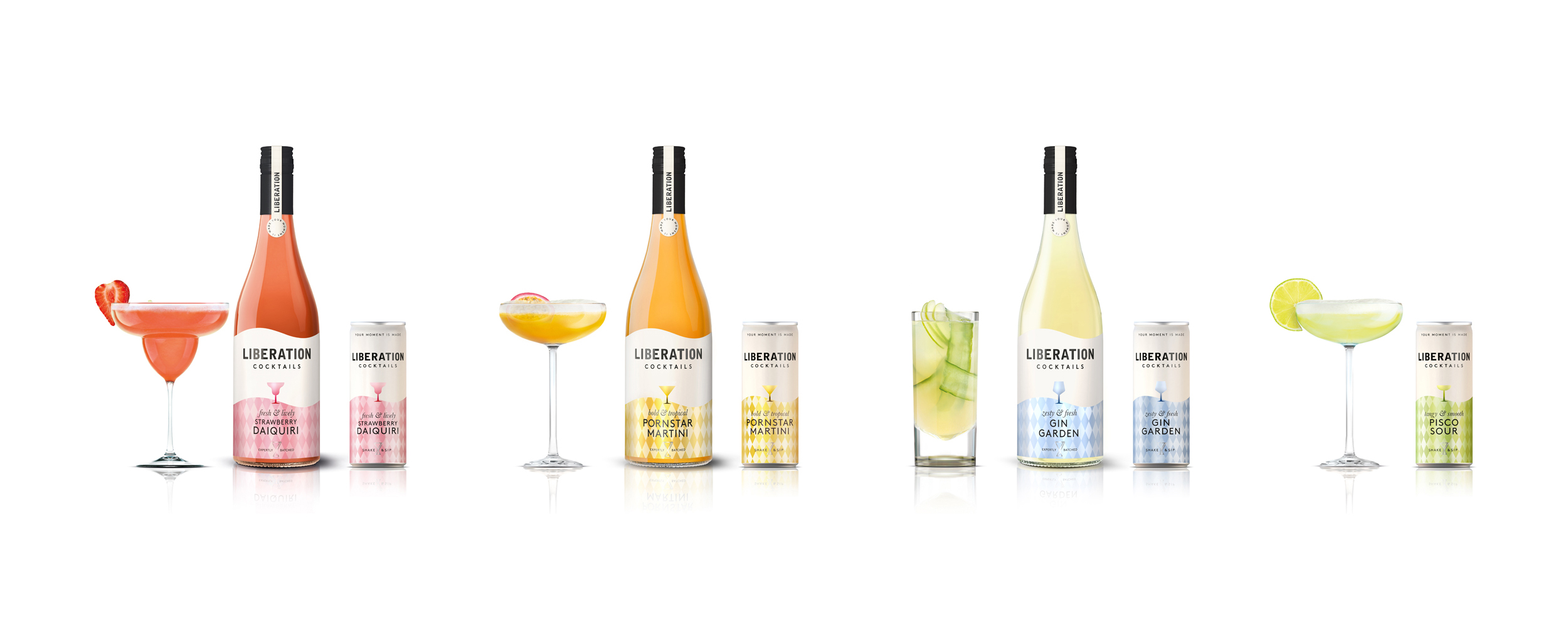
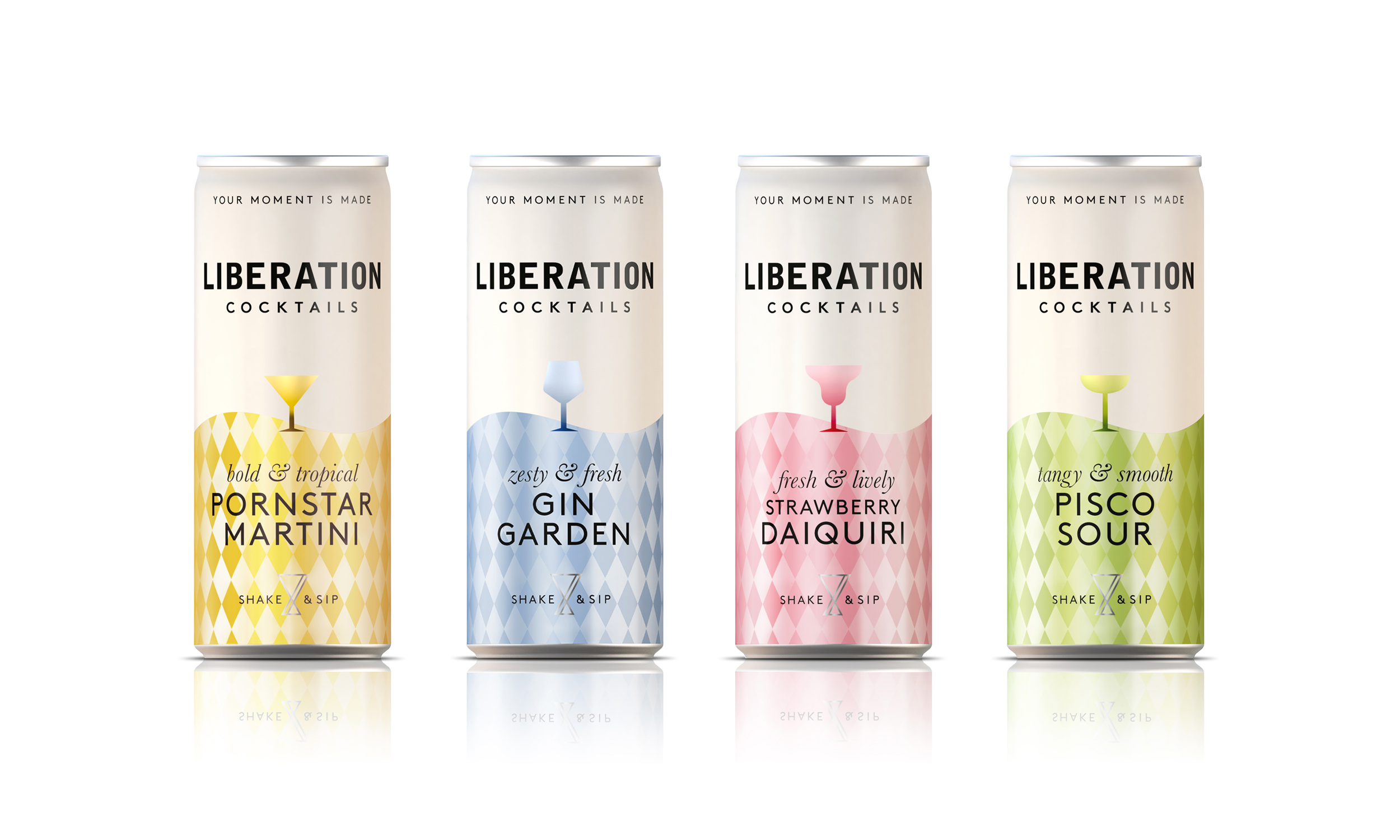
At the heart of the identity system is the Shimmering Wave – a flowing shape filled with a diamond motif that gleams with the colour of each liquid.
Popp Studio Creative Director and Co-Founder Poppy Stedman says:
“The shimmering wave mimics the sensation of the cocktail being poured into your glass and invites that laid-back release of the cocktail moment. It’s a shape consumers will easily recognise from across a bar or in a shop. The diamonds evoke the sparkling liquid and make it feel extra special.”
It also allows the Masterbrand to have clear space without compromising on variant navigation or taste cues.”
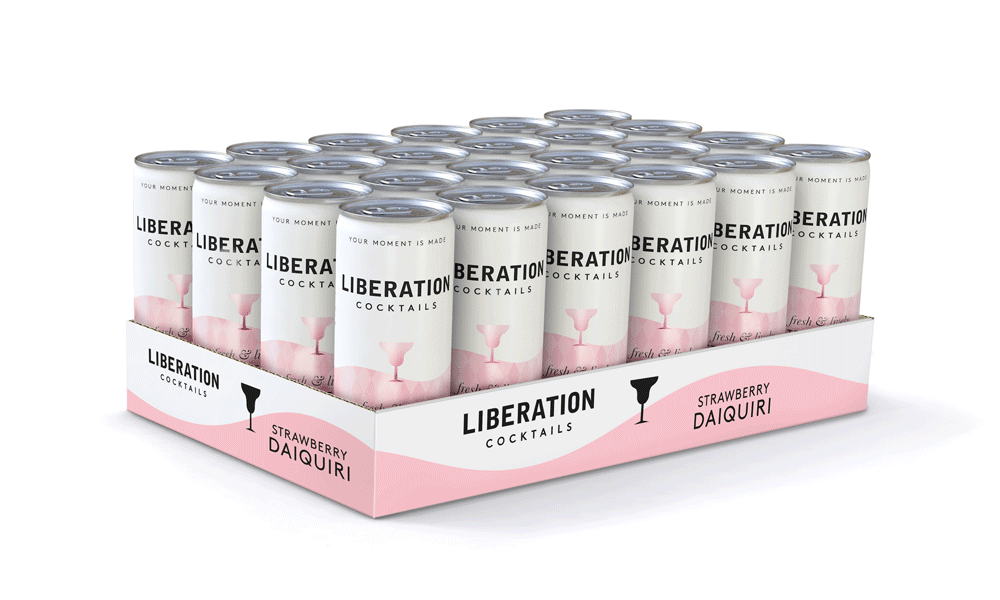
Each variant has a glass silhouette at its heart, and at the base sits the Infinite Jigger. This secondary asset is a symbol of the mixologist’s craft and the ‘always ready,’ endless pour of Liberation through its infinite loop shape. This is paired with format-specific messaging; “expertly batched” on bottles, “shake & sip” on cans, and “flow free” on taps.
Liberation Cocktails Managing Director and Co-Founder George Workman says:
“Throughout the rebrand, Popp has expertly guided us through the strategic, creative and production process, and given us a dynamic brand identity that sets us up to accelerate growth and celebrate Liberation from Lockdown.”
Liberation cocktails are ready to be enjoyed online at www.liberationcocktails.com, in various UK bars and restaurants, and from “The Cocktail Cruiser” in London, the mobile cocktail bar in a van.
CREDIT
- Agency/Creative: Popp Studio
- Article Title: Liberation Cocktails Rebranded by Popp Studio
- Organisation/Entity: Agency, Published Commercial Design
- Project Type: Packaging
- Agency/Creative Country: United Kingdom
- Market Region: Europe
- Project Deliverables: Brand Guidelines, Brand Identity, Brand Strategy, Brand World, Branding, Graphic Design, Packaging Design, Rebranding, Tone of Voice
- Format: Bottle, Can, Case, Keg, Tray
- Substrate: Glass Bottle, Metal


