


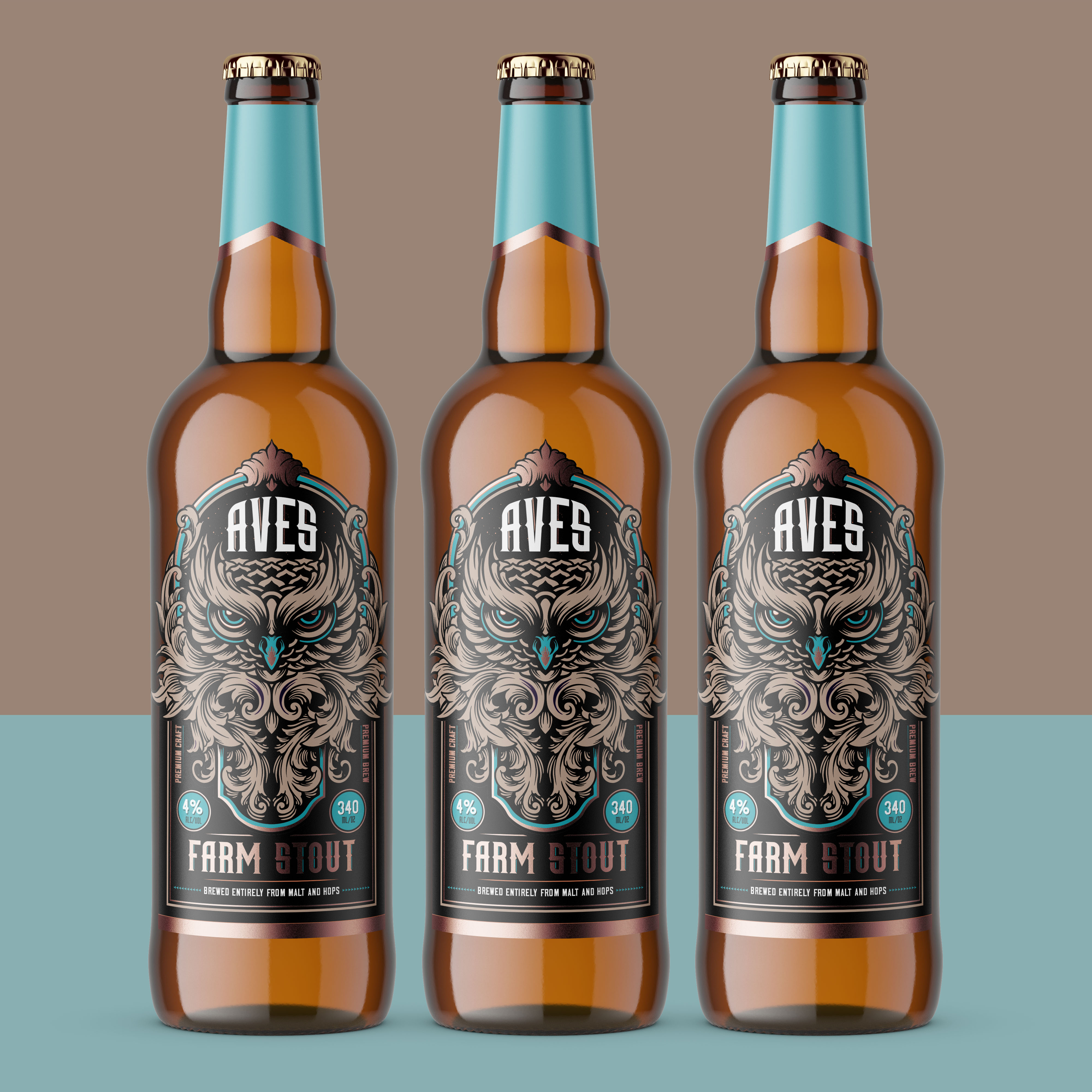
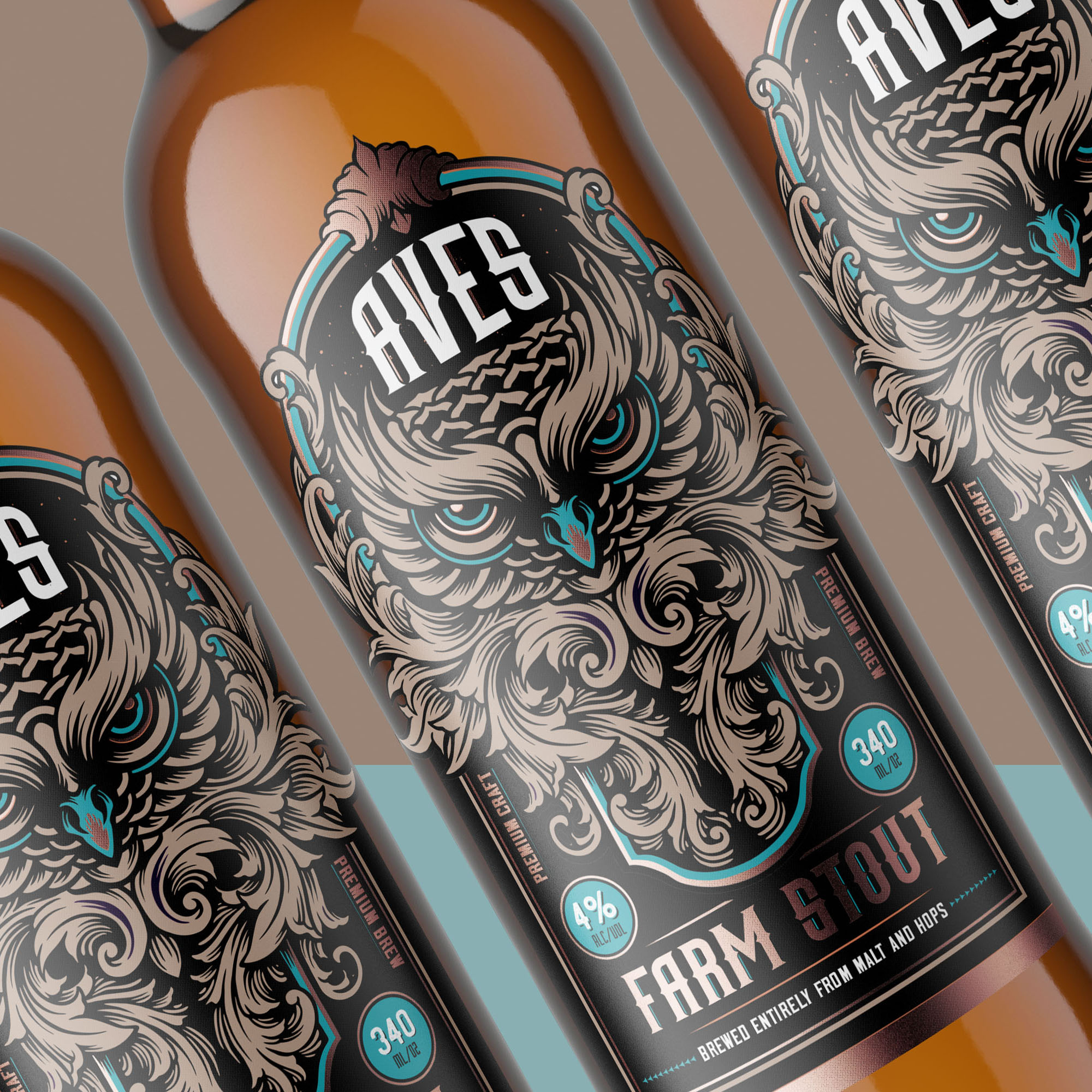
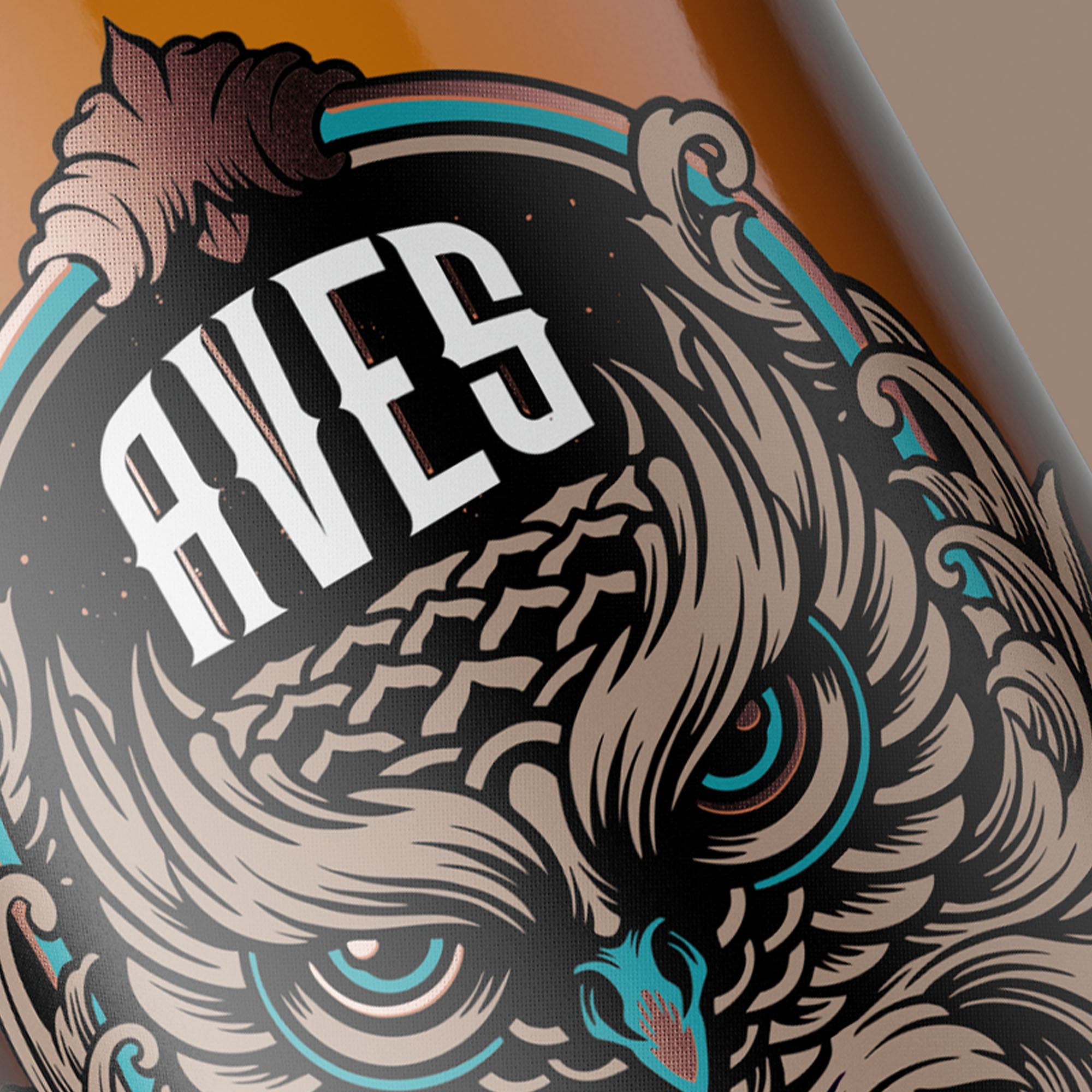
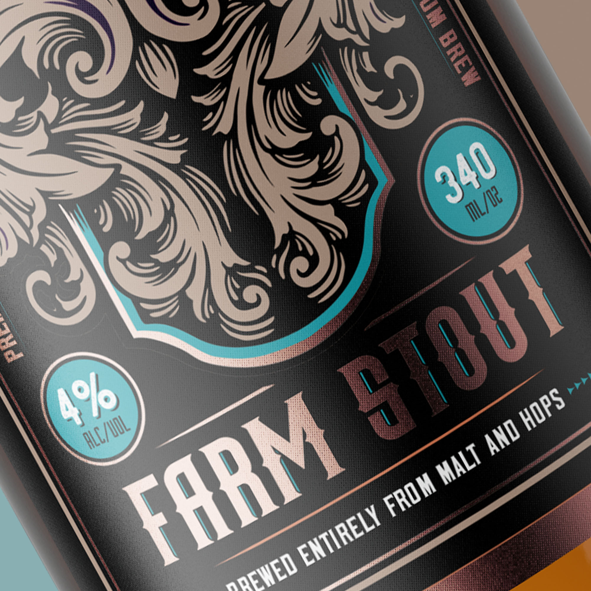
There is an old farmhouse in the Western Cape in South Africa that has now been converted into a small brewery. The farmhouse has always been home to a family of owls and careful consideration was given not to disturb these owls in the renovation. Today, these owls still call the brewery home and in their honour, this farm stout was named after these beautiful birds. The brief was to make the owl the hero of the beer and create a label that still brings a premium feel. This was achieved through printing on metalised paper which gave all colours a slightly metallic look. Additional metallic copper was used to highlight certain parts of the illustration and type to make it stand out more. The colours used were the original colour palette of the original farmhouse.
CREDIT
- Agency/Creative: Suckerpunch
- Article Title: Label Design for a Traditional Farm Style Stout
- Organisation/Entity: Freelance, Non Published Concept Design
- Project Type: Packaging
- Agency/Creative Country: South Africa
- Market Region: Africa
- Project Deliverables: Brand Creation, Brand World, Graphic Design
- Format: Bottle
- Substrate: Glass Bottle


