


Batllegroup has created the design for the brand, volume and packaging of the new RB brand, Botanical Origin. A new range of household cleaning products of botanical origin seeking to promote more environmentally friendly consumption habits without sacrificing efficacy. Batllegroup created the brand, volume and packaging design, devised to connect with the new generations and convey the values of naturalness and sustainability while, at the same time, potentiating performance.
RB, a world leader in health, hygiene and household consumer products, presents Botanical Origin, a new range of detergents, fabric conditioners and multi-purpose household cleaners born to help create a cleaner world.
The challenge: To convey efficacy which respects both people and the environment
RB launches a new product brand with up to 97% ingredients of botanical origin for household cleaning which, nonetheless, is still perceived of as an effective product. The challenge was clear: to convey naturalness and respect for both people and the environment, while underscoring the efficacy and cleaning power of a full range of products.
The strategy: A revolutionary concept
In a mature category, one in which codes are firmly established, with clear purchase drivers and fast decision-making processes, RB has broken in with a disruptive product concept. Devised to connect with the needs and expectations of the new generations, the new range promotes more environmentally sensitive forms of consumption without sacrificing efficacy. Batllegroup created a differential design, in tune with the product proposal, in which the transparency, shapes and colour become the major assets of the new brand.
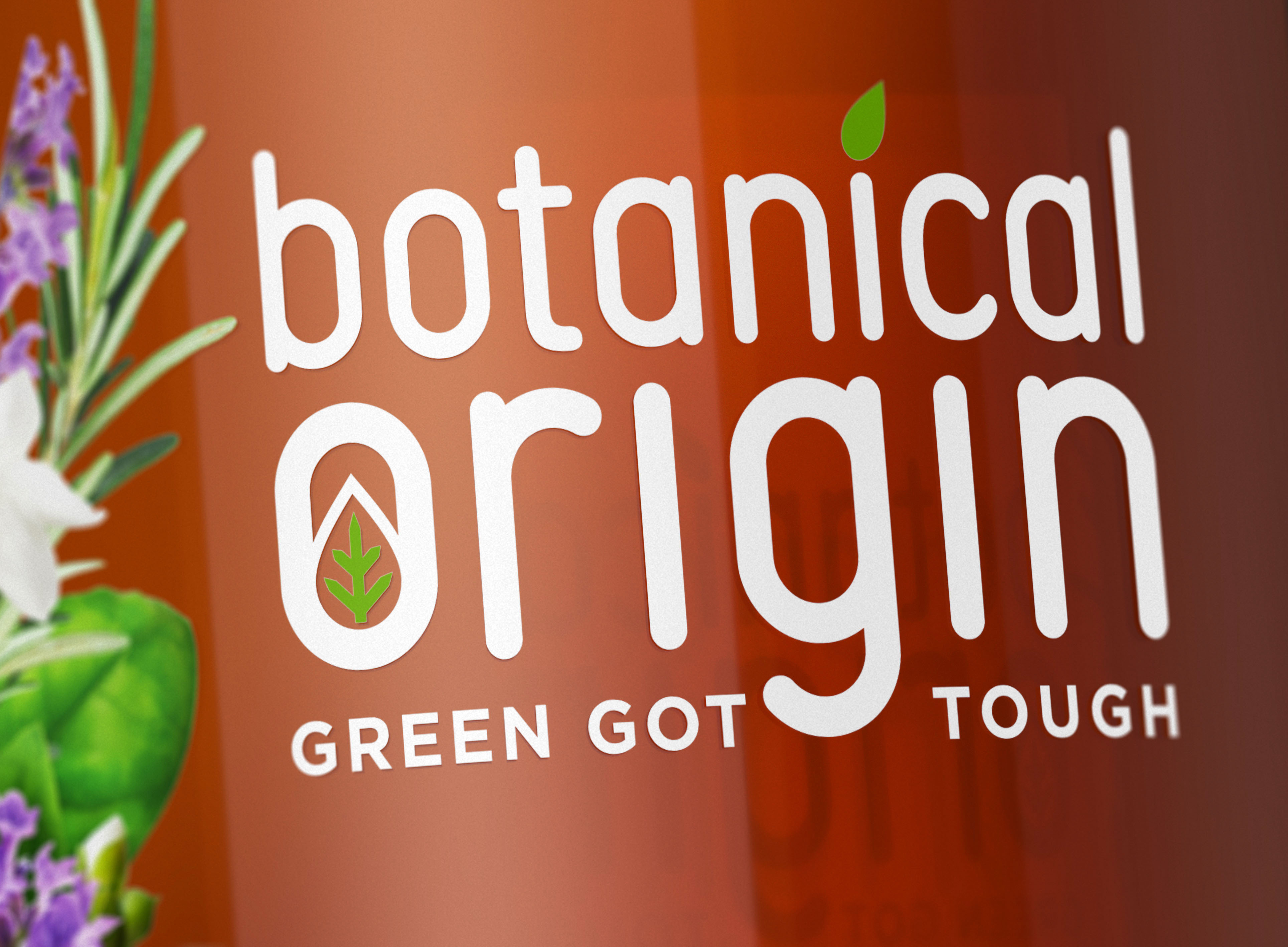
Botanical Origin: New branding for a cleaner world
The branding seeks to convey simplicity and naturalness. To such ends, we created a logo employing a unique, personalised typeface to enhance the singularity of the brand. To work together with our special typography, we designed a series of graphic botanical elements to boost naturalness, as one of the core values of the new brand. Lower case is used to provide the brand with a friendlier, closer feeling in its verbal language, while the brand itself figures in white to preserve all its radiance and legibility against a transparent pack.
The brand is accompanied by the claim, “Green got tough”, expressing the full power and efficacy of the new range of products.
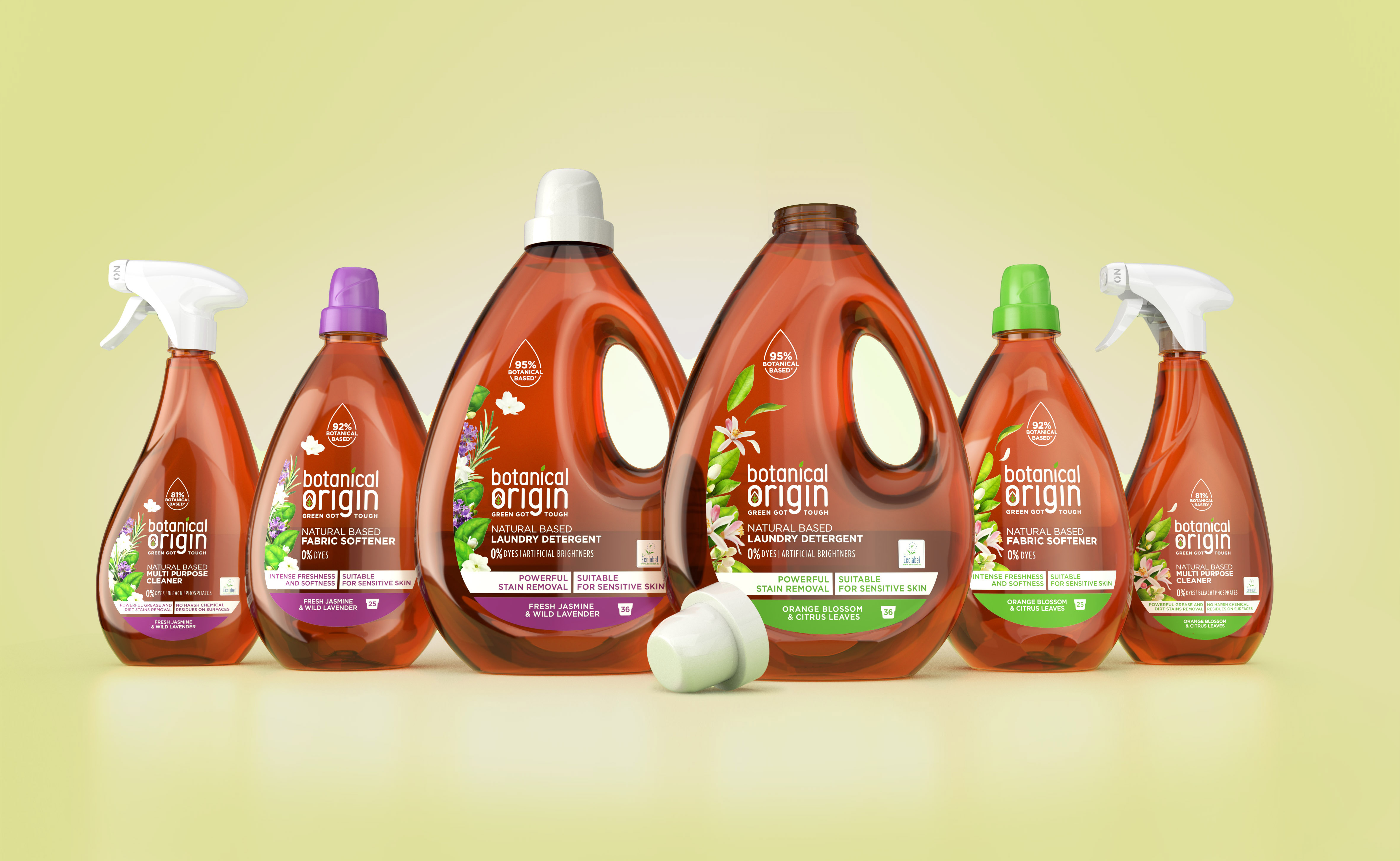
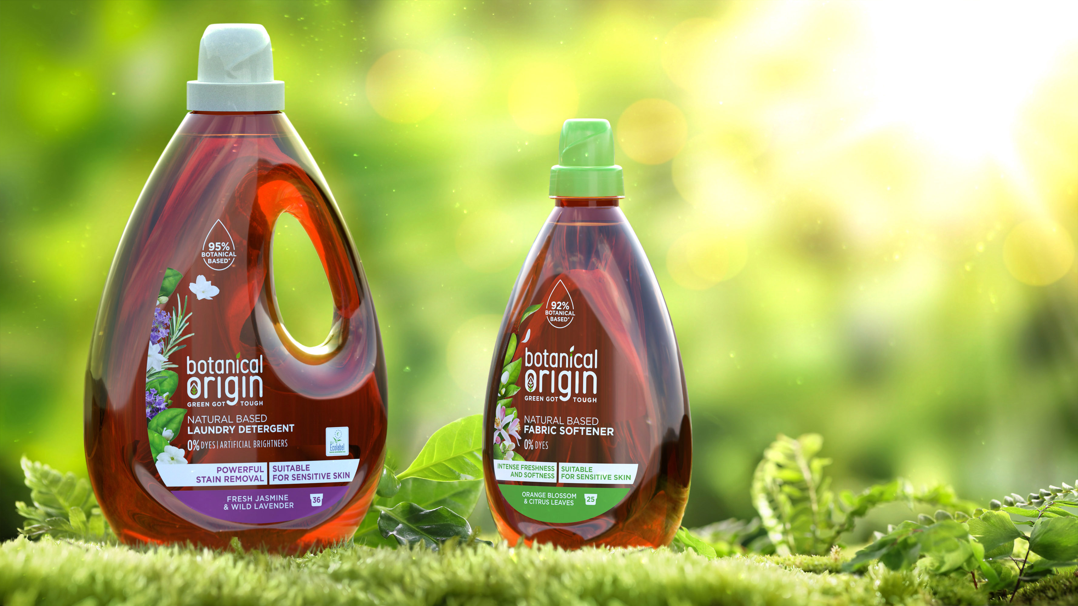
Packaging: All the power of nature concentrated into a translucent, radiant droplet
We worked from the creative concept, “the power of nature”, when devising the volume of the pack, designed together with the product design agency, Stimulo, and transformed the essence of a droplet into the new detergent bottle, the flagship product of the new range. A design which, through its shape and amber colour, concentrates the full power of nature in an iconic translucent and radiant form. A translucence which is echoed in each of the packs of the new range.
All the packs of the range are 100% recyclable, and some made with up to 50% of recycled plastic.
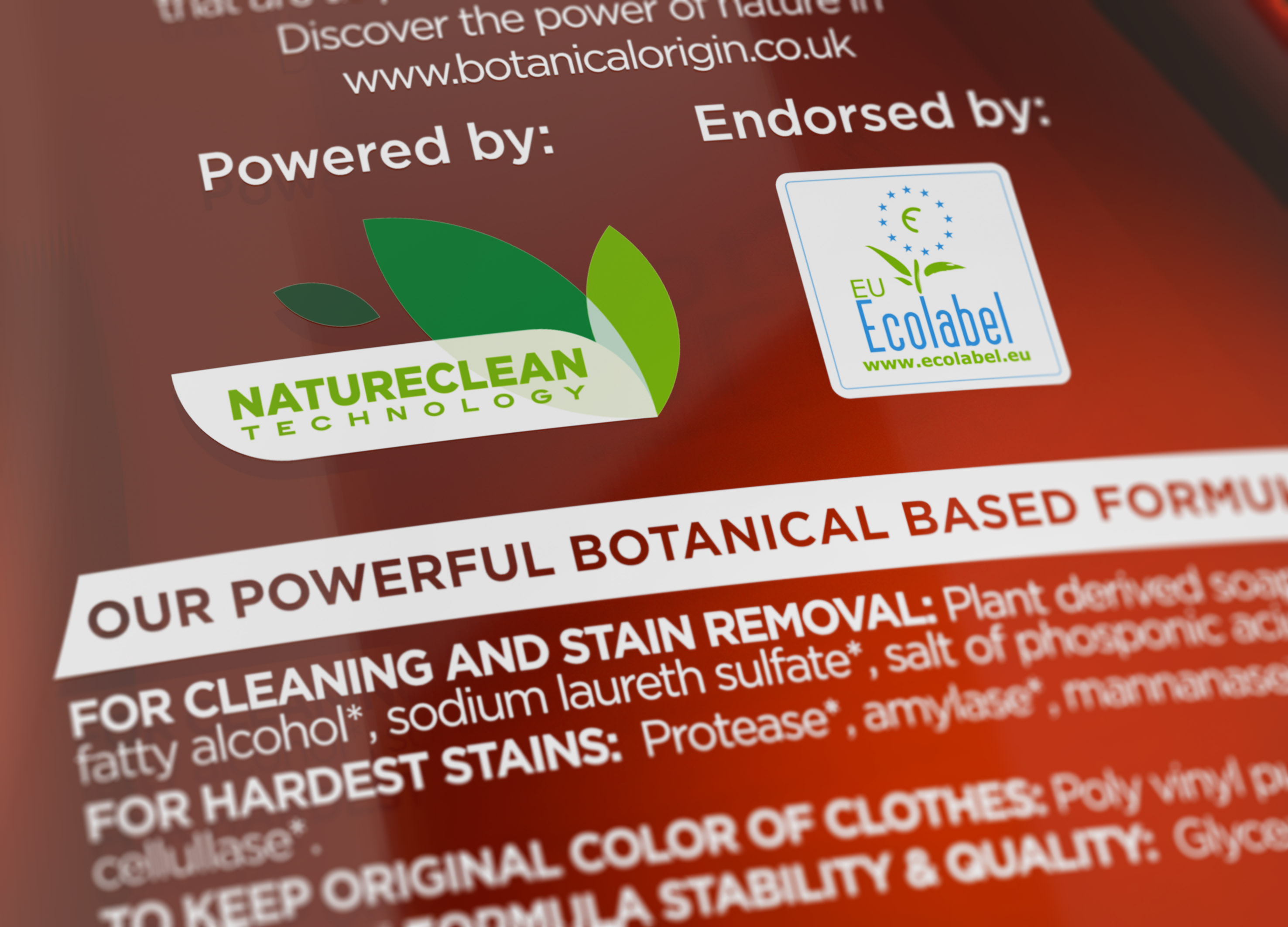
The design of the label combines the sensuousness of the ingredients of botanical origin with the performance and efficacy of the products, visibly underscoring the main benefits. Particular emphasis is placed on specially developed Natureclean technology, which combines potent cleaning agents of botanical origin, to ensure the same degree of efficacy achieved with conventional products.
Likewise, the labels are designed with transparent materials to potentiate the luminescence and naturalness of the product. And we respect the essential colours of the botanical ingredients and establish them as the code which differentiates the various aromatic options.

CREDIT
- Agency/Creative: batllegroup
- Article Title: Global Branding for a Cleaner World
- Organisation/Entity: Agency, Published Commercial Design
- Project Type: Packaging
- Agency/Creative Country: Spain
- Market Region: Europe
- Project Deliverables: Brand Experience, Brand Identity, Brand Naming, Brand Redesign, Brand Strategy, Branding, Packaging Design, Rebranding
- Format: Blister-Pack
- Substrate: Plastic


