


The agency’s task: Our task was to develop a single recognisable corporate identity for the non-profit organisation “Chistaya Vuoksa”. It mattered to create an image that will attract younger and more active volunteers and partners.
The project “Chistaya Vuoksa” offers large-scale volunteer eco-boat trips that unite people and enable to form a culture of eco-friendly recreation and nature conservation in the Leningrad Oblast near Saint Petersburg, Russia. The project has existed for eight years. Since the creation of the project in 2013, the Chistaya Vuoksa volunteers collected more than 300 tons of garbage as well as 115kg of batteries and more than 45 tons were handed over for recycling. More than 4,000 people took part in the project.
The market of eco-projects: An identical identity Most of the market players develop their corporate identity in a very traditional way: green colour, outdated graphics and classic images. A negative imagery In their communication, eco-brands very often take the position of accusers while using emotionally negative messages and images.
An ideal future: A new generation of eco-brands is emerging on the market. They focus on the idea of an ideal world when people join their
movements.
The consumers: Our audience consists of people who are not indifferent to nature and its future. They value and understand the importance of their participation in cleaning up the planet. They are modern and active city dwellers. They choose to act on their own responsibility rather than waiting for others. It is important for them to feel like a part of a large and friendly community where they can find like-minded people and friends.
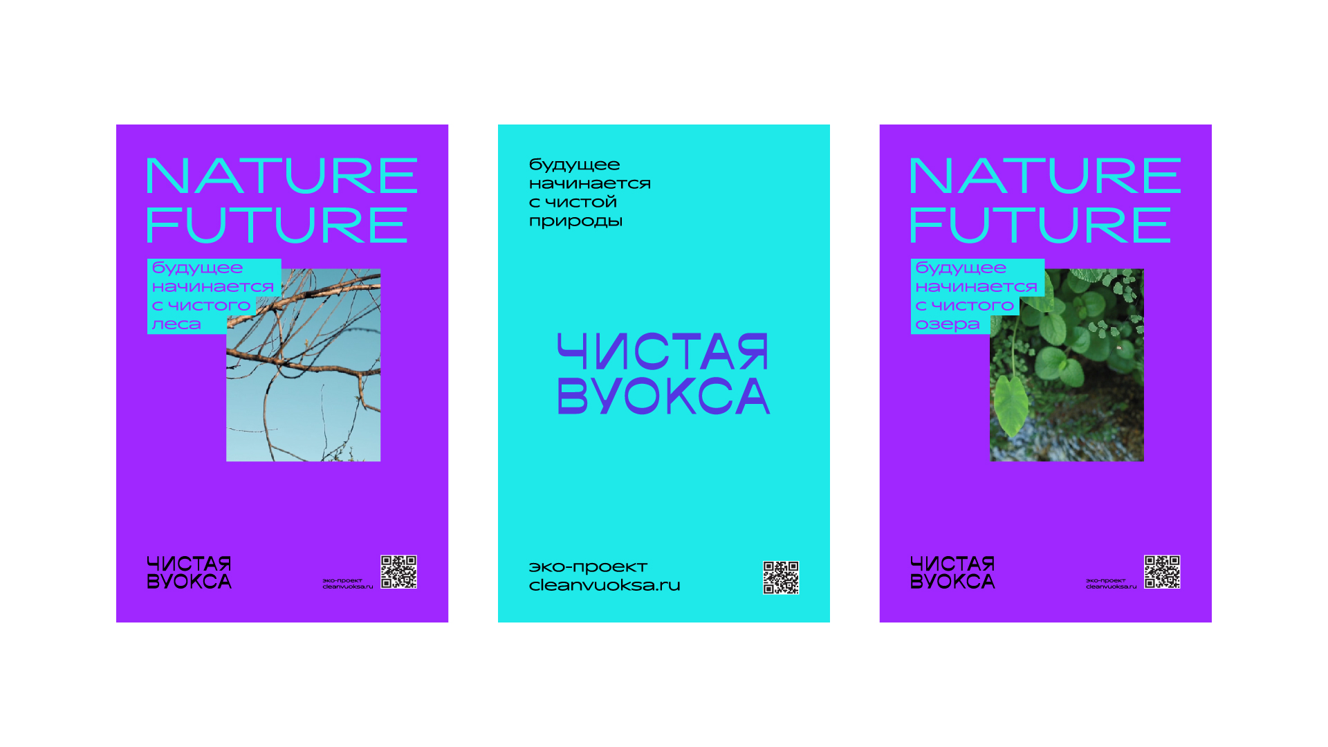
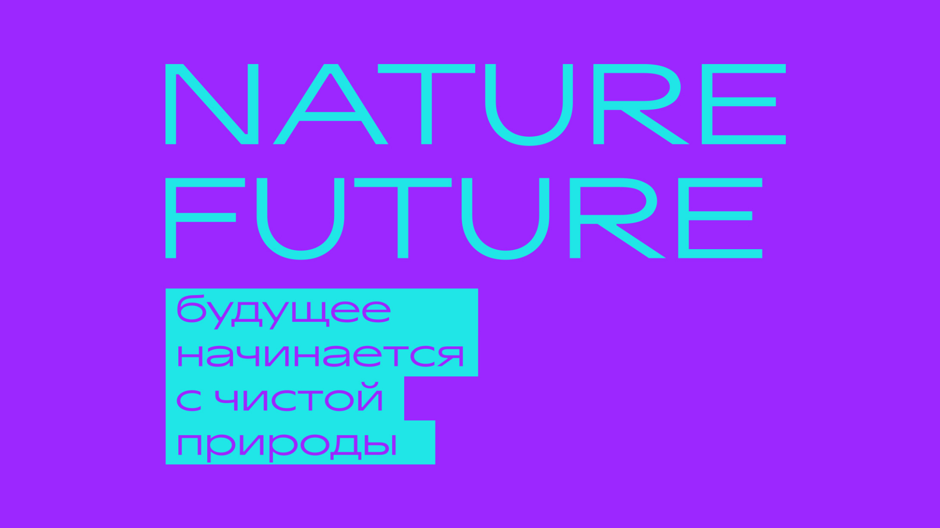
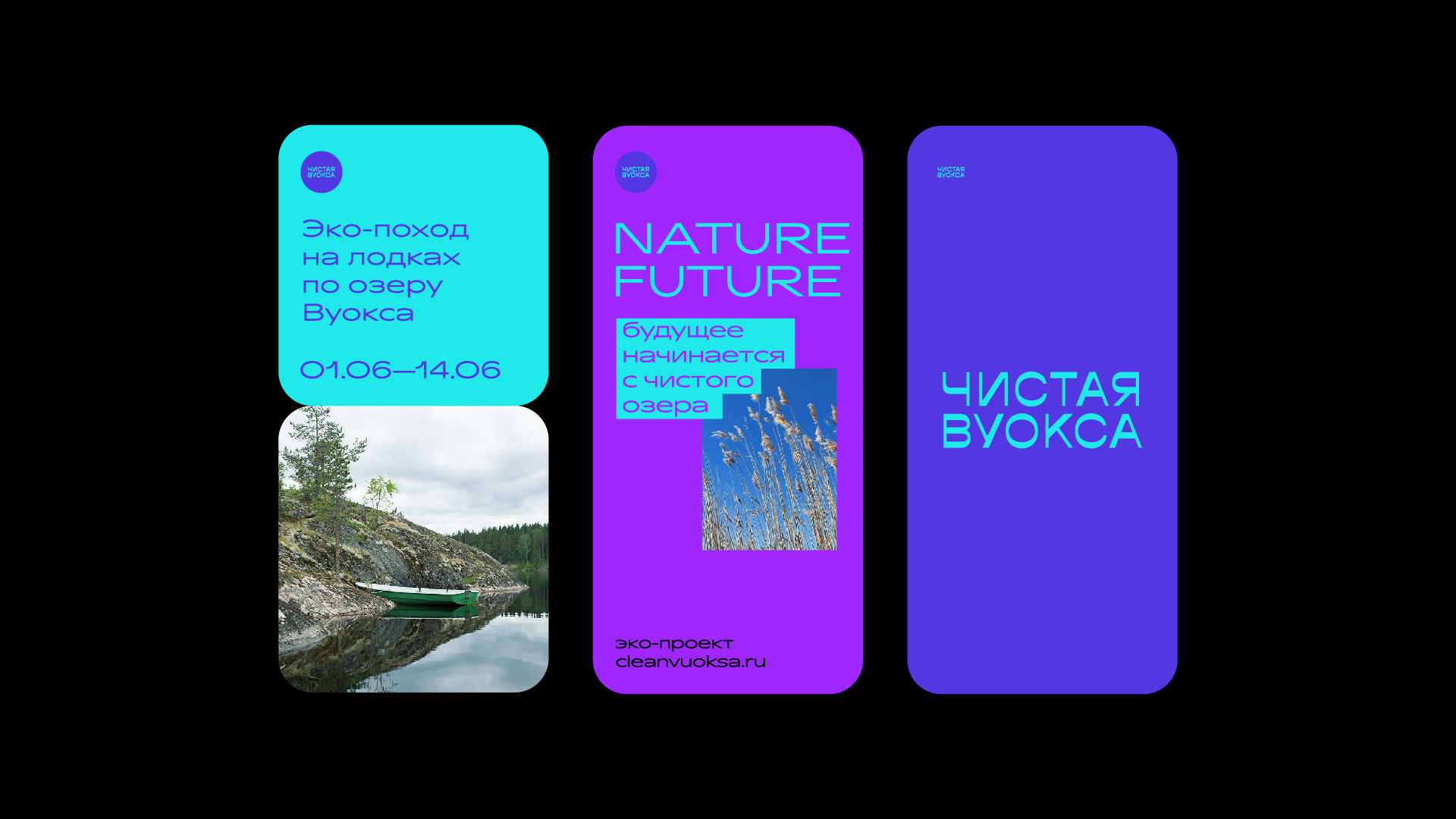
The design idea: a modern look at eco-projects: The future depends on us and future generations. How we relate to nature today influences tomorrow. We understand that it is
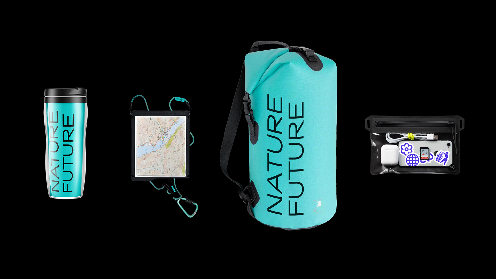
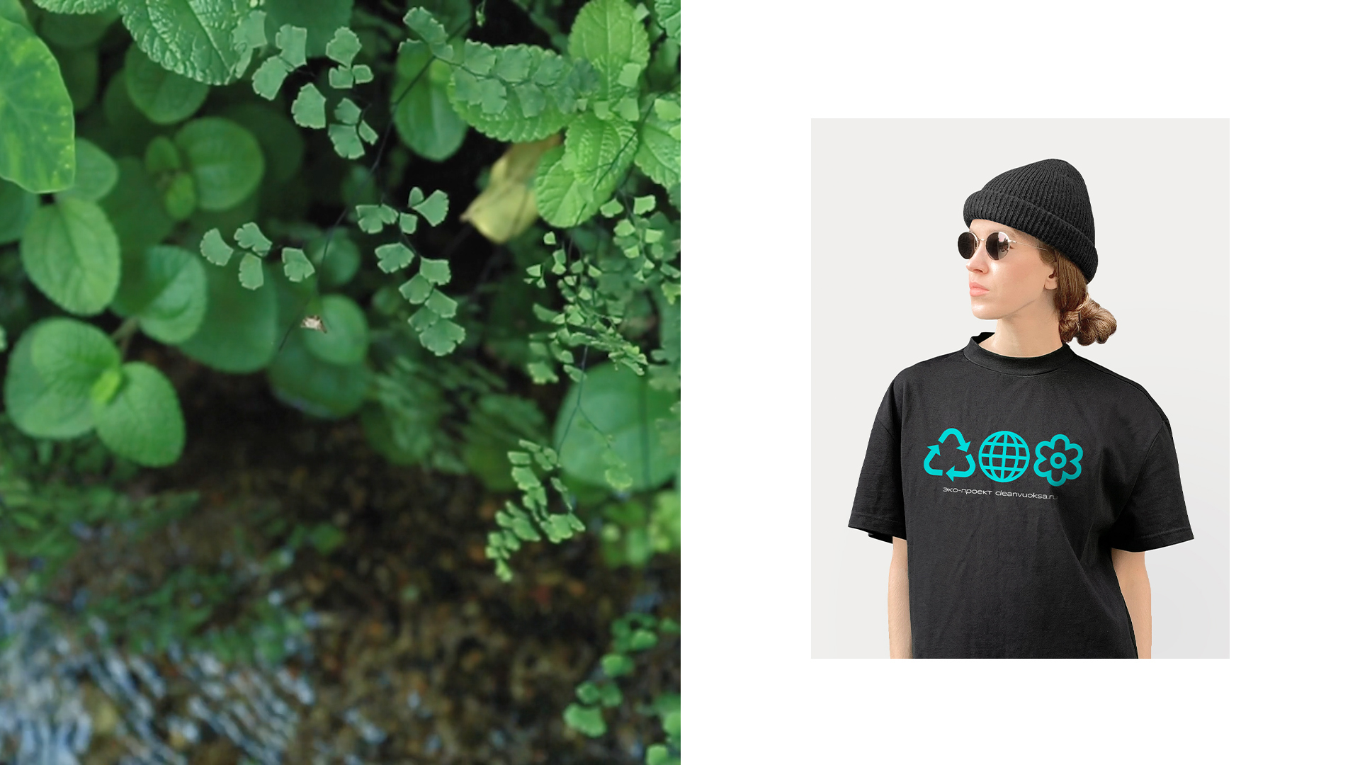
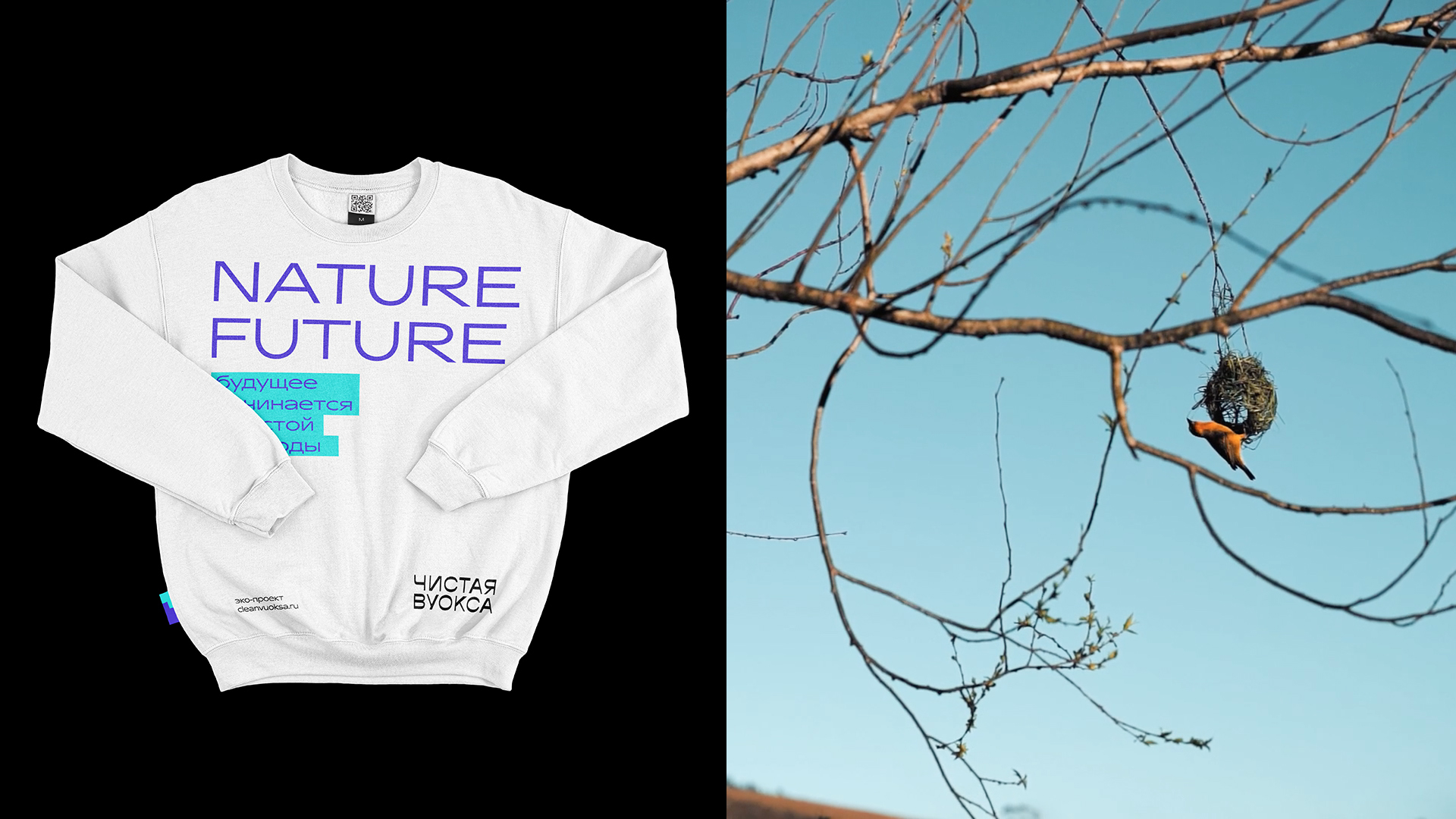
important to involve young people in active volunteer activities in the Chistaya Vuoksa project. That’s why, we have developed a modern, slightly futuristic corporate identity that speaks to them. The design: At the heart of the design solution is the key slogan “Nature Future”. This name possesses a lot of meanings. When paying attention to the spelling, you notice that the words have the same ending. This emphasises their relationship and interdependence: naTURE — fuTURE. The slogan is the basis for communication in all media. The logo: In the logo, it mattered to emphasise the modernity of the project while combining nature and manufacturability in it. The clean lines and crisp letterforms of the sign maintain this balance. The sign is perceived as calm and is paired with the main font of the brand called “Transgender”. The primary colours are turquoise and blue. Red and purple are used as an additional palette. Their ratio is approximately 80/20, which enables them to emphasise the brand’s calm and clean character, while maintaining the idea of the future and modernity.
The results: We focused on a young and active audience. We have detached ourselves from similar eco-projects due to a modern image and emotional communication. We supported the main USP of the brand, which is about the readiness to help nature.
CREDIT
- Agency/Creative: Ferma Branding Agency
- Article Title: Ferma Agency Revamps Design of Environmental Organisation
- Organisation/Entity: Agency
- Project Type: Identity
- Project Status: Published
- Agency/Creative Country: Russia
- Agency/Creative City: Saint Petersburg
- Market Region: Europe
- Project Deliverables: Advertising
- Industry: Non-Profit
- Keywords: Eco Tourism, Volunteering, Garbage Collecting, Protect Nature
-
Credits:
Ferma Agency: Ferma Agency


