


Before starting the project for Fathom, Form Digital completed market research that exposed the saturation and technological advancement of the engineering industry’s marketplace. Most brands in the sector share a highly modern design approach, alluding to the future in an attempt to communicate technological superiority.
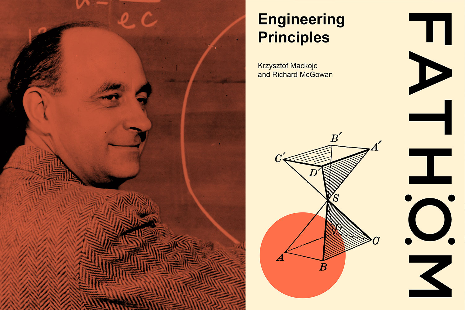
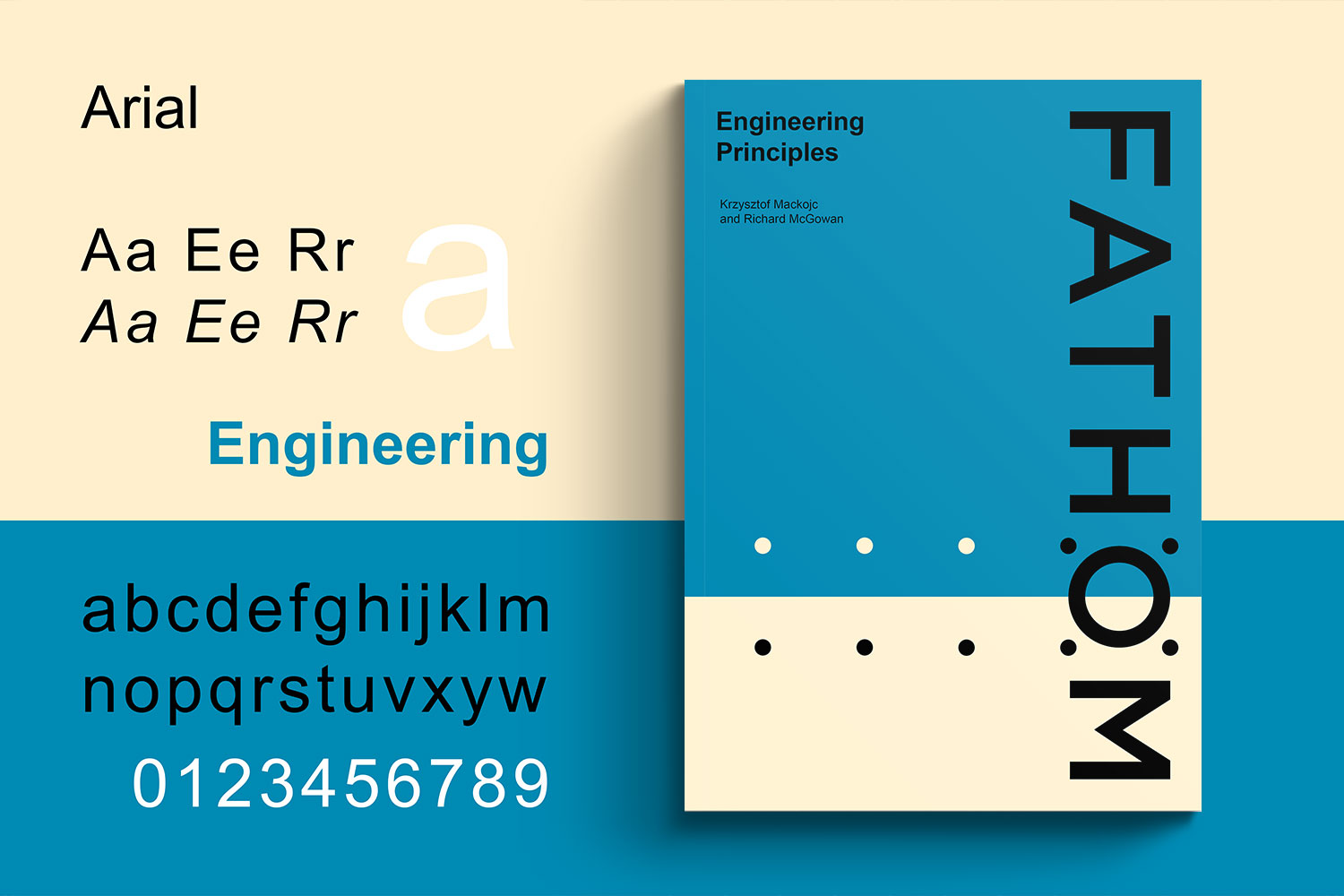
We set out to instead define Fathom through its origins, creating visual branding that would signify the core principles of engineering, evoking a sense of nostalgia that would disrupt the market’s highly modern tendencies. We challenged ourselves to create a brand identity that could convey a balance of cutting edge engineering with an evocative retro twist. We drew inspiration from historical engineering textbooks, coupling bold blocks of colour with the uncomplicated Arial typeface, widely acknowledged as the engineers font of choice.
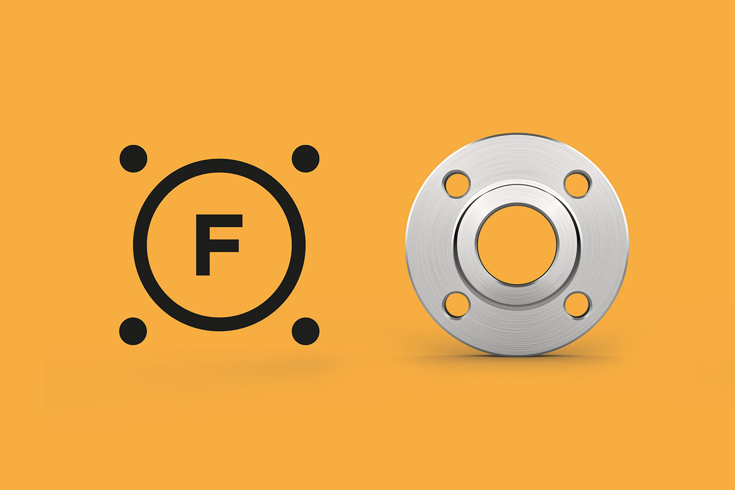
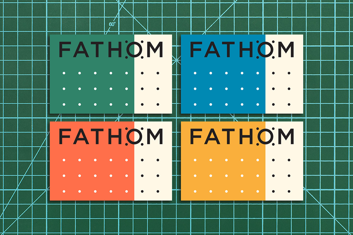
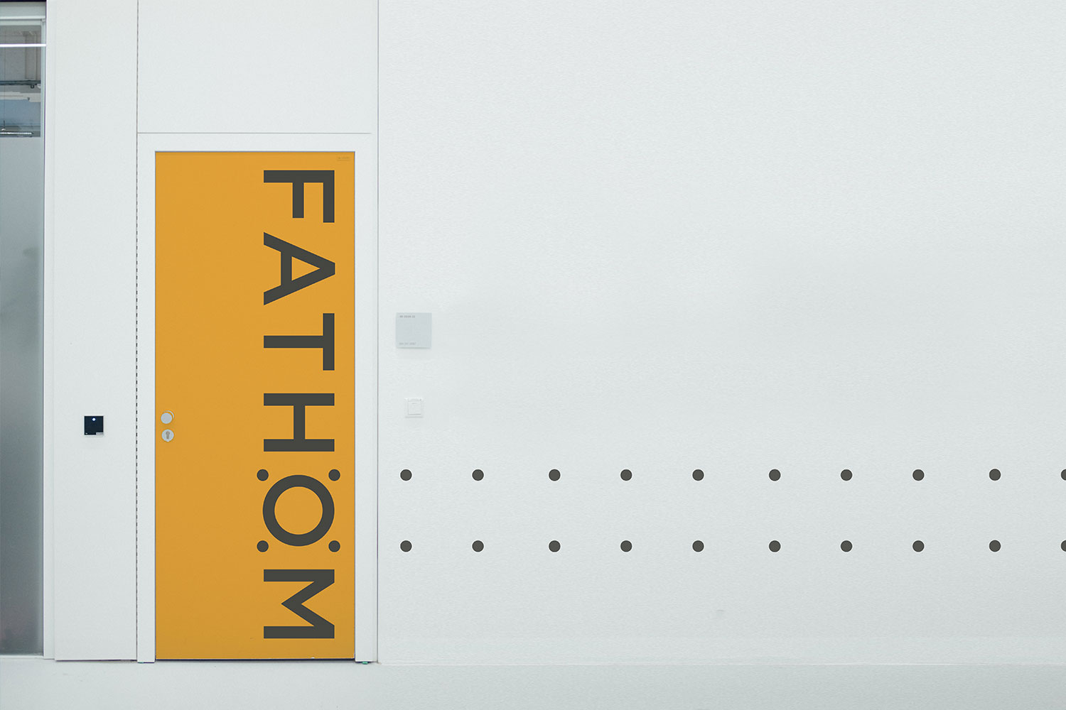
The base design for the logo marque mirrors a simple flange element with a 4 bolt stud pattern to signal the brand’s association with the oil and gas industry. The accompanying animation that displays diagonal dots appearing, expands on this symbolism to reflect bolt tightening sequences. We designed the logo to be elegant yet strong in its simplicity to ensure that it remains memorable and will stand the test of time.
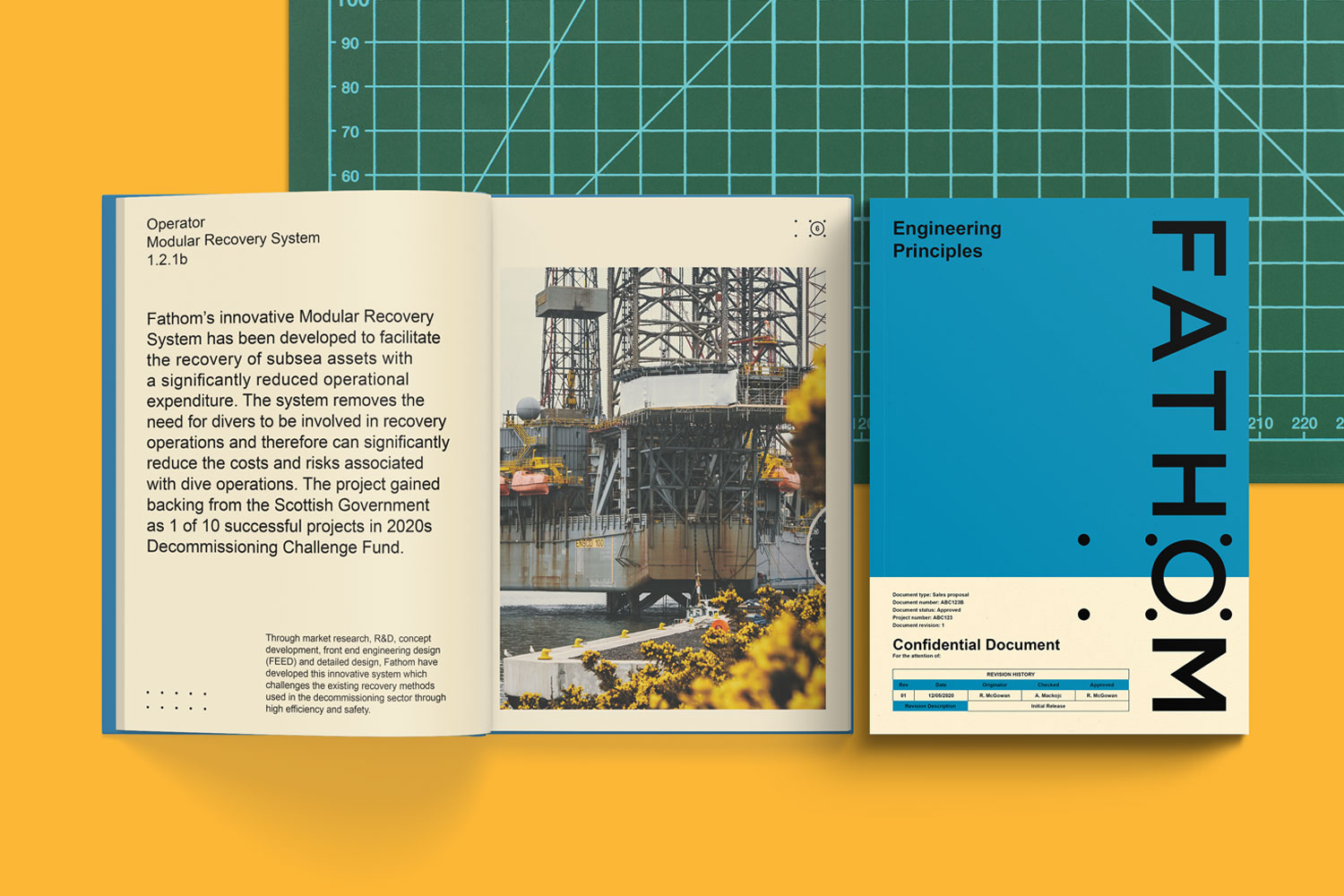
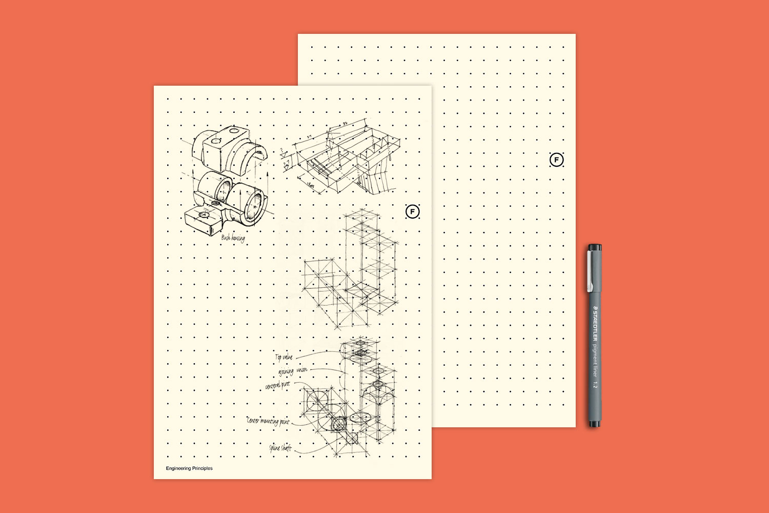
The brand colours emulate those used in the early maths and engineering textbooks with which all engineers will be familiar. Triggering a memory through the pastel colours and overlaid shapes from these industry-specific resources contributes to the wider sense of nostalgia we were aiming to evoke – as well as generally communicating a reassuring warmth. In the creation of imagery assets, we continued our stripped-back approach, deriving content from engineers’ software at source that focused less on marketing and more on the facts, figures and knowledge that we were looking to elevate.
Engineering principles are the basis and fundamentals that route engineering and mathematical origins. Without these principles, all engineering and guiding rules would not exist. Many companies have used terms such as pioneering and innovation, however we chose to start at the basis of engineering knowledge, where it lies and is truly rooted. We simply chose engineering principles for the company strapline.
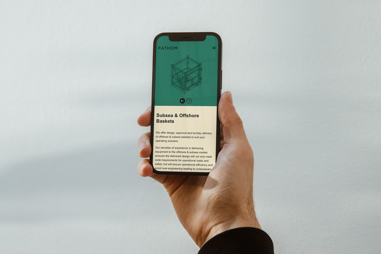
The final stage was to deliver a digital platform for the new brand to live, embracing the latest in web technologies but still staying true to the nostalgic aesthetic we had created.
We opted for a clean and bold interface with large blocks of colour and the use of subtle animation to bring the site to life. It was important for the team at Fathom for us to deliver something that could grow with them as a company and allow the team to showcase their range of services and equipment in a way that was intuitive to navigate.
CREDIT
- Agency/Creative: Form Digital
- Article Title: Fathom Brand Identity – a Nostalgic Approach for a Forward Thinking Company
- Organisation/Entity: Agency
- Project Type: Identity
- Project Status: Published
- Agency/Creative Country: United Kingdom
- Agency/Creative City: Aberdeen
- Market Region: Europe
- Project Deliverables: Brand Creation
- Industry: Energy
- Keywords: WBDS Agency Design Awards 2021/22
-
Credits:
Design & Motion: Form Digital


