


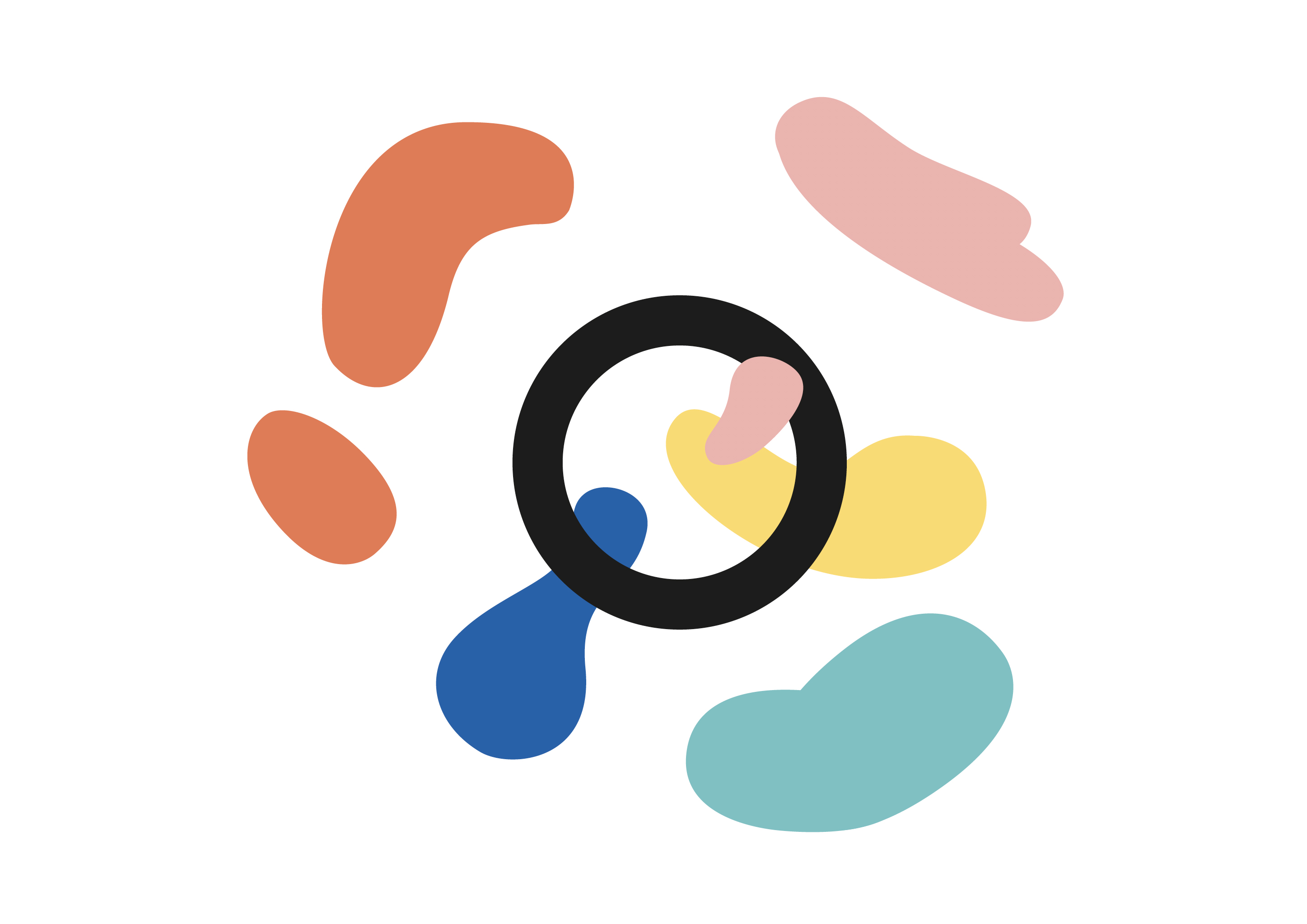
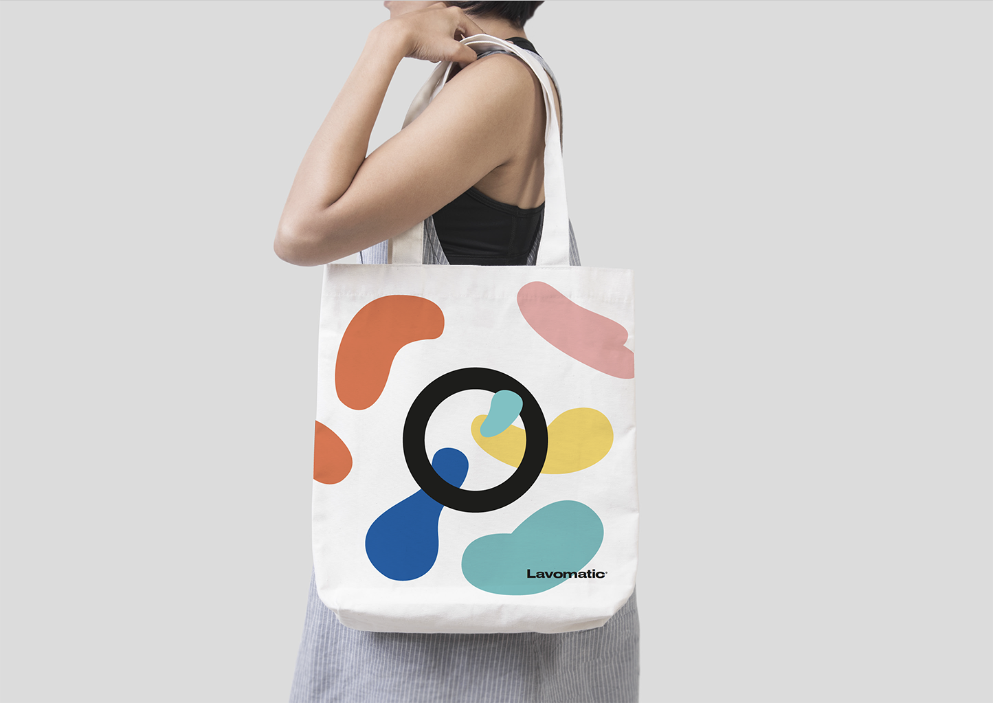
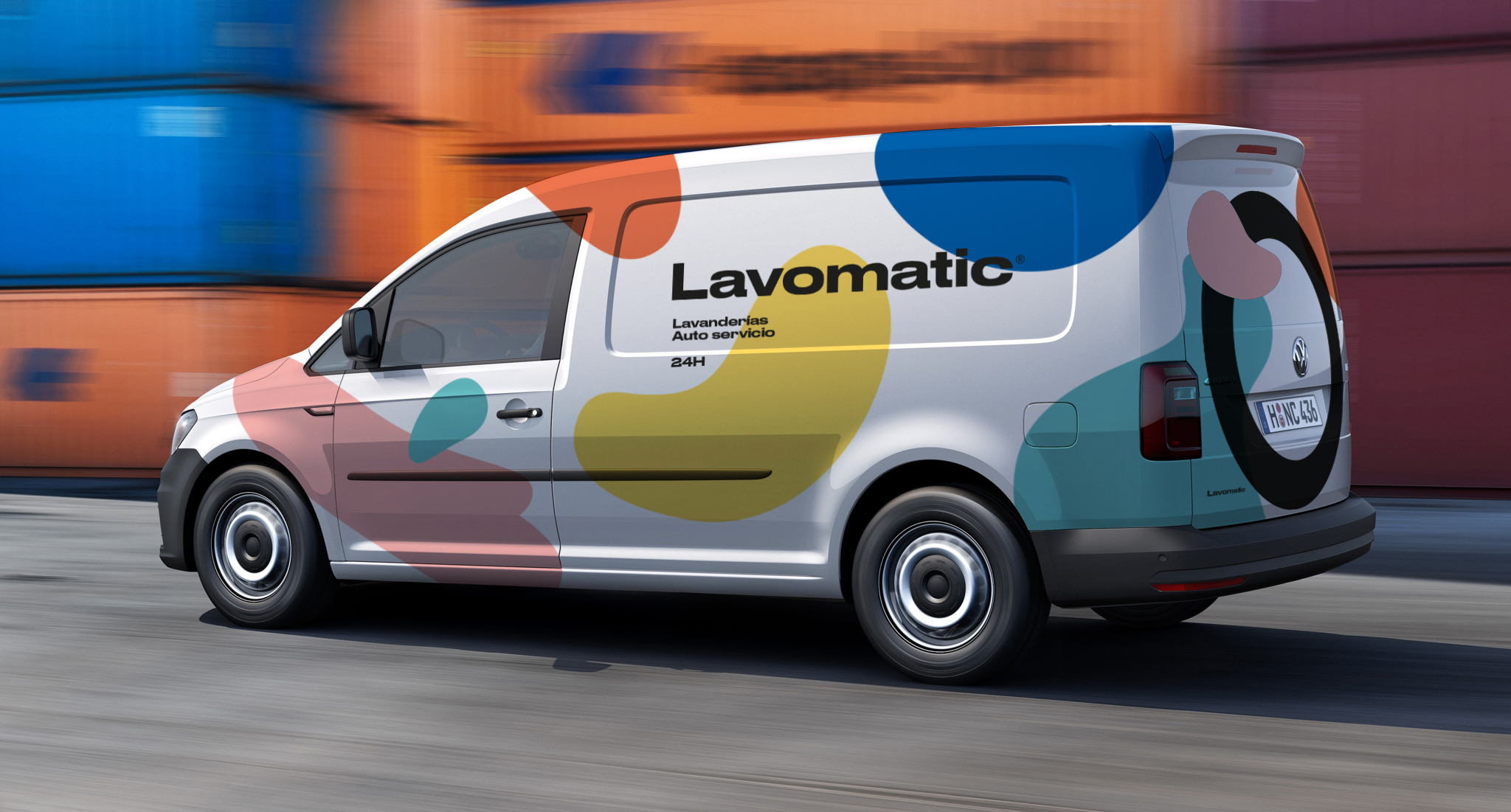
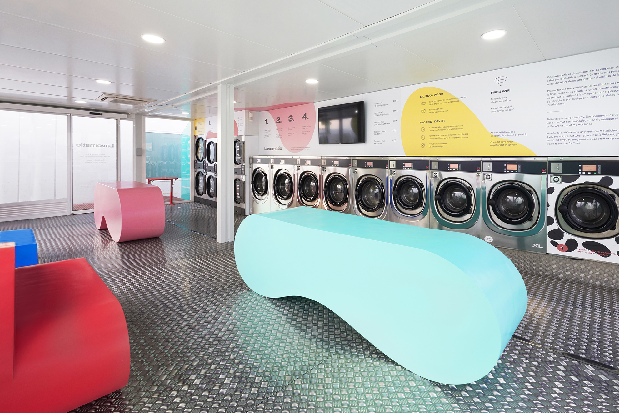
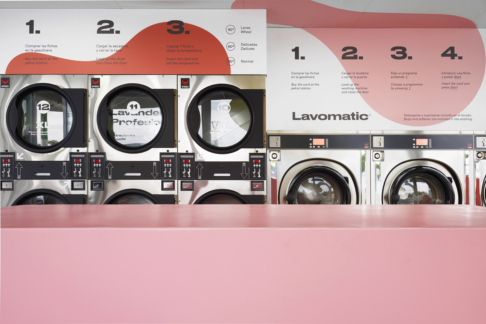
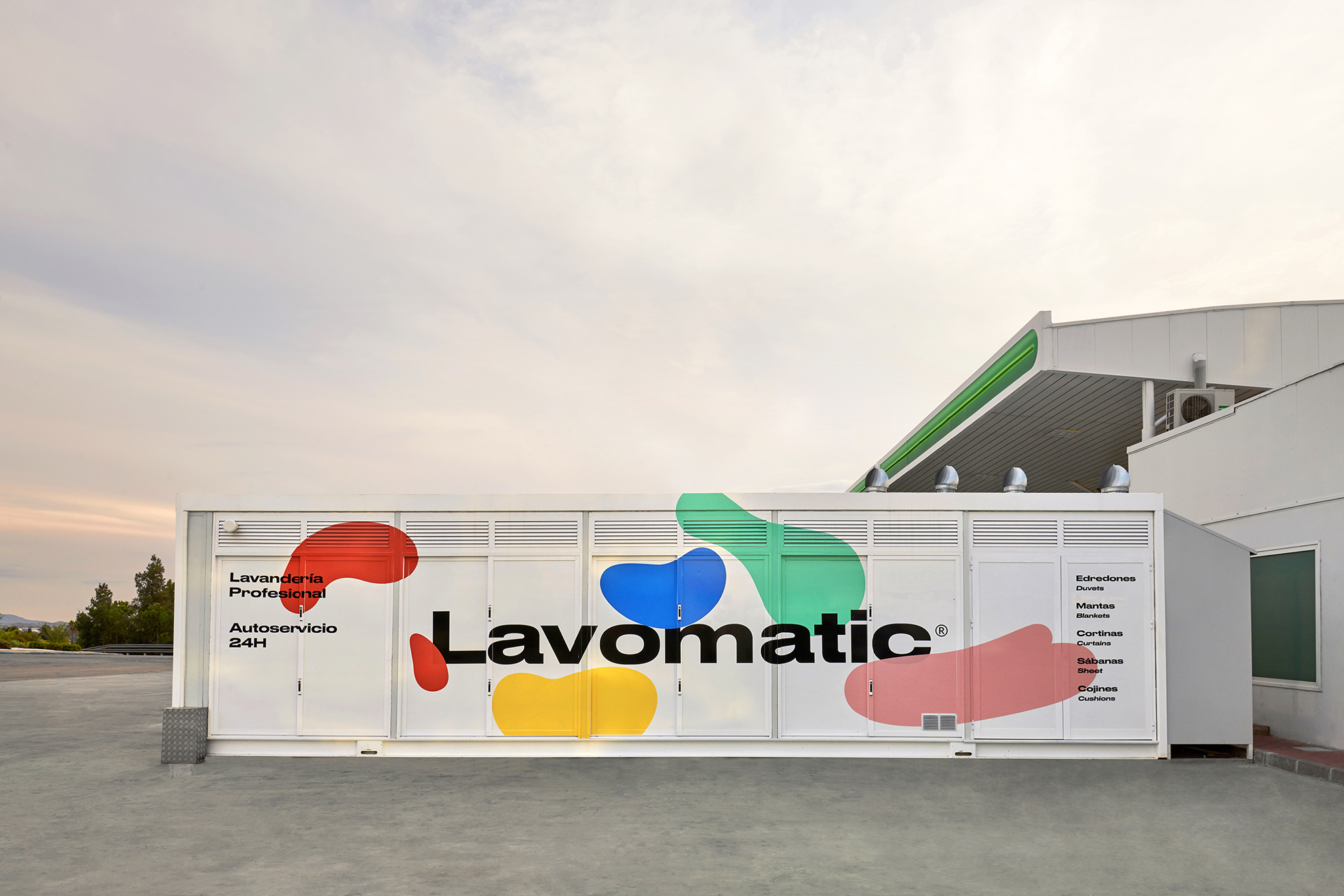
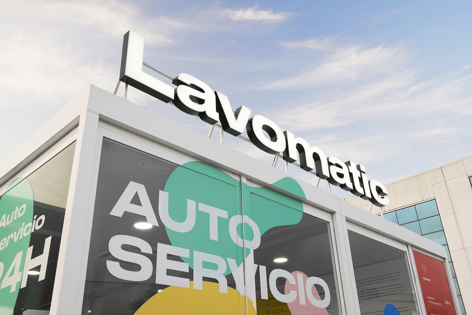
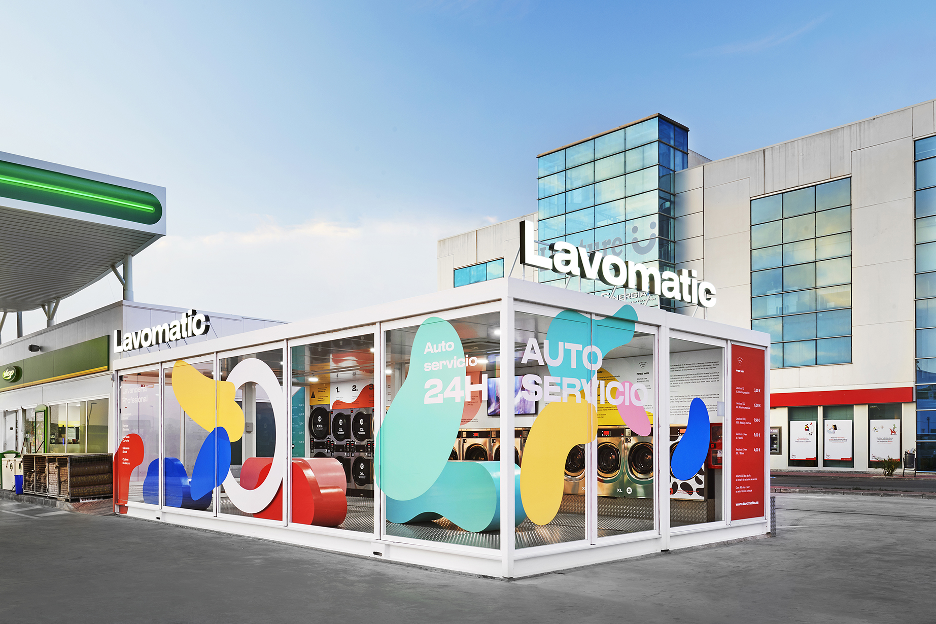
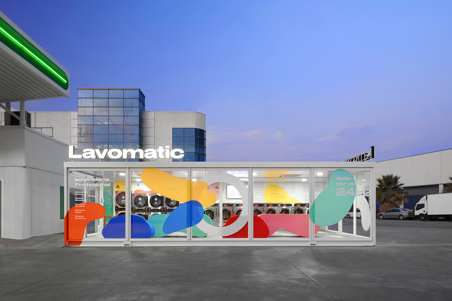
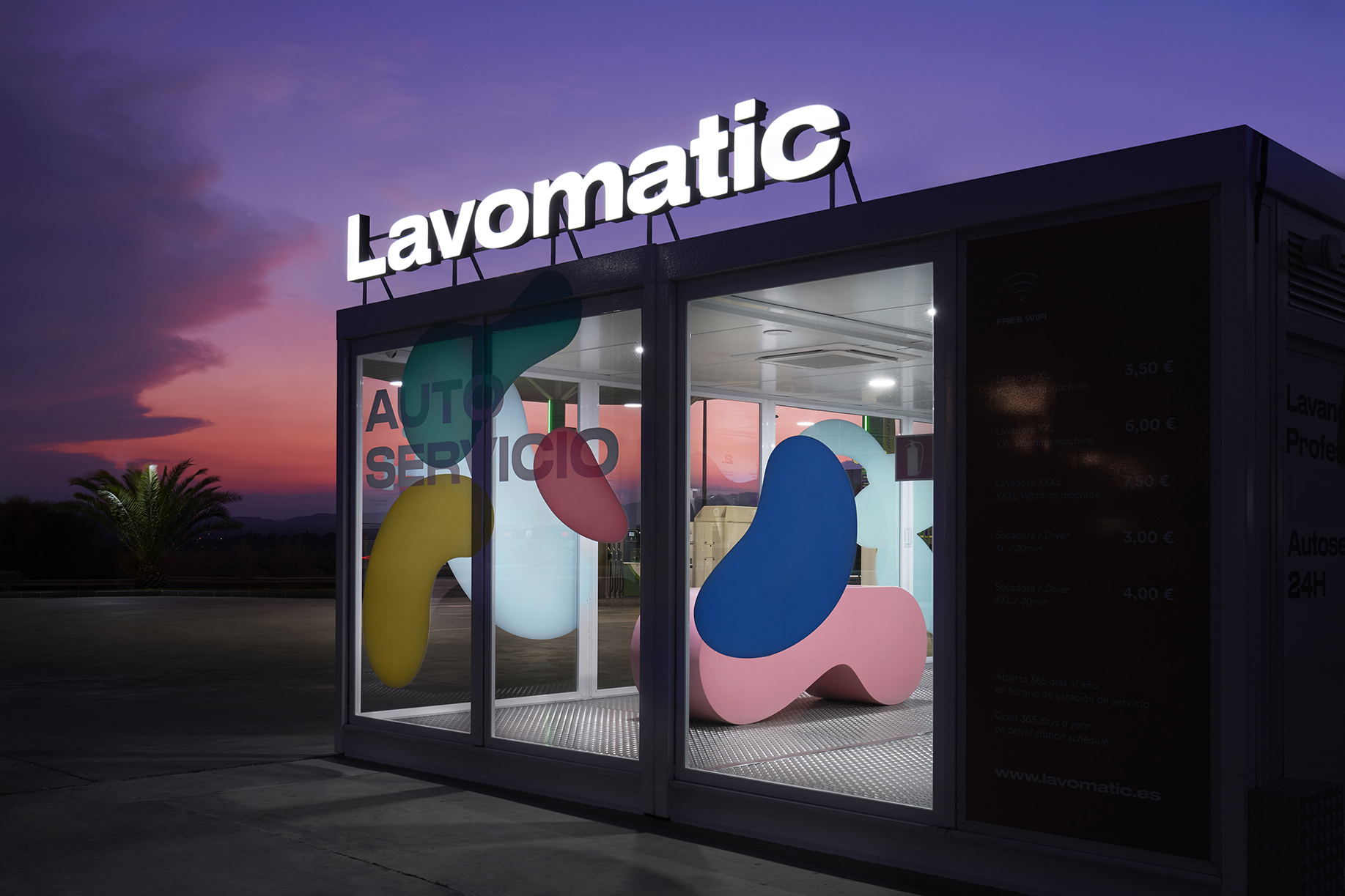
To generate the identity for Lavomatic we use different colored shapes to represent the dirty clothes around the drum of the washing machine itself.
A very personal communication that makes the difference with its competition thanks to its colours and the furniture, which is made with the same shapes and adapted to a prefabricated space.
CREDIT
- Agency/Creative: F33
- Article Title: F33 Redesign a Self-Service Laundry Network Brand
- Organisation/Entity: Agency, Published Commercial Design
- Project Type: Identity
- Agency/Creative Country: Spain
- Market Region: Europe
- Project Deliverables: Brand Identity, Brand Redesign, Brand Refinement, Brand World, Branding, Graphic Design, Identity System, Rebranding
- Industry: Hospitality
- Keywords: Laundry, color, shapes, branding, graphic design
FEEDBACK
Relevance: Solution/idea in relation to brand, product or service
Implementation: Attention, detailing and finishing of final solution
Presentation: Text, visualisation and quality of the presentation


