


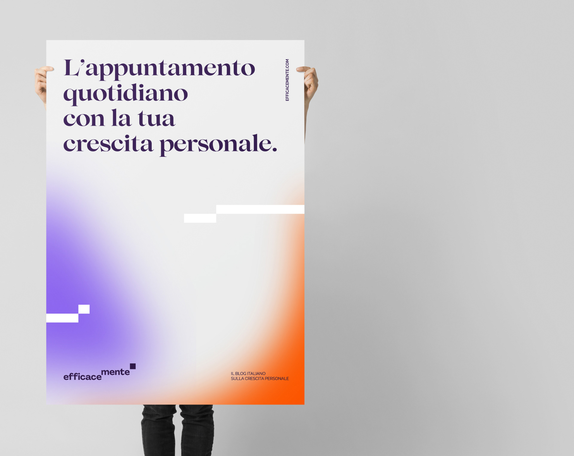
Efficacemente is the Italian reference blog for personal growth.A platform showing best practices, methods and daily activities to achieve different kinds of personal and professional goals. We were asked to work on rebranding, to simplify the brand and make it more immediate and understandable. We organised a co-design workshop with the owners and managers to define the values to be transmitted and the uniqueness of the project.
The rebranding, therefore, takes into account the three value pillars of the brand: Growth, Concreteness and Methodology.
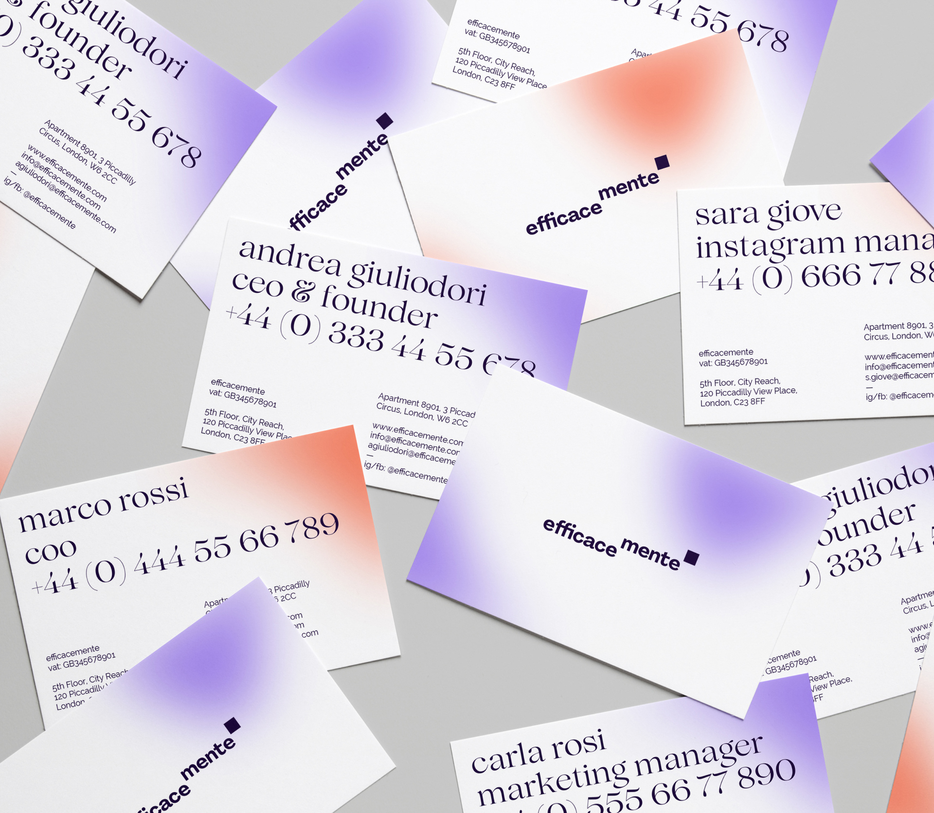
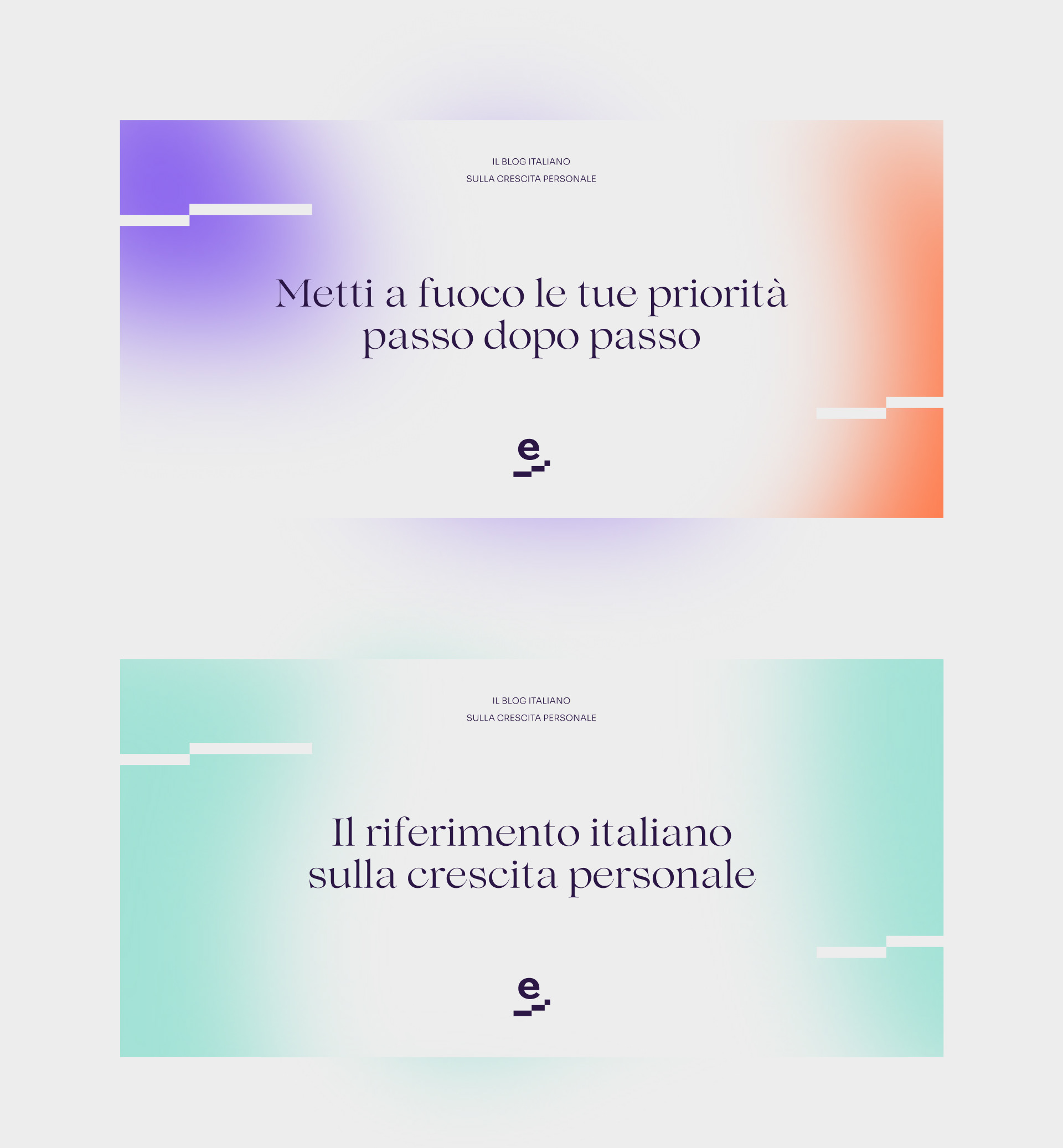
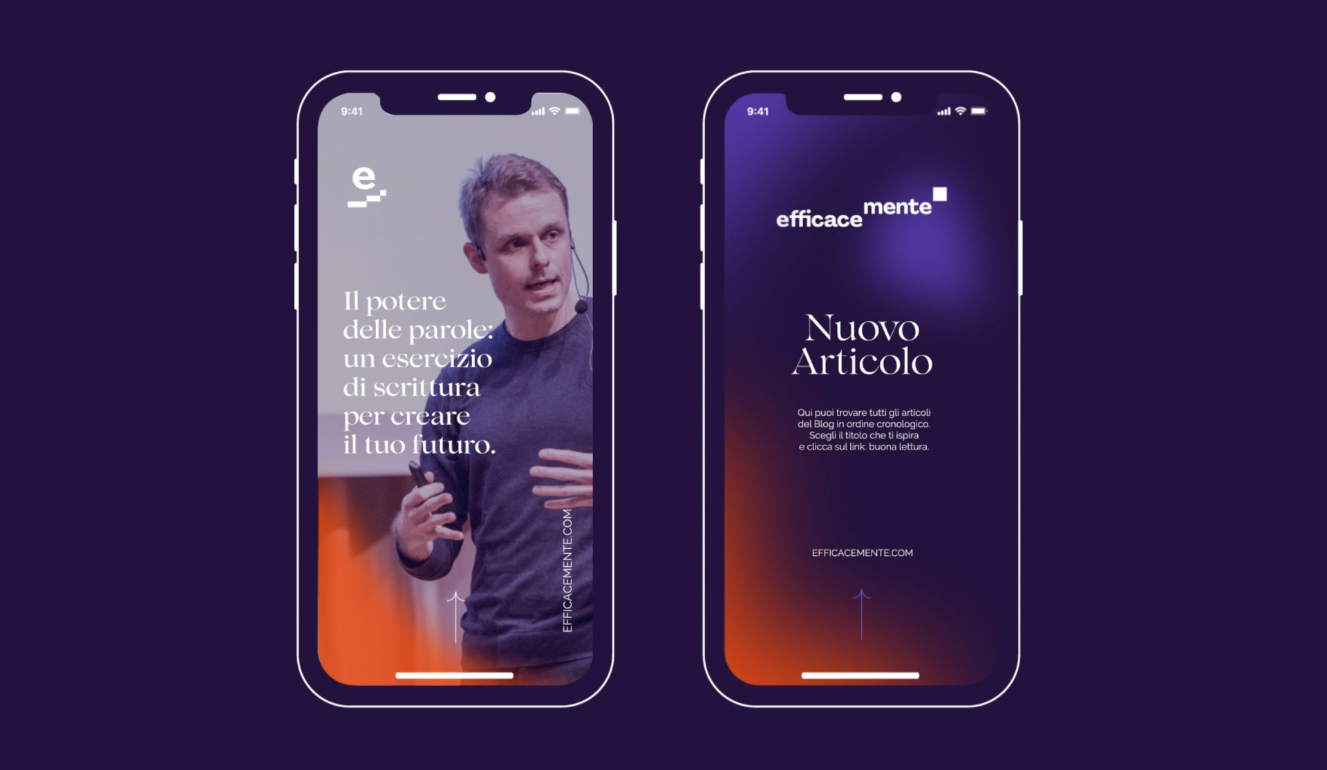
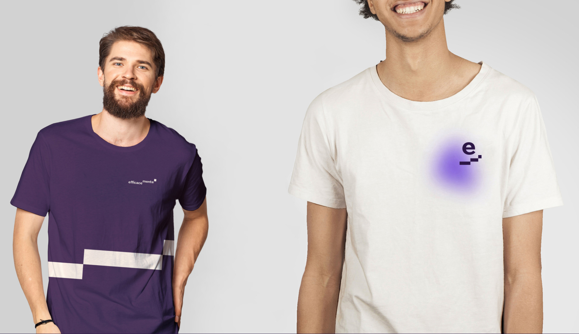
We modelled the logotype as a path of exponential growth visually arranged on three different heights like a reverse ‘gantt chart’ showing all the positive changes. The visual identity also includes a system of blurred shapes in light and dark versions. The blurred shapes represent our goals that are not yet in focus and create a perfect contrast to the remaining sharp geometric shapes that help us to focus and achieve them.
Furthermore, as this is an editorial project, we have introduced two fonts, one serif and one sans serif (the Lovelace and the Sora) to achieve the easiest and most immediate readability possible. The two fonts work very well together, giving all the drafts elegance but also concreteness. The colour palette has been designed in both ‘dark mode’ and ‘light mode’ so that each user can decide on the appearance of the future blog according to their own needs.
We also took care of creating a personalised brand sound that could work in symbiosis with the visual identity in order to create extremely personalised and recognisable digital works.
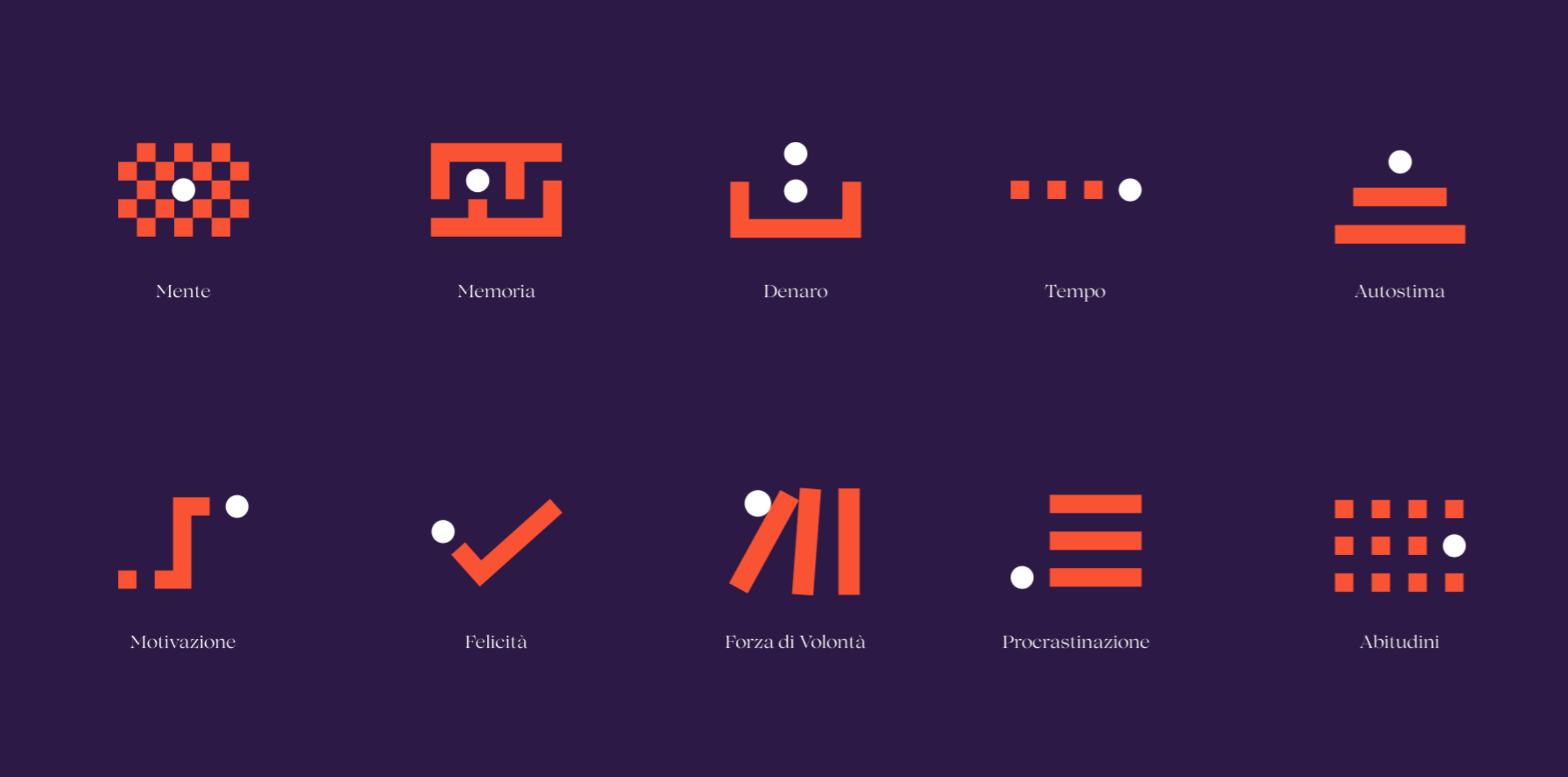
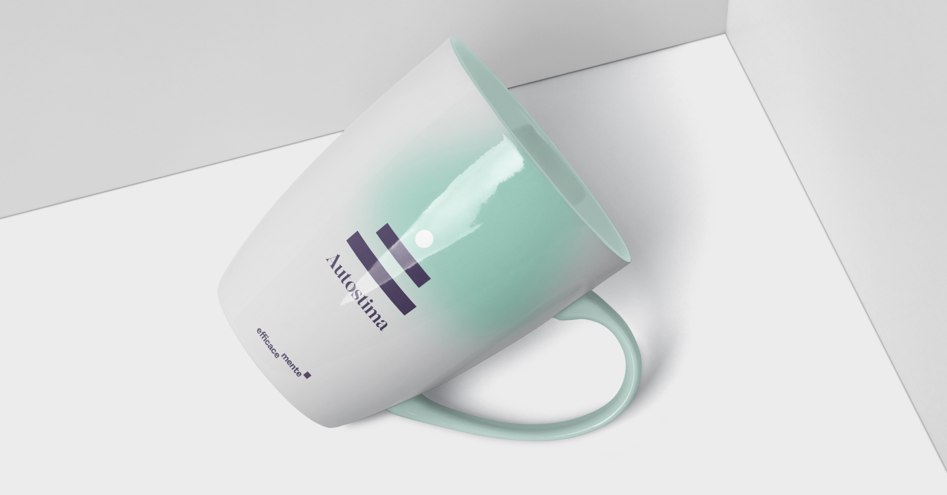
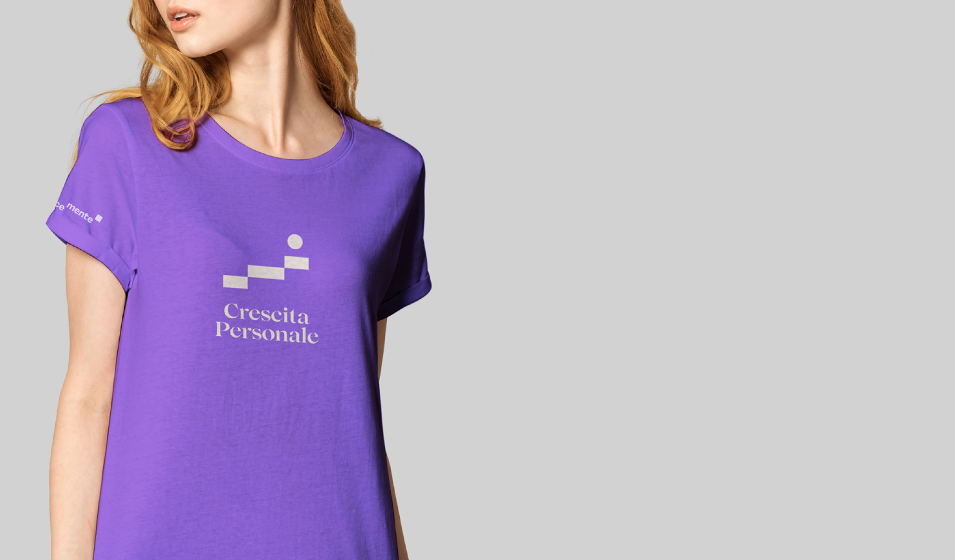
We designed a complex icon system based solely on basic geometric elements (circle and square) that communicate the different categories of the site, non-figurative elements that need reference icons, such as: motivations, relationships, personal growth, habits.
The entire visual identity system is presented in a sixty-second video in which the entire design process that led to the new rebranding is concentrated.
CREDIT
- Agency/Creative: onlab
- Article Title: Efficacemente the Italian Blog on Personal Growth
- Organisation/Entity: Agency, Published Commercial Design
- Project Type: Identity
- Agency/Creative Country: Italy
- Market Region: Europe
- Project Deliverables: Brand Design, Brand Guidelines, Brand Identity, Brand Redesign, Brand Strategy, Branding, Graphic Design, Identity System, Illustration, Rebranding
- Industry: Education
- Keywords: growth, personal growth, methodology, concreteness, objectives, effectiveness, efficiency, motivation,


