


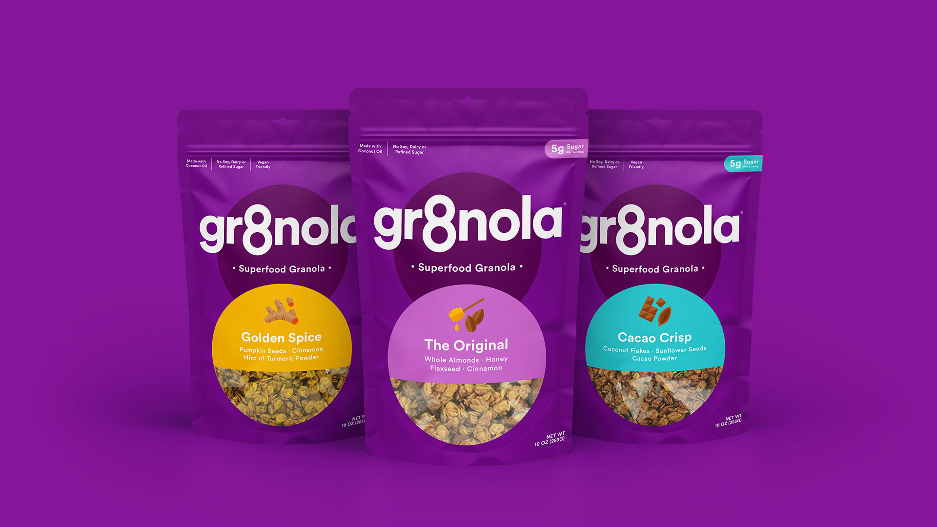
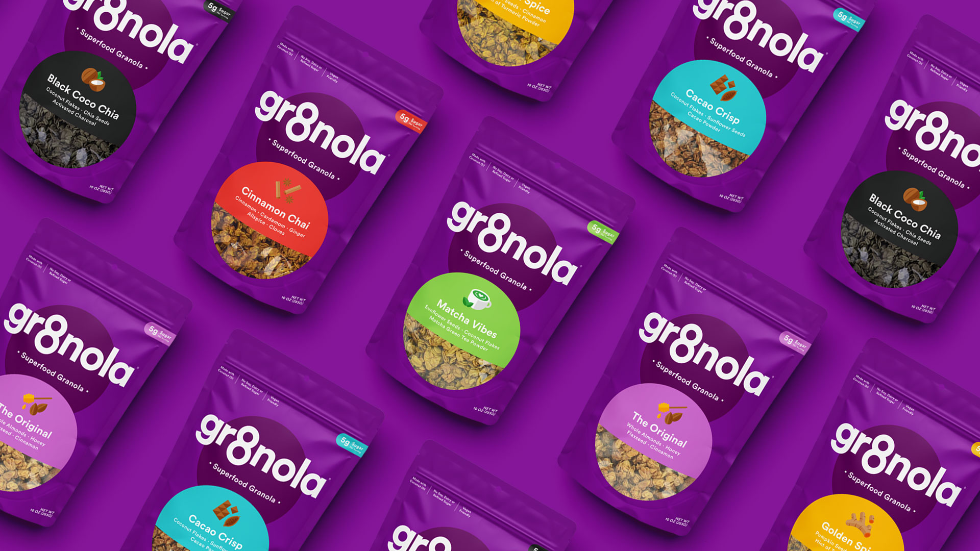
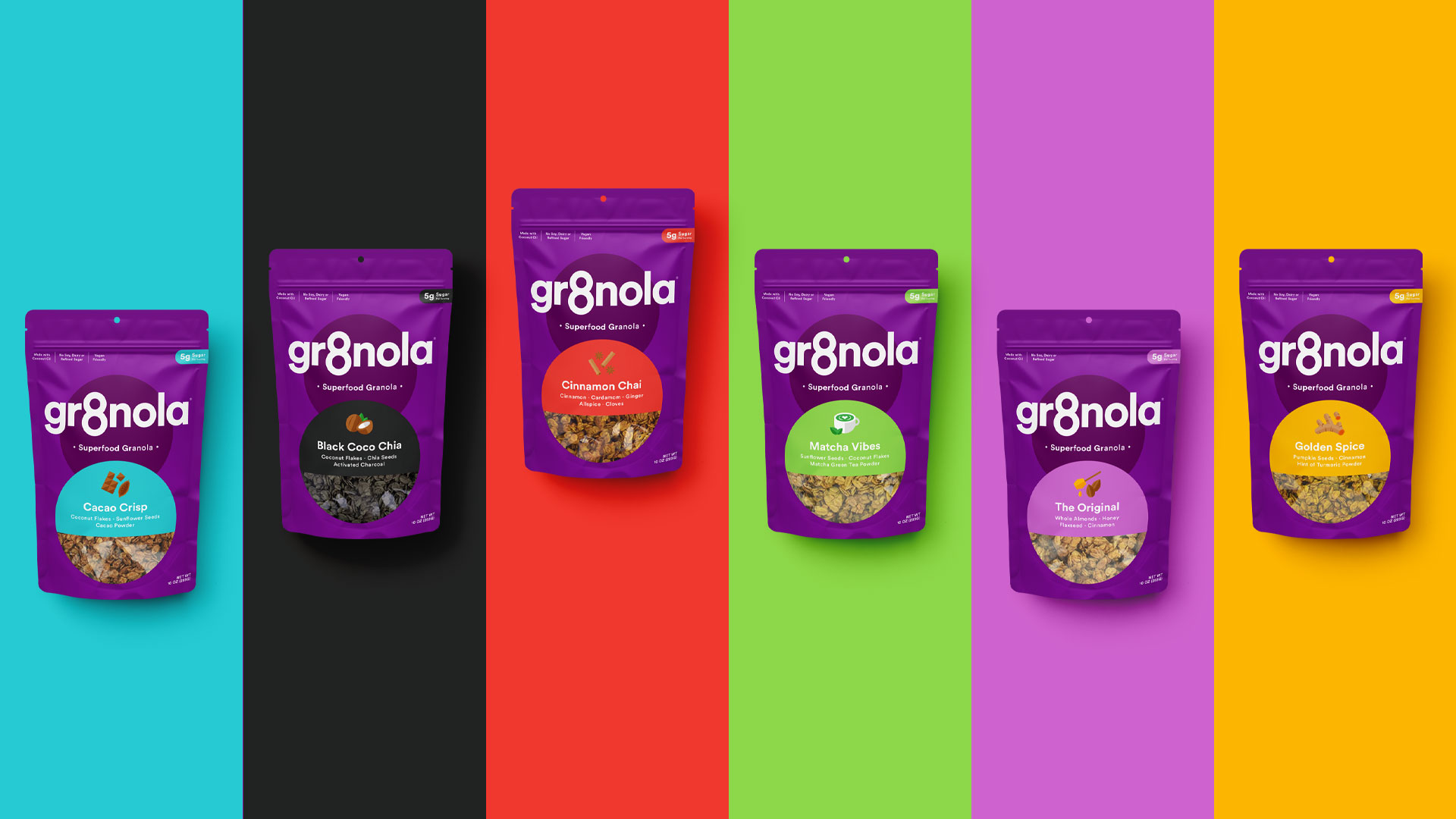
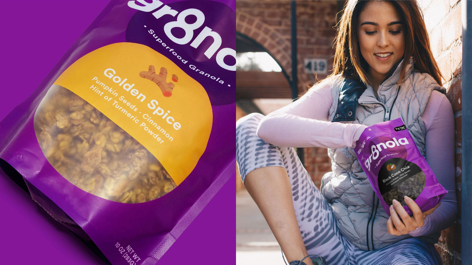
Deuce Studio have been working with Gr8nola for over 4 years, when they first rebranded the US based superfood granola brand, building upon that rebrand the agency has added some extra taste appeal and approachability with a set of fun flavour illustrations and extra helping of colour in the form of a semi circle device.
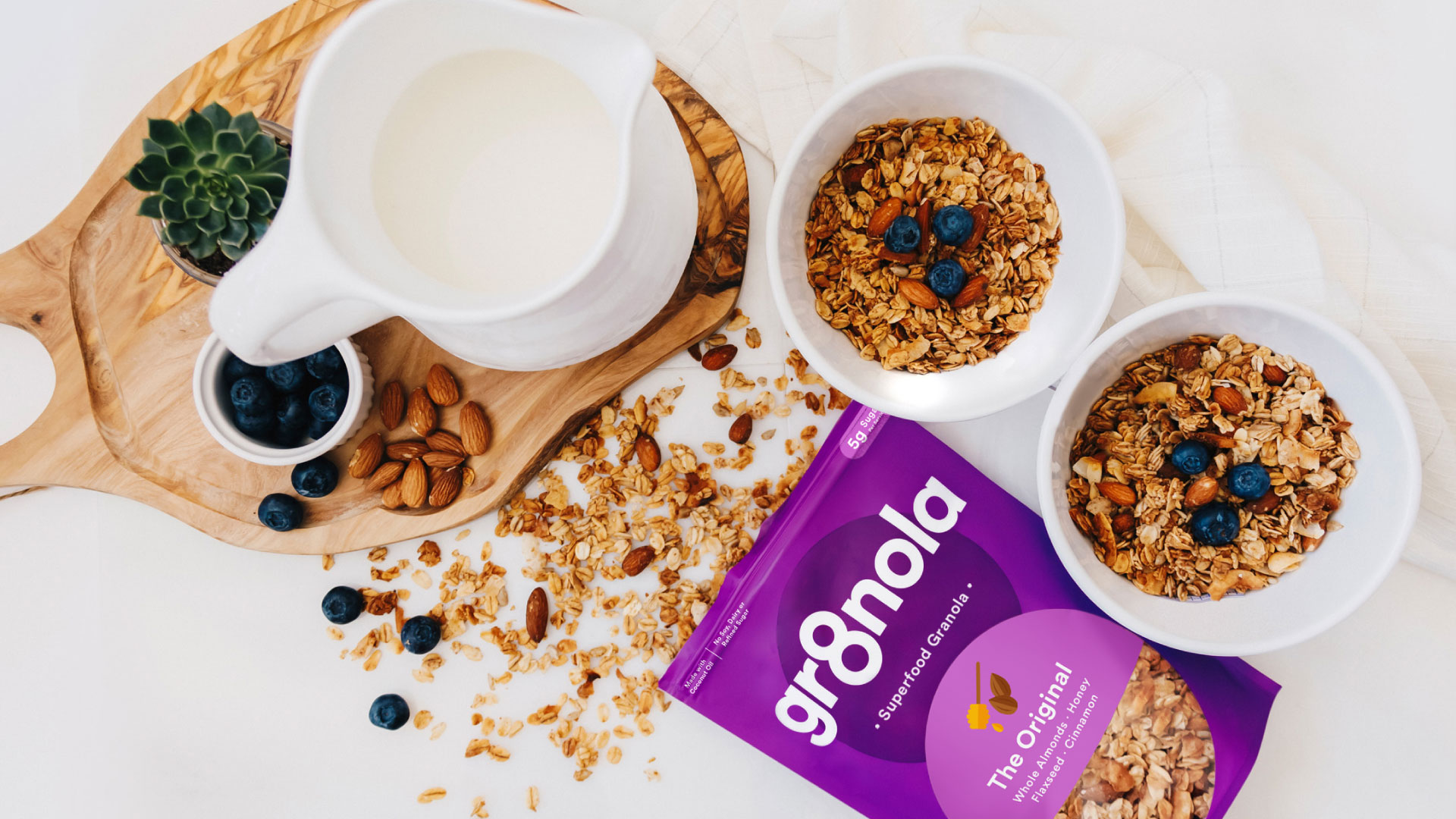
The original rebrand introduced a new and stand out predominately purple colour scheme for the cereal category combined with an honest and aspirational tone of voice, to inspire consumers to eat, be and do gr8 things. The overall brand design language is simple and bold to help cut through the noise of the overly fussy category to create real standout on shelf.
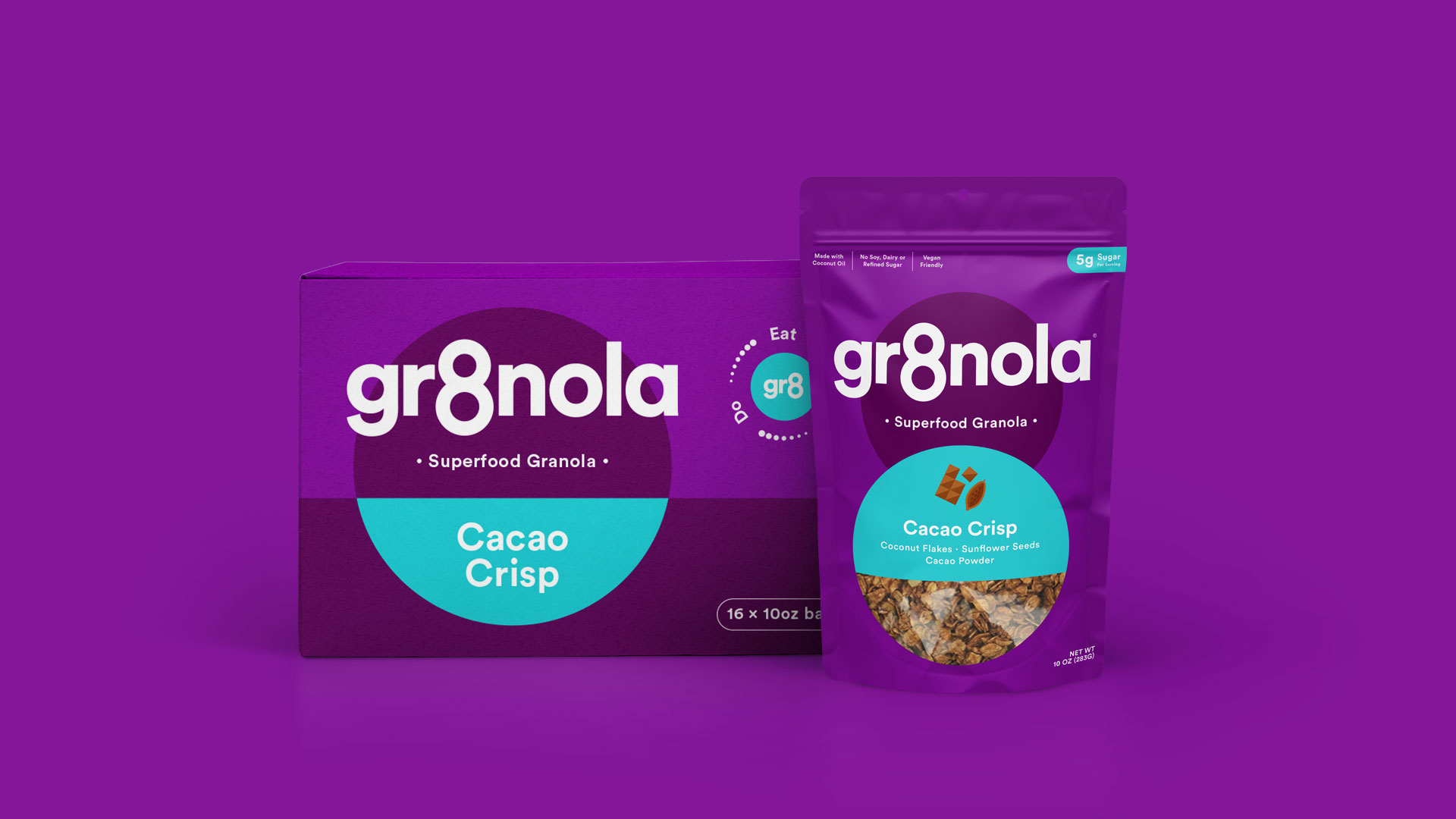
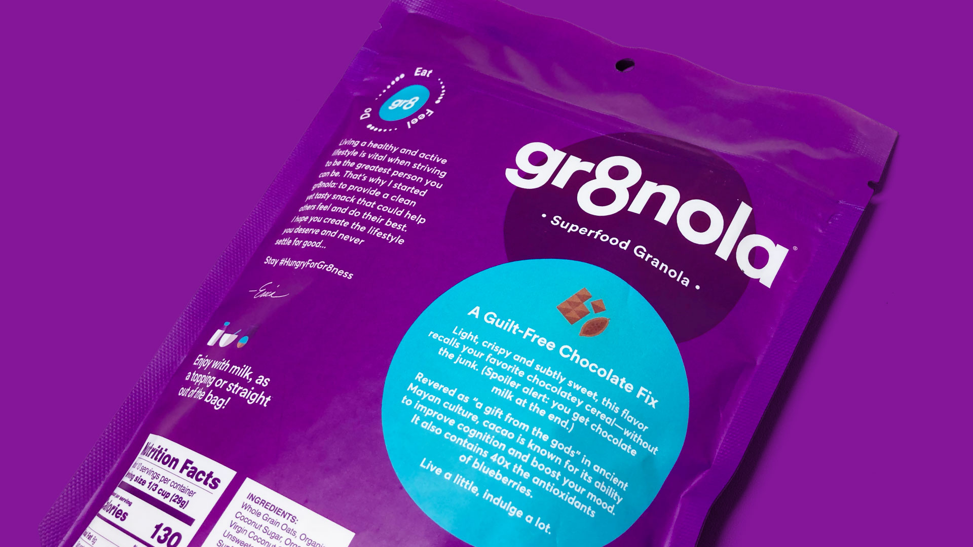
The packaging refresh confidently restates these original values and introduces new elements to push this further by adding an extra level of personality and enticing elements such as the new flavour naming system and fun illustrative icon set.
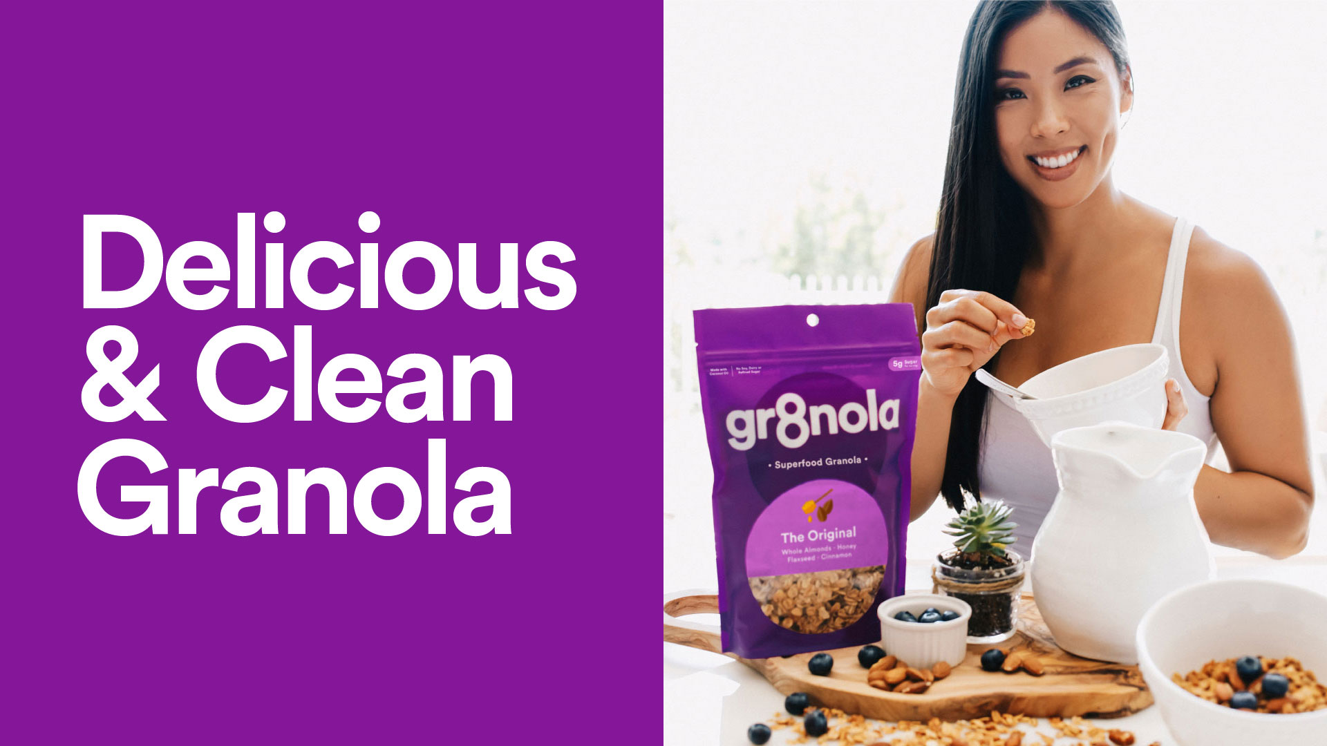
The founder of Gr8nola, Erica Liu Williams, wanted to take her business to the next level and asked us to rebrand her all-natural granola product. She wanted to challenge the market and offer a tasty product packed full of healthy benefits that you could enjoy any time of the day, a 24/7 snack inspired by her annual Super Bowl cleanse.
We created the new brand identity and packaging system based around the number 8, a key visual device to help Gr8nola stand out and be remembered on the shelf. The visual style is simple and bold, reflecting the ‘Delicious & Clean’ ingredients and their benefits. The playful and empowering tone of voice reinforces Gr8nola’s core beliefs; that you can do anything that you put your mind to and being healthy should be one of those goals.
Deuce Studio not only look after Gr8nola’s brand and packaging, but all of their communications including e-commerce website, advertising and general up keep of the brand across print and digital touchpoints.


CREDIT
- Agency/Creative: Deuce Studio
- Article Title: Deuce Studio Refreshes Packaging for US Superfood Granola Brand
- Organisation/Entity: Agency
- Project Type: Packaging
- Project Status: Published
- Agency/Creative Country: United Kingdom
- Agency/Creative City: London
- Market Region: North America
- Project Deliverables: Advertising, Brand Creation, Brand Design, Brand Identity, Brand Redesign, Brand Refinement, Brand Rejuvenation, Brand Strategy, Brand Tone of Voice, Branding, Identity System, Packaging Design, Packaging Guidelines, Web Design
- Format: Bag
- Substrate: Plastic
- Industry: Food/Beverage
- Keywords: food granola superfood cereal gr8 gr8nola brand branding packaging refresh
-
Credits:
Client: Gr8nola


