


” Design Bridge and Guinness are very excited to reveal details of their work redesigning the world famous Guinness harp icon. The new harp conveys the true craftsmanship and history behind Guinness’s distinctive beers that set it apart from the recent wave of new, craft beers, while also resonating with the next generation of drinkers. ”
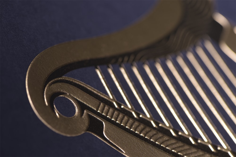
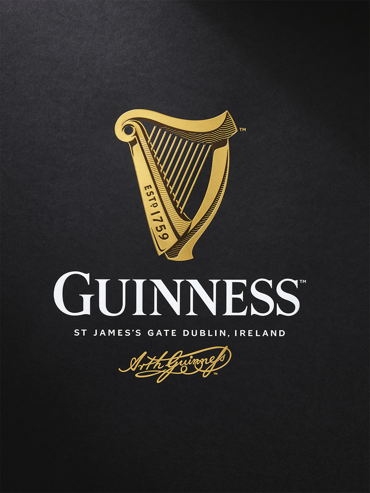
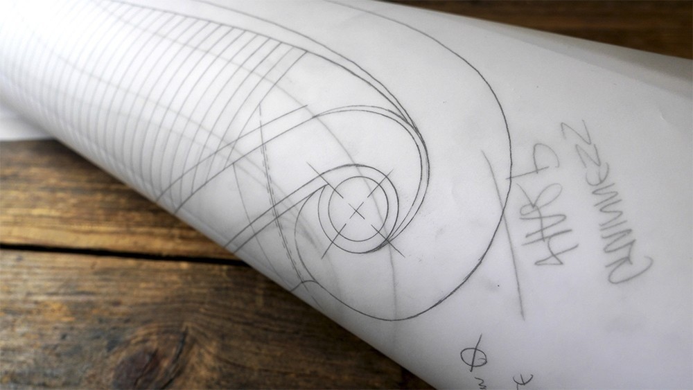
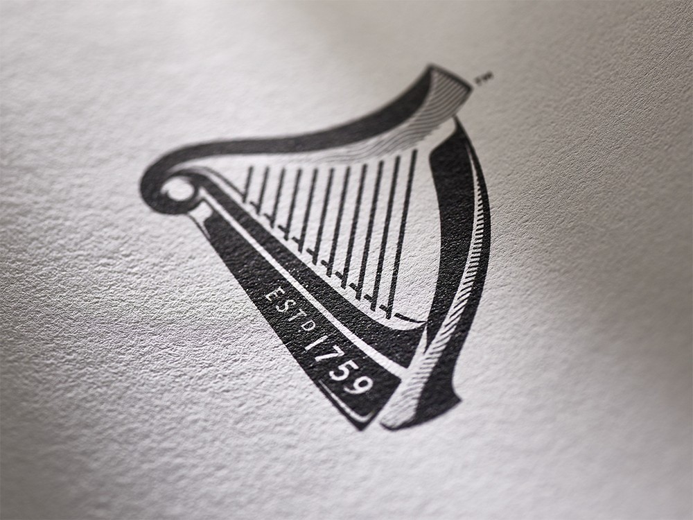
“Mark Sandys, Diageo Global Head of Beer and Baileys, said “We’re so proud of the craftsmanship of Guinness and all the brand has stood for over 250 years of its history. The harp is the original symbol of Guinness, dating back to 1862 and it has continuously been featured on all our branding for over 150 years. The Guinness harp was originally based on the legendary ‘Brian Boru harp’, a powerful symbol of Ireland’s national identity and heritage. In keeping with the Guinness ‘Made of More’ ethos, we have reintroduced a special handmade quality to the harp to reflect the experience, craftsmanship and passion that we put into brewing our Guinness beers.” To bring their vision to life, Design Bridge made models and mock-ups of their initial harp sketches with expert guidance from London-based harp-makers Niebisch & Tree. This collaborative process allowed the team to fully immerse themselves in the harp’s shape and form, from the characteristic curve of the harmonic neck to the way shadows are cast on the instrument, ensuring their design looked and felt as authentic as possible. Design Bridge then sought the expertise of renowned illustrator Gerry Barney, who had drawn a previous version of the Guinness harp in 1968, who hand drew the new icon from their collection of sketches and harp models.”
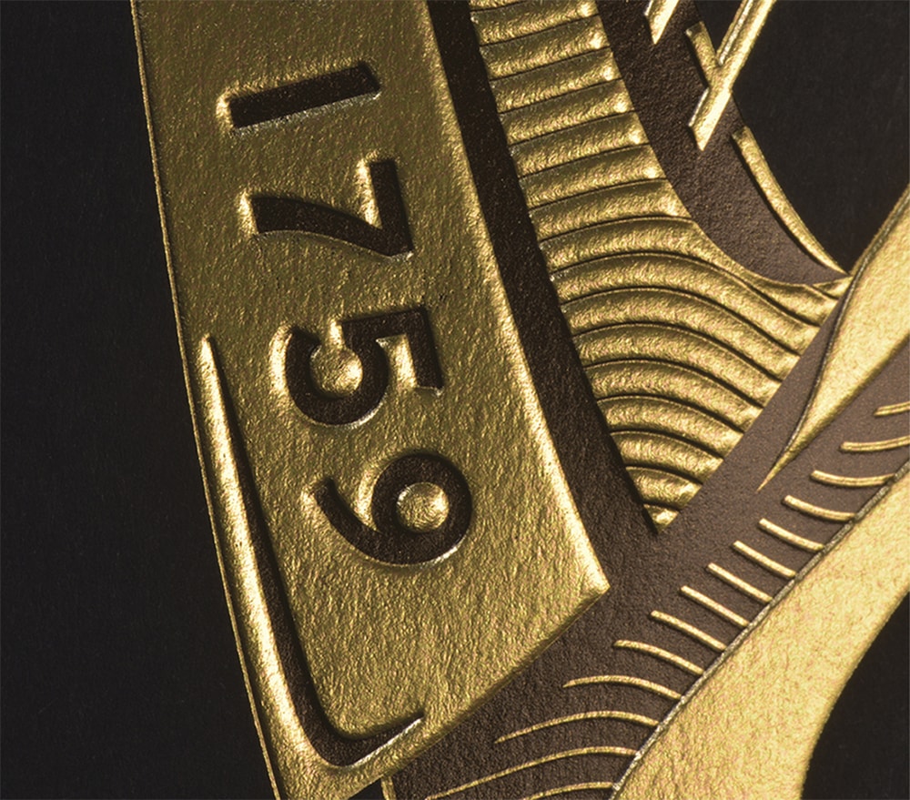
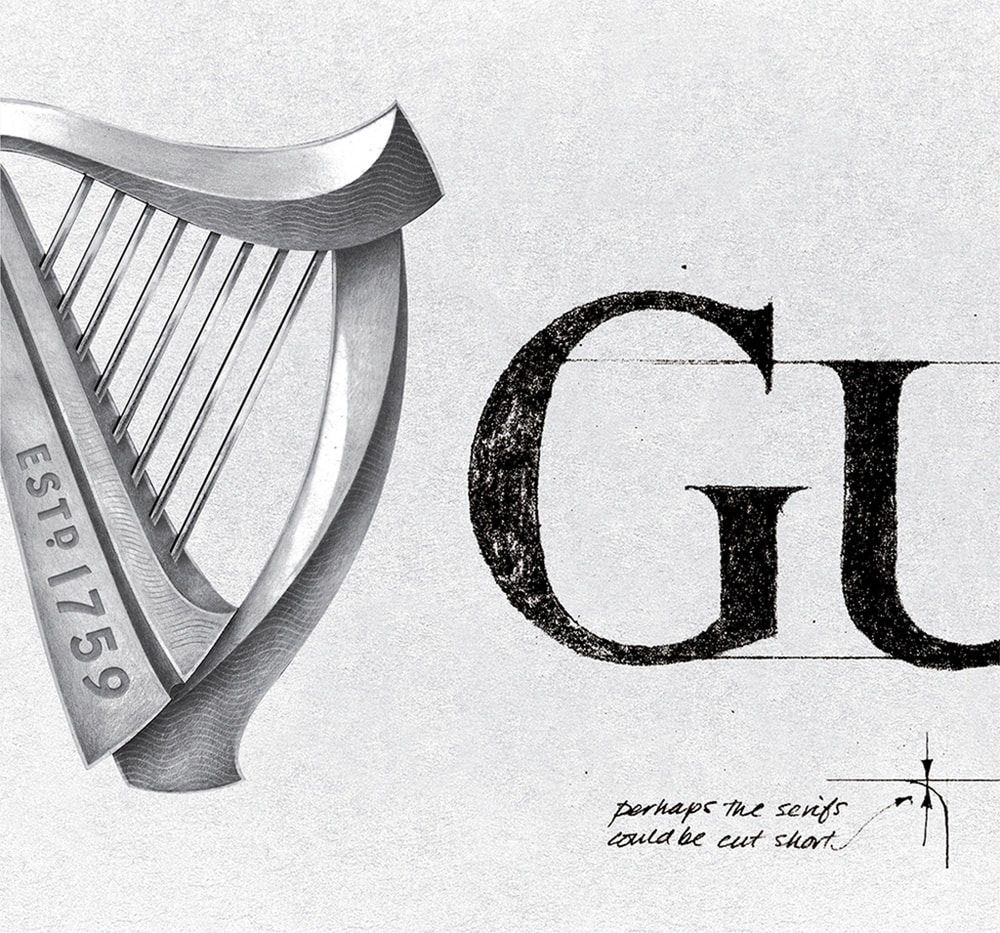
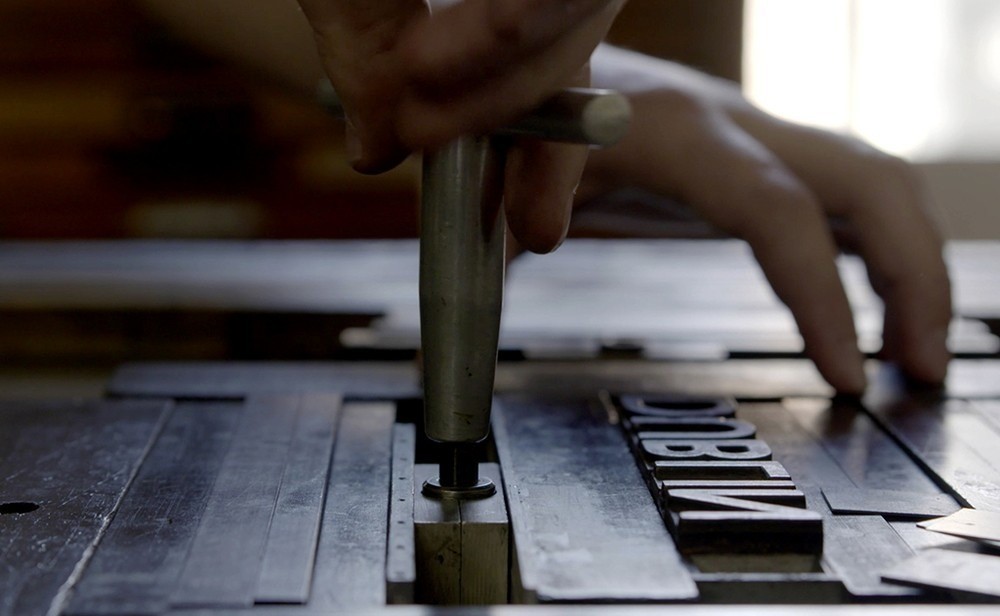
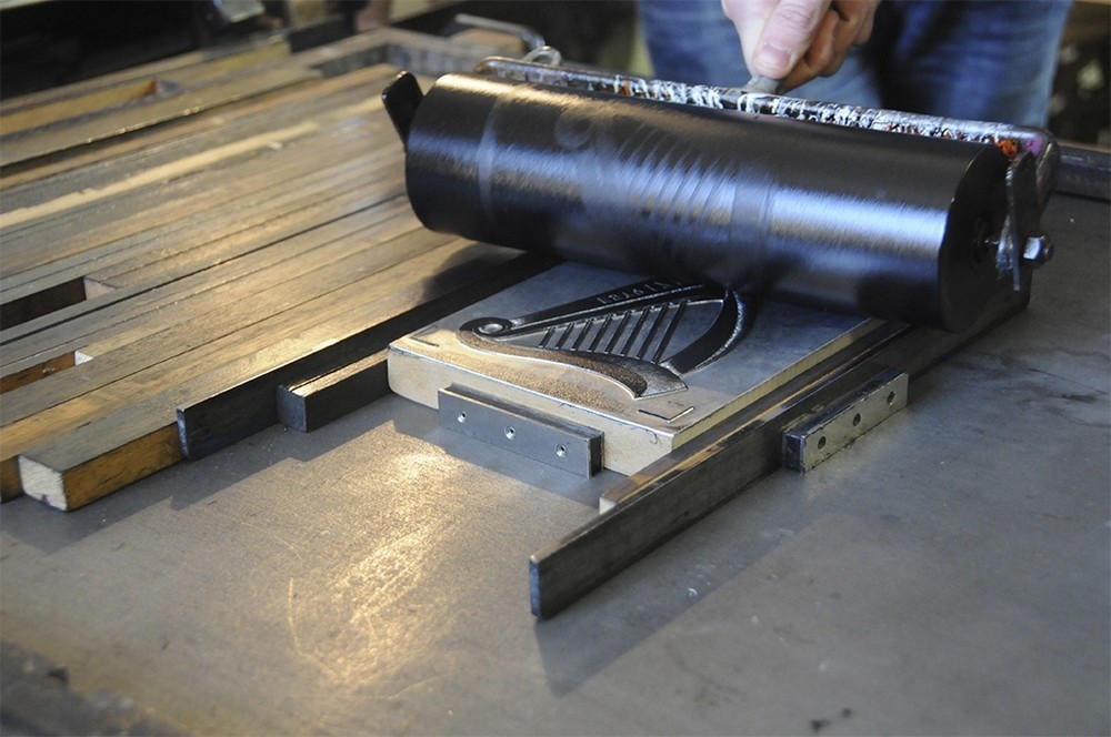
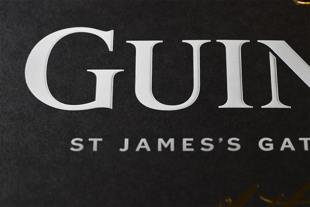
“Tim Vary, Creative Director at Design Bridge commented, “Gerry’s illustration marks a return to a carefully sculpted harp and incorporates the classic curved shapes and false perspective of the soundboard that are so memorable. We’ve also incorporated ‘Est.1759’ onto the side of the harp, inspired by metal stamped lettering imprinted in the ironwork at the Guinness Storehouse, and the set of wavy lines that symbolised the nearby River Liffey on original Guinness labels. Gerry’s hand-drawn typography for the wordmark is also inspired by historic labels, combining details of letter press type with elements from John Gilroy’s famous Guinness posters in the 20th century.” Design Bridge also collaborated with artisan letterpress print studio, New North Press, to help dramatise the harp’s form even further and create the striking physical impression of the final design. Separating the harp illustration out into a series of layers, Design Bridge experimented with letterpress techniques to build up the design by overlaying different colours, textures and techniques, such as embossing, foil block and metallic inks. The final design captures the tactility, depth, light and shadow the team got to know so well through their sketch work, illustrations and 3D harp models.”
“Graham Shearsby, Chief Creative Officer at Design Bridge commented, “Our final design for the new Guinness harp is a result of a long and thorough process of getting to know the Guinness brand, and the harp itself, as intimately as possible. Collaborating with a carefully selected group of fine craftspeople and experts has allowed us to turn everything that we’ve learnt into a new harp icon rich with depth and history that also feels right for a modern, global beer brand.””
CREDIT
- Agency/Creative: Design Bridge
- Article Title: Design Bridge – Guinness Harp Identity
- Project Type: Packaging
- Substrate: Pulp Paper


