


Pernod Ricard came to CF Napa Brand Design to redesign the direct-to-consumer single vineyard tier under their Sonoma-based Kenwood Vineyards brand. While their current wine packaging design looked premium, it shared a look too similar with their lower tiers of wine and it was extremely difficult to tell the various wines apart from one another, causing confusion for tasting room staff and consumers alike. The brand also wanted the wine packaging to better connect with their target consumer – people who love being outdoors and close to nature – and be better aligned with their brand essence.
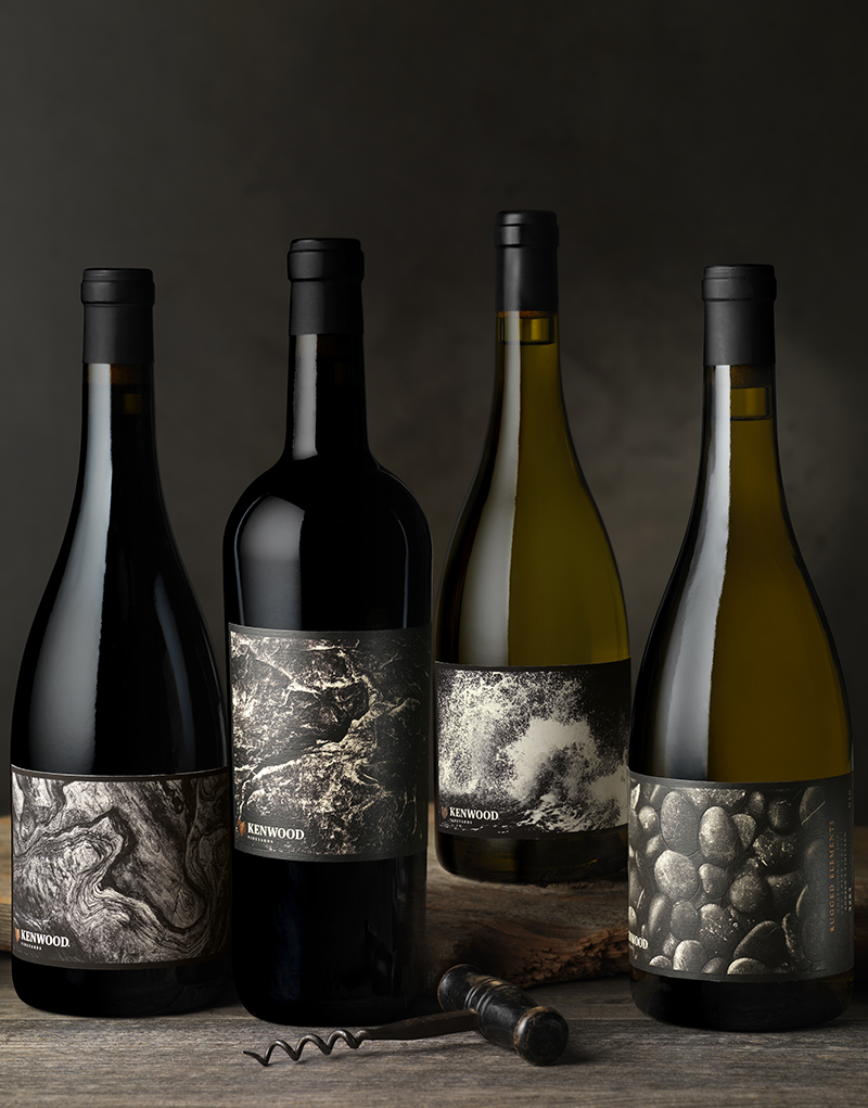
CF Napa Brand Design redesigned the new vineyard designate tier inspired by its new name – Rugged Elements – and each of the vineyard’s unique elements and microclimates that give the premium grapes their distinctive taste. The new line of wines is completely unique from the other Kenwood Vineyards tiers while stylized photos provide easy differentiation between the various SKUs. Each label utilizes a bold, artistic, black-and-white photograph of a natural element that is unique to each of the vineyards – including volcanic soil, river rocks, sandy-loam soil, fog and redwood forest. The new concept stays true to Kenwood Vineyards’ passion for diverse terroirs and their brand purpose – to inspire people to step outside and reconnect with what matters.
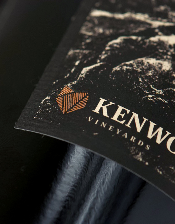
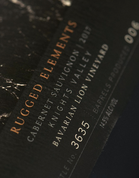
The Kenwood Vineyards icon gets a copper foil treatment – creating a brand endorsement for the new line of wines and connecting the line back to their other tiers. A grid system was developed for the side of the label – providing a common place to find all of the technical information across SKUs without distracting from the beautiful photography. The bottle number and number of barrels produced for each wine was included to create an excitement of exclusivity. The design fulfills the brand’s goal – for the wine to be an authentic expression of Sonoma’s wild character.
CREDIT
- Agency/Creative: CF Napa Brand Design
- Article Title: CF Napa Brand Design’s Terroir-Drive Redesign for Kenwood Vineyards
- Organisation/Entity: Agency, Published Commercial Design
- Project Type: Packaging
- Project Status: Published
- Agency/Creative Country: United States
- Market Region: North America
- Project Deliverables: Brand Identity, Brand Redesign, Brand Refinement, Brand Rejuvenation, Brand Strategy, Branding, Graphic Design, Identity System, Packaging Design, Rebranding
- Format: Bottle
- Substrate: Glass, Glass Bottle, Metal, Pulp Paper


