


A task: A client, or rather a client, came to us with the task of developing a brand of a fish store, and subsequently a fish network. Where did the idea to open a fish store come from? The fact is that the client herself loves fish very much, so to speak “fish soul”, plus she loves to cook. The client herself is from Novosibirsk and knows where to buy good quality fish here, but since she often flies to Moscow, one might say lives there, she did not find good offers there. Later, after analyzing the market together with her, we identified competitors and, in general, the picture in Moscow was drawn. Analytics revealed the pros / cons of existing stores, and the most important of them is a weak assortment, lack of clear concepts and service. Some have a meager choice, others have expensive ocean fish. Many people who love fish do not even know about the variety and recipe. Also, many competitors have poor marketing and almost all lack positioning. What the client has in his arsenal: trusted fish suppliers, a rich assortment in one place, culinary and semi-finished products, an emphasis on service and hospitality, the presence of an online store and delivery in the future. Therefore, it was decided to open the first mass fish market in Moscow.
Decision: The agency conducted analytics on competitors to understand their alignment, media exposure and marketing. We conducted a number of in-depth interviews with respondents in order to identify hidden needs, analyzed existing trends. The main weaknesses of fish shops are the lack of clear concepts and services. At the same time, customer requirements are growing. People get used to the service in other stores, switch to eco-friendly products, cut down on cooking times, want to afford more, are willing to pay for a good attitude, and want to feel significant to the company. The business begins to work in the Human to human format (a person sells to a person). Based on the data, we proposed several ideas for rebuilding and settled on the one that is closest to the feelings of the client herself and is able to give a positive experience to the store’s customers.
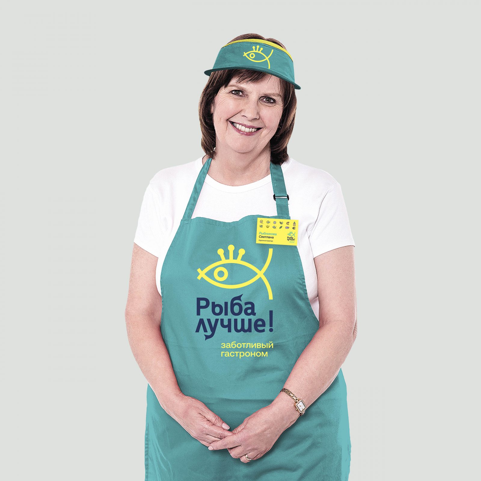
Positioning: Long wording: A network of fish shops led by a woman for customers who love service and who want to buy good quality fish and fish semi-finished products. Unlike other stores, our manager and team care about customers, their families and the surrounding nature, which allows customers to purchase really high-quality products and enjoy shopping and eating fish.
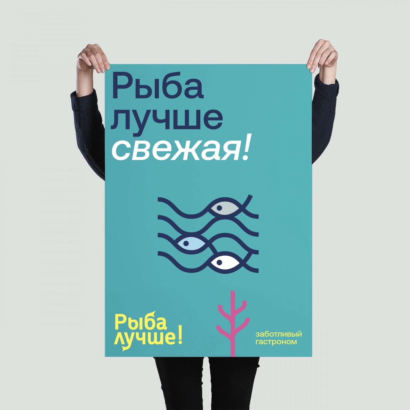
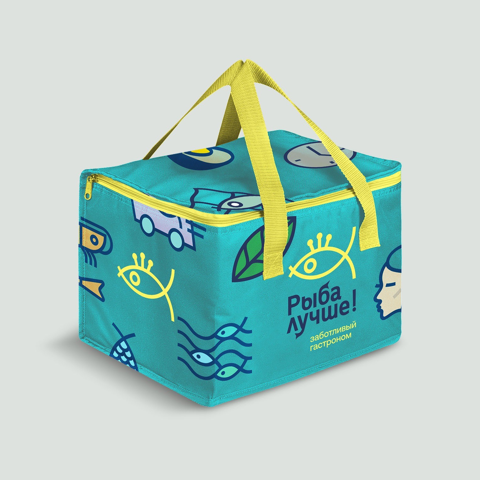
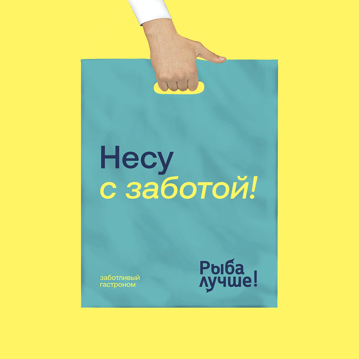
In short: A chain of fish shops where, thanks to a female manager, customers take care of themselves, their families and the environment. Concept: Caring stores. Stores that take care of customers – through assortment, cooking, service, delivery and pre-order availability. Verbal identification: Naming: The task is to convey the care for the client and the nature through the name. “Fish is better” The double meaning is that it is better to eat fish than meat and that we have better fish.
Visual identification: In the mass market segment, the main thing we wanted to achieve was to be understandable for a fairly wide target group that consumes fish. The pricing policy and assortment of the store is aimed at meeting different needs. Some come for fresh, dried, slightly salted fish and freezing; others for seafood, snacks and salads; the third for semi-finished products and dishes “almost everything is ready” with already thought out sauces and recipes. We divided our clients into three main segments according to their needs: meat replacement (they monitor their health and replace meat with fish in whole or in part); diversify food (they eat meat more often, but they try to diversify their food with fish); fish aesthetes (they know different types of fish, understand it – where they get which one, especially transportation, know how to choose the right one).
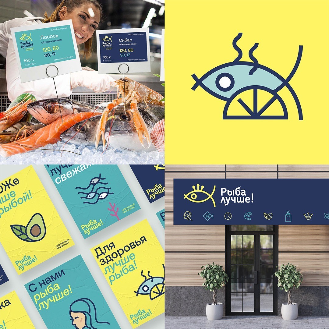
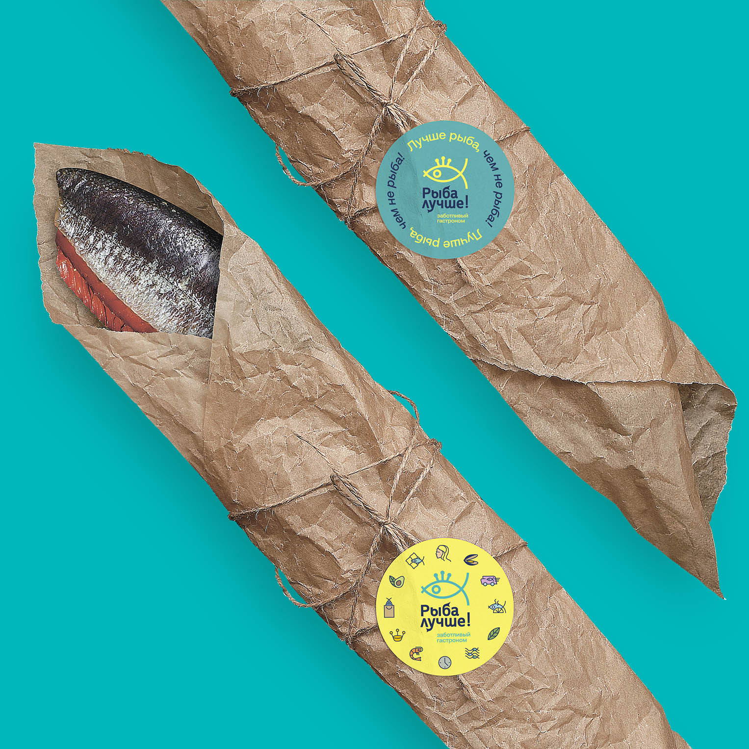
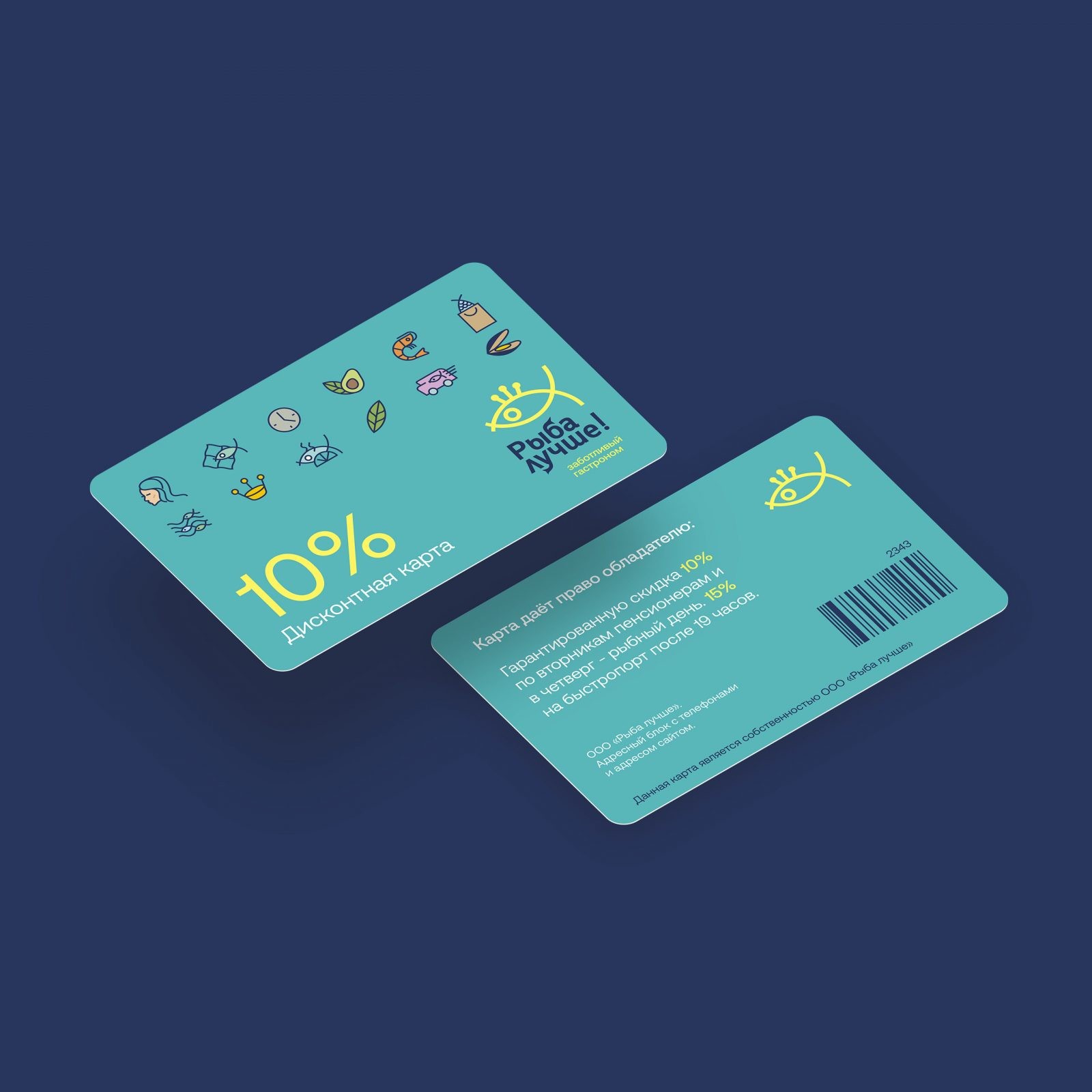
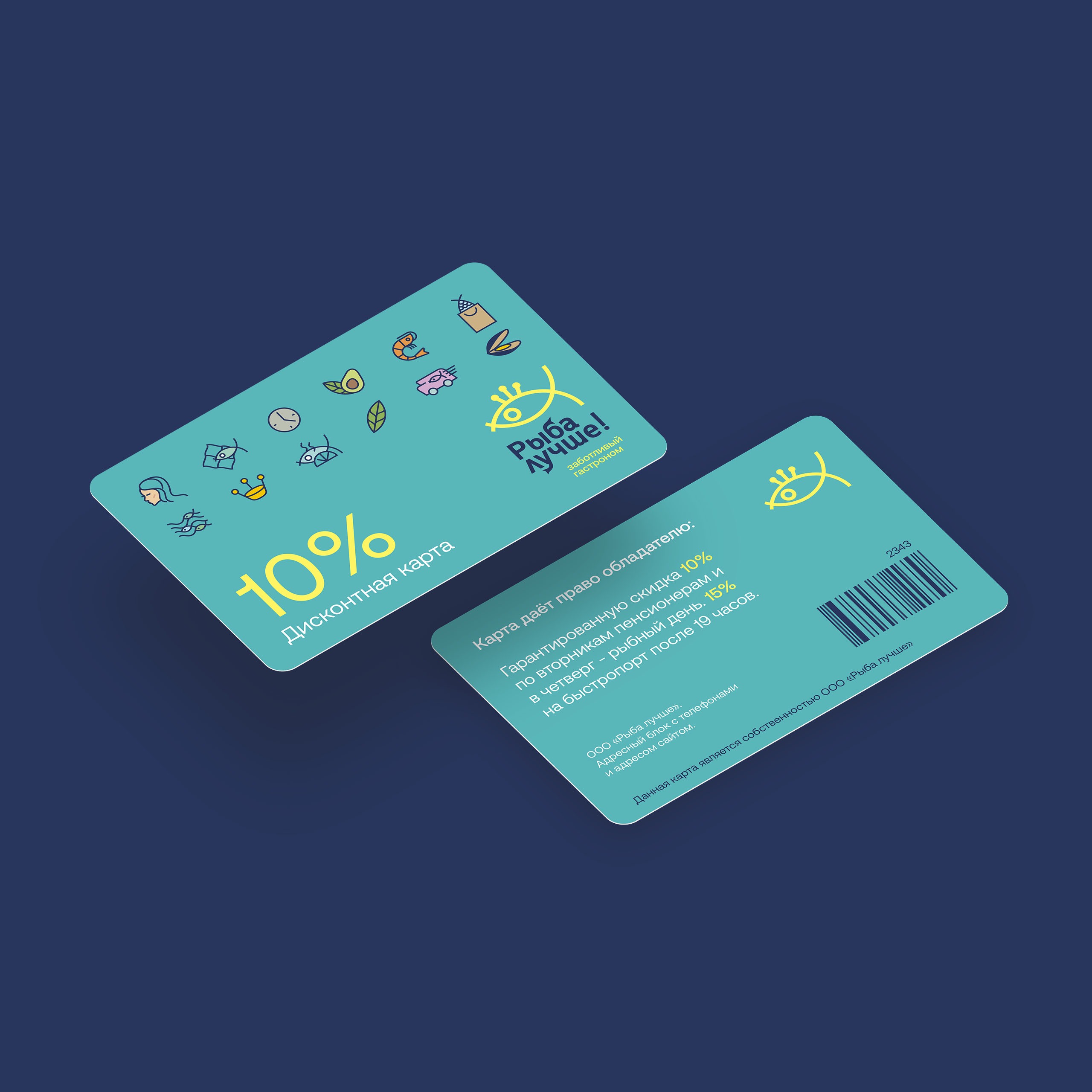
The logo continues the idea of naming and consists of a unique style and a sign in the form of a fish – a queen, showing its supremacy. Sign and typeface can be used separately from each other without blurring brand awareness.
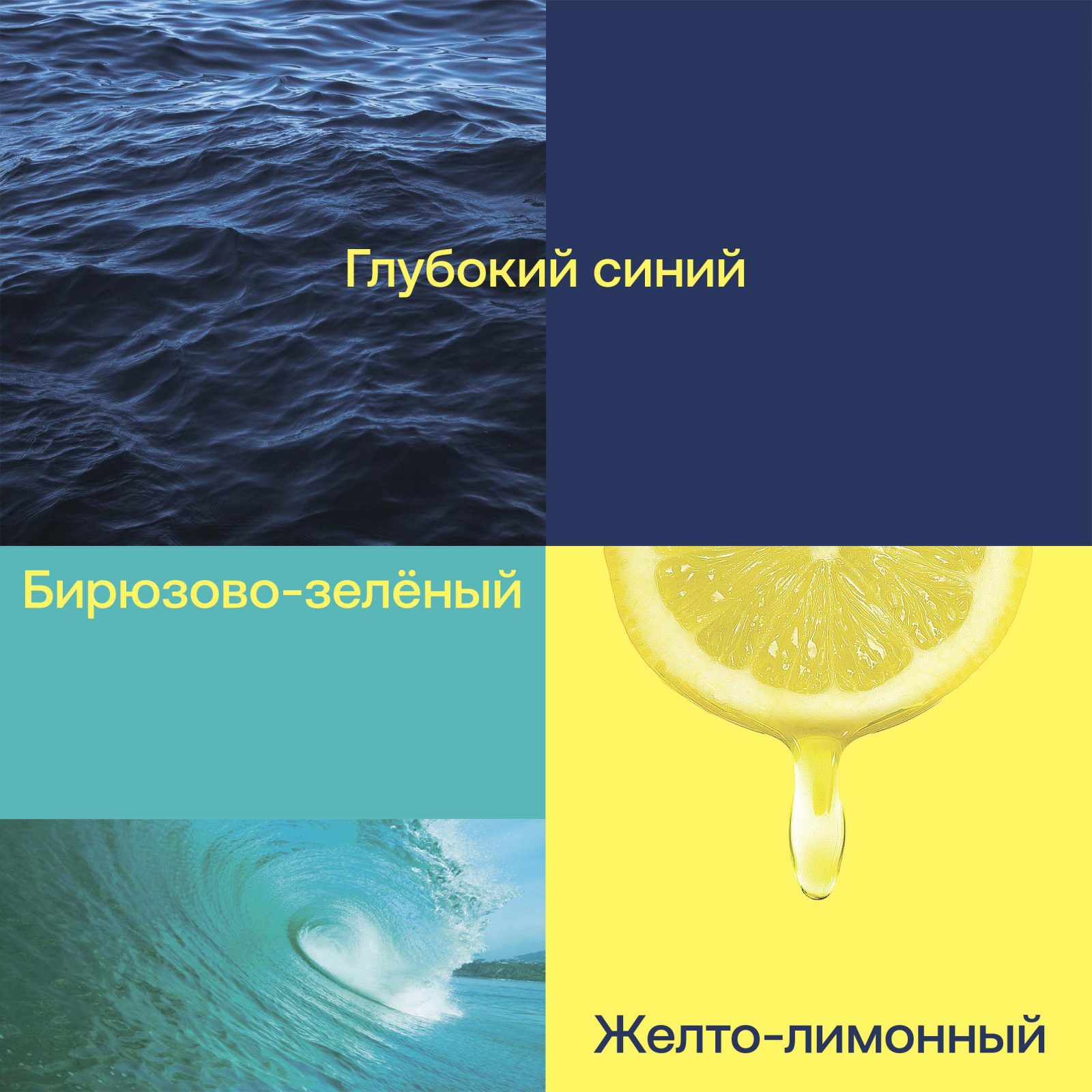
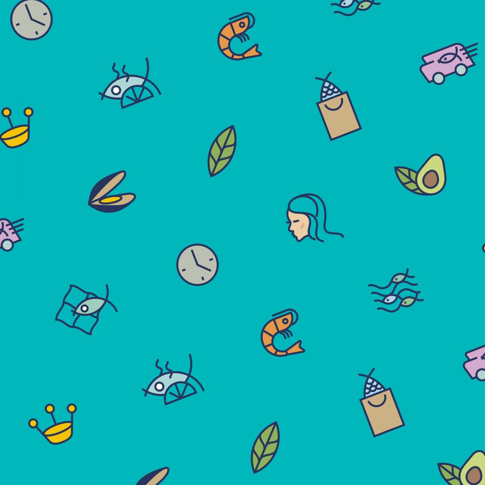
The design system is based on branded pictograms that reflect care through the category, service, women’s business, time saving, ecology, and cooking. Corporate colors strongly differentiate the brand from competitors, while remaining in its own category. In this niche, it is important that the brand speaks to its audience, so communication messages are part of the identity. The combination of colors, pictograms with communication makes the brand understandable, friendly and easy to perceive, just what is needed for a wide audience.

CREDIT
- Agency/Creative: Trava
- Article Title: Branding for Better Fish Store Chain by Trava Studio
- Organisation/Entity: Agency
- Project Type: Campaign
- Project Status: Published
- Agency/Creative Country: Russia
- Agency/Creative City: Москва
- Market Region: Asia
- Project Deliverables: Brand Creation, Brand Identity, Brand Naming, Branding, Graphic Design
- Industry: Food/Beverage
- Keywords: Рыба лучше!
-
Credits:
Brand Director: u041cu0438u0440u043eu043du0435u043du043au043e u0421u0435u0440u0433u0435u0439


