


The public organization “Athena. Women against cancer” provides comprehensive support to women diagnosed with cancer. Currently “Athena” is the largest patient support organisation in Ukraine. It fights against corruption, lobbies the governmental units to protect the interests of the patients and provides educational support in the area of cancer treatment. It informs patients about the available treatment opportunities, and educates about cancer, specifically as it relates to the commonly spread forms of the disease among women.
Yet the most important purpose of the organization is to provide an active and robust support community. Athena was started by a group of patients who were seeking to aid each other in treatment and to this day continues to support women fighting with cancer. And it has done so tremendously well, as evidenced by its record of success.
Openness, enthusiasm, and calm and ironic attitude towards the disease were the attributes that stood out the most from our conversation with the members of the Athena team. Perhaps, such a clam and casual attitude is considered standard among them. Yet it was quite remarkable to realize that an individual who was diagnosed with cancer may be much more tranquil about the disease than someone who simply just heard about it.
When working on the identity there was no need to formulate the image of the brand. It has been formed when the founder of the organization has named it “Athena”. The reason for such name was the founder’s fascination with the antiquity and its applicability to the idea, especially now as the organization has gained good traction. Just as the ancient Greek mythological goddess, the organization cares and protects its patients, showing them the way to the cure. It may also push back in the case of abuse or any other wrongful actions on behalf of the clinics, governmental units, government officials, corrupted medical professionals or others who ask for it.
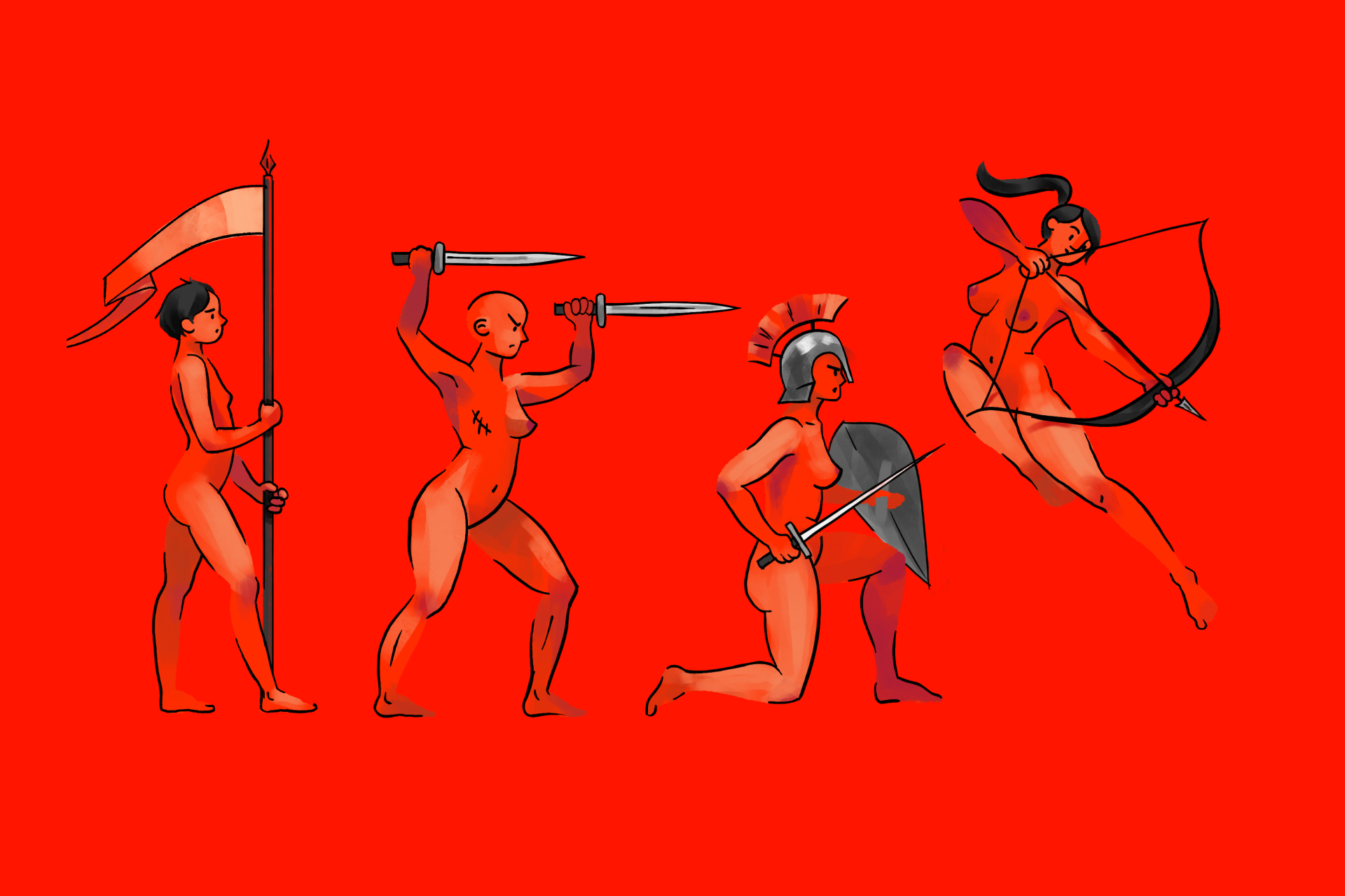
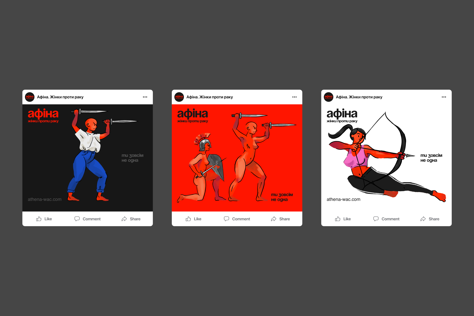
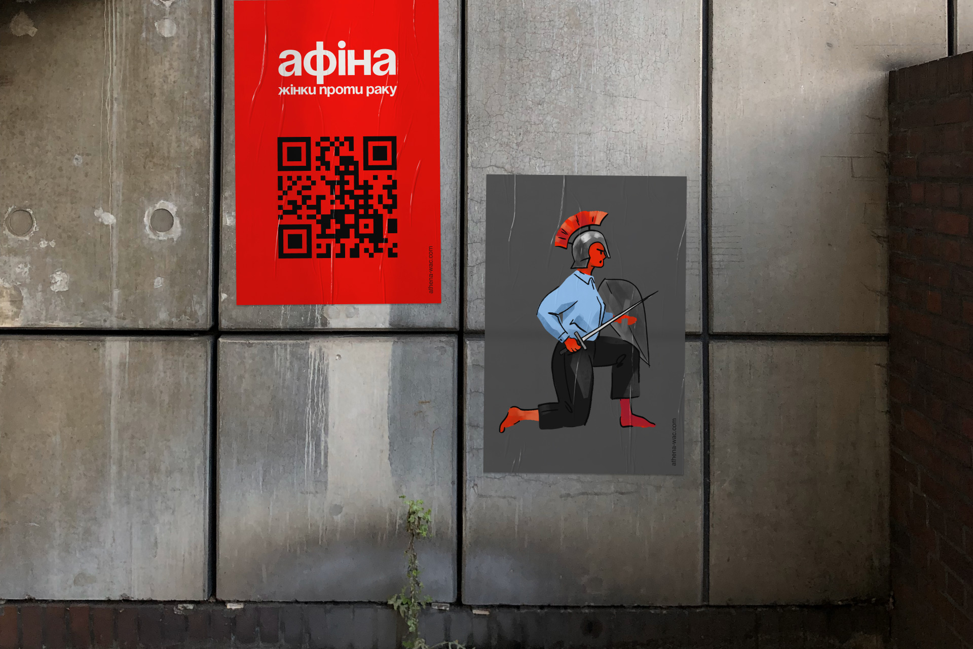
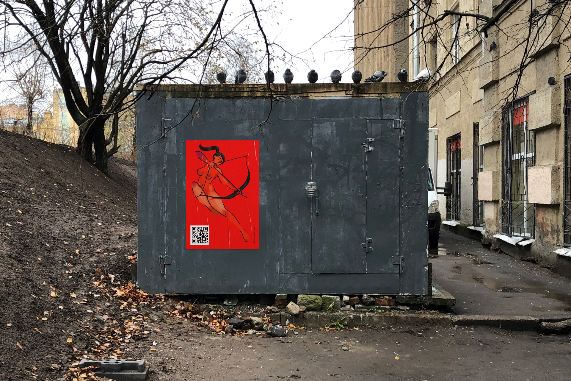
Thus, what we had to do was to correctly visualize the character of the organization and apply the appropriate degree. The most important element of the identity is the illustration. It is the “illustration of the Athenas”, as the members of the organization like to call themselves. They are warlike because they are strong and determined to win. They are naked because they are not ashamed of the situation they are in, their vulnerability and the scars that were left from their battle with cancer. This is the pretentious side of the illustration.
The panache references the antique style of vases, which in the ancient times were used to describe the heroic achievements. Yet we added some ease and naiveness to them, which makes them seem a little more like a childish picture. This way we can remove some of the unnecessary drama. The basic everyday clothes illustrated in a censored version (so it is not banned on social platforms) makes it even more natural. The illustrations become a little bit more caricature-like and playful. This is the ironic side of the illustration.
The balance between the pathos and the irony helps to achieve the resonance that replicates the relationship between the Athenas and their illness. Thus, there are two aspects to the illustration: one that is serious and portrays the fight against the disease (the side with pathos), and the other one that demonstrates the ease and calmness with which the presence of the disease is realized (the ironic side).
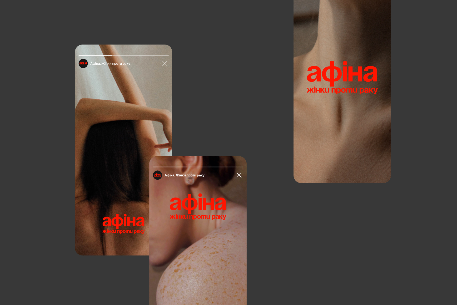
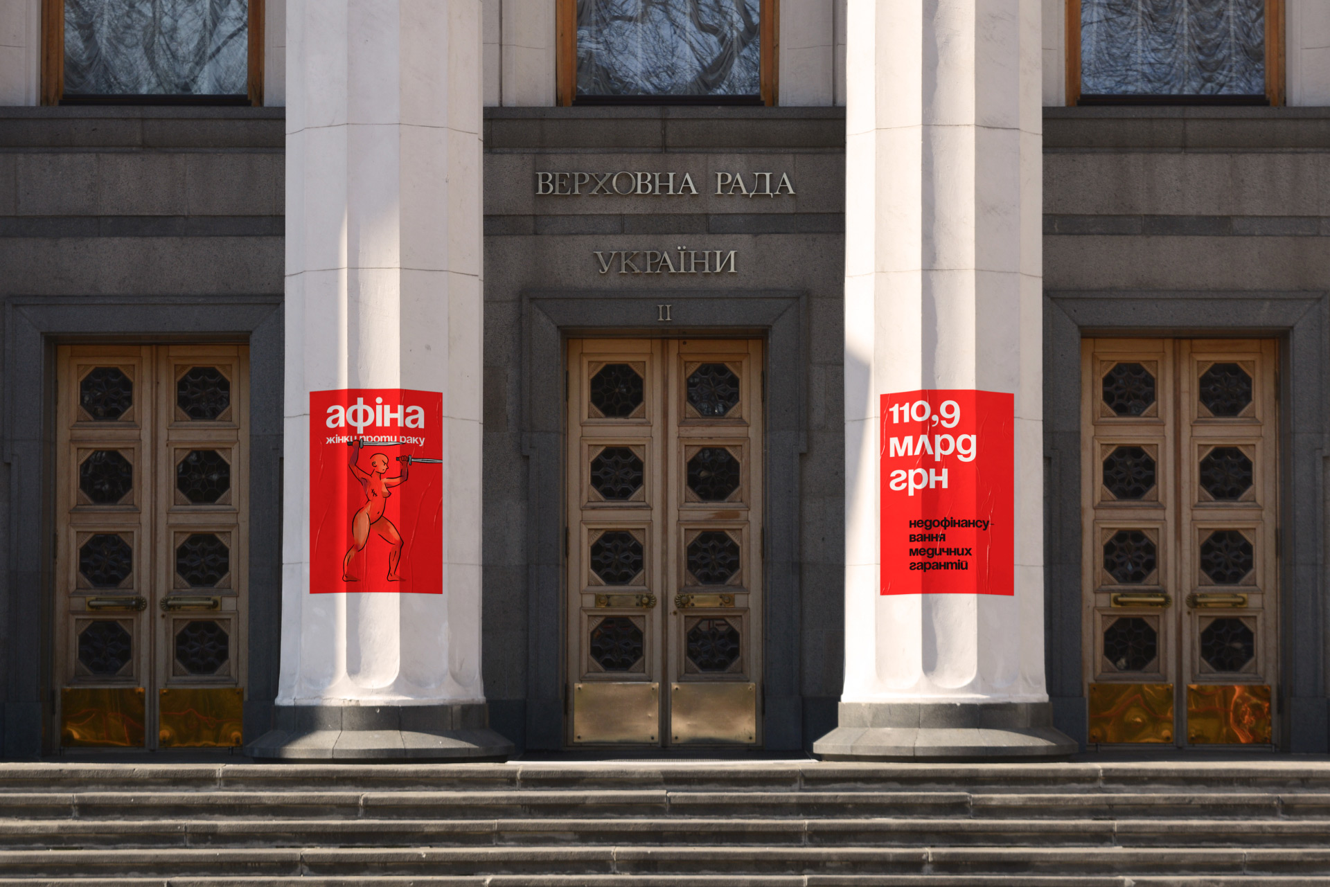
The active red is the main color which is responsible for the loudness of the identity. It correctly translates the nerve and the enthusiasm of the organization and it can be easily used to scare the hiding government officials at the acts of protests. We gave a graphite vibe to the red color so that along with the use of black and white colors we can switch the expression of the style when it comes to the protest posters or Facebook posts.
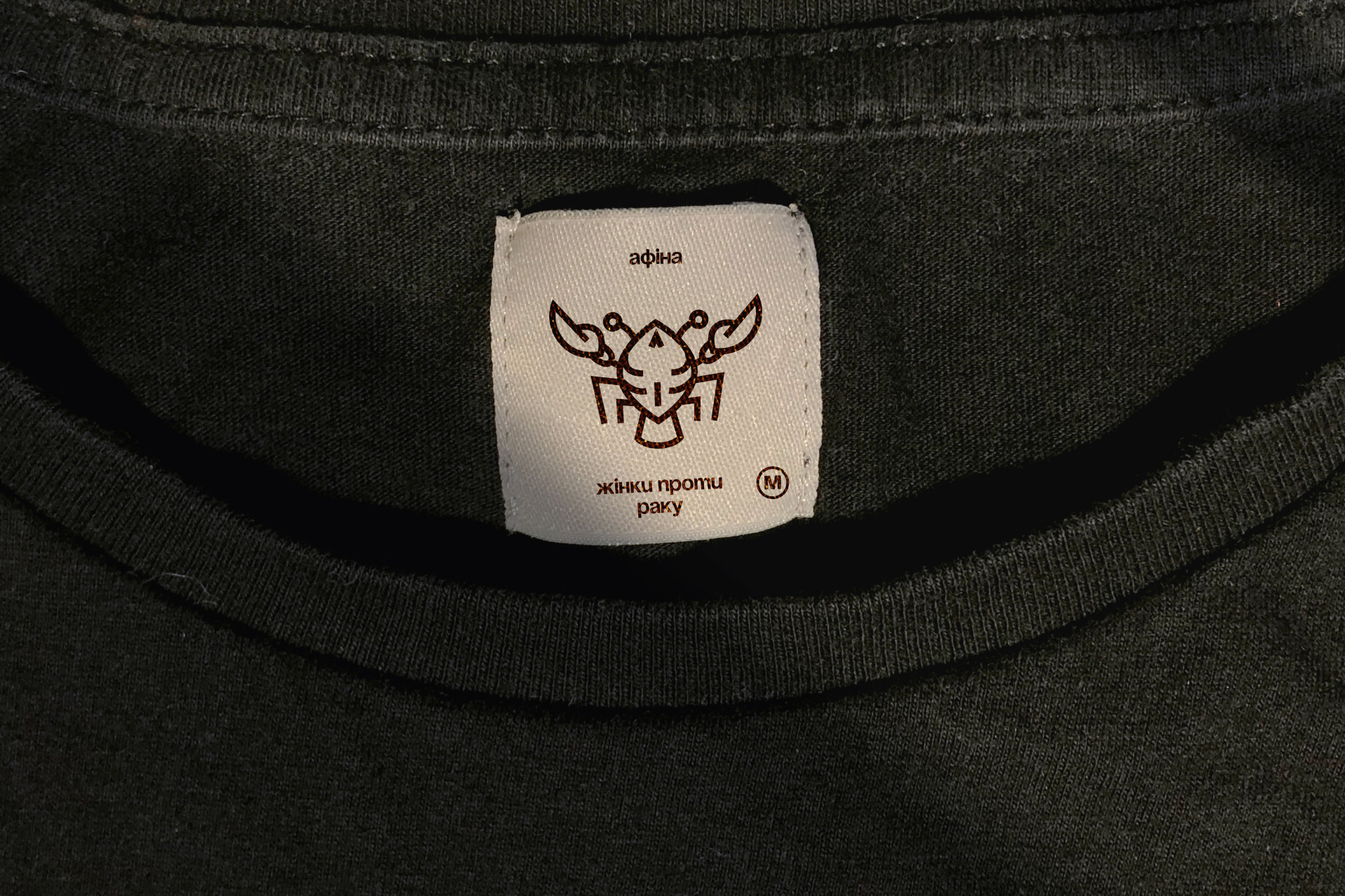
The logo is typed with letter font and is accentuating. It corresponds with the character and the illustration. We purposefully selected three types for the logotype, so that it can be posted on social platforms, posters, hand bracelets and the health minister’s forehead. The red cherry of the identity is the awkward crustacean. He is both the antagonist when it comes to the heroic actions of the Athenas and the symbol that demonstrates the realization of the disease and its surmount ability.
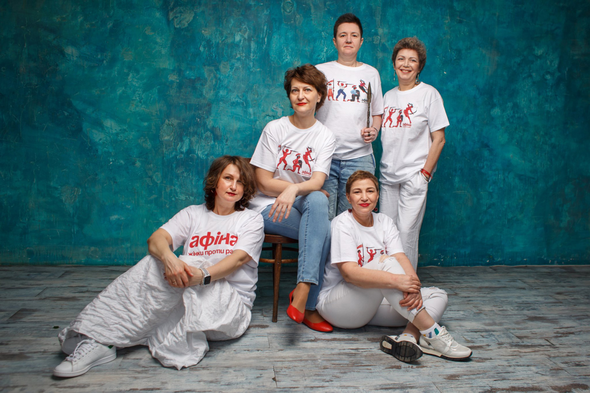
We also would like to pinpoint the flexibility of the style. Considering that it will be used by amateur designers, each visual element was developed in such a way that it would help identify the brand. You only need to type the phrase with the accentuated font on the classic red background to make a brand sticker. You add an illustration at any point, and it becomes branded. You put a crustacean on the label and you get yourself a merch to wear.
In the end, instead of a well-put summarizing phrase, which we can’t come up with mainly due to a lack of the corresponding talent, we leave you with the requisites of the organization and the links to its pages on social platforms. On YouTube you can find many useful videos which are important to know about.

CREDIT
- Agency/Creative: 9.8
- Article Title: Branding for Athena. Women Against Cancer Patient Support Organisation in Ukraine
- Organisation/Entity: Agency
- Project Type: Identity
- Project Status: Published
- Agency/Creative Country: Ukraine
- Agency/Creative City: Kyiv
- Market Region: Europe
- Project Deliverables: Brand Identity, Branding, Graphic Design, Illustration
- Industry: Non-Profit
- Keywords: Woman Non-Profit, Athena, Antiquity, Red, Illustration, Visual Identity System Character Design
-
Credits:
Producer: Sasha Medvynskyi
Art-director: Anna Svarovskaya
Creative Director: Sergey Lisovsky


