


The Event: Ortigia Design is a design event that took place on Ortigia Island, Syracuse, Italy from 22 to 26 September 2021. The event involved some important design brands such as Bertone Design, Man To Design, San Lorenzo Yachts, architects and designers from all over the world. The event organisers asked us to design the identity of the first edition of the festival. The aim was to design a brand linked to the territory, but capable of conveying a sense of design.
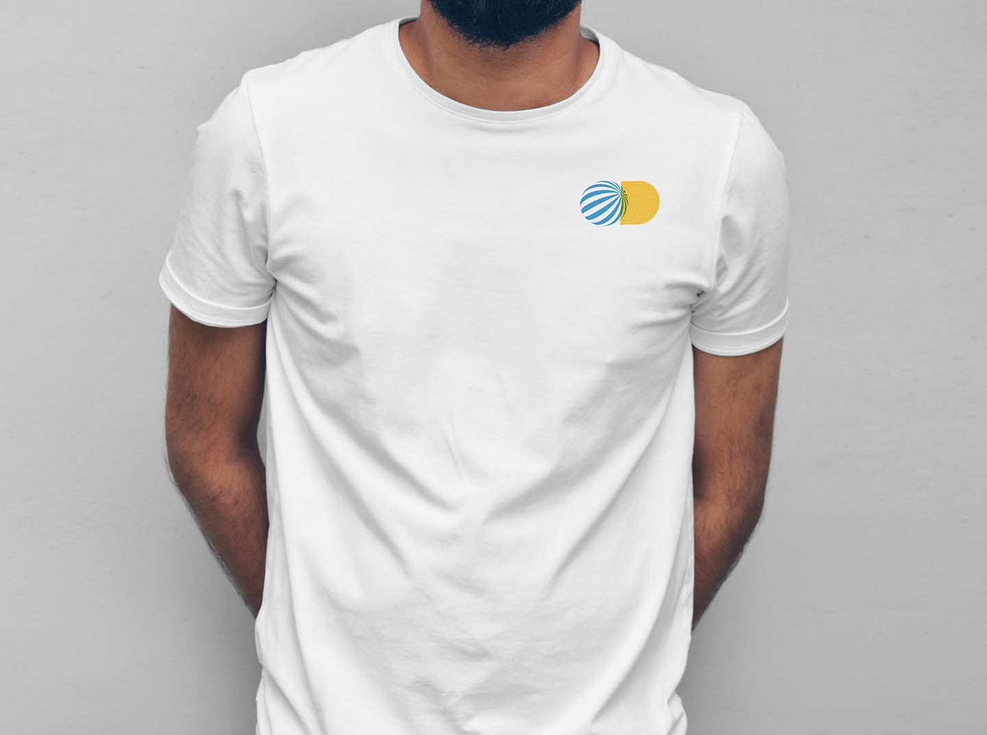
Concept: Taking two simple geometric shapes, square and circle, as a model, we drew an O and a D full, initials of the words “Ortigia” and “Design”, joining them together to obtain a first simple symbol.
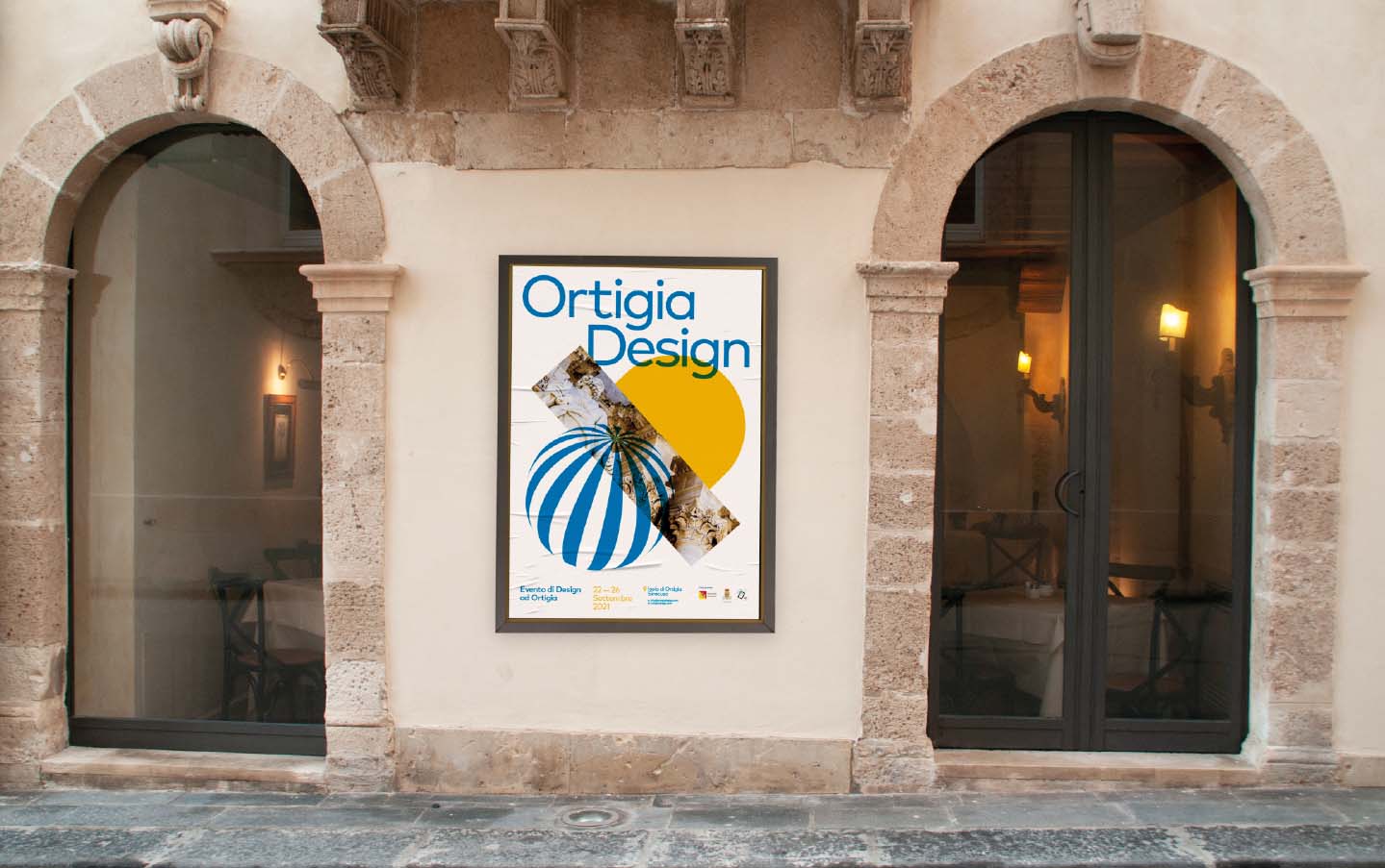
During the five days of the event, Ortigia became the meeting point of world design. That is why we turned the O into a globe, whose lines converge in the centre, it also appears as a 3D design object close to the concept of Optical Art. We wanted a symbol that would attract the public’s attention, that would become strong and recognisable even if not accompanied by the logotype.
We chose to colour the O in cyan, to recall the colour of the sky and the sea, and the D in a warm yellow, for the colours of the island, whose architecture composed mainly of white stone actively interacts with the reflections of the sun. Finally, we slightly overlapped the two symbols, obtaining a chromatic and overprinting effect that characterised Italian graphics and design from the 1960s onwards.
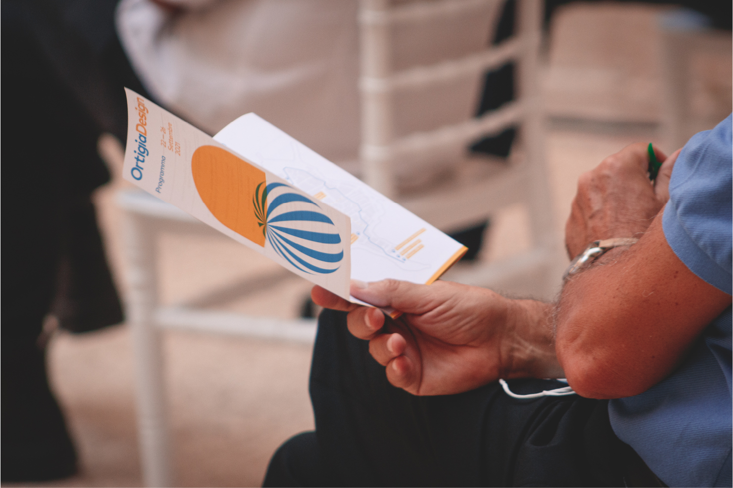
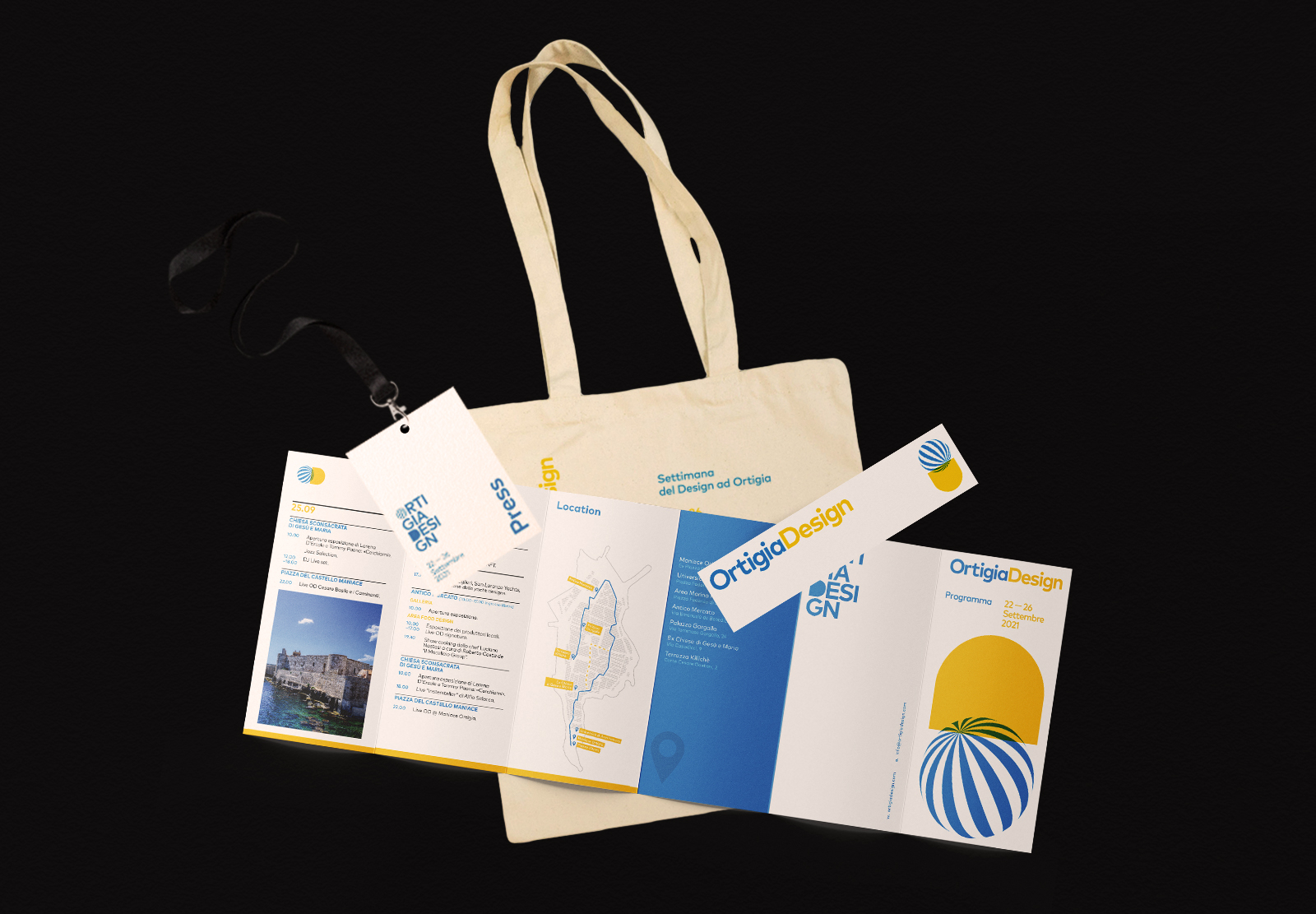
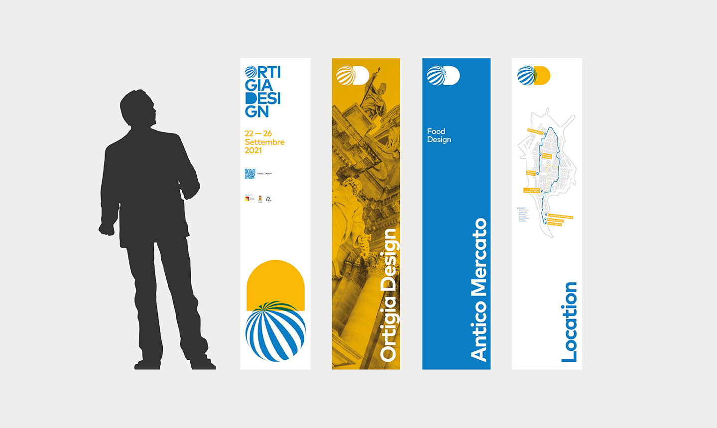
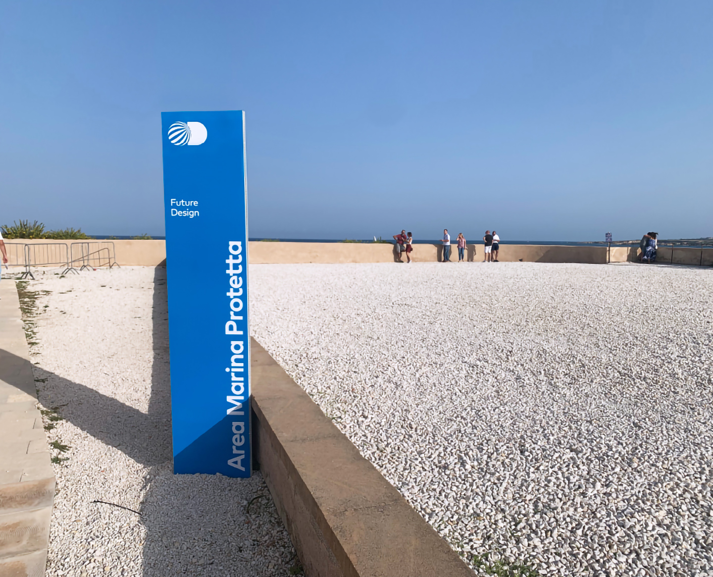
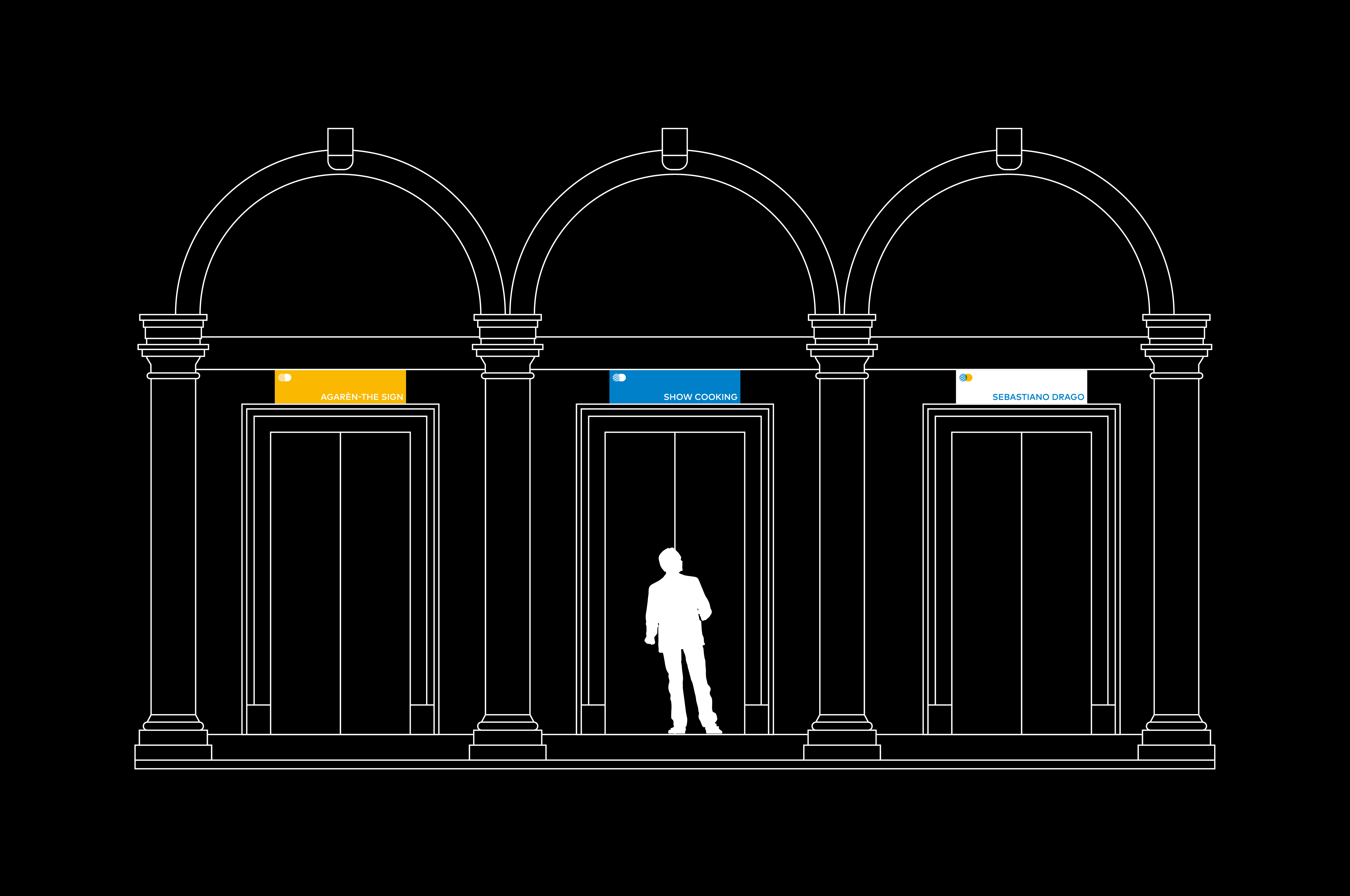
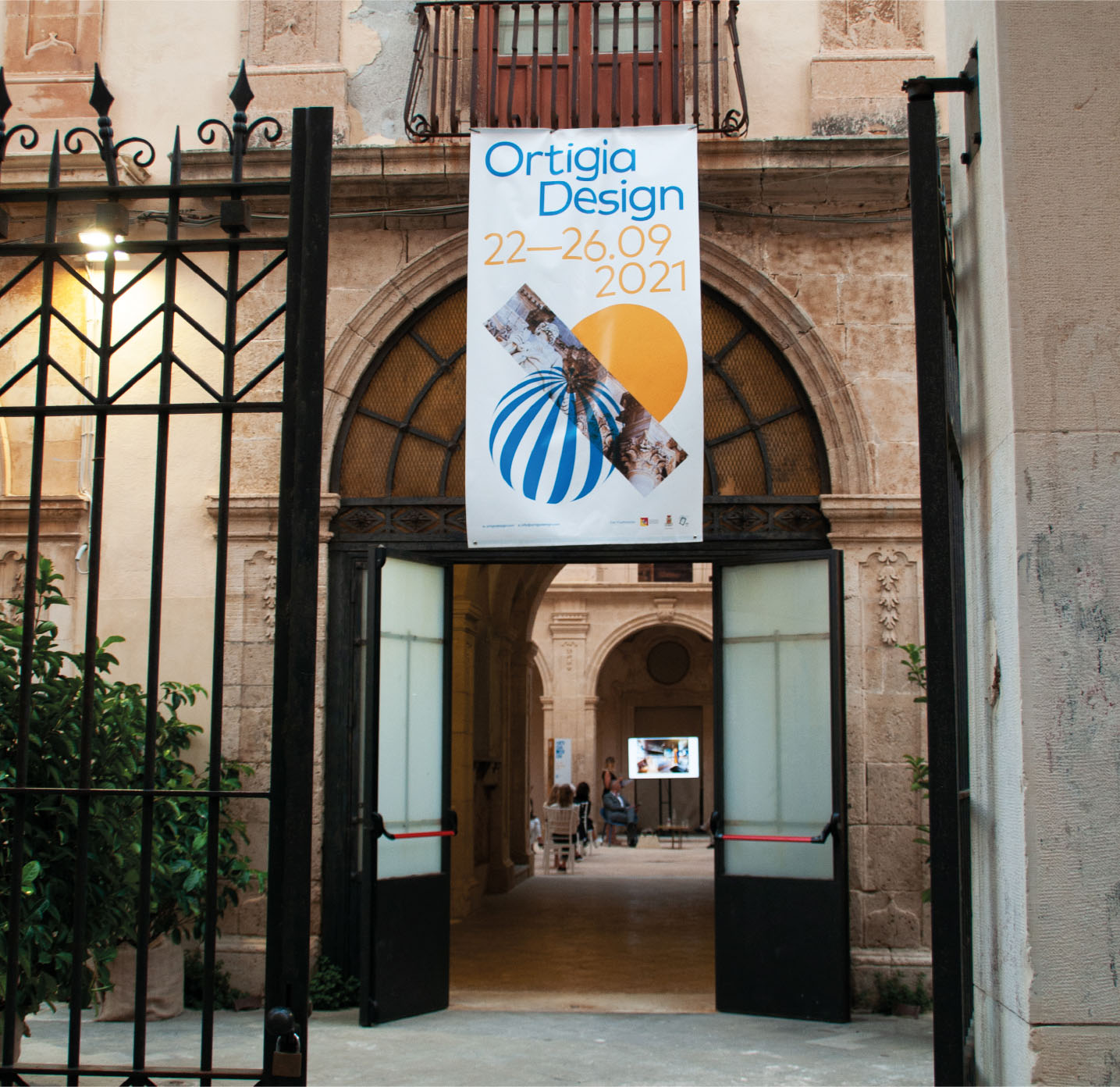
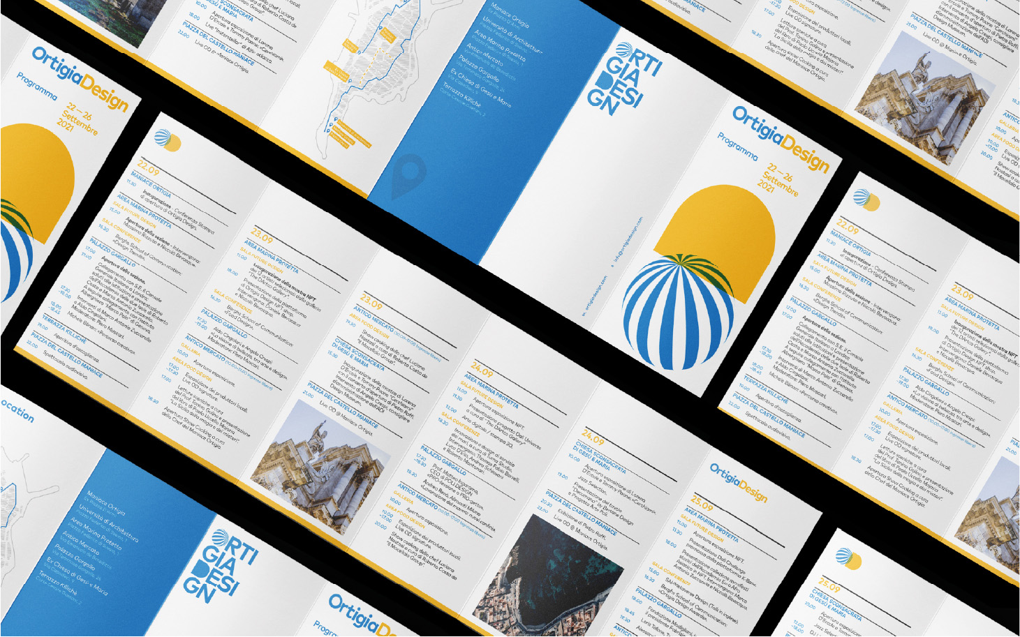
Logo Secon Version: We went beyond the simple symbol + logotype, thinking of a second use of the mark that could be applied as an alternative to the first, depending on the type of use. A second, totally typographic mark, in which the previously created symbol continues to be present. Visual Identity: For Ortigia Design we created the design of the social campaign and the press kit, posters, brochures, programme, invitations, totems, signs and banners.
For five days the island was filled with the OD symbol, which went viral, blending perfectly with the architecture of the site.
CREDIT
- Agency/Creative: Studio K95
- Article Title: Branding and Visual Identity for Ortigia Design by Studio K95
- Organisation/Entity: Agency
- Project Type: Graphic
- Project Status: Published
- Agency/Creative Country: Italy
- Agency/Creative City: Catania
- Market Region: Europe
- Project Deliverables: Art Direction, Brand Creation, Brand Design, Brand Experience, Brand Mark, Branding, Graphic Design
- Industry: Entertainment
- Keywords: Festival, Event, Design, Design Week, Logo, Mark, Branding
-
Credits:
Graphic Designer / Creative Director: Danilo De Marco
Graphic Designer: Dario Leonardi
Project Manager / SMM: Daria Beleykanich
Copywriting / SMM: Federica Musumeci
Print Specialist: Giorgia Leonardi


