


About the company: A London-based jewellery brand for the woman who knows what she wants and dares to make every day extraordinary. We believe in elevating the everyday which is why we’ve designed & hand-sourced accessories that not only look good but guarantee the quality you’ve come to expect from our brand. A metaphor. “Objects are emotions”
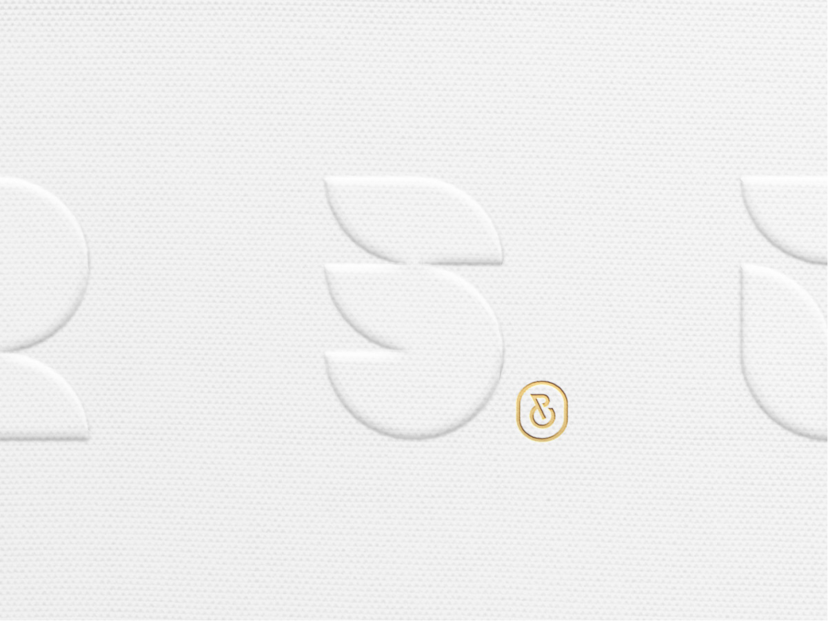
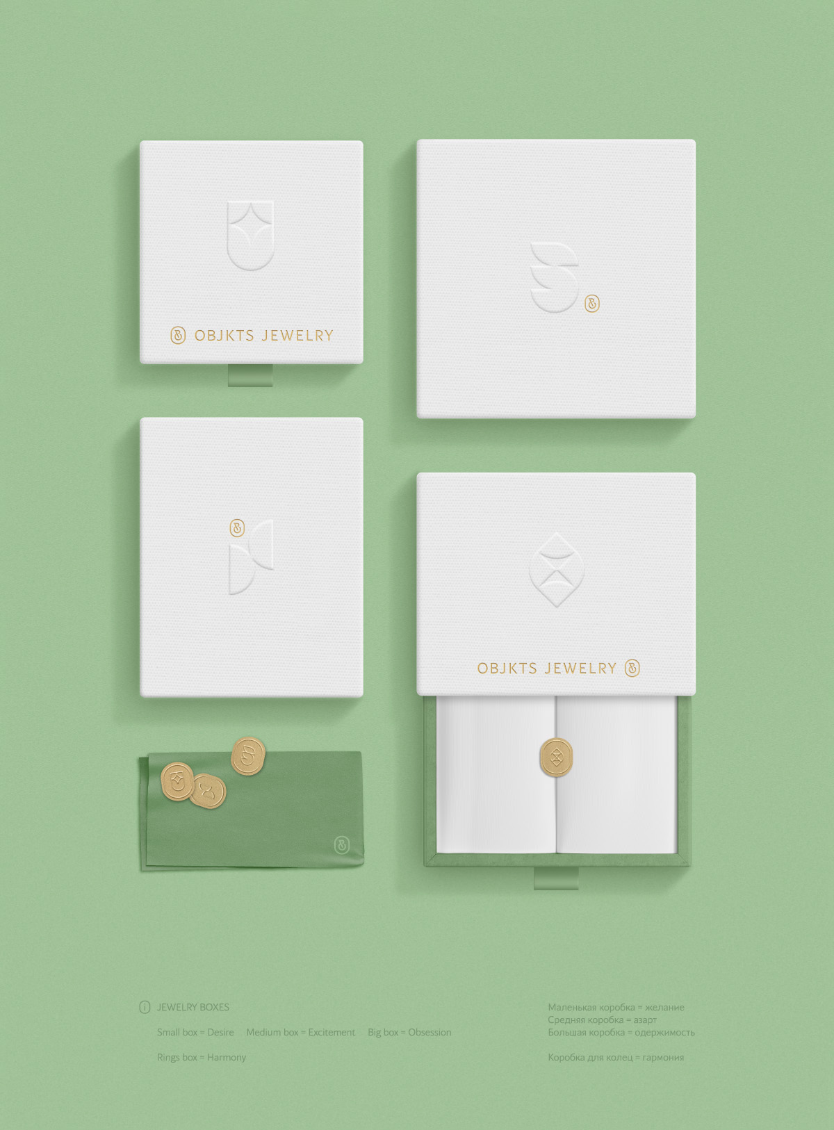
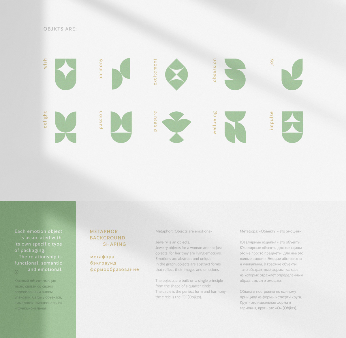
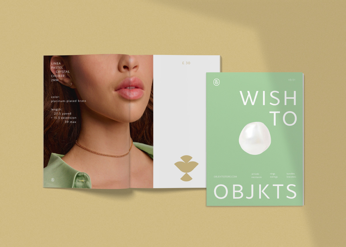
Background: The company’s business at the fundamental level is the sale of jewellery. However, for a woman, jewellery is not an object, it is emotion. Different emotions. Therefore, the company’s business at the mental level is the sale of emotions. Any jewellery object is an emotion. This basic business principle works in identity. Any emotion is subjective and abstract. In the project schedule, objects are abstract forms, each of which reflects a certain image, meaning and emotion. These emotional objects are placed on different types of packaging. That is, each emotion in the project has its own unique graphic appearance, it is placed on a specific selected type of packaging. The connection between objects and packaging is semantic, emotional and functional. It is also important that the company name-objekts-is a lot of objects, plural. Therefore, the identity in the complex is based on different objects. The objects are graphically constructed according to a single principle from the shape of a quarter circle. A circle is an ideal form and harmony, a circle is an” O ” (Objekts).
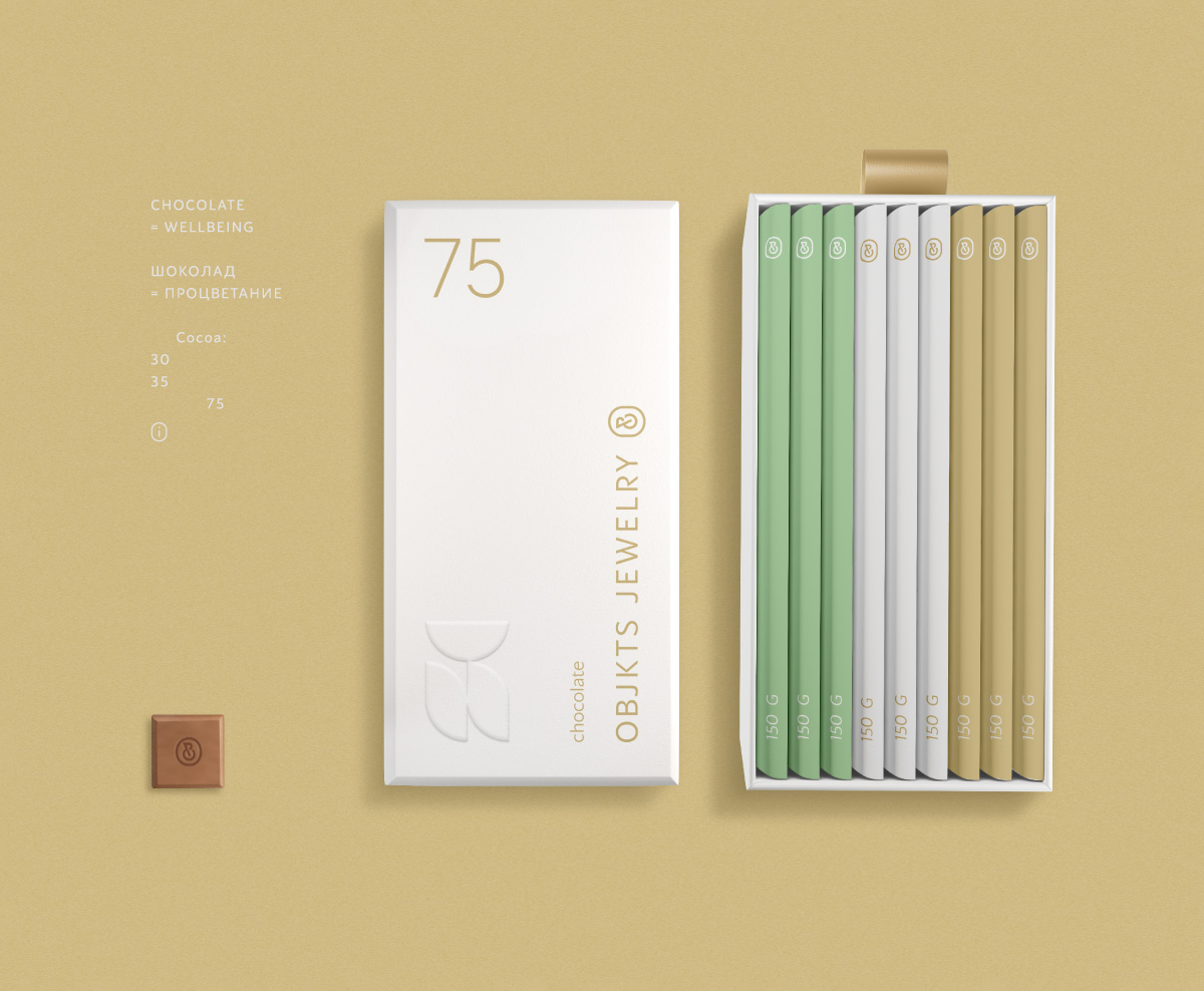
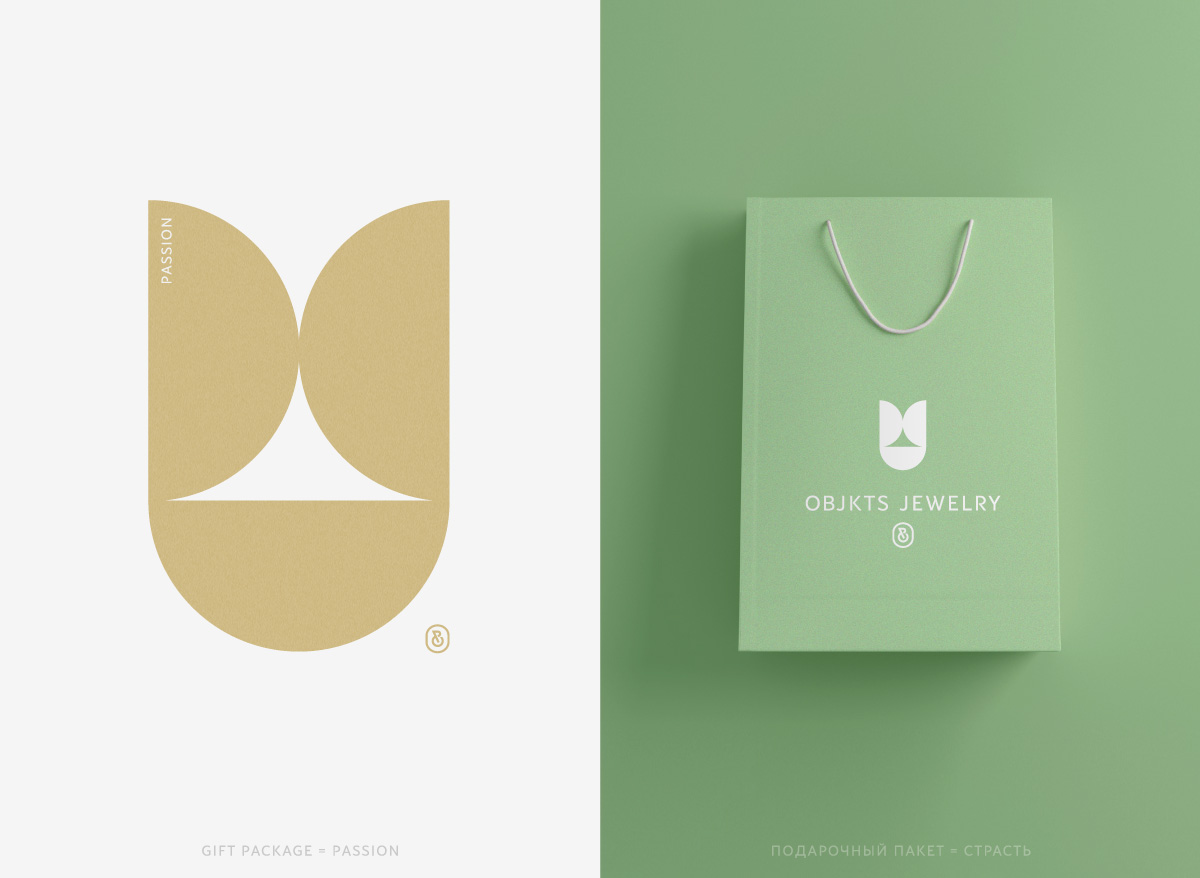
The use of a metaphor: The identity is packaging, that is, it consists of different types of packaging. Therefore, the identity must work and develop correctly within the framework of packaging at the structural and ideological level. Each type of packaging is associated with its own role/function and can be associated with different emotions. Therefore, each element of the package has its own unique graphic object-an an emotion. It is important that all emotions are matched to the elements meaningfully and logically. The placement takes into account the function of the element, its role and emotional purpose. The project uses a diverse range of emotions that are associated with the purchase of jewellery.
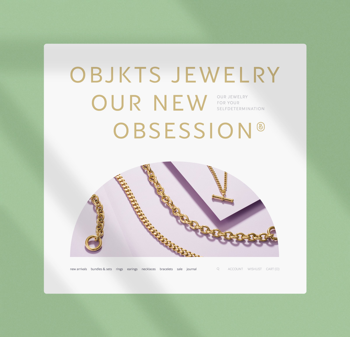
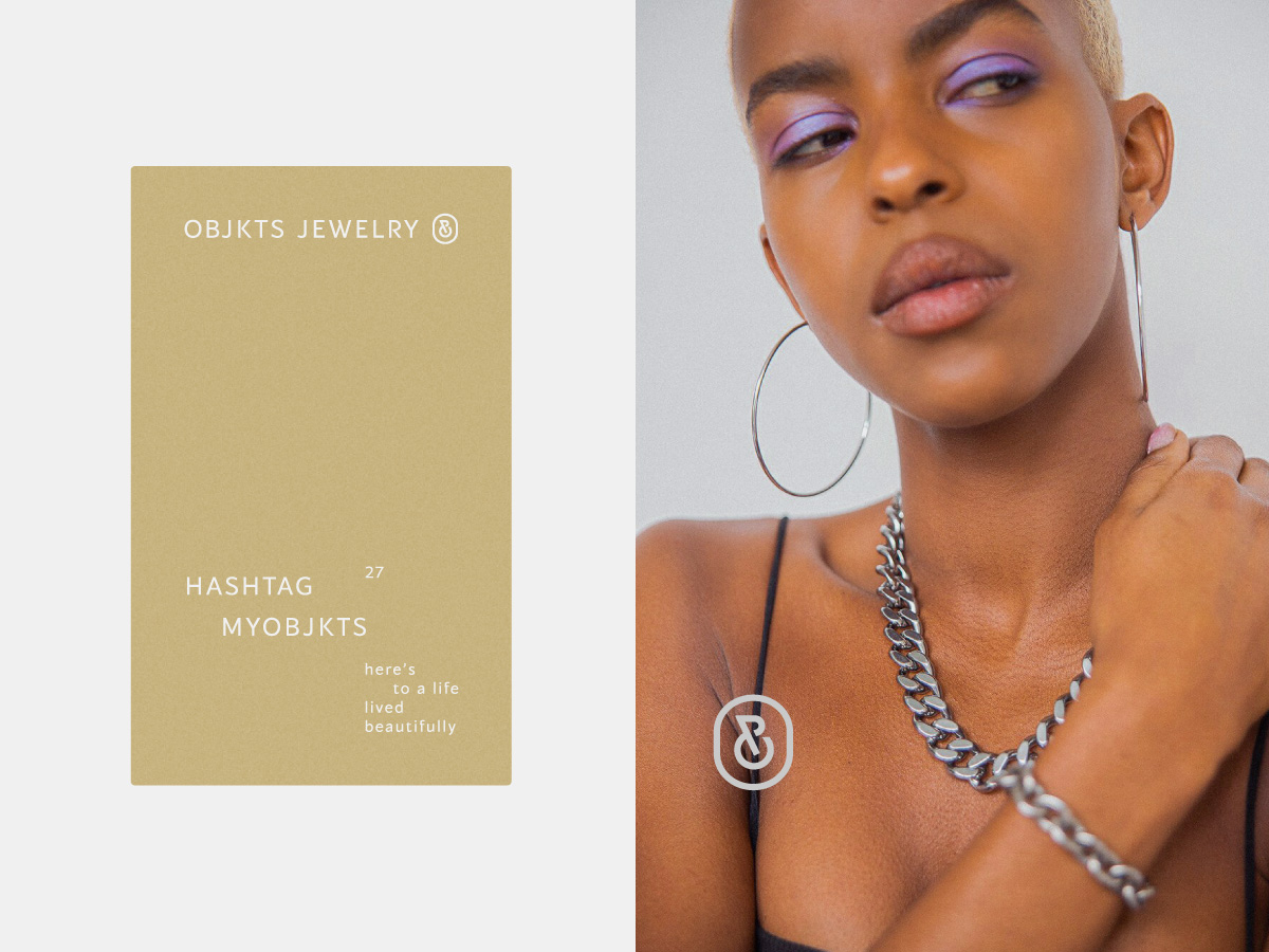
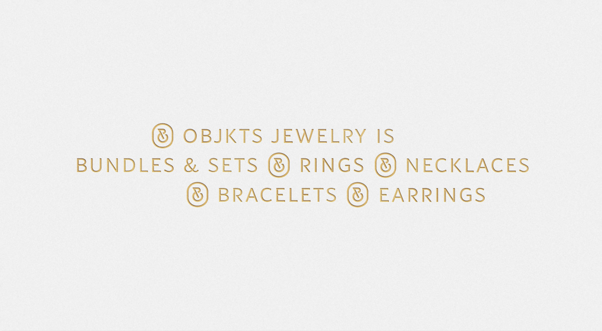
About the logo: The logo system consists of a font part and a brand icon (a stamp on the product). The system is focused on the most universal application in different situations. The variability in the arrangement of the logo elements and the layout of the logo system is high. The brand icon is made in the style of a monogram of two letters (OJ) using the aesthetics of the corporate font, which allows you to make a single harmonious tandem from the font part and the brand icon in different compositional situations.
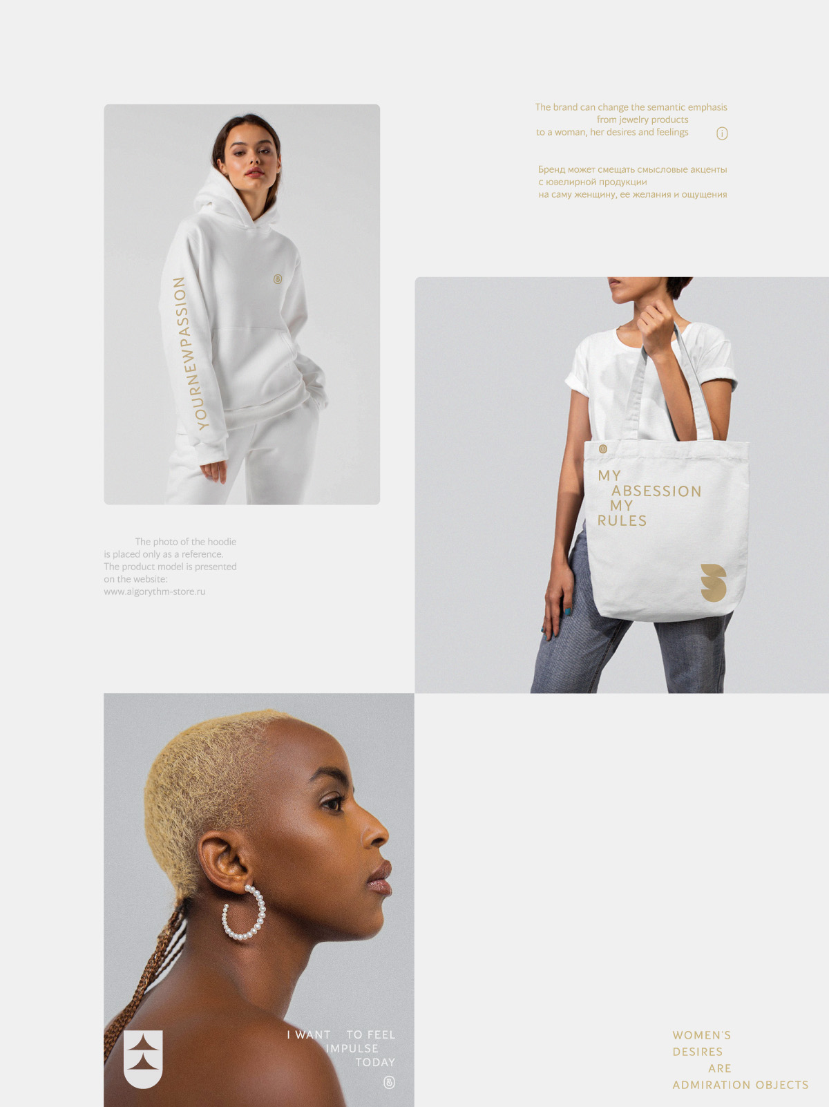
About the context: The ideological basis of the project is based on the graphic and contextual display of emotions. Emotions can be associated with a specific package and its function. In this case, emotions are focused on physical objects and their characteristics. The brand can also shift the emotional emphasis from the function of the object to the woman herself and her desires, which is expressed in gift products, photo materials and branded merchandise. Thus, the emotional component is universal and can be used in different semantic and functional situations.
CREDIT
- Agency/Creative: Artgeneracia
- Article Title: Branding and Packaging Design for a London-Based Jewellery Brand Objekts
- Organisation/Entity: Freelance
- Project Type: Identity
- Project Status: Published
- Agency/Creative Country: Russia
- Agency/Creative City: Tver
- Market Region: Europe
- Project Deliverables: 2D Design, Art Direction, Brand Creation, Brand Design, Brand Identity, Brand Redesign, Branding, Packaging Design, Rebranding, Typography
- Industry: Fashion
- Keywords: Artgenerator, Artgeneracia, Branding, Identity, Brand Identity, Typography, Fashion, Boutique, Emotion, Emotions, Gem, Gems, Jewelry, Jewellery, Minimalism, Woman, Girl
-
Credits:
Art-Direction and Brand Design: Ivan Voznyak


