
Asprey Creative – Irrewarra Sourdough
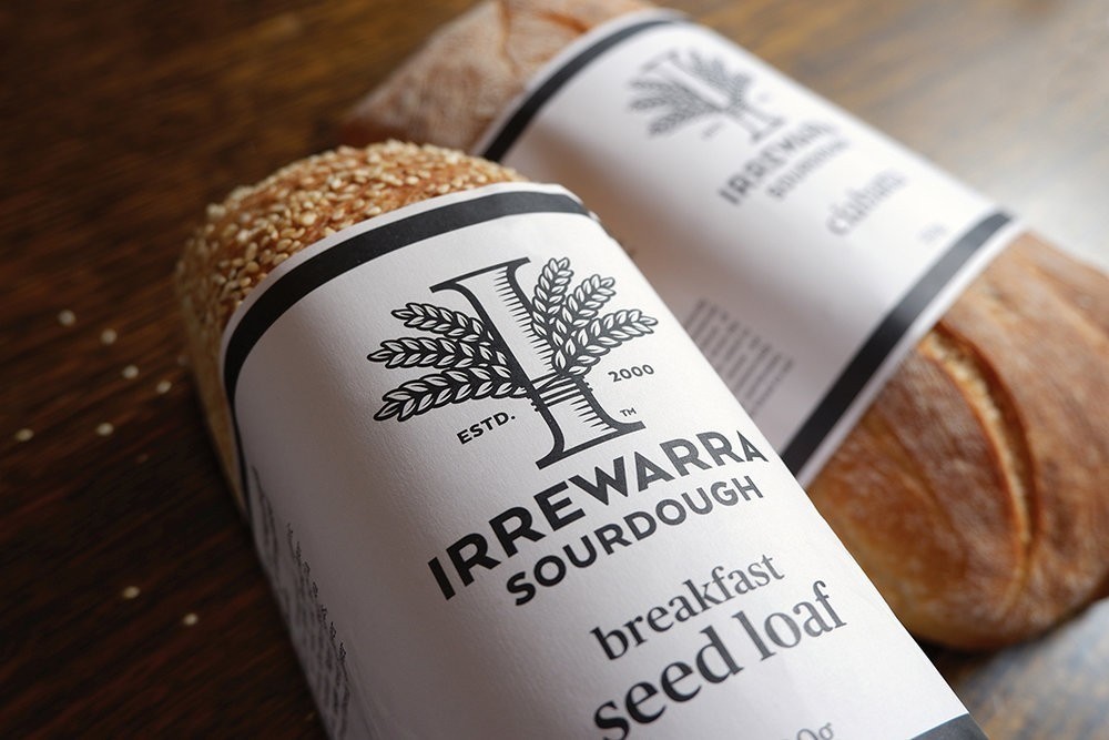
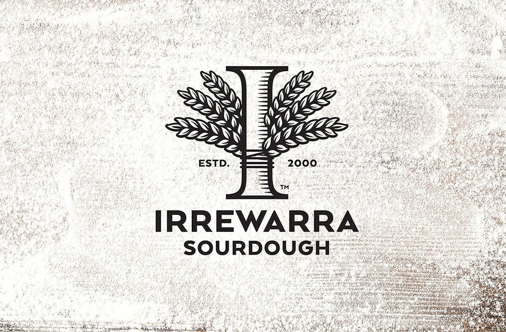
Irrewarra is a successful bakery in regional Victoria, Australia with a huge following, genuine heritage and, when they approached us, a clear need for a prouder, more confident brand strategy.
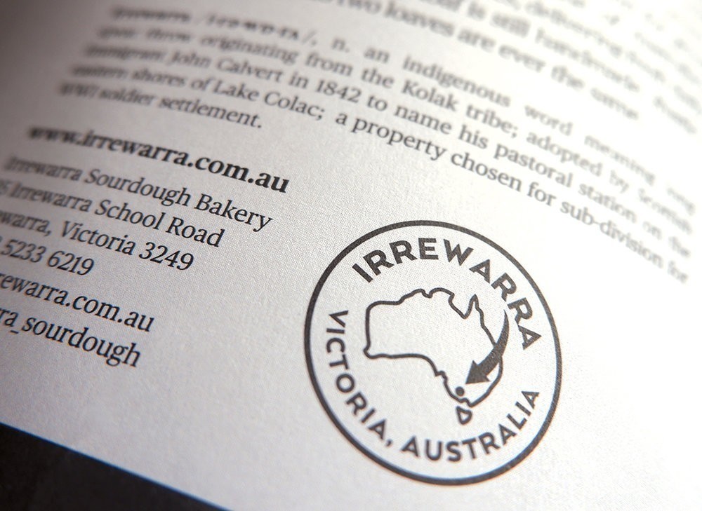
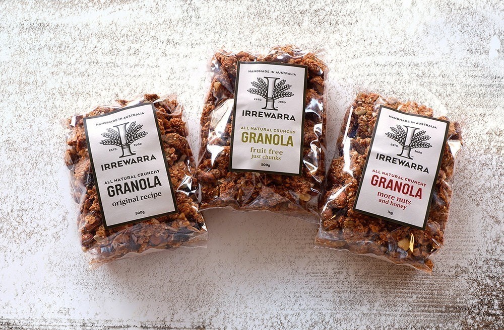
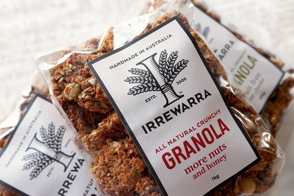
We took a holistic approach to reinventing Irrewarra’s brand and packaging. We improved the brand’s expression by simplifying and modernising messaging across all their touchpoints. We reinterpreted the brand mark without detracting from its heritage, consolidated brand expression across secondary product ranges and refined brand language to tell a more engaging story of quality ingredients and pride of place.
Design Agency Name: Asprey Creative
Organisation/Project Type: Agency, Published Commercial Design
Article Title: Brand and Packaging Design for Bakery
Brand / Project Name: Irrewarra Sourdough
Project Type: Consumer Brand Redesign
Strategic Deliverables: Consumer Tone of Voice
Design Deliverables: Consumer Rebranding, Consumer Brand Identity System, Consumer Graphic Packaging Design, Consumer Structural Packaging Design
Location: Australia
Market Country: Australia
Market Region: Oceania
Project Category: Bakery
Consumer Packaging Format: Bag, Sleeve
Consumer Substrate / Material: Plastic, Pulp Paper
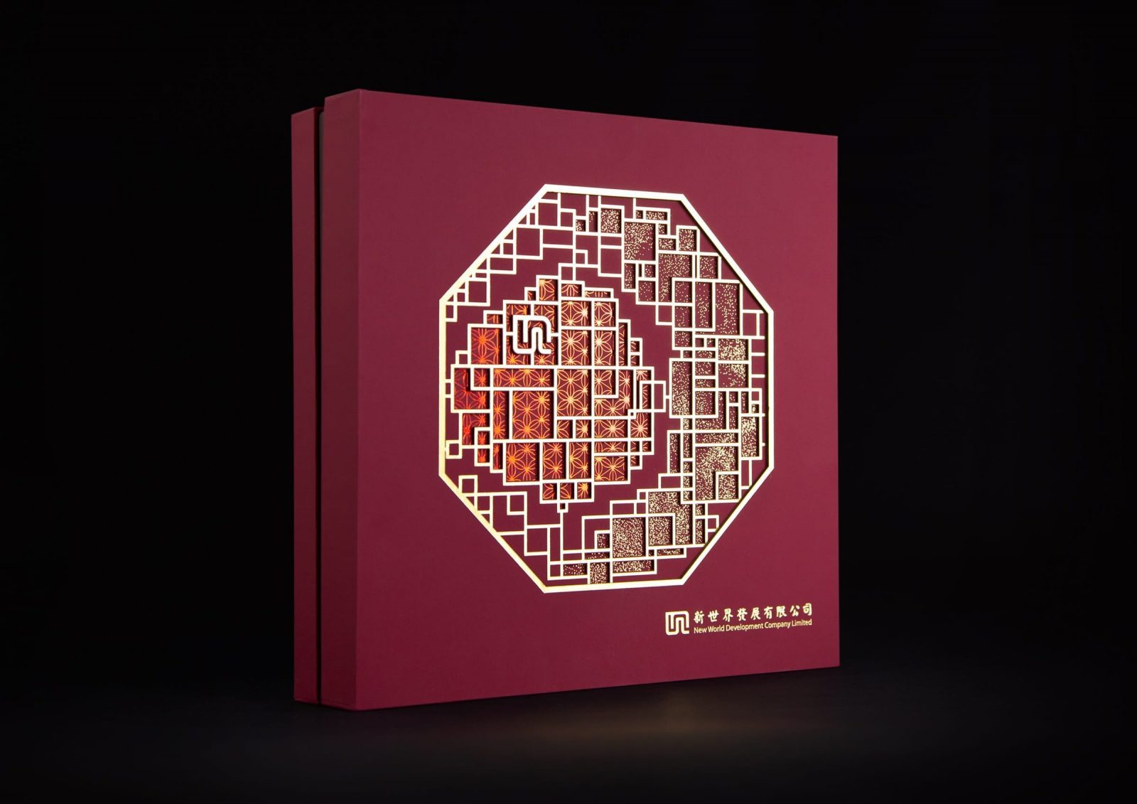
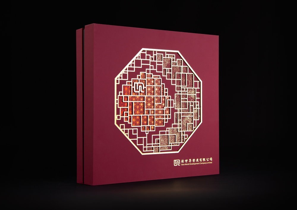
Box Brand Design – NWD Mooncake 2018
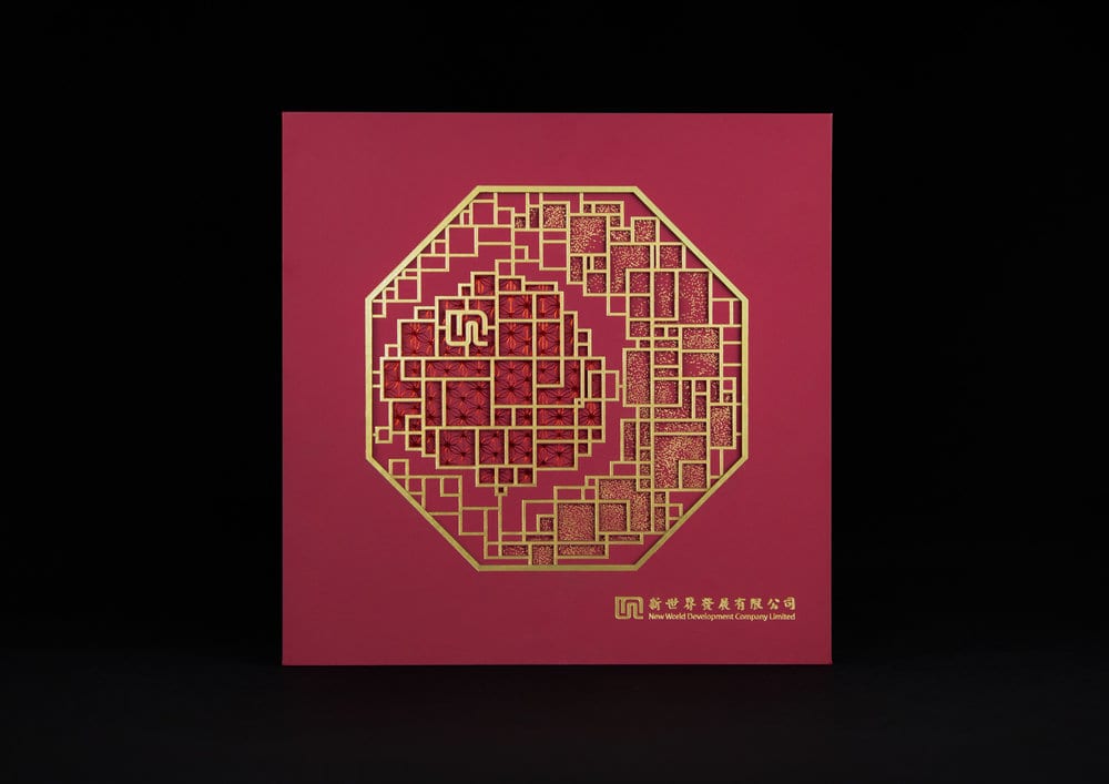
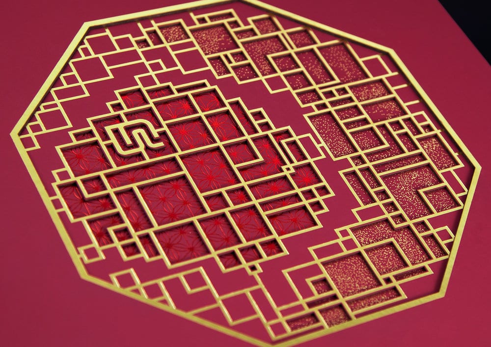
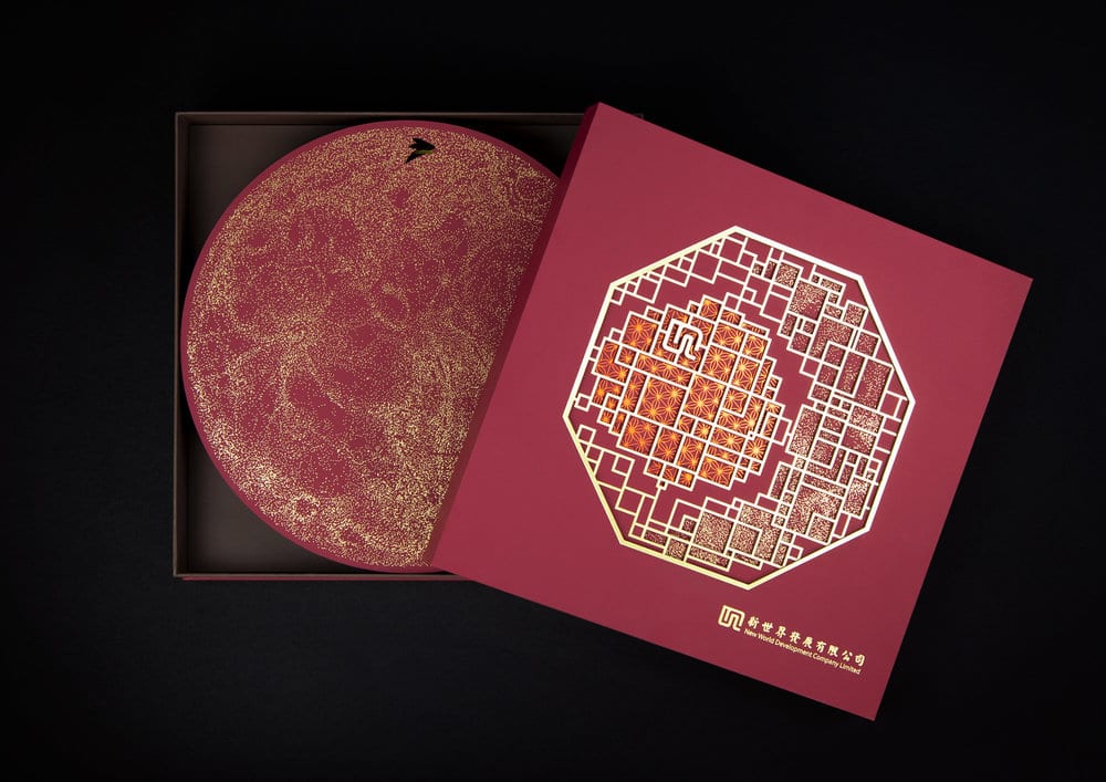
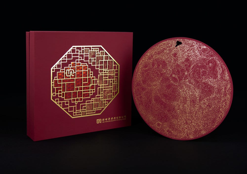
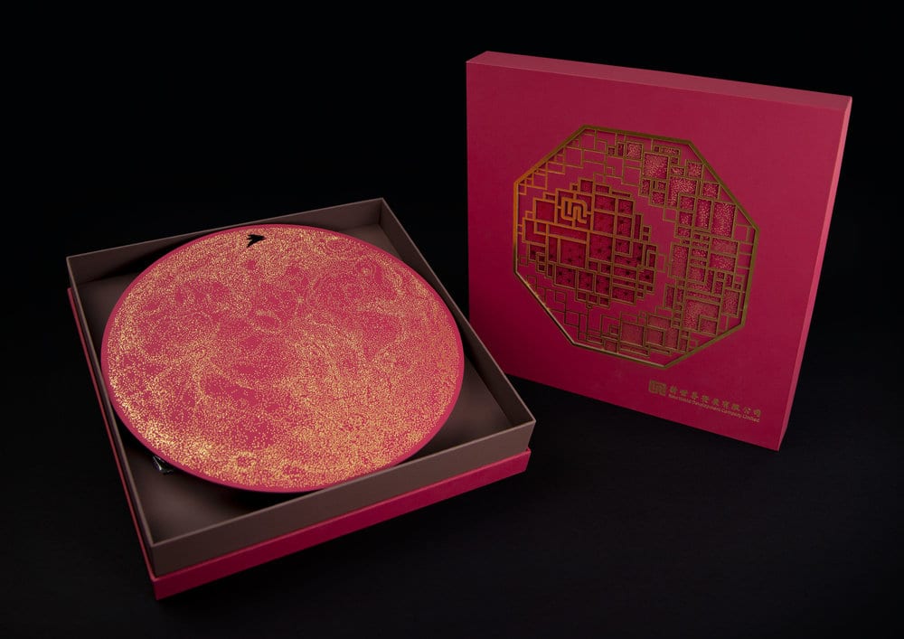
Traditional culture and imagination inhabit in our daily spaces naturally. The creative combination expands a new journey of imagination. NWD persists in delivering bespoke craftsmanship manifested by originality. The intimate interaction between humanity and nature savours the modern Chinese style from completely fresh perspectives.
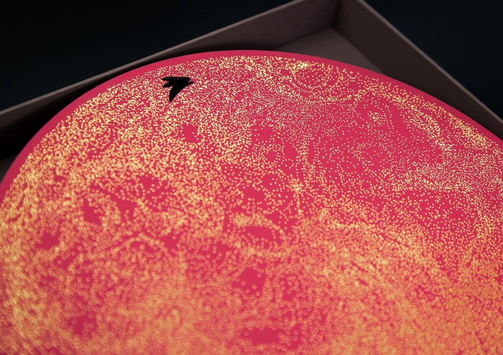
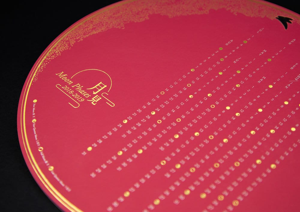
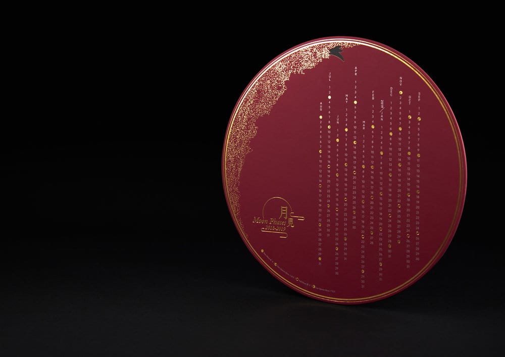
Design Agency Name: Box Brand Design
Organisation/Project Type: Agency, Published Commercial Design
Article Title: Modern Chinese Premium Mooncake Packaging
Brand / Project Name: NWD Mooncake 2018
External Design Credits: AE: Miki Long Graphic Designer: Joey Lo Art Director: Yvonne Chung Design Director: Joey Lo
Project Type: Consumer Brand Creation
Strategic Deliverables: Consumer Research / Insight, Consumer Brand Strategy, Consumer Tone of Voice
Design Deliverables: Consumer Branding, Consumer Graphic Packaging Design, Consumer Structural Packaging Design, Consumer Industrial Brand Design
Location: Hong Kong
Market Country: Hong Kong
Market Region: Asia
Project Category: Promotional
Consumer Packaging Format: Box
Consumer Substrate / Material: Pulp Board, Pulp Paper

bulldog studio – Sun and Fruits
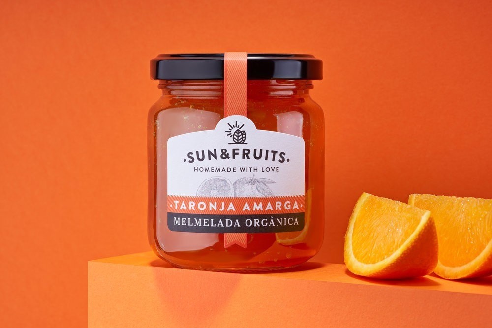
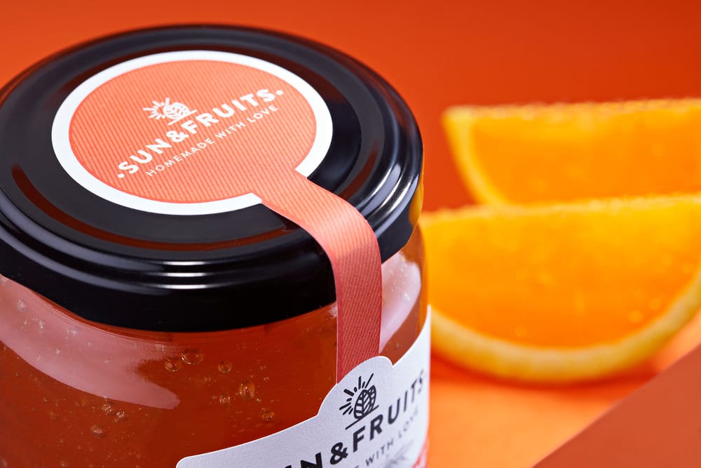
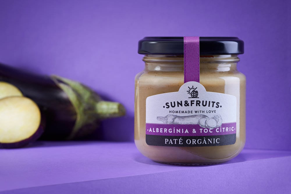
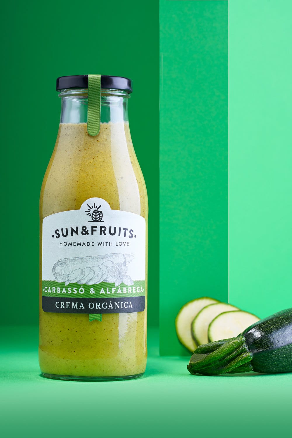
Sun & Fruits is a brand of creams and marmalades made with love, for the love of a mother and a daughter who work from the workshop in their home.
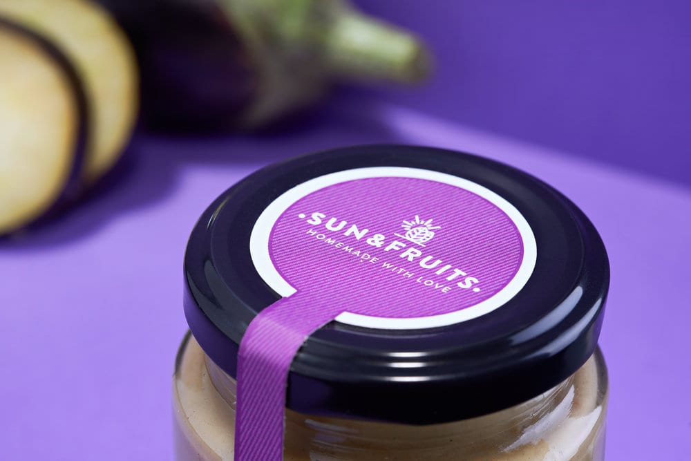
We wanted to capture it in the design and that the consumer would notice, that’s why we mixed illustration, typography and color, to create a climate at the time of purchase
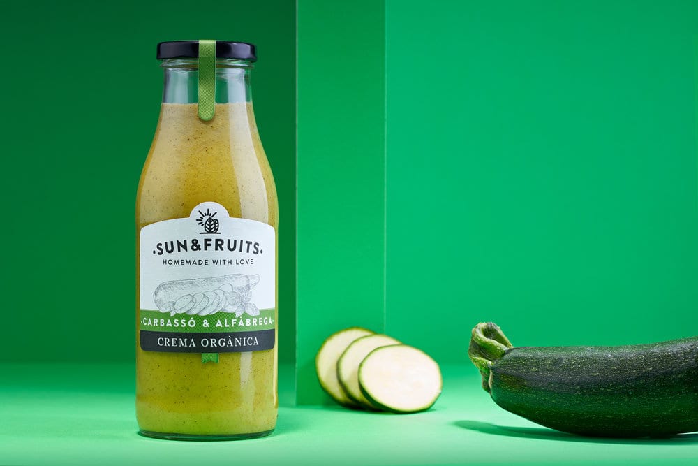
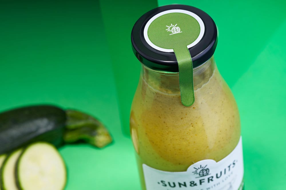
Design Agency Name: bulldog studio
Organisation/Project Type: Agency, Published Commercial Design
Article Title: Sun and Fruits Packs Line for Homemade Creams
Brand / Project Name: Sun and Fruits
Production Credits : www.vidalarmadans.com
Project Type: Consumer Brand Creation, Consumer Brand Redesign
Strategic Deliverables: Consumer Research / Insight, Consumer Brand Strategy, Consumer Brand Naming, Consumer Brand World
Design Deliverables: Consumer Branding, Consumer Brand Creation, Consumer Brand Identity, Consumer Brand Guidelines, Consumer Graphic Packaging Design, Consumer Retail Brand Design
Location: Spain
Market Country: Spain
Market Region: Europe
Project Category: Condiments
Consumer Packaging Format: Cup, Flow-Pack, Tag
Consumer Substrate / Material: Glass, Pulp Paper

The Creative Union – Brava Studio
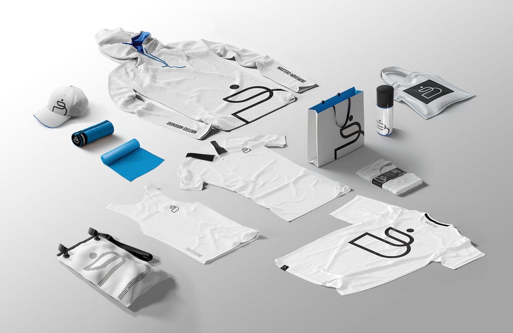
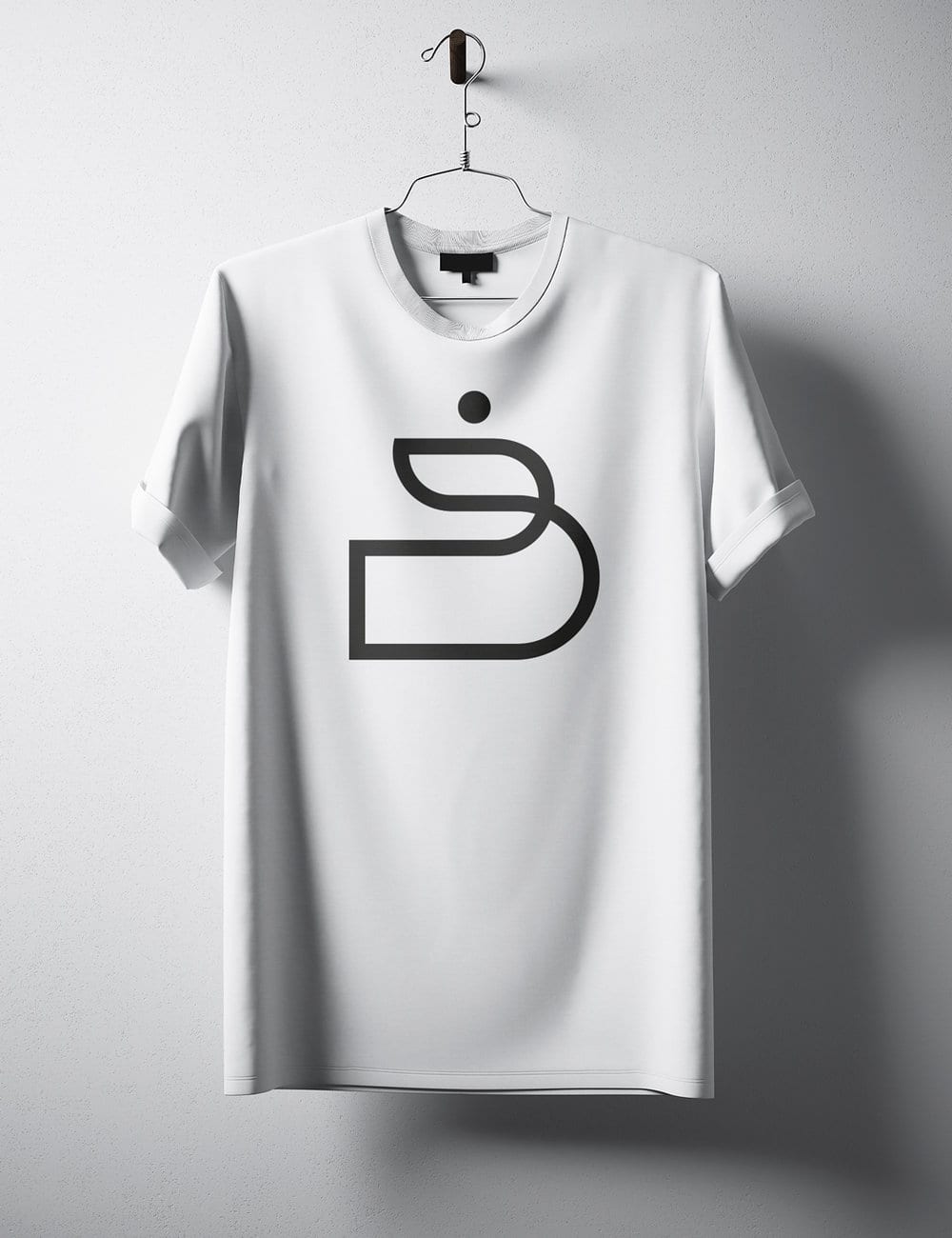
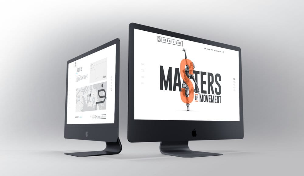
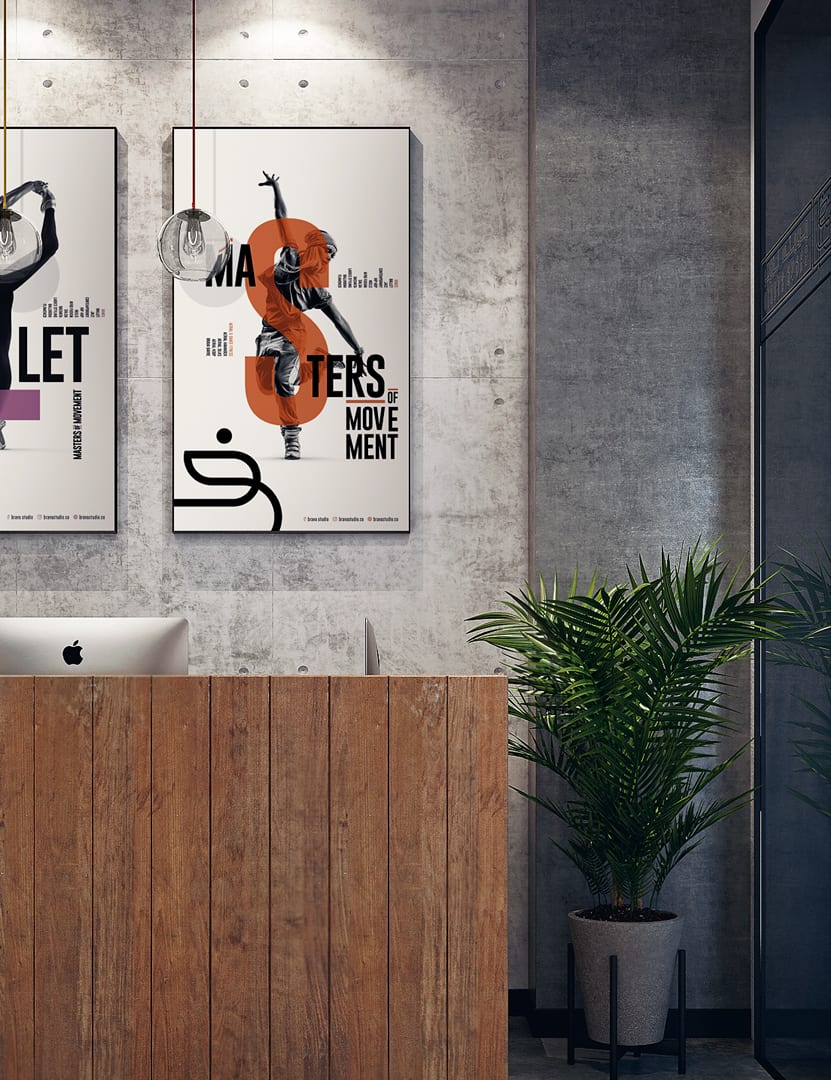
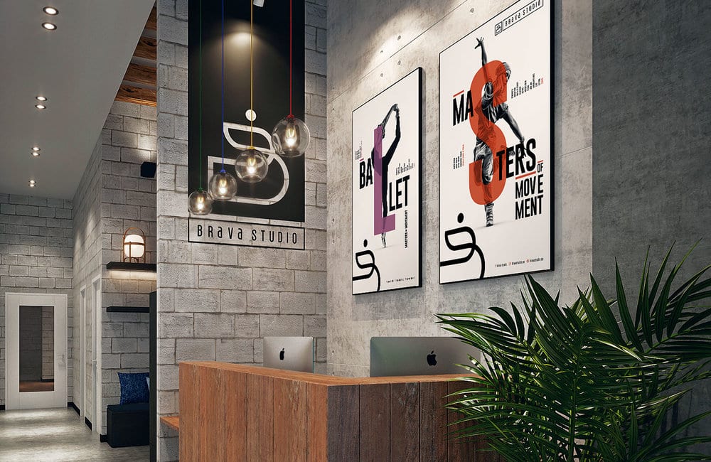
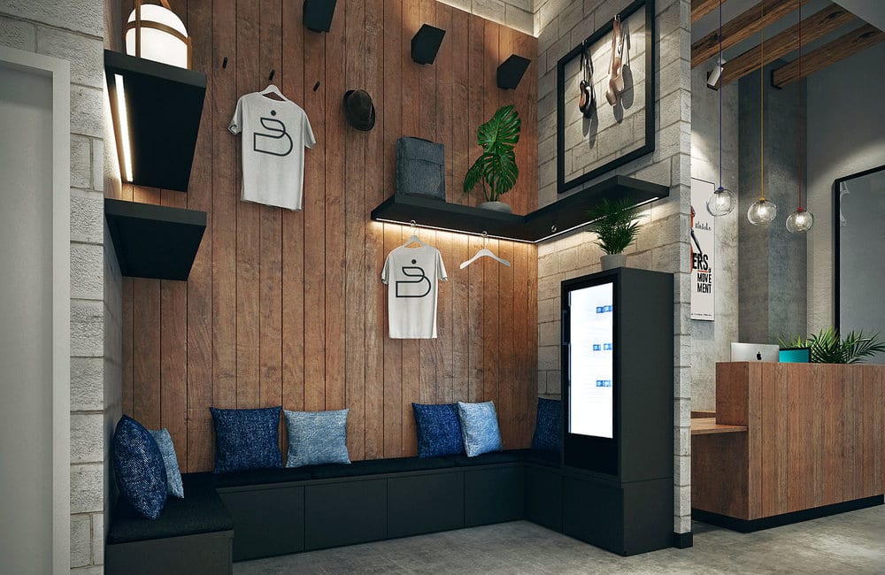
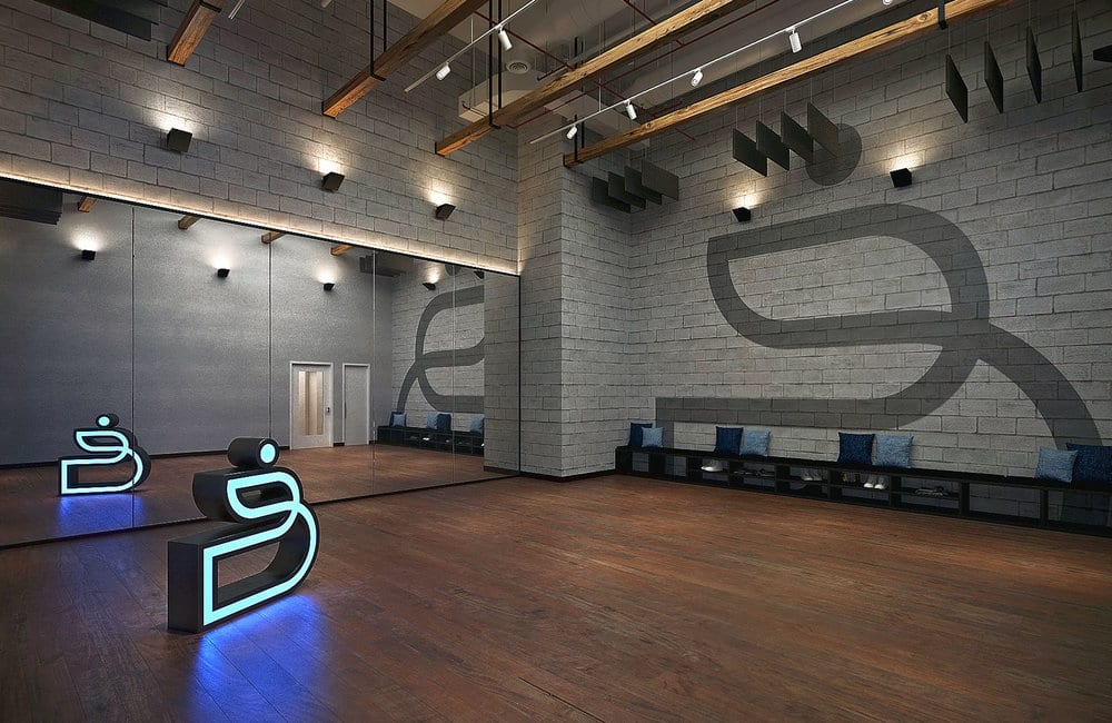
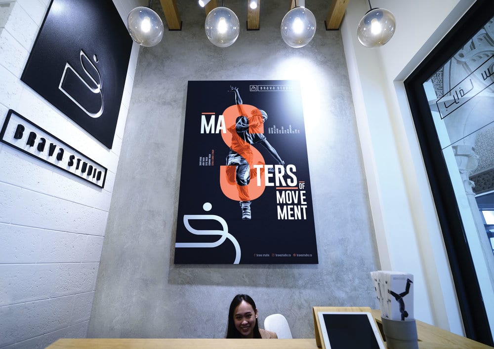
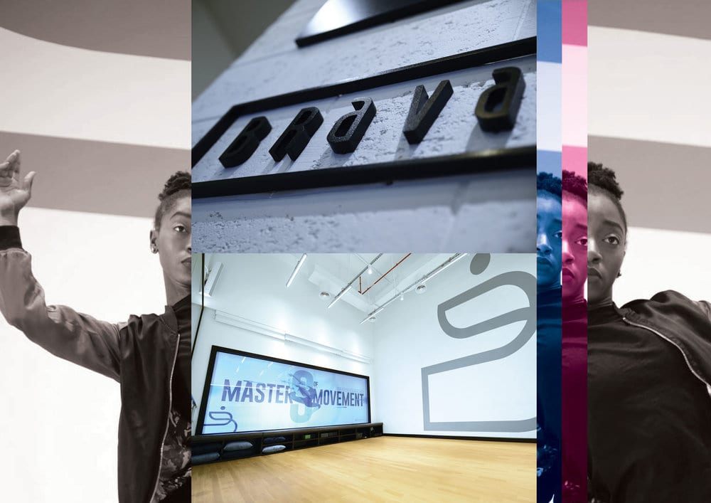
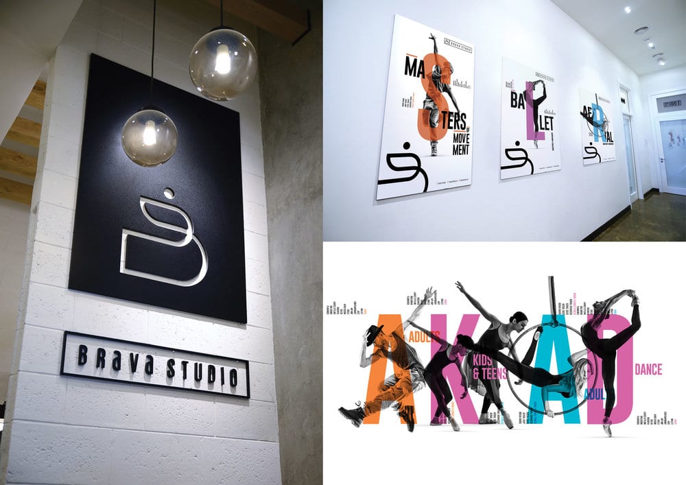
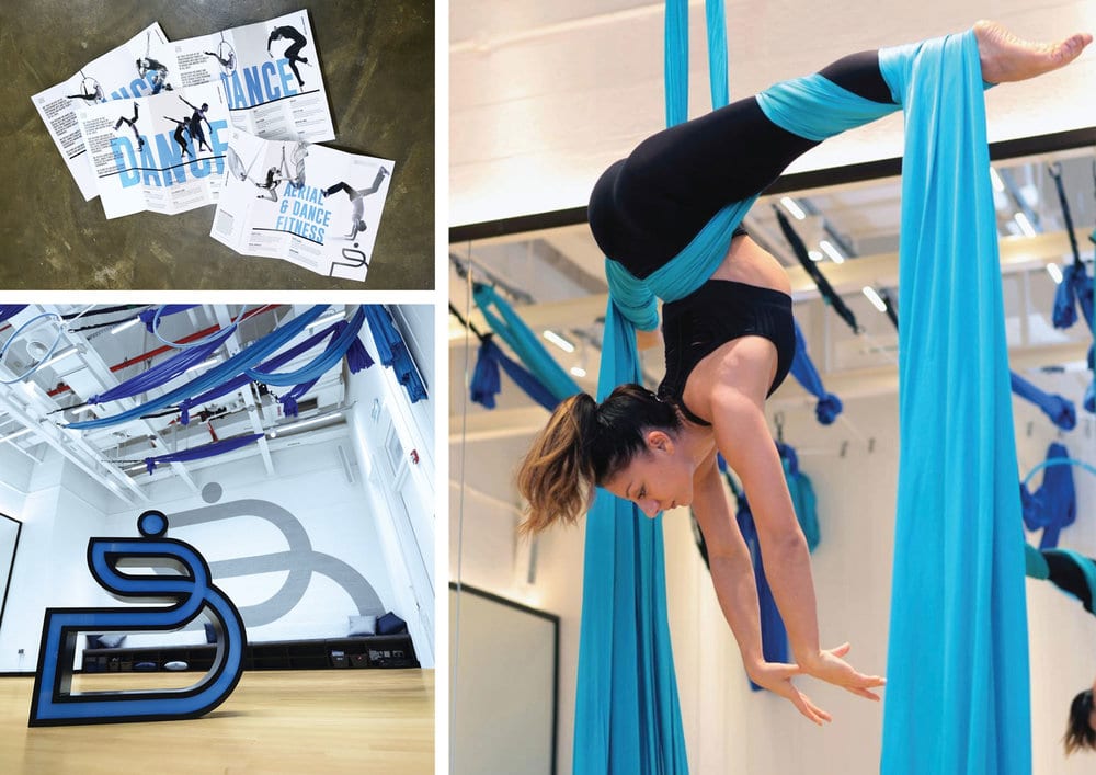
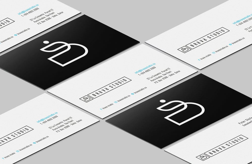
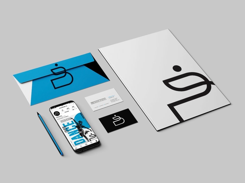
The branding developed is inspired by movement, flexibility, and lines. A contemporary brand that can be adapted in many ways. The crafted brand logo represents a “B” but also forms a fluid abstract outline of a dancer in motion. The typography used is tall and elegant to mimic the graceful nature of the art of dance and the mastery of movement, gender neutral and resonating well for both males and females of all ages. The brand language is contemporary, bold and plays with enlarged letters overlapping black and white imagery. For the interior space, we drew inspiration from the streets of an urban city where you would find professional dance studios in funky parts of town. We used mixed materials treated in a sophisticated and elegant way. Woods, concrete, white bricks.

Design Agency Name: The Creative Union
Organisation/Project Type: Agency, Published Commercial Design
Article Title: Brava Studio
Brand / Project Name: Brava Studio
Project Type: Corporate Brand Creation
Strategic Deliverables: Corporate Brand Strategy, Corporate Brand Naming, Corporate Tone of Voice, Corporate Product Brand Architecture
Design Deliverables: Corporate Brand Identity, Corporate Branding, Corporate Brand Creation, Corporate Brand Identity, Corporate Brand Identity System, Corporate Brand Guidelines, Corporate Brand Experience, Corporate Retail Brand Design, Corporate Brand Digital Design
Location: Qatar
Market Country: Qatar
Market Region: Middle East
Project Category: Entertainment
Corporate Brand Touchpoints: Architecture Interior, Brand Identity, Graphic Design, Printed Stationary, Digital Social Media, Digital Social Media Campaign

Azadeh Graphic Design Studio – Beauty Cosmetic
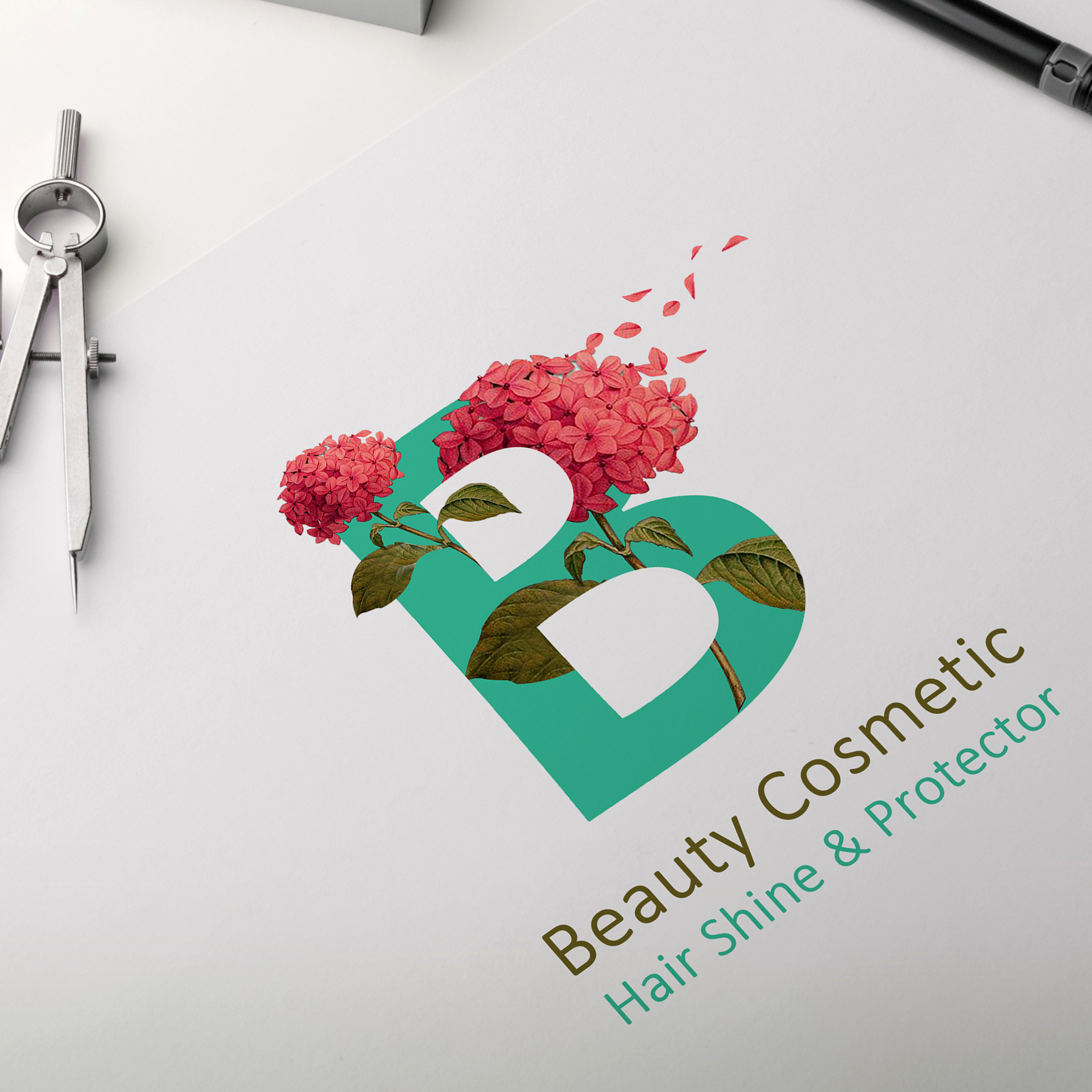
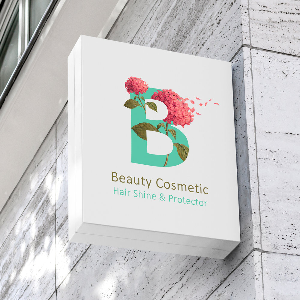
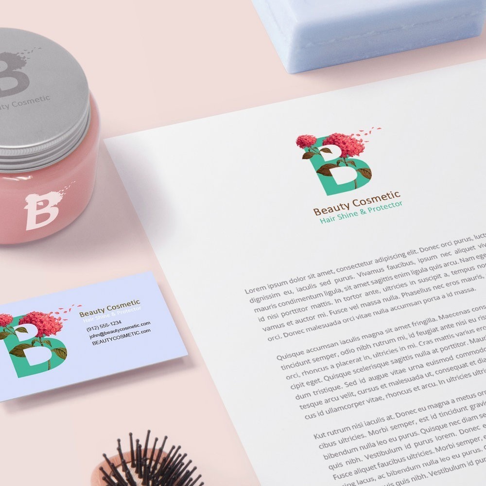
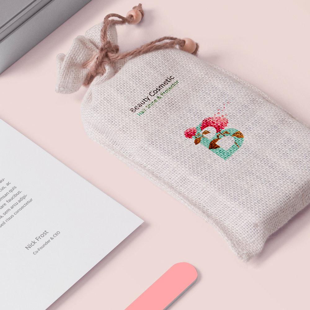
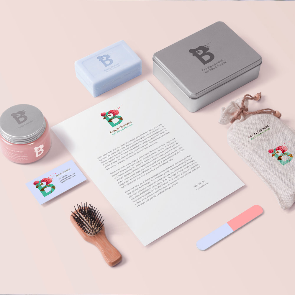
I tried to use a colorful pattern to reference the purity which is available in nature, the natural colors which are not dangerous or do not remind us of chemical products. I tried to use a collection of simplicity in font, shape, and adjacent of pure color which broaden the safety sense of consumers.. it is worth mentioning that these colors represent their activity and potential. the beauty cosmetic STATIONARY is trying to absorb a new range of consumers who are always concerned about their beauty staff in terms of whether they are organic, healthy, pure and so on.
Design Agency Name: Azadeh Graphic Design Studio
Organisation/Project Type: Agency, Published Commercial Design
Article Title: Identity Cooperation for Cosmetic Products
Brand / Project Name: Beauty Cosmetic
Project Type: Consumer Brand Creation
Strategic Deliverables: Consumer Brand Strategy
Design Deliverables: Consumer Branding
Location: Iran
Market Country: Iran
Market Region: Asia
Project Category: Promotional
Consumer Substrate / Material: Pulp Paper

Taha Fakouri – Honey Packaging
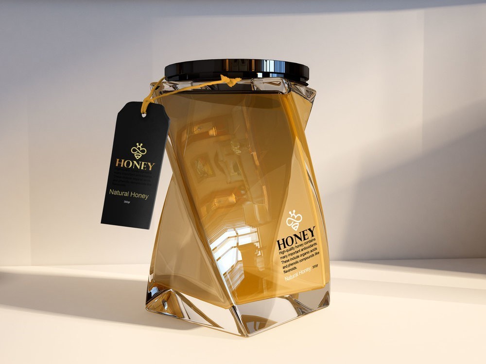
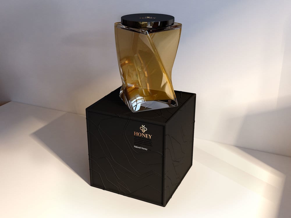
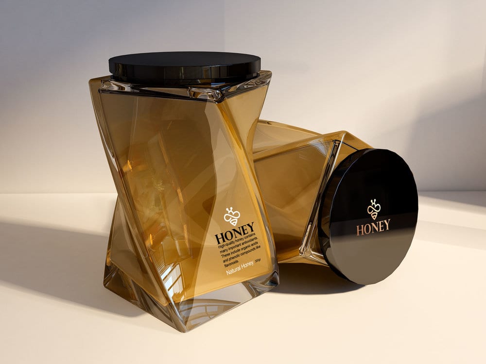
When we carefully look at honey packaging, they are basically all in almost the usual form, and the ultimate creativity is that a good label is designed for the honey dish.
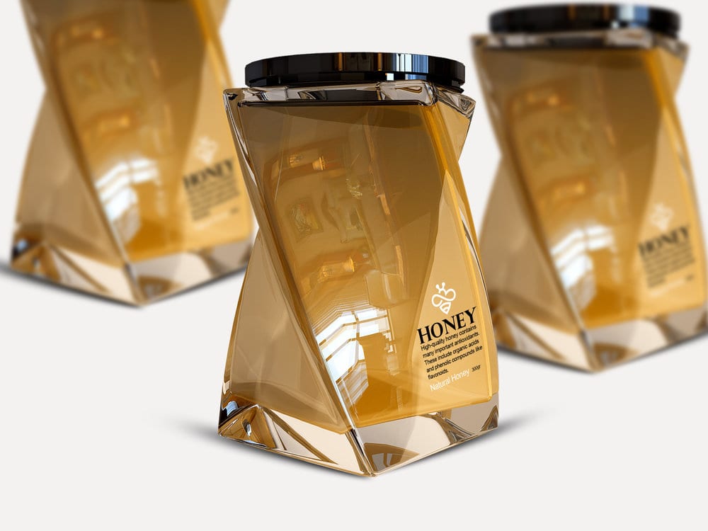
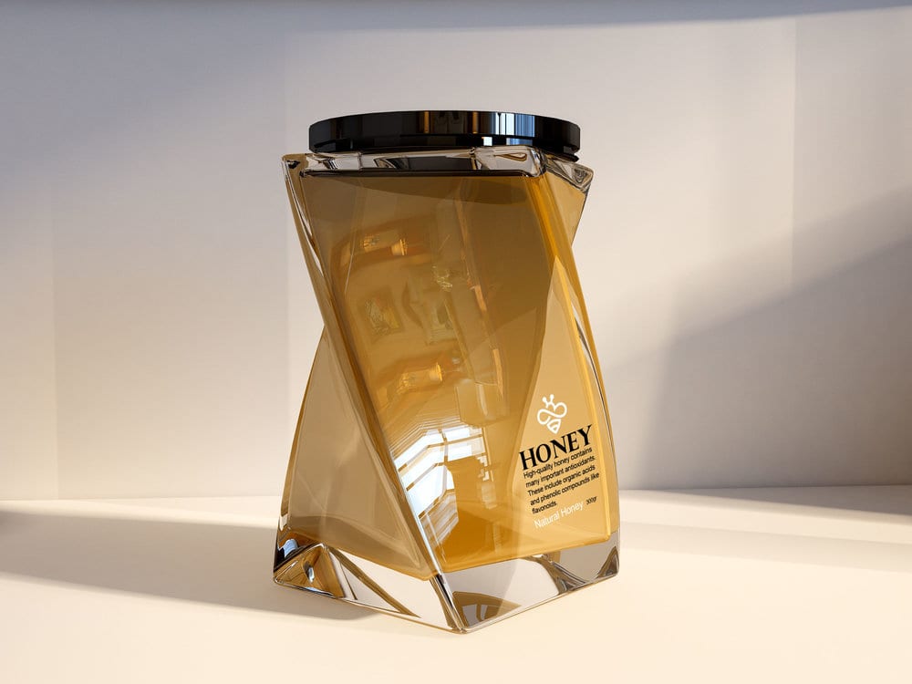
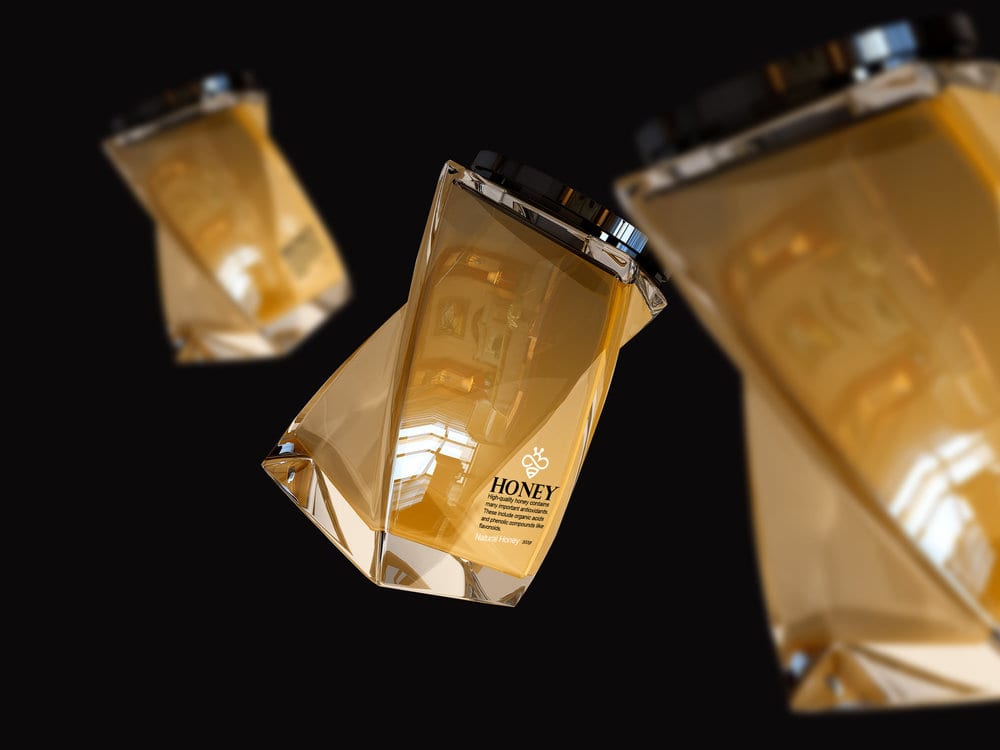
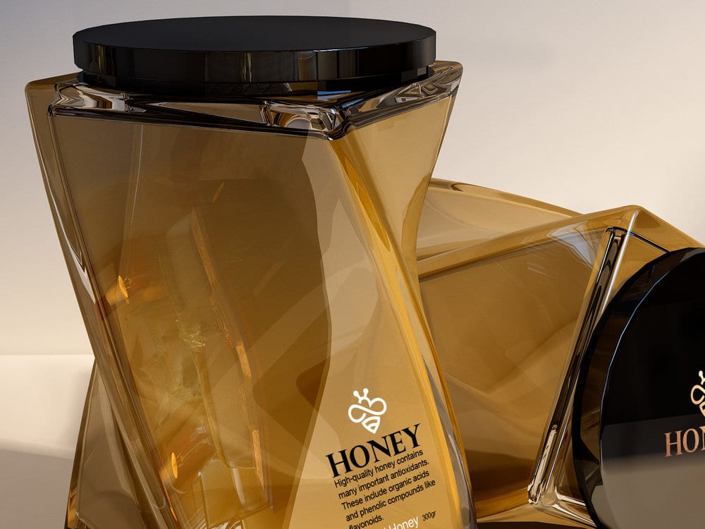
In this form, I tried to go far beyond the usual templates and make to a special form, which, with the simple writing on the package, would have a special visual look into the honey package,
i Hope friends and professional designers like it.
Design Agency Name: Taha Fakouri
Organisation/Project Type: Freelance, Published Commercial Design
Article Title: Honey Packaging
Brand / Project Name: Honey Packaging
Project Type: Consumer Brand Creation
Strategic Deliverables: Consumer Brand World
Design Deliverables: Consumer Graphic Packaging Design, Consumer Structural Packaging Design
Location: Iran
Market Country: Iran
Market Region: Global
Project Category: Cupboard Food
Consumer Packaging Format: Bag, Box, Jar
Consumer Substrate / Material: Glass, Plastic, Pulp Paper

Provincia Estudio Creativo – Las Frescas Brand and Identity
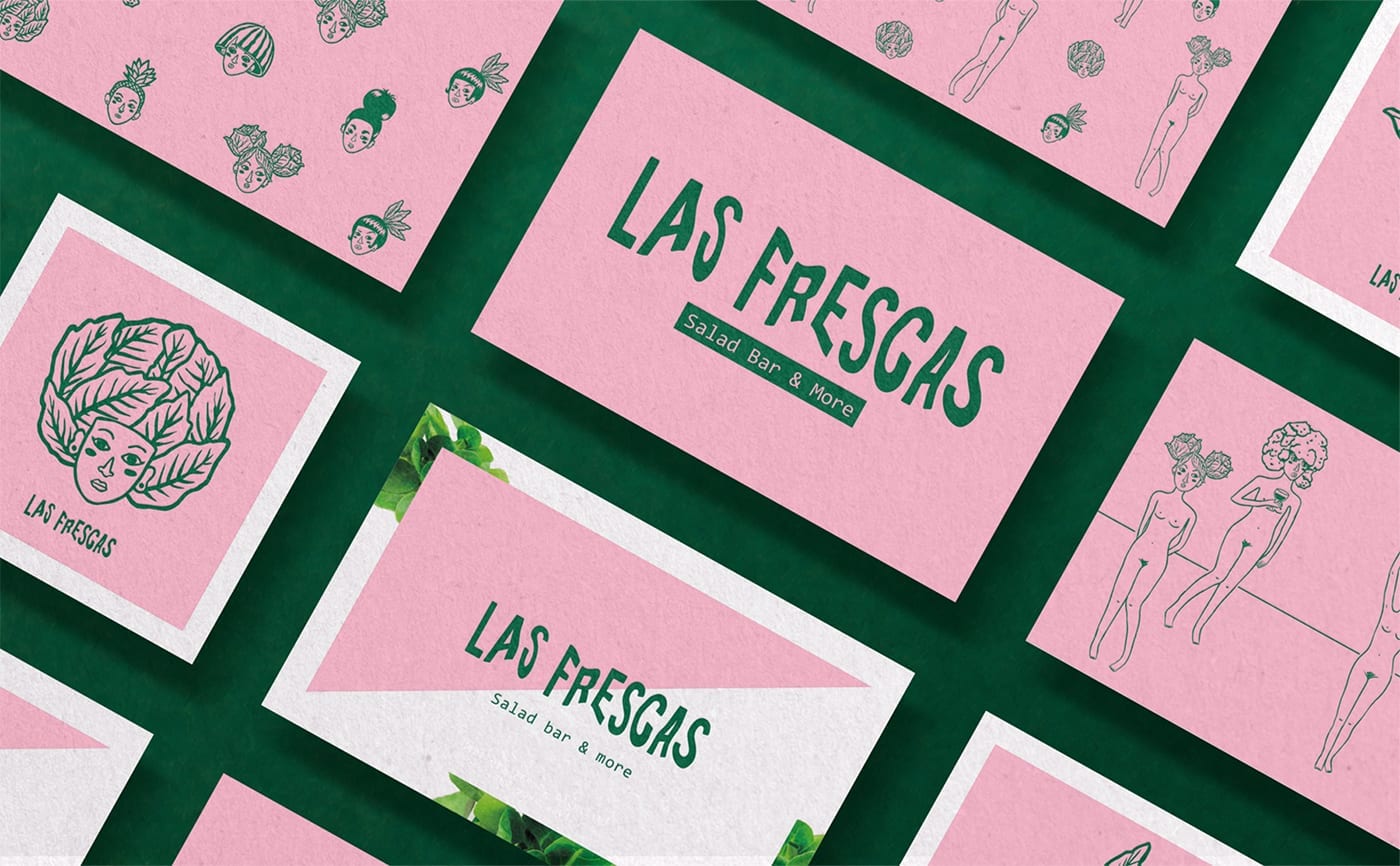
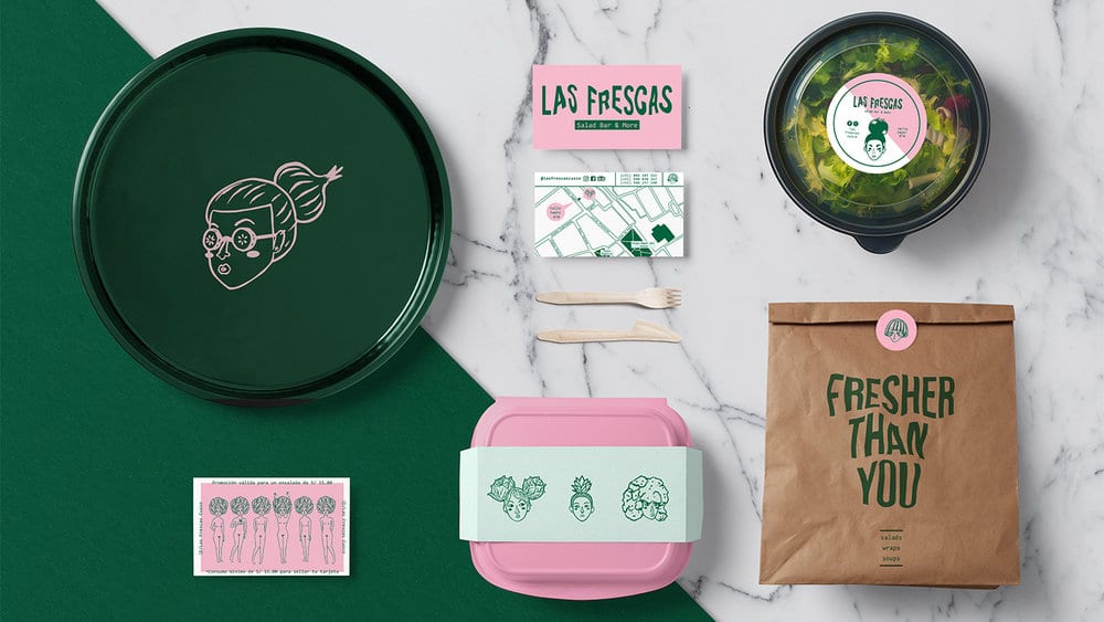
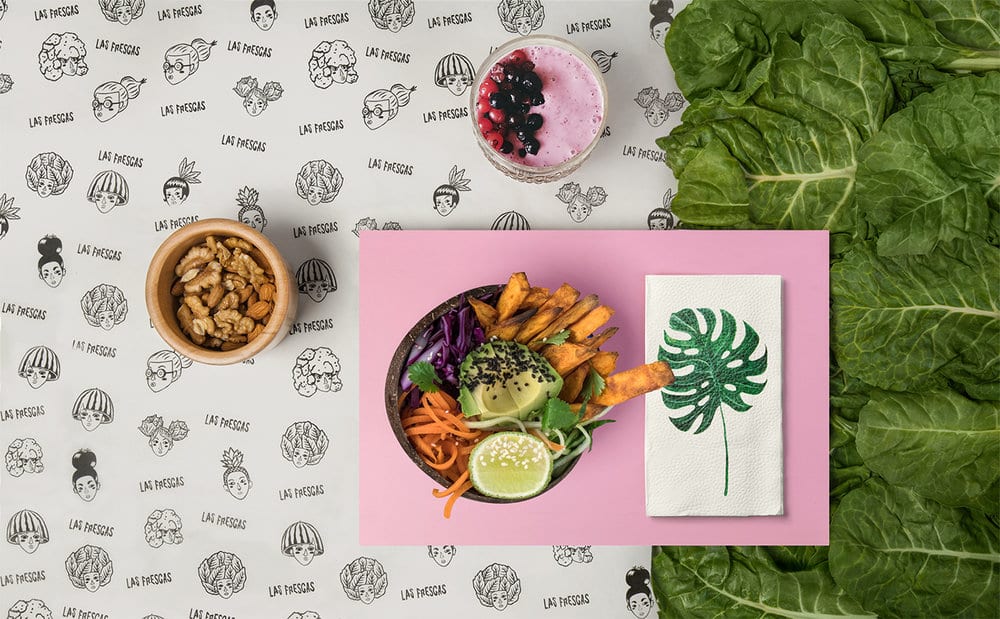
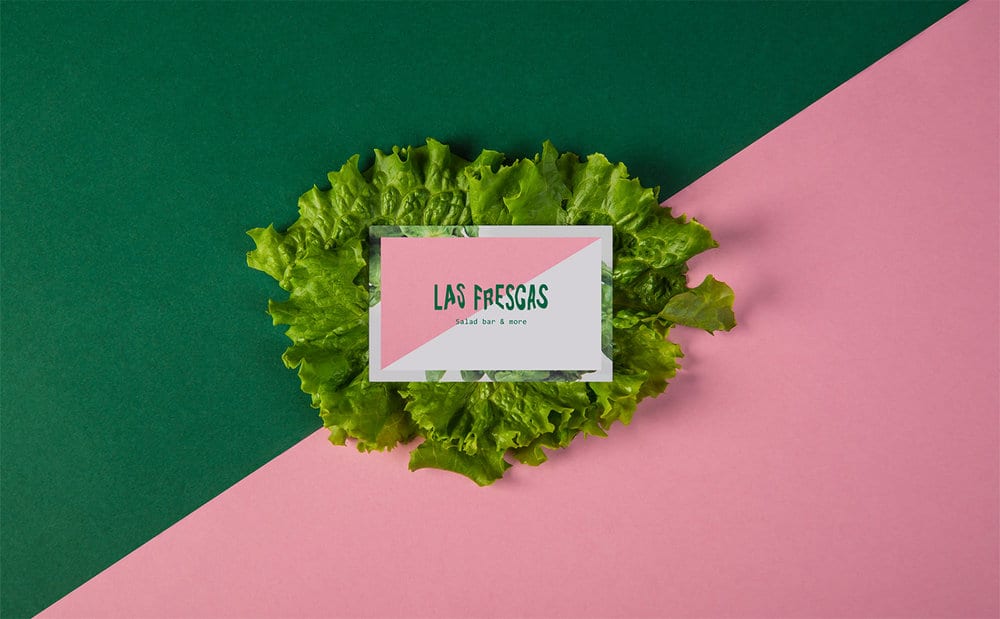
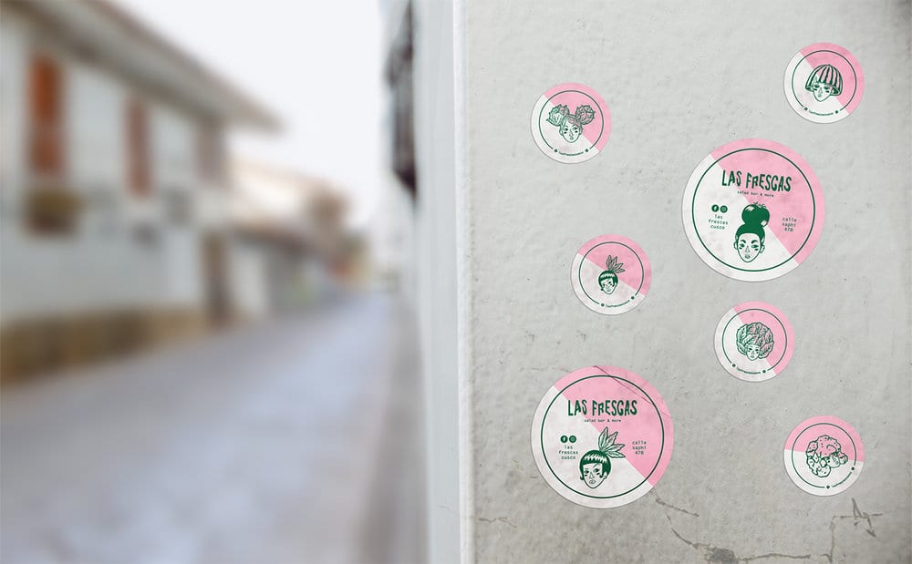
Las Frescas is the first Salad Bar in Cusco, Peru. Its founders propose healthy non-restrictive food.
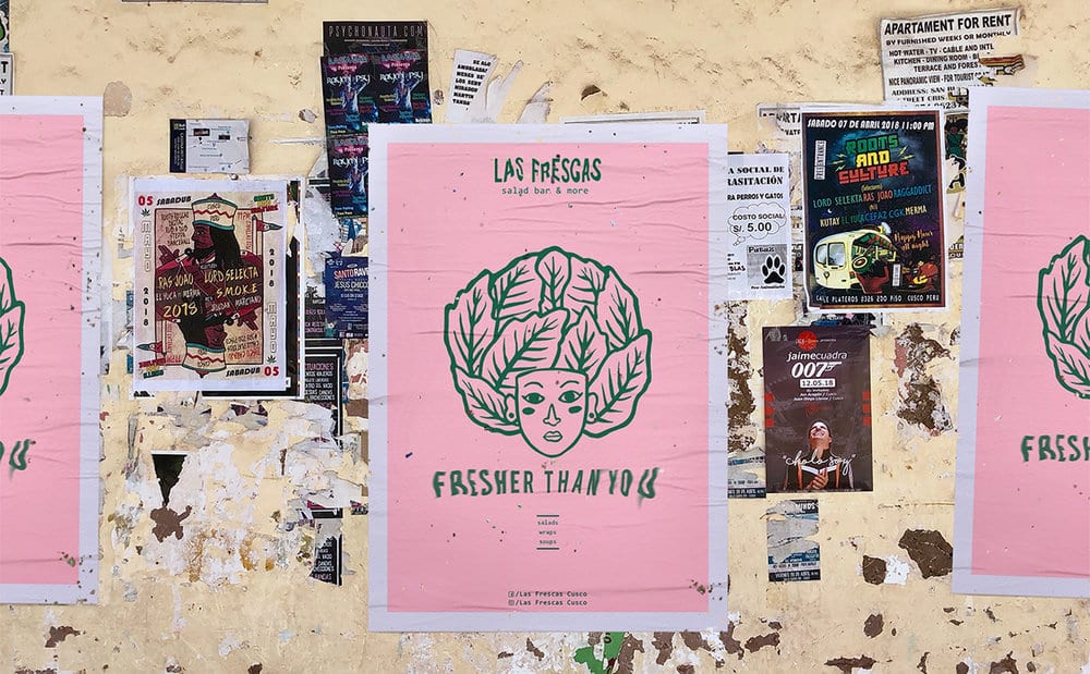
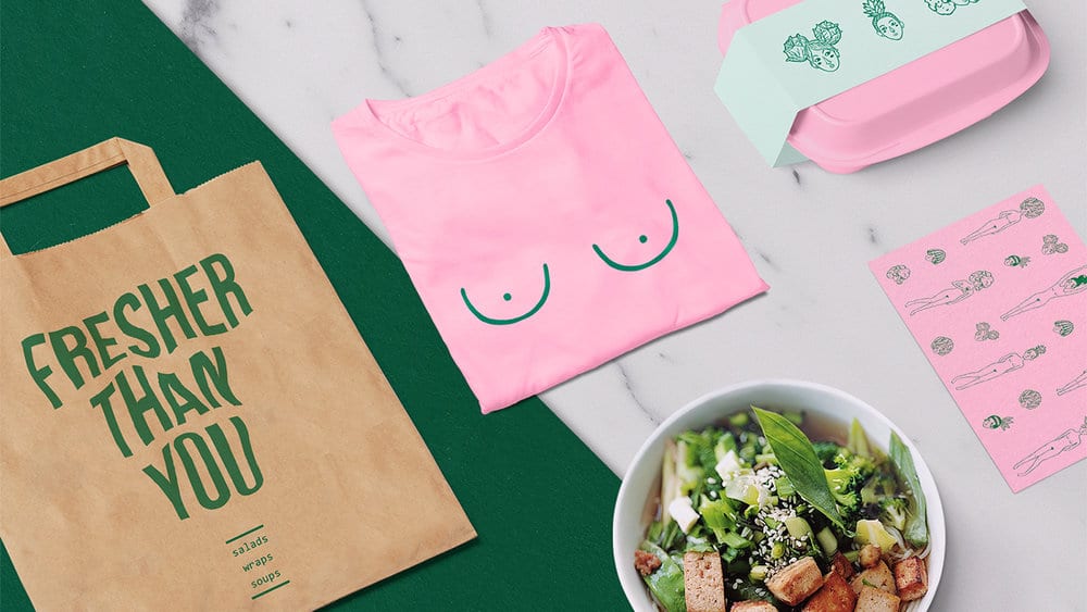
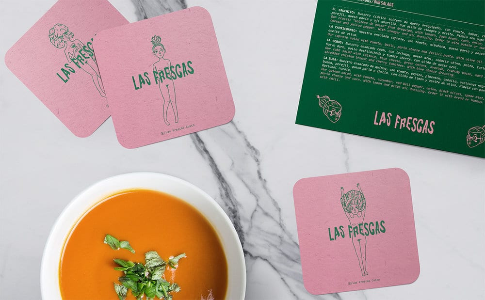
Here, quinoa and bacon can exist under the same plate if one wants to. For us, that carelessness and freshness around food were translated into perfect differentiating attributes. That’s why we chose “Las Frescas” as the name for the salad bar in the honor of the vegetables, the original and a certain effrontery. These adjectives merge with each other in their brand identity.
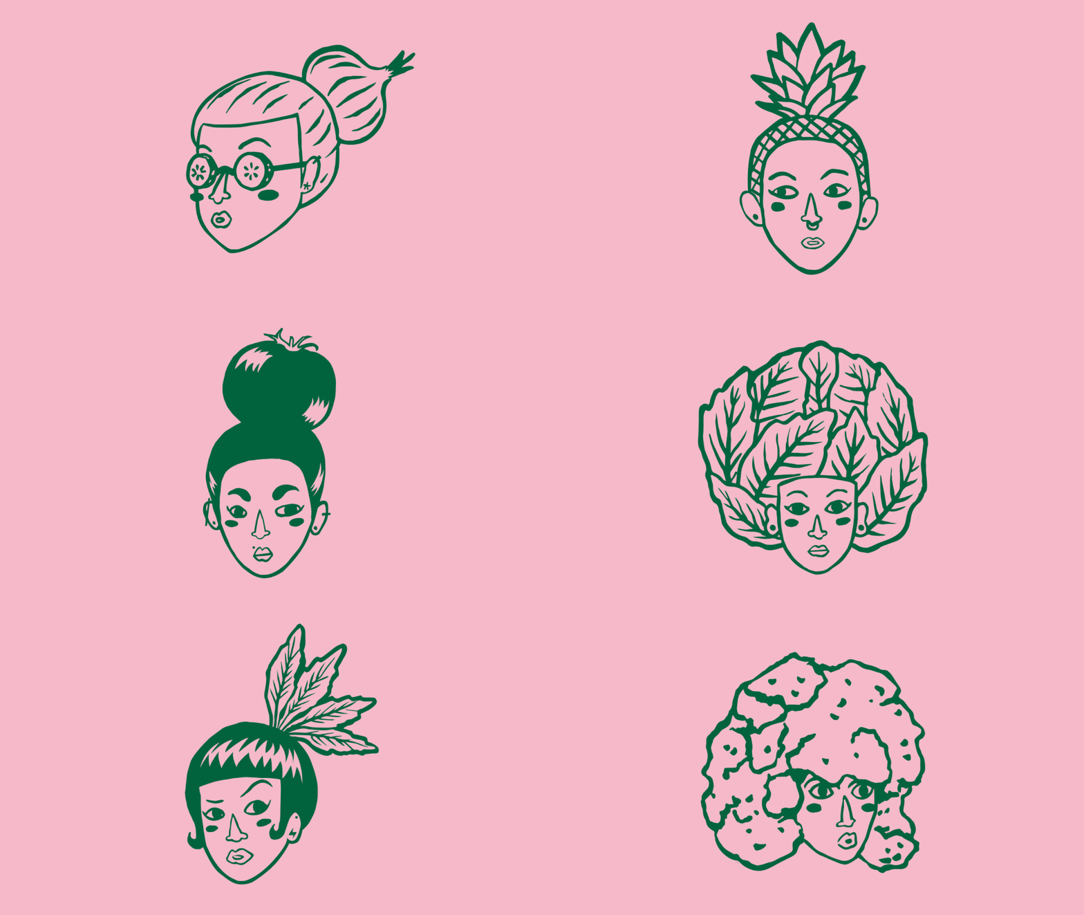
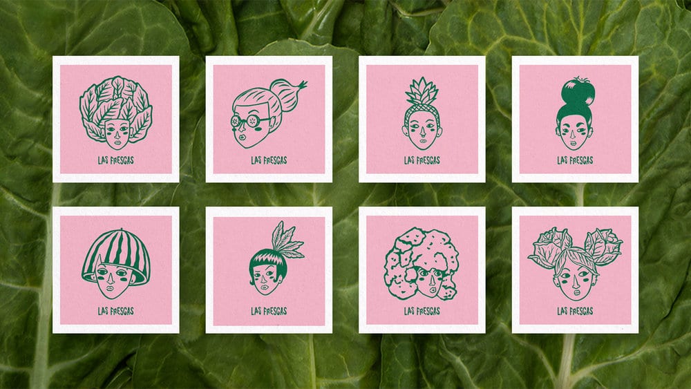
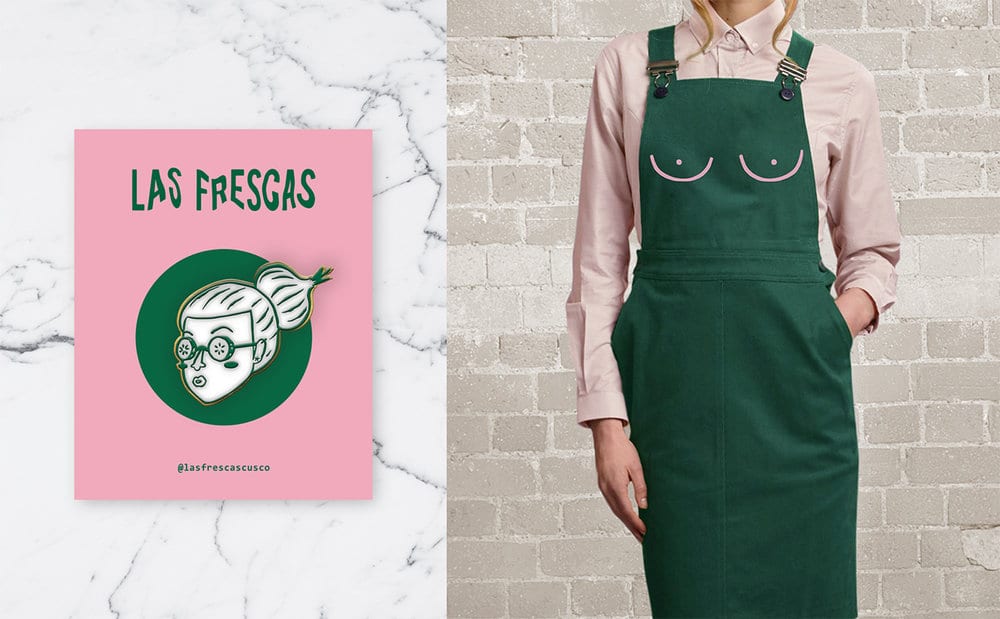
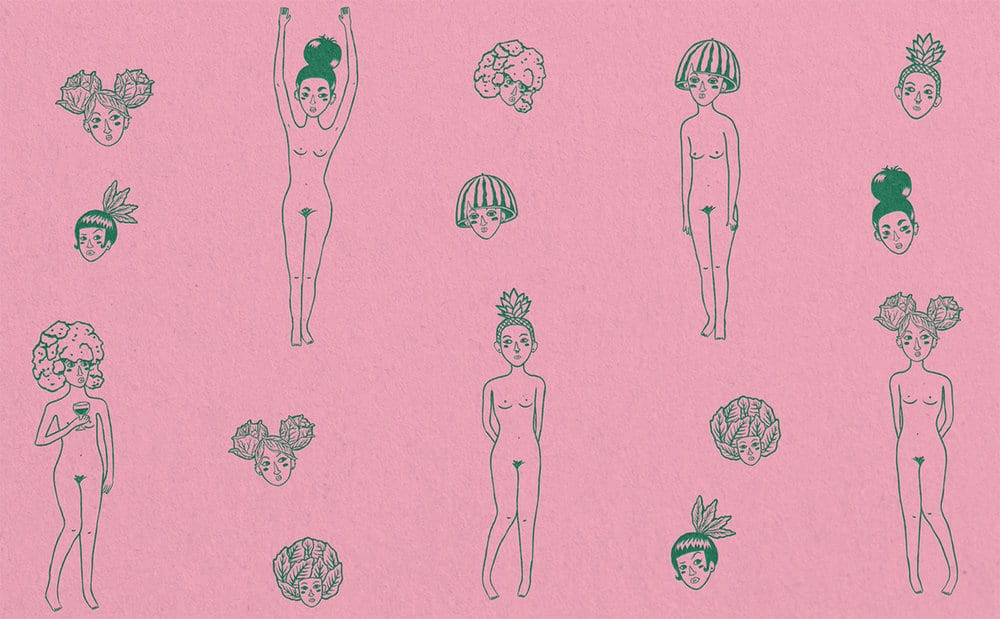
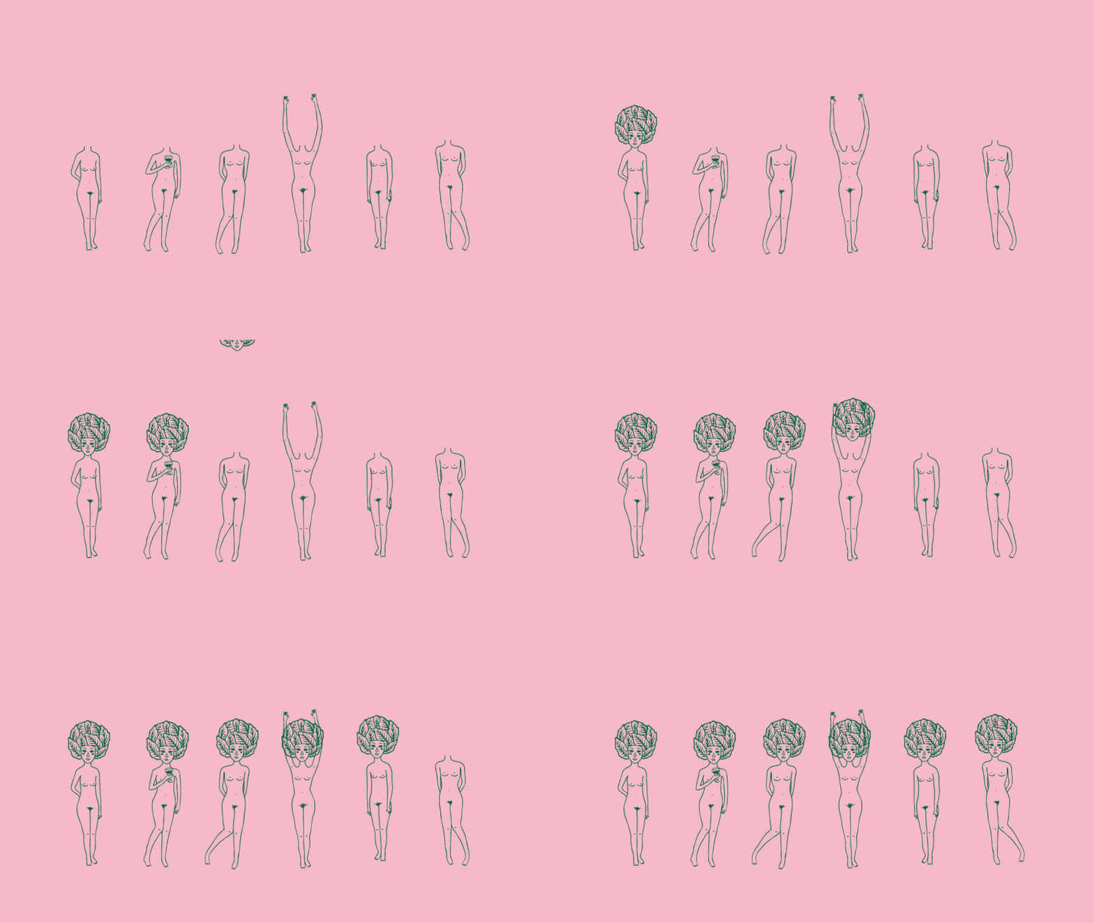
We designed a dynamic logo, an irreverent voice and characters we named “Frescuritas”. They are bold and carefree, and they personify the brand’s voice.
In 2019, Las Frescas was crowned by the international digital press as one of the most recommended restaurants in the city of Cusco.
Design Agency Name: Provincia Estudio Creativo
Organisation/Project Type: Agency, Published Commercial Design
Article Title: Brand and Identity for Las Frescas Salad Bar
Brand / Project Name: Las Frescas Brand and Identity
External Design Credits: Photography Jairo Cubas , Illustrator Miguel Manrique
Production Credits : Printer Pedro Pelayo
Project Type: Corporate Brand Creation
Strategic Deliverables: Corporate Brand Naming
Design Deliverables: Corporate Brand Identity, Corporate Branding, Corporate Brand Creation, Corporate
Graphic Design
Location: Peru
Market Country: Peru
Market Region: South America
Project Category: Food/Beverage
Corporate Brand Touchpoints: Brand Identity, Illustration, Service Design, Printed Stationary, Digital Animation

Just Design – Plaisir de Merle Charles Marais
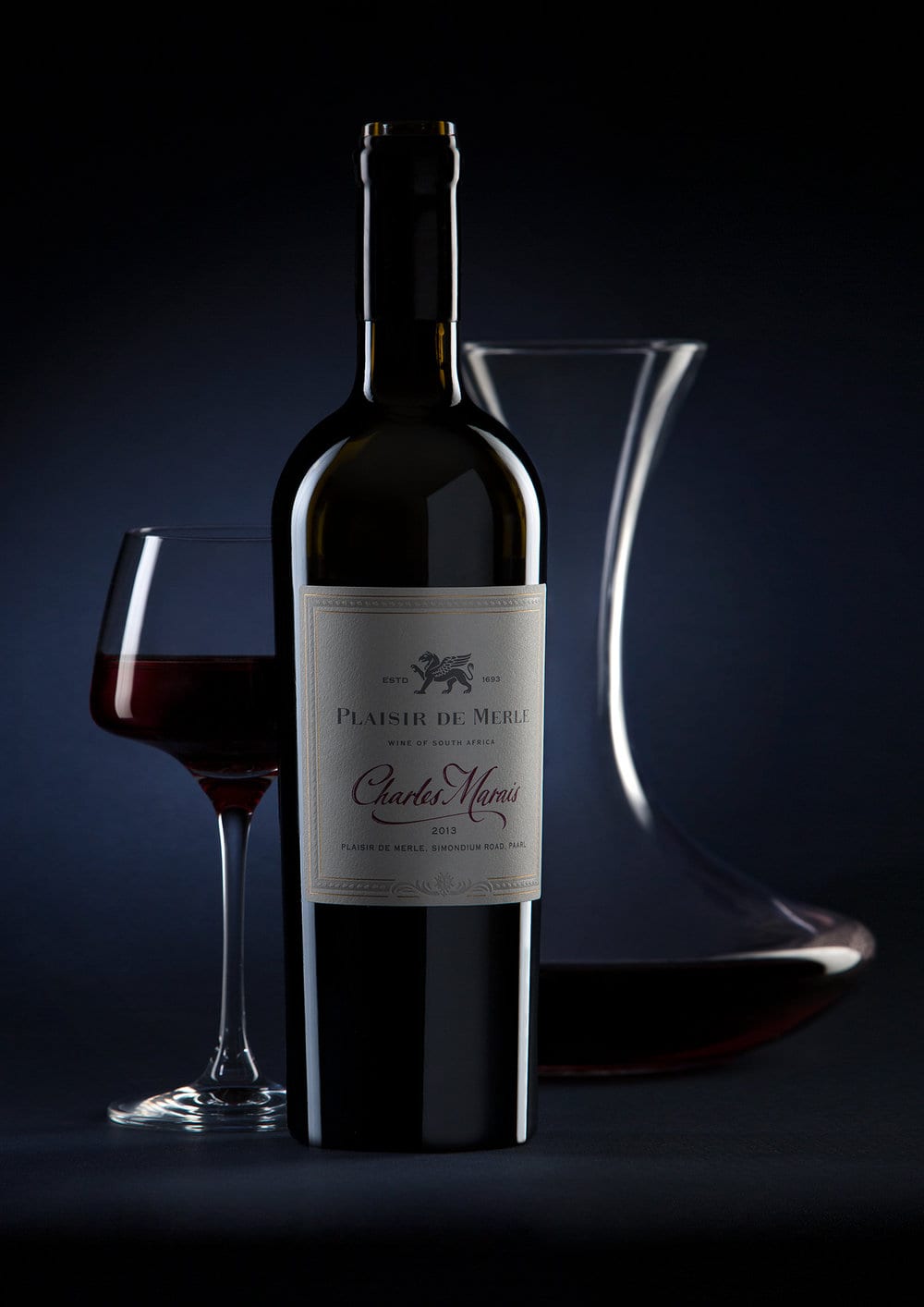
Plaisir de Merle is an imminent Franschhoek wine estate that stands for uncompromising French winemaking tradition. The brand radiates old-world sophistication, embellished with elegance and vintage glamour.
When the brand set out to add an icon tier to their wine stable, they worked with their longstanding packaging partners at Just Design to develop a conceptual territory, variant name and ultra premium packaging.
Just Design immersed themselves in the history and stories of the brand to find the perfect match for the brief. Working through a series of options, they arrived at a rich and fitting narrative: creating a noteworthy tribute to the 17th century Huguenot founder of the Plaisir de Merle estate, Charles Marais.
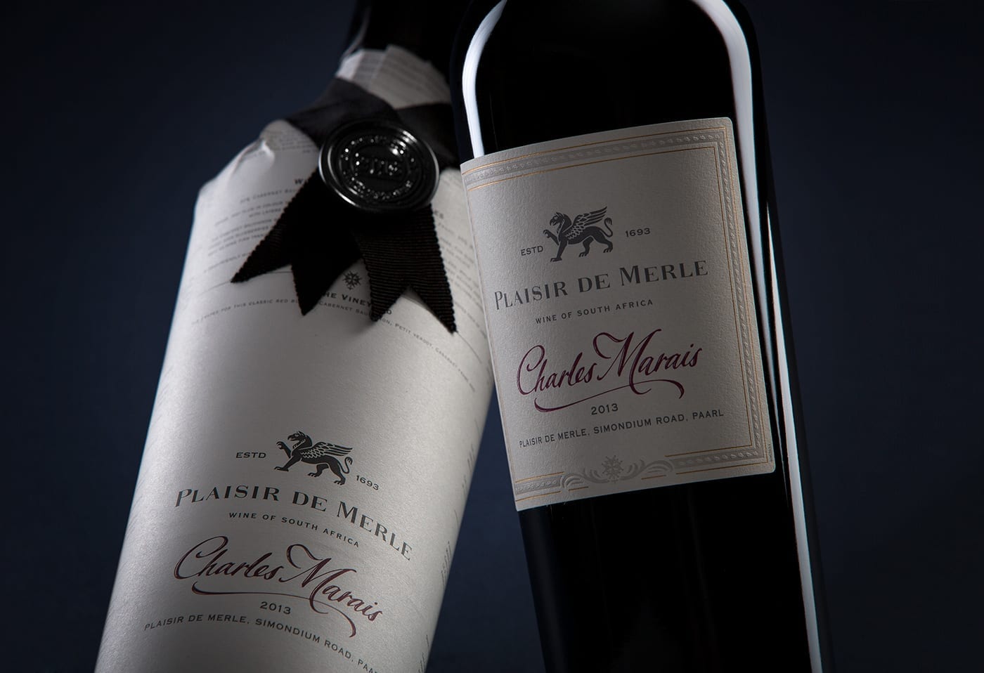
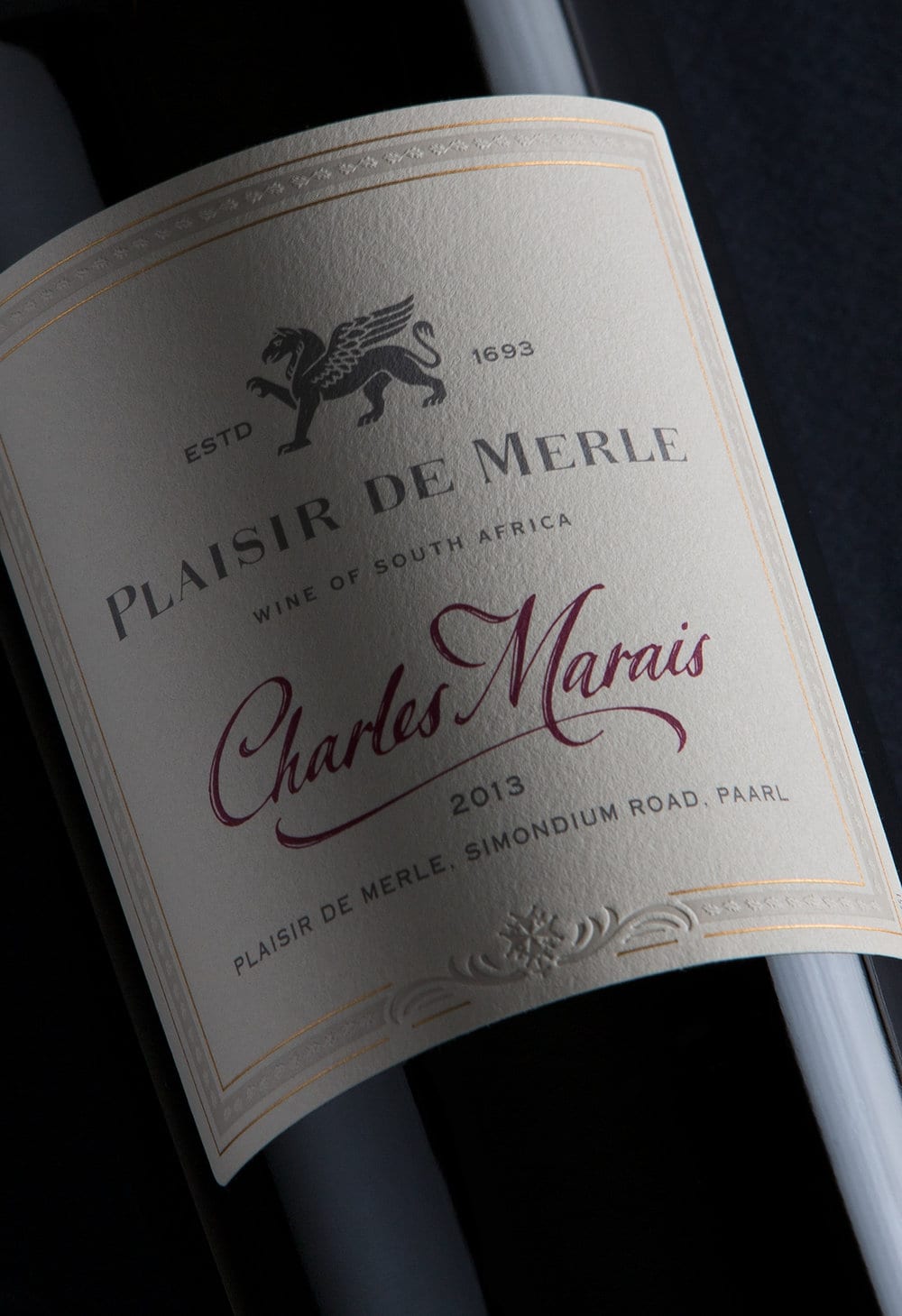
The label centres on a handwritten signature, which was created in collaboration with a calligrapher working from actual samples of Charles Marais’ handwriting.
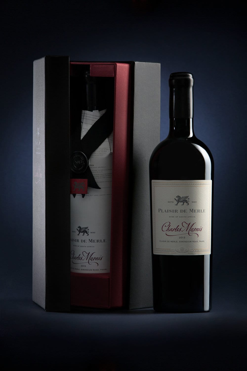
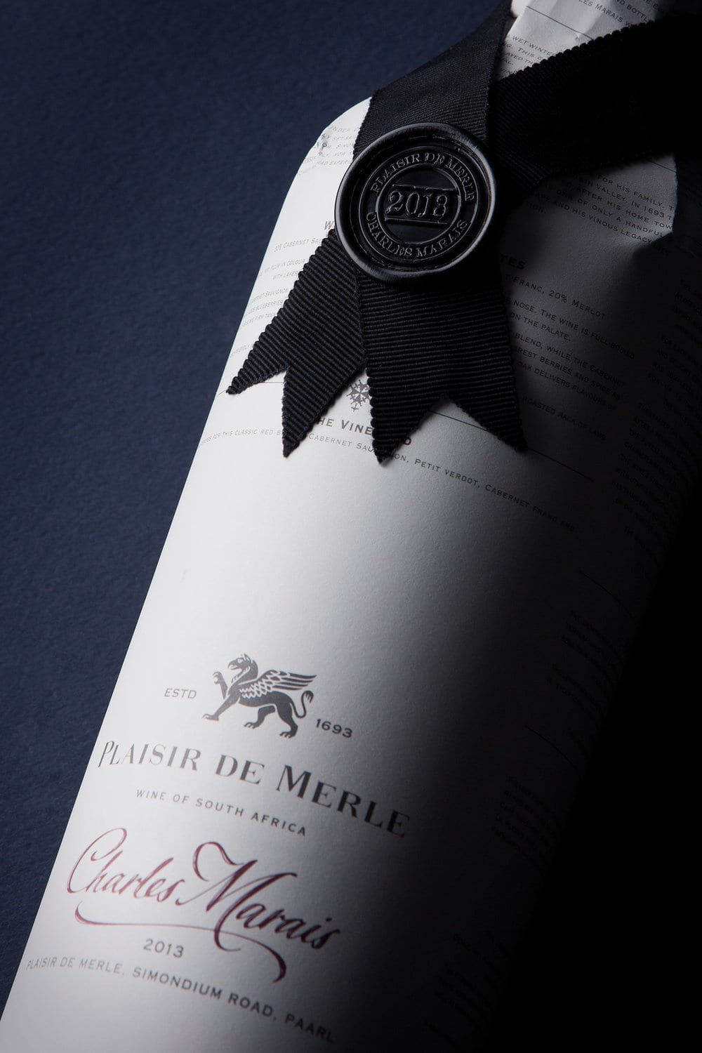
To reflect his honour and stature, our design team adopted a layered approach to packaging. The immersive journey of experience begins with a black Wibalin box, subtly embossed. Opening to reveal a proud bottle silhouette, wrapped in fine tissue paper detailing the brand story and wine credentials, finished with ribbon ties and sealed with wax.
The label is printed on cotton rich paper with an embossed French-style border, gold foil and a monotone colour palette. The use of burgundy creates subtle standout for the handwritten signature. The rich heraldic history is further explored in the De Wet griffon and symbolism.
Plaisir de Merle Charles Marais reflects the brand character: embodying the French heritage in the rich details and beautiful crafting. The overall result is a pared down, elegant wine label; where texture, print finishes and premium cues set a new benchmark for icon wines. A representation of true luxury.
Design Agency Name: Just Design
Organisation/Project Type: Agency, Published Commercial Design
Article Title: Plaisir de Merle Charles Marais Wine Label Design
Brand / Project Name: Plaisir de Merle Charles Marais
External Design Credits: Creative Director – Thelmarie Toerien, Designer – Louwrens Venter
Project Type: Consumer Brand Creation
Strategic Deliverables: Consumer Brand Strategy, Consumer Brand Naming, Consumer Product Brand Architecture
Design Deliverables: Consumer Branding, Consumer Graphic Packaging Design
Location: South Africa
Market Country: South Africa
Market Region: Africa
Project Category: Wine
Consumer Packaging Format: Bottle, Box, Wrap
Consumer Substrate / Material: Glass
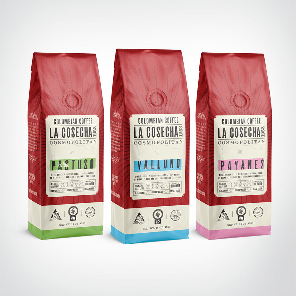
0923 STUDIO – Café la Cosecha
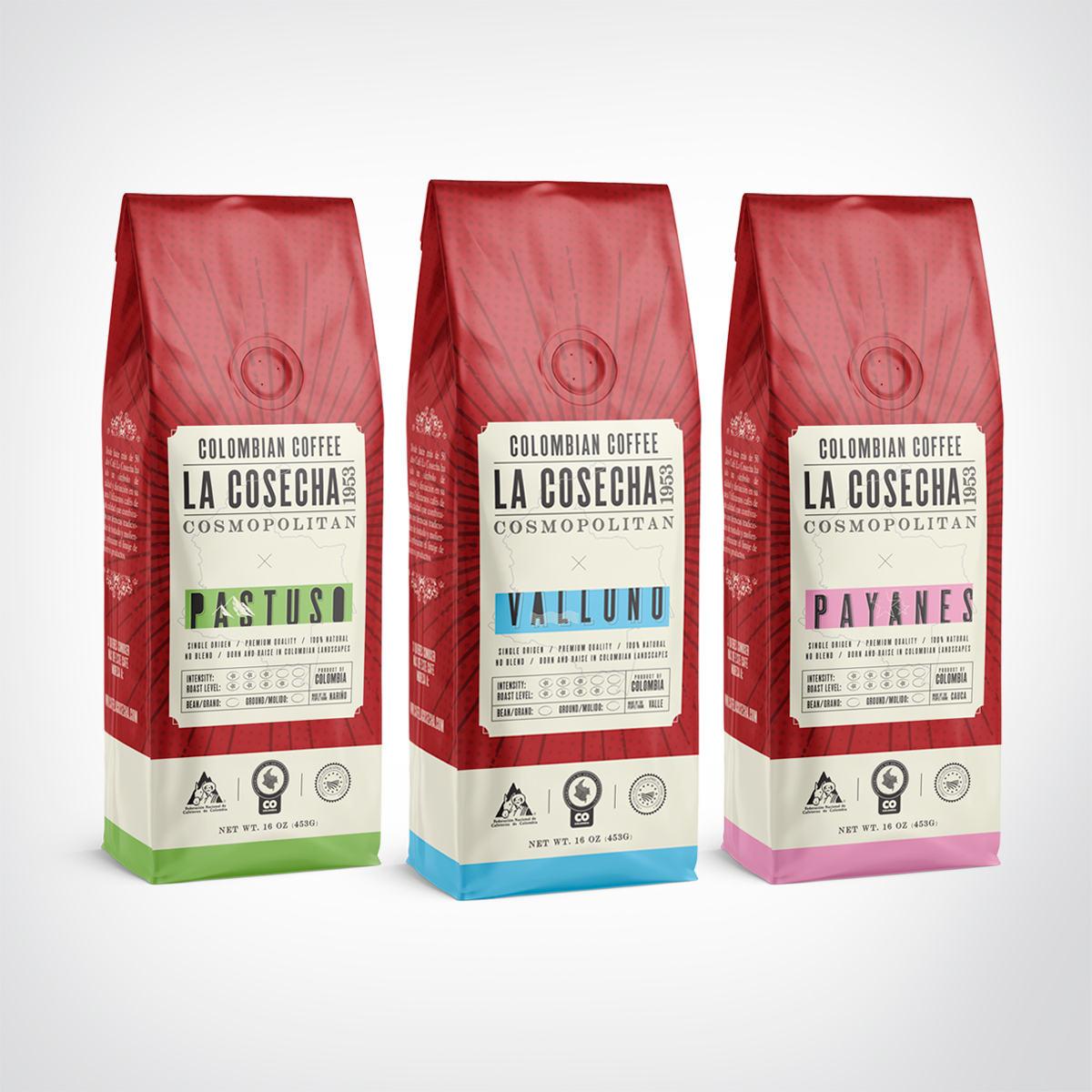
Con la idea de conquistar el mercado americano, Café la Cosecha presenta su producto cosmopolitan. El reto era construir un empaque que lograra captar la atención del público y que reflejará una visión no tan campesina del café colombiano y al contrario verse completamente contemporáneo frente al mercado internacional.
Design Agency Name: 0923 STUDIO
Organisation/Project Type: Agency, Published Commercial Design
Article Title: Colombian Vintage Inspired Packaging Design for Grinded Coffee
Brand / Project Name: Café la Cosecha
External Design Credits: tr3s60 BPO.
Project Type: Consumer Brand Creation
Strategic Deliverables: Consumer Brand Strategy
Design Deliverables: Consumer Branding, Consumer Graphic Packaging Design, Consumer Structural Packaging Design
Location: Colombia
Market Country: Multiple Countries
Market Region: North America
Project Category: Beverages
Consumer Packaging Format: Bag
Consumer Substrate / Material: Plastic
Zeljka Mitrovic – Bite Chocolate Bars
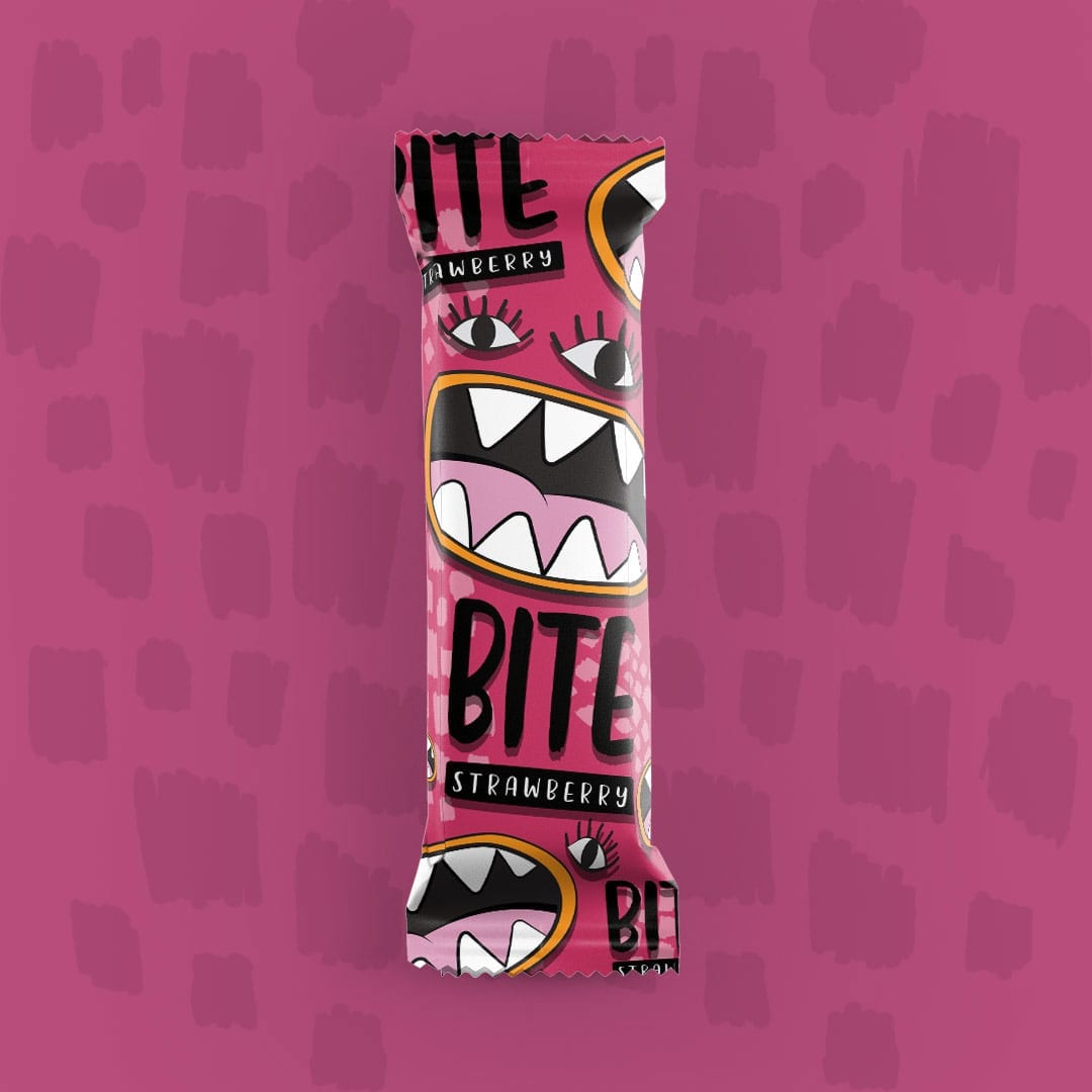
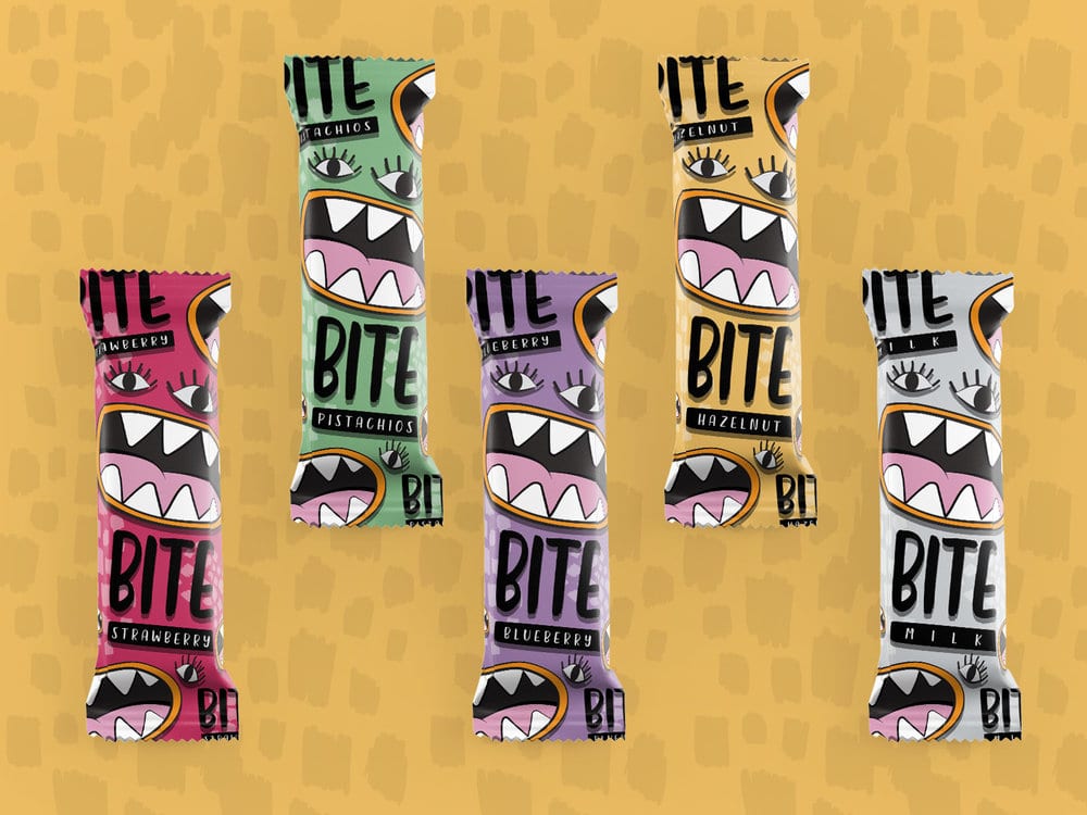
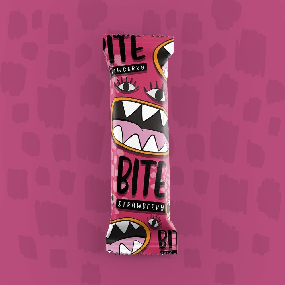
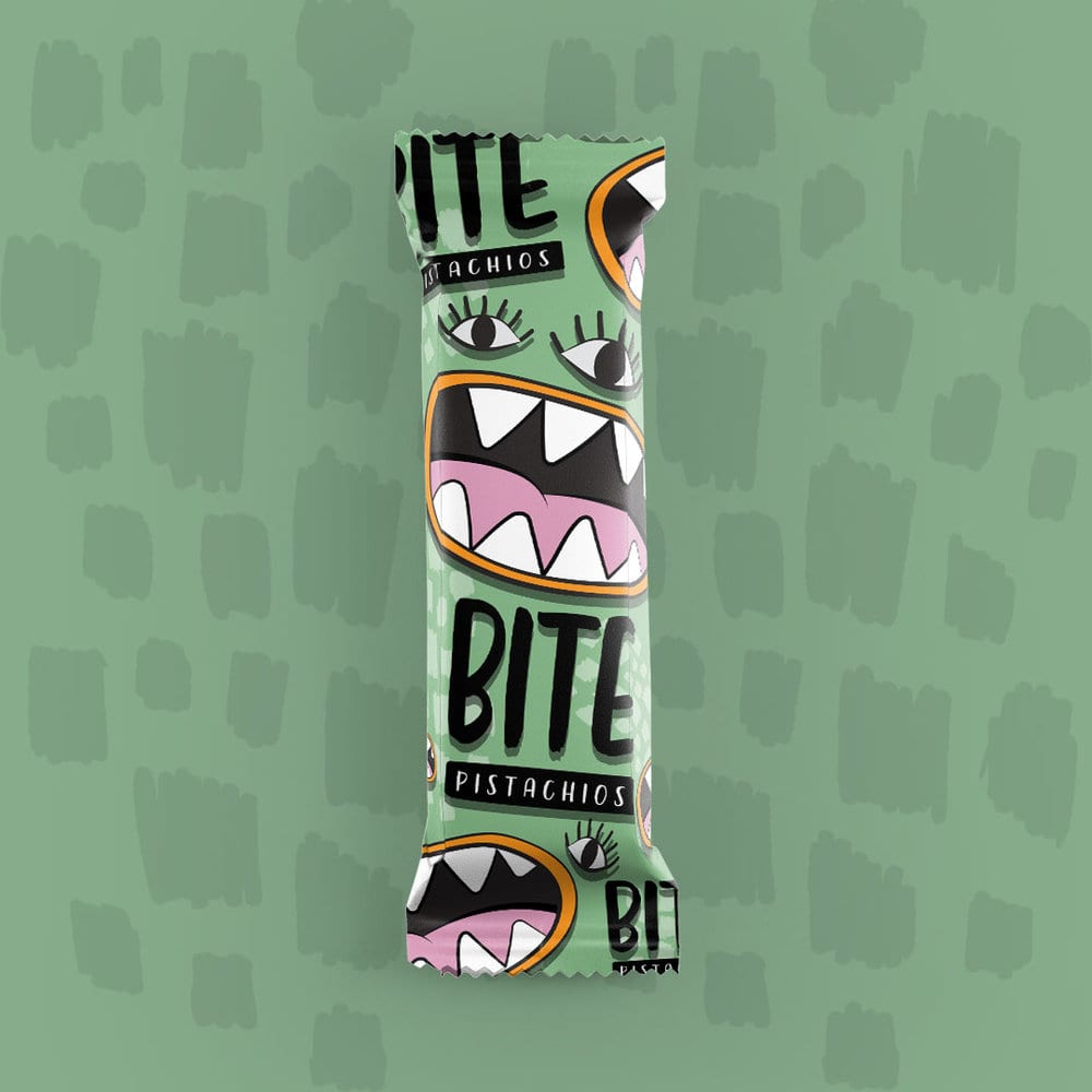
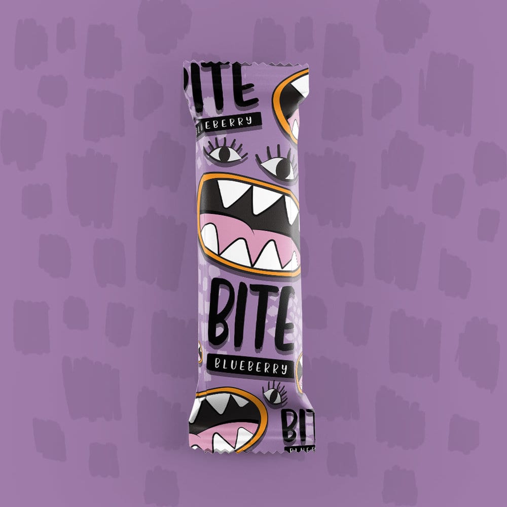
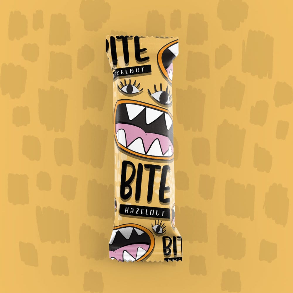
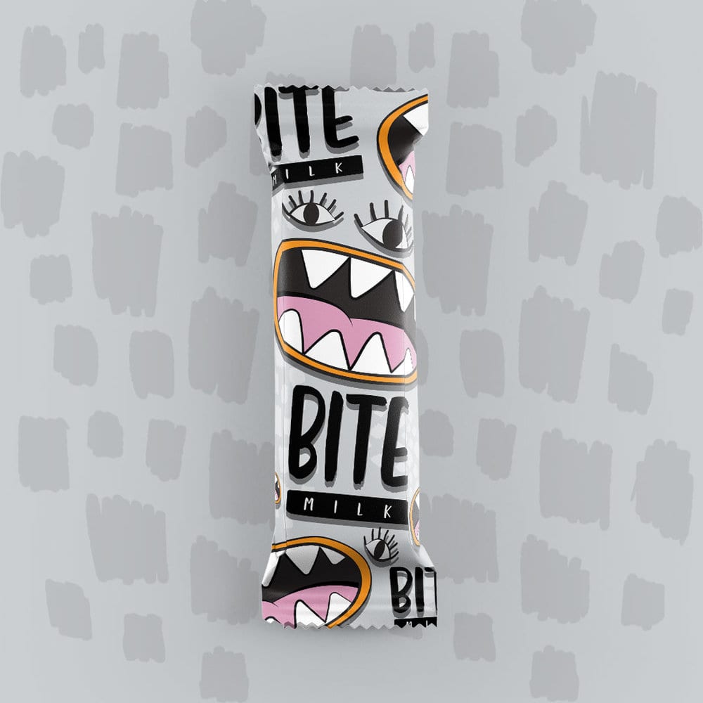
Colorful design for Bite chocolate bars packaging.
This days you can find lots of different kind of chocolate in stores and it is very difficult to attract consumers attention. That’s why I created a series of chocolates bars named BITE.
Every color represent different flavor (5 flavors) and packaging Illustration is following name of the brand.
Design Agency Name: Zeljka Mitrovic
Organisation/Project Type: Freelance, Non Published Concept Design
Article Title: Chocolate Bars Packaging
Brand / Project Name: Bite Chocolate Bars
Project Type: Consumer Brand Creation
Strategic Deliverables: Consumer Research / Insight
Design Deliverables: Consumer Graphic Packaging Design
Location: Serbia
Market Country: Multiple Countries
Market Region: Global
Project Category: Confectionery
Consumer Packaging Format: Wrap
Consumer Substrate / Material: Plastic
Yoshitomo Yoshiike Design – Manmaru
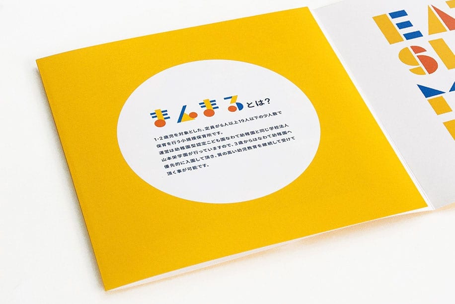
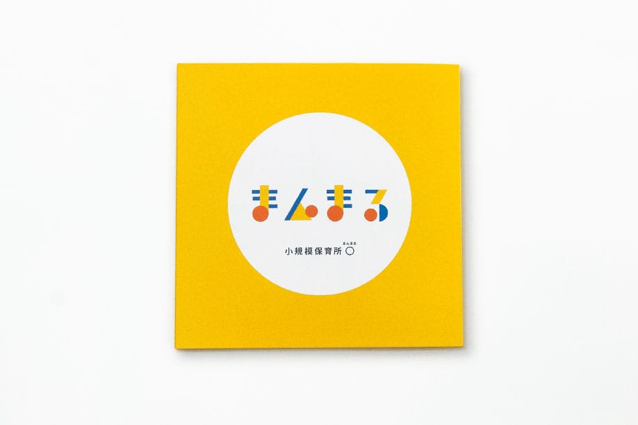
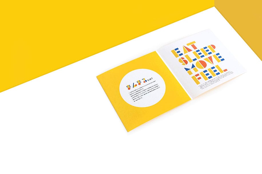
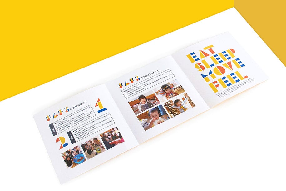
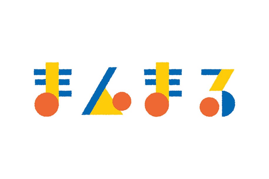
Manmaru is a public kindergarten located in Osaka, Japan. Manmaru means “a perfect circle” in Japanese and connotes gentleness and harmoniousness.
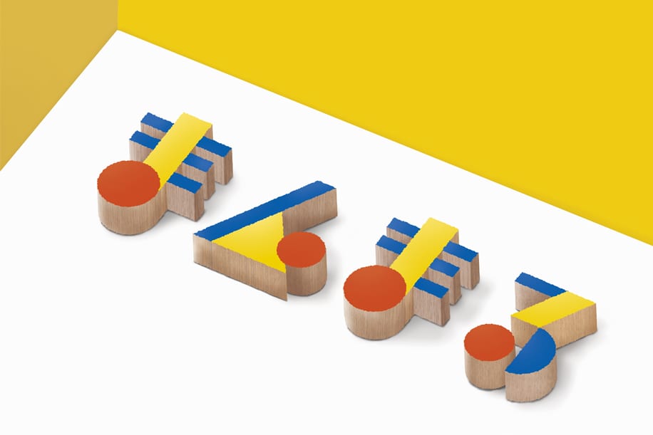
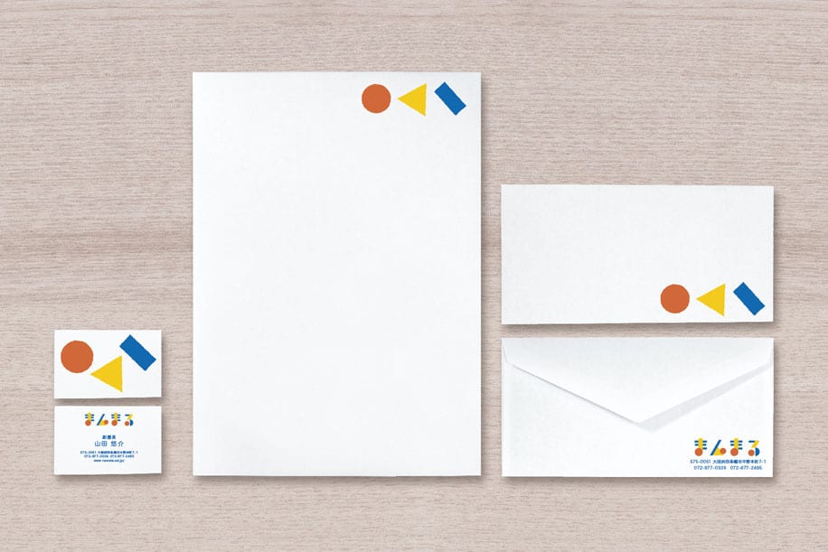
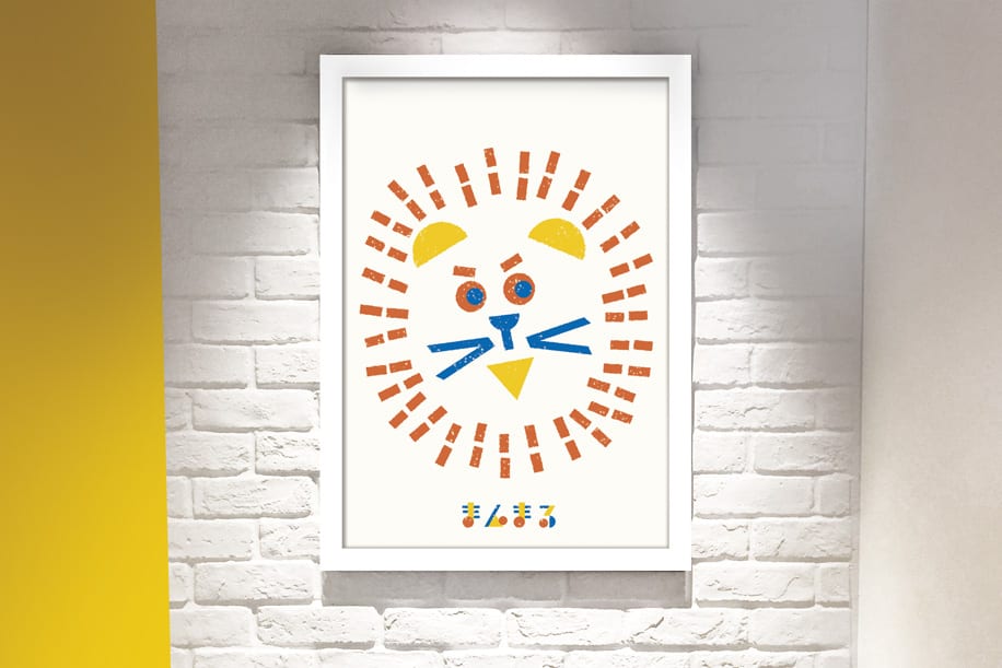
I produced the logo inspired by wooden toy blocks and each letter has the circle.
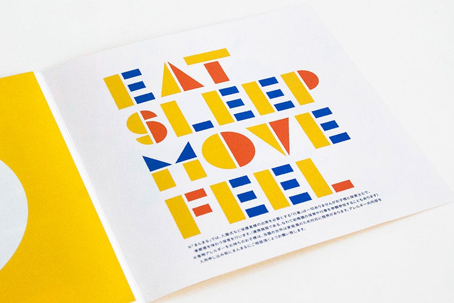
These shapes can be transformed to illustrations, typography through brand communications.

Design Agency Name: Yoshitomo Yoshiike Design
Organisation/Project Type: Agency, Published Commercial Design
Article Title: Identity and Communication for a Japanese Kindergarten
Brand / Project Name: Manmaru
Project Type: Corporate Brand Creation
Strategic Deliverables: Corporate Brand Strategy
Design Deliverables: Corporate Branding
Location: Japan
Market Country: Japan
Market Region: Asia
Project Category: Education
Corporate Brand Touchpoints: Graphic Design, Typography, Printed Promotional, Printed Stationary
HC GORDON – Sud Off
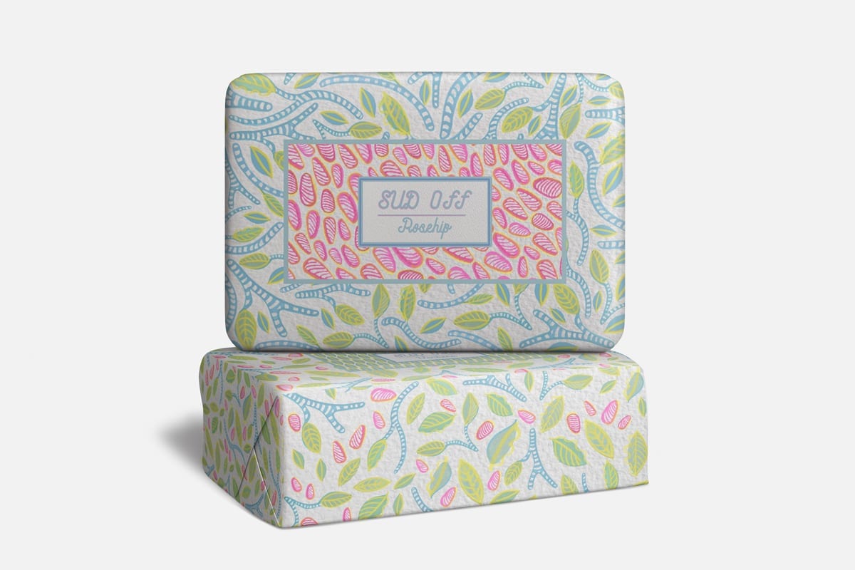
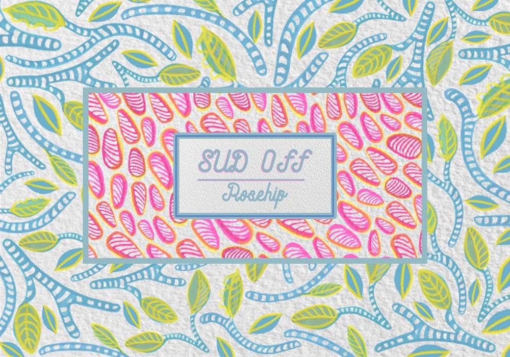
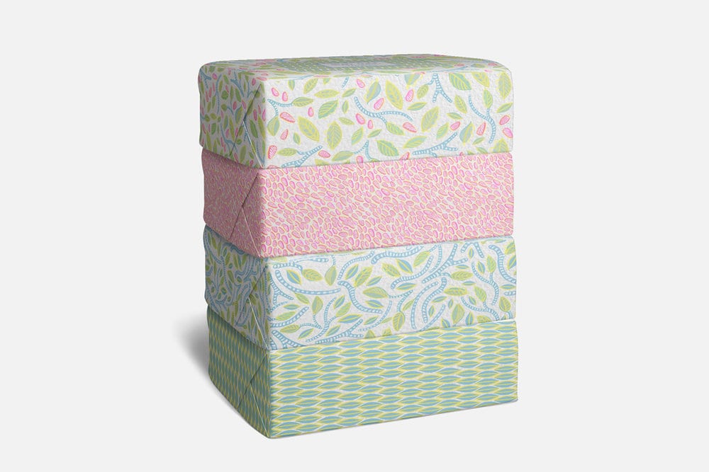
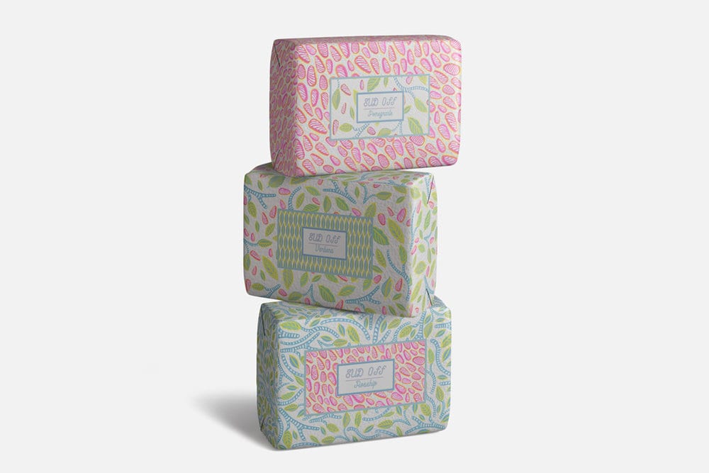
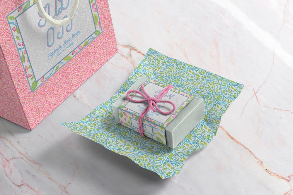
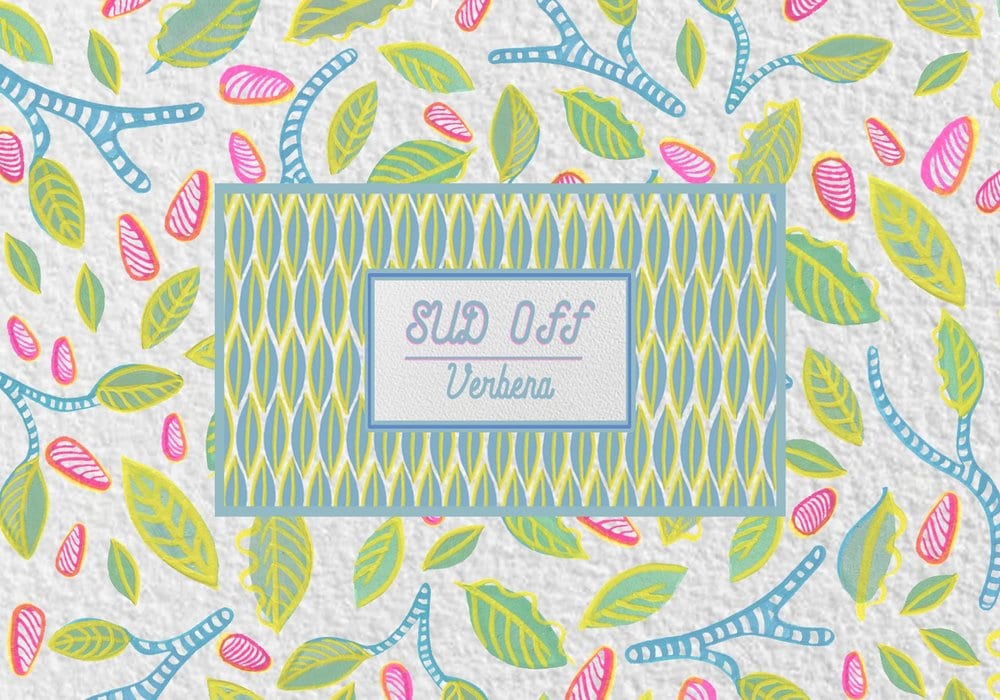
I designed a series of floral motifs inspired by pomegranates to create a bespoke pattern for the artisanal soap brand Sud Off’s packaging.
There are four unique & richly patterned designs which decorate the soap’s wrappers as well as the gift bags and gift wrapping.

Design Agency Name: HC GORDON
Organisation/Project Type: Freelance, Non Published Concept Design
Article Title: Sud Off Soap Packaging Surface Design
Brand / Project Name: Sud Off
Project Type: Consumer Brand Creation
Strategic Deliverables: Consumer Brand Strategy
Design Deliverables: Consumer Branding, Consumer Brand Creation, Consumer Brand Identity, Consumer Graphic Packaging Design
Location: Ireland
Market Country: Multiple Countries
Market Region: Multiple Regions
Project Category: Health and Beauty
Consumer Packaging Format: Wrap
Consumer Substrate / Material: Pulp Paper
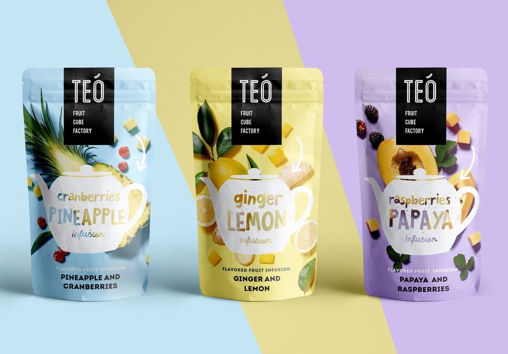
Michal Suday design group – Teo
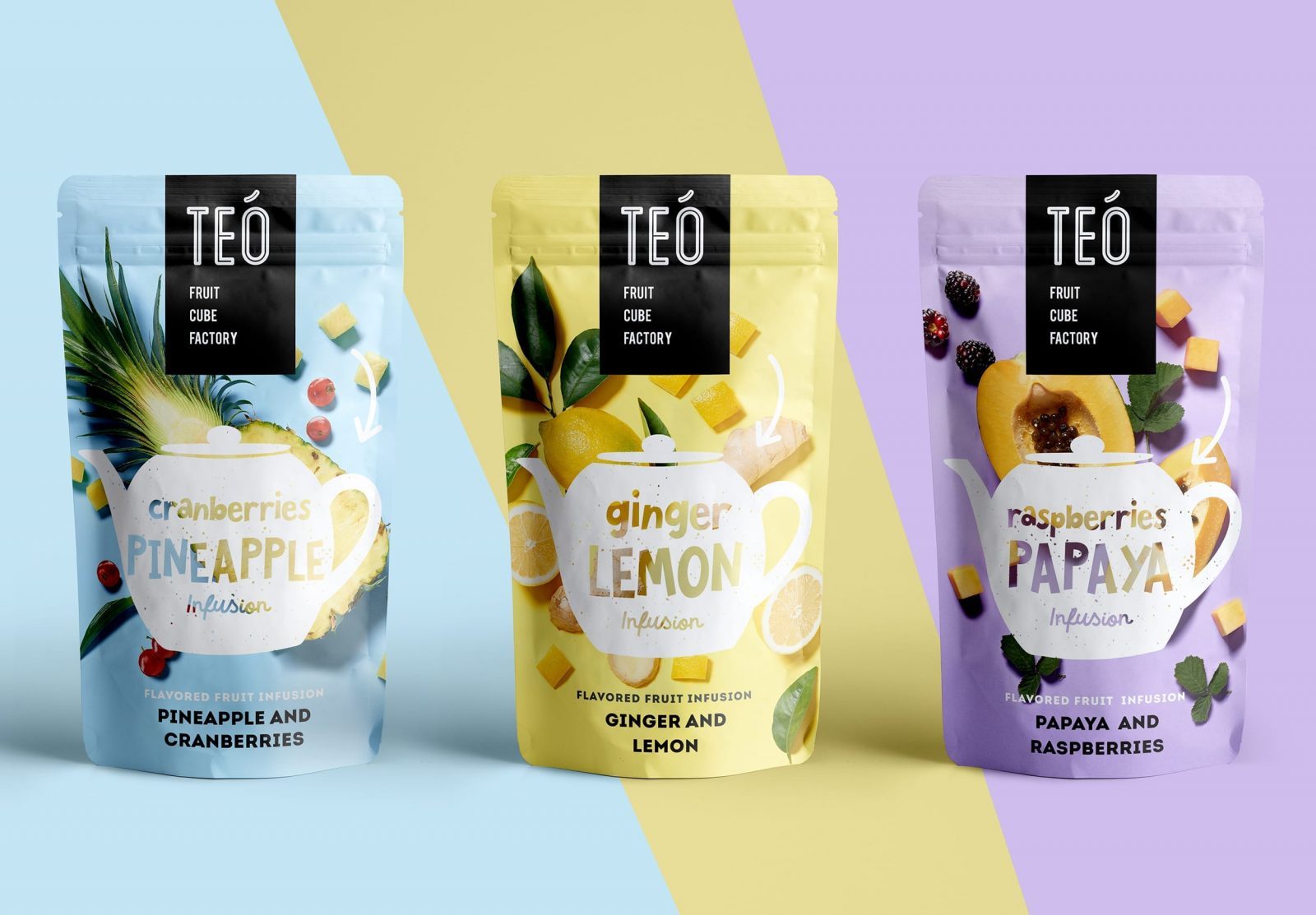
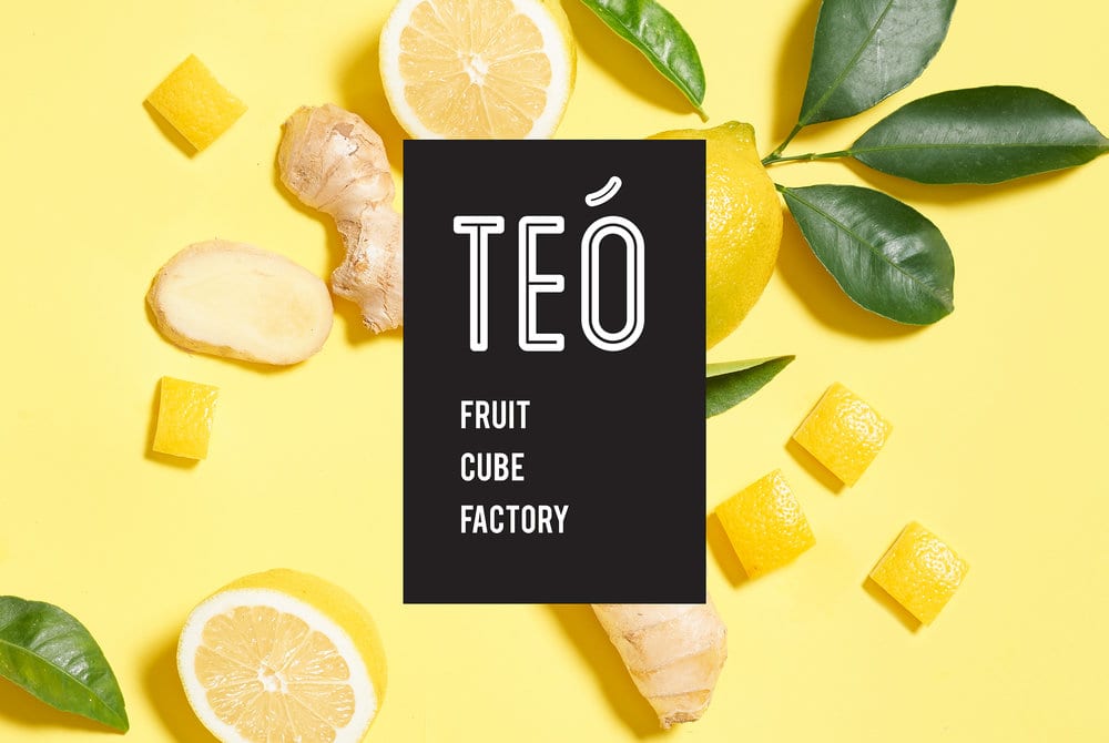
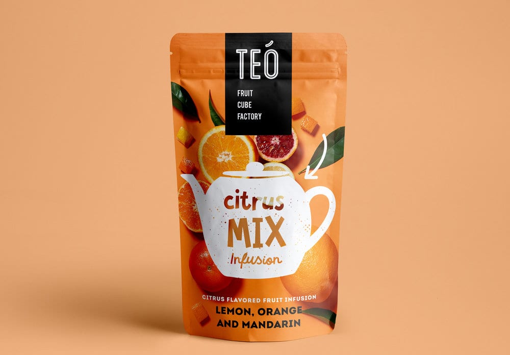
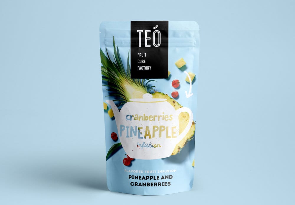
TEO is a new for making refreshing fruit tea and infusion, we’ve created a yummy and full of food appeal brand with colorful images and up to date look and feel.
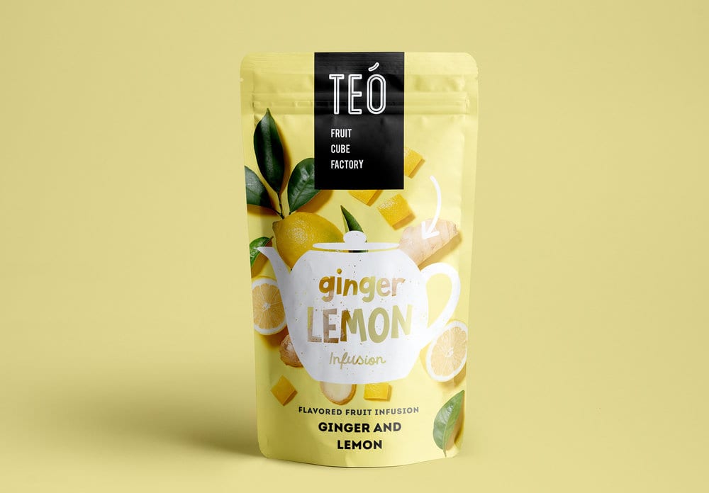
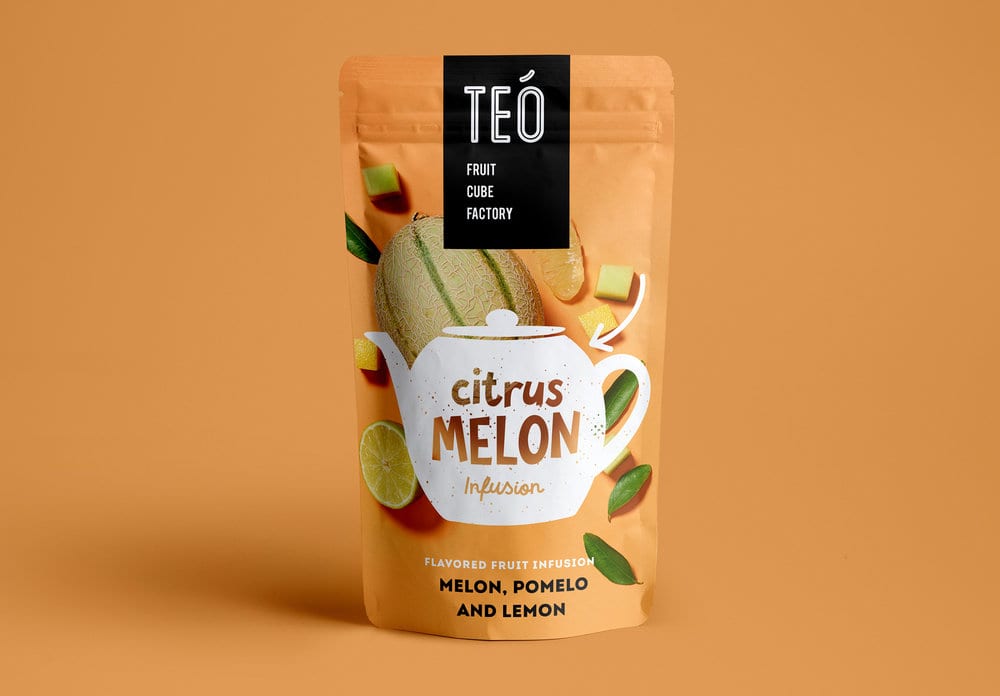
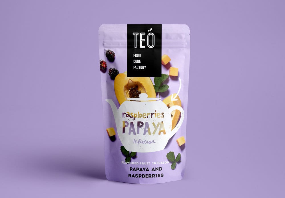
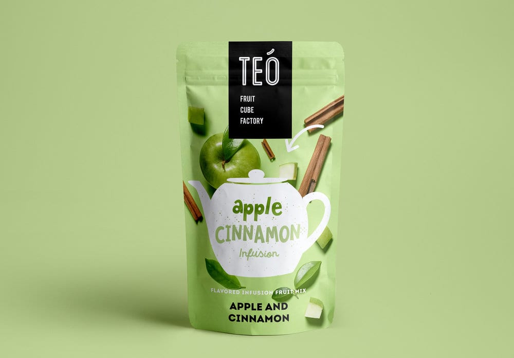
Design Agency Name: Michal Suday design group
Organisation/Project Type: Agency, Published Commercial Design
Article Title: Teo – Fruit Cube Factory
Brand / Project Name: Teo
Project Type: Consumer Brand Creation
Strategic Deliverables: Consumer Brand Strategy, Consumer Brand Naming
Design Deliverables: Consumer Branding, Consumer Brand Identity, Consumer Graphic Packaging Design
Location: Israel
Market Country: Israel
Market Region: Middle East
Project Category: Beverages
Consumer Packaging Format: Bag
Consumer Substrate / Material: Plastic

Onfire Design – Vitafresh
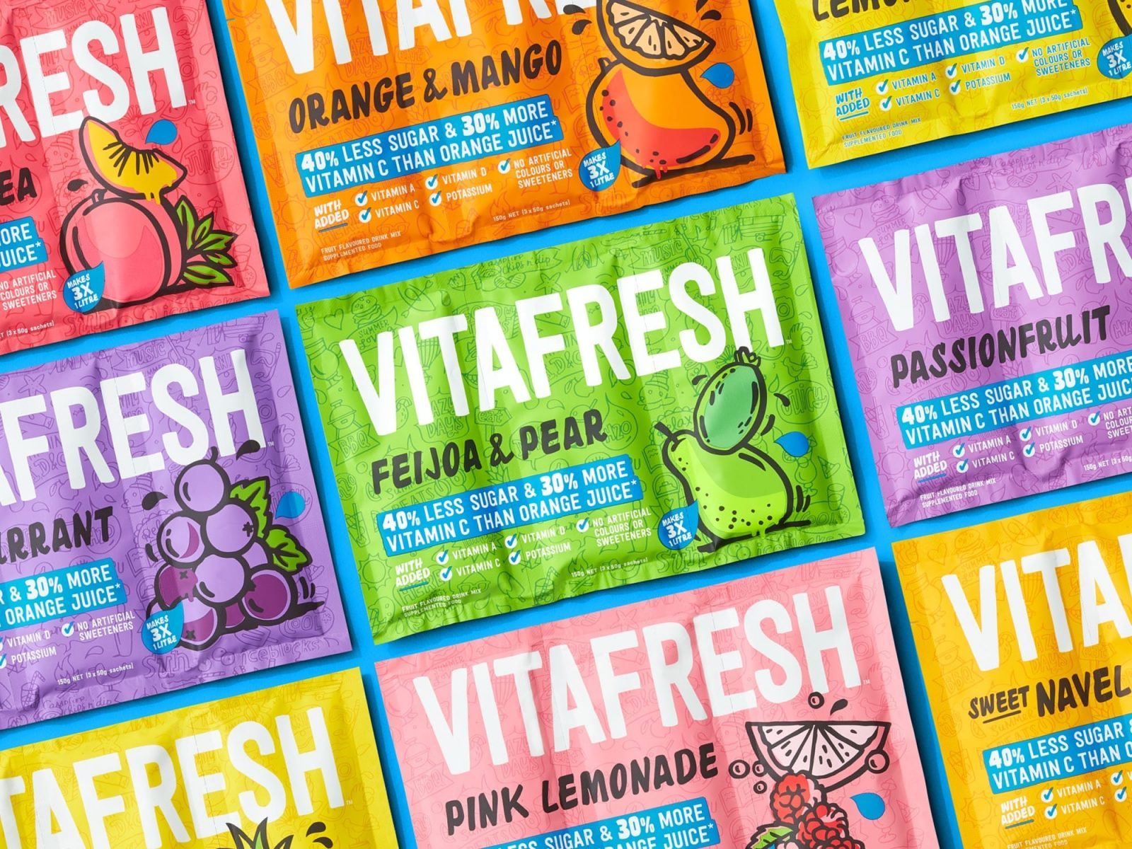
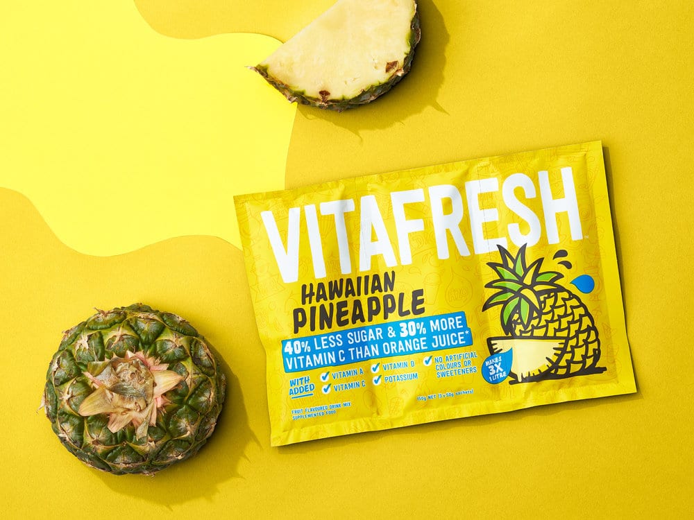
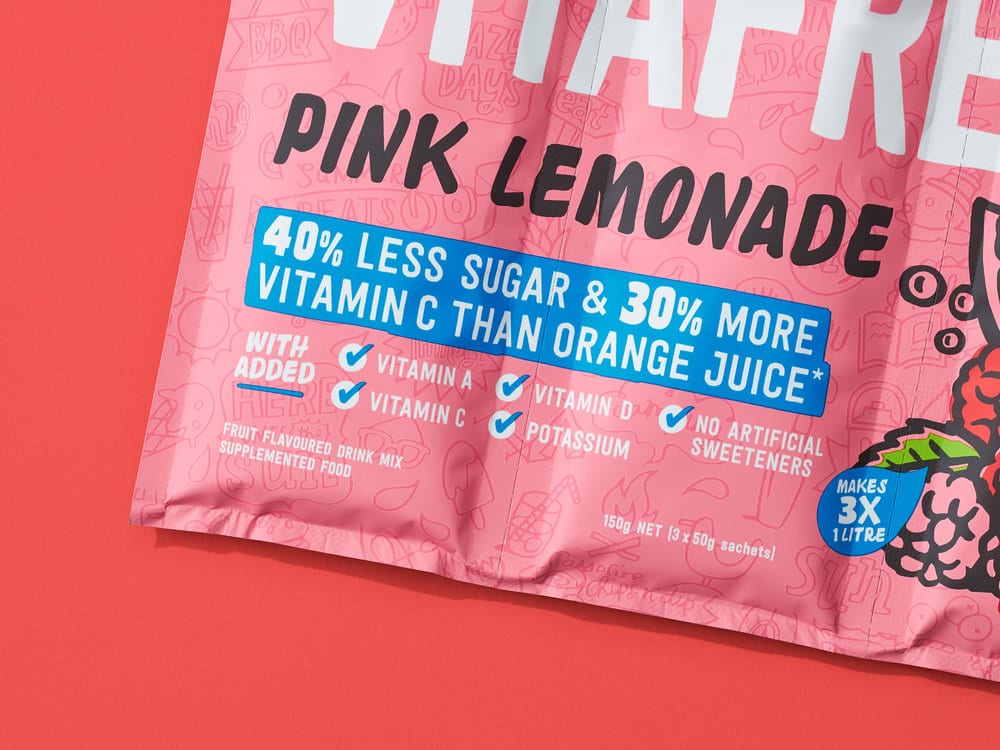
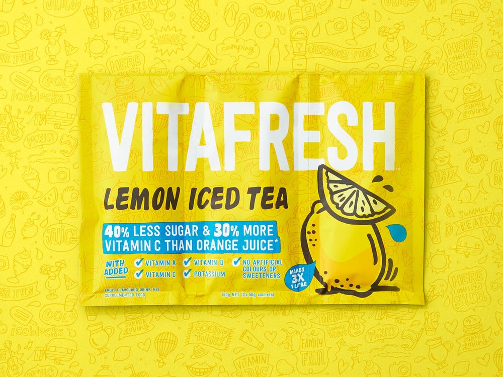
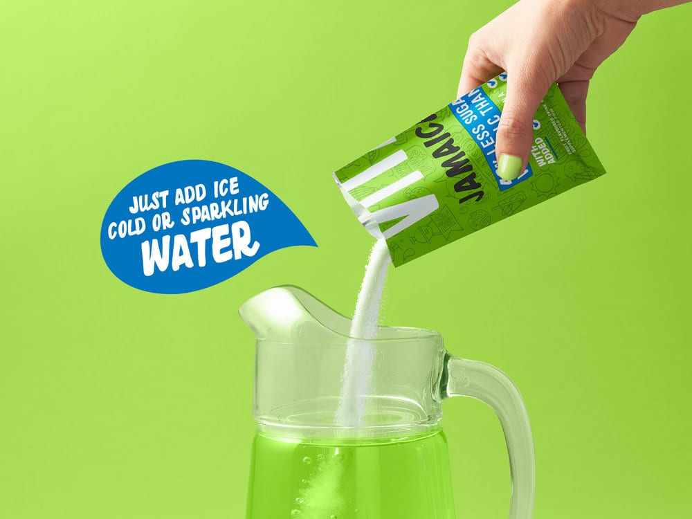
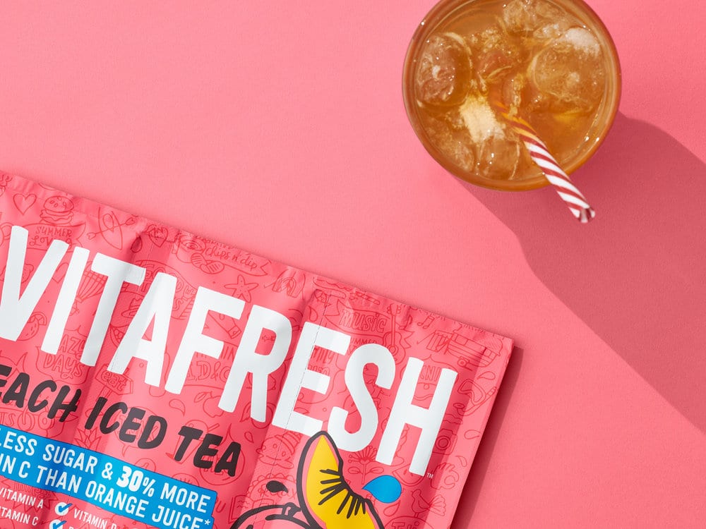
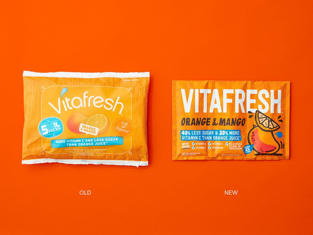
Known for its range of flavours and ease of use, Vitafresh flavoured water powders have been a firm favourite for Kiwi families since the 1980’s. The supermarket flavoured water category is a confusing mix of pack formats and brands with a mass of product messaging. The aisle was also often overlooked from a brand maintenance point of view and had also attained a reputation of products high in sugar and lacking any health benefits. Walter & Wild saw the opportunity of revitalising the category by rethinking the Vitafresh product formulation, fortifying the products with vitamins and minerals, and a new packaging format which cut down on materials and manufacturing costs. In doing so the brand would raise the bar for the category and improve the shelf impact which needed to be refreshingly bold, fun and aspirational.
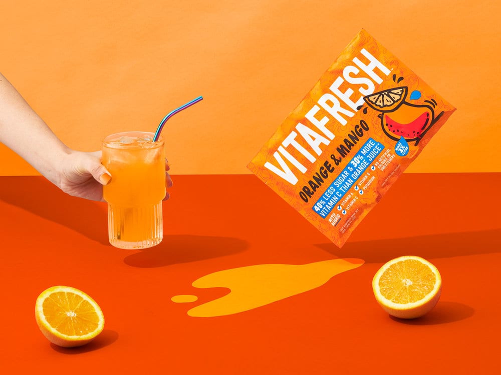
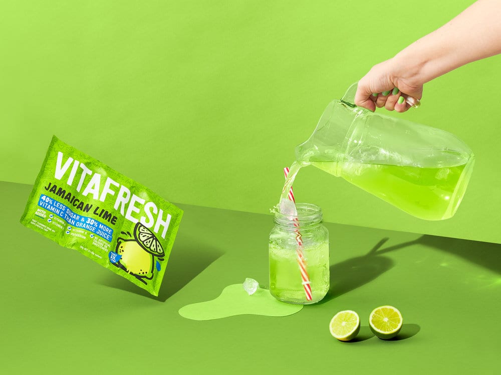
The challenge for Vitafresh was to remain true to its core roots while embracing the daring and bold new vision for the brand. We recreated the brand into a simple, tall and proud brand mark which stretched across the entire new 3 sachet pack format which shouts out of a new brighter colour palette. A new cartoon-stylised illustration set of flavour callouts were created which added the fun factor back into the packaging. A subtle background illustration helped tell the Vitafresh lifestyle story, all based around vitality, summer vibes and the products multi uses. These new elements put the serious fun and enjoyment back into the brand and seriously shakes up the category with new energy.
Design Agency Name: Onfire Design
Organisation/Project Type: Agency, Published Commercial Design
Article Title: Revitalising a New Zealand family Favourite Brand
Brand / Project Name: Vitafresh
External Design Credits: Suze Crawford
Project Type: Consumer Brand Redesign
Strategic Deliverables: Consumer Brand Strategy, Consumer Tone of Voice
Design Deliverables: Consumer Branding, Consumer Rebranding, Consumer Brand Experience, Consumer Graphic Packaging Design, Consumer Structural Packaging Design
Location: New Zealand
Market Country: New Zealand
Market Region: Oceania
Project Category: Beverages
Consumer Packaging Format: Sachet
Consumer Substrate / Material: Plastic

Higgins-Design GmbH – Freiheit 1884 German Single Malt Whiskey
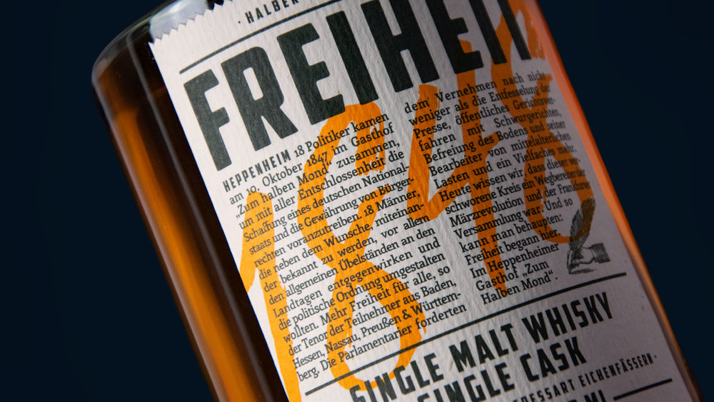
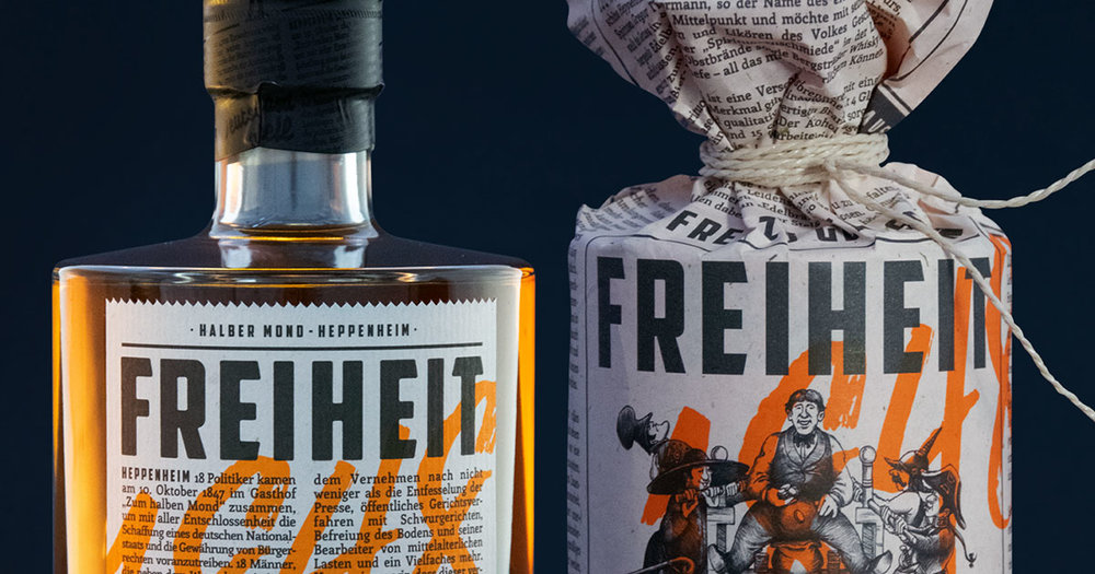
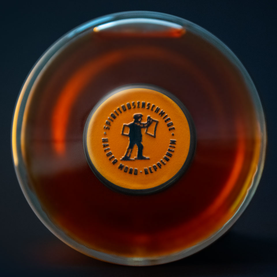
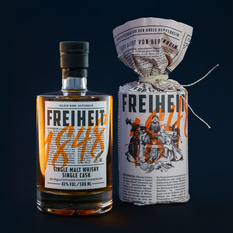
Excellent packaging always tells a story. With our design for a superb single cask malt whisky, we fulfilled this requirement in a very special way, and even took the design process one step further. Because “Freiheit 1848”, a whisky with a name steeped in history, commemorates in “texts and pictures” all those who lost their lives in the fight for civil rights during the 1848 German Revolution.
The revolution had its origins in the “Halber Mond” Guesthouse in Heppenheim – and went on to have a significant influence on the development of democracy in Germany. In 1847, 18 liberal politicians met up in this very guesthouse to agree on, among other things, unrestricted press freedom without conditions or reprimands of any form. The location, where today the single malt whisky matures in original casks made of oak from the Spessart region, was the inspiration for the unconventional packaging: a newspaper entirely devised and designed by us. The outer packaging only appears to be a newspaper from the year 1848. The vintage character in particular is evoked by the illustrations that we created ourselves, based on the style of early satirical cartoons, as well as by texts that use the language and the content of that era. However, the packaging doesn’t feel out of place today. Because firstly, we underline the brand’s heritage with a retro design that feels authentic. And secondly, the gaudy orange of our packaging makes it appear trendy and up-to-date.



Design Agency Name: Higgins-Design GmbH
Organisation/Project Type: Agency, Published Commercial Design
Article Title: Naming, Branding and Packaging Design for a German Single Malt Whiskey
Brand / Project Name: Freiheit 1884 German Single Malt Whiskey
External Design Credits: Text: Marco Steinbuß, Illustration: Olav Marahrens
Project Type: Consumer Brand Creation
Strategic Deliverables: Consumer Product Naming
Design Deliverables: Consumer Branding
Location: Germany
Market Country: Germany
Market Region: Europe
Project Category: Spirits
Consumer Packaging Format: Bottle, Wrap

HAJOK Design – Allos Tea
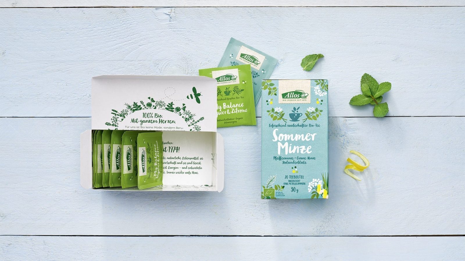
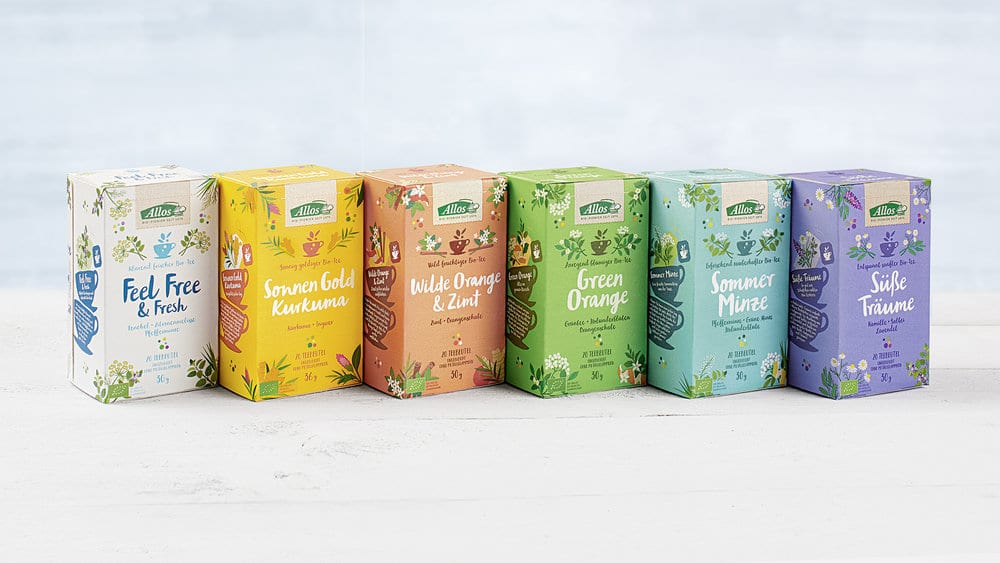
Following the successful packaging design relaunch for Allos, HAJOK Design has now also designed their new tea range. The lovingly-executed illustrations are a key visual element on-pack and were realised in-house at HAJOK Design.
While Allos has been successful in the organic retail trade for almost 45 years, the tea category is completely new terrain for the traditional company. In such a booming and extremely dynamic market, making your mark requires not only special tea blends, but also creative packaging design.
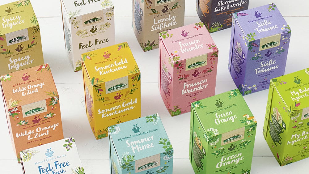
After the successful relaunch for the packaging design of the Allos food range, the brand agency HAJOK was also commissioned to design the new tea line-up. Whilst the design of the teas had to be recognisable as part of the umbrella brand, they also needed a completely unique look to stand out in this dynamic category. An in-depth competition and category code analysis formed the basis for the launch of the 12 different tea variants.
In contrast to packaging design already completed for Allos, this time illustrations were to form the visual mainstay, rather than photography. All of HAJOK’s in-house drawn herbs and tea ingredients reflect attention to detail and thus the brand positioning of Allos as a “farm-based manufacturer of lovingly-composed natural food”. The illustrated teacup as a key visual forms a unifying component featured on all packaging, from the box, the individual sachets to the tea bag tag itself. The different colours characterise each variety and communicate the diversity of the range. The matt surface and embossing stand for premium quality. The result is a colourful packaging design that stands out in a credible and appealing way from other tea brands.
Design Agency Name: HAJOK Design
Organisation/Project Type: Agency, Published Commercial Design
Article Title: Packaging Design for The New Allos Tea Range
Brand / Project Name: Allos Tea
Production Credits : Client: Allos Hof-Manufaktur
Project Type: Consumer Brand Creation
Strategic Deliverables: Consumer Research / Insight, Consumer Product Brand Architecture
Design Deliverables: Consumer Branding, Consumer Brand Creation, Consumer Brand Identity, Consumer Graphic Packaging Design
Location: Germany
Market Country: Germany
Market Region: Europe
Project Category: Beverages
Consumer Packaging Format: Box, Sachet
Consumer Substrate / Material: Pulp Carton
ZOCA – Good Sunday
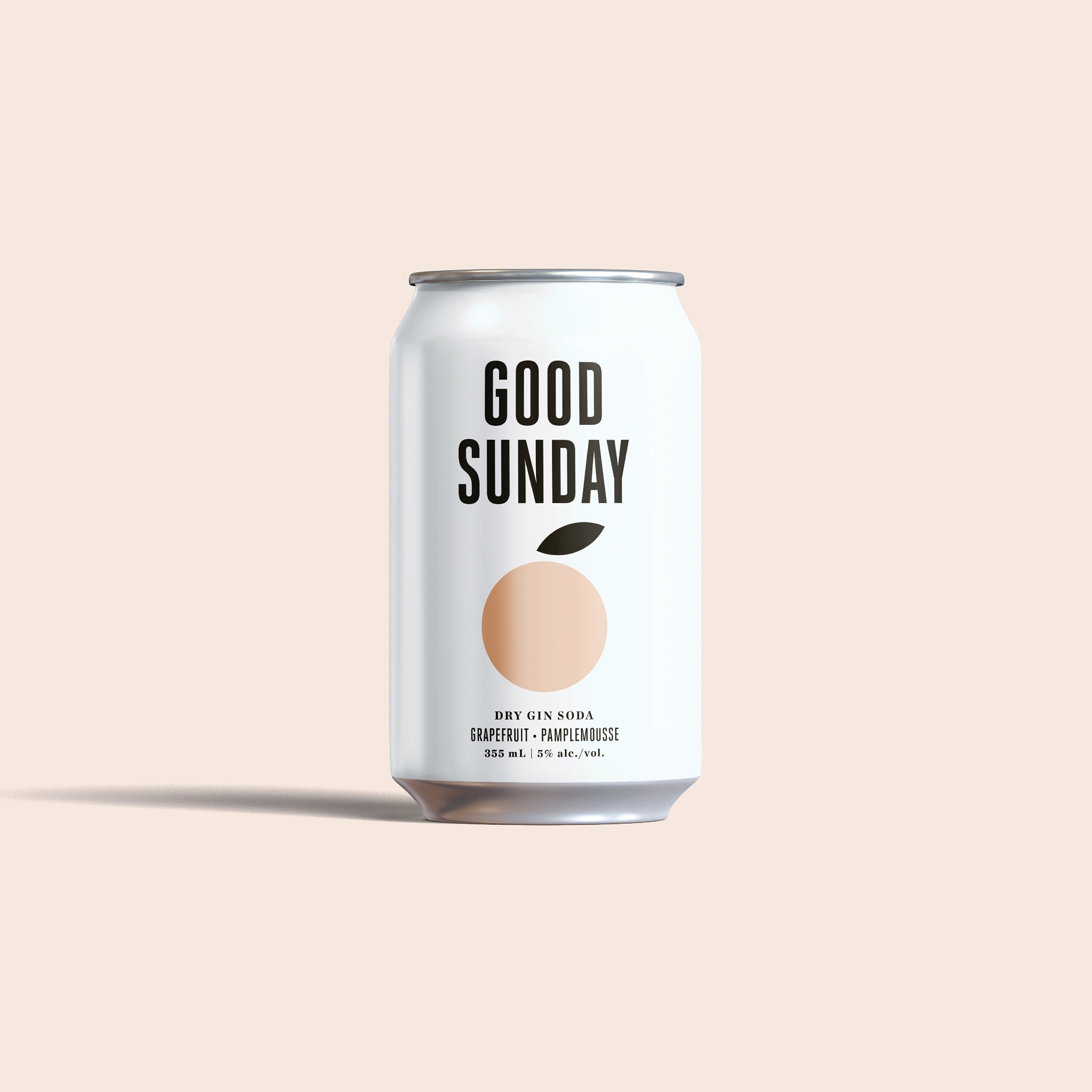
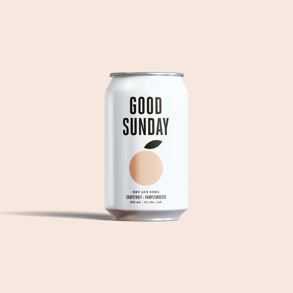
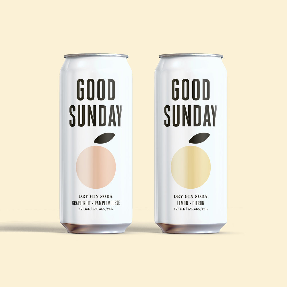
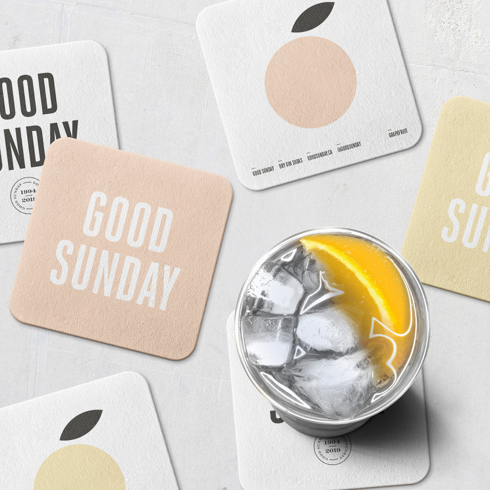
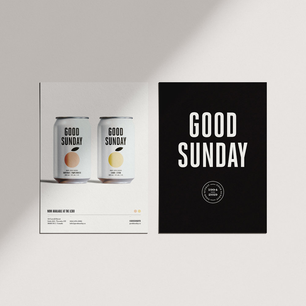
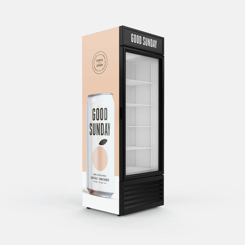
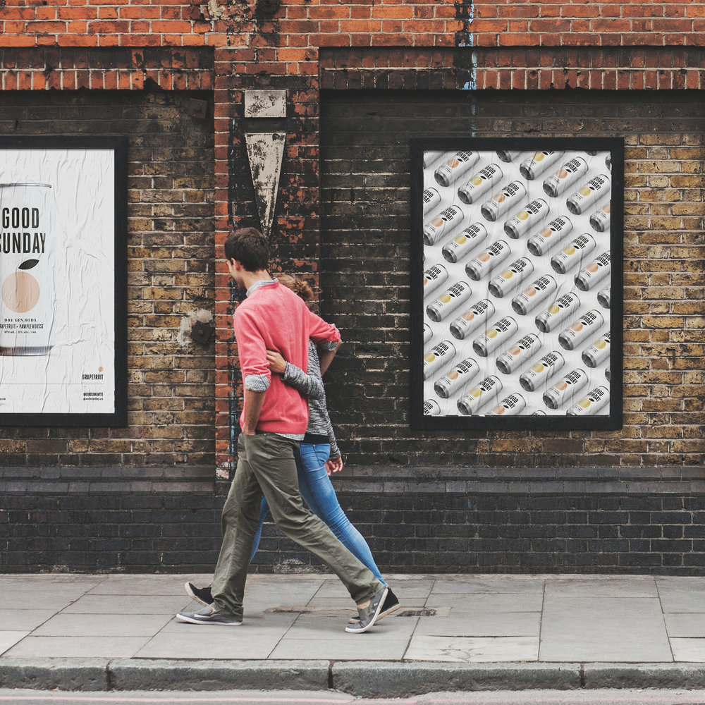
Good Sunday, is built on one simple principal, simplicity and it was ZOCA’s task in creating a meaningful brand identity and packaging system that would capture Good Sunday’s minimalist and beautiful culture. The modernistic and simplistic approach on the packaging was a process that took various refinements until it felt authentic to Good Sunday’s ethos. The ultimate goal for the brand identity and packaging was to convey a celebration of simplicity and the power within the experience and that brings people and friends together. Deliverables included; a brand identity system, packaging design, print materials and social media assets.
Design Agency Name: ZOCA
Organisation/Project Type: Agency, Published Commercial Design
Article Title: Good Sunday Packaging and Brand Identity
Brand / Project Name: Good Sunday
External Design Credits: Christian Karayannides
Project Type: Consumer Brand Creation
Strategic Deliverables: Consumer Brand Strategy, Consumer Brand World
Design Deliverables: Consumer Branding, Consumer Brand Creation, Consumer Brand Identity, Consumer Brand Identity System, Consumer Graphic Packaging Design
Location: Canada
Market Country: Canada
Market Region: North America
Project Category: Spirits
Consumer Packaging Format: Can
Consumer Substrate / Material: Metal

Comeback Studio – Megaris Oregano
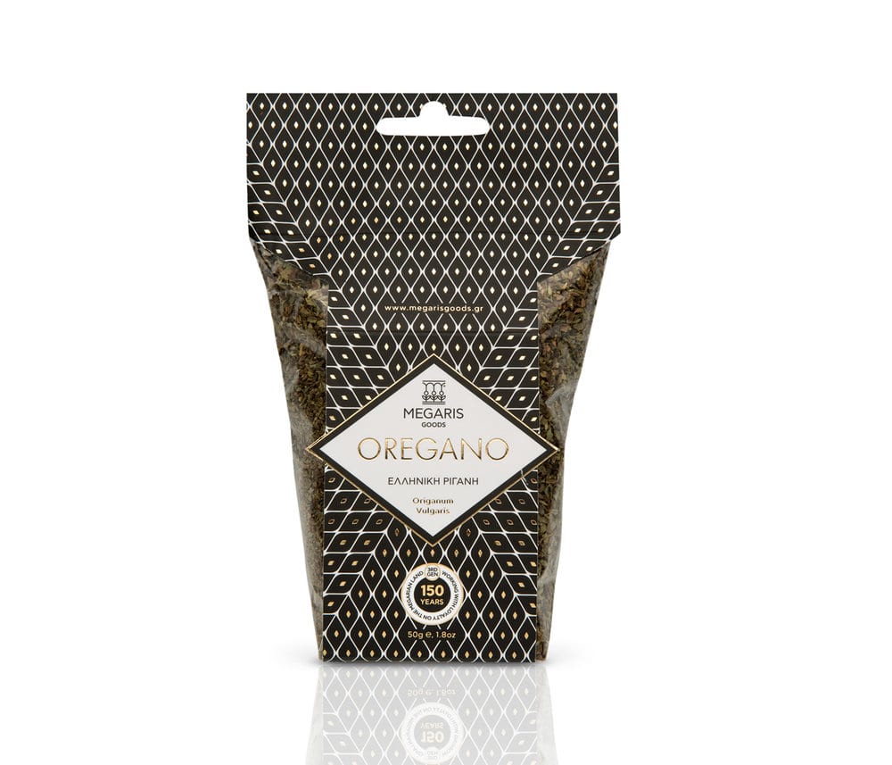
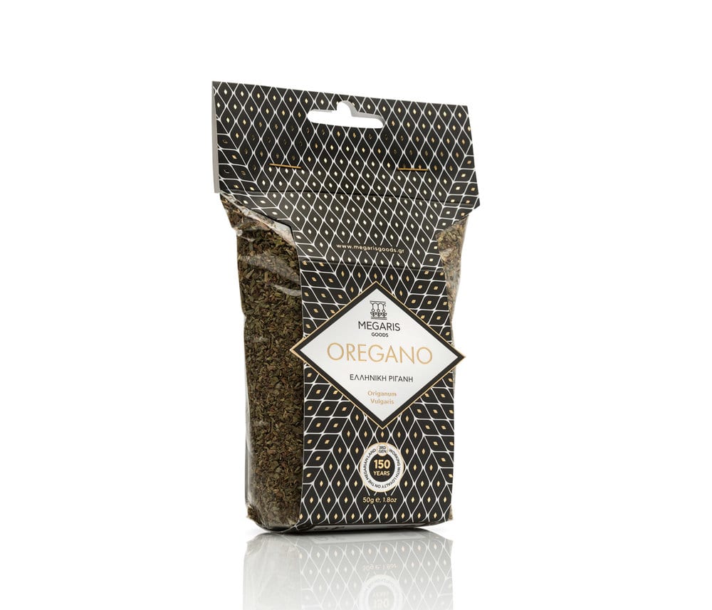
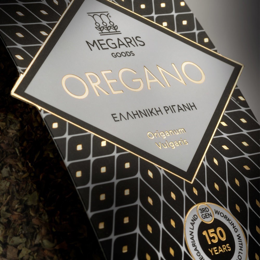
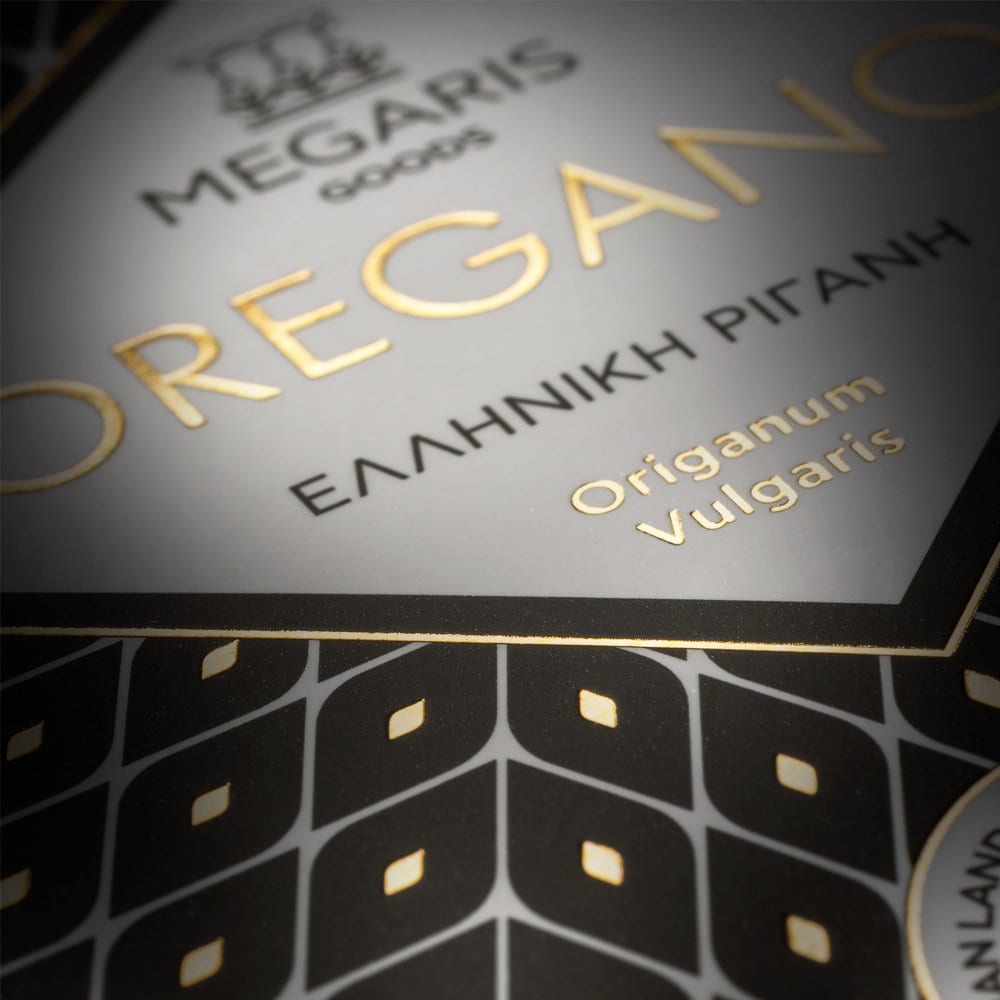
Oregano packaging for Megaris Goods. The main element of the design is a geometric pattern which is based on the shape of the flower of the oregano plant. Gold hot foil was used to highlight the excellent quality of the product, but also to make the packaging stand out from its competitors on the shelf.
Design Agency Name: Comeback Studio
Organisation/Project Type: Agency, Published Commercial Design
Article Title: Megaris Oregano
Brand / Project Name: Megaris Oregano
External Design Credits: Studio Anastassatos, photographer
Production Credits : Doculand, print
Project Type: Consumer Brand Creation
Strategic Deliverables: Consumer Product Brand Architecture
Design Deliverables: Consumer Branding
Location: Greece
Market Country: Greece
Market Region: Global
Project Category: Condiments
Consumer Packaging Format: Wrap
Consumer Substrate / Material: Plastic, Pulp Paper

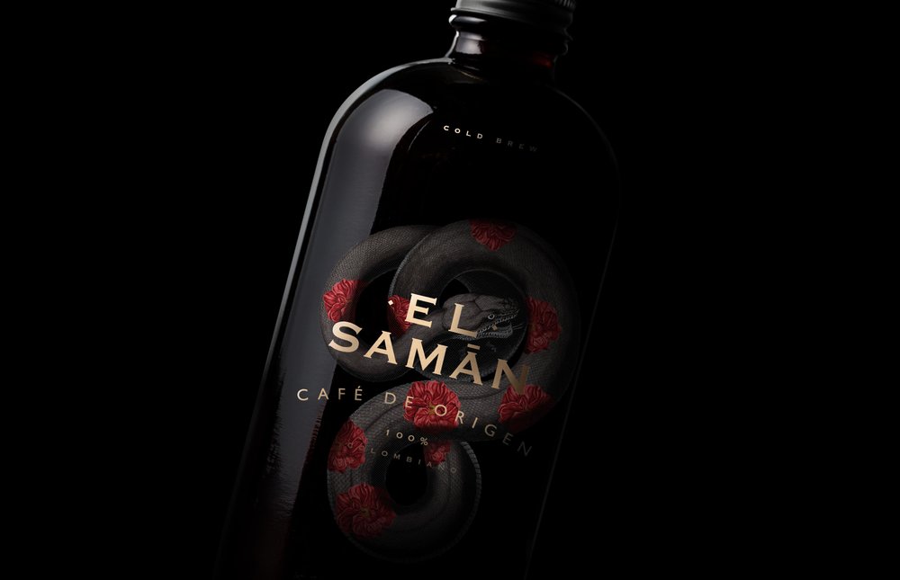
BACKBONE BRAND WONDERING – El Samán Madremonte
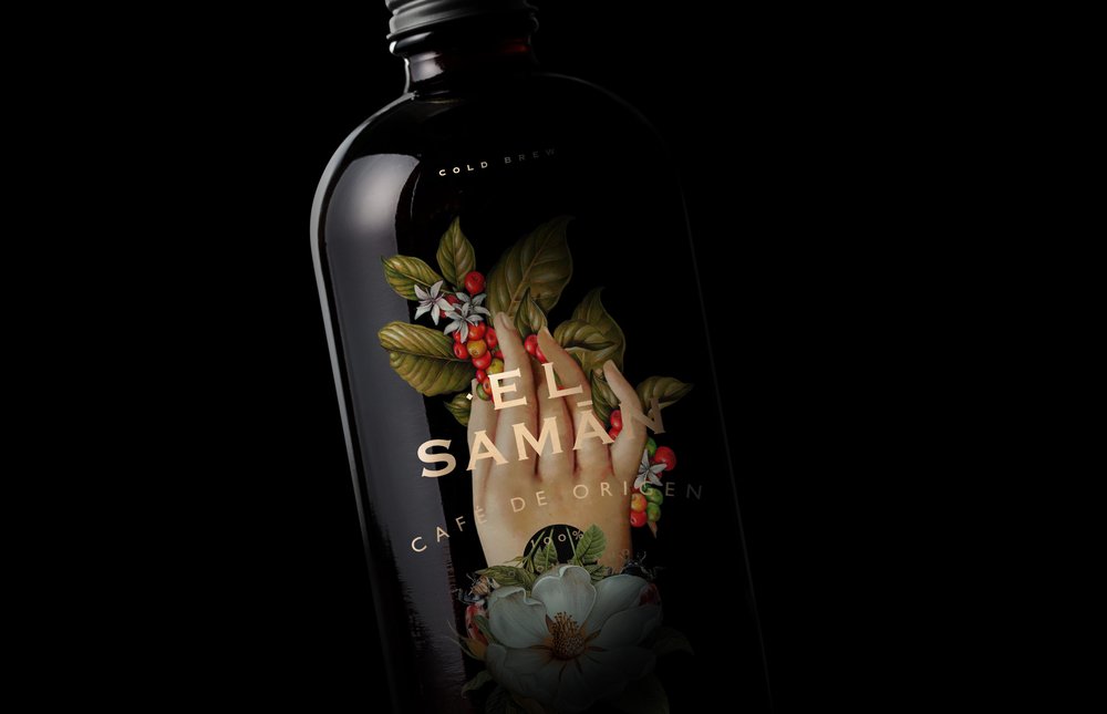
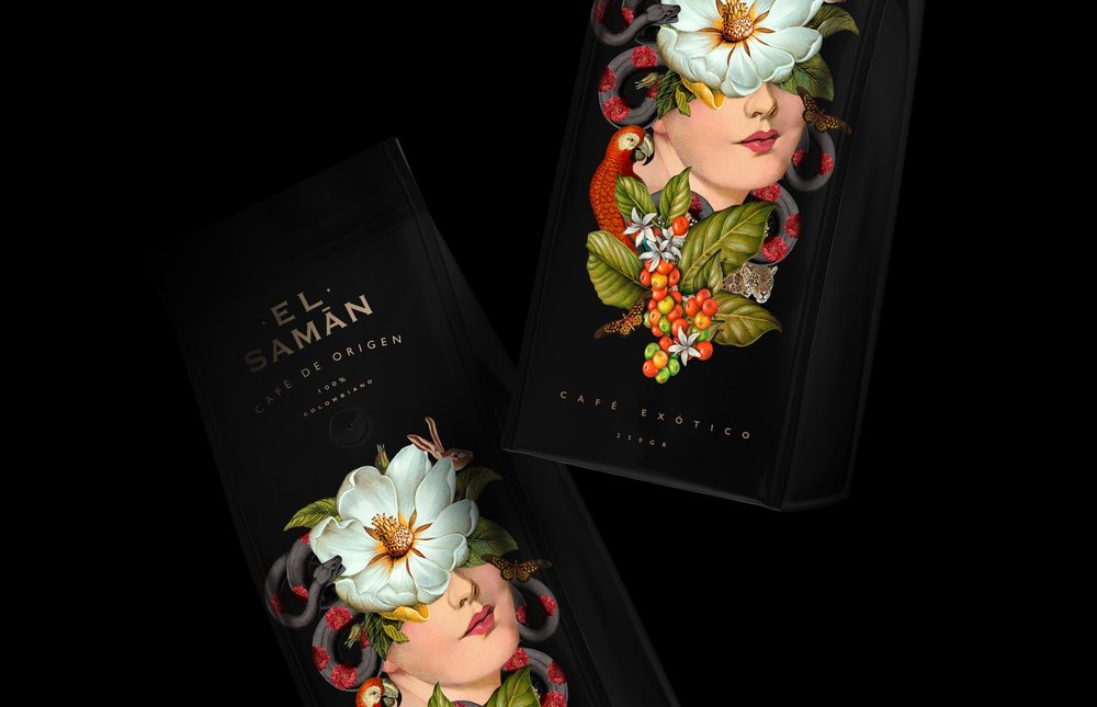
To honor the spirit of the earth to celebrate the sun that illuminated it, the rain that refreshed it, the air that renewed it, and the woman who cares for nature, the animals, and the plants that inhabit it.
(ES) Honrar el espíritu de la tierra para celebrar el sol que la alumbro, la lluvia que la refresco, el aire que la renovó, y la mujer que cuida la naturaleza, los animales, y las plantas que la habitan.
Design Agency Name: BACKBONE BRAND WONDERING
Organisation/Project Type: Agency, Published Commercial Design
Article Title: El Samán Exotic Coffee
Brand / Project Name: El Samán Madremonte
Project Type: Consumer Brand Creation
Strategic Deliverables: Consumer Brand World
Design Deliverables: Consumer Branding, Consumer Brand Identity, Consumer Brand Identity System, Consumer Graphic Packaging Design
Location: Colombia
Market Country: Colombia
Market Region: South America
Project Category: Beverages
Consumer Packaging Format: Bag, Bottle
Consumer Substrate / Material: Glass, Pulp Paper

CUBA Creative Branding Studio – Pava-Pava
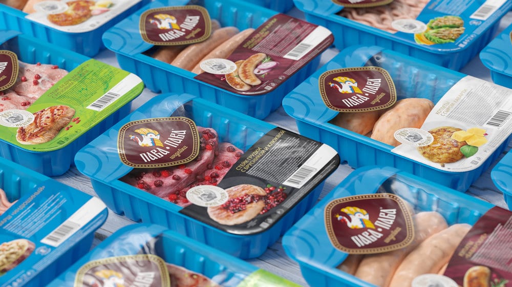
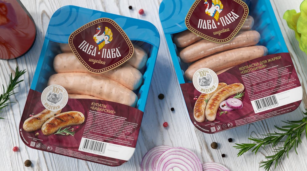
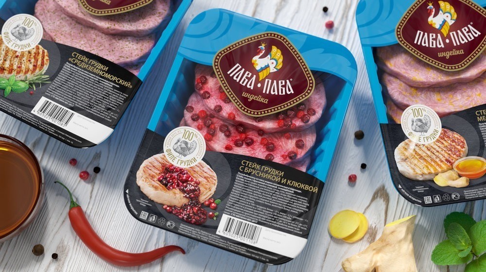
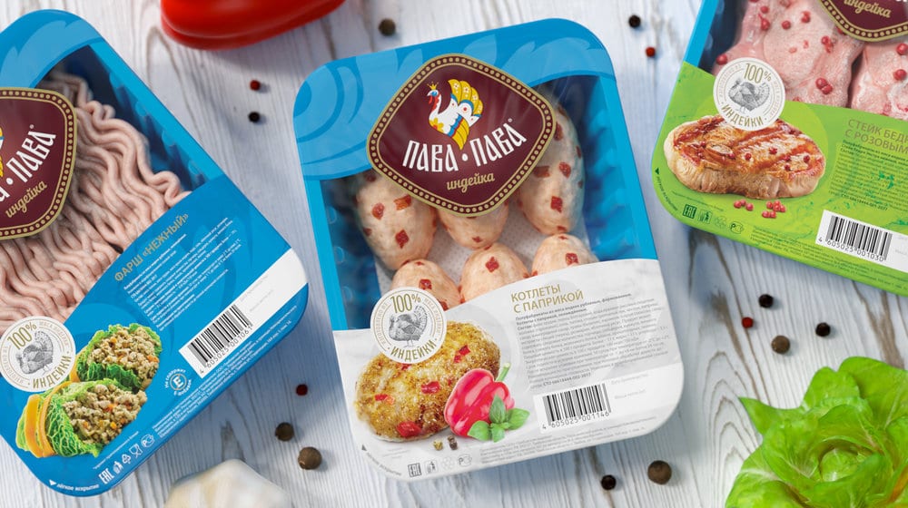
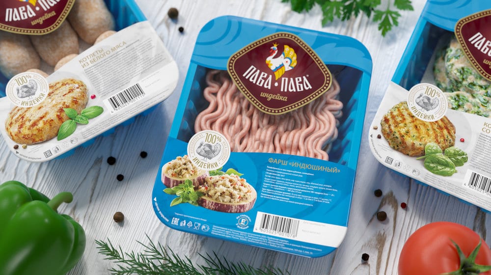
A new packaging design for new extended Pava-Pava brand positions was created by CUBA Creative Branding Studio in a project with the goal to improve a long-term, successful collaboration with manufacturer, built upon trust and transparency. The new packaging design was created for five categories of turkey meat products: breast steaks, bone steaks, minced meat, meatballs and sausages.
Initially the Pava-Pava brand was the fruit of mutually beneficial cooperation between CUBA Creative Branding Studio and teams Cherkizovo Group (Russia) and Grupo Fuertes (Spain). After a year and a half after the brand launch, Pava-Pava brand became the most popular brand in Moscow and St. Petersburg.
In 2018, the brand’s products won the Product of the Year award in Russia, and in 2019 were prized by the German Design Award in Frankfurt am Main in the packaging design category.
Currently, the brand is well distributed in Russia, expanded from Moscow and St. Petersburg to to the regions.
Design Agency Name: CUBA Creative Branding Studio
Organisation/Project Type: Agency, Published Commercial Design
Article Title: New Packaging Design for New Extended Pava-Pava Brand Positions Created by CUBA Creative Branding Studio
Brand / Project Name: Pava-Pava
Project Type: Consumer Brand Creation
Strategic Deliverables: Consumer Product Brand Architecture
Design Deliverables: Consumer Branding
Location: Russia
Market Country: Russia
Market Region: Europe
Project Category: Fresh Food

