


Ayuda en Acción is a Spanish organization with a deep activity in 22 countries, they decided to update its brand system after the 2020 lockdown situation, empowering a process of selection of a strategic partner to develop the entire project and launch the new brand across 2021.
Despite the uncertain situation, during Summer 2020 the entity chose Relajaelcoco as a partner for the project, beginning a deep process of analysis and strategy development to define which values are the fundamental pillars of the rebranding.
Luis Palacios, director of Marketing and Communications, affirms that the aim is to drive the organization to new challenges, reaching a visual system that reflects the actual essence of Ayuda en Acción letting each team communicate the values throughout a renewed image based on solid ideas.
“The new brand system we want to represent the mark we leave in the world and in each person with whom we work, together with the idea of the print that other collaborators do with us”.
Pablo Galeano, the co-founder of Relajaelcoco, outlines that “the biggest challenge of the entire process has been defining the essence of Ayuda en Acción, creating a differentiating element with a solid pyramid of values that outstand the presence in the NGOs sector. The combination of primary elements together with rational ones describes how the entity connects different realities worldwide”.
Francesco Maria Furno, also co-founder of the design studio, remarks that “we had a very good starting point knowing the organization since 7 years ago, designing the annual report and learning about the way they operate worldwide. For this reason, the brand evolution has been planned to be as efficient as possible. The way we have been working together made it possible to create a new path, more impactful in each detail”.
We have divided the rebranding process into 3 main steps:
01. Strategic Design Analysis: in which we have been exploring and consolidating the essence of the organization thanks to a series of workshops made with all the stakeholders divided into groups of analysis. Thankfully to the groupal result, we have been able to define the global essence taking care of each detail managing a collective dynamic.
02. Look and Feel Proposal: The creative team collect and synthesize each conversation to define a scheme of key values and the brand personality translating it to a new visual system made by a behavioural approach in which we propose to avoid logocentrism in the next years and focus on a compound of visual elements (shapes, colours and types) to enhance the evolution of the brand and the main value: being a game-changer injecting a new way of doing things.
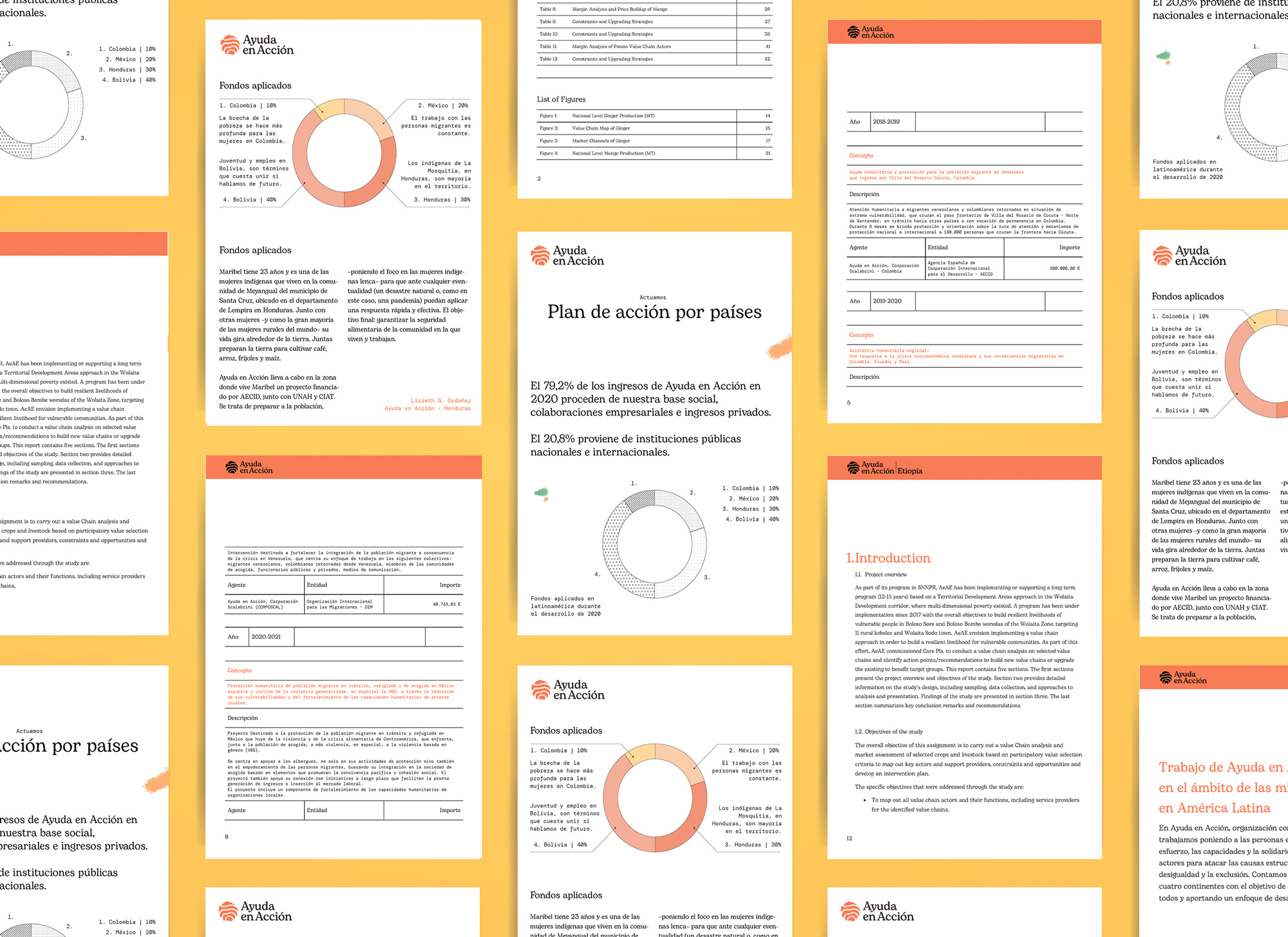
03. Assets development and brand manual: During this last step the design team, together with the internal team from Ayuda en Acción, develops all the brand assets and the brand manual, made in collaboration with Corebook to let NGOs’ teams have direct access to all the new brand components. The objective is to create a series of templates that let team members prepare reports, presentations and any kind of essential asset to consolidate the new brand.
Working side by side to spread the new brand system: We decided to use the same process that the NGO applies to its daily workflow when interacting with each community. During the last year, Relajaelcoco has accompanied the organization to let its members create and familiarize themselves with the new brand identity, assuming the essential values of the brand related to the social values the NGO applies in the day by day activity. We have been part of the organization to create the new system evolving the precedent one to outline the main essence: Ayuda en Acción is the promoter of a social change, based on youth and sustainable development. In this way, its essence is to keep transforming, stimulating the different realities in Europe, Africa, Asia and Latin America.
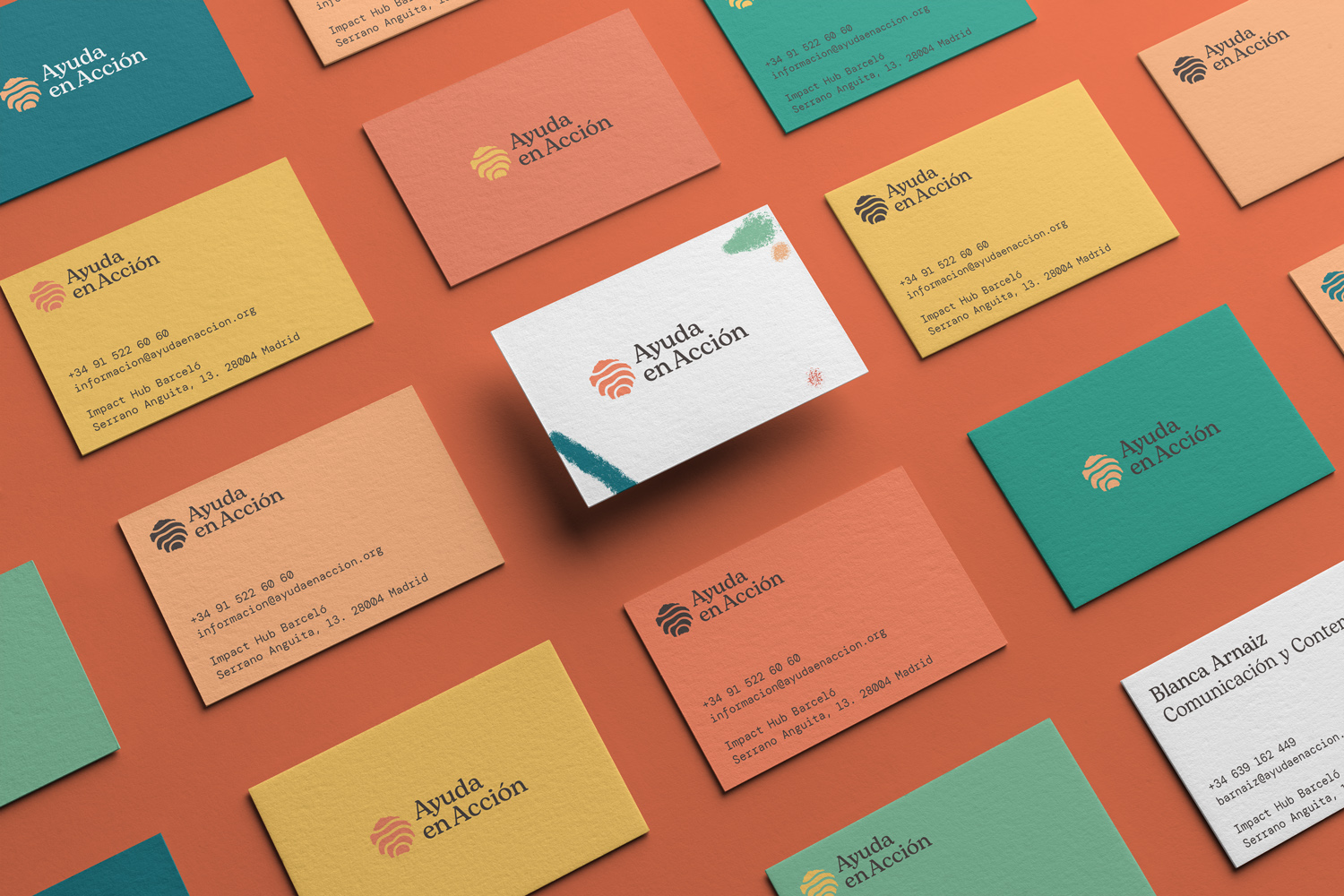
The logotype is the synthetic representation of making the difference leaving a permanent mark.
Ideally, Ayuda en Acción leaves a mark that transforms the immediate environment, a powerful idea that lets us design the new isotype.
According to Fernando Mudarra, General Director of the organization: “We have switched from a logotype composed by a hand and an arrow —symbolising the action of helping— to the effect that the action per se provokes. For this reason, it is precise to talk about the mark we leave, about the final result we hopefully expect to accomplish. It is an optimistic print for the planet and people that receive our support, an indelible mark in each human being that takes action to be part of our organization, to sum up, and promote a new world, fairer, more supportive”.
During these days the new brand system is released after more than one year of work and development. A new step begins in which Ayuda en Acción is activating the global implementation of the brand, starting in the 22 countries in which it wants to consolidate its social, strategic and visual presence.
The New Brand Essence
The final result pushes to transform the new identity into a behavioural system instead of being logocentric. All the visual elements form a graphic system that defines the personality that makes the organization more recognizable, using the logo as a signature. The visual language points to a more contemporary aesthetic to get closer to a younger target of people that may be interested in the organization activity. The main existence is the promoting essence of Ayuda en Acción and how they leave a mark. The aim was to supply the organization with a dynamic brand manual, based on positive inputs instead of prohibitions, marking a clear path. We have decided to use an interactive tool to let the brand manual be more efficient instead of a static PDF, enriching it with assets and materials that may help the daily life development of visual communication. From Powerpoint documents to Word files for reports to creating merchandising pieces to assets for volunteers we have created plenty of options.
Technical Aspects
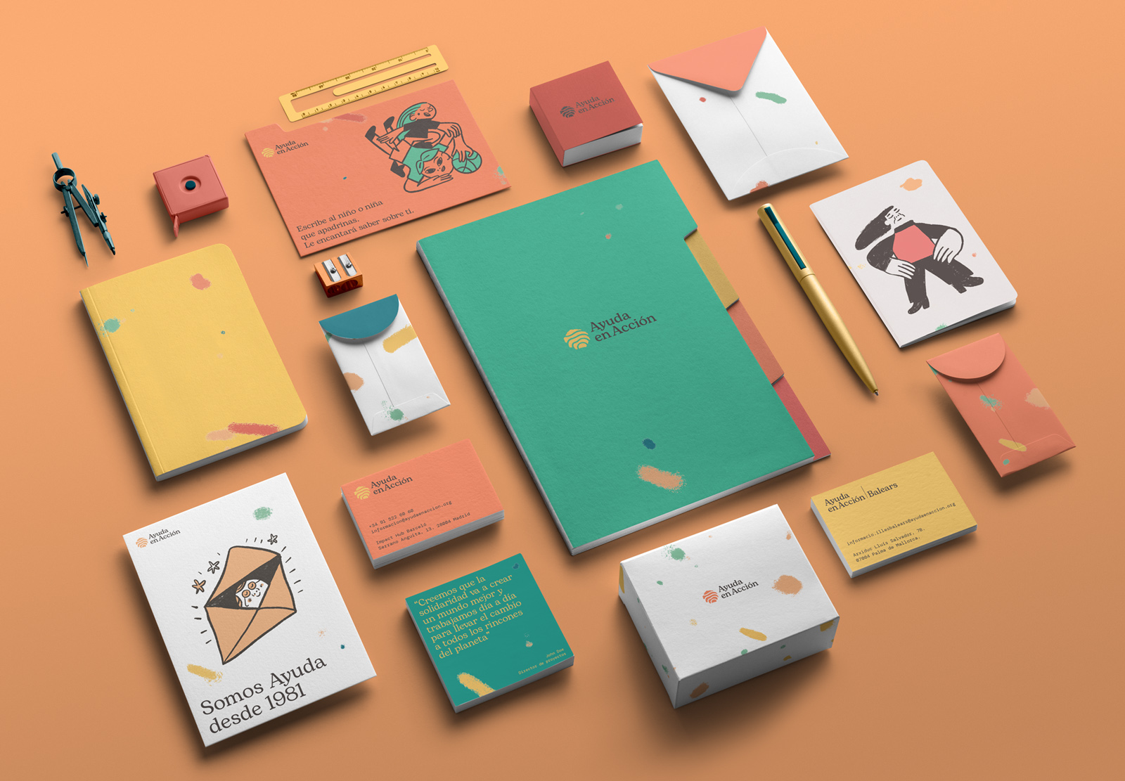
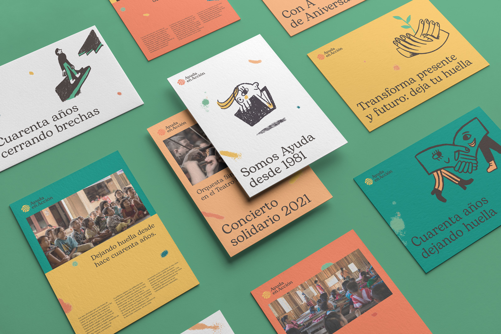
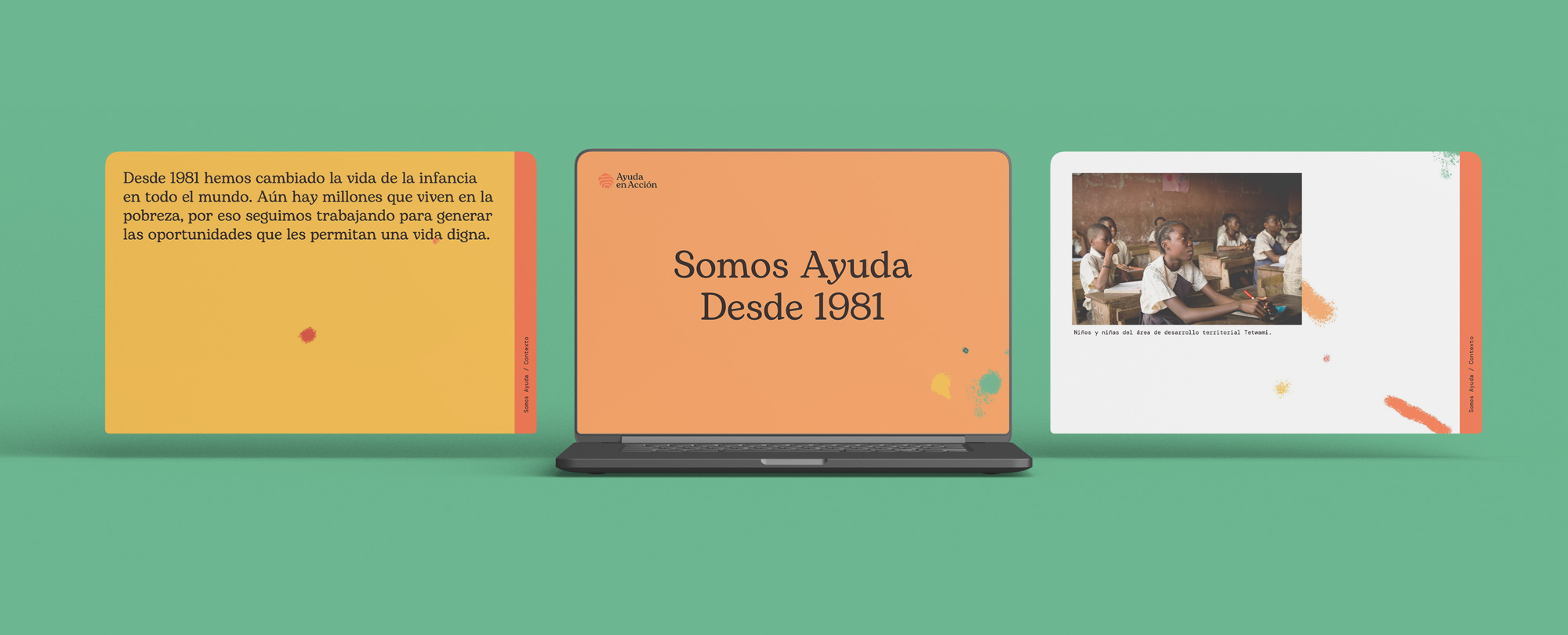
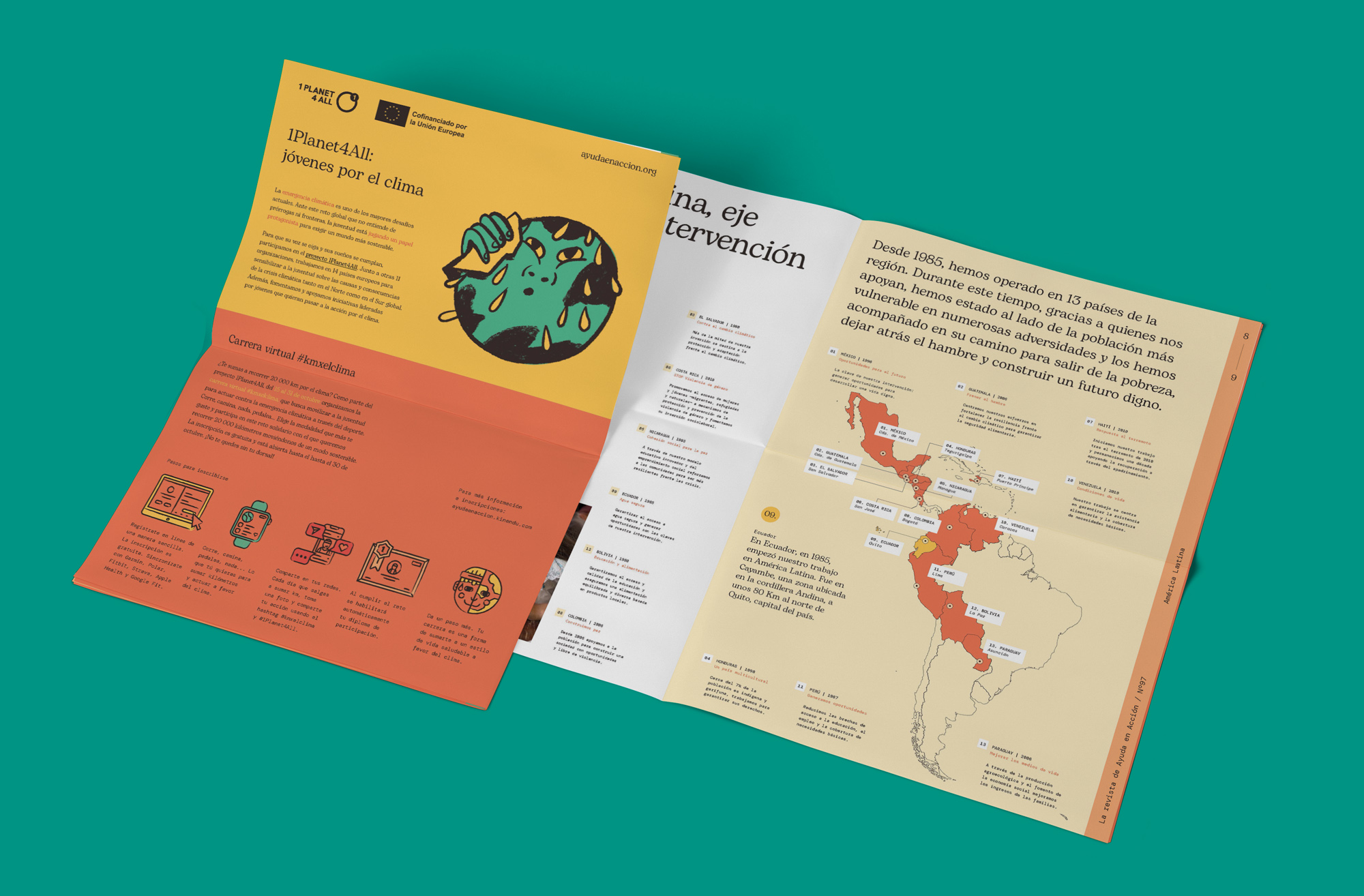
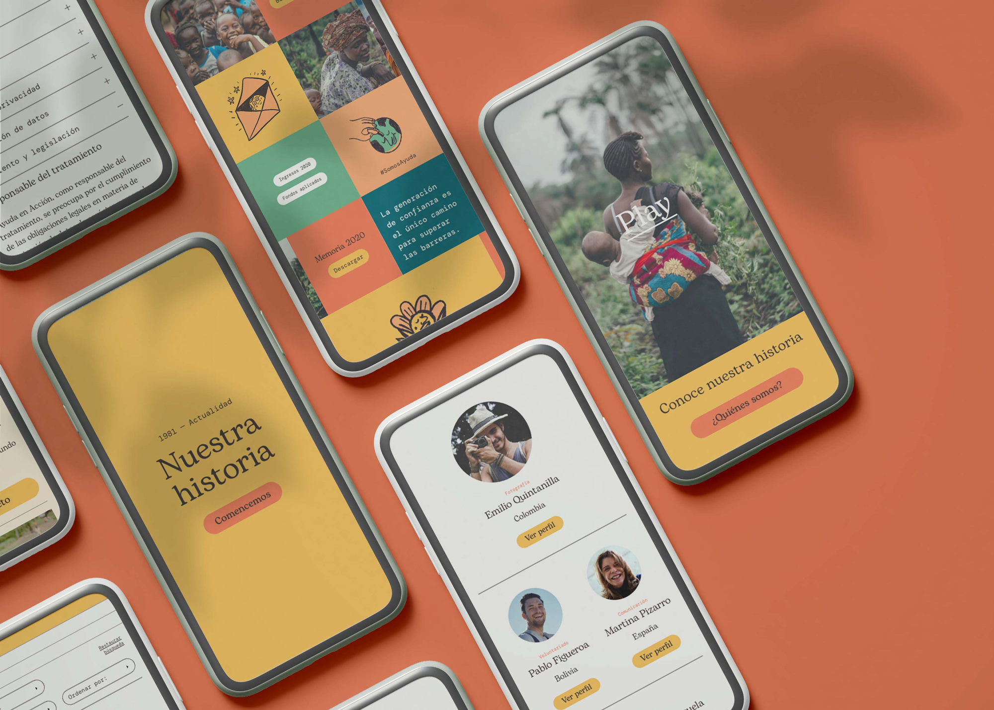
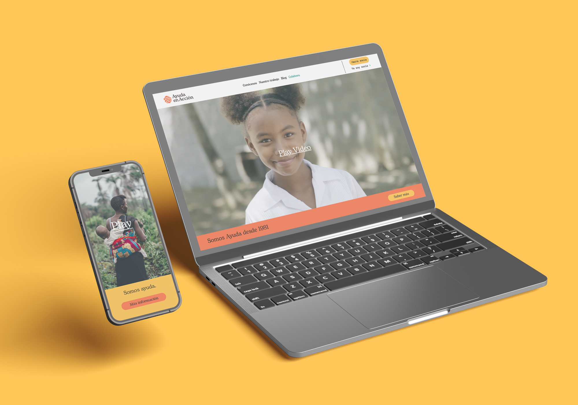
Typography: Typography is a key element in this visual system. Both Bogart by Zetafont and DM Mono by Colophon Foundry define the two main nuances of the brand focusing on a digital approach and readability. We have been establishing that Bogart reminds a humanistic and close approach of the organization and the DM Mono is more focused on the professionality of Ayuda en Acción. Colour: Orange is the main colour of Ayuda en Acción and we have developed a rich colour palette made of warm colours accompanied by some greens and turquoise resulting in the dynamic action of the organization as a change agent.
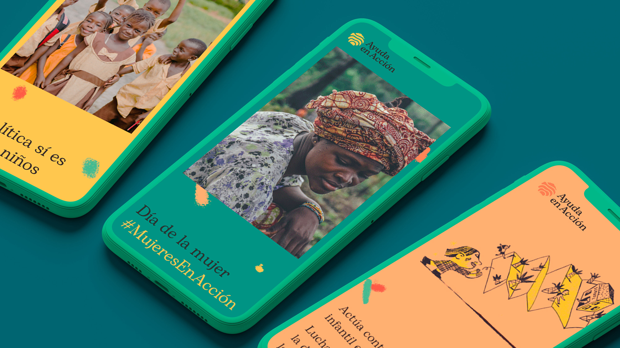
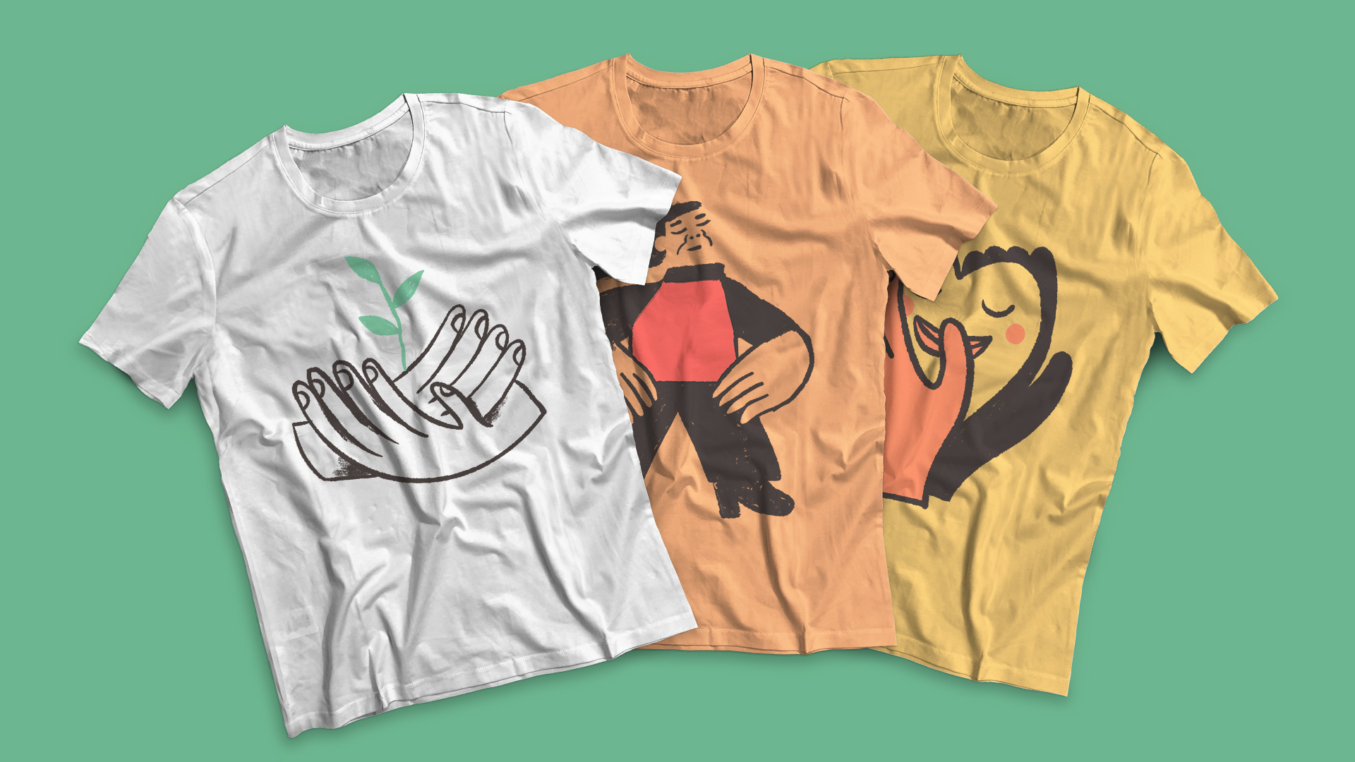
The Colour palette is based on vibrant colours but not as saturated as we are used to seeing in the NGOs sector. Photographic Style: The visual style is based on documentary essence trying to represent reality avoiding forced poses and unnatural situations. The idea is to provide each picture with a warm light that spreads a clear attitude of embracing communities to remark a human approach. Illustration style: The illustration style, made together with Pedro Perles, is based on a more pictorial approach to outline the primary essence that all cultures have in common.
Website Design and Development: After a first analysis, the main solution for the web development is based on a modular system, made in Adobe XD and implemented by Lin3s company. This part of the project was coordinated by Rocío Melero, responsible for Digital Area at Ayuda en Acción. The objective of this process was to provide the organization with a solid system that can be useful to design and develop any kind of landing and corporate pages. Assets: The huge change is a system of several assets designed together by Ayuda en Acción Communication internal team and Relajaelcoco last summer. This part of the rebranding process is to provide each team of the organization with basics that help to spread the new brand essence worldwide.
CREDIT
- Agency/Creative: Relajaelcoco
- Article Title: Ayuda en Acción, a Spanish NGO with a Solid Rebranding
- Organisation/Entity: Agency
- Project Type: Identity
- Project Status: Published
- Agency/Creative Country: Spain
- Agency/Creative City: Madrid
- Market Region: Africa, Asia, Europe, South America, Global
- Project Deliverables: Architecture Concept, Brand Architecture, Brand Creation, Brand Design, Brand Guidelines, Brand Identity, Brand Mark, Brand Redesign, Brand Strategy, Brand Tone of Voice, Branding, Editorial Design, Graphic Design, Icon Design, Infographic, Logo Design, Motion Graphics, Poster Design, Rebranding
- Industry: Non-Profit
- Keywords: NGO, branding, Spain, Rebranding, Fingerprint, Development, Sustainability, Social, Change, Coherence
-
Credits:
Designer and Coordinator: Francesco Maria Furno
Art Director: Pablo Sánchez Galeano
Junior Designer: Celia Campos
Junior Designer: Carmen Fernández
Marketing Director: Luis Palacios
Illustrator: Pedro Perles


