


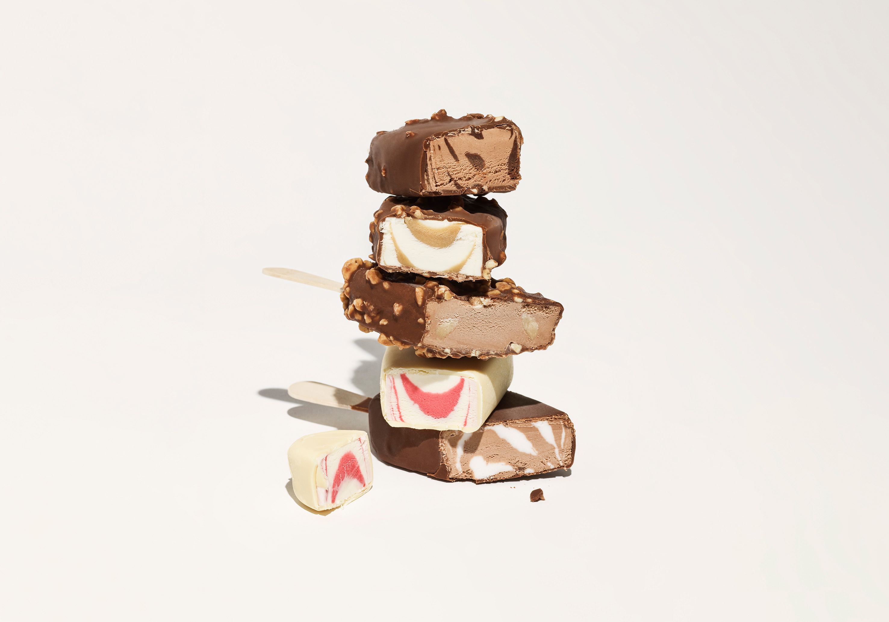
“The secret of this ice cream is there’s no secret.” At its launch in 2012, 3 Kaverin Jäätelö (3 Friends Ice Cream) was the first craft ice cream brand in Finland. Since then, this company founded by 3 passionate ice cream lovers has been the forerunner in the Finnish ice cream scene. Just like true friends, 3 Kaveria ice cream doesn’t keep secrets. It’s made from only good and natural ingredients, so there’s no reason to explain or hide anything.
The mission of Kuudes was to better reflect the great quality of the product, strongly communicate the philosophy behind the taste and, most importantly, increase credibility to support sales in international markets. We were briefed to make a design evolution instead of a revolution. That’s why we kept the iconic orange brand colour but tuned it just a little brighter.
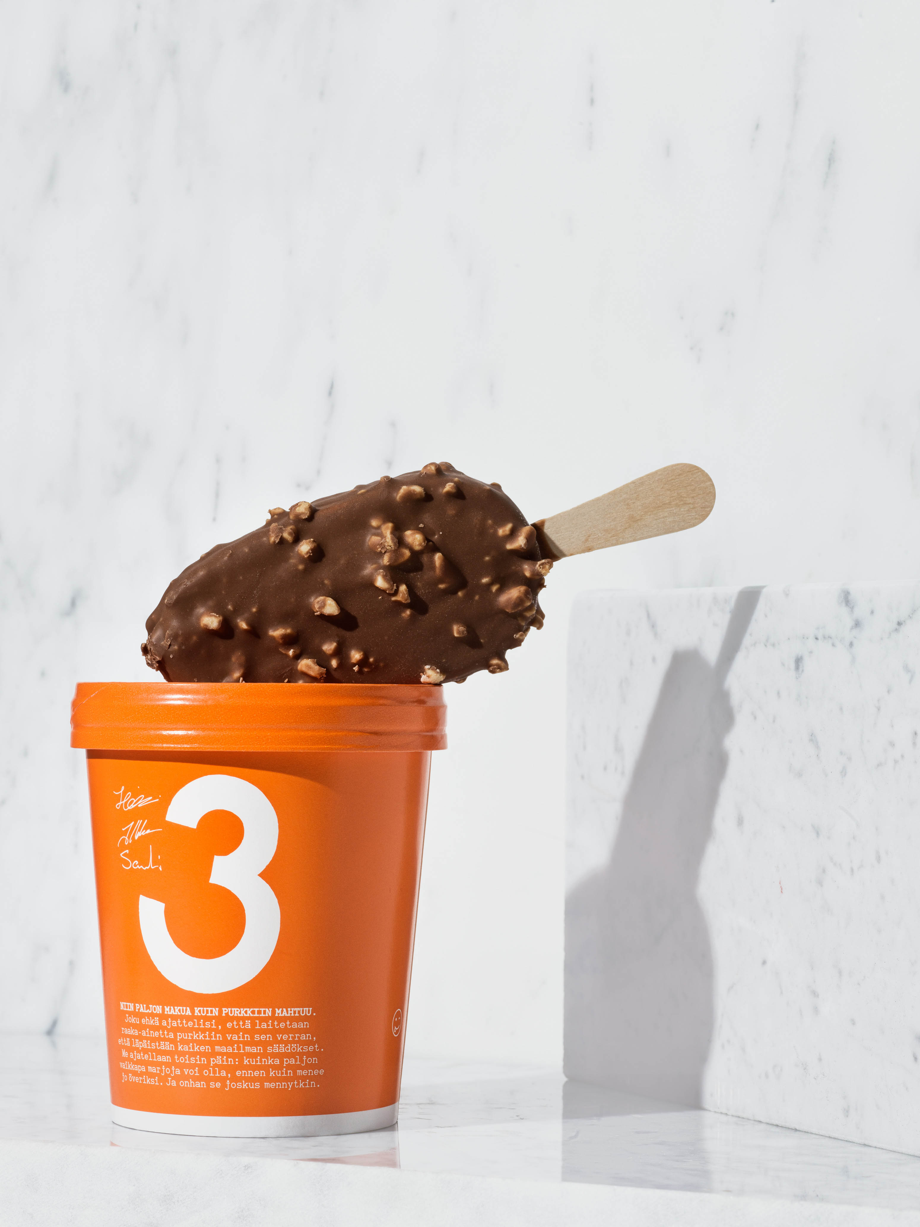
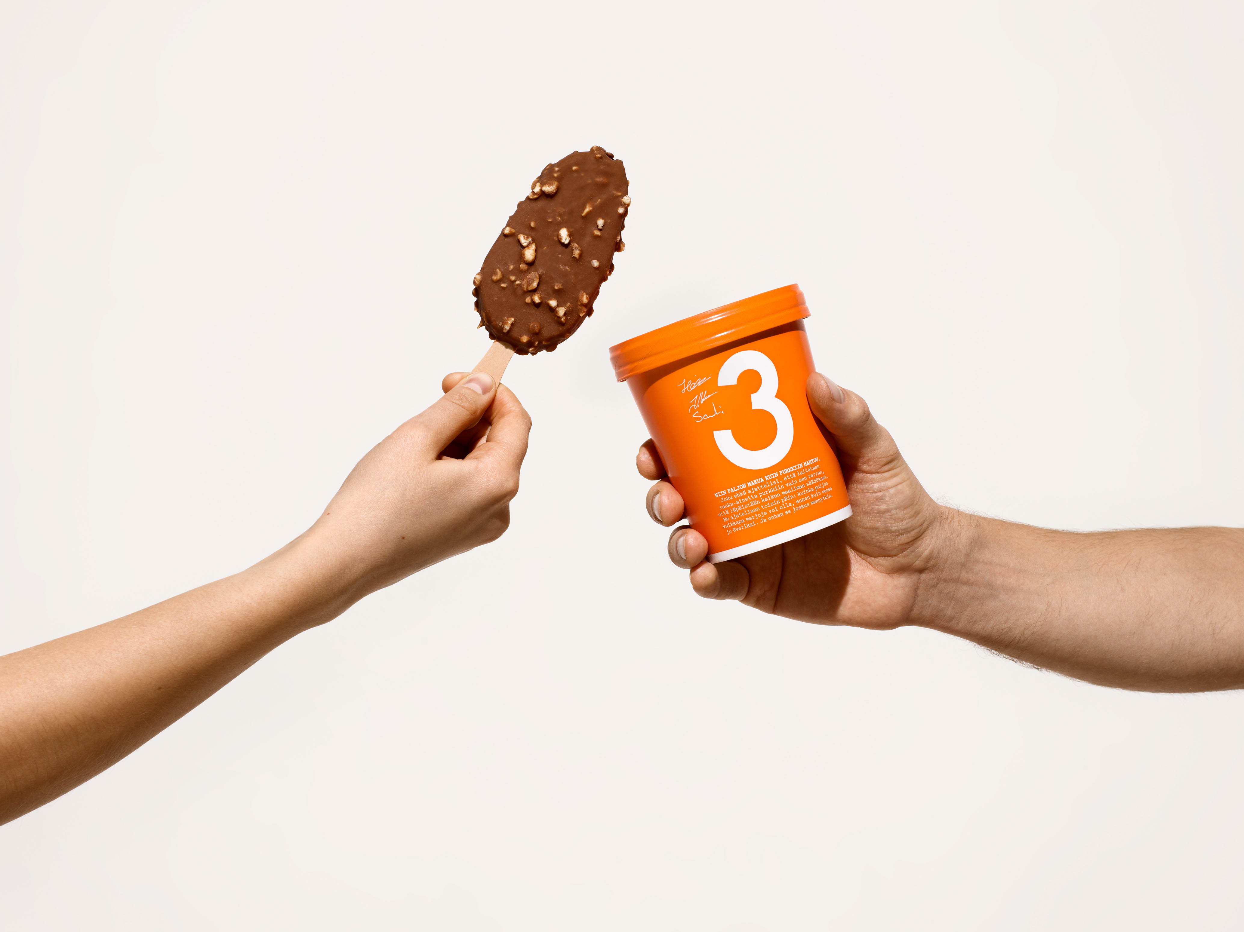
To stand out better in the freezer, we wanted the beloved brand name and number 3 to be more prominent in the visual identity. The typography of the rotating 3 Kaveria text on the carton was inspired by an Italian sign post and brought to life with a custom font.
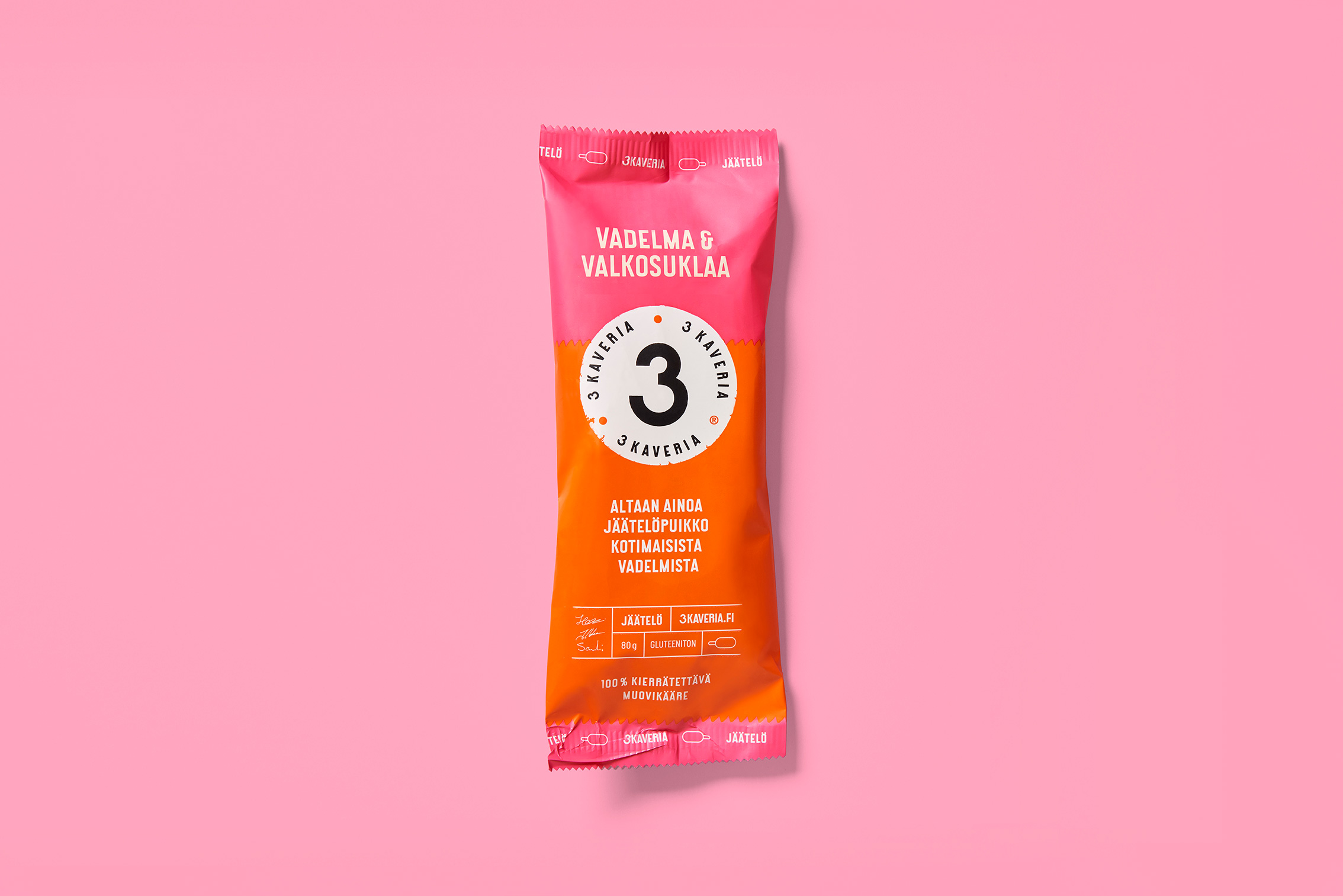
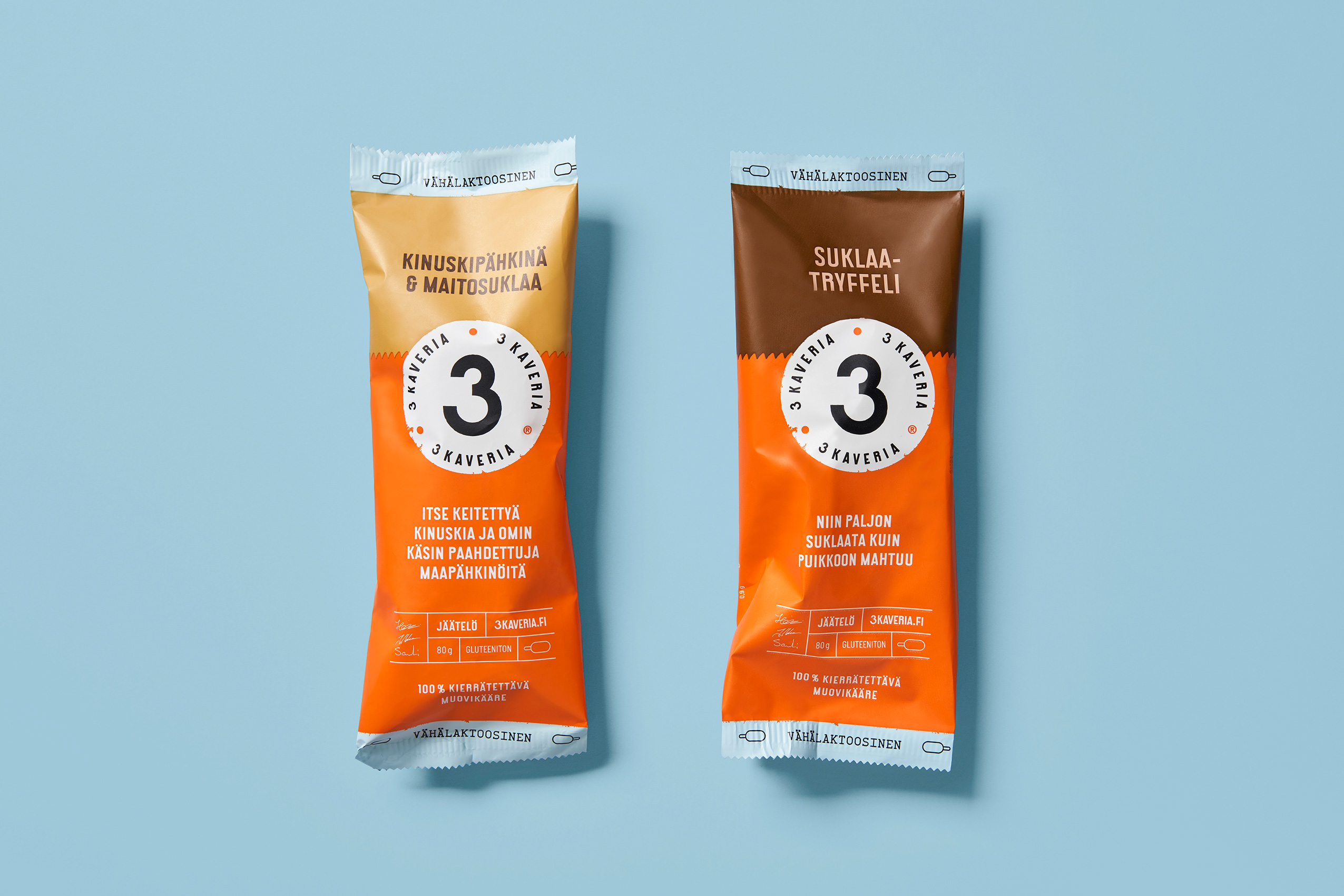
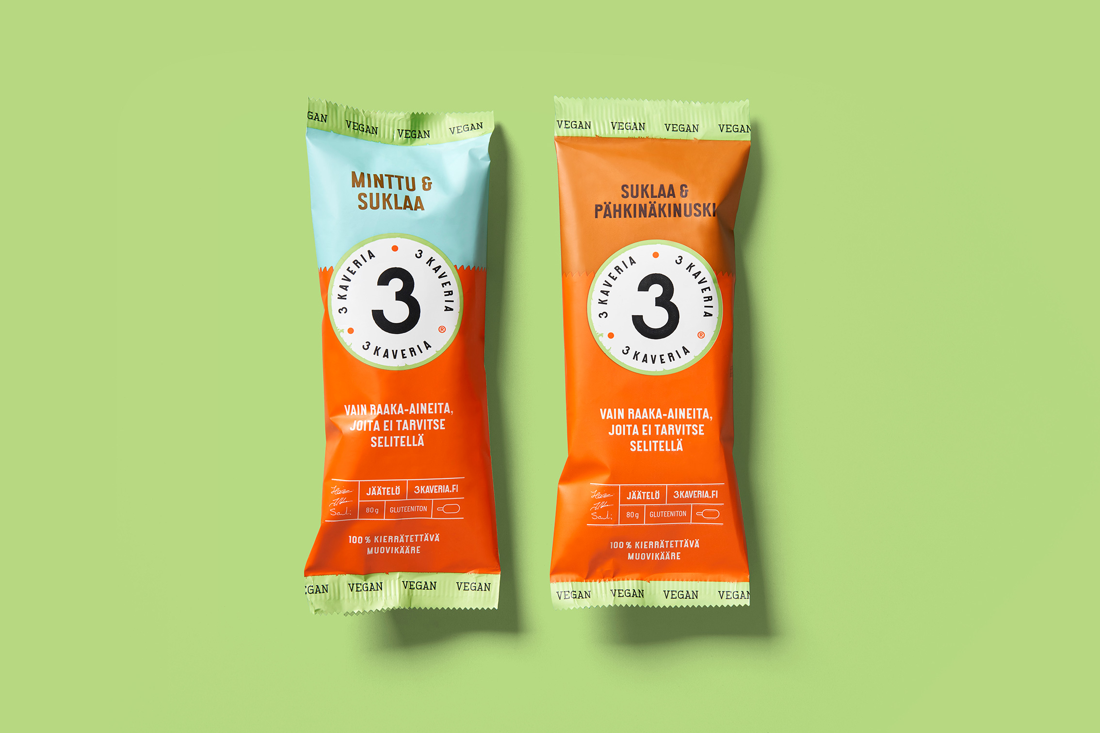
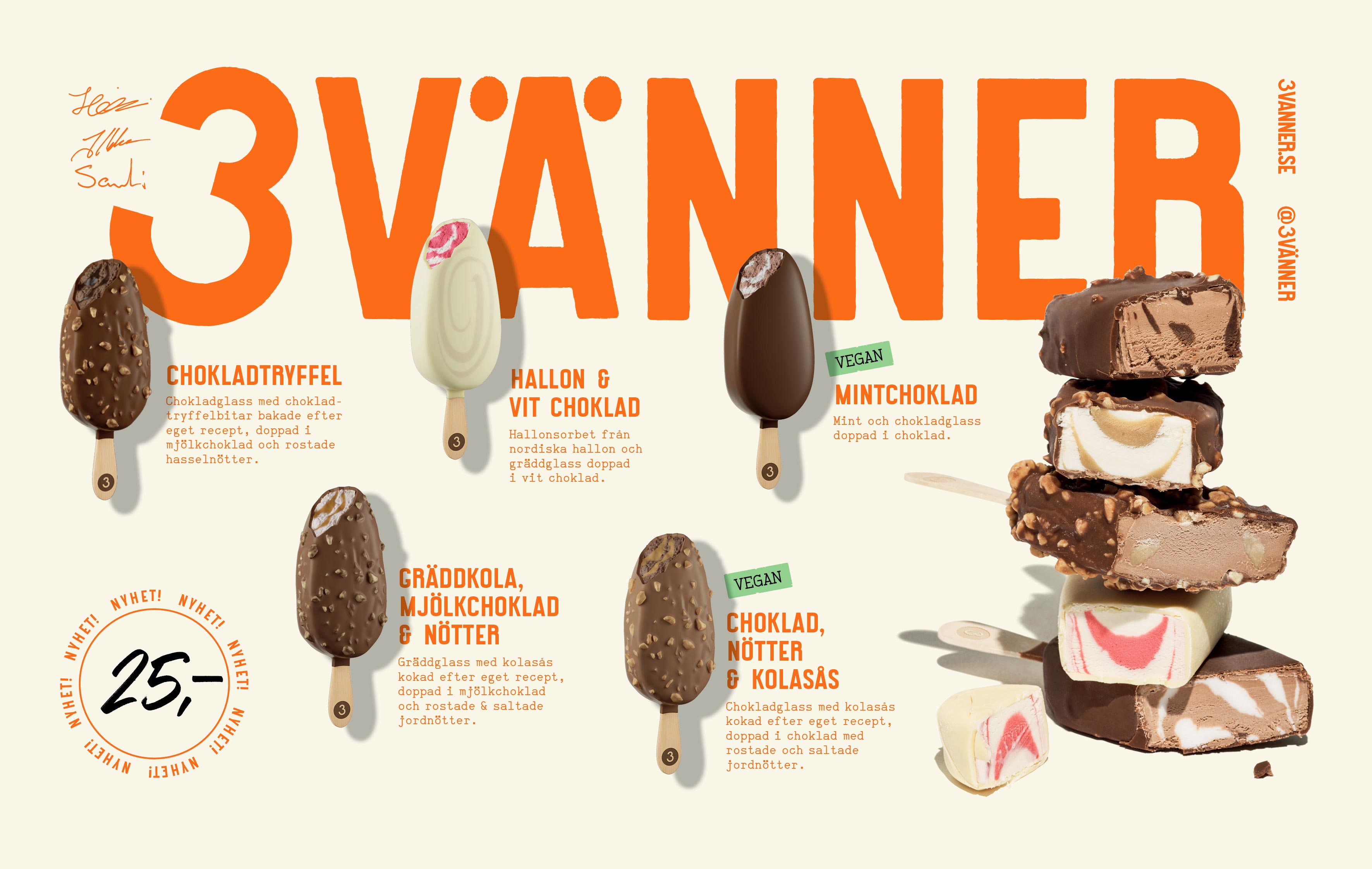
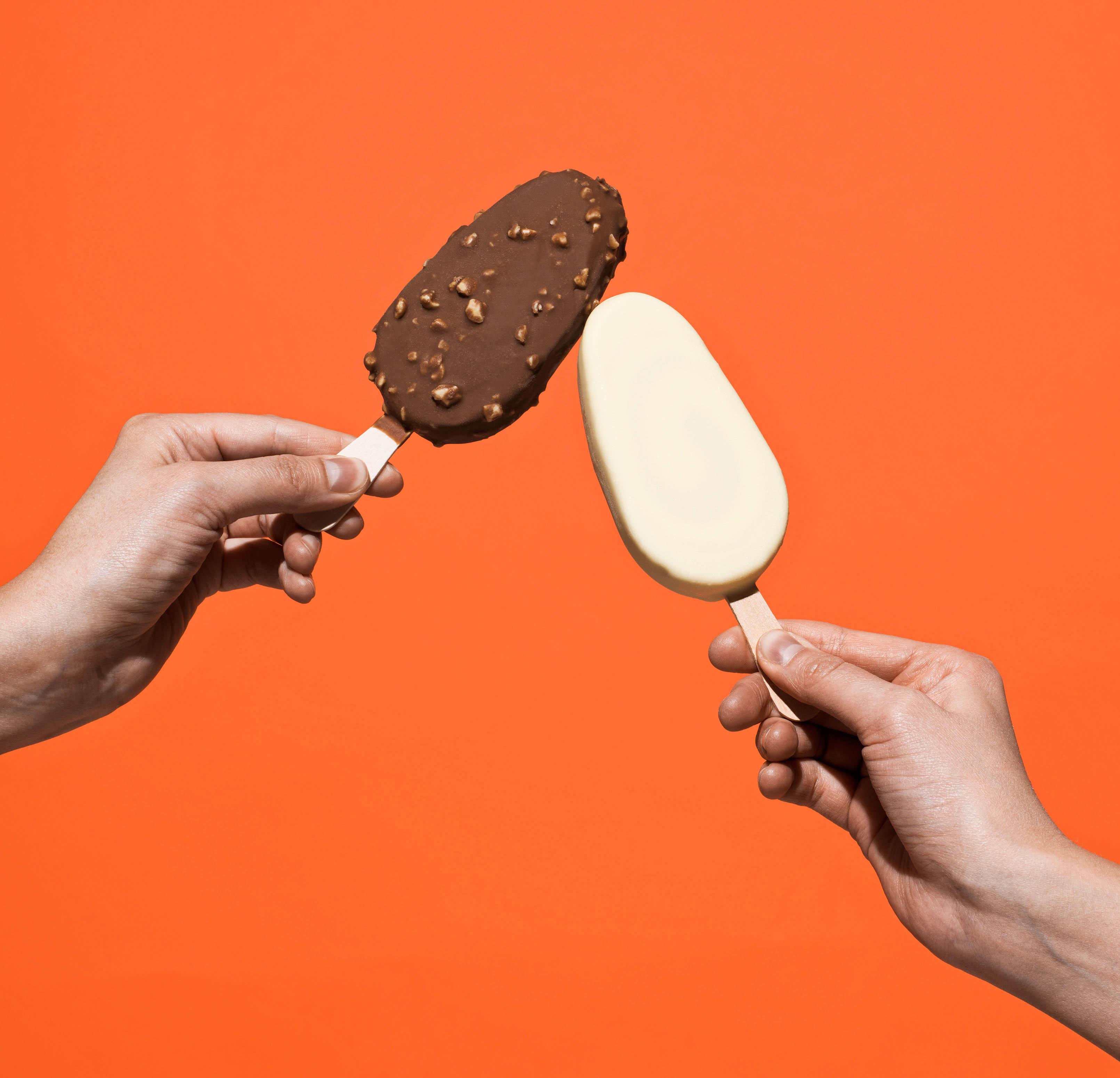
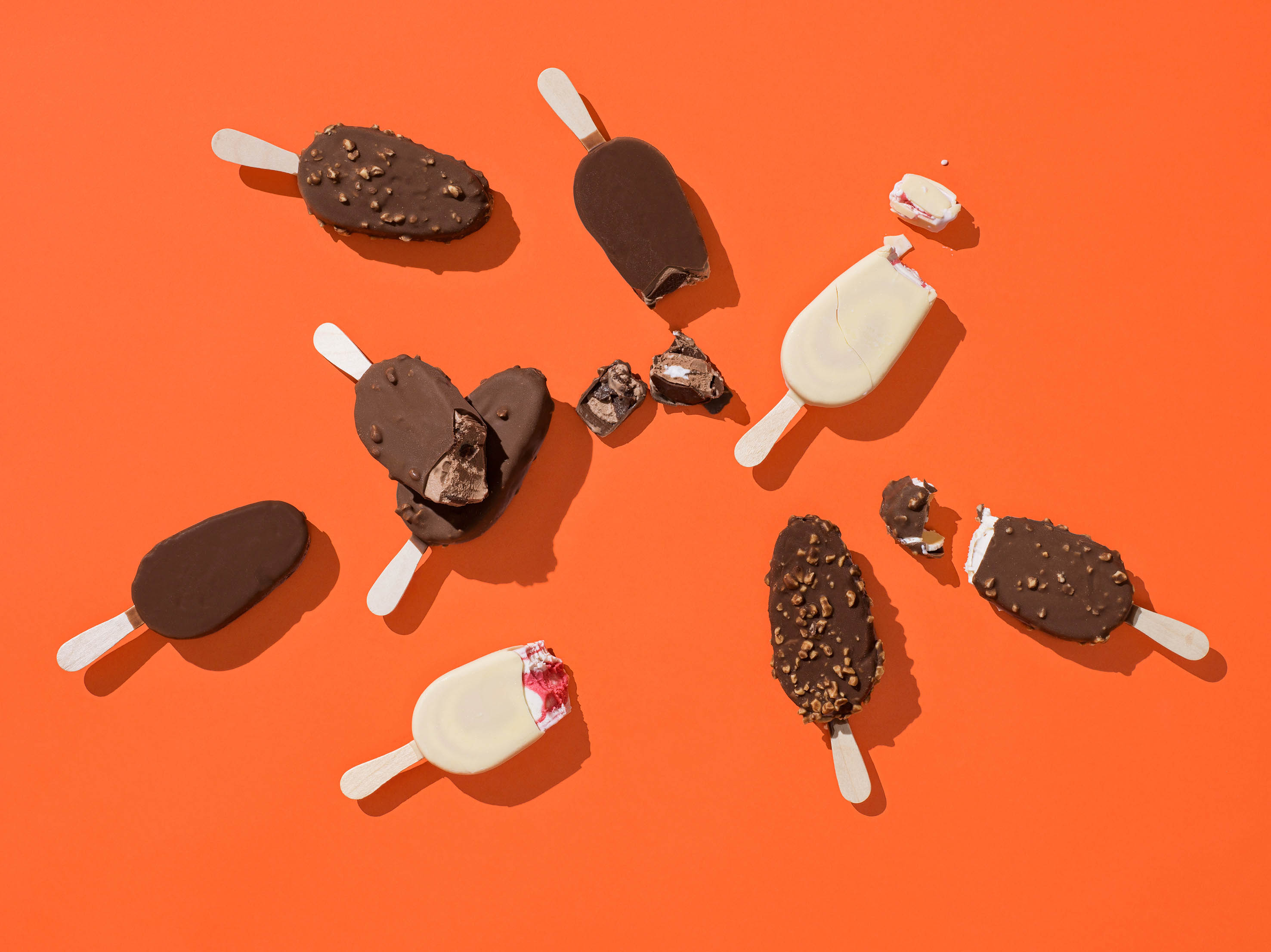
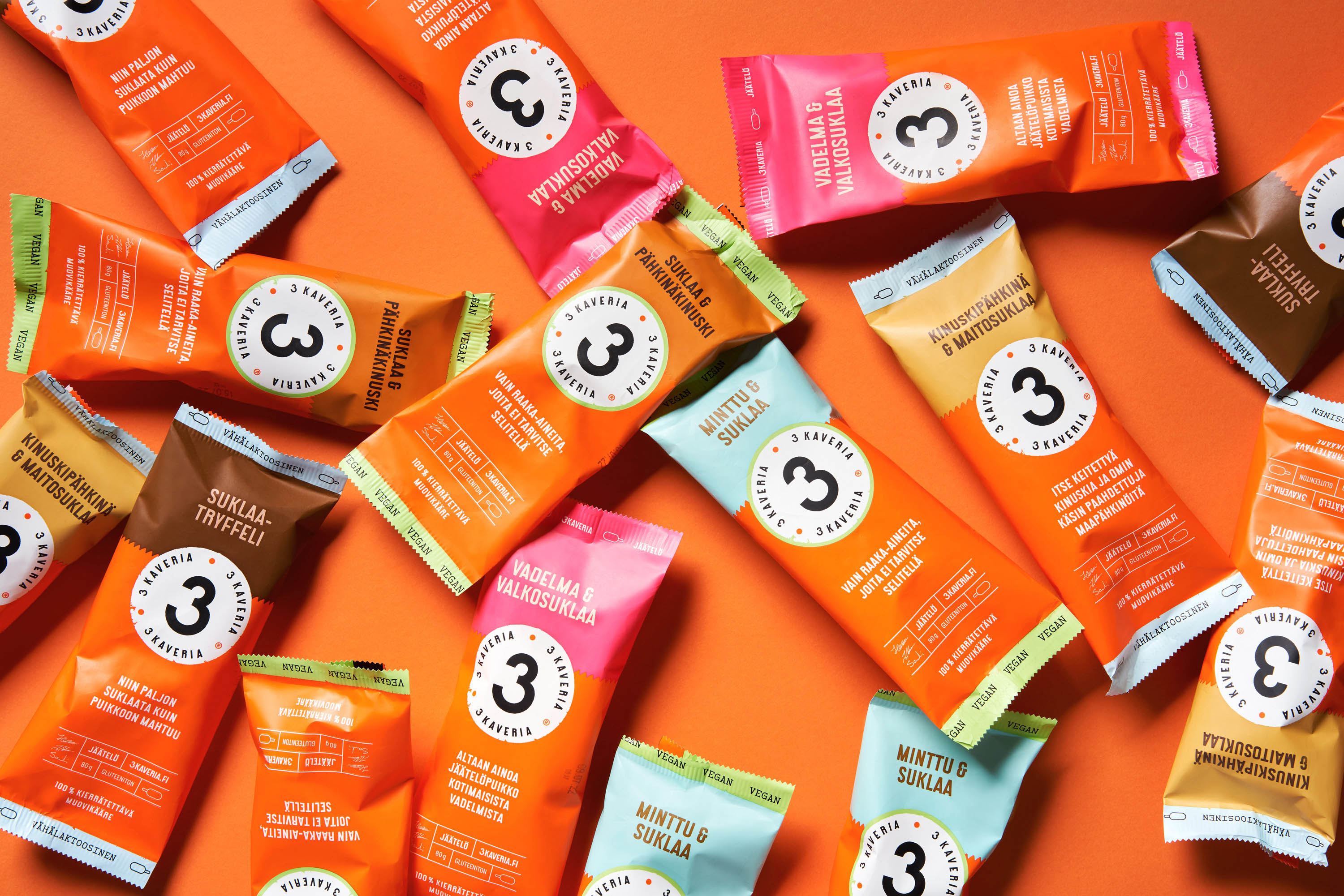
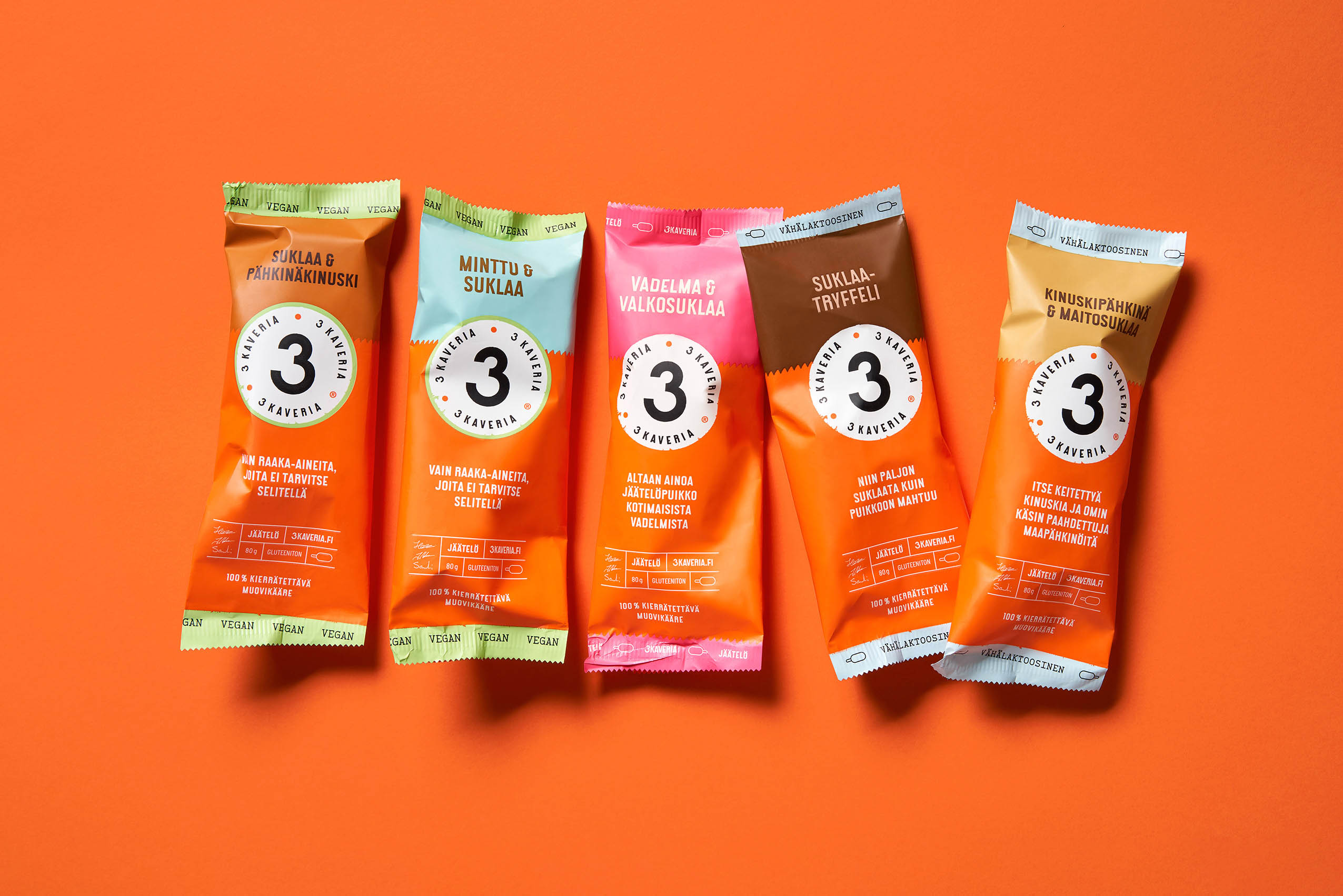
Friends stick together! An ice cream stick that deserves a world-class wrapping. Since 2012, the Helsinki-based 3 Kaveria has been offering the best home made ice cream in 0,5l tub format. Now the success story continues, it’s time to introduce new friends with a new look and flavours in 110 ml ice cream bars. They’re as tasty as they look! Check it out but most of all try them out!
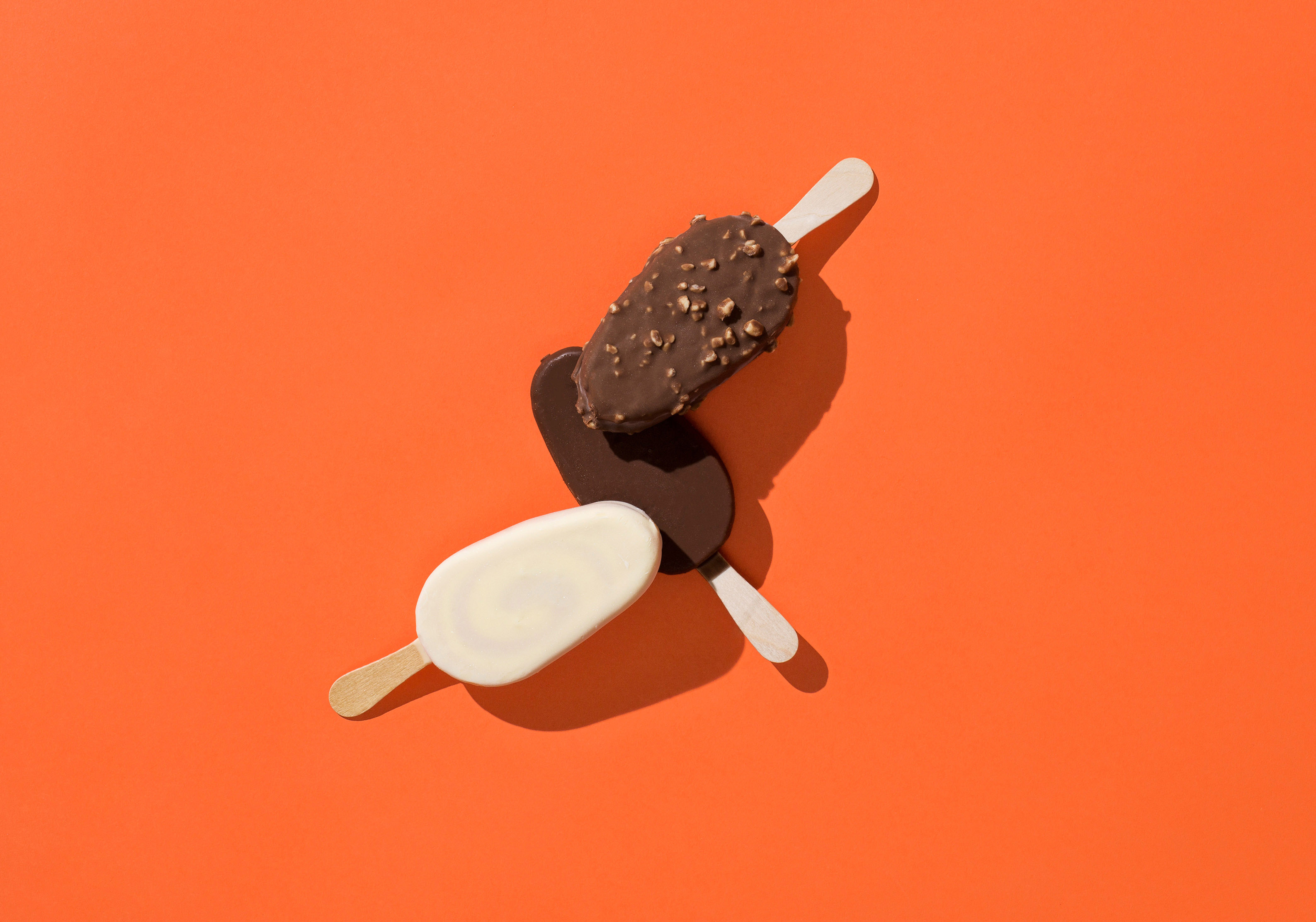
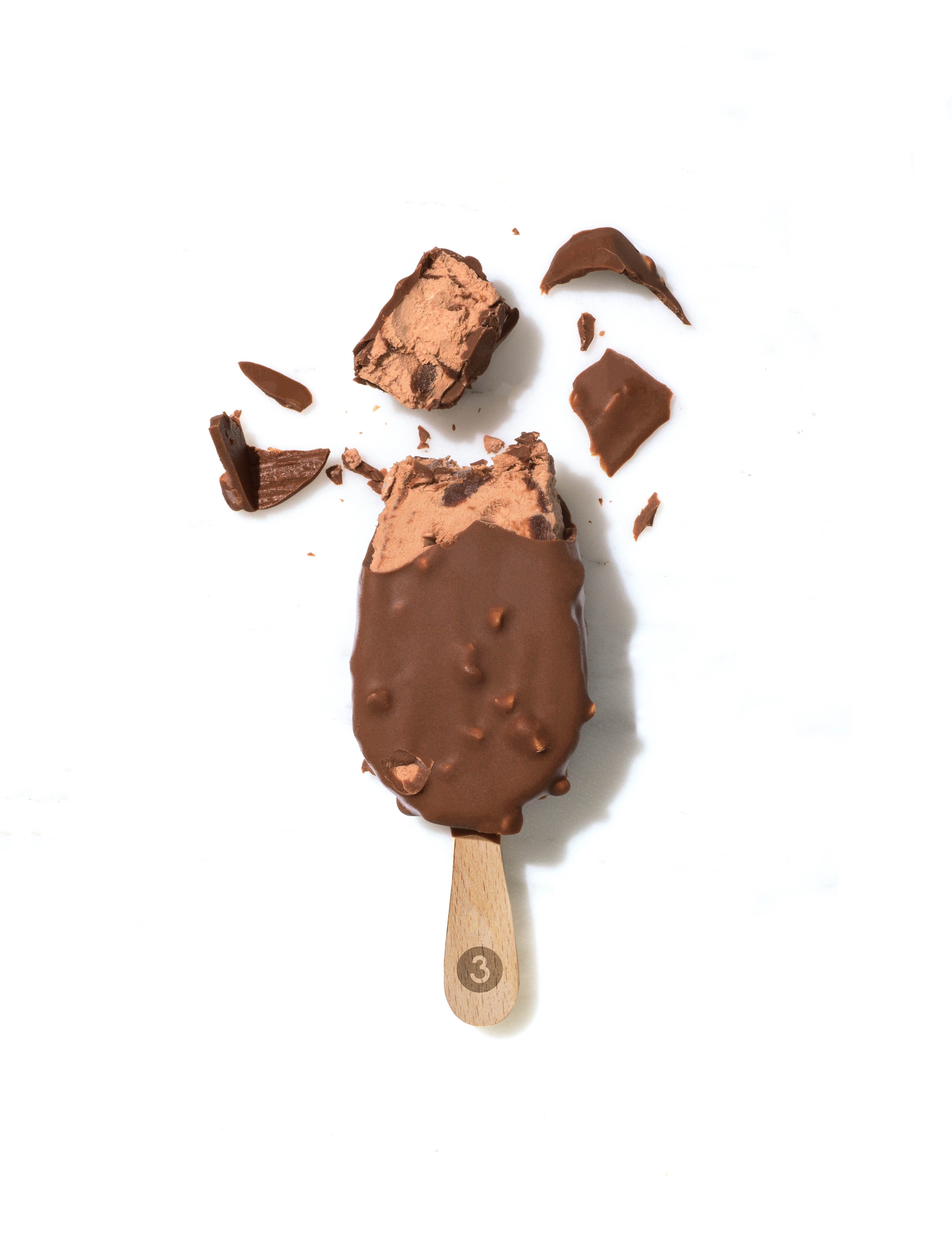
3 Friends, the beloved craft ice cream manufacturer, decided to become the first independent brand to expand their range to ice cream sticks. As a new challenger in the market, the packaging would compete with huge international brands that dominate the category. After testing various lines at the freezer aisles, we chose a vertical format. It was the best in communicating both the delicious flavours and the orange brand colour – no matter which way the packaging lay in the freezer. The final result fulfils the 3 Friends’ quality promise with modern, elegant and simplistic style. From now on, 3 Friends will have ice cream lovers eating out of their hands.
CREDIT
- Agency/Creative: Kuudes Helsinki
- Article Title: An Ice Cream Stick That Deserves a World-class Wrapping
- Organisation/Entity: Agency, Published Commercial Design
- Project Type: Packaging
- Agency/Creative Country: Finland
- Market Region: Europe
- Project Deliverables: Brand World, Branding, Graphic Design, Packaging Design, Rebranding
- Format: Flow-Pack
- Substrate: Wood


