


As we’re well underway with the Party Season, we thought we’d share some unused pitch work that we created a while ago for Iconic British Luxury Department Store Harvey Nichols.
We were invited by the Harvey Nichols marketing team to reinvent their widely recognised Food Store packaging range. Although their food packaging was iconic, unfortunately, trends shift and as it hadn’t been changed for over 20 years, it was time for a refresh.
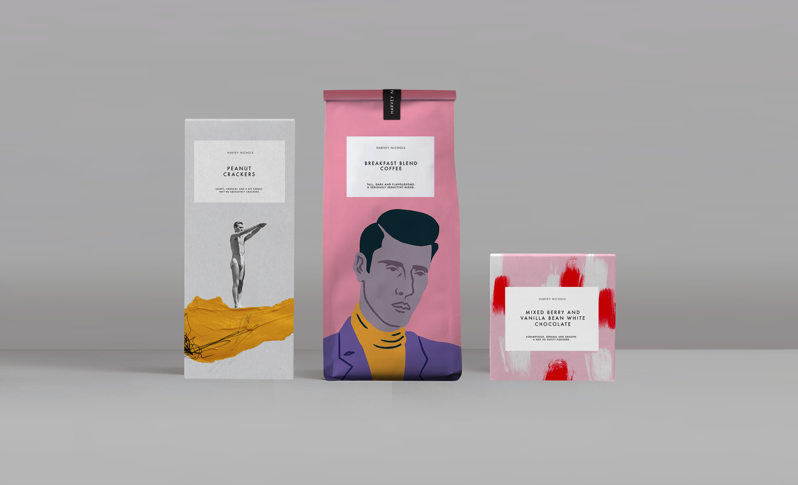
The task was to update the entire food range; From Chocolate and Party Snacks to Preserves and Christmas Ranges. The ranges needed to feel cohesive, yet unique and most importantly iconically ‘Harvey Nics’.
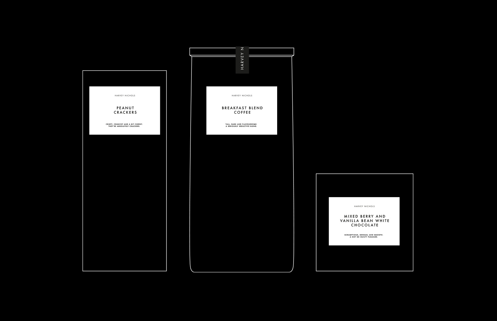
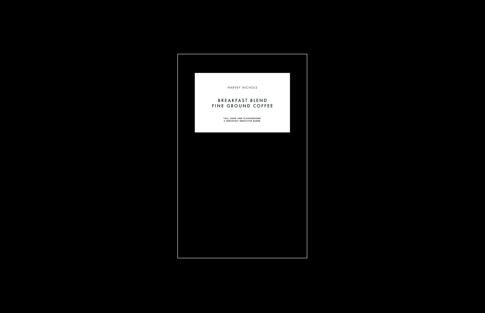
Although the pre-existing Harvey Nichols packaging was dated, it was still very recognisable and Iconic to the brand. Therefore, we decided to look at evolution instead of revolution, taking inspiration from the white rectangular ‘window’ device that was ever-present across product ranges.
The magic of the ‘Window’ concept is that artwork/design can be easily swapped out within the brand window to ensure that each piece of packaging is versatile and unique whilst still retaining its iconic ‘ Harvey Nics’ recognisability.
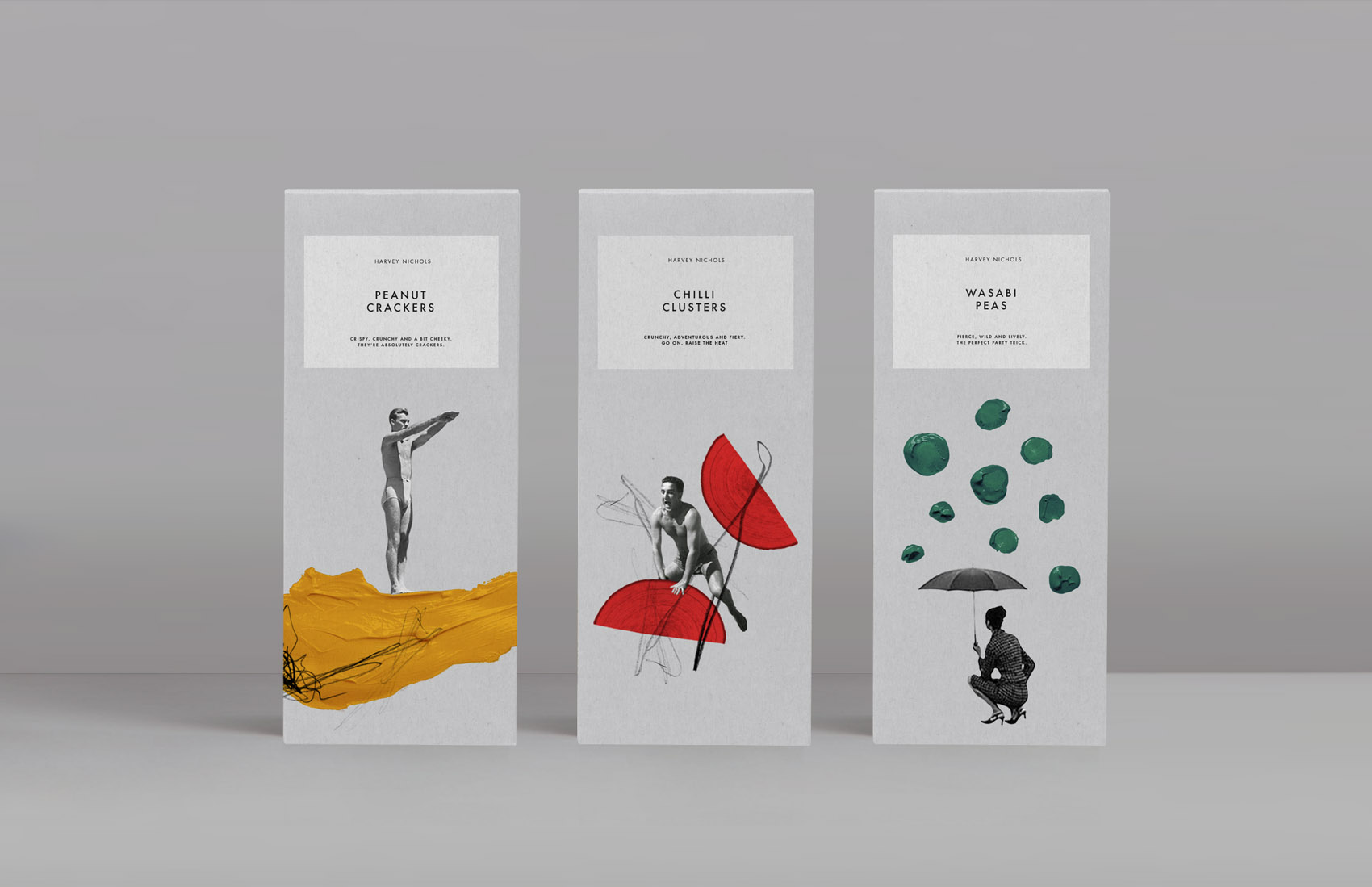
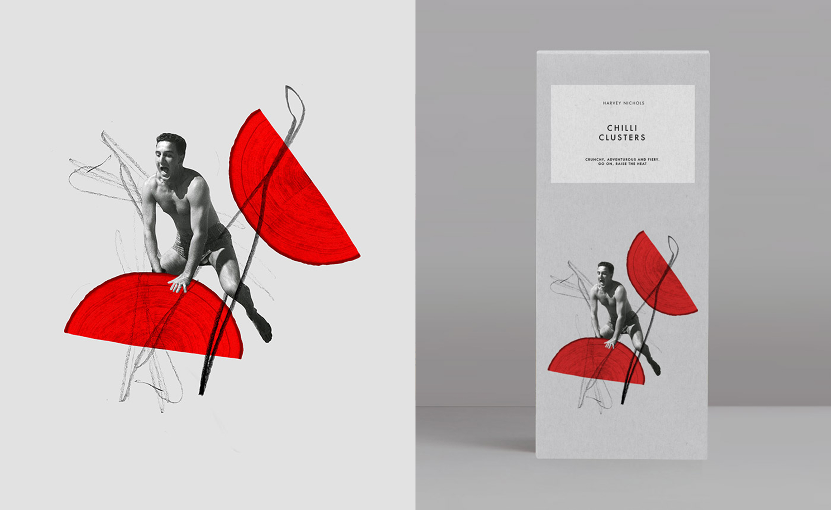
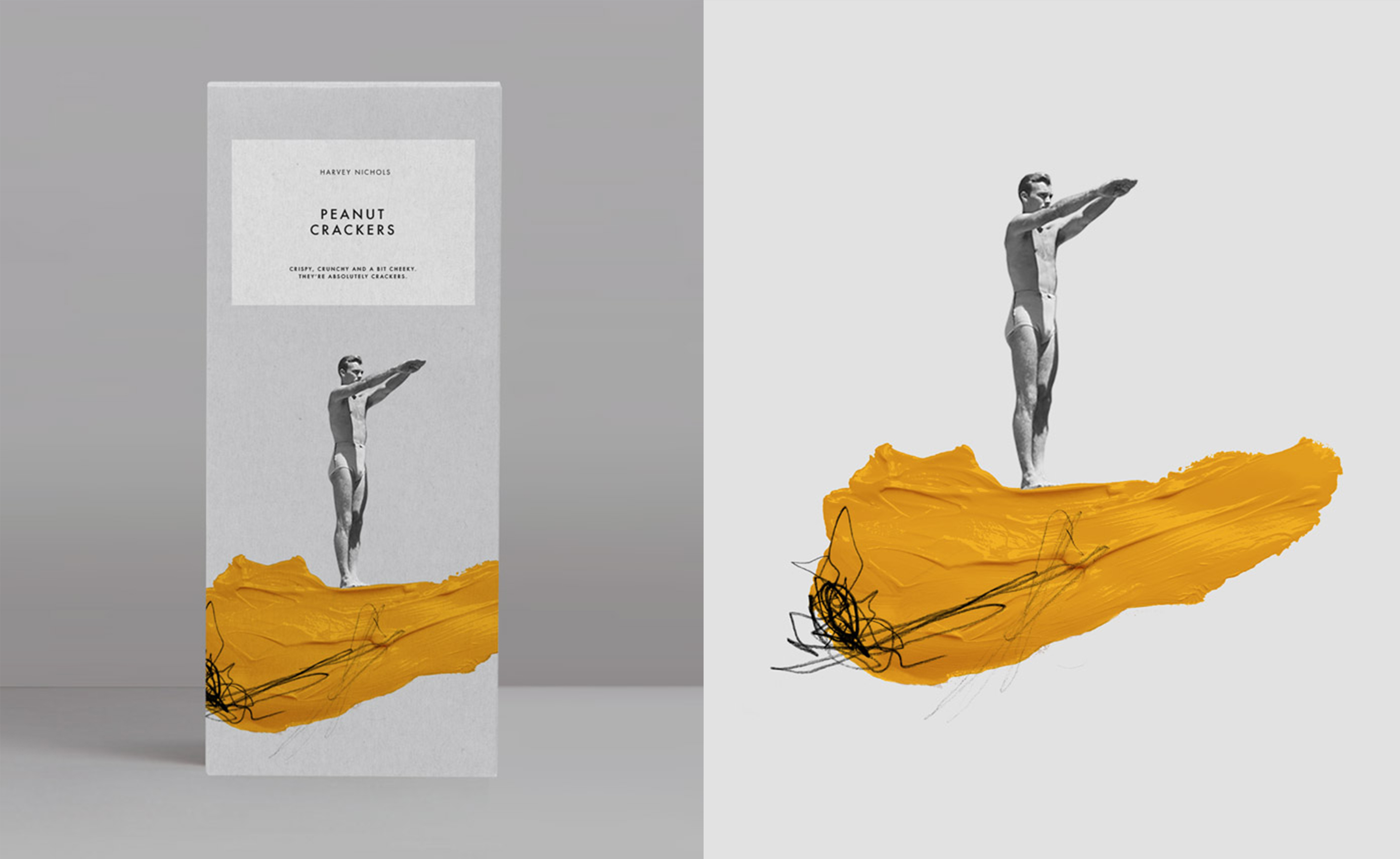
Party Snacks – Taking inspiration from the vintage photography of the original Iconic Harvey Nichols packaging, we designed the Party Snack packaging as a modern spin on a similar concept, as well as a nod to the classic ranges. We created collages by combining vintage black and white photography with abstract coloured paint explorations inspired by the individual ingredients of the products, in this case, Peanut Crackers, Chilli Clusters and Wasabi Peas.
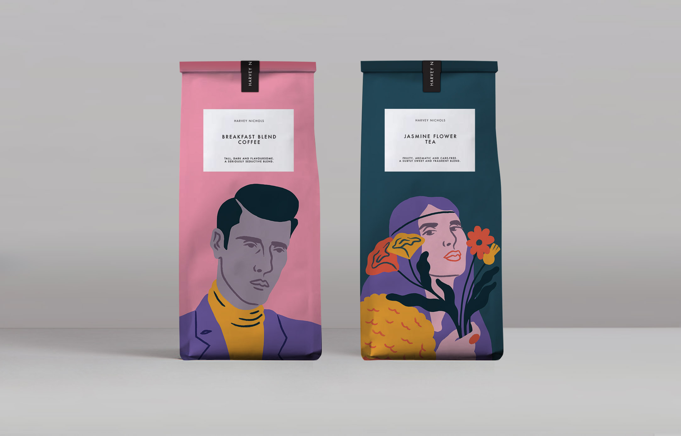
Tea & Coffee – We collaborated with forward-thinking up and coming British Artist Joel Burden, to create playful illustrations of modern personalities to represent each of the different strains of Coffee and Tea. The Examples pitched included a Sophisticated Gentlemen to represent the ‘Breakfast Blend Coffee’ paired with the charming messaging line of ‘Tall, Dark and Flavoursome’ as well as a Free-Spirit Hippy Chick to represent the ‘Jasmine Flower Tea’ paired with the witty messaging line of ‘Fruity, Aromatic and Care Free’.
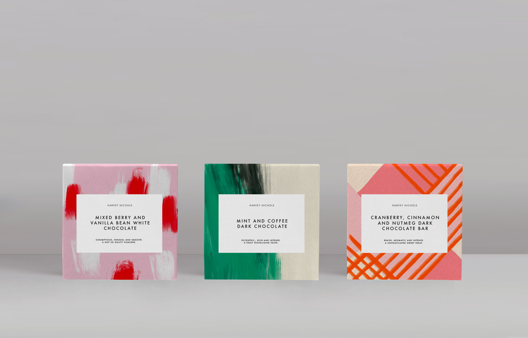
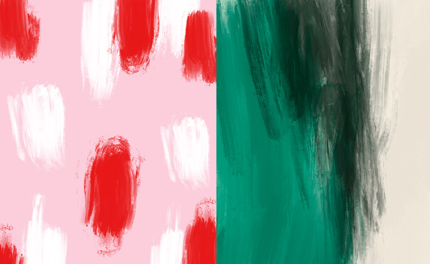
Chocolate – The luxury chocolate was arguably the most paired-back design in the range but still packed a huge punch. We wanted to show how the packaging system could scale from being more bold and playful right the way through to being a little bit more premium and sensible. With this in mind, we created abstract explorations of colour, pattern and a range of textures as a visual representation of the unique flavour combinations within the Harvey Nichols range of luxury chocolate bars.

CREDIT
- Agency/Creative: Alphabet Design Agency
- Article Title: Alphabet Concept Design for Harvey Nichols Food Store Packaging
- Organisation/Entity: Agency, Non Published Concept Design
- Project Type: Packaging
- Agency/Creative Country: United Kingdom
- Market Region: Europe
- Project Deliverables: Brand Refinement, Graphic Design, Identity System, Packaging Design, Tone of Voice
- Format: Bag, Box, Pouch
- Substrate: Pulp Fibre, Pulp Paper


