


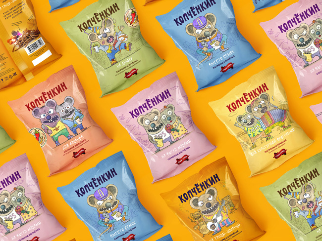
Brand “Kopchenkin” produces inexpensive cheesy smoked beer snacks. When a customer approached us, the brand “Kopchenkin” already existed. However, sales were quite weak. At the same time, the quality of the product was excellent. The smoked cheese had a pleasant bright taste, a comfortable texture (unlike the gum-hurting crackers and chips). The product was very well suited to the format of a beer snack and, with good price had great chance to please the audience. But even a cursory analysis of the packaging was enough to identify the problem. Faceless, created according to the standards of the market design was intended to just ” to be”. But it wasn’t able to highlight a product and attract a customer.
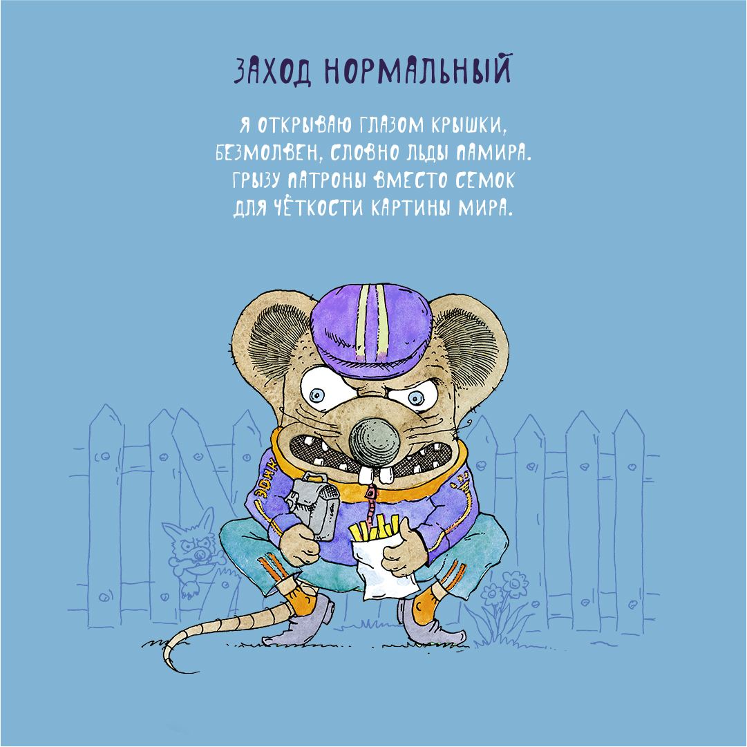
It was obvious one: the name “Kopchenkin” commits to the character. The development went in two directions. The first is the creation of a character-gopnik. We focused on the gopnik, but with a good energy, like the character Leonov from the movie “Gentlemen of Fortune”.
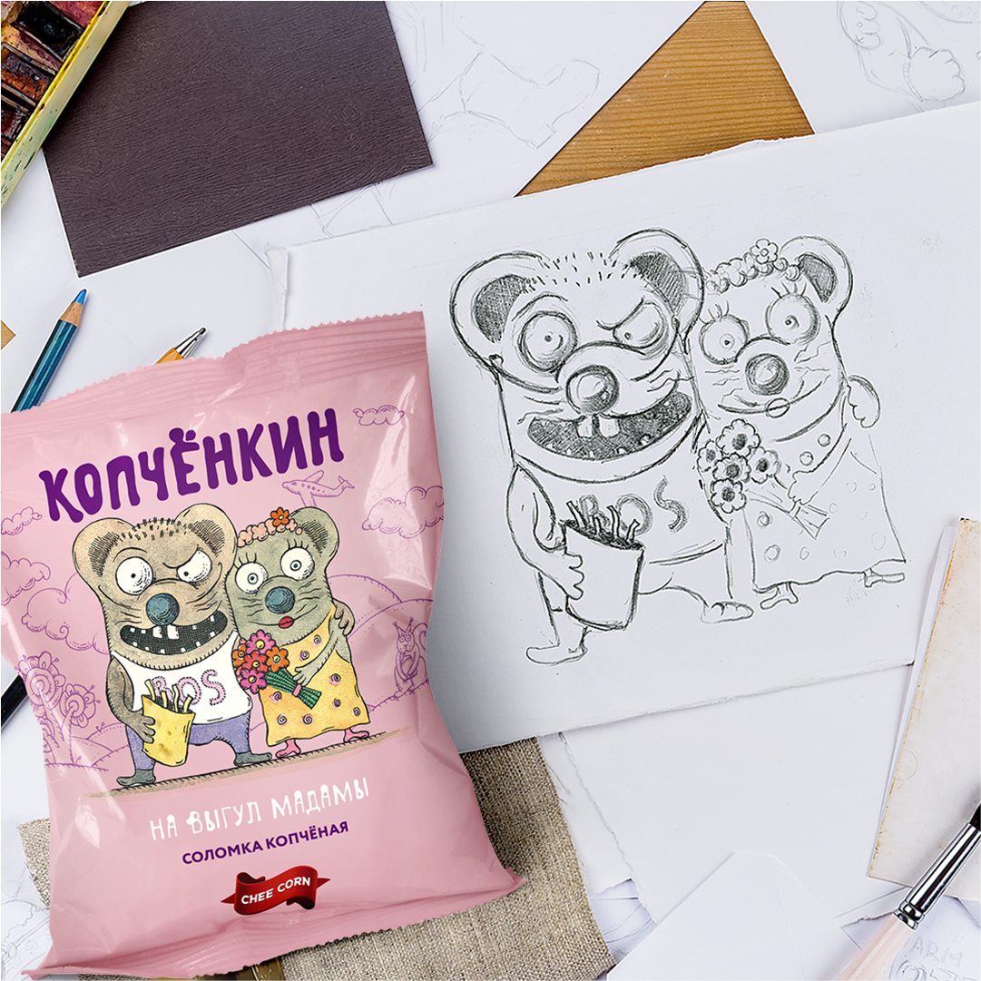
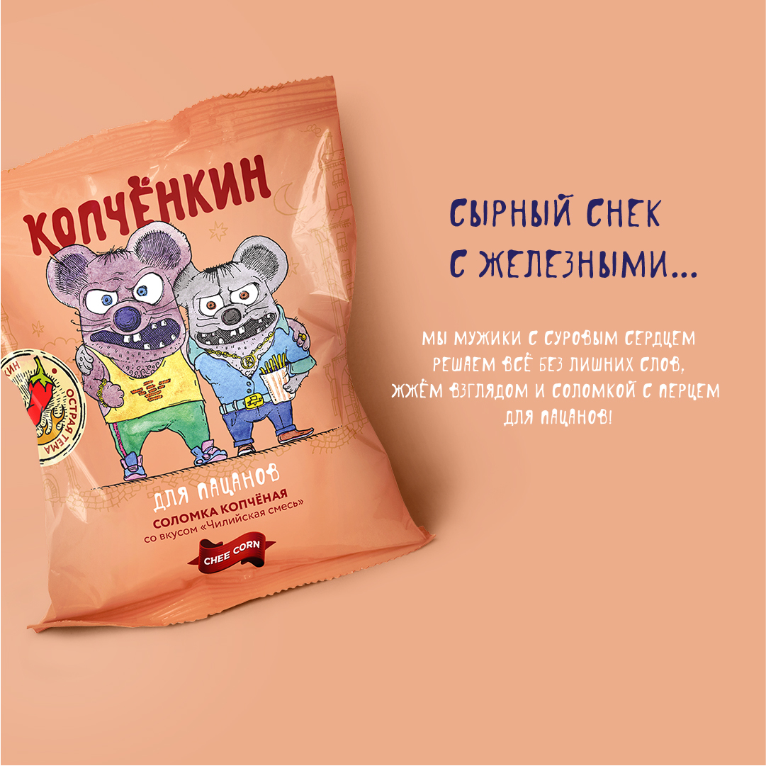
The second was the creation of a rat to project template situations. We can’t say that the first option failed. But the second found so strong love of the audience and customers, that the question of choosing was no longer. Adequate people brand studio created a stereotypical situation for each package, which were described as funny “pies” — short rhymes of a special structure.
It was not difficult to find typical situations. But finding the perfect type for each of them was a more difficult task. On average, 5-7 pencil sketches were made for each of the packages. Funny “pies” tell the story of each character. So a static picture turned into an action with a moral. Another element of engagement is the small details. We drew our characters so that you could notice something new with every sight.
Another important moment was the original style of the pseudo-fur coat. Direct copying of the splint style would give us too archaic a reference.
A similar technique made it possible to get a national flavor in modern processing.
CREDIT
- Agency/Creative: Adequate people
- Article Title: Adequate People Creates Kopchenkin Brand Identity and Packaging Design
- Organisation/Entity: Agency, Published Commercial Design
- Project Type: Packaging
- Agency/Creative Country: Russia
- Market Region: Europe
- Project Deliverables: Brand Architecture, Brand Creation, Brand Identity, Brand Strategy, Branding, Identity System, Packaging Design, Rebranding, Research, Tone of Voice
- Format: Flow-Pack
- Substrate: Plastic


